How this neon font generator works
This neon font generator turns a word or a short phrase into a glowing neon sign you can save as a PNG, a JPG, a short looping clip or a block of CSS. Everything runs in your browser. No sign up, no watermark.
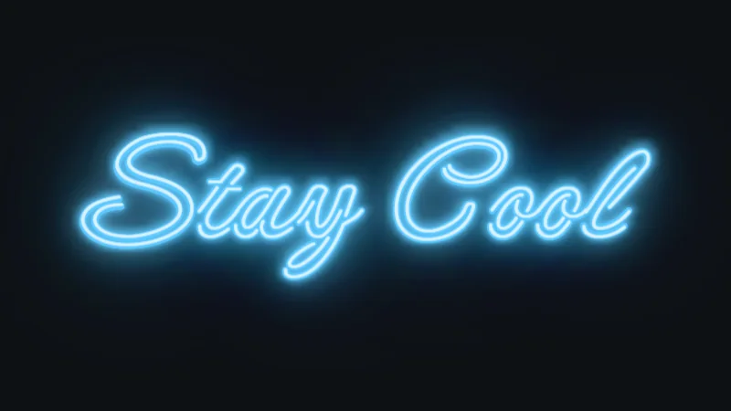
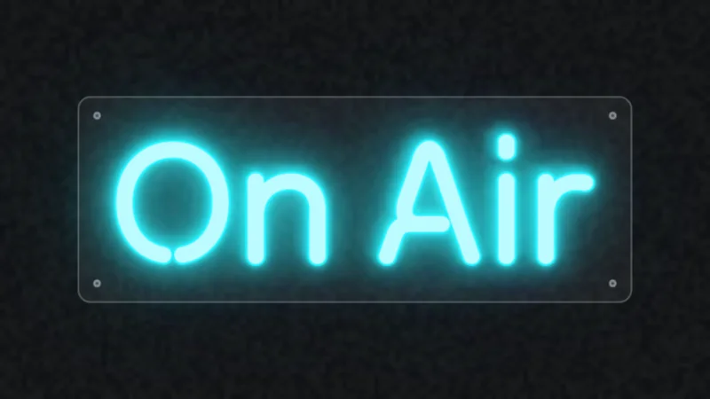
Each sign is built in layers: a dim unlit tube, a colored tube with a white-hot core, and several soft halos that spill onto the wall behind it. That layering is what makes it look like glass and gas instead of a font with a drop shadow. Searching for a neon text generator or a neon sign maker? Same tool.
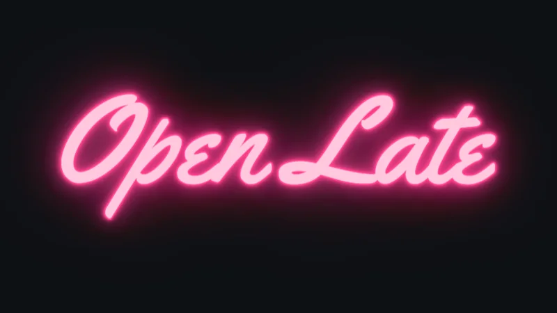
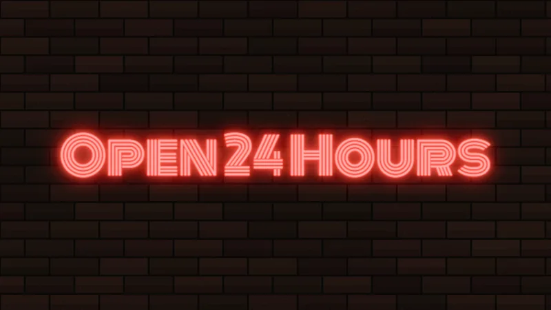
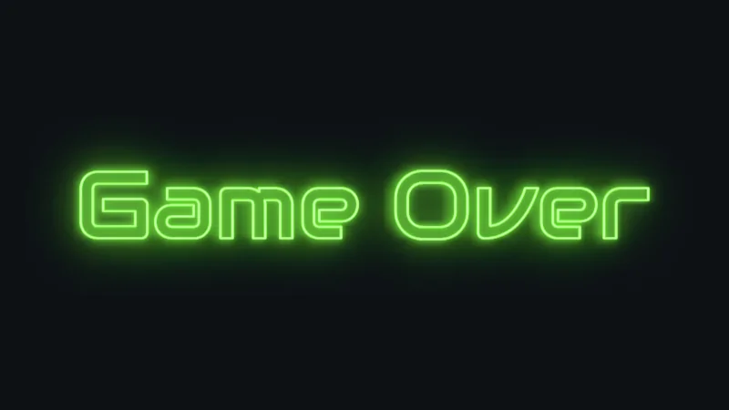
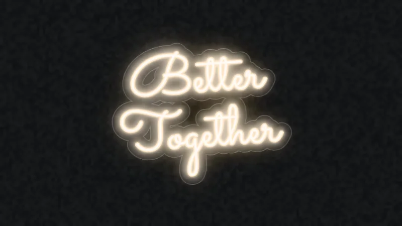

What is a neon font generator?
A neon font generator is an online text effect tool that turns typed text into glowing, neon-sign-style lettering, with controls for the typeface, glow color and glow strength.
The output is one of three things: Unicode characters you paste as text, an image you download, or CSS code you drop into a page.
All three get called generators. They are not interchangeable.
The word "font" causes most of the confusion. A font only supplies the letter shapes, so the neon look usually comes from the effect layered on top.
Google's own description of Neonderthaw, a neon-style script, says it needs an app that can use blurs, plus some added glow, to become signage.
The 3 kinds of neon font generator:
- Unicode copy-paste: swaps each letter for another character and adds combining marks, so no font or image is involved
- Image generators: render a PNG from your text, through a canvas editor, an effect panel inside a design app, or an AI prompt tool. The generator on this page is this kind, with a CSS export on top.
- CSS generators: output stacked text-shadow code with adjustable glow color, intensity and an optional flicker animation
Unicode output depends on the viewer's system font, so the same text can show decorative marks on one device and plain glyphs on another.
Image generators give you the most control over the look. CSS gives you the most control over the page.
Which type of neon font generator should you use?
Pick by destination: Unicode for chats and bios, an image generator for posters, thumbnails and merch, CSS for website headings.
A PNG is fixed pixels, Unicode text depends on the viewer's font, and CSS needs a page to live on. Choosing wrong means redoing the work.
| Type | Output | Editable afterward | Best for |
|---|---|---|---|
| Unicode copy-paste | Pasted text | No | Chat messages, usernames, bios |
| Image generator | PNG | Only in the source project | Posters, thumbnails, merch, mockups |
| CSS generator | text-shadow code | Yes, change the values | Website headings, dark hero sections |
Cost and sign-up differ more than the output does. Some tools ask for an account before the first export. Others keep watermark-free files or commercial rights for paid plans only. This one is free, asks for no account and adds no watermark.
For a single graphic, an image generator is the safe default. Skip the Unicode type for anything that has to stay readable to screen readers.
Which fonts work best for neon text?
Tilt Neon, Neonderthaw, Monoton and Codystar are four open-source Google Fonts typefaces built around the neon and lit-sign look, and each can be dropped into a generator or a CSS file. Bebas Neue is the plain workhorse to pair with them.
| Font | Style | License | Best use |
|---|---|---|---|
| Tilt Neon | Variable sans with rotation axes | OFL | Storefront-style headings |
| Neonderthaw | Single-weight neon script | OFL | Handwritten-style signs |
| Monoton | Art Deco multi-line display | OFL | Large headlines |
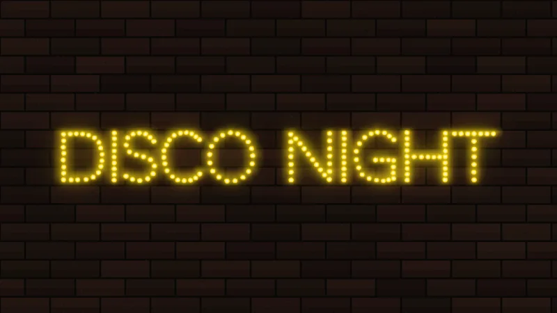
| Codystar | Dotted LED-style display | OFL | Marquee and disco looks |
| Bebas Neue | Condensed all-caps sans | OFL | Bold one-line signs |
All five are in the font list above, along with Sacramento, Yellowtail, Pacifico, Audiowide, Righteous, Quicksand and Bungee Hairline.
Fonts designed as neon
Tilt Neon: Andy Clymer's take on storefront neon lettering, one of three Tilt styles. Google Design's launch post said the Tilt family supports 254 languages.
Neonderthaw: Robert Leuschke's single-weight script that simulates neon, covering Latin and Vietnamese.
Monoton: Vernon Adams' inline-striped display face, which Google Fonts describes as built for sizes above 30 points. Below that, the stripes have little room to read.
Codystar: Crystal Kluge's dotted, LED-style display face from Neapolitan.
Tilt Neon is also a variable font. Its Rotation in X and Y axes let you turn the glyphs like a sign seen from the side, per Google Fonts.
Regular fonts that work with a glow effect
Any typeface can take a glow. The ones that look right share thin, even strokes and generous letter spacing, because heavy letters fill the gaps the blur needs.
- Monoline scripts such as Sacramento
- Brush scripts such as Pacifico and Lobster
- Condensed caps such as Bebas Neue, which has no lowercase to fall back on
For a longer shortlist, this roundup of fonts for neon signs covers more styles.
How do glow color, intensity and background settings work?
The glow is a blurred, colored copy of the text placed behind a bright core. Color sets the hue, intensity sets the blur and strength, and the background decides whether any of it shows.
Glow color
A real neon tube has a white-hot core wrapped in colored gas glow, and CSS neon text rebuilds that in layers.
The recipe: white or near-white text, a tight white shadow for the core, then colored shadows at rising blur, each at zero offset so the light spreads evenly.
- Preset palette: eleven tube colors, from hot pink and cyan to warm white, one click each
- Custom hex: the Custom picker matches a brand color exactly
- Solid colors: a real tube glows one color, so each line gets one solid color here, and every line can have its own
Glow intensity and flicker
MDN defines blur radius simply: the higher the value, the bigger the blur, and the shadow gets wider and lighter.
Low blur: a tight halo, letters stay sharp.
High blur: a wide, soft halo that loses brightness and can smear thin strokes.
A good rule of thumb: a white core plus three or four colored layers reads as neon. Stack many more and it starts to look like a casino.
In this generator, Glow strength sets the brightness and Glow reach sets the blur radius. White-hot core controls how pale the center of the tube gets. Flicker is a separate step: pick it in the Animation menu, and the CSS code adds a matching keyframe animation.
Tubes and backboards
- Solid letters fill each letter with light. Best for thin scripts.
- Outline tubes trace the edge of each letter, like a tube bent around the shape. Best for bold fonts such as Righteous or Audiowide.
- Lights on switches the sign off so you can see the bare tubes, handy for a before and after.
- Backboard adds a clear acrylic panel with standoffs, or an acrylic piece cut around the letters.
Background
Neon needs darkness.
On white, the glow reads as a smudge. Photos follow the same rule: darker scenes show the glow more dramatically, and bright scenes give a subtler effect.
- Dark solid color: the safest choice, and the default here
- Brick or concrete wall: adds realism to a sign mockup
- Transparent PNG: set the background to None to place the text anywhere
A transparent export only moves the decision. The glow still needs a dark surface behind it wherever the file ends up.
How to make neon text step by step
Type the text, pick the font, set glow color and intensity, choose a background, check the preview, then export in the format the destination needs.
- Type a word or short phrase. Long lines shrink the letters until the glow runs together. Up to 3 lines fit, so break long phrases.
- Pick the font before touching any glow setting, since stroke width decides how much blur reads as light.
- Start from a style thumbnail, then move the glow sliders in small steps while watching the live preview.
- Set the background to the surface the file will sit on.
- Leave margin around the text so the glow fades out before the canvas edge. The Text size slider and the Tight format both keep room for the halo.
- Export, using the format guide below.
Tight font spacing causes most muddy results, because the halos of neighboring letters merge into one blob. Two other common mistakes:
- Glow clipped at the canvas edge
- Solid-background PNG exported when the layout needed an overlay
Choosing an export format
- PNG: fixed pixels with the glow baked in, right for thumbnails, posts and mockups. PNG 2x doubles the size for print.
- Transparent PNG: the same file without a background, so it can sit on any dark layout
- JPG: the smallest file, always on a dark background
- Video clip: a seamless 4 second loop of the Buzz, Flicker or Pulse animation, saved as MP4 or WebM depending on your browser
- CSS code: live text with text-shadow layers, editable by changing values. Copy it from the code block under the editor, then change the
font-sizeto fit your page. - SVG: scalable shapes, with the glow built from an feGaussianBlur filter that MDN lists as available across browsers since October 2018. This generator doesn't export SVG, so use PNG 2x when you need a bigger file.
Tips for a sign that looks real
- Use connected scripts for a hand-bent look. Real tubes are continuous, so joined letters feel more believable.
- Turn the core up and the glow strength down for a crisp photo look. Do the opposite for a dreamy, hazy one.
- Mix two colors at most. A warm white line under a colored one is a classic combo.
- Add a slight tilt of 3 to 6 degrees for a hand-hung feel.
Can you use neon text commercially?
Yes, when the typeface license and the generator's terms both allow it. Check them separately, because one can permit what the other forbids.
Every typeface carries its own font licensing terms, and the generator adds a second layer of terms on top.
- Open Font License typefaces: Google Fonts says they can be used commercially, including in logos, print, websites, apps and storefronts
- Personal-use typefaces: DaFont labels these "free for personal use," and business work needs a purchased license
- Generator plan: free-tier exports can carry limits that paid plans lift, so read the plan page before printing merch
The twelve fonts in this generator use the SIL Open Font License, except Yellowtail, which uses the Apache License 2.0. Both allow commercial use, and the exports carry no watermark or plan limits.
One DaFont listing, The Question by Origin Type, warns that unlicensed commercial use carries a penalty of up to 100 times the standard license fee.
If a favorite neon style is personal-use only, swap in one of the fonts released free for commercial use instead.
The Open Font License draws one hard line. Per the SIL OFL FAQ, the font files cannot be sold on their own, so neon artwork made with them is fine and a resold download is not.
Logos need extra care. Some design platforms bar their library content from trademarks, and a logo you plan to register is safer built from fonts whose license you have read yourself.
When neon text does not work
Neon text fails for readers who need accessible text, at small sizes, in fast flicker animations and in layouts that already hold another glowing element.
Accessibility
WCAG 1.4.3 sets contrast at 4.5:1 for normal text and 3:1 for large text, and logotypes are exempt (W3C).
A bright white core on a dark background clears that easily. Saturated blues and purples without a white core often do not. Test the pair in a color contrast checker before you ship it.
- Screen readers can read Unicode neon text character by character, for example "mathematical sans-serif capital H"
- Heavy combining marks can crash some text-rendering engines
- A PNG headline is an image of text, which WCAG 1.4.5 asks authors to avoid when real text can do the job
For page headings that must stay readable, live CSS text set in typefaces chosen for accessibility beats an exported image.
Small sizes and exact wording
Glow needs room.
Below headline size, halos swamp thin strokes and the letters smear into each other. Drop the effect and switch to one of the fonts built for small text.
Test the exact wording in the live preview, numbers and punctuation included, because display fonts often cover fewer characters than a regular family.
Flicker and motion
- Flash rate: content that flashes more than three times in any one second fails WCAG 2.3.1, a Level A criterion
- Reduced motion: wrap the flicker in the prefers-reduced-motion media query so those users get a static glow
- Pause control: motion that keeps running needs a way to pause, stop or hide it (WCAG 2.2.2)
The Flicker setting here stays under that flash limit, and the CSS it writes already includes the reduced-motion fallback.
Overuse
A good rule for neon: one sign per scene.
A page with five glowing headings has no neon. It has noise.