Despite the name, a vertical font generator doesn't make a font. It takes horizontal text and hands it back as vertical output, either stacked characters you copy and paste or a rendered image.
A bio field wants pasted text and a printed shirt wants an image. Web pages are a third case, and Discord has its own quirks.
Styled results are look-alike Unicode characters, and many of them come from the Mathematical Alphanumeric Symbols block, which the Unicode Standard describes as meant for mathematical variables, not everyday text.
What Is a Vertical Font Generator?
The word "font" in the name points to the styled look of the result, not to something you install.
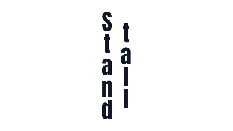
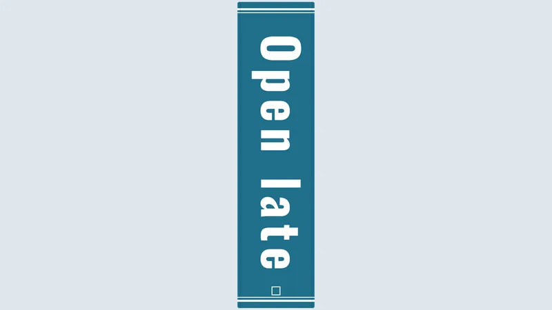
Most text-based tools stack letters one per line and let you swap them into a Unicode style. Image-based tools skip text altogether and give you a transparent PNG. This generator does both: the preview is drawn in a real typeface and exports as an image, while the box beside it holds the stacked text you can copy.
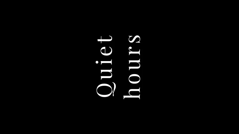
People sometimes mix it up with rotated text, where the whole line turns 90 degrees, or with letter-spaced text (W A I T), which stays horizontal. It also has nothing to do with font files that carry vertical glyph metrics, the kind CJK typesetting needs. That's a separate font-engineering job, and web tools don't touch it.
How a Vertical Font Generator Builds Vertical Text
Under the hood, the tool breaks your input into single characters first. After that it either joins them with line breaks, swaps them for Unicode look-alikes, or draws them onto a canvas. The first two give you text. The third gives you a PNG.
Stacked text with line breaks
Stacking puts one character on each line, so a 4-letter word becomes 4 lines.
Because the output is made of ordinary characters, spaces and line breaks, it survives a paste into most bio fields, chats and notes apps. The direction is always top to bottom, and the cost is length. A word of n letters becomes 2n minus 1 characters once the line breaks are counted.
Unicode font styles
Styled output is not a font at all. The tool replaces each Latin letter with a look-alike character from a different part of Unicode, and the screen draws another glyph because the underlying character changed.
Bold, italic, script, fraktur, double-struck, monospace and circled are the usual styles, and you can switch between them in the Unicode style menu and watch the text box update before copying one.
Most of these letters come from the Mathematical Alphanumeric Symbols block, U+1D400 to U+1D7FF. Others, such as circled letters, come from other parts of Unicode. The Unicode code chart describes the math letters as meant for mathematical variables where style variation carries meaning, and points everyday text back to standard letters.
The main weakness follows from that origin. Scope, the UK disability charity, notes that a screen reader may read a stylised "t" aloud as "mathematical sans-serif script t".
Image output
Image output skips Unicode entirely. You type the word, choose a layout (stacked, rotated or columns), pick a font and download a transparent PNG. The text is drawn in a real typeface, so the result looks the same everywhere.
The catch is the file itself. A PNG is a bitmap image, so you can't edit the wording afterward and enlarging it loses sharpness. That is why the generator also offers a 2x export.
Which Output Method Fits Your Use Case
Stacked Unicode text suits bios and chats. Websites should use CSS writing-mode, and print or design files need a PNG. Each method breaks somewhere the other two do not.
| Method | Works in | Font control | Breaks when |
|---|---|---|---|
| Stacked Unicode text | Bios, captions, chats | Unicode styles only | Pasted into print or design tools |
| CSS writing-mode | Websites, web apps | Any web font | You need to paste it into an app |
| PNG image | Print, merch, slides | Any font the tool offers | The wording must change later |
Need to edit the wording later? Stay with text, not an image. A real typeface rules out Unicode styles, and anything that has to be read correctly by assistive technology should go through CSS.
On a web page, line-break stacking is the weakest of the three. W3C's WCAG 2.1 technique F32 flags white space characters, line breaks included, used to space out the letters of a word, because assistive technology then reads the pieces instead of the word.
CSS avoids that by keeping the string whole and rotating only the layout. MDN lists writing-mode as widely available across browsers since March 2017. For a website I'd reach for it before any generator, and the CSS panel under the preview writes the matching rule for your current layout.
How to Make Vertical Text for an Instagram Bio, Discord and Other Social Platforms
Line breaks count as characters, so a short word fits in a bio and a sentence won't.
- Type or paste one or two short words.
- Choose the stacked layout, then a Unicode style.
- Press the copy text button instead of selecting the text by hand.
- Open Edit profile in Instagram and paste into the bio field.
- Check the preview and the character count before saving.
The same paste flow works in TikTok and X bio fields. Each has its own length limit, so look that up first.
Character limits to check before pasting
Instagram caps bios at 150 characters and captions at 2,200, according to Instagram's own documentation. The counter under the text box compares your output with the 150 limit.
A 10-letter word stacked one letter per line takes 19 characters (10 letters plus 9 line breaks). That is 19 of the 150 bio characters gone on a single word.
Keeping line breaks from collapsing
Instagram can collapse blank lines, which is why the generator has a Fill blank lines with U+2800 option. U+2800 is Braille Pattern Blank, a character that many fonts draw as an empty space while it is not a regular space (Unicode Standard). It still counts toward the 150.
If your breaks vanish after pasting, start by pasting your text into the tool and copying from there, not from Notes or Word. Some mobile keyboards strip breaks on paste, so retyping them inside the Instagram editor is the next thing to try. And don't type breaks into a desktop comment box, where Enter submits the comment.
Discord and the display name
A display name is a single line, so stacking cannot live there.
Discord display names run 1 to 32 characters, and special characters, spaces and emojis are allowed (Discord Support). Leave headroom below 32 when you use styled letters, since they may not be counted the way they look.
Usernames are stricter, with lowercase letters, numbers, underscores and periods only. Style the display name and put the stacked version in messages.
Discord draws pasted characters in its own interface font, so a style that font lacks falls back to another typeface on the reader's device.
How to Create Vertical Text With CSS
Set writing-mode: vertical-rl on the element, then pick a text-orientation value. Two declarations replace the generator, and the result stays live text on the page.
| Value | What happens to Latin letters | Typical use |
|---|---|---|
| mixed (default) | Rotated 90 degrees clockwise | Japanese text with Latin words inside |
| upright | Stay upright, one per line | Stacked word, signage-style label |
| sideways | Whole line rotated 90 degrees clockwise | Rotated labels, table headers |
MDN lists text-orientation as widely available across browsers since September 2020. It only takes effect when writing-mode is something other than horizontal-tb.
Stacking Latin letters with upright orientation
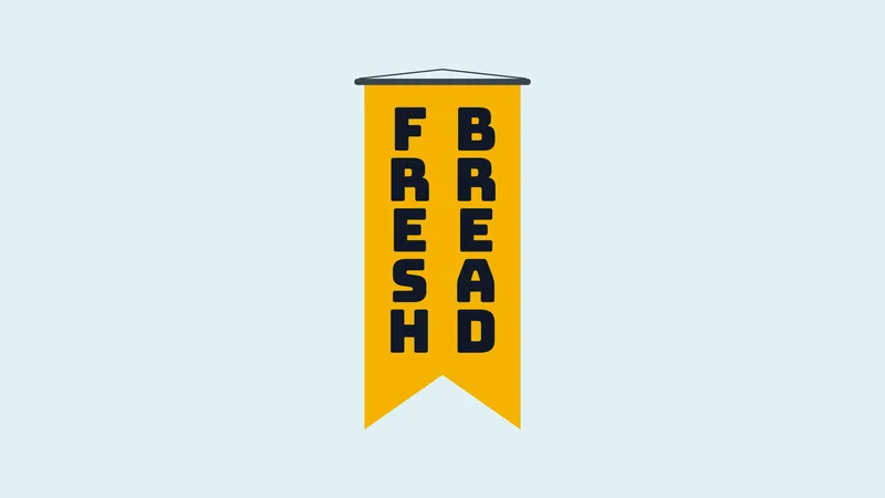
The upright value is the CSS version of what a stacked generator outputs.
The minimum CSS is writing-mode: vertical-rl plus text-orientation: upright. Give the container a height too, since vertical lines wrap at the block's height.
MDN notes that upright forces the used direction to ltr, so the letters read top to bottom in typing order.
Gaps between stacked letters come from letter-spacing, which now acts along the vertical axis. Line-height sets the distance between columns instead.
To rotate a label so it reads bottom to top, writing-mode: sideways-lr does it natively, but support is not universal yet. The safer route is vertical-rl with transform: rotate(180deg), which is what the CSS panel outputs for the Rotated 270 layout.
Japanese tategaki with vertical-rl
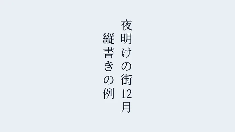
W3C's Requirements for Japanese Text Layout describes Japanese composition as using both horizontal and vertical writing modes. Tategaki is a standard layout, not a style effect.
With vertical-rl, characters run top to bottom and each new line sits to the left of the previous one (MDN). The Columns upright and Columns mixed layouts follow the same rule, so the first line you type becomes the rightmost column.
Latin words inside the line get rotated sideways by text-orientation: mixed. A short run of digits, such as a two-digit date, fits into one character box with text-combine-upright: all, which is called tate-chu-yoko, and the generator does the same for two-digit numbers. Line breaks follow kinsoku shori rules, which keep closing punctuation from starting a line and opening brackets from ending one (W3C JLReq).
MDN adds that the digits value of text-combine-upright has no browser support, so all is the working choice.
Fonts and Export Settings for Print, Merch and Tattoo References
Use a condensed, heavy sans-serif and export a transparent PNG at the size of the print area. A stack is one letter wide and as tall as the word, so narrow letterforms keep the column compact.
Ornate serifs and wide capitals such as W and M break the rhythm of a column. A condensed typeface like Anton or Bebas Neue avoids that, and both are in the font list.
For shirts and print-on-demand, go with a PNG on a transparent background. Printful's guidance names PNG as the usual choice for direct-to-garment printing, because a solid background in the file can print on the garment.
Resolution matters as well. Printful asks for at least 150 DPI for most products and 300 DPI for paper prints, with the file sized to the real print dimensions.
Cutting machines treat files differently. Cricut's help center says PNG and JPG uploads arrive in Design Space as basic raster images on a single layer, while SVG and DXF files arrive as vector layers.
For letters you still need to edit, add the font to Design Space and type the word there instead of uploading a picture of it.
For tattoo ideas, export at the largest size the tool allows and hand the PNG to your artist as a starting reference, not as finished linework.
When Vertical Text Does Not Work
Vertical text fails when the reader has to take in more than a word or two, and when a PNG gets enlarged past its pixels.
The reading research is fairly one-sided for Latin script. Yu, Park, Gerold and Legge (Journal of Vision, 2010) found horizontal English text read 139% faster than upright stacked letters and 81% faster than rotated text.
The same paper discusses earlier work suggesting that Japanese readers, who handle both orientations daily, read them at similar speeds.
Porter and Arblaster (British and Irish Orthoptic Journal, 2020) also measured significantly faster horizontal reading. The sources diverge by reader group, not by method, so the penalty belongs to Latin-script stacks and does not carry over to tategaki.
So where does stacking go wrong in practice? Anything that carries an action, like prices, calls to action and names, belongs in horizontal text. Keep stacks to one or two words. And watch the PNG size, because a small file scaled up to shirt size drops far below Printful's 150 to 300 DPI range.
Scope lists people with dyslexia and low vision among those who struggle with custom fonts and fancy symbols. Where legibility matters more than style, pick one of the typefaces built for accessibility and keep the line horizontal.
A single stacked word beside horizontal copy stays on the right side of every limit above.
Vertical Font Generator FAQ
How do I make vertical text in Word, Google Slides or Canva?
In Word, put the text in a text box or shape, then open Text Direction and rotate all text 90 or 270 degrees, per Microsoft Support. Google Slides has no vertical mode, so rotate the text box 90 degrees.
In Canva, add a text box and enter 90 under Position, in the Rotate field. Canva's built-in vertical text option only covers Chinese, Japanese and Korean text.
Can I stack letters by hand instead of using a generator?
Yes, in any field that accepts line breaks. Press Enter after each letter.
A 6-letter name needs 5 breaks, which is fine once. A generator earns its place on longer words and when you want a Unicode style applied to every letter.
Do I need a license to use generated vertical text on merch?
Pasted text needs none, because it is plain characters and not a font. A PNG embeds a typeface, so check that font's license and the tool's terms before printing.
Every font in this generator is open source under the SIL Open Font License, except Permanent Marker, which uses the Apache License 2.0. Both allow commercial use.
Are there fonts built specifically for vertical writing?
Yes, in CJK typesetting, where fonts can carry dedicated vertical glyph forms.
Web generators do not produce these files. On a website, a CJK font that already carries vertical forms plus writing-mode: vertical-rl does the job.
Testing Vertical Text Before You Publish It
Paste the output of a vertical font generator into the exact field where it will live, save it, and reopen it. The saved field decides whether the stack survives, not the tool's preview.
Order matters here. Save the draft and reopen it first, then read the character counter against the stack, then view the saved result on a second device.
Saving goes first because that step strips line breaks and filler characters. The counter comes second, since fillers only count once they survive. The second device is last, because it only matters once the text is intact.
The price is one throwaway draft per platform.
This holds as of November 2026. A change to Instagram's bio limit, or a Discord update that changes how styled letters are counted, would shorten the routine.