How this color palette generator from image works
Upload the same photo to two palette generators and you will often get two different sets of swatches. That is normal. The result depends on the clustering method, not only on the photo.
This color palette generator from image reads the pixels of a photo, groups similar colors and gives you the main ones as a palette. It runs in your browser, so your image never leaves your device. No sign up, no watermark.
Under the hood, the pixels are sorted by how different they look to the human eye, using the CIELAB color space, and grouped with k-means clustering. Each group is averaged into one color, and colors that are nearly identical get merged. That is why a sunset gives you a few clear tones instead of fifty shades of orange.
Web designers lean on these tools for interface themes and brand boards, and now and then for a mood reference, instead of choosing colors by eye.
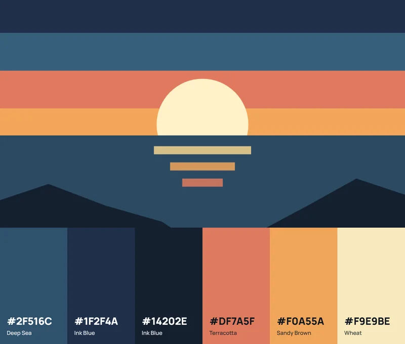
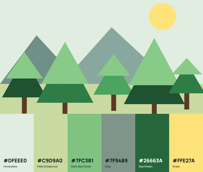
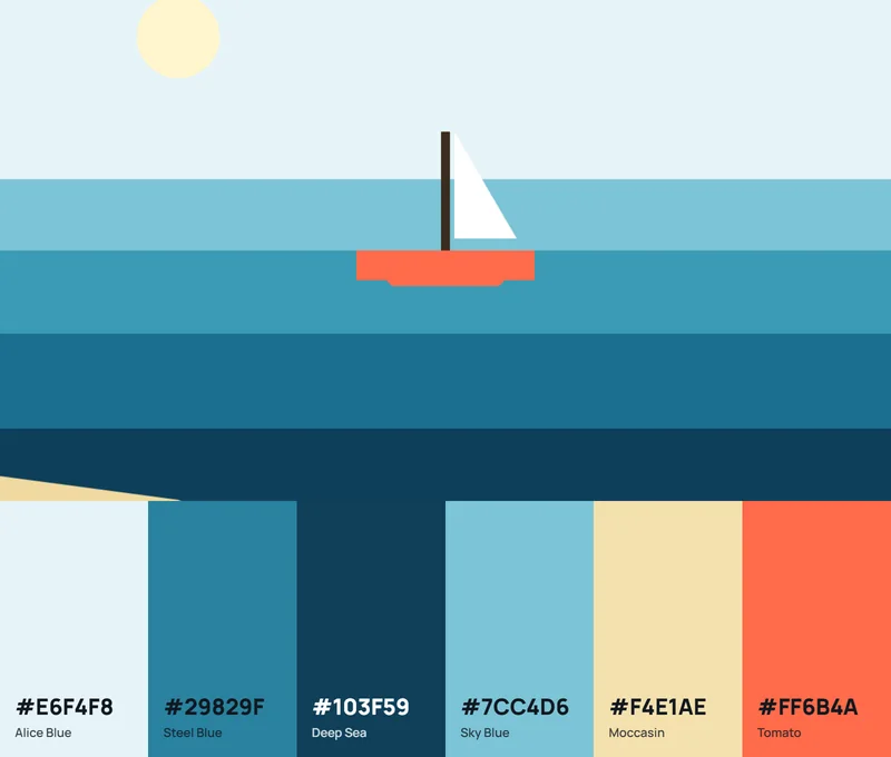
How to make a palette from an image
- Pick an image that holds the colors you want, and crop out borders, watermarks and interface chrome first.
- Add it. Press Upload image, drop a file onto the preview or paste one from your clipboard. PNG, JPG, WebP, GIF, AVIF and BMP files up to 25 MB work.
- Pick how many colors you want, from 2 to 12. Six is a good start for a brand or a UI.
- Choose a style. Balanced follows the image as is. Vivid, Soft, Dark and Light push the palette toward those qualities.
- Correct the misses. Drag a pin to take a color from another spot, click the image to add one, or delete a swatch that doesn't belong.
- Lock what you like. Locked colors stay when you change the settings.
- Copy or export. Click a swatch to copy it, or take the whole palette as code, a PNG or a swatch file.
A screenshot is the usual way this goes wrong. Browser bars and sidebars outweigh the content, and the palette comes back gray.
What each control does
| Control | What it does | Use it when |
|---|---|---|
| Colors | Sets the palette size, 2 to 12 | You need a short brand palette or a wider range |
| Balanced | Follows the pixels with no bias | You want an honest summary of the image |
| Vivid | Favors saturated colors | A photo is mostly gray but has one bold accent |
| Soft | Favors muted, low-saturation colors | You want calm backgrounds and neutrals |
| Dark and Light | Favor shadows or highlights | You need text colors or surface colors |
| Pins | Show where each color was taken and let you move it | An extracted color is close but not exact |
| Lock | Keeps a color when the settings change | You found a color you want to keep |
| Sort | Orders by share, hue, lightness or vividness | You are building a ramp or a color scale |
Each swatch shows its HEX, RGB and HSL values, the nearest named color and the share of the image it covers. A contrast chip shows whether white or black text reads better on it, with the WCAG ratio.
How does a color palette generator pull colors out of an image?
It reads pixel values, groups the similar ones, and returns a short set of swatches with HEX, RGB and HSL codes.
Scheme generators go the other way. They take one base color and apply harmony rules to invent the rest.
How millions of pixels become a few swatches
Under the hood this is color quantization, which cuts a photo with a huge number of distinct shades down to a handful of representative ones. Paul Heckbert's 1982 SIGGRAPH paper on frame buffer display set the pattern. Sample the image for color statistics, then choose a reduced set of colors from them.
Many extractors shrink the image first and sample pixels from the smaller copy. The grouping step works on the RGB values of those sampled pixels, so in a basic tool it measures numbers, not how the colors look to a person. This generator groups in CIELAB instead, which is built around perceived difference.
Which clustering method does the grouping
Median cut, octree and k-means cover most of what you will run into.
| Method | How it groups pixels | Does well | Slips on |
|---|---|---|---|
| Median cut (MMCQ) | Splits a box of pixels at the median of its longest color side, then averages each box | Large majority color areas | Small spot colors |
| Octree (octcube) | Sorts pixels into a tree of color cells and merges the least used | Spot colors | Needs two passes |
| k-means | Moves k centroids until each pixel sits with its nearest one | Centroids land on real clusters | Slower on big images, small accents get absorbed |
Leptonica, the image library behind Tesseract, documents the median cut versus octcube trade-off directly. Median cut wins on majority color regions, and the octcube quantizer handles spot colors slightly better.
A gray street with one red door is the classic trouble case. A median-cut tool can return five grays and no red, which is annoying when the red door was the whole reason for the photo. In this image color palette generator the Vivid style and the pins are there for exactly that case.
Why two tools disagree on the same photo
The quantizer is the obvious cause (median cut, octree or k-means, as above). Sample size is another, meaning the full image versus a downscaled copy.
Then there is the quality setting. In Color Thief, 1 is the most thorough, and higher values skip pixels for speed with a greater chance of missed colors. Rendering plays a part as well, since node-vibrant's documentation warns that browser canvas rendering is platform dependent, so swatches can differ between machines.
Different swatches from the same file are normal, not a bug.
Extraction versus role selection
Android's Palette documentation takes another approach. It scores extracted colors against profiles such as Vibrant, Muted, and their light and dark variants, using pixel population along with saturation and luminance.
The same documentation notes that a swatch comes back null when the image has no color for that profile. A role-based tool can therefore return fewer colors than you asked for. This generator can do the same: when an image has fewer distinct colors than you asked for, the palette is shorter and says so.
Dominant colors and Vibrant or Muted swatches are different questions, so a tool built for one is not really comparable to a tool built for the other.
Building extraction into an app
Color Thief is a JavaScript library that clusters with median cut and returns a palette for whatever color count and quality value you set. node-vibrant returns Vibrant and Muted style swatches in Node and in browsers.
On Android there is the Palette API, a Jetpack library, and Android's documentation suggests using it to color a song title card from its album cover.
Material Dynamic Color goes further. Android detects the main colors in a wallpaper, extracts a source color, then derives Primary, Secondary, Tertiary, Neutral and Neutral variant key colors.
Material Theme Builder previews this from any dropped image, in the browser or as a Figma plugin, with a Wallpaper or Content setting that switches the algorithm.
A library is the wrong tool for a one-time palette. Reach for one only when the colors must change with user content such as avatars or album art.
How many colors should a palette from an image have?
Match the count to the roles the palette has to fill. A UI theme needs a handful and a brand board a few more, and any swatch you cannot tell from its neighbor is a candidate for deletion.
Ask the tool for a few more colors than you need, then prune.
What the documentation says
Android's Palette documentation sets the maximum color count at 16 by default and says the best value depends on the source image, with 8 to 16 working for landscapes and 24 to 32 for pictures with faces.
That count is a candidate pool that gets scored into roles. The workable routine is a larger pool first, then a short list you actually design with. This color palette generator tops out at 12, which covers a landscape and any UI theme.
A decision rule by project
For a UI theme, keep a background, a text color, a primary, an accent and one spare for states.
A brand board takes the same roles plus whatever neutrals the photo supplies. Illustration and mood references can go higher, because the tonal steps carry the mood. Portraits go higher still, following Android's guidance for faces.
Pruning a larger set
Keep the darkest and the lightest swatch first, since they become text and background. Then keep the most saturated one for the accent.
Whatever is left fills secondary roles.
Android's documentation notes that extracting more colors improves the odds of matching each profile but slows palette generation. In an app that cost is real. In a browser tab it is not, so the limit is your own patience.
Turning extracted swatches into usable design colors
Give every swatch a role before anything else, then export in whatever format your tool reads. HEX covers CSS and most design apps. RGB or HSL suit color math, CMYK is for print, and CSS variables or ASE files are for reuse.
Which format fits which job
| Format | Describes | Use it for |
|---|---|---|
| HEX | RGB channels in base 16 | CSS, Figma, most design apps |
| RGB | Red, green, blue from 0 to 255 | Opacity math, canvas, code |
| HSL | Hue, saturation, lightness | Building tints and shades |
| CMYK | Ink percentages | Print files |
CMYK values describe ink coverage, so any CMYK number from an image tool is a conversion of the screen color, not a reading of the original.
Tools copy HEX by default, so when a stylesheet or design app wants channel values, run the code through a HEX to RGB converter. This color palette generator from image also shows RGB and HSL for every swatch.
Export routes
CSS custom properties let you store each swatch once and reference it everywhere. The code box here gives you a HEX list, CSS variables, SCSS variables, JSON and a Tailwind block. Tailwind CSS v3 projects add colors under theme.extend.colors in tailwind.config.js, while v4 moved that work into CSS.
JSON feeds scripts and design-token tooling, and the .ase download opens in Adobe apps. A .gpl file works in GIMP, Krita and Inkscape. A PNG swatch is the quick option for client approval.
Tailwind's v4.0 announcement (January 22, 2025) lists CSS-first configuration and CSS theme variables that expose design tokens as native CSS variables. In a v4 project a swatch becomes a --color-* variable inside an @theme block, so paste the HEX values from the list into your theme instead of the v3 config block.
Assign roles before you export
Android's documentation describes a design token as a way to assign color roles to interface elements instead of fixed values. Name your variables the same way.
A variable called accent survives a rebrand. One called orange does not.
How to check an image-derived palette for contrast and accessibility
Test every text and background pair from the palette against WCAG 2.2. The W3C sets 4.5:1 for normal text and 3:1 for large text under SC 1.4.3, and 3:1 for UI components and graphics under SC 1.4.11.
W3C's guidance adds that computed ratios are not rounded, so 4.499:1 fails the 4.5:1 threshold.
Why palettes from photos fail so often
Colors pulled from one photo share the same light, so neighboring swatches often sit close in lightness. That is pleasant to look at and poor for reading.
WCAG turns the color part of contrast in design, the visible difference between two elements, into a ratio.
Plenty of sites still get this wrong. WebAIM's 2026 Million report (February 2026 data) found low-contrast text on 83.9% of the top one million home pages, up from 79.1% in 2025 and again the most common failure it detected.
Testing the pairs
- List every pair you will actually use. Body text on background and button label on button are the obvious ones, and icon on background counts too.
- Read the contrast chip on each swatch, or enter both colors into our color contrast checker.
- Compare the ratio with the threshold for that use. Large text means 18 point (24 CSS pixels) or 14 point bold.
- Re-test after every change.
Fixing a failing pair
Adjust the lightness and leave the hue alone. Push the darker color darker or the lighter color lighter in HSL, then convert back with an HSL to RGB converter if your tool wants channel values.
The hue stays recognizable, so the palette still reads as the photo.
Re-test anyway. WCAG measures luminance, and an HSL lightness slider does not move luminance in step with it.
When does a palette generated from an image fall short?
It falls short when the file is a heavily compressed JPEG, when color profiles do not match, or when the lighting tints the whole frame. Backgrounds that crowd out the subject cause trouble too, and so does any job that ends in print.
All of these have a cause you can check before trusting the swatches.
Compressed JPEGs invent in-between colors
Most JPEG encoders use 4:2:0 chroma subsampling, which averages color across each 2x2 pixel block, according to Kraken.io's documentation. MediaWiki's documentation lists the cost as possible color fringing at sharp edges.
A fringe pixel is a real value in the file, so an extractor can report it as a swatch.
Start from a PNG or a high-quality export, and delete any swatch that appears nowhere in the picture.
Color profiles change the numbers
WebKit's December 2021 post on wide gamut canvas shows a color filled as display-p3 0.5 0 0 reading back as 128, 0, 0 in Display P3 and 141, 0, 0 after conversion to sRGB.
Same color, different channel values. The post also notes that Display P3 colors drawn on an sRGB canvas are clamped to the sRGB gamut.
HEX codes are sRGB, so values extracted from a wide-gamut photo can come out duller than the picture looks on a P3 display.
Tailwind CSS v4.0 moved its default palette from rgb to oklch to use that wider gamut, so a pasted HEX swatch can sit beside default colors that look more vivid.
Lighting and background can skew the palette
A warm indoor cast shifts every swatch warm, and the tool reports the file, not the object's true color. A flat sky or wall can claim several swatches, so crop to the subject and re-run.
Deep shadow areas add near-black swatches that carry no design information.
If the accent you want keeps vanishing, raise the color count or sample it by hand with a pin.
Print jobs
Screens add light and printers add ink, so some saturated screen colors have no exact CMYK equivalent. Converting RGB to CMYK in Photoshop shows how far each swatch moves.
Delta E puts a number on that shift. CIEDE2000 is a standard formula for it, and Sharma, Wu and Dalal's 2005 implementation paper is the usual reference for coding it correctly.
The preview is only as honest as the screen showing it, so calibrate your monitor for print before judging a conversion by eye. Treat the screen palette as a brief, and let the printed proof decide the final shade.
When a base-color scheme beats an image palette
Go with an image palette when you want the mood of one specific photo. It also fits when you need colors that already coexist, or when no brand color exists yet.
A base-color scheme is the better call when a brand color is fixed and the rest must follow harmony rules such as complementary or analogous. Same if you need a systematic ramp of tints and shades. And when the photo is muddy, a muddy photo returns a muddy palette, so start from a base color instead.
In short, an image gives you a mood, and if you need a system you are better off starting from a base color.
Color palette generator from an image FAQ
Is it safe to upload a client's image to a palette generator?
It depends on where the processing runs. This generator samples pixels in your browser and sends nothing to a server.
To confirm this for any tool, open the browser's network tab during the upload and look for an image request.
Do I need to pay or create an account?
No. This generator is free, with no account and no watermark.
Accounts usually enter at the saving step in other tools, so check that step first.
Can I pull colors from a logo or a website screenshot?
Yes. Both are ordinary image files, so save them as PNG or JPG and upload.
For a flat-color logo, set the color count to the number of fills and the swatches land close to the exact values. A screenshot needs cropping first.
How do I bring an extracted palette into Photoshop or Figma?
For Photoshop and other Adobe apps, download the .ase swatch file and load it into the Swatches panel.
For Figma, copy the HEX codes and save each as a color style.
Can colors be extracted from a video?
Yes, from a single frame. Export a still as PNG and upload it like any photo.
These tools read still images, so a moving clip needs one exported frame for each palette you want.
From five swatches to a full UI color scale
A color palette generator from an image stops at swatches, so a working interface needs a lightness scale built around each one. Keep every extracted swatch as a fixed anchor and generate the lighter and darker steps in HSL or OKLCH.
Lock the anchors first, one per role. Then generate tints and shades for each anchor with a tint and shade generator, and re-test every text pair for contrast last, since the scale creates pairs that did not exist before it.
Each step away from an anchor trades fidelity to the photo for usability, so use the extracted value itself wherever the design allows.
As of November 2026, the generator returns HEX and RGB values tied to sRGB, so a wider-gamut scale such as Tailwind's oklch defaults has to be built after the export.