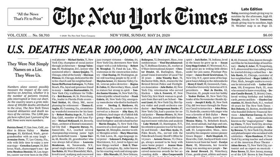
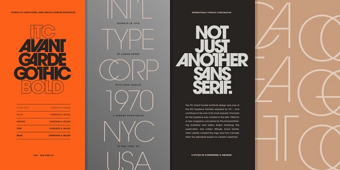
Most diplomas use blackletter typefaces like Old English Text MT for the institution name, paired with a classic serif font like Garamond or Times New Roman for body text. The recipient’s name is typically set in a flowing script or copperplate style. There is no single universal diploma font, but this three-layer structure (blackletter heading + serif body + script name) is the most consistent pattern across academic institutions.
Some universities commission proprietary typefaces or use licensed commercial fonts tied to their visual identity. Harvard, Yale, and similar institutions tend to have deeply embedded typographic traditions that go beyond any off-the-shelf font choice.
What Type of Font Is Old English Text MT?
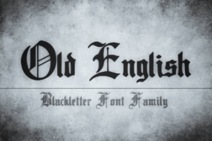
Old English Text MT is a blackletter typeface, specifically falling under the Textura subcategory of Gothic scripts. It features high contrast between thick downstrokes and fine hairline strokes, ornate uppercase capitals with decorative flourishes, and tight, angular letterforms that compress horizontally.
The blackletter font style sits firmly in the display category. It is not built for long body copy. Used at headline scale (the institution name, a degree title), it projects authority. Set at 10pt for paragraph text, it becomes nearly unreadable. That is why diplomas always combine it with a more open, legible serif typeface below.
The typography on a diploma is deliberately hierarchical. Blackletter commands the top, serifs handle the details, and script fonts personalize the recipient’s name.
The Three-Font Layer Pattern
Most formal diploma designs follow this structure:
- Institution name: Blackletter (Old English Text MT, Wilhelm Klingspor Gotisch)
- Body text and degree title: Old-style serif (Garamond, Times New Roman, Baskerville)
- Recipient’s name: Script or copperplate (Edwardian Script, Spencerian-style)
This typographic hierarchy has been standard since the early 19th century, when pre-printed diploma templates became common across North American and European universities.
Who Designed Old English Text MT?
Old English Text MT was produced by Monotype Typography as a digital font around 1990. Its design traces back to Caslon Black, a blackletter typeface cast by the William Caslon foundry in England circa 1760. It closely resembles Cloister Black, designed by Morris Fuller Benton in 1904.
Monotype did not create this style from scratch. The letterforms follow a tradition stretching to medieval scriptoriums, where trained scribes produced official documents by hand using quill pens on parchment. The style entered printing after Gutenberg’s press, and it never really left academic documents.
The digital version standardized what had previously been a loosely consistent calligraphic tradition, making it available for desktop publishing and mass certificate printing. That accessibility is a big part of why it became the default diploma font for so many institutions.
Is Old English Text MT Free to Use?
Old English Text MT is a commercial font licensed through Monotype. It ships bundled with certain Microsoft Office installations and some Windows operating systems, which is why many people have access to it without realizing they technically licensed it through Microsoft.
If you need it for standalone use outside of Microsoft products, you would need to purchase a license directly from Monotype. Font licensing for commercial certificate design (selling diploma templates, for example) requires a separate commercial license.
For personal diploma recreation or print-at-home projects, most users already have access through their operating system without needing to buy anything additional. This is especially important for anyone creating custom novelty printed documents, where font choice should match the intended decorative style while still respecting commercial licensing rules.
What Are Free Alternatives to Diploma Fonts?

There are solid free options for every layer of the typical diploma design. The blackletter, serif, and script categories each have freely downloadable alternatives that hold up well in print.
| Font | Category | Best For | Source |
| UnifrakturMaguntia | Blackletter | Institution name / Main heading | Google Fonts |
| EB Garamond | Old-style serif | Body text, degree title | Google Fonts |
| Cinzel | Serif / Roman caps | Headers, formal sub-lines | Google Fonts |
| Cormorant Garamond | Display serif | Elegant modern diplomas | Google Fonts |
| Great Vibes | Script | Recipient’s name | Google Fonts |
EB Garamond is probably the most useful of the group. It is an open-source revival of Claude Garamont’s 16th-century humanist typefaces, available on Google Fonts, and it reads cleanly at small sizes on parchment-style paper.
If you want a more contemporary approach, Cormorant Garamond pairs beautifully with Cinzel and handles the classical-but-not-stuffy brief that modern certificate designers often need.
What Font Did Diplomas Use Before Standardized Printing?
Before pre-printed diploma templates became common in the early 19th century, diplomas were written entirely by hand. Scribes used flexible-nib scripts including Spencerian script and copperplate-style penmanship. Latin text was standard for any institution with serious academic credentials.
The earliest diplomas were issued on sheepskin (vellum), and the writing itself was meant to be difficult to replicate. Parchment was expensive, scribes charged professional rates, and securing official signatures from university administrators was a formal process. The difficulty of production was itself a form of authentication.
Blackletter played a prominent role in handwritten diplomas, but it was not the only style. Spencerian and copperplate traditions produced a slightly warmer, more fluid look than the angular Gothic scripts. When printing took over in the 1800s, blackletter dominated because it reproduced well and carried the visual weight of official documents.
How to Use Diploma Fonts in Design Software

In Canva
Canva’s free plan includes access to several blackletter and formal serif fonts. Search “Old English” or “blackletter” in the font picker. For body text, EB Garamond and Cormorant Garamond are both available natively.
If you have a purchased font file you want to use, uploading fonts to Canva requires a Canva Pro subscription. Worth it if you are designing certificates regularly.
In Adobe InDesign
InDesign is the standard tool for formal document design. Adding fonts to InDesign is straightforward: install the font file to your system, restart InDesign, and it appears in the font menu automatically.
For diploma design specifically, InDesign’s paragraph styles and baseline grid tools are very useful. You can lock your body text to a consistent baseline across the document, which matters a lot when mixing three different typefaces at different weights.
In Figma
Adding fonts to Figma requires installing the Figma desktop app, which gives it access to locally installed fonts. Google Fonts (including UnifrakturMaguntia and EB Garamond) are available natively in Figma’s font picker without any installation.
Why Do Diplomas Still Use Blackletter?
Tradition, not aesthetics. According to Charles Nix, Creative Type Director at Monotype, blackletter’s continued presence on diplomas is largely about institutional inertia and cultural association. The letterforms carried meaning through centuries of official use, and that meaning attached itself permanently to the style.
Nix described it plainly: blackletter on diplomas is essentially anachronistic in the 21st century. It no longer carries the meaning it once did in the context of medieval manuscript culture. But it does carry a visual signal that says “formal,” “earned,” and “official” to anyone who grew up seeing it on degree certificates.
The psychology of diploma fonts runs deeper than simple aesthetics. When you see Old English Text MT on a document, your brain has likely already filed it under “serious, credentialed, legitimate” before you read a single word. That is a very difficult signal to replicate with a clean geometric sans-serif, no matter how well designed.
Some modern institutions, especially professional certification programs and design schools, have moved toward cleaner typefaces like Playfair Display or contemporary serif pairings. The results can look polished and current. But for traditional universities, the switch feels risky. Changing the font on a Harvard diploma would be news. That is exactly how deeply embedded these typographic conventions are.
There is also a purely practical reason: the dramatic thick-thin stroke contrast of blackletter and copperplate fonts reproduces well on high-quality paper stock with offset or letterpress printing. The visual weight commands attention. On parchment-colored paper with an embossed seal, these fonts look genuinely impressive. That matters when the document is meant to represent years of work.
Diploma Font Pairings That Actually Work
Picking a single font for a diploma will always look wrong. The document needs contrast between its typographic layers to function visually.
A few pairings that hold up:
- Old English Text MT + Garamond: The classic combination. Blackletter institution name, Garamond for all body copy. Timeless.
- Cinzel + EB Garamond: Roman capitals for the header, humanist serif for the body. Works well for modern institutions that want formal but not Gothic.
- Copperplate Gothic + Great Vibes: The engraved heading style with a flowing script name. Less traditional, more legible than full blackletter.
- Playfair Display + Cormorant Garamond: Both share classical proportions and high contrast. A contemporary take that doesn’t feel like a template.
The rule for any of these: keep the blackletter or display font to one element only (usually the institution name). Use something cleaner for the degree title and body language. Reserve the script for the graduate’s name.
If you are designing a certificate from scratch and want to understand how visual hierarchy works in formal documents, studying actual university diplomas is worth the time. The best ones are exercises in restrained typographic layering, where every font choice has a clear purpose.
For more on how typefaces communicate authority in different contexts, the comparison between serif and sans-serif fonts is a useful place to start. Diplomas are one of the few design contexts where the answer is almost never sans-serif.
FAQ on What Font Is Used on Diplomas
What is the most common font used on diplomas?
Old English Text MT is the most widely used diploma font. It is a blackletter typeface produced by Monotype, typically set for the institution name. Body text usually uses a classic serif like Garamond or Times New Roman.
Why do diplomas use blackletter fonts?
The tradition goes back to medieval scribes who wrote official documents by hand in Gothic script. When printing took over in the 1800s, blackletter carried over because it already signaled authority and formal credibility to readers.
Is the font on diplomas the same at every university?
No. Each institution sets its own font standards. Many use Old English Text MT or similar blackletter styles, but some universities commission proprietary typefaces. The three-layer structure (blackletter, serif, script) stays consistent even when specific fonts differ.
What font is used for the graduate’s name on a diploma?
Most diplomas use a formal script font for the recipient’s name. Common choices include Edwardian Script and Spencerian-style typefaces. The goal is to make the name feel personally inscribed rather than simply printed.
What serif fonts appear on diplomas?
Garamond, Times New Roman, and Baskerville are the most common. They handle the degree title, body language, and formal text below the institution name. These old-style serifs read cleanly on parchment paper at small sizes.
Can I use a sans-serif font on a diploma?
Technically yes, but it rarely works for traditional academic documents. Sans-serif fonts lack the visual weight and historical association that diploma design depends on. Modern certification programs sometimes use them, though traditional universities almost never do.
What free fonts look like diploma fonts?
UnifrakturMaguntia and EB Garamond are both available free on Google Fonts. Cinzel works well for formal headers. These cover the blackletter and serif layers of a typical diploma without requiring a paid license.
What is Copperplate Gothic and is it used on diplomas?
Copperplate Gothic is a display serif designed by Frederic W. Goudy in 1901. It appears on diplomas that favor engraved formality over Gothic drama. It features small serifs, uniform strokes, and an all-caps structure that reads as precise and official.
What software do universities use to design diplomas?
Adobe InDesign is the standard for formal document design. Some institutions use custom font files installed system-wide. Canva is common for smaller organizations producing certificates at scale with less production overhead.
Does the font on a diploma affect how legitimate it looks?
Yes, significantly. Font choice is one of the first visual signals readers use to judge document authenticity. Blackletter and formal serif typefaces trigger an immediate association with credentialed, official documents. The wrong font undermines that impression instantly.
Conclusion
Understanding what font is used on diplomas comes down to one consistent pattern: blackletter for the institution name, an old-style serif for body text, and a formal script for the graduate’s name.
Old English Text MT, Garamond, and copperplate-style typefaces have held this role for centuries, and that is not changing soon.
Whether you are designing a certificate from scratch or just curious about academic document typography, the font choices on a diploma are never accidental. Each typeface carries the weight of a long tradition in formal academic lettering and Gothic script that signals credibility before a single word is read.

Renowned for his expertise in logo design and visual branding, Bogdan has developed a multitude of logos for various clients.
His skills extend to creating posters, vector illustrations, business cards, and brochures. Additionally, Bogdan's UI kits were featured on marketplaces like Visual Hierarchy and UI8.
He also wrote in the past years on sites like Design Your Way, WebDesignerDepot, WPDean, Designmodo, Speckyboy, Slider Revolution, and more.
- The Windsurf Logo History, Colors, Font, And Meaning - 10 October 2026
- How to Remove Background From Product Photos (No Photoshop) - 10 October 2026
- How Designers can Build a Stronger Online Creative Identity - 9 October 2026

Bogdan Sandu is a seasoned designer who has been designing websites since 2008. Renowned for his expertise in logo design and visual branding, Bogdan has developed a multitude of logos for various clients. His skills extend to creating posters, vector illustrations, business cards, and brochures. Additionally, Bogdan's UI kits were featured on marketplaces like Visual Hierarchy and UI8. He also wrote in the past years on sites like Design Your Way, WebDesignerDepot, WPDean, Designmodo, Speckyboy, Slider Revolution, and more.
You Might Also Like