Helvetica costs money, and sometimes you need something different anyway.
Whether you’re designing a website, building a brand identity, or just tired of seeing the same neutral sans serif everywhere, plenty of alternatives exist. Some match Helvetica’s clean proportions exactly. Others bring their own personality while maintaining that professional grotesque foundation.
This guide covers 20 fonts similar to Helvetica that actually work in real projects. You’ll find free open-source options, premium commercial families, and everything between.
Each font includes technical specs, visual comparisons to Helvetica, and specific use cases. Some are metric-compatible substitutes. Others modernize the grotesque tradition for contemporary interfaces and editorial design.
By the end, you’ll know which Helvetica alternative fits your project, budget, and design goals.
Fonts Similar To Helvetica
| Font Name | Availability | Best Use Case | Key Distinction |
|---|---|---|---|
| Arial | System font (Windows/Mac) | Universal compatibility, web safe | Helvetica’s close substitute, slightly wider |
| Nimbus Sans | Open source, free | Linux systems, budget projects | URW++ metrically compatible clone |
| Inter | Google Fonts, open source | UI design, digital screens | Optimized for screen readability, tall x-height |
| Roboto | Google Fonts, open source | Android apps, Google ecosystem | Geometric skeleton, dual nature design |
| Arimo | Google Fonts, open source | Documents, Liberation Sans alternative | Metrically compatible with Arial |
| IBM Plex Sans | Open source, IBM | Corporate branding, multilingual | IBM’s corporate typeface, warm character |
| Open Sans | Google Fonts, open source | Web content, high legibility | Friendly, neutral, optimized stress |
| Akzidenz Grotesk | Commercial license | Editorial, historical authenticity | Helvetica’s predecessor (1896), rawer aesthetic |
| Univers | Commercial license | Systematic weight variations | Structured numbering system, contemporary of Helvetica |
| Aktiv Grotesk | Commercial (Dalton Maag) | Modern branding, clean interfaces | Refined proportions, contemporary update |
| Neue Haas Grotesk | Commercial license | Purist design, original spirit | Original Helvetica name, faithful revival |
| FF Bau | Commercial (FontFont) | Architecture, minimalist projects | Bauhaus influence, geometric structure |
| Proxima Nova | Commercial (Adobe Fonts) | Modern web design, tech brands | Hybrid geometric/humanist, versatile weights |
| ARS Maquette | Commercial (Aisleone) | Editorial design, refined layouts | Subtle personality, contemporary refinement |
| Grotte | Commercial (Colophon Foundry) | Contemporary branding | Modern interpretation, balanced proportions |
| TeX Gyre Heros | Open source, TeX | Academic typesetting, LaTeX | Metrically compatible with Helvetica |
| Brandon Grotesque | Commercial (HVD Fonts) | Headlines, display purposes | Geometric, vintage character, uppercase focus |
| National | Commercial (Klim Type Foundry) | News design, editorial use | Compact design, space-efficient |
| Acumin | Commercial (Adobe) | Variable font applications, responsive | Condensed widths, modern flexibility |
| Rubik | Google Fonts, open source | Friendly interfaces, rounded aesthetics | Rounded corners, approachable character |
Arial
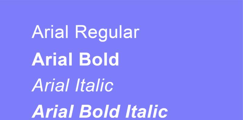
Created by Robin Nicholas and Patricia Saunders for Monotype in 1982, Arial remains the most ubiquitous Helvetica substitute worldwide. Bundled with Windows 3.1 in 1992, it spread faster than any font in modern history.
Classification & Design Characteristics
Neo-grotesque sans-serif font with rounded curves and fuller counters compared to its inspiration. X-height sits slightly taller than Helvetica at medium sizes.
Stroke terminals cut at angles rather than horizontal (c, e, s). Counter spaces open wider in letters like a, e. Square dots on i and j. The lowercase t flag extends with diagonal cut.
Technical Specifications
18 weights across regular, narrow, condensed, and rounded variants. Standard version includes regular, italic, bold, bold italic. Character set spans 650+ glyphs with extensive language coverage.
Arial Unicode MS variant supports 50,000+ characters. No true italics (uses obliques instead). OpenType features minimal compared to modern alternatives.
Visual Similarities to Helvetica
Metrically identical to Helvetica. Every character width matches precisely, allowing document substitution without reflow. Nearly identical proportions and overall appearance from distance.
Key differences: Arial’s G lacks horizontal spur. R has straighter leg. Lowercase a more rounded. Q tail angles differently. Number 1 typically lacks base serif.
Optimal Use Cases
Office documents, presentations, internal communications. Web body text where system fonts preferred. Corporate materials in organizations using Microsoft stack.
Budget-conscious projects requiring professional appearance. Avoid for high-end print work or branding where licensing fees won’t strain budget.
Licensing & Availability
Free with Windows and macOS. Available through Microsoft font licensing program. Google Fonts excludes Arial (use Arial alternatives instead).
Commercial projects covered under OS license for most uses. Extended distribution rights available through Monotype for embedding applications.
Nimbus Sans
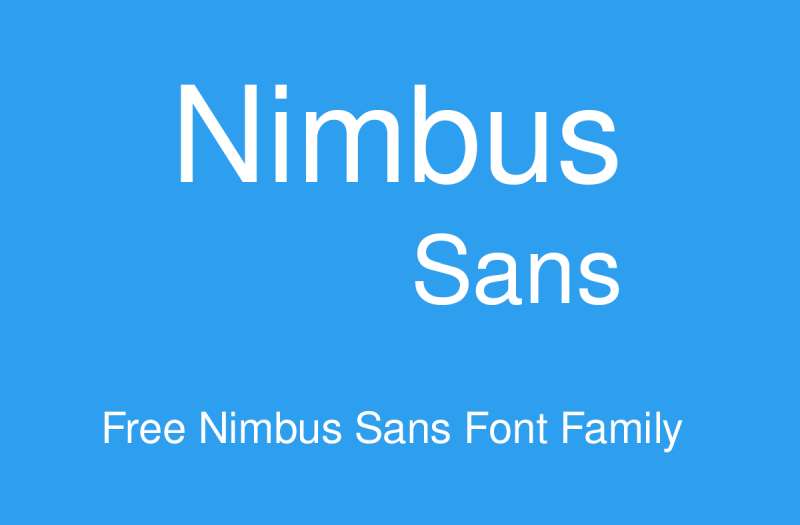
URW++ digitized this Helvetica alternative in the 1980s, originally for the SIGNUS sign-making system requiring 1/100mm precision. The L version specifically matched Adobe’s PostScript Helvetica.
Classification & Design Characteristics
Neo-grotesque with geometric construction. Multiple optical sizes: T (text), D (display), P (poster) with progressively tighter spacing.
Baseline and x-height vary between versions. Nimbus Sans Novus (1980s redesign) features smaller x-height, narrower proportions than Neue Helvetica at same point size. Moderate apertures, closed counters.
Technical Specifications
37 styles across regular, condensed, extended widths. L version includes 18 styles in 5 weights, 2 widths. Round variants add softened corners to all letterforms.
Character coverage includes Western Europe, East Europe, Turkish, Baltic, Romanian. Cyrillic support added by Valek Filippov. Variable font axis in newer releases.
Visual Similarities to Helvetica
Nimbus Sans L designed for metric compatibility with PostScript Helvetica. Character proportions match closely.
Weight system differs: Regular weight resembles Helvetica Light. Medium weight matches Helvetica Regular. Semibold weight available (Neue Helvetica lacks this). Tighter spacing in D and P versions.
Optimal Use Cases
Linux systems (default in Ubuntu through 8.10). Sign-making and vinyl cutting requiring extreme precision. Budget-conscious digital projects needing Helvetica appearance.
Open-source software interfaces. Embedded systems. Print work where exact Helvetica match unnecessary.
Licensing & Availability
GNU General Public License (free for commercial use). Nimbus Sans L available through Font Squirrel, CTAN. Commercial Nimbus Sans versions sold through URW Type Foundry, MyFonts.
TeX Gyre Heros derivative includes Greek, math support. FreeSans (2002) another GPL derivative.
Inter

Rasmus Andersson released Inter in 2017 specifically for computer screens, addressing Roboto’s readability issues at small sizes. Figma adopted it after extensive internal testing.
Classification & Design Characteristics
Neo-grotesque optimized for UI text. Tall x-height enhances legibility of mixed-case text at 11-14px sizes.
Open apertures distinguish similar characters. Ink traps at small sizes prevent letter fusion. Optical size axis adjusts details from text to display automatically.
Technical Specifications
2000+ glyphs supporting 147 languages. Variable font with weight axis (100-900) and optical size axis. 18 static styles: 9 weights with matching true italics.
OpenType features include contextual alternates, tabular numbers, slashed zero, fractions. True italic (not oblique). Weight, slant adjustable in real-time via variable font.
Visual Similarities to Helvetica
Shares neo-grotesque skeleton but optimized differently. Similar neutral appearance, professional tone. Taller x-height creates different rhythm.
More open counters in a, e, c. Curved stroke terminals rather than straight cuts. Less geometric than Helvetica, incorporating subtle humanist touches. Wider letter spacing improves screen readability.
Optimal Use Cases
User interface design across web and mobile. Dashboard displays, control panels, admin interfaces. Small-text applications (captions, labels, fine print).
SaaS products, developer tools, technical documentation. Works across NASA, Mozilla, GitLab, elementary OS, GNOME. Accessed 414 billion times annually on Google Fonts.
Licensing & Availability
SIL Open Font License (free for all uses). Available through Google Fonts, direct download from rsms.me/inter. Variable font and static versions both available.
No restrictions on commercial use, modification, distribution. Font files downloadable without registration.
Roboto

Christian Robertson designed Roboto in 2011 as Android’s system font, replacing Droid Sans. Significantly redesigned in 2014 for Android 5.0, becoming rounder and wider.
Classification & Design Characteristics
Neo-grotesque with dual nature: mechanical skeleton meets friendly, open curves. Largely geometric forms softened with humanist touches.
Moderate x-height. Letters settle into natural widths rather than forced rhythm. Modern proportions balance geometric precision with organic feel.
Technical Specifications
12 weights from Thin (100) to Black (900). Six main weights: Thin, Light, Regular, Medium, Bold, Black. Each includes oblique (not true italic). Condensed subfamily adds Light, Regular, Bold with obliques.
Roboto Flex variable font (2022) includes 12 adjustable axes. Character set covers Latin, Greek, Cyrillic. Standard version lacks weights 200 (Extra Light), 600 (Semi Bold), 800 (Extra Bold).
Visual Similarities to Helvetica
Similar neutral, clean appearance suited to wide applications. Less geometric than Helvetica, more natural rhythm.
Geometric skeleton visible but softened. Wider letter spacing in default settings. Curves fuller, more approachable. Terminal cuts less severe. Better distinguishes similar characters (I, l, 1).
Optimal Use Cases
Android system UI, mobile app interfaces. Google services (Play, YouTube, Maps, Images). Cross-platform digital products requiring consistency.
Body text for websites, blogs, applications. LCD displays (used in NYC Subway B Division countdown clocks). Unreal Engine 4 default font. Kodi interface text.
Licensing & Availability
Apache License 2.0 (original), now SIL Open Font License. Free through Google Fonts. Desktop installation available from multiple repositories.
No usage restrictions for commercial or personal projects. Roboto Flex adds enhanced capabilities under same license.
Arimo
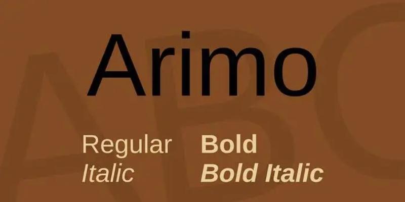
Liberation font collection member, Arimo provides metric compatibility with Arial while remaining open-source. Part of Red Hat’s Liberation font family released 2007.
Classification & Design Characteristics
Neo-grotesque sans-serif font maintaining Arial’s proportions. Clean, functional design without ornamentation.
Standard x-height matching Arial metrics. Uniform stroke weight throughout most glyphs. Slightly wider counters than Arial in some characters.
Technical Specifications
4 core weights: Regular, Italic, Bold, Bold Italic. Character set covers basic Latin, extended Latin. TrueType and OpenType formats available.
Limited OpenType features compared to commercial alternatives. Basic kerning pairs included. Designed primarily for document compatibility rather than advanced typography.
Visual Similarities to Helvetica
Resembles Arial closely, inheriting Arial’s Helvetica similarity. Metrically compatible with Arial (documents reflow identically).
Same character widths, similar proportions. Diagonal terminal cuts like Arial. Visual differences minimal at typical reading sizes. Subtle variations appear at large display sizes.
Optimal Use Cases
Linux systems replacing Arial. Open-source software requiring system-neutral fonts. Document sharing between proprietary and open platforms.
Government organizations, educational institutions with open-source mandates. Budget-limited projects needing professional appearance. Office documents, forms, basic web typography.
Licensing & Availability
SIL Open Font License (GPL previously). Free download through Google Fonts, Font Squirrel. Included in Liberation Fonts package.
No restrictions on commercial or personal use. Modification and redistribution permitted under license terms.
IBM Plex Sans
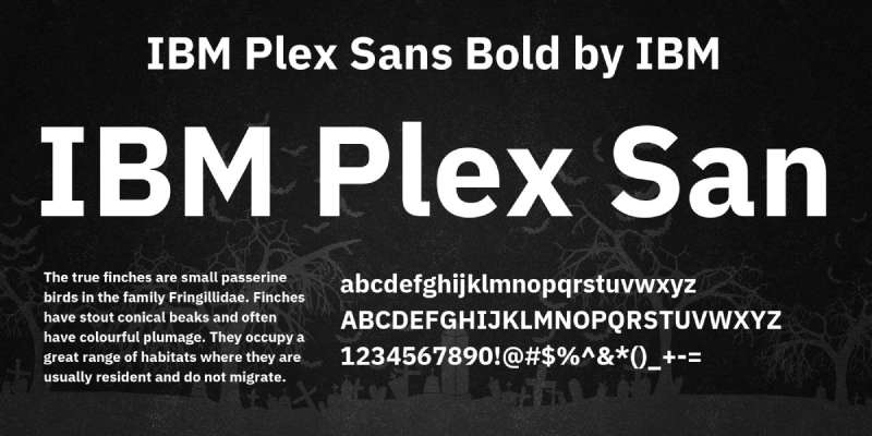
IBM commissioned Plex in 2017 from Mike Abbink and Bold Monday to unify its global brand identity. Name derives from computing term “multiplex.”
Classification & Design Characteristics
Grotesque sans-serif font with international flavor. Slightly more geometric than Helvetica while retaining warmth.
Taller x-height than traditional grotesques. Open apertures improve legibility. Distinctive details include angled stroke terminals, open counters in a, e, c.
Technical Specifications
8 weights from Thin to ExtraBold with matching italics (16 styles total). Character set exceeds 1000 glyphs. Supports 100+ languages including Latin, Cyrillic, Greek, Arabic, Hebrew, Thai, Devanagari.
OpenType features include ligatures, fractions, tabular figures, stylistic alternates. Available in Condensed width. Monospace and Serif companions maintain design consistency.
Visual Similarities to Helvetica
Shares neutral, utilitarian philosophy. Similar weight distribution and overall structure. Less geometric, more humanist feel than Helvetica.
Open apertures create airier appearance. Distinguishing features include curved tail on l, rounder dots. Wider spacing in default settings. More contemporary feel while maintaining professional tone.
Optimal Use Cases
Corporate branding and communications. Technical documentation, code comments (use Plex Mono). User interfaces requiring multilingual support.
Marketing materials, presentations, web design. Works across IBM’s product ecosystem. Pairs well with IBM Plex Serif for editorial content.
Licensing & Availability
SIL Open Font License (free for all uses). Available through IBM’s GitHub repository, Google Fonts. Desktop, web, and mobile fonts provided.
No restrictions on modification or commercial use. Encouraged for open-source projects.
Open Sans

Steve Matteson designed Open Sans for Google in 2011, optimizing it for web and mobile interfaces. Based on his earlier Droid Sans.
Classification & Design Characteristics
Humanist sans-serif font with upright stress and open forms. Wider proportions than many grotesques.
Tall x-height with wide apertures. Neutral but friendly character distinguishes it from strict geometrics. Double-story a, g in roman; single-story in italic.
Technical Specifications
10 weights from Light (300) to ExtraBold (800) with matching italics. Character set includes 800+ glyphs. Supports Latin, Greek, Cyrillic scripts. Extended coverage for Vietnamese, African languages.
OpenType features: ligatures, fractions, tabular figures. Condensed width adds 10 additional styles. Web-optimized hinting ensures crisp rendering at small sizes.
Visual Similarities to Helvetica
Shares neutral tone and professional appearance. More humanist than Helvetica’s geometric approach. Wider letters create different rhythm.
Open apertures more pronounced. Rounder curves, softer overall feel. Less mechanical, more approachable. Better distinguishes similar glyphs through subtle variations.
Optimal Use Cases
Website body text, interface copy. Mobile applications requiring excellent screen legibility. Long-form reading on displays.
Google services (formerly default for many). Editorial content, blogs, news sites. Print materials benefiting from friendly professionalism. Pairs well with serif companions for hierarchy.
Licensing & Availability
Apache License 2.0 (later SIL OFL). Free through Google Fonts, Font Squirrel. Self-hosting files easily obtained.
No usage restrictions for commercial or personal projects. Among most popular fonts on Google Fonts platform.
Akzidenz Grotesk
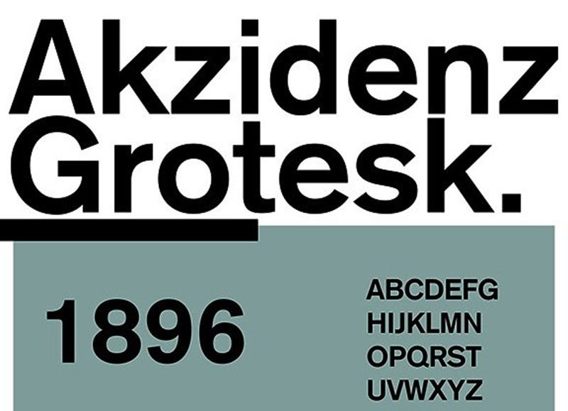
Berthold Type Foundry released Akzidenz-Grotesk in 1898 as commercial jobbing type. Became iconic during 1950s-60s Swiss design movement, inspiring Helvetica itself.
Classification & Design Characteristics
Grotesque sans serif font, the traditional unadorned German style. Family compiled from multiple sources over decades, creating subtle inconsistencies.
Moderate x-height varies slightly across weights. Letterforms show 19th-century character rather than modernist uniformity. Square dots over i, j. Slightly rounded curves in o, b.
Technical Specifications
60 styles in Akzidenz-Grotesk Pro family. Weights from Light to Super across multiple widths. Regular, Medium, Bold, plus Condensed, Extended variants.
Akzidenz-Grotesk Next (2006) rationalized family with consistent design. AG Old Face (1984) preserves metal type inconsistencies. Character set supports Central and Eastern European languages.
Visual Similarities to Helvetica
Helvetica directly inspired by Akzidenz-Grotesk. Similar proportions, neutral appearance. Akzidenz-Grotesk retains more personality, subtle irregularities.
Less refined, more organic than Helvetica’s polish. Certain letters (R, Q) show distinctive character. Helvetica systematized and modernized Akzidenz-Grotesk’s foundation. Used interchangeably in Swiss design work.
Optimal Use Cases
Heritage branding, luxury goods. Editorial design requiring timeless quality. Poster design, large-format signage (AG Super excels).
Corporate identity for established institutions. Print work valuing typographic tradition. American Red Cross, Volvo use customized versions. Arizona State University official font.
Licensing & Availability
Commercial license through Berthold Types, MyFonts, Linotype. Desktop, web, app licenses available separately. No free versions of authentic Akzidenz-Grotesk.
Pricing varies by style count and usage rights. CastleType’s Standard CT offers related interpretation.
Univers
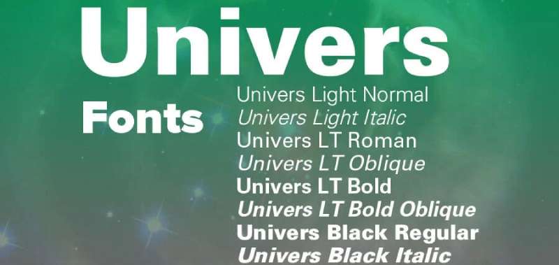
Adrian Frutiger designed Univers in 1954-1957 for Deberny & Peignot, conceiving it as unified system from start. First typeface family designed holistically rather than assembled piecemeal.
Classification & Design Characteristics
Neo-grotesque with systematic design. Each weight and width follows same letterform scheme. Numbering system organized family logically (Univers 55, 65, 75, etc.).
Moderate x-height, consistent across all styles. Uniform stroke terminals cut horizontally. More mechanical feel than Helvetica while maintaining neutrality.
Technical Specifications
21 styles in original release (1957). Linotype Univers (1997 redesign) expanded to 63 fonts. Weights from Ultra Light to Black across five widths: Condensed, Narrow, Normal, Extended, Extra Extended.
Extended character set supports multiple languages. OpenType features in digital versions. Numbering: first digit indicates weight, second indicates width, odd=roman, even=italic.
Visual Similarities to Helvetica
Contemporary of Helvetica (both late 1950s). Similar neutral, modernist philosophy. Univers slightly narrower, more condensed proportions.
Tighter spacing, more mechanical rhythm. Straighter lines, less warmth than Helvetica. Both exemplify International Typographic Style. Often compared as equally valid approaches to sans serif perfection.
Optimal Use Cases
Corporate identity systems requiring extensive style variations. Wayfinding, transportation signage. Technical documentation, scientific publishing.
Large format displays, exhibition graphics. Architectural presentations. Works where systematic family organization benefits complex hierarchies. Montreal Metro, Munich Airport use customized versions.
Licensing & Availability
Commercial license through Linotype, MyFonts, Adobe Fonts. Desktop, web, and app licensing available. Linotype Univers most complete digital version.
No free alternatives maintaining complete system. Pricing based on weight count and usage rights.
Aktiv Grotesk
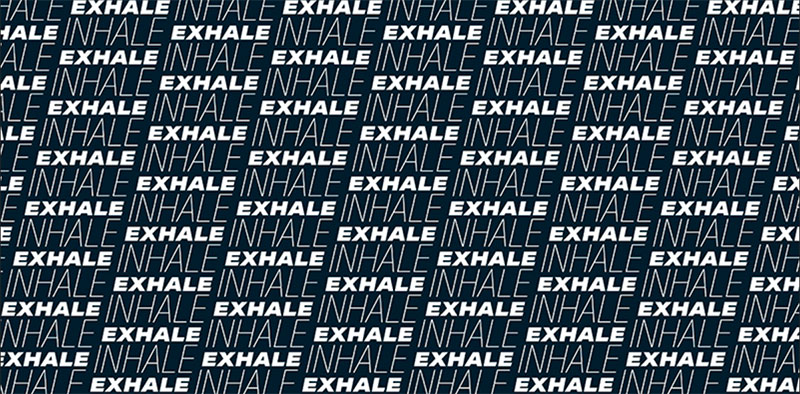
Dalton Maag released Aktiv Grotesk in 2010, modernizing the grotesque tradition. Designed as contemporary workhorse balancing clarity with personality.
Classification & Design Characteristics
Neo-grotesque with subtle humanist touches. Clean construction benefits from digital-era precision.
Generous x-height improves legibility at small sizes. Open apertures in a, c, e, s. Geometric skeleton softened with organic curves. Diagonal stroke terminals add movement.
Technical Specifications
5 weights from Thin to Black, each with italic (10 styles). Extended family includes Condensed widths. Character set covers 200+ languages including Latin, Cyrillic, Greek, Arabic, Hebrew, Thai.
OpenType features: ligatures, stylistic sets, case-sensitive punctuation, fractions. Designed with screen rendering in mind. Available as desktop, webfont formats.
Visual Similarities to Helvetica
Modernizes Akzidenz-Grotesk/Helvetica tradition rather than copying. Similar neutral foundation, professional tone.
More refined than Akzidenz-Grotesk, warmer than Helvetica. Balanced proportions create even texture. Distinguishing details include curved tail on t, open counters. Contemporary feel while respecting grotesque heritage.
Optimal Use Cases
Brand identity requiring contemporary professionalism. User interfaces, app design. Editorial design, magazines, publications.
Corporate communications, annual reports. Wayfinding systems, environmental graphics. BMW, Norwegian Airlines, numerous tech companies use Aktiv Grotesk variants.
Licensing & Availability
Commercial license through Dalton Maag, MyFonts. Desktop and webfont licenses priced separately. Custom weights, extensions available for enterprise clients.
Trial versions for testing. No free alternatives available.
Neue Haas Grotesk

Christian Schwartz and Berton Hasebe restored the original 1957 Neue Haas Grotesk (pre-Helvetica) in 2010. Commissioned for Bloomberg Businessweek redesign, recovering Max Miedinger’s original proportions.
Classification & Design Characteristics
Authentic neo-grotesque matching Miedinger’s 1957 metal type. Warmer, more organic than digital Helvetica.
Original tight spacing characteristic restored in Display styles. Text styles offer looser spacing, sturdier construction. Straight-legged R alternate available (originally special-order only). Swiss-style cedilla (flattened comma).
Technical Specifications
16 fonts total: 8 Display weights (Thin to Black), 3 Text weights (55, 65, 75), all with italics. Extended character set supports Central/Eastern European languages.
OpenType features include stylistic alternates, case-sensitive forms, fractions. Display styles use original tight spacing. Text weights optimized for body copy, technical documentation.
Visual Similarities to Helvetica
Neue Haas Grotesk IS original Helvetica before Linotype adaptations. More personality than Neue Helvetica. Softer, rounder curves. Better spacing than many digital Helveticas.
Proportions closer to 1957 metal type than modern Helvetica. Width of each glyph optimized rather than compromised for linecasting. Essentially “true” Helvetica before industrial constraints altered it.
Optimal Use Cases
Editorial design requiring authentic Swiss typography. Magazine layouts, publication design. Branding for design-conscious clients.
Display typography in posters, headers. Body text in premium publications. Bloomberg Businessweek, The Guardian considered it (unused). Projects valuing typographic authenticity over ubiquity.
Licensing & Availability
Commercial license through Commercial Type. Desktop and webfont options. Premium pricing reflects restoration quality.
No free alternatives. Fontstand offers rental option.
FF Bau
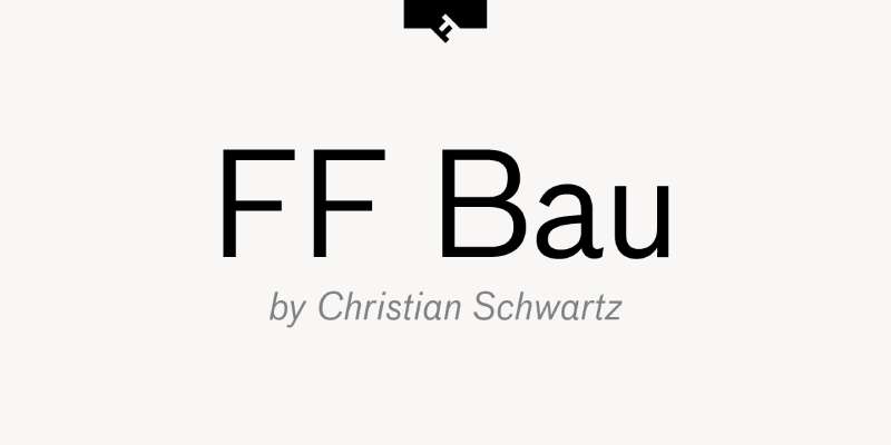
Christian Schwartz designed FF Bau for FontFont (2002-2003), inspired by Schelter & Giesecke’s early 20th century grotesques. Name means “construction” in German.
Classification & Design Characteristics
Grotesque with geometric influences. Combines modern construction with historical inspiration.
Moderate x-height, open counters. Distinctive features include curved leg on R, open G. Slightly condensed proportions create efficient text setting. Square dots on i, j.
Technical Specifications
5 weights from Light to Bold with italics (10 fonts). Extended with additional weights in later releases. Character set supports Western and Central European languages.
OpenType features include ligatures, alternate glyphs, proportional/tabular figures. Designed for both text and display.
Visual Similarities to Helvetica
Shares grotesque lineage but more personality. Similar neutral foundation, different details. More geometric structure than Helvetica’s humanist subtleties.
Tighter letter spacing, narrower proportions. Distinctive R, G create brand identity opportunities. Contemporary take on tradition rather than homage.
Optimal Use Cases
Brand identity for tech, design firms. Editorial design, art publications. Signage, environmental graphics.
User interfaces prioritizing character over neutrality. Marketing materials, advertising. Works where slight personality benefits without overwhelming.
Licensing & Availability
Commercial license through FontFont (now Monotype). Desktop and webfont options. Part of larger font collections through Adobe Fonts.
Trial weights for testing. Pricing based on usage rights.
Proxima Nova
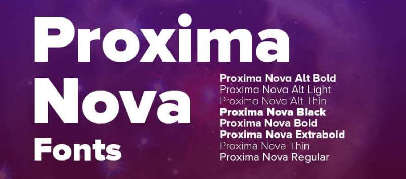
Mark Simonson released Proxima Nova in 2005, expanding his 1994 Proxima Sans into comprehensive family. Bridges gap between geometric Futura and grotesque Akzidenz-Grotesk.
Classification & Design Characteristics
Hybrid combining geometric appearance with modern proportions. Humanistic rather than purely geometric.
Moderate x-height, slightly condensed proportions. Open apertures, rounded forms. Diagonal stroke terminals add dynamism. Double-story a, g maintain readability.
Technical Specifications
80 fonts total (as of 2023): 8 weights (Thin to Black) across 5 widths. Each weight includes italic. 1453 characters per font. Supports Greek, Cyrillic, Vietnamese, Arabic, Thai, Devanagari, Korean, Hebrew, Tamil.
Extensive OpenType features: small caps, multiple figure styles, fractions, stylistic alternates. Proxima Vara variable font version available separately. Most popular commercial font on web (hundreds of thousands of sites).
Visual Similarities to Helvetica
More geometric than Helvetica while less rigid than Futura. Similar neutral professionalism. Warmer, friendlier than Helvetica’s strictness.
Taller x-height, more open counters. Better distinguishes similar characters. Modern proportions create balanced, even color. Contemporary alternative rather than direct substitute.
Optimal Use Cases
Website design, digital interfaces. Brand identity requiring versatility. Marketing materials, advertising.
App design, mobile interfaces. Editorial design, publication layouts. BuzzFeed, Mashable, Wired, Spotify among notable users. Works across print and digital equally well.
Licensing & Availability
Commercial license through Mark Simonson Studio. Desktop, webfont, app licenses available. Adobe Fonts includes standard widths (not all 80 fonts).
Pricing scales with weight count. No free alternatives matching quality and completeness.
ARS Maquette
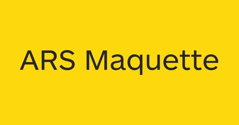
ARSType foundry released Maquette as versatile grotesque for contemporary applications. Designed specifically for user interfaces and editorial work.
Classification & Design Characteristics
Neo-grotesque with balanced proportions. Clean, functional design without excess ornamentation.
Good x-height for legibility. Open apertures prevent similar letters from conflicting. Slightly wider than traditional grotesques. Rounded forms create approachable character.
Technical Specifications
Multiple weights with matching italics. Character set covers extended Latin, supports Western/Central European languages. OpenType features for professional typography.
Optimized for screen and print. Standard and web formats available.
Visual Similarities to Helvetica
Shares grotesque foundation with Helvetica. More contemporary refinement, less mechanical. Similar neutral tone suitable for wide applications.
Wider proportions, more generous spacing. Better screen performance than Helvetica at small sizes. Balanced between traditional grotesque and modern UI font.
Optimal Use Cases
User interface design, digital products. Editorial design, magazines, publications. Corporate communications.
Branding requiring flexible system. Works where neutrality plus subtle warmth needed.
Licensing & Availability
Commercial license through ARSType, distributors. Desktop and webfont options. No free versions available.
Grotte
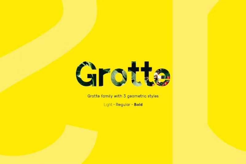
FSD studio designed Grotte as contemporary grotesque exploring historical roots. Released as flexible system for modern graphic design.
Classification & Design Characteristics
Grotesque with attention to optical corrections. Each weight carefully calibrated.
Moderate x-height, balanced proportions. Clean forms with subtle personality. Open counters improve legibility. Uniform stroke endings.
Technical Specifications
Multiple weights from Light to Bold with italics. Supports Latin-based languages. OpenType features for professional applications.
Designed for both display and text use.
Visual Similarities to Helvetica
Follows grotesque tradition like Helvetica. More organic, less systematized. Similar neutral appearance with slightly warmer character.
Proportions comparable though details differ. Less industrial feel. Contemporary interpretation rather than historical revival.
Optimal Use Cases
Editorial design, art direction. Brand identity for creative fields. Print and digital applications.
Display typography, posters. Body text in publications. Projects valuing typographic nuance.
Licensing & Availability
Commercial license through FSD studio. Desktop and web options. Available through various distributors.
TeX Gyre Heros
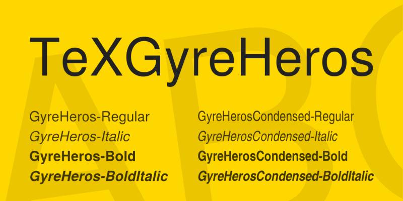
GUST typefoundry created TeX Gyre Heros as free alternative based on Nimbus Sans. Part of TeX Gyre collection for scientific publishing, released under GUST Font License.
Classification & Design Characteristics
Neo-grotesque matching Nimbus Sans/Helvetica proportions. Designed for mathematical typesetting integration.
Standard x-height, balanced construction. Clean forms suitable for technical documentation. Metric compatibility with Helvetica allows document substitution.
Technical Specifications
Multiple weights from Regular to Bold. Extended character coverage including Greek, mathematical symbols. Specifically optimized for TeX/LaTeX scientific document preparation.
OpenType and Type 1 formats. Extensive math support distinguishes it from typical grotesques.
Visual Similarities to Helvetica
Based on Nimbus Sans L (itself Helvetica clone). Nearly identical proportions, character widths. Subtle differences in spacing, details.
Metric compatibility means documents render identically. Visual distinction minimal at text sizes. Mathematical symbol integration differentiates it for technical use.
Optimal Use Cases
Academic papers, scientific publications. LaTeX documents, technical reports. Mathematics typesetting, scientific notation.
Open-source projects requiring Helvetica substitute. Educational materials. Free alternative for budget-limited academic work. CTAN distribution standard in TeX world.
Licensing & Availability
GUST Font License / LaTeX Project Public License (free). Available through CTAN, TeX distributions. Included automatically in most LaTeX installations.
No restrictions on academic or commercial use. Modification and redistribution permitted.
Brandon Grotesque
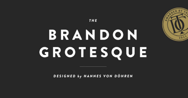
HVD Fonts released Brandon Grotesque in 2010 as geometric sans with warm personality. Hannes von Döhren designed it as versatile family for contemporary branding.
Classification & Design Characteristics
Geometric sans serif font with humanist influences. Circular forms create friendly character.
Large x-height improves readability. Open counters, rounded forms throughout. More geometric than Helvetica, less rigid than Futura. Distinctive lowercase a, g with simplified structures.
Technical Specifications
6 weights from Thin to Black with matching italics (12 fonts). Condensed width available separately. Character set includes 550+ glyphs. Supports Western/Central European languages.
OpenType features: ligatures, stylistic alternates, multiple figure styles. Optimized for display and body text.
Visual Similarities to Helvetica
Significantly different approach. Geometric rather than grotesque foundation. More personality, less neutrality than Helvetica.
Circular forms create warmer, friendlier impression. Better for brands seeking approachability. Fashion-forward aesthetic versus Helvetica’s timelessness. Works where character outweighs neutrality.
Optimal Use Cases
Brand identity for lifestyle, fashion brands. Marketing materials, advertising campaigns. Website headers, display typography.
Editorial design in magazines, blogs. Packaging design. Comedy Central, Urban Outfitters among users. Projects where geometric warmth beats neutral professionalism.
Licensing & Availability
Commercial license through HVD Fonts, MyFonts. Desktop, webfont licenses separate. Pricing varies by weight count.
Trial versions available. No free alternatives with same character.
National

Klim Type Foundry released National in 2008 by Kris Sowersby as comprehensive grotesque system. Draws from early 20th century Swiss and German grotesques.
Classification & Design Characteristics
Grotesque with systematic design. Extensive family covering wide range of applications.
Balanced x-height, clean construction. Multiple optical sizes optimize for different point ranges. Neutral yet distinctive. Open apertures, precise curves.
Technical Specifications
14 weights across Display and Text optical sizes. Each weight includes italic. Character set supports Latin, Cyrillic, Greek scripts. 1000+ glyphs per font.
Extensive OpenType features: small caps, multiple figure styles, contextual alternates. Web fonts optimized for performance.
Visual Similarities to Helvetica
Follows grotesque tradition like Helvetica. More refined, contemporary execution. Similar neutral foundation with better spacing.
Optical sizing improves on Helvetica’s one-size approach. Text weights sturdier, display weights tighter. Better distinguishes similar glyphs through careful design.
Optimal Use Cases
Editorial design, magazine layouts. Brand identity systems. Signage, wayfinding systems.
Corporate communications requiring flexibility. Digital interfaces, web design. Air New Zealand, Stuff.co.nz, numerous publications use National. Works where grotesque tradition meets modern needs.
Licensing & Availability
Commercial license through Klim Type Foundry. Desktop and webfont options. Premium pricing reflects extensive development.
Trial weights for testing. Custom modifications available.
Acumin
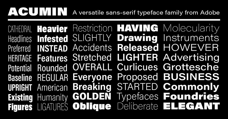
Robert Slimbach designed Acumin for Adobe in 2015 as modern sans serif system. First Adobe Original released directly through Adobe Fonts.
Classification & Design Characteristics
Humanist sans serif font with large family. Warm, approachable character.
Generous x-height, open forms. Slightly condensed proportions create efficiency without compression. Subtle stroke modulation adds warmth. Distinctive italic with pronounced slant.
Technical Specifications
Variable font with 90 named instances. Weight axis from Thin to Black (100-900). Width axis from Condensed to Wide. Extensive character set supports multiple languages.
OpenType features: ligatures, contextual alternates, multiple figure styles. Optical sizing built into variable font.
Visual Similarities to Helvetica
More humanist than Helvetica’s grotesque foundation. Less mechanical, warmer personality. Similar neutral professionalism suitable for corporate use.
Open counters, better glyph distinction than Helvetica. More contemporary feel. Variable font technology offers flexibility Helvetica lacks.
Optimal Use Cases
Corporate branding, communications. User interfaces, digital products. Editorial design, publications.
Marketing materials requiring versatility. Presentations, reports. Adobe software interfaces. Works where warm professionalism beats strict neutrality.
Licensing & Availability
Included with Adobe Creative Cloud subscription through Adobe Fonts. Desktop sync, webfont use included. No separate purchase required for CC subscribers.
Commercial use covered under subscription. No standalone purchase option.
Rubik
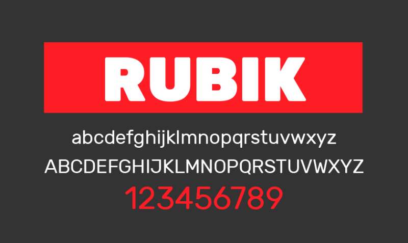
Philipp Hubert and Sebastian Fischer designed Rubik, released through Google Fonts. Five-sided rounded corners create distinctive character.
Classification & Design Characteristics
Sans serif font with slight slant, rounded corners. Geometric foundation with playful personality.
Large x-height, wide proportions. Five-degree slant creates dynamic rhythm. Rounded corners soften geometric structure. Even texture across weights.
Technical Specifications
Variable font supporting weight axis 300-900. 5 static weights from Light to Black with italics. Character set covers Latin, Cyrillic, Hebrew scripts.
OpenType features include ligatures, tabular figures. Optimized for screen display.
Visual Similarities to Helvetica
Geometric rather than grotesque like Helvetica. More personality, less neutrality. Similar professional tone with friendlier approach.
Rounded corners create softer impression. Slant adds dynamism Helvetica lacks. Contemporary, digital-first aesthetic. Works where approachability outweighs strict professionalism.
Optimal Use Cases
Website design, digital interfaces. App design, mobile applications. Brand identity for tech, startups.
Educational materials, children’s content. Marketing materials requiring friendliness. YouTube uses Rubik variants. Projects valuing approachability and modern feel over timeless neutrality.
Licensing & Availability
SIL Open Font License through Google Fonts. Free for all uses. Variable and static versions available.
No restrictions on commercial or personal use. Self-hosting or CDN options.
FAQ on Fonts Similar To Helvetica
What is the closest free font to Helvetica?
Inter and Nimbus Sans L rank as closest free alternatives. Inter offers superior screen readability with open apertures and tall x-height, ideal for digital interfaces. Nimbus Sans L provides metric compatibility, allowing direct Helvetica substitution in documents without reflow. Both available under open-source licenses through Google Fonts and Font Squirrel.
Is Arial really the same as Helvetica?
No. Arial mimics Helvetica’s character widths exactly but differs in letterform design. Terminal cuts angle differently on letters like c, e, s. The G lacks Helvetica’s horizontal spur. R has straighter leg. Both share neo-grotesque classification and neutral appearance, but Arial’s curves are rounder, counters more open.
Which font replaced Helvetica in modern design?
No single replacement exists. Roboto dominates Android interfaces. Inter conquers web UI design. Proxima Nova leads commercial websites. Each modernizes the grotesque tradition differently, addressing screen rendering, multilingual support, and variable font technology that Helvetica lacks. Context determines which works best.
Can I use Helvetica for free legally?
Only if bundled with your operating system for personal projects. macOS includes Helvetica. Commercial use, web embedding, or app distribution requires licensing through Linotype or Monotype. Costs vary by usage type. Free alternatives like Inter, Roboto, Open Sans avoid licensing fees entirely.
What’s the difference between grotesque and neo-grotesque fonts?
Grotesques emerged in 19th century with slight irregularities and personality. Neo-grotesques like Helvetica (1957) refined these with uniform construction, consistent weights, and systematic design. Akzidenz-Grotesk represents earlier grotesque style. Univers and Helvetica exemplify neo-grotesque rationalization. Both remain neutral sans serif families.
Why do designers avoid Arial?
Professional stigma, not technical flaws. Arial emerged as budget Helvetica substitute, creating perception of cheapness. Design community views it as inferior despite widespread availability. Better free options like Inter, IBM Plex Sans now offer superior screen rendering and OpenType features without Arial’s negative associations.
What font does Apple use instead of Helvetica?
San Francisco replaced Helvetica as Apple’s system font in 2015. Custom-designed for legibility across devices, from Apple Watch to Mac displays. Features dynamic optical sizing, tight spacing at large sizes, generous spacing for small text. Not publicly available for licensing. iOS and macOS interfaces exclusively use it.
Is Proxima Nova better than Helvetica?
Different purposes. Proxima Nova bridges geometric and grotesque traditions with warmer personality. Offers 80 fonts across five widths with extensive language support. Better for branding requiring approachability. Helvetica remains more neutral, timeless. Proxima Nova excels digitally; Helvetica dominates print heritage. Neither objectively “better.”
What’s the most popular Helvetica alternative for websites?
Inter leads with 414 billion annual Google Fonts requests. Designed specifically for user interfaces with tall x-height, open apertures optimizing screen legibility. Used by NASA, Mozilla, GitLab. Roboto and Open Sans follow closely. Popularity stems from free licensing, variable font support, extensive character sets covering 140+ languages.
How can I tell if a font is similar to Helvetica?
Check neo-grotesque classification, neutral appearance, uniform stroke weight. Compare x-height ratio, aperture openness, terminal cuts. Test character widths against Helvetica. Examine distinctive letters: R leg angle, G spur presence, Q tail direction. Similar fonts maintain professional tone, clean construction, minimal stroke contrast throughout weights.
Conclusion
These fonts similar to Helvetica offer solutions for every project constraint. Budget limits? Inter, Roboto, and Open Sans deliver professional results without licensing costs.
Need exact metric compatibility? Arial and Nimbus Sans L substitute directly into existing layouts.
Want contemporary refinement? Proxima Nova, Aktiv Grotesk, and Neue Haas Grotesk modernize the grotesque tradition with better screen rendering and expanded language support.
The right choice depends on your specific requirements. User interfaces benefit from Inter’s tall x-height and open apertures. Editorial design gains from National’s optical sizing. Corporate branding thrives with IBM Plex Sans’s international character set.
Test multiple options in your actual layout. Typography decisions reveal themselves through real content, not specimen sheets alone.
Start with the free alternatives, then explore commercial options if your project demands specialized features or wider weight ranges.
If you enjoyed reading this article about fonts similar to Helvetica, you should check out these articles with fonts similar to Gotham, Garamond, Lato, Futura, Times New Roman, Raleway, Bodoni, Roboto, and Optima.

Renowned for his expertise in logo design and visual branding, Bogdan has developed a multitude of logos for various clients.
His skills extend to creating posters, vector illustrations, business cards, and brochures. Additionally, Bogdan's UI kits were featured on marketplaces like Visual Hierarchy and UI8.
He also wrote in the past years on sites like Design Your Way, WebDesignerDepot, WPDean, Designmodo, Speckyboy, Slider Revolution, and more.
- The Retool Logo History, Colors, Font, And Meaning - 20 July 2026
- CMYK to Pantone Converter - 19 July 2026
- Fresh Inter Font Pairing Ideas for Modern Designs - 18 July 2026

Bogdan Sandu is a seasoned designer who has been designing websites since 2008. Renowned for his expertise in logo design and visual branding, Bogdan has developed a multitude of logos for various clients. His skills extend to creating posters, vector illustrations, business cards, and brochures. Additionally, Bogdan's UI kits were featured on marketplaces like Visual Hierarchy and UI8. He also wrote in the past years on sites like Design Your Way, WebDesignerDepot, WPDean, Designmodo, Speckyboy, Slider Revolution, and more.
You Might Also Like