


Plastic packaging does not automatically keep food fresh longer. WRAP ran an 18-month study in 2022 on apples, bananas, broccoli, cucumbers and potatoes, and it found that plastic packaging did not necessarily prolong shelf life. Most items lasted longer in refrigerated storage.
A film or a format earns its place only when it extends life for that specific food, not because plastic is assumed to help. That pushes structure and materials ahead of artwork, and it puts legal compliance and the label rules for the principal display panel ahead of the front of pack too.
Which Package Format Fits the Food Product?
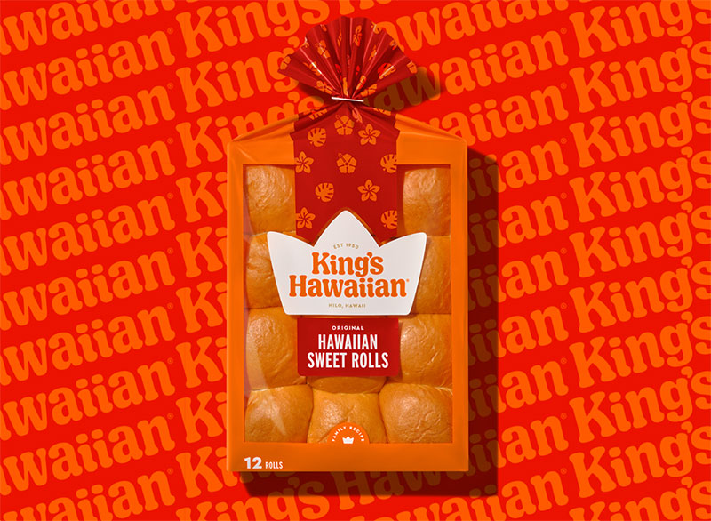
Dry snacks usually go into pouches or cartons. Wet or heat-processed foods go into jars, cans and trays, mostly because those formats survive the fill method. How the food is filled, protected and sold narrows the choice quickly.
The order matters more than people expect. Product constraints come first, then the format, then the barrier material. Food contact compliance and mandatory label content get settled after that, and the front of pack is the last thing anyone designs, since every earlier choice has already removed some options.
| Format | Best for | Main limit | Print surface |
|---|---|---|---|
| Stand-up pouch | Snacks, powders, sauces | Needs laminated barrier film, hard to recycle | Full wrap on film |
| Folding carton | Cereal, frozen meals, dry goods | No barrier alone, needs liner or inner bag | Large flat panels |
| Tray with lidding film | Ready meals, meat, produce | Seal integrity, mixed-material recycling | Lid film and sleeve |
| Glass jar | Sauces, preserves, spreads | Weight, breakage, freight cost | Label or direct print |
| Metal can | Long shelf life, retorted foods | Weight, curved label area | Wrap label or direct print |
Constraints to Fix Before Design Starts
The shelf life target comes first, because it sets the barrier level and the barrier level narrows the format list.
Fill method is next. Hot fill, retort and gas flushing each rule out certain films and closures, so a pouch that looks perfect on paper might not survive your line.
Then there’s the sales channel, which could be an ambient shelf, a chilled cabinet, a freezer or parcel shipping. Budget matters here too, freight weight included, since glass and cans cost more to move than film.
Settle these before anyone opens design software.
After that comes structure. The deliverable is the dieline, a flat template that fixes every panel, fold and seal area, and artwork gets built on top of it. Doing it the other way round means redrawing the art.
Primary, Secondary and Tertiary Packaging
Most of the design effort goes into primary packaging, meaning whatever touches the food: the pouch, jar, tray or can. Secondary packaging groups those units (a display carton, a shelf-ready tray). Pallets and shipping cases make up the tertiary level, and nobody cares how they look as long as they hold up.
Each level still has its own brief, though.
Shelf-ready packaging sits at the secondary level, and the brief there is practical. The case has to open cleanly and present the product facings. It also has to survive transit.
Closures are part of the structure brief as well. A resealable zipper or a tamper-evident band changes the dieline and also the barrier at the seal, so settle the tamper-proof packaging design features before the first prototype is cut.
How to Choose Packaging Materials and Barrier Properties
Start with whatever spoils the food. Oxygen, moisture, light and aroma loss are the usual culprits, and each one points to a different material. Once that’s clear, compare candidate films on OTR (oxygen) and WVTR (water vapor), both measured at the same test conditions.
What OTR and WVTR Measure
Film gets rated by how much oxygen passes through one square meter of it per day, which is the OTR, reported in cc/m2/day. WVTR covers moisture the same way, in g/m2/day.
Lower is better for both.
Packaging Warehouse’s technical guide makes the point that OTR values only compare when temperature, relative humidity and test method (ASTM D3985, ASTM F1927 or ISO 15105-2) match. So two spec sheets quoted at different humidity can’t be ranked against each other. A number on its own tells you very little.
Matching Barrier to the Food
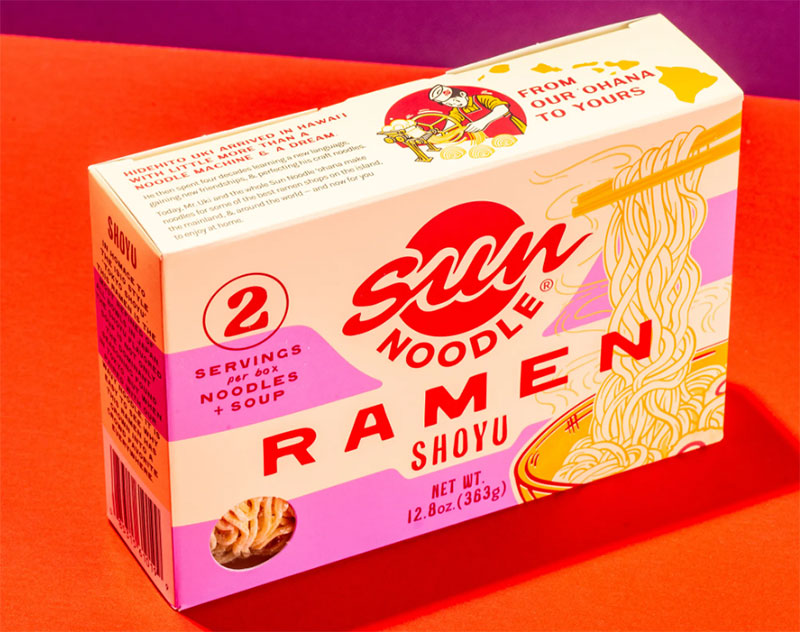
Coffee, nuts, fatty snacks and dairy go off through oxygen. Rancidity and aroma loss drive the spec, so the oxygen barrier comes first.
Crackers, cereal and powders have a different problem, staling and caking, which makes WVTR the number to check first. Anything sensitive to both ends up in a high-barrier laminate with foil or metallized PET.
Fresh produce is the odd one out. It respires, so the film has to let gas through.
Material Options
Glass is impermeable to gas and moisture, but it’s heavy and it breaks. PET covers clear rigid containers with a moderate barrier. PE and PP films are cheap and decent against moisture, though weak against oxygen.
EVOH has very low oxygen permeability, so it usually shows up as a buried layer in multilayer film. For the strongest combined oxygen, aroma and moisture barrier, aluminum foil and metallized PET win, according to the Sorbent Systems packaging glossary.
Foil has a weak spot. Pinholes cut its barrier performance sharply, which is why thin foil layers get protected by laminate on both sides.
Modified atmosphere packaging (MAP) swaps the air in the pack for a gas mix, usually nitrogen or carbon dioxide, and it only works if the film is a high enough barrier to hold that gas for the whole shelf life.
Where a High-Barrier Film Fails
EVOH gives the best oxygen barrier per micron, but it absorbs water, and absorbed water loosens the polymer. Retort pouches and hot-fill products are where that bites.
The figures show how wide the gaps are.
- EVOH film at 25 um, 25 C and 0% RH measures 0.1 to 0.2 cc/m2/day (Packaging Warehouse technical guide)
- BOPP and OPP film under the same conditions come in at 1,000 to 2,500 cc/m2/day (Packaging Warehouse)
- LDPE film, same conditions again, runs 7,000 to 8,500 cc/m2/day (Packaging Warehouse)
- A PET/EVOH/PP laminate measured 0.16 cc/m2/day untreated, then 13.99 cc/m2/day after 60 minutes at 121 C with 7.3% water uptake (Mokwena, Tang and Laborie, Journal of Food Engineering, 2011)
The last value is an 87-fold increase. The two sources used different test conditions (the Mokwena study measured at 20 C and 65% RH), so read the first three as a ranking and the fourth as a warning.
For retorted or humid-chain products, ask the film supplier for OTR measured after your process, not the dry value on the data sheet. The Mokwena study is also from 2011, and no newer comparable figure turned up in published sources.
Which Food Contact Rules Apply to Packaging Design?
The market where the product sells decides. US packaging falls under FDA food contact substance rules, and EU packaging falls under Regulation (EC) No 1935/2004 plus its specific measures, such as Regulation (EU) No 10/2011 for plastics.
SafetyCulture’s compliance guide, among others, describes food packaging regulations as practically the same across the globe. They aren’t. The US authorizes by substance and named supplier, while the EU lists substances and sets numerical migration limits. PFAS gets handled through different mechanisms on each side too.
United States
FDA treats the coatings, plastics, paper, adhesives and colorants in packaging as food contact substances, and each one needs authorization (FDA). That can come through a food additive regulation (21 CFR Parts 170-189), a food contact notification (FCN), or a threshold of regulation exemption (21 CFR 170.39).
An FCN is effective only for the manufacturer or supplier named in it (21 CFR 170.100). A packaging spec therefore has to name an authorized supplier, not just a material.
PFAS grease-proofing agents show how fast this can change. FDA announced in February 2024 that they were no longer sold for food contact paper in the US, and 35 related FCNs stopped being effective on January 6, 2025.
European Union
Regulation (EC) No 1935/2004 is the framework everything else hangs on. Article 3 sets the general safety requirement and Article 16 calls for a written declaration of compliance. Traceability falls under Article 17, and good manufacturing practice comes from Regulation (EC) No 2023/2006.
Regulation (EU) No 10/2011 covers plastics, and its numbers end up driving material decisions. The overall migration limit is 10 mg of total constituents per dm2 of contact surface (Article 12). Specific migration limits are set per substance in mg/kg of food, with a generic 60 mg/kg where no limit exists (Article 11). Infant foods get a stricter overall limit of 60 mg/kg of food simulant.
Work from the latest consolidated version of the regulation, as the Finnish Food Authority advises, since amendments keep arriving.
The newest rule is the PFAS limit. Since 12 August 2026, food-contact packaging placed on the EU market cannot contain PFAS at or above 25 ppb for any single PFAS or 250 ppb for the sum of targeted PFAS, and total PFAS including polymeric PFAS is capped at 50 ppm (Regulation (EU) 2025/40, Article 5(5)).
No stock-exhaustion period applies to packaging first placed on the market after that date, according to Food Packaging Forum’s summary of the Commission position. The Commission also recommends a stepwise testing approach because no harmonised PFAS test method exists for food contact packaging.
Inks, Coatings and Adhesives
Food-safe is not a default setting.
An ink printed on the outside of a pouch can still reach the food, through thin film or by set-off when printed rolls touch the food side. EU good manufacturing practice rules cover printing inks for that reason.
Ask the printer for a declaration of compliance covering the exact ink and coating, and the adhesive too, as Article 16 expects at every supply chain stage.
What Must Appear on a Food Package Label?
A US label carries a statement of identity, net quantity of contents, ingredient list, Nutrition Facts, allergen declaration and the name and address of the manufacturer or distributor. EU labels add date marking and a minimum print height, and the nutrition declaration is required on prepacked food.
Required Elements on Every Label
The principal display panel (PDP) is the face shoppers see at purchase, and the law puts two things on it, the statement of identity and the net quantity of contents. The information panel beside it holds the rest. Ingredients go in descending order by weight.
FDA requires the net quantity statement in the bottom 30 percent of the PDP, in lines generally parallel to the base of the container. Panels of 5 square inches or less are exempt from the placement rule (FDA, 21 CFR 101.105).
Allergen lists changed on January 1, 2023. The FASTER Act added sesame as the ninth major US allergen, alongside milk, eggs, fish, shellfish, tree nuts, peanuts, wheat and soybeans. Panel-by-panel layout detail is covered in this guide to FDA label design requirements.
For the barcode and GTIN, GS1 puts the barcode low on the back panel, preferably at the right and on a flat surface. It should never run across seams, folds, flaps, perforations or tight curves (GS1 General Specifications, section 6).
Claims need care too. A term such as “low sodium” has a regulatory definition in the US, so it is not free marketing copy.
Where US and EU Rules Differ
On a US label, net quantity type size scales with PDP area, and the quantity appears in US customary and metric units. Nine major allergens get declared by name.
The EU works differently. One floor applies to all mandatory text, an x-height of 1.2 mm, or 0.9 mm when the largest surface is under 80 cm2. Fourteen allergens have to be emphasized in the ingredient list through font, style or background color, and the nutrition declaration has been mandatory on prepacked food since 13 December 2016.
The EU rule is written in x-height, the height of the lowercase x, so the point size on the artwork tells you little (Regulation (EU) No 1169/2011, Annex IV, as summarized by FSAI). Measure the printed character, and check it on the smallest pack in the range.
How to Organize the Front of Pack
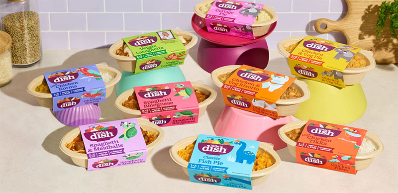
Regulated content gets its space first. What remains goes mostly to the brand and the product name with its variant, plus one clear benefit. Everything else moves to the sides and back.
Metrixlab’s pack-testing framework lists brand, product, functional benefit, reason to believe, end promise and call to action as the elements of a strong pack. It scores packs on shelf visibility, variant findability, appeal and benefits perception.
- Reserve the PDP space that law already claims (identity, net quantity)
- Set one dominant element, usually the brand block
- Name the product and mark the variant so shoppers find their flavor fast
- Add one benefit, not five
- Place imagery that matches what is inside
- Check legibility at shelf distance and at the minimum type size
A clear visual hierarchy is what makes steps 2 to 4 work. If three elements compete at the same size, shoppers read none of them.
Imagery has a legal edge as well. EU rules require food information to be accurate and not misleading, so a hero photo showing more filling or bigger portions than the pack holds is a compliance problem, not just a taste call.
Type deserves a separate test on a printed sample. Pick typefaces that stay legible on small labels and check contrast against the actual substrate, not the screen.
Plan for one proposed change. FDA’s January 2025 proposal for a Nutrition Info box would sit in the upper third of the PDP on most packaged foods, with compliance three years after a final rule for businesses with $10 million or more in annual food sales and four years for smaller ones. Reporting through mid-2026 (Packaging Digest, InfoLaw Group) still described it as a proposal, so leave the space flexible rather than redrawing templates yet.
Changing recognizable assets carries real risk. Tropicana swapped its orange-with-a-straw for a glass of juice in January 2009, Pure Premium sales reportedly fell 20% within two months, and on February 23, 2009 the company announced the old carton would return (Packaging Strategies).
How to Design Food Packaging for Recyclability Without Losing Shelf Life
Design for the recycling stream first, then add only as much barrier as the shelf life target requires. A pack that protects the food but cannot be recycled costs more in producer fees and, under EU rules, eventually cannot be sold.
Mono-Material Versus Multilayer Packaging
RecyClass tested EVOH inside polyethylene film in independent laboratories. Up to 5% of film weight had a minor effect on recycled material, and anything above it is treated as not compatible with recycling (RecyClass, 2019).
Packaging Warehouse puts EVOH layers at 2 to 10 um, and EVOH is denser than PE. A thin pouch film can therefore pass the 5% weight line with a layer that looks tiny, so get the weight share from the film converter instead of judging by thickness.
The 5% cap is a default, not a ceiling for every structure. RecyClass has recognized one Mitsubishi Chemical PE barrier film with EVOH at 10% of film weight, PE-g-MAH tie layers and a recycling agent as compatible with PE flexibles recycling, but only when the film is made to its protocol conditions (RecyClass, 2024).
SiOx or AlOx coatings, with no additional coatings on top, keep PE film in the top recyclability classes. So does EVOH at 5% or less, as long as it sits with PE-g-MAH tie layers and an EVOH to tie-layer ratio of 1 or less.
Going the other way, PVC or PVDC barrier layers, aluminum, an AlOx coating with a PVOH primer, or EVOH above 5% will drop the film to a lower class or to non-recyclable. All of this comes from the RecyClass guidelines for natural PE flexible films.
EPR Fees and Regulation Deadlines
Producer fees now track recyclability in the EU and in a growing set of US states.
| Rule | Where | Date |
|---|---|---|
| Recyclability criteria and grades due (delegated acts) | EU | By 1 January 2028 |
| Minimum 70% recyclability (Grades A to C) | EU | From 1 January 2030 |
| Minimum rises to 80%, removing Grade C | EU | From 1 January 2038 |
| Producer fees collected with eco-modulation | Oregon | Since July 2025 |
| Producer fee obligations begin | Colorado | January 2026 |
Under Regulation (EU) 2025/40, Grade A needs at least 95% recyclable by weight, Grade B 80% and Grade C 70%, and anything below 70% counts as technically non-recyclable (Packaging Law; Greiner Packaging). EPR fees are then modulated by grade.
The American Bar Association’s July/August 2026 review counts seven US states with packaging EPR laws, namely Maine, Oregon, Colorado, California, Minnesota, Maryland and Washington.
Eco-modulation only works when producers report material types, weights and recyclability accurately, Earth911 notes, and GS1 US has published guidance on organizing that data.
So keep a packaging data sheet per SKU with weight by material. It feeds the EPR report and any recyclability claim from one source.
On-Pack Sustainability Claims
Directive (EU) 2024/825 has applied since 27 September 2026. It bans generic environmental claims such as eco-friendly, green, biodegradable and ecological unless the pack shows recognized excellent environmental performance or states the specific benefit (Baker McKenzie, 2026).
Packaging already on shelves is in scope. The Consumer Protection Cooperation (CPC) Network of national authorities agreed a common understanding on old stock in June 2026, which is guidance rather than a binding interpretation (AGRINFO, 2026).
Scope matters too. If only the packaging contains recycled material, the claim cannot suggest it covers the whole product.
How2Recycle, run by the Sustainable Packaging Coalition, stopped approving legacy labels on 1 February 2026, so new artwork needs the Pro label (GreenBlue, 2025).
On placement, Metrixlab advises putting product benefits ahead of sustainability messages and balancing both against brand messaging. A claim that survives legal review can still lose the shelf if it crowds out the benefit shoppers came for.
Compostable and Recycled-Content Options
Compostable packaging works only where a facility will take it.
A Composting Consortium and BioCycle survey of 200 US food waste composting facilities found that 71% accept some compostable food-contact packaging, up from 58% in 2018 (2023). Household access is far lower, with about 11% of the US population living in one of the largest cities with a composting program that accepts some compostable packaging, according to Sustainable Packaging Coalition data covered by Packaging Dive.
That gap is why a compostable claim can be accurate and still useless to most shoppers. BPI certification is the labeling standard in North America, per the Sustainable Packaging Coalition’s survey of composters.
Recycled plastic in direct food contact needs its own review, and FDA publishes chemistry recommendations for recycled plastics in food packaging. The PPWR also sets recycled-content targets for plastic packaging, with separate treatment for contact-sensitive formats.
FSC certification on paperboard covers fibre sourcing. It says nothing about recyclability or food contact compliance.
How Do Print Method and Prepress Setup Affect the Final Pack?
Print method sets plate cost, minimum type size, color gamut and unit cost at a given run length. Prepress setup decides whether the file prints the way it looks on screen.
Choose the method from run length and version count, then build the artwork to that press’s limits.
Flexo, Gravure, Digital and Offset
Flexographic printing uses raised flexible plates that cost less than gravure cylinders, and it’s widely used on films and cartons. Gravure runs on engraved cylinders with a high setup cost, so it pays off on long runs, where it also gives the best quality on film.
Digital presses (HP Indigo class) skip plates altogether. Changeovers are quick and versioning is easy, but ink costs more. Offset has economical plates and sound margins on short runs, though it runs into limits with solid whites and varnishes on flexible film.
These profiles draw on Esko’s flexo comparison and Contiweb’s review of flexible packaging printing.
Where Printers Disagree on Short Runs
Esko lists digital as the strongest option for short runs and variable data, especially when artwork changes often.
Clifton Packaging’s managing director calls digital best for samples and mock-ups, or very small runs, and an expensive compromise for the mainstream. UNI Packaging’s Matt Baldock argues that calling digital a short-run medium is a generalization, since a press does not pay back on tiny runs alone (Packaging Europe).
The sources diverge because converters price differently. Digital saves plates and changeovers, and flexo spreads plate cost across volume.
No source gives a universal break-even. Ask for quotes at three run lengths, using the real number of versions.
Pantone, CMYK and Extended Gamut
According to X-Rite Pantone figures, CMYK reproduces about 55% of Pantone spot colors. A digital CMYK device gets to about 65%, and seven-color extended gamut (CMYK plus orange, green and violet) reaches about 90%.
Brand colors usually arrive as Pantone references, so each one needs a decision, either a spot ink or an extended gamut simulation, with an accepted CMYK shift as the fallback. Pantone’s Extended Gamut Guide shows 1,729 seven-color simulations to judge by eye.
If a simulation is not a visually acceptable match, keep that color as a solid spot.
Steps to a Print-Ready File
Flexo on film moves. Interplas notes that stretching and tension loosen registration compared with offset, so keep fine reverse type and tight color-to-color fits out of the design.
This follows the usual print-ready file setup, adjusted for flexible packaging.
- Start from the printer’s dieline and keep it on a locked layer
- Extend backgrounds through the bleed and keep type and barcodes inside the safe zone
- Name spot colors exactly and build everything else in CMYK, never RGB
- Check minimum type size and line weights with the printer, since reverse type needs heavier strokes than positive type (Anyflexo prepress guidelines)
- Ask whether the printer applies trapping or expects it in the file
- Keep barcode quiet zones intact and verify the printed symbol before the full run
- Outline fonts, place images at 300 dpi at final size and send a PDF reference
- Approve a physical proof on the actual substrate
How Is Food Packaging Tested Before Launch?
Prototypes should be made from the real film and filled on the real line, and the testing happens on those, before the print run is ordered.
Shelf Life Studies
Real-time storage is the reference. Accelerated aging compresses time with heat, and ASTM F1980-21, the best-known protocol, is written for medical device sterile barrier systems.
Its own text says real-time studies must confirm the accelerated results. A food team borrowing the Q10 method gets a screening estimate, not proof (ASTM, 2021).
Barrier and Seal Checks
Measure barrier values on finished, filled and processed packs. Heat, humidity and folded seals change results that looked fine on the raw film.
Check barcode scanning on filled packs too, because GS1 India warns that flexible packages can bend awkwardly after filling.
Distribution Testing
ASTM D4169 is a laboratory practice that runs shipping units through a sequence of distribution hazards (drop, compression, vibration). Pick the cycle that matches the route, and use the general cycle (DC-1) when the route is undefined (Smithers).
ISTA 3A is a general simulation performance test, and it’s accepted as a route to ISO 11607-1 compliance for medical packaging. For single parcels up to 150 lb there’s ASTM D7386 (DE Solutions).
ASTM D4169 states it does not replace material specifications or pre-shipment tests.
Shopper Findability
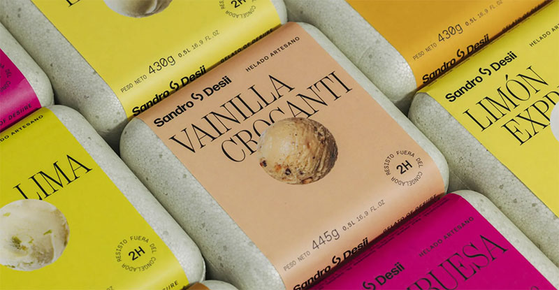
Ralf van der Lans of HKUST measured how package design affects product search with timed tasks on computer-simulated shelves.
Copy the method with prototype packs beside competitors, and record time to find and wrong picks.
When Do Food Packaging Best Practices Fail?
Best practices fail when two rules compete for the same space or the same layer of film.
Small Packs Run Out of Label Space
Below 12 square inches of available labeling space, FDA lets a pack omit Nutrition Facts if it makes no nutrient claim and gives consumers another way to get the information. At 40 square inches or less, tabular or linear formats are allowed (University of Georgia Extension, summarizing 21 CFR 101.9(j)(13)).
A nutrient claim removes that exemption, so a “low sodium” badge on a tiny pack can cost more space than it earns.
Minimalist design suits the front only if the back and sides can hold every required element. On small packs, cut the claim before cutting the type.
Clear Windows Shorten Shelf Life
Light starts photo-oxidation in foods that contain photosensitizers, and the effect is strongest in translucent packaging under bright store lighting. Virginia Tech food scientists report that only a fully opaque container protects the product completely.
So shrink the window, keep it off fatty and dairy products, and include light exposure in the shelf life study. Kemin notes the same in confectionery, where white chocolate shifts from a creamy white to a yellow tone during lighted retail storage.
Compostable Swaps That Fail the Shopper
Frito-Lay launched a compostable PLA SunChips bag in April 2009. Consumers complained it was too loud, sales reportedly declined during the 18 months it was on shelves, and Frito-Lay pulled it from five of six flavors in October 2010 (FoodNavigator; PlasticsToday).
The company said the sales cause was hard to pinpoint (NPR, 2010), but the lesson holds. A new material has to pass the same handling and sensory checks as the old one.
Stock Formats Beat Custom Structures for First Runs
A custom structure adds tooling and minimums before the brand has proven the product. For a first run, a stock pouch, jar or carton with a custom label does the job, and the dieline can stay simple until sales justify tooling.
Custom structure makes sense once volume, not preference, pays for it.
Food Packaging Design FAQ
How Much Does Food Packaging Design Cost?
No single figure holds, because design fees and unit costs are separate budgets. Design fees depend on how many SKUs there are and how much compliance work comes with them. Unit cost is driven by film structure, print method, color count and run length.
Shopify’s packaging guide advises setting the budget and shipping costs for each container type before design starts.
How Long Does a Food Packaging Design Project Take?
That depends on how many approval loops the project has, whether it’s structure, compliance review, printer proofs or testing. No published standard duration exists.
Real-time shelf life data takes as long as the shelf life itself, so start that study early and let accelerated results guide the first run.
Which Software Do Designers Use for Food Packaging Artwork?
Adobe Illustrator is the usual choice for artwork and dielines, since printers commonly ask for Illustrator files with text converted to outlines.
Esko ArtiosCAD covers structural design, and Photoshop prepares raster images at 300 dpi.
Does Color Psychology Work on Food Packaging?
Partly, and mostly through category habits rather than universal moods. In a 2015 HKUST feature on his eye-tracking work, Ralf van der Lans noted that shoppers tend to go for red when buying cola, and he advised new brands against copying the market leader’s color.
Use color to signal flavor and variant first.
Are QR Codes Worth Adding to a Food Package?
Yes, if the code adds something the pack can’t hold, like updatable recycling or sourcing details. It’s a poor substitute for mandatory label content though, which EU rules require on the package or an attached label.
Keep the code high-contrast with a clear quiet zone, and test scanning on the filled pack.
How Many Pouches Must Be Ordered for Custom Printing?
The minimum comes from the converter, not a standard, and it varies with print method, film structure and pouch size. Digital printing lowers the minimum because it needs no plates.
Ask for the minimum per artwork version, since flexo and gravure repeat plate or cylinder costs for every version.
Decisions to Lock Before the First Prototype
Fix the shelf life target and the sales markets before any brief goes out, along with the film structure. Claim wording and color specification can stay open until a prototype exists, and so can the front-of-pack layout.
The price of locking early is less room to change. A film swap after the first prototype restarts the real-time shelf life study, which runs as long as the shelf life itself.
Markets and film also carry a date risk. California’s SB 54 producer registration deadline passed on 1 June 2026 and full program implementation is scheduled for 1 January 2027 (Mayer Brown, June 2026), with its recyclability requirements escalating through 2032, so a film locked in October 2026 needs checking against that schedule.
The printer brief comes next. It starts with preparing cut lines for packaging printers on the supplied dieline.

Renowned for his expertise in logo design and visual branding, Bogdan has developed a multitude of logos for various clients.
His skills extend to creating posters, vector illustrations, business cards, and brochures. Additionally, Bogdan's UI kits were featured on marketplaces like Visual Hierarchy and UI8.
He also wrote in the past years on sites like Design Your Way, WebDesignerDepot, WPDean, Designmodo, Speckyboy, Slider Revolution, and more.
- The Windsurf Logo History, Colors, Font, And Meaning - 10 October 2026
- How to Remove Background From Product Photos (No Photoshop) - 10 October 2026
- How Designers can Build a Stronger Online Creative Identity - 9 October 2026

Bogdan Sandu is a seasoned designer who has been designing websites since 2008. Renowned for his expertise in logo design and visual branding, Bogdan has developed a multitude of logos for various clients. His skills extend to creating posters, vector illustrations, business cards, and brochures. Additionally, Bogdan's UI kits were featured on marketplaces like Visual Hierarchy and UI8. He also wrote in the past years on sites like Design Your Way, WebDesignerDepot, WPDean, Designmodo, Speckyboy, Slider Revolution, and more.
You Might Also Like


