Pull up any black website design example and the choice that hits you first has nothing to do with fonts or layout. It’s darkness itself, used as the canvas rather than a border around one.
Black website design leans on a black or near black background as the dominant color, then adds high contrast text and one or two accent colors to point the eye somewhere specific.
Luxury houses, fashion labels, and consumer tech brands reach for it constantly. Whether it actually works gets judged by the same accessibility yardstick used on any other color palette, no exceptions made for mood.
There’s a persistent assumption that dark pages are gentler on the eyes. A Nielsen Norman Group review of the academic research didn’t back that up: it found no significant difference in visual fatigue between dark and light interface themes (Nielsen Norman Group, 2020).
What Is Black Website Design
Darkness does the heavy lifting here. A black or near black background carries the page as the dominant color, and everything else, the type, the accents, gets built to survive on top of it rather than the other way around.
That places the style inside the wider field of web design, though it makes one deliberate call most sites don’t: darkness becomes the base, not the exception.
People confuse this with a few things it isn’t.
- It’s not the same as a system level dark mode toggle. That’s a software setting, not a brand decision.
- It’s not automatically minimalist either. Plenty of black sites carry heavy texture, video, or grain.
- And it’s not just an inverted color scheme. Text color, spacing, image treatment, all of it shifts once black takes over as the base.
The color itself does work before a single word of copy loads. Research on black as a color keeps linking it to authority, formality, and restraint, which explains why premium product pages reach for it so often.
A black website design still needs the same basic building blocks any page needs: layout, color, type, space. What changes is how those blocks behave once the base color starts absorbing light instead of reflecting it.
What Are the Main Styles of Black Website Design
Not every black site looks the same. Swap out the accent color and the whole mood shifts, more than any other single decision on the page.
| Style | Accent color | Mood |
|---|---|---|
| All black and monochrome | Off white or gray | Quiet, editorial |
| Black and gold | Metallic gold | Luxury, formal |
| Black and white | Pure white | Strict, high contrast |
| Black with neon | Green, pink, or blue | Bold, current |
All Black and Monochrome
This is the style pushed to its purest form. Black sits at nearly full saturation across the background, the panels, even the navigation bar.
Almost all the contrast has to come from typography and thin borders, since there’s no second color doing that job.
- Off white or light gray text instead of pure white, to soften the harshness
- Thin hairline dividers to separate sections without adding a second color
- Large, uninterrupted black areas that function as negative space
Photographers and architects lean on this version more than anyone else building a portfolio. It puts the image front and center and gets out of the way.
Black and Gold
Pair black with a metallic gold accent and the page reads as premium almost instantly. It’s one of the fastest signals in the whole toolkit.
The gold rarely covers a full panel. It shows up on logos, on call to action buttons, maybe a single decorative line, and that’s usually it.
A muted, desaturated gold tone reads as more expensive on screen than a bright, saturated yellow gold.
Jewelry brands, hotels, and spirits companies lean on this pairing more than most others.
Black and White
Strip out every accent color and you’re left with the strictest contrast a screen can produce.
Pure white text against pure black hits a very high contrast ratio, though most designers soften that with off white text to cut down on glare. Readability goes up, warmth goes down, that’s the trade.
Editorial and fashion sites favor this combination since it leaves all the color on the page for the photography.
Generous spacing between blocks becomes the only way left to create separation, with no second color to lean on.
Black with Neon Accents
This version pulls one bright color, often green, pink, or blue, out of the dark background to flag anything interactive.
That neon tends to land in the same few spots.
- Hover states on buttons and links
- Small icons or status indicators
- Glow effects around form fields
Gaming, music, and tech startup sites use this to feel current instead of corporate.
How Does Contrast Work on a Black Background
Contrast gets measured the same way here as anywhere else: a ratio between the luminance of the text and the luminance sitting behind it.
Pure black paired with pure white text sits at the top of that scale, though almost no production site actually runs pure black across a full page.
A few numbers matter more than the rest.
- WCAG 2.1 Level AA requires a 4.5:1 contrast ratio for normal text and 3:1 for large text (W3C, WebAIM)
- WCAG Level AAA raises that bar to a 7:1 ratio for normal text (W3C, WebAIM)
- Low contrast text was found on 83.9% of the one million home pages checked in the 2026 WebAIM Million report, up from 79.1% in 2025
- The European Accessibility Act has required WCAG 2.1 AA conformance for many new or updated digital products since June 28, 2025, with existing products given until June 28, 2030
Those figures matter specifically for black website design, because dark backgrounds tempt designers into softer dark gray text. That softer choice quietly drops the ratio below the legal threshold without anyone noticing until an audit flags it.
Checking contrast early, before content goes in, catches this before it turns into a rework.
Here’s a failure pattern that looks harmless at first glance: dark gray navigation text sitting around 3:1 against black. It passes a quick look but fails AA the moment it’s used for body copy.
How Should Typography Be Styled on a Black Background

Text on black needs a heavier hand than text on white. Thin strokes disappear against a dark field faster than most designers expect, and it catches people off guard the first time they see it happen.
Font weight usually gets bumped up one level from whatever would run on a light background.
- Body text set in a regular or medium weight instead of light
- Off white color such as #f2f2f2 instead of pure white, to cut glare on large blocks of copy
- Slightly increased letter spacing on headlines, so characters stop merging visually
Most black website design examples lean on a clean sans-serif font for body copy. Geometric shapes just hold up better at low light values than fine serif details do.
Serif fonts still show up, usually only at large display sizes where the thin strokes stay visible.
Getting the size scale right depends on a working typographic hierarchy, so headlines, subheads, and body copy stay distinct without color doing that job.
Line height also tends to run a little looser on black backgrounds. Tight leading makes pale text blur together under low ambient light.
How Should Buttons, Links and Hover States Work on Black Backgrounds
Interactive elements need to announce themselves on a dark page, since there’s no light background doing the framing for free.
- Solid fill buttons in the accent color, reserved for the primary action only
- Outline buttons with a 1 to 2 pixel border for secondary actions
- Generous padding, since thin buttons read as disabled on a dark field
A button or link turns into the page’s focal point the second its color breaks from the surrounding black. Designers tend to save the brightest accent for the one action they most want a visitor to take, and nothing else.
Hover states usually move in one of two directions: a brightness increase on the accent color, or a subtle background fill that wasn’t visible before the cursor showed up.
Both rely on movement to confirm the interaction happened, whether that’s a color fade, a slight scale change, or an underline drawing in from one side.
Underlined links tend to outperform color only links on black pages. Some visitors just can’t pick out the accent color from the surrounding text at a glance.
What Effect Does Black Website Design Have on Brand Perception
Black reads as formal before a visitor processes a single word on the page.
That reaction is consistent enough that entire industries build their visual identity around it, rather than treating it as a passing trend.
It tends to signal exclusivity and a premium price point, plus a kind of confidence that sometimes tips into aggressive.
Seriousness rides along with all of that too, which is part of why B2B software rarely goes fully black.
Chanel’s website leans almost entirely on black and white, reinforcing a brand built on restraint rather than noise.
The same choice can work against a brand chasing an approachable or budget friendly feel, since black rarely reads as warm or casual, no matter how the rest of the page is styled.
Font choice reinforces or undercuts that signal fast, which explains why so many luxury brand typefaces lean thin, high contrast serif or geometric sans-serif rather than rounded and friendly.
Pair a black background with a bouncy rounded font and the two signals just fight each other on screen.
Which Industries Use Black Website Design Most
Some sectors reach for black by default. Others avoid it almost entirely.
| Industry | Typical accent color | Example brand |
|---|---|---|
| Luxury fashion | Gold or white | Chanel |
| Consumer tech | White or single brand color | Apple product pages |
| Entertainment and streaming | Red or brand color | Netflix |
| Creative agencies and portfolios | Neon or white | Independent studio sites |
Fashion and luxury goods use black more consistently than almost any other category, since the color pairs naturally with the exclusivity these brands are selling in the first place.
Vogue’s website mixes black panels with a strong editorial typeface choice to keep the page feeling like a print magazine instead of a generic blog.
Consumer tech brands are more selective about it, often saving black for flagship product pages rather than the whole site.
Corporate and B2B sites use it least. Corporate identity work in that space usually chases trust and openness over drama.
Healthcare, education, and government sites almost never go fully black. Readability for a broad, older, or first time audience takes priority over mood there.
Black Website Design Examples
What black gets asked to do changes by site type. A portfolio wants it to disappear behind the work, staying out of the way entirely. Landing pages flip that: one action gets pushed forward while everything else goes quiet in the background.
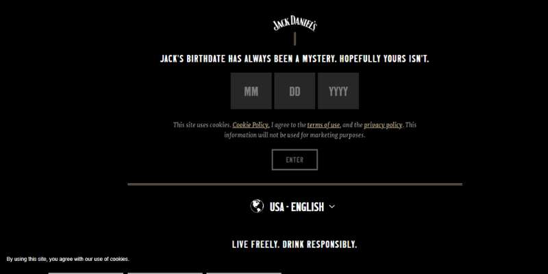
Jack Daniel’s
GoSqaured

BlackBerry

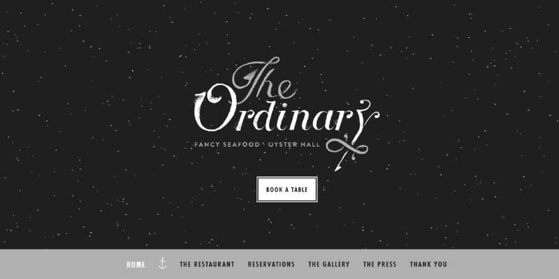
The Ordinary
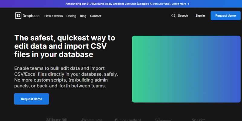
Dropbase
Icelandic Fashion Festival

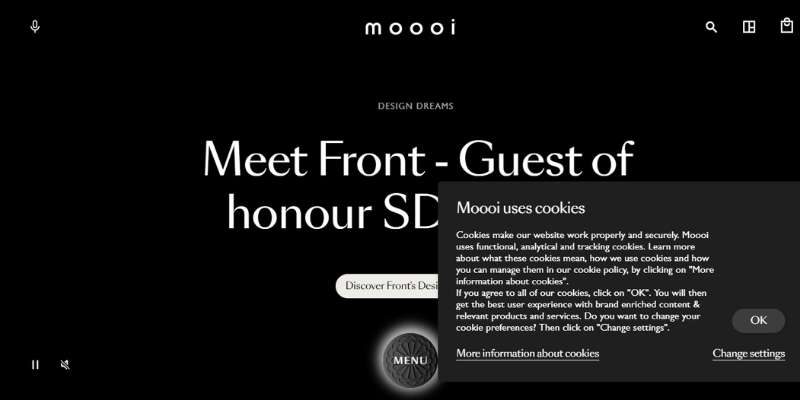
Moooi
International Women’s Day

Blake Allen

Versions

Clover

Airnauts

Thomas Rhythm

CONTRATEUR

Is Black Website Design Better Than White Website Design
Neither is better in the abstract. They’re solving different problems.
| Aspect | Black website design | White website design | Best use case |
|---|---|---|---|
| Mood | Formal, dramatic | Open, approachable | Depends on brand tone |
| Photography | Makes color pop | Can wash out dark images | Black for moody shots |
| Reading long text | More fatiguing over time | Easier for long articles | White for content sites |
| Accessibility testing | Requires more care | Easier to hit ratios | White for broad audiences |
Google’s homepage is the clearest counterexample to black website design: almost entirely white space, with a single search box as the real interface element.
That kind of extreme restraint depends on visual balance working through empty space rather than through darkness.
Black backgrounds create a strong figure and ground relationship the moment any light element lands on them. Designers often lean on Gestalt principles to explain why a single white shape on black reads instantly, while the same shape on a white page needs a border or shadow just to stand out.
Black wins on mood and drama. White wins on comfort and scanning speed. That’s the honest answer.
What Are the Pros and Cons of Black Website Design
Pros
- Photography and product shots read as higher end against a dark field
- Visitors browsing on OLED phone screens draw less battery on black pages, with Purdue University’s 2021 measurement study finding typical savings of 3 to 9 percent under normal brightness, rising to 39 to 47 percent outdoors at full brightness
- A dark page gives the design a strong sense of unity without needing many colors to tie sections together
Cons
- Body text needs more testing than it would on a white page
- Pure black surfaces aren’t even recommended inside Google’s own Material Design specification, which calls for dark grey rather than true black as the primary surface color to avoid visual vibration
- The mood can read as cold for brands trying to feel friendly or affordable
Neither list runs longer because one style is objectively stronger. The trade-offs just land differently depending on the brand doing the choosing.
When Does Black Website Design Not Work
Black website design fails in a few predictable situations, and they’re worth naming plainly instead of dancing around them.
Content heavy sites struggle first. News articles, documentation, and long form blog posts ask visitors to read for minutes at a time, and sustained white text on black backgrounds gets tiring well before a white page does.
Vision research explains part of why. Roughly one in three people has some degree of astigmatism, and light colored text on a black background produces a bleeding effect called halation that makes letters blur for that group.
- Government portals, where plain, high readability layouts serve the widest possible audience
- Healthcare and medical sites, where an older or vision impaired visitor base makes contrast comfort a priority over mood
- Budget or discount brands, where a black theme signals a price point the brand isn’t actually offering
USA.gov is a useful reference point here: a plain white, high contrast layout built for the broadest possible audience rather than for brand drama.
There’s a legal angle too. UsableNet’s 2025 year end report counted more than 5,000 ADA digital accessibility lawsuits filed in the United States that year, with ecommerce sites named in close to 70 percent of filings, and low contrast text is one of the easiest issues for a plaintiff’s team to document.
How Do You Build a Black Website Step by Step
Building a black site in the wrong order is how most of the common mistakes happen.
- Pick a near black base color, something like a very dark charcoal defined in RGB rather than pure #000000, so the page has room for elevation and shadow later
- Choose one or two accent colors and lock their hex values before any content goes in
- Set the type scale and confirm every text color against the WCAG AA threshold before writing a single word of copy
- Build the layout grid and establish a clear visual hierarchy for headline, subhead, and body text
- Style buttons, links, and hover states, and test them with a keyboard, not just a mouse
- Run the full page through a contrast checker and an automated audit tool, then fix flagged text before launch
Skipping step three is the most common failure point. Teams often add real content only after the visual design is finished, and at that point every fix turns into a rework instead of a decision.
Tools like Figma or Webflow make it easy to preview a black layout early, but no tool catches a failed contrast ratio automatically without someone running a dedicated check.
FAQ on Black Website Design
How is black website design different from dark mode
Dark mode is a system level setting that a device or browser applies automatically. Black website design gets baked into the page itself as a deliberate brand choice, and it doesn’t budge based on the visitor’s own light or dark preference.
Which tools are used to build black websites
Figma and Adobe XD handle the mockup stage. WordPress, Webflow, and Squarespace all hold ready made dark templates.
Chrome DevTools and Lighthouse catch contrast failures before launch, and WebAIM’s checker confirms the WCAG ratios hold up.
Does black website design slow down page load speed
The color itself adds no weight at all. Slowdowns come from heavy hero video, large uncompressed images, or animation libraries like GSAP and Three.js layered on top of the dark theme, not from the background color choice.
Is black website design still popular in 2026
Yes. Luxury, fashion, and tech brands keep reaching for it on flagship pages, and Awwwards continues to feature black and near black sites among its top rated entries year after year.
What fonts pair best with black backgrounds
Clean geometric sans-serif fonts carry body copy best, and a single high contrast serif can anchor large headlines well enough on its own.
Testing font combinations before launch catches pairs that look fine in mockups but blur once they’re actually rendered against true black.
What Should You Fix First in Black Websites?
Contrast comes first. A striking dark layout still fails every visitor who can’t comfortably read the text sitting on top of it, no matter how polished the rest of the page looks.
- Contrast first, checked against WCAG before any content gets finalized
- Typography weight second, since thin fonts vanish once contrast gets fixed
- Interactive states last, once buttons and links actually have something solid to sit on
Fixing contrast before mood trims some of the drama a designer wanted. A slightly lighter background just reads as less severe than pure black, and that’s a fair trade most of the time.
Once contrast and hierarchy hold steady, the next move is stepping back from color entirely and testing the layout against the broader principles that govern any design decision, since black is one choice inside a much bigger system.

Renowned for his expertise in logo design and visual branding, Bogdan has developed a multitude of logos for various clients.
His skills extend to creating posters, vector illustrations, business cards, and brochures. Additionally, Bogdan's UI kits were featured on marketplaces like Visual Hierarchy and UI8.
He also wrote in the past years on sites like Design Your Way, WebDesignerDepot, WPDean, Designmodo, Speckyboy, Slider Revolution, and more.
- The Substack Logo History, Colors, Font, And Meaning - 2 October 2026
- How UX Design Impacts SaaS User Retention and Churn - 1 October 2026
- How to Embed Fonts in PDF for Reliable Printing - 30 September 2026

Bogdan Sandu is a seasoned designer who has been designing websites since 2008. Renowned for his expertise in logo design and visual branding, Bogdan has developed a multitude of logos for various clients. His skills extend to creating posters, vector illustrations, business cards, and brochures. Additionally, Bogdan's UI kits were featured on marketplaces like Visual Hierarchy and UI8. He also wrote in the past years on sites like Design Your Way, WebDesignerDepot, WPDean, Designmodo, Speckyboy, Slider Revolution, and more.
You Might Also Like