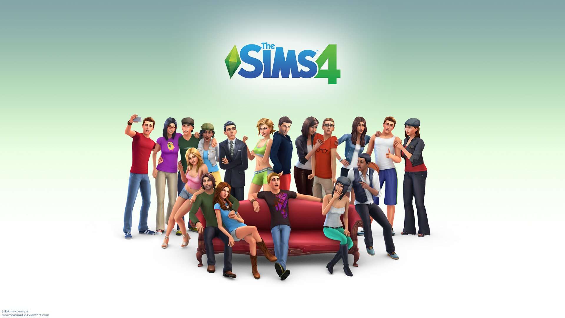
The Sims 4 uses Sims Sans Bold SC, a geometric sans-serif font designed by Jason Williford and trademarked by Electronic Arts in 2014.
EA commissioned this typeface specifically for The Sims 4 logo, meaning it is not a commercial retail font you can simply purchase or license through a standard type foundry. The wordmark pairs the font with the iconic green plumbob symbol, which has anchored the franchise’s visual identity since the original game launched in February 2000.
What Type of Font Is Sims Sans Bold SC?
Sims Sans Bold SC is a geometric sans-serif typeface, available in 2 weights. It features even stroke weights, open letterforms, and slightly indirect (softened) corners that give it a modern yet approachable character.
The letterforms, particularly the “S,” carry custom curve treatments that EA’s design team refined across multiple logo iterations. It is not a strict geometric sans in the Futura mold. There is a subtle playfulness to the spacing and terminal shapes that keeps it from feeling corporate or rigid.
That quality matters for a game built around personality, creativity, and life simulation. A hard, cold sans-serif would have sent the wrong signal entirely.
Understanding typography in game branding means looking at how a typeface carries a brand’s tone at a glance. Sims Sans does that well. It reads as clean and friendly at small app icon sizes, which is important for a game sold primarily through digital storefronts.
Who Designed Sims Sans Bold SC?
Jason Williford designed Sims Sans Bold SC. The font was created in 2014 as part of The Sims 4’s branding refresh, with the copyright held by Electronic Arts.
It was not created independently and licensed by EA afterward. It was built specifically for this franchise, which makes it a proprietary typeface rather than a commercial release.
That distinction matters. No type foundry sells it. You will not find it on Adobe Fonts, Font Squirrel, or any legitimate storefront.
Williford’s design sits within a broader context of game logo typography where studios began moving away from heavy display fonts toward cleaner, more scalable sans-serif styles around 2012 to 2015. The Sims 4 logo landed right in that shift.
Is Sims Sans Bold SC Free to Use?
No. Sims Sans Bold SC is a proprietary typeface owned by Electronic Arts. It carries a trademark and is not publicly available for download or commercial use.
Some third-party font sites have uploaded versions of the file, but using those without EA’s permission would violate their intellectual property. It is worth understanding font licensing before grabbing any file from unofficial sources.
For the original Sims logo (Sims 1), the closest public match is SimLLHP, designed by SML Designs. That one is free for personal use and available through sites like Fonts4Free. It covers uppercase, lowercase, numbers, and limited punctuation across 251 defined characters.
What Font Did The Sims Use Before?
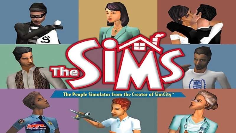
The franchise has used different typefaces across each major release. Here is how the typography shifted across the series:
| Game | Font / Style | Notable Change |
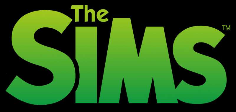
| The Sims (2000) | SimLLHP (similar match) | Bubbly, cartoon style with thick outlines |
| The Sims 2 (2004) | Cleaner sans-serif variation | More geometric, polished plumbob introduced |
| The Sims 3 (2009) | ITC Kabel-influenced style | Lighter wordmark, glossy plumbob treatment |
| The Sims 4 (2014) | Sims Sans Bold SC | Flat, minimal design aligned with digital storefronts |
The shift from Sims 3 to Sims 4 was the most significant typographic change. EA moved from a heavier, more stylized display style to a clean flat wordmark that holds up at app icon scale.
That decision reflects how game distribution changed. When most purchases happen through Steam, Origin, or mobile stores, logos need to be legible at 128 by 128 pixels. The older Sims logo styles simply did not survive that kind of reduction.
What Are the Best Free Alternatives to Sims Sans Bold SC?
Since the actual font is not publicly available, here are 5 free alternatives with similar geometric, clean sans-serif qualities:
| Font | Similarity | License | Source |
| Nunito | Rounded terminals, even stroke weight | Free (OFL) | Google Fonts |
| Comfortaa | Rounded geometric construction, playful feel | Free (OFL) | Google Fonts |
| Montserrat | Geometric structure, bold weights | Free (OFL) | Google Fonts |
| DM Sans | Low contrast, clean geometric sans-serif | Free (OFL) | Google Fonts |
| SimLLHP | Direct Sims 1 logo match | Free (personal use) | Fonts4Free |
Nunito is the closest structural match if you want that even weight and slightly rounded feel without going fully bubbly. Comfortaa works better for designs that lean into the playful side of The Sims aesthetic.
If you are working on something that specifically references the older Sims 1 branding, SimLLHP is the obvious choice. Just check the license terms before any commercial use. Knowing which are the best free Google Fonts for your project saves a lot of time when proprietary fonts are out of reach.
How to Use a Sims-Style Font in Your Design Tools
Once you have downloaded a free alternative like Nunito or SimLLHP, installing it is straightforward across most design tools.
Figma: Figma reads fonts installed on your system automatically. Install the font at the OS level, restart the Figma desktop app, and it appears in the font picker. If you are on browser-based Figma, you need the Figma Font Helper installed locally. You can also learn how to add fonts to Figma step by step if you hit any issues.
Canva: Free Canva accounts can access uploaded fonts in some regions, while Pro accounts support full custom font uploads. If you want to upload fonts to Canva, the process takes about 2 minutes.
Photoshop: Drop the font file into your system’s Fonts folder, restart Photoshop, and it appears in the character panel. A full walkthrough on how to add fonts to Photoshop covers edge cases if the font does not appear.
Web use: For Nunito or Montserrat, you can embed them directly from Google Fonts with a single link tag. No hosting required.
Why Did EA Choose This Font for The Sims 4?
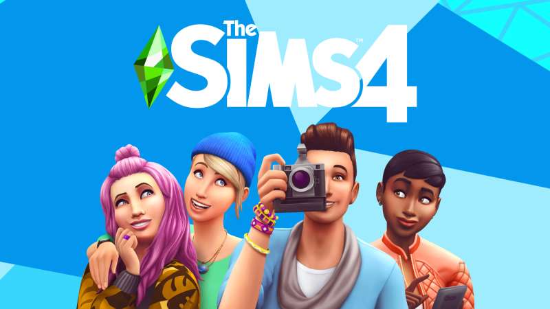
The Sims 4 launched in 2014, right as flat design was taking over everything. Apple had just shipped iOS 7. Google was finalizing Material Design. Every major software brand was stripping back ornamentation and going clean.
EA’s decision to commission a flat, geometric wordmark for Sims 4 was not coincidental. The game needed to sit comfortably on Steam, Origin, and eventually mobile storefronts. Heavy, glossy logo styles from the Sims 3 era looked dated on flat UI surfaces.
The even stroke weights of Sims Sans Bold SC serve a practical purpose: the wordmark holds its legibility whether it appears at 512px on a website or 32px inside a game launcher.
There is also a brand identity angle. The Sims 4 went free-to-play in October 2022, significantly expanding its audience. A cleaner, less “gamer” aesthetic makes the franchise more approachable to a broader demographic, including casual players and younger audiences who discovered the game through social media.
The visual hierarchy of the current Sims logo is deliberate: the plumbob draws the eye first, the wordmark second. This is actually the opposite of most game logos, where the text does the heavy lifting. EA leaned into the plumbob as the primary recognition mark and let the typography play a supporting role. That is a confident branding decision, and it has worked well across 10+ years of the franchise’s history.
The font choice also connects to broader font psychology. Geometric sans-serifs communicate clarity, modernity, and accessibility. For a life simulation game where anyone is supposed to feel welcome, that is the right typographic signal. A heavy display font or a serif font would have created the wrong tone entirely.
If you are into how other games handle their typography, it is worth looking at the Call of Duty font, the Rocket League font, or even the Minecraft fonts for comparison. Each franchise makes very different choices, and those choices say something specific about who each game is for.
FAQ on What Font Does The Sims Use
What is the exact font used in The Sims 4 logo?
The Sims 4 logo uses Sims Sans Bold SC, a geometric sans-serif typeface designed by Jason Williford and trademarked by Electronic Arts in 2014. It was commissioned specifically for the franchise and is not available through any public type foundry.
Is the Sims font free to download?
Sims Sans Bold SC is proprietary and not legally available for public download. The original Sims 1 logo font, SimLLHP by SML Designs, is free for personal use and can be found on Fonts4Free.
What font does The Sims 1 use?
The Sims 1 logo closely matches SimLLHP, a cartoon-style typeface designed by SML Designs. It features bubbly letterforms with a thick outline style typical of early 2000s game branding.
What font does The Sims 3 logo use?
The Sims 3 wordmark uses a style closely related to ITC Kabel, a geometric sans-serif originally designed by Rudolf Koch. The “S” character in the logo appears to be a custom modification not found in the standard ITC Kabel family.
Who designed the Sims Sans font?
Jason Williford designed Sims Sans Bold SC in 2014 under commission from Electronic Arts. The copyright is held by EA. It was built solely for The Sims 4 brand identity, not as a general commercial release.
Can I use the Sims font commercially?
No. Sims Sans Bold SC is an EA trademark. Commercial use without a license from Electronic Arts is not permitted. For similar projects, free geometric sans-serif fonts like Nunito or Montserrat from Google Fonts are solid alternatives.
What font is closest to the Sims font on Google Fonts?
Nunito is the closest free match available on Google Fonts. It shares even stroke weights and softly rounded terminals similar to Sims Sans Bold SC. Comfortaa is another option if you want a slightly more playful feel.
Does The Sims use a custom font or a standard one?
The Sims 4 uses a custom-commissioned font created by Jason Williford for EA. Earlier entries in the franchise used styles closer to existing commercial typefaces, but the Sims 4 wordmark was built from scratch for the brand.
What font is used in The Sims UI and menus?
The in-game UI across The Sims 4 uses clean, neutral geometric sans-serif typefaces optimized for screen legibility. EA has not publicly documented the specific menu font, but it aligns with the same visual system as the Sims Sans family.
What font should I use to recreate The Sims logo style?
Start with Nunito Bold or Comfortaa from Google Fonts. Pair either with a flat geometric plumbob graphic. For a Sims 1 style, download SimLLHP from Fonts4Free. Check logo design principles before finalizing any layout.
Conclusion
So, what font does The Sims use? Sims Sans Bold SC, a proprietary geometric sans-serif commissioned by Electronic Arts and designed by Jason Williford in 2014.
It is not publicly available, but free alternatives like Nunito and Comfortaa cover most use cases without sacrificing the clean, approachable feel of the Sims brand identity.
Each game in the Maxis franchise made deliberate typographic choices, from the cartoon Simlish-era lettering of Sims 1 to the flat, scalable wordmark of Sims 4.
Good font choices in game branding are rarely accidental. The typographic hierarchy behind the plumbob and wordmark combination has kept this franchise instantly recognizable for over two decades.

Renowned for his expertise in logo design and visual branding, Bogdan has developed a multitude of logos for various clients.
His skills extend to creating posters, vector illustrations, business cards, and brochures. Additionally, Bogdan's UI kits were featured on marketplaces like Visual Hierarchy and UI8.
He also wrote in the past years on sites like Design Your Way, WebDesignerDepot, WPDean, Designmodo, Speckyboy, Slider Revolution, and more.
- Jujutsu Kaisen Font Generator - 12 October 2026
- The Windsurf Logo History, Colors, Font, And Meaning - 10 October 2026
- How to Remove Background From Product Photos (No Photoshop) - 10 October 2026

Bogdan Sandu is a seasoned designer who has been designing websites since 2008. Renowned for his expertise in logo design and visual branding, Bogdan has developed a multitude of logos for various clients. His skills extend to creating posters, vector illustrations, business cards, and brochures. Additionally, Bogdan's UI kits were featured on marketplaces like Visual Hierarchy and UI8. He also wrote in the past years on sites like Design Your Way, WebDesignerDepot, WPDean, Designmodo, Speckyboy, Slider Revolution, and more.
You Might Also Like