Bodoni’s razor-thin hairlines crack under digital pressure. That’s the brutal truth about using this 18th-century icon for modern projects.
But you’re not stuck with mediocre alternatives.
Fonts similar to Bodoni exist across every licensing model and use case. Some offer warmer personalities while maintaining that signature high-contrast elegance. Others solve practical problems like web rendering or text-size legibility that Bodoni struggles with.
This guide covers 16 modern serif typefaces that capture Bodoni’s sophisticated DNA. You’ll discover which alternatives work best for editorial design, luxury branding, fashion typography, and digital applications.
From free Google Fonts options to professional revivals with optical sizing, each recommendation includes specific use cases and honest comparisons. Some stay faithful to neoclassical proportions. Others push the Didone style in contemporary directions.
The right choice depends on your medium, message, and budget.
Fonts Similar To Bodoni
| Font Name | Key Characteristics | Best Use Cases | Availability |
|---|---|---|---|
| Didot | Extreme thick-thin contrast, elegant vertical stress, refined serif details | Luxury branding, fashion magazines, high-end editorial | Commercial |
| Walbaum | Strong contrast, slightly softer than Didot, German neoclassical design | Book typography, cultural publications, premium print | Commercial |
| Bodoni Moda | Modern Bodoni interpretation, variable font technology, optimized for digital | Web design, responsive layouts, digital applications | Google Fonts (Free) |
| Playfair Display | High contrast, transitional style, designed for large displays | Website headers, titles, digital editorial content | Google Fonts (Free) |
| Libre Bodoni | Open-source Bodoni revival, sharp serifs, clean geometric structure | Modern web projects, open-source applications, branding | Google Fonts (Free) |
| Vidaloka | Delicate hairlines, elegant curves, optimized for screen display | Blog titles, elegant web typography, display purposes | Google Fonts (Free) |
| Arapey | Contemporary serif, moderate contrast, classical proportions | Web headlines, elegant content, modern editorial | Google Fonts (Free) |
| Prata | Sharp serifs, vertical stress, balanced contrast for digital reading | Website headers, app interfaces, digital magazines | Google Fonts (Free) |
| Cardillac | Art deco influence, geometric construction, bold character | Retro designs, vintage branding, specialty projects | Commercial |
| Voga | Ultra-thin hairlines, dramatic contrast, fashion-forward aesthetic | Fashion design, beauty brands, high-contrast displays | Free |
| Basilia | Refined serifs, classical elegance, Swiss precision | Premium print, corporate identity, sophisticated layouts | Commercial |
| Filosofia | Crisp serifs, high contrast, modern Bodoni interpretation | Contemporary branding, editorial design, luxury packaging | Commercial |
| Ambroise | French typographic tradition, elegant proportions, refined details | Luxury publishing, fine books, premium editorial | Commercial |
| Bauer Bodoni | Classic revival, faithful to original Bodoni, multiple weights | Traditional typography, book design, formal documents | Commercial |
| ITC Bodoni | International Typeface Corporation version, comprehensive family, versatile | Professional publishing, advertising, diverse applications | Commercial |
| Bodoni Recut | Contemporary reinterpretation, sharp cuts, modern aesthetics | Modern design projects, digital branding, contemporary layouts | Commercial |
Didot
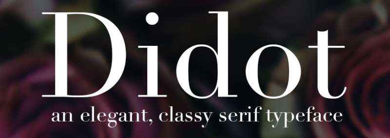
Didot stands as Bodoni’s closest relative. Created by the Didot family in France between 1784-1811, this neoclassical serif font emerged during the same period as Bodoni’s work.
Classification & Style
Modern serif/Didone
Extreme vertical stress with dramatic contrast between thick and thin strokes. Flat unbracketed serifs that sit at perfect right angles.
The typeface represents the pinnacle of Enlightenment design thinking.
Design Features
Hairline horizontal strokes contrast sharply with bold verticals. Serifs maintain mathematical precision without brackets.
The capital Q features a centered tail.
Ball terminals appear on lowercase letters like ‘a’ and ‘c’. Teardrop terminals mark uppercase characters.
Available in multiple weights from Linotype and Hoefler & Co.
Best Use Cases
Headlines and display work at 24pt and above
Fashion magazines depend on Didot for sophisticated editorial layouts. Luxury brand identities incorporate this design for instant refinement.
Book covers in literary fiction genres.
Not suitable for body text below 12pt due to hairline fragility.
Comparison to Bodoni
Both emerged from the same late 18th century design revolution. The stroke contrast reaches similar extremes in both designs.
Didot maintains slightly more vertical rigidity. Bodoni shows more warmth in rounded letterforms.
Choose Didot when projects demand French neoclassical heritage. The typography speaks to Enlightenment ideals more directly than Bodoni.
Availability & Licensing
Linotype Didot (Adrian Frutiger’s revival) bundles with macOS. HTF Didot from Hoefler & Co offers 42 fonts across seven optical sizes.
Commercial licensing required for both versions. Prices start around $199 per weight.
Walbaum

Justus Erich Walbaum designed this German modern serif in the early 1800s. It flew under the radar while Bodoni and Didot claimed fame, but recent revivals showcase its warmth.
Classification & Style
Modern serif with transitional characteristics
Strong vertical stress combined with high stroke contrast. The design bridges Modern and Transitional classifications through subtle details.
Walbaum retains a warmth absent from most Didone designs.
Design Features
The stroke contrast appears slightly softer than Bodoni’s extremes. Serifs show minimal bracketing unlike pure modern designs.
Round letterforms feature organic curves rather than geometric precision.
Monotype’s 2018 restoration includes 32 weights with optical sizes from 6pt to 96pt. Display weights push contrast to dramatic extremes.
Best Use Cases
Text and display applications
Book typography was Walbaum’s historical strength. The mid-20th century saw widespread adoption for long-form reading.
Modern applications include editorial design, upscale branding, and advertising campaigns. Works effectively from tiny e-reader text to massive billboards.
Luxury fashion and lifestyle brands benefit from its sophisticated approachability.
Comparison to Bodoni
Walbaum offers more warmth and less geometric rigidity. The letterforms breathe easier with slightly open spacing.
Bodoni emphasizes mathematical perfection. Walbaum shows subtle calligraphic influence in rounded forms.
Choose Walbaum when projects need elegance without coldness. It reads better at text sizes than most Bodoni revivals.
Availability & Licensing
Monotype Walbaum available through Monotype Fonts subscription. Individual weights start at $50.
Full family with optical sizes costs $899. Also available through Adobe Fonts with Creative Cloud subscription.
Bodoni Moda

Google Fonts commissioned this no-compromises Bodoni for the digital age. Built specifically for contemporary web and screen use.
Classification & Style
Modern serif/Didone optimized for digital
Classic Bodoni characteristics adapted for pixel rendering. Vertical stress and extreme contrast maintained across all weights.
Variable font technology enables precise weight adjustments.
Design Features
Sharp vertical strokes with hairline horizontals. Ball terminals on lowercase letters.
Nine weights from Regular (400) to Black (900) plus matching italics. Variable font axes include weight (wght) and optical size (opsz) from 6-96pt.
Extended character set supports Latin and Latin Extended.
Best Use Cases
Digital headlines and editorial design
Web typography for fashion blogs and lifestyle sites. Editorial layouts requiring elegant display type.
Works best at 18pt and above for optimal readability. The optical size axis automatically adjusts for different sizes.
Perfect for designers needing free Bodoni-style typography.
Comparison to Bodoni
Bodoni Moda closely follows classic Bodoni proportions. Slightly wider letterforms improve screen rendering.
Traditional Bodoni requires commercial licensing. Bodoni Moda provides free access with nearly identical aesthetics.
Choose Bodoni Moda for web projects or when budget constraints limit font purchases. The quality rivals commercial alternatives.
Availability & Licensing
Google Fonts (completely free)
Open source license permits commercial and personal use. Download or link via Google Fonts API.
Also available through Adobe Fonts for Creative Cloud subscribers.
Playfair Display

Claus Eggers Sørensen designed this transitional display font inspired by 18th century pointed pen lettering. It bridges the gap between Baskerville and Bodoni.
Classification & Style
Transitional with modern tendencies
High contrast strokes with vertical stress. Rounded geometry softens the overall appearance compared to strict Didone designs.
Takes inspiration from John Baskerville’s innovations and Scotch Roman designs.
Design Features
Contrast appears moderate compared to Bodoni but strong by transitional standards. Rounded serifs and curved terminals add warmth.
Ball terminals on select lowercase letters. The ‘t’ features a distinctive curved finish.
Six weights available: Regular, Medium, Semi Bold, Bold, Extra Bold, Black. Full italic range accompanies each weight.
Best Use Cases
Editorial headlines and luxury branding
Magazine mastheads and article titles. Wedding stationery and formal invitations.
Fashion brand websites and e-commerce platforms. Blog headers requiring elegant sophistication.
Performs well on screen at 16pt and above. Not recommended for body text below 14pt.
Comparison to Bodoni
Playfair Display shows less extreme contrast. The curves feel organic rather than geometric.
Bodoni emphasizes mathematical precision. Playfair Display retains calligraphic warmth from its transitional heritage.
Choose Playfair Display for projects needing elegance with readability. It’s become the default free alternative to Bodoni for web designers.
Availability & Licensing
Google Fonts (free)
Open source license covers all uses. Massive adoption in web design (appearing on millions of sites).
Also available through Adobe Fonts.
Libre Bodoni

Based on Morris Fuller Benton’s ATF Bodoni from the 19th century, this revival specifically targets web requirements. Pablo Impallari and Rodrigo Fuenzalida adapted it for digital environments.
Classification & Style
Modern serif optimized for web rendering
Classic Bodoni proportions adjusted for screen legibility. Vertical stress with high contrast typical of Didone designs.
The design respects historical Bodoni while embracing digital constraints.
Design Features
Slightly heavier hairlines than traditional Bodoni improve web rendering. Increased x-height aids readability at smaller sizes.
Seven weights: Regular, Medium, Semi Bold, Bold available with italics. Variable font version enables custom weight selection.
Open counters prevent filling at low resolutions.
Best Use Cases
Web headlines and editorial content
Fashion websites and luxury brand digital presence. Magazine-style blogs requiring editorial sophistication.
E-commerce sites in upscale product categories. Digital lookbooks and online catalogs.
Works best at 18pt and above. The design sacrifices some historical accuracy for practical web use.
Comparison to Bodoni
Libre Bodoni follows ATF Bodoni more than Italian originals. Slightly more robust than delicate display Bodonis.
Original Bodoni requires licensing. Libre Bodoni offers free access with web-optimized improvements.
Choose Libre Bodoni for web projects requiring true Bodoni aesthetics without licensing costs. It handles digital rendering better than direct Bodoni conversions.
Availability & Licensing
Google Fonts (free and open source)
SIL Open Font License permits modification and commercial use. Download directly or link via CDN.
Popular choice for web designers seeking authentic Bodoni without cost barriers.
Vidaloka

Alexei Vanyashin and Olga Karpushina created this Didone display face with baroque influences. The name comes from a small village, reflecting its distinctive character.
Classification & Style
Didone display font
High contrast with dramatic thick/thin relationships. Vertical stress maintains modern classification.
Baroque-inspired details distinguish it from strict neoclassical designs.
Design Features
Curled drops and sloping terminals create unique personality. The Q tail shows characteristic baroque curvature.
Tighter kerning than typical Didone faces. Letters sit closer together, maximizing space efficiency.
Single weight limits versatility but ensures consistent identity.
Best Use Cases
Long headlines and display titles
Editorial mastheads benefit from the condensed spacing. Fashion photography overlays and lifestyle brand headers.
Works best at 16pt and above due to high contrast. Not suitable for body text or extended reading.
The tight spacing makes it ideal for fitting more text in limited horizontal space.
Comparison to Bodoni
Vidaloka features closer letter spacing than Bodoni. The baroque details add decorative flourish absent in Bodoni’s geometric purity.
Bodoni maintains more traditional proportions. Vidaloka pushes stylistic boundaries with unique terminals.
Choose Vidaloka when headlines need maximum impact in minimal space. The distinctive details work for projects embracing ornamentation.
Availability & Licensing
Google Fonts (free)
Open source license covers all applications. Single weight limits use cases but reduces decision paralysis.
Less common than Playfair Display, making it distinctive in web design.
Arapey
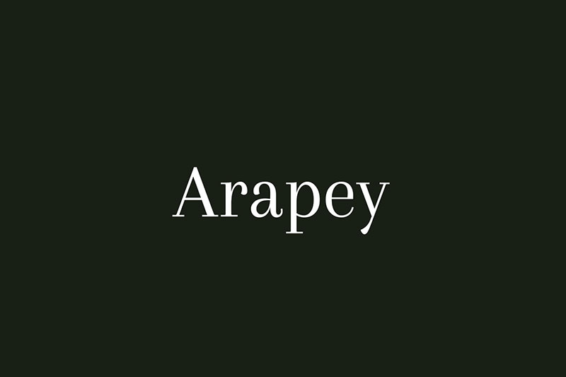
Eduardo Tunni designed Arapey as a contemporary take on Bodoni aesthetics. Named after a town in Uruguay, it brings modern sensibility to classic proportions.
Classification & Style
Modern serif with Bodoni features
Soft lines and refined finishes distinguish it from strict Bodoni interpretations. Vertical stress with moderate contrast.
Contemporary design thinking applied to traditional structures.
Design Features
Softer stroke transitions than geometric Bodoni. Serifs maintain elegance without severe hairlines.
The lowercase and uppercase ‘q’ show distinct character. The ‘y’ terminal differs noticeably from Bodoni’s version.
Two styles: Regular and Italic. Limited weight options keep the family focused.
Best Use Cases
Headlines and short text blocks
Wedding invitations and formal stationery. Luxury product packaging and brand identity.
Editorial pull quotes and callout text. Fashion lookbooks and high-end catalogs.
Best displayed at 18pt and above. The thin strokes struggle below 14pt.
Comparison to Bodoni
Arapey shows gentler contrast and softer curves. Bodoni’s geometric precision gives way to organic refinement in Arapey.
Most letterforms match Bodoni closely. Subtle differences in ‘q’ and ‘y’ reveal the modern interpretation.
Choose Arapey for projects wanting Bodoni’s sophistication with contemporary softness. The limited weights work for focused branding applications.
Availability & Licensing
Google Fonts (free)
SIL Open Font License permits commercial use. Two-style family keeps the package manageable.
Ideal for designers seeking Bodoni alternatives without extensive weight requirements.
Prata
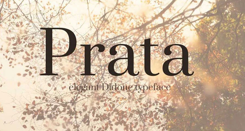
Ivan Petrov designed this Didone for modern applications. The high contrast style features sharp details balanced by organic curves.
Classification & Style
Didone with modern refinements
Triangular serifs and teardrop terminals define the character. Vertical stress with strong thick/thin contrast.
Virile serifs contrast with soft refined curves.
Design Features
Sharp triangular serifs accent thin strokes. Teardrop terminals add elegance to lowercase letters.
The ‘y’ differs significantly from Bodoni’s approach. Minor variations in lowercase ‘g’ show modern interpretation.
Single weight Regular limits applications but ensures consistent results.
Best Use Cases
Display headlines
Fashion editorial mastheads. Luxury brand identity and packaging.
Works effectively at 16pt and above due to high contrast. The design demands attention in display settings.
Not suitable for body text or extended reading. Pair with clean sans-serif font for readability.
Comparison to Bodoni
Prata matches Bodoni in most letterforms. Key differences appear in ‘y’ and ‘g’.
Bodoni offers more weight options and optical sizes. Prata provides single-weight simplicity.
Choose Prata when projects need free Bodoni aesthetics with distinctive personality. The triangular serifs add sharpness to designs.
Availability & Licensing
Google Fonts (free)
Open source license covers all uses. Single weight makes font selection straightforward.
Third-tier alternative after Bodoni Moda and Libre Bodoni for free Bodoni-style needs.
Cardillac
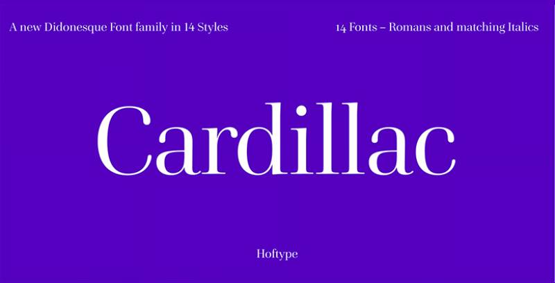
This ultra-condensed modern serif pushes contrast to dramatic extremes. The design emphasizes vertical compression and striking visual impact.
Classification & Style
Ultra-condensed modern serif
Extreme vertical stress with condensed proportions. Very high contrast between thick and thin strokes.
The compression creates distinctive personality unavailable in standard-width designs.
Design Features
Extremely narrow letter width maximizes space efficiency. Hairline serifs and connecting strokes maintain readability despite condensation.
The vertical emphasis becomes pronounced through narrow construction. Ball terminals appear compressed but recognizable.
Limited weight availability focuses the design direction.
Best Use Cases
Tight headline spaces
Magazine columns with narrow layouts. Vertical signage and poster typography.
Fashion editorial where space constraints demand efficiency. Branding requiring maximum impact in minimal width.
Only works at display sizes above 24pt. The extreme condensation and contrast fail at smaller sizes.
Comparison to Bodoni
Cardillac condenses Bodoni’s proportions dramatically. Bodoni maintains classical width relationships.
Both share extreme contrast philosophy. Cardillac sacrifices some elegance for spatial efficiency.
Choose Cardillac when horizontal space limits make standard Bodoni impractical. The condensed proportions solve specific layout challenges.
Availability & Licensing
Typically available through commercial foundries. Check specific vendors for licensing terms and pricing.
Less widely distributed than mainstream Bodoni alternatives.
Voga
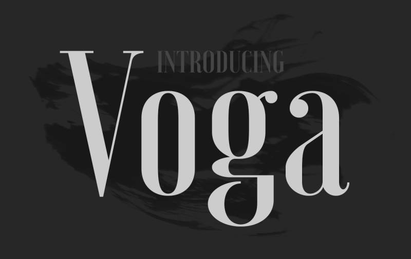
Charles Daoud created this condensed Didone combining elegance with contemporary edge. The design embraces contrast principles to create glamorous display typography.
Classification & Style
Condensed modern Didone
Built on contrast principles: curves versus straight lines, hairlines versus thick stems, ball terminals versus geometric serifs.
The condensed construction provides elegant space efficiency.
Design Features
Extreme contrast between stroke weights. Geometric serifs meet organic ball terminals.
Condensed proportions maintain readability despite narrow construction. Unique letterforms based on contrast philosophy.
Three weights: Regular, Medium, Bold. Extensive glyph set supports multiple languages.
Best Use Cases
Display typography and large settings
Fashion brand identities and luxury packaging. Magazine mastheads and editorial titles.
Advertising headlines and poster typography. Wedding stationery and formal invitations.
Readable at text sizes despite display optimization. Works best above 16pt for maximum impact.
Comparison to Bodoni
Voga condenses Bodoni’s proportions while amplifying contrast. Bodoni maintains classical width.
Both draw inspiration from iconic Didone characteristics. Voga pushes stylistic boundaries further with “sexy” design philosophy.
Choose Voga for projects demanding glamour and sophistication. The condensed proportions work when space efficiency matters.
Availability & Licensing
Medium weight free for personal and commercial use. Full family (Regular, Medium, Bold) available from North Type.
MyFonts and Behance offer purchase options. The free medium weight provides generous access for most projects.
Basilia
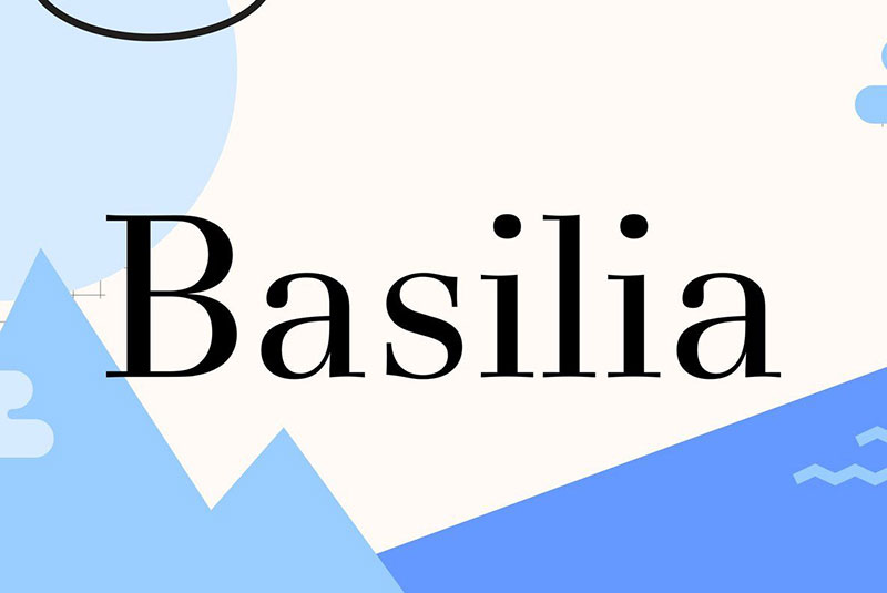
André Gürtler designed Basilia in 1968 for Haas Type Foundry. This modern serif deliberately departs from strict Bodoni interpretation while maintaining modern classification.
Classification & Style
Modern serif with soft, open character
Classical strong stroke contrast with robust verticals and fine horizontals. Deliberately avoids Bodoni’s angular, narrow spacing.
Lighter, more transparent than historical models.
Design Features
Softer stroke curves than geometric Bodoni. Round forms show much gentler treatment in curves.
Straight horizontal serifs at right angles maintain modern rigidity. The design avoids stiff, vertical grid-like strokes.
Six styles available including normal, italic, and bold. Originally designed for hot metal then adapted to filmsetting.
Best Use Cases
Text and display applications
Book typography and extended reading. The design specifically targeted text use rather than display-only applications.
Professional publications requiring modern elegance without reading difficulty. Corporate communications and annual reports.
Works effectively from 9pt through display sizes. The optical considerations make it versatile across size ranges.
Comparison to Bodoni
Basilia rejects Bodoni’s round letter angularity. The spacing opens considerably compared to Bodoni’s tight construction.
Bodoni emphasizes geometric precision. Basilia prioritizes transparency and legibility.
Choose Basilia when projects need modern serif aesthetics without Bodoni’s reading challenges. The design explicitly addresses Bodoni’s limitations.
Availability & Licensing
Linotype offers Basilia through commercial licensing. Available through Monotype Fonts subscription service.
Professional-grade pricing reflects limited distribution. Less common than mainstream Bodoni alternatives.
Filosofia
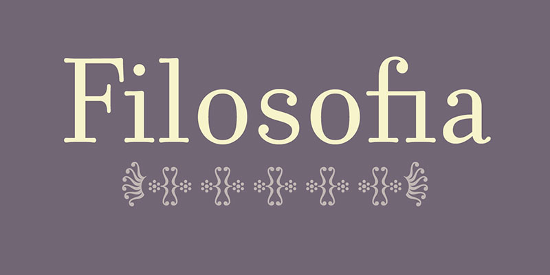
Zuzana Licko designed this Bodoni interpretation for Emigre in 1996. It shows personal geometric preferences while incorporating letterpress heritage.
Classification & Style
Geometric Bodoni interpretation
Personal geometric approach to Bodoni’s model. Slightly bulging round serif endings reflect printed Bodoni samples.
Rugged text version contrasts with refined display version.
Design Features
The Regular family reduces contrast for text applications. Grand family increases delicacy for display settings.
Bulging serif endings acknowledge letterpress technology. These subtle bulges appeared in historical Bodoni printing.
Unicase variant included in Grand package. Filosofia Parma variation features increased x-height.
Best Use Cases
Text and display flexibility
Book typography with Regular family. Magazine headlines with Grand family.
Branding projects requiring both text and display weights. Editorial design needing cohesive family across size ranges.
Regular works at 9-12pt for body text. Grand shines at 18pt and above for display purposes.
Comparison to Bodoni
Filosofia interprets rather than copies Bodoni. The geometric preference creates distinct personality.
Bodoni follows historical models closely. Filosofia makes deliberate stylistic choices reflecting designer vision.
Choose Filosofia when projects need Bodoni spirit with contemporary digital optimization. The text/display split addresses practical needs.
Availability & Licensing
Emigre Fonts offers Filosofia commercially. Also available through Adobe Fonts with Creative Cloud subscription.
Professional licensing required. Prices vary by package (Regular family versus Grand family).
Ambroise
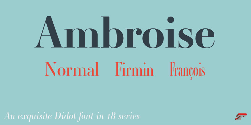
Jean François Porchez designed this revival family named after the Didot family member. It captures 18th century French typography with contemporary refinement.
Classification & Style
Modern serif/Didone revival
Based on Firmin Didot’s work with refined details. High contrast with vertical stress following Didone conventions.
Multiple optical sizes address historical size-specific design practices.
Design Features
Optical sizes range from small text to large display. Each size features adjusted proportions and contrast levels.
Sharp serifs and clean geometry maintain modern classification. The design respects historical models while incorporating digital advantages.
Extensive weight range covers light through black. Complete italic range accompanies all weights.
Best Use Cases
Professional editorial and branding
Book design requiring sophisticated typography. Magazine layouts with varied text sizes.
Luxury brand identities demanding refinement. Annual reports and corporate communications.
The optical sizing makes it versatile across all applications from footnotes to billboards.
Comparison to Bodoni
Ambroise follows Didot more than Bodoni. Both come from the same Didone tradition.
Bodoni shows Italian character. Ambroise maintains French typographic heritage.
Choose Ambroise when projects specifically reference French neoclassical design. The optical sizing provides professional flexibility.
Availability & Licensing
Available through typofonderie (Jean François Porchez’s foundry). Commercial licensing required.
Professional-grade pricing reflects comprehensive optical size range. Less commonly available than mainstream alternatives.
Bauer Bodoni

Heinrich Jost drew this Bodoni revival for Bauer Type Foundry in 1926. It emphasizes extreme contrast between hairline and main strokes.
Classification & Style
Modern serif emphasizing maximum contrast
Geometric precision with vertical stress. The most dramatic contrast of major Bodoni revivals.
Faithful to Bodoni’s spirit while amplifying key characteristics.
Design Features
Hairlines pushed to extreme thinness. Main strokes maintain robust weight for maximum differentiation.
Punches cut by Louis Hoell. The first two weights with italics released 1926-27. Bold added 1952, Bold Italic 1955.
Eight styles available including multiple weights and italics.
Best Use Cases
Display typography
High-fashion editorial headlines. Luxury brand identities requiring maximum sophistication.
Print advertising on quality paper stock. The extreme contrast demands proper printing conditions.
Not recommended below 18pt. Hairlines disappear at smaller sizes or on low-resolution output.
Comparison to Bodoni
Bauer Bodoni pushes contrast beyond most Bodoni interpretations. It represents the most extreme viable Bodoni aesthetic.
Other Bodoni revivals moderate contrast for versatility. Bauer commits fully to dramatic differentiation.
Choose Bauer Bodoni when projects demand maximum visual drama. The extreme contrast creates undeniable presence.
Availability & Licensing
Linotype distributes Bauer Bodoni. Available through Monotype Fonts and professional font vendors.
Commercial licensing required. Classic revival commands professional pricing.
ITC Bodoni

Sumner Stone led this comprehensive 1994 Bodoni revival focusing on optical sizing. The design team included Holly Goldsmith, Janice Prescott Fishman, and Jim Parkinson.
Classification & Style
Optically-sized modern serif system
Three size-specific designs: ITC Bodoni Six, Twelve, and Seventy-Two. Each optimized for specific point size ranges.
Based on different Bodoni originals appropriate to each size.
Design Features
ITC Bodoni Six (based on Filosofia) handles 6pt setting with reduced contrast. ITC Bodoni Twelve designed for 12pt body text with moderate adjustments. ITC Bodoni Seventy-Two (based on Papale) maximizes drama for display settings.
Each size includes roman, italic, bold variants. Swash capitals available in Seventy-Two Italic.
Best Use Cases
Professional multi-size applications
Book design requiring both text and display. Editorial layouts with varied hierarchy needs.
Corporate communications spanning footnotes to headlines. Packaging requiring size flexibility.
Use Six for captions and small text. Deploy Twelve for body copy. Reserve Seventy-Two for headlines.
Comparison to Bodoni
ITC Bodoni resurrects historical size-specific practice. Single-master Bodonis use optical scaling without design adjustment.
Original Bodoni created 140+ romans for different sizes. ITC Bodoni follows this principle with three key sizes.
Choose ITC Bodoni for professional projects requiring proper optical sizing. The approach respects historical typography practices.
Availability & Licensing
ITC through Monotype Fonts and font retailers. Adobe Fonts includes ITC Bodoni with Creative Cloud.
Professional licensing required. The comprehensive system commands higher pricing than single-master alternatives.
Bodoni Recut
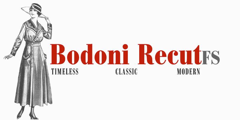
This contemporary reinterpretation aims for faithful reproduction of Bodoni’s original designs. Limited information available suggests focused historical accuracy.
Classification & Style
Modern serif emphasizing historical accuracy
Based on careful study of Bodoni’s original punches and specimens. Vertical stress with high contrast following original models.
The recut approach prioritizes authenticity over modern adaptation.
Design Features
Details drawn from examination of Bodoni’s steel punches. Characteristics match historical specimens rather than later interpretations.
Serif treatment and stroke modulation follow original proportions. The design resists modernization trends affecting other revivals.
Availability and weight range varies by specific recut version.
Best Use Cases
Projects requiring historical authenticity
Period-appropriate typography for historical publications. Museum and cultural institution materials.
Editorial projects specifically referencing Bodoni heritage. Academic publications about typography history.
Use when historical accuracy matters more than digital optimization.
Comparison to Bodoni
Bodoni Recut attempts closest reproduction of original designs. Most Bodoni revivals adapt characteristics for contemporary use.
Other revivals balance history with practicality. Recut versions prioritize faithful reproduction.
Choose Bodoni Recut when projects demand period-appropriate typography. Accept potential digital rendering limitations for historical accuracy.
Availability & Licensing
Distribution varies by specific recut version. Some available through specialty foundries focusing on historical revivals.
Commercial licensing typically required. Availability less widespread than mainstream Bodoni alternatives.
FAQ on Fonts Similar To Bodoni
What is the closest free alternative to Bodoni?
Bodoni Moda from Google Fonts delivers the most authentic Bodoni experience without cost. It includes variable font technology with nine weights plus italics. Libre Bodoni offers another strong option, based on ATF’s historical revival and optimized for web rendering.
Which Bodoni alternative works best for body text?
ITC Bodoni Twelve was specifically designed for body copy around 12pt. Filosofia Regular reduces contrast for text applications. Most display-oriented Bodoni alternatives fail below 14pt due to hairline stroke degradation at smaller sizes.
Are Didot and Bodoni the same font?
No. Both are Didone typefaces from the late 1700s but come from different designers. Didot originated in France with the Didot family. Bodoni came from Italian printer Giambattista Bodoni. Didot shows slightly more rigid vertical stress.
What’s the difference between Bauer Bodoni and ITC Bodoni?
Bauer Bodoni emphasizes extreme contrast in a single optical size. ITC Bodoni provides three size-specific designs (Six, Twelve, Seventy-Two) with adjusted proportions for each range. ITC follows historical practices of creating different designs per size rather than scaling one master.
Can I use Playfair Display instead of Bodoni?
Playfair Display works as a transitional alternative with less extreme contrast. It shares Bodoni’s elegance but retains more warmth through organic curves. The letterforms read better at smaller sizes. However, purists notice the stylistic differences immediately in side-by-side comparison.
Which Bodoni alternative has the most weights?
Monotype’s Walbaum restoration includes 32 weights across optical sizes from 6pt to 96pt. The family spans hairline display weights through heavy black styles. ITC Bodoni offers extensive options across its three size-specific families with multiple weights per optical size.
Is Filosofia a good Bodoni substitute?
Filosofia interprets rather than copies Bodoni. Designer Zuzana Licko added geometric preferences and bulging serif endings reflecting letterpress heritage. The Regular family works for text while Grand handles display applications. It captures Bodoni’s spirit with distinct personality.
What Bodoni alternative works best for fashion branding?
Voga delivers condensed glamour specifically for fashion applications. Didot remains the industry standard for luxury fashion typography. Bauer Bodoni provides maximum drama for high-contrast editorial work. Choose based on whether you need condensed proportions or classical width.
Why do Bodoni fonts look bad on screens?
Extreme hairline strokes disappear at low resolutions or small sizes. The dazzle effect from alternating thick and thin strokes strains readability. Bodoni Moda and Libre Bodoni solve these issues through digital optimization. Variable fonts help by adjusting proportions per size.
Which serif fonts pair well with Bodoni alternatives?
Pair Didone display fonts with clean sans-serifs like Helvetica or Futura for body text. Geometric sans-serifs complement the mathematical precision of modern serifs. Avoid pairing two high-contrast serifs together. The competing hairlines create visual chaos and reading difficulty.
Conclusion
The search for fonts similar to Bodoni ends with understanding your specific needs. Display typography demands different solutions than body text applications.
Free options like Playfair Display and Libre Bodoni handle web projects admirably. Professional work benefits from ITC Bodoni’s optical sizing or Walbaum’s warmth.
Fashion brands gravitate toward Didot’s French elegance or Voga’s condensed glamour. Editorial designers appreciate Filosofia’s geometric interpretation.
The extreme contrast that defines Didone typography comes with tradeoffs. Hairline serifs demand quality paper stock in print and careful size selection for digital.
Test your shortlisted typefaces at actual usage sizes. What looks sophisticated at 72pt might disappear at 12pt.
Consider pairing your chosen modern serif with a sans-serif for body text. The combination balances elegance with legibility across your typographic hierarchy.
Budget, licensing terms, and weight availability matter as much as aesthetic appeal.
If you enjoyed reading this article on fonts similar to Bodoni, you should check out these articles with fonts similar to Gotham, Garamond, Helvetica, Futura, Times New Roman, Raleway, Lato, Roboto, and Optima.

Renowned for his expertise in logo design and visual branding, Bogdan has developed a multitude of logos for various clients.
His skills extend to creating posters, vector illustrations, business cards, and brochures. Additionally, Bogdan's UI kits were featured on marketplaces like Visual Hierarchy and UI8.
He also wrote in the past years on sites like Design Your Way, WebDesignerDepot, WPDean, Designmodo, Speckyboy, Slider Revolution, and more.
- The Beehiiv Logo History, Colors, Font, And Meaning - 18 September 2026
- Why Small Teams Wait Too Long to Bring On Specialist Engineers - 17 September 2026
- Versatile Work Sans Font Pairing for Every Project - 16 September 2026

Bogdan Sandu is a seasoned designer who has been designing websites since 2008. Renowned for his expertise in logo design and visual branding, Bogdan has developed a multitude of logos for various clients. His skills extend to creating posters, vector illustrations, business cards, and brochures. Additionally, Bogdan's UI kits were featured on marketplaces like Visual Hierarchy and UI8. He also wrote in the past years on sites like Design Your Way, WebDesignerDepot, WPDean, Designmodo, Speckyboy, Slider Revolution, and more.
You Might Also Like