A woman floats face-up in dark water, wearing a coat. That was Prada ads in 1997, shot by Glen Luchford, and the brand has been removing things from the frame ever since.
Prada advertising covers 41 years, from a 1985 Helmut Newton print run to the 2026 campaign built by artist Anne Collier.
The names behind it are worth knowing: Steven Meisel, Willy Vanderperre, Ferdinando Verderi, Wes Anderson, Roman Polanski.
This page covers the campaigns with their years, photographers and markets, plus the layout logic underneath them:
- Campaign-by-campaign breakdown, 1996 to 2026
- How the print composition and typography actually work
- Why the short films exist instead of TV spots
Prada advertising covers 41 years, 9 lead photographers and 6 flagship campaigns, from a 1985 Italian print run shot by Helmut Newton to “Image of an Image”, released in January 2026.
The work runs on austere black-and-white photography, cinematic staging and almost no copy. Magazines, billboards and short film carry most of it.
This page covers the campaigns by name, with the photographer, year and market behind each one, plus the composition and typographic decisions that hold them together.
Prada Advertising at a Glance
Prada has advertised since 1985, working with Glen Luchford, Steven Meisel and Willy Vanderperre under art directors David James and Ferdinando Verderi. Its best-known campaigns are the Luchford cinematic series, Prada Candy and Prada Re-Nylon. Black, white and the inverted triangle carry the identity.
| Attribute | Value |
|---|---|
| First major campaign | 1985, Italy, shot by Helmut Newton (“The Impression”) |
| Lead photographers | Peter Lindbergh, Glen Luchford, Steven Meisel, Willy Vanderperre, David Sims, Oliver Hadlee Pearch |
| Art directors | David James (from 1996), Ferdinando Verderi (2020 onward) |
| Best-known campaigns | Prada 96-98, Prada Candy, Re-Nylon “What We Carry,” Prada Galleria, “Image of an Image” |
| Primary media | Print, billboards, cinema, short film, social video |
| Awards (Verderi) | Cannes Grand Prix, D&AD, Grand Clio (Business of Fashion) |
| Visual signature | Black and white, Didone-style serif logotype, inverted triangle, wide empty margins |
| Recurring device | Almost no headline copy; the image argues with itself |
Which Prada Ad Campaigns Are the Most Famous?
Six campaigns define the house: Glen Luchford’s cinematic series (1996-1998), the Steven Meisel era (2004-2016), Prada Candy (2011-2013), Re-Nylon “What We Carry” (2019-2021), the Galleria short films (2023-2025) and “Image of an Image” (2026).
Prada 96-98 by Glen Luchford (1996-1998)

Luchford shot the Prada campaigns from 1996 to 1998 under an exclusive contract signed in 1997, with Amber Valletta as the recurring face. The images borrowed from Stanley Kubrick and Andrei Tarkovsky rather than from fashion photography.
Production scale drove the look. The autumn/winter 1997 image required closing a stretch of the Tiber in Rome and shooting in the last ten minutes of daylight, with kerosene-soaked hay bales burning to fake mist (Luchford, via The Guardian).
The V&A holds the spring/summer 1997 Cibachrome print of Valletta floating in dark water, given by the photographer.
The Steven Meisel Era (2004-2016)

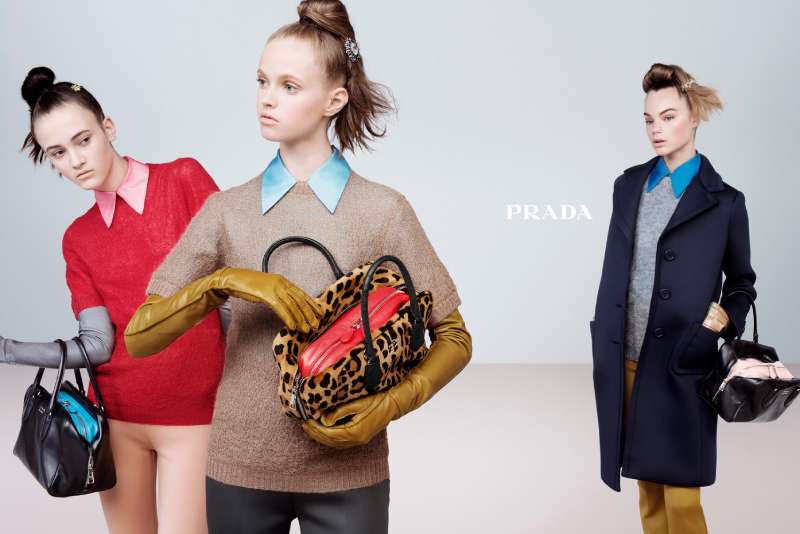
Format: studio and set-built group portraits, saturated color, many models per frame.
Duration: Meisel shot every Prada campaign between 2004 and 2016 (SHOWstudio).
Return: holiday 2020 in black and white, then spring/summer 2025 with Carey Mulligan.
The 2025 campaign, “Act Like Prada”, cast Mulligan as ten separate invented characters, each with its own haircut, posture and decade. It was Meisel’s first Prada campaign in ten years.
Prada Candy (2011-2013)
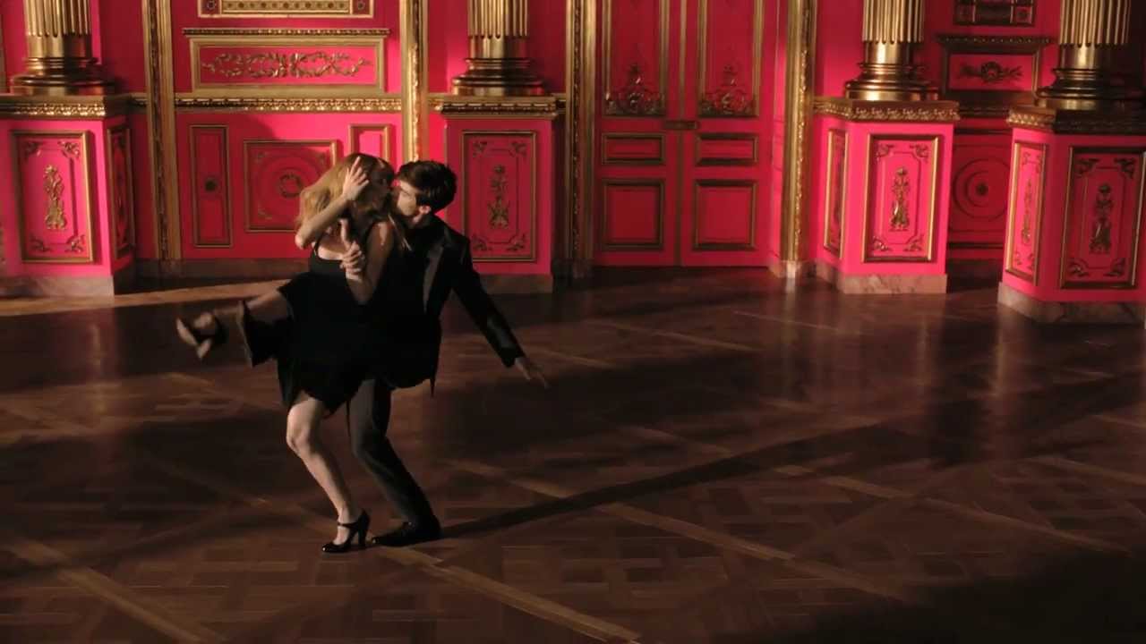
Wes Anderson and Roman Coppola directed a three-part film series for Prada Candy L’Eau in March 2013, starring Lea Seydoux as Candy opposite two suitors. Symmetrical framing, pastel sets and French dialogue placed the fragrance inside a Nouvelle Vague pastiche.
Anderson also directed Castello Cavalcanti for Prada, an 8-minute short with Jason Schwartzman, filmed at Cinecitta in Rome and released 13 November 2013.
- Cinematography by Darius Khondji
- Distributed by Prada rather than by a broadcaster
Prada Re-Nylon: What We Carry (2019-2021)
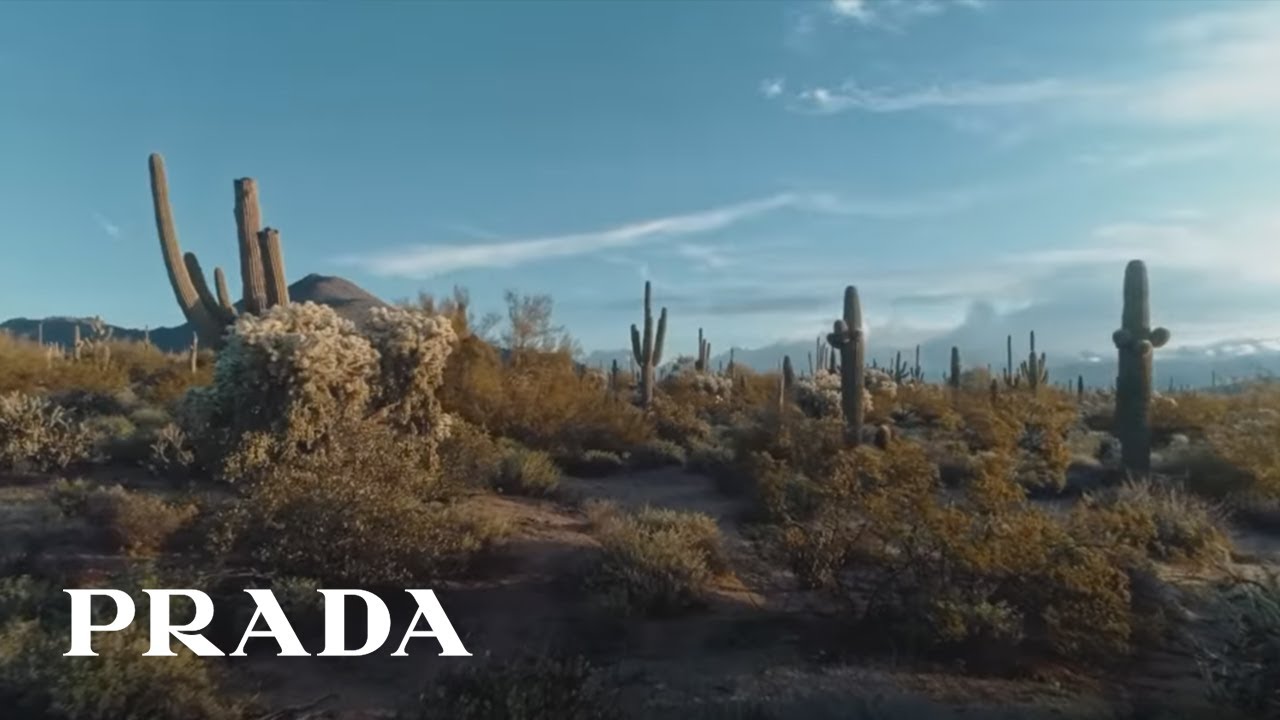
National Geographic CreativeWorks produced 5 films across 5 continents to document the ECONYL supply chain behind the Re-Nylon bag collection, launched 24 June 2019.
Episodes were shot in Arizona, Cameroon, New Zealand, China and Slovenia, each pairing a National Geographic explorer with a Prada ambassador such as Bonnie Wright or Adut Akech Bior.
National Geographic reports 2.7 million video views in 5 months and 35% higher dwell time than the site average over the same period.
Prada Galleria Short Films (2023-2025)

Prada rebuilt the Galleria handbag campaign as an annual director slot with Scarlett Johansson as the constant.
| Year | Director | Treatment |
|---|---|---|
| 2023 | Alex Da Corte | Pop-art color blocks, 1960s styling |
| 2024 | Jonathan Glazer | Monochrome close-ups, Shakespeare monologues |
| 2025 | Yorgos Lanthimos | “Ritual Identities,” Johansson as several selves |
The bag stays fixed while the authorship rotates. That is the whole mechanism.
Image of an Image (2026)

The spring/summer 2026 campaign photographs photographs. American artist Anne Collier built still-life compositions in which anonymous hands hold up printed images of the collection, shot separately by Oliver Hadlee Pearch.
Cast inside those held prints: Carey Mulligan, Nicholas Hoult, Damson Idris, Hunter Schafer, Levon Hawke, Liu Wen and musician John Glacier. Creative direction by Ferdinando Verderi, under Miuccia Prada and Raf Simons.
Prada Fragrance Print Ads and Films (2021-2024)
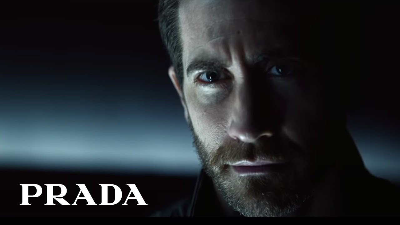
Luna Rossa Ocean (2021): Jake Gyllenhaal, shot by Solve Sundsbo, film directed by Johan Renck. First Prada scent under the L’Oreal license.
Paradoxe (2022): Emma Watson starred and made her directorial debut. Industry sources put first-year retail sales near $100 million (WWD).
Beyond the Line (2024): a three-part documentary following Gyllenhaal aboard the Luna Rossa racing boat.
In Europe and North America combined in 2023, the Prada fragrance business ranked 15th among selective fragrances and grew close to four times faster than that market (WWD).
How Do Prada Print Ads Work Visually?
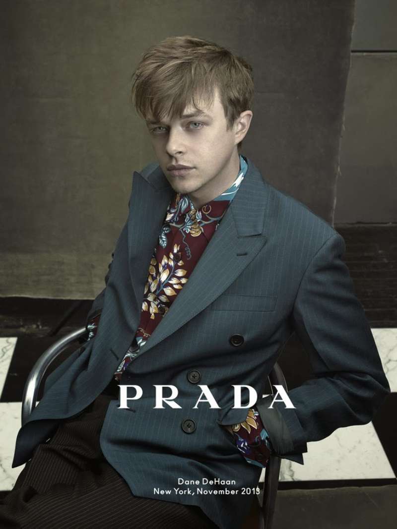
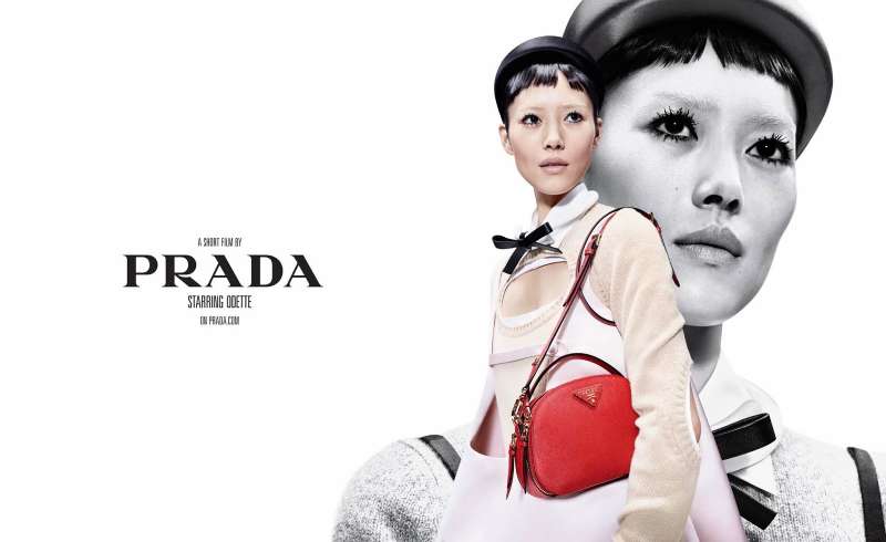
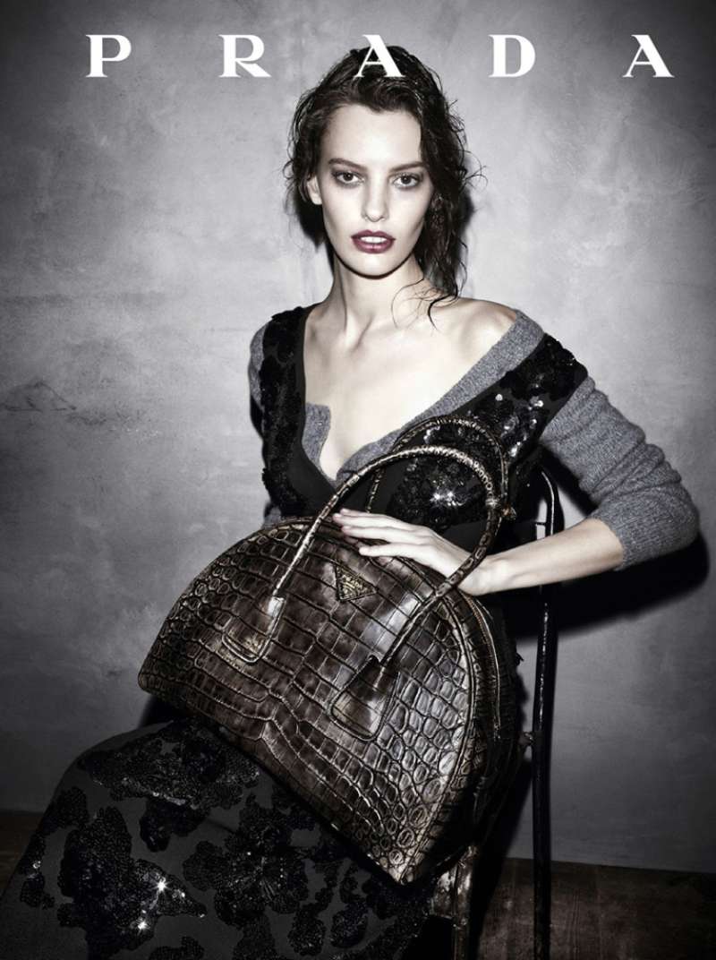
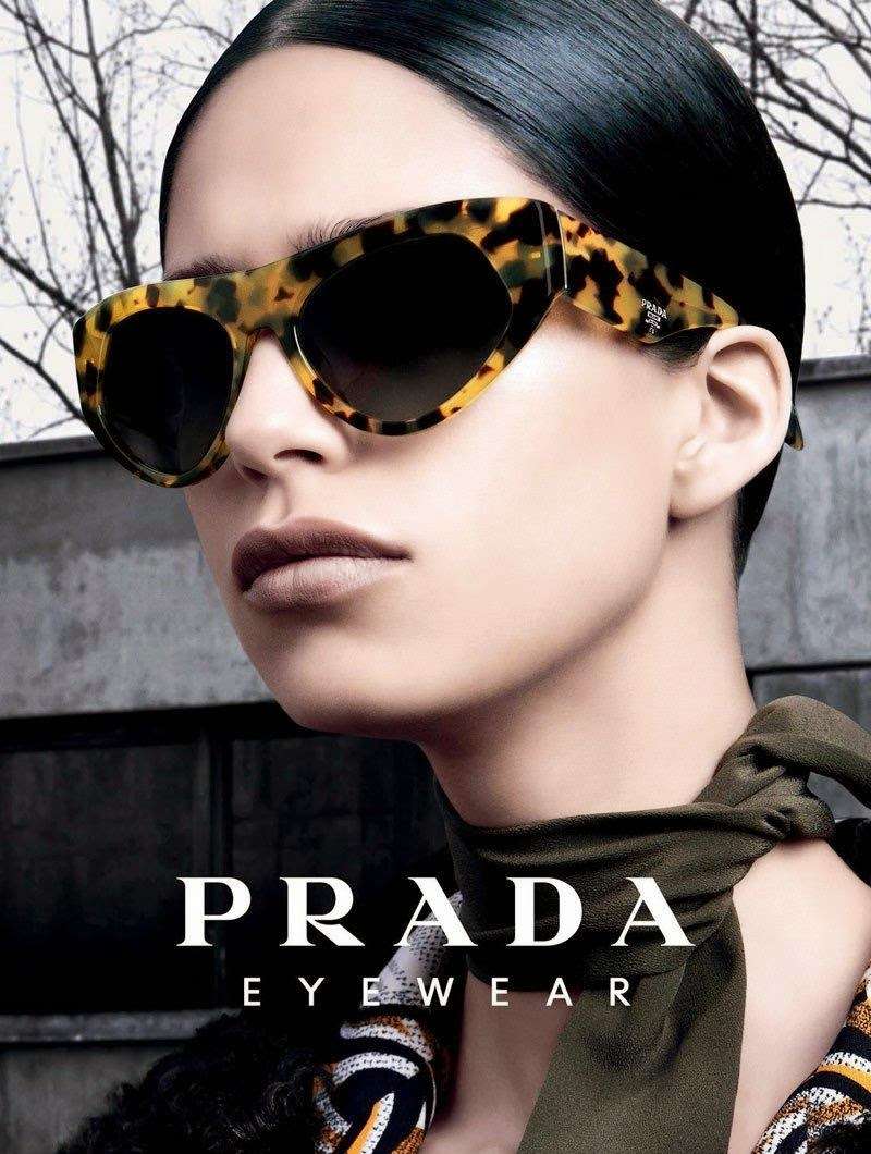
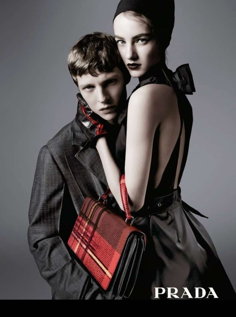
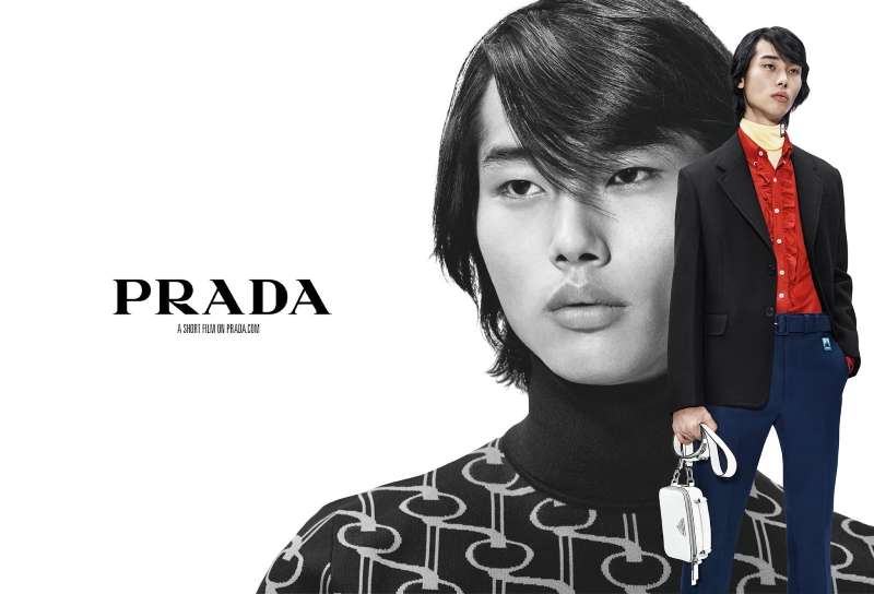
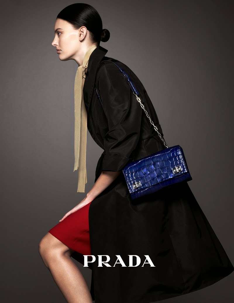
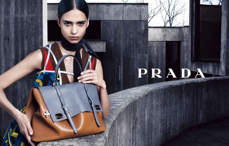
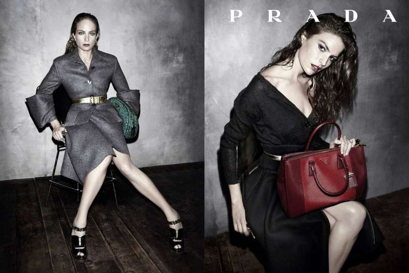
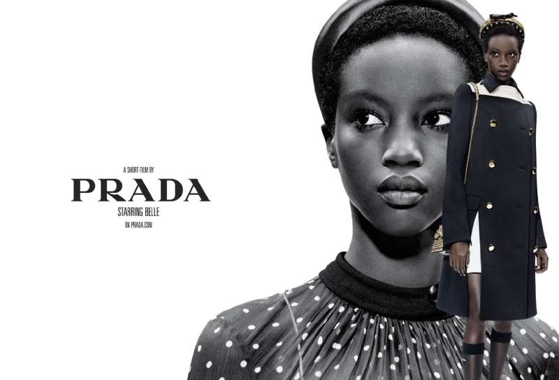
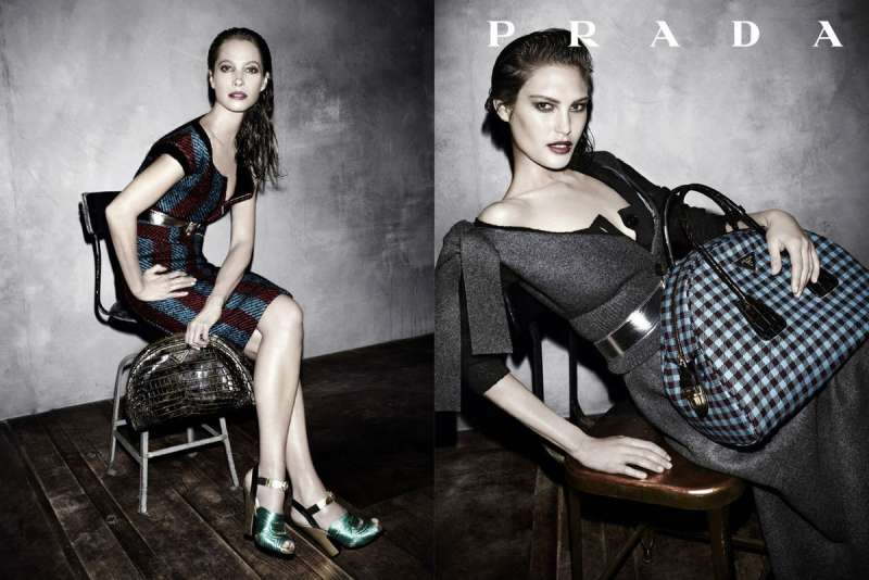
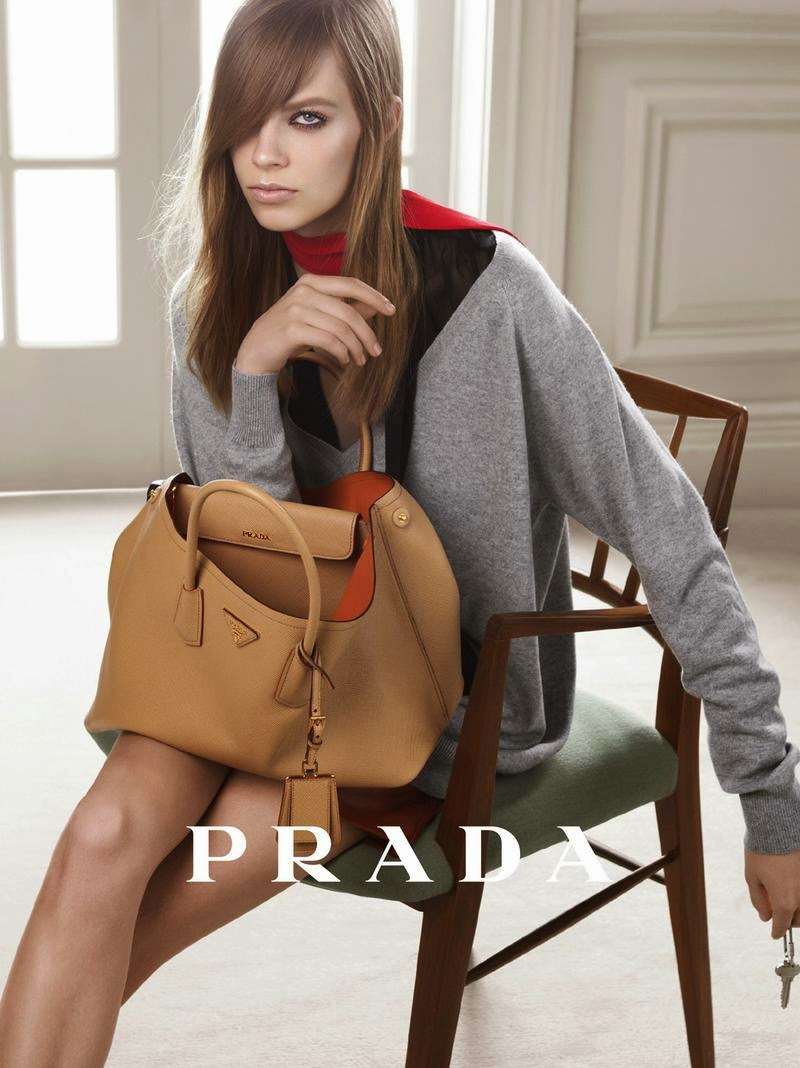
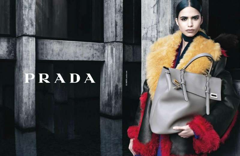
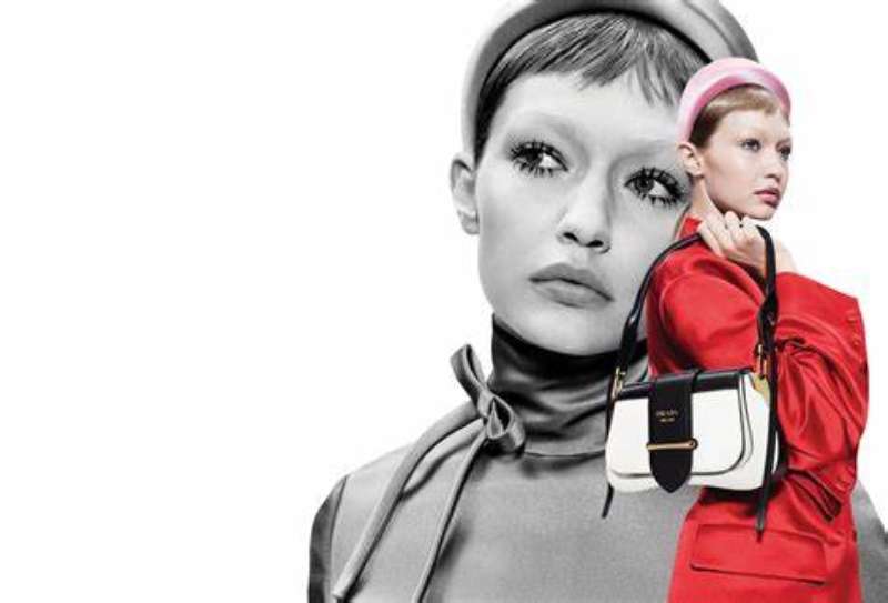
Prada print ads run on three constants: a single figure held off-center, heavy empty margin around the subject, and the logotype set small at the top or bottom edge. Color is subtracted rather than added. Copy is usually absent.
The logotype does the identity work alone. It is a high-contrast serif of the Didone family, tall and narrow, with hairline thins against heavy stems. Set at 6% to 10% of the page width, it reads as a caption rather than a headline.
The figure is never centered. Prada layouts push the subject toward a third of the frame and let the remaining white space carry the tension. That off-balance placement is what gives the pages their unease.
Because there is no headline competing for attention, the visual hierarchy is short: face, garment, logotype. Three stops, in that order.
Color follows the same subtraction. Even in seasons with saturated clothes, backgrounds stay in monochrome colors or single flat fields, so the garment becomes the only focal point in the frame.
Look at the 2026 Collier images against a 2005 Meisel spread and the grammar holds. Different decade, same three stops.
How Do Prada TV Commercials Differ From Its Print Ads?
Prada rarely makes conventional television spots. The house commissions short films from feature directors instead, running 3 to 8 minutes, released online and at festivals rather than in broadcast slots. Print states; film narrates.
| Dimension | Print ads | Short films |
|---|---|---|
| Author | Photographer | Feature film director |
| Length | Single frame | 3 to 8 minutes |
| Copy | Logotype only | Scripted dialogue |
| Placement | Magazines, billboards | Prada.com, YouTube, Cannes |
A Therapy (2012). Roman Polanski directed a 4-minute comedy with Ben Kingsley as an analyst who becomes fixated on his patient’s fur coat while Helena Bonham Carter talks. Alexandre Desplat scored it. It screened at Cannes Classics on 22 May 2012.
Thunder Perfect Mind (2005). Ridley and Jordan Scott co-directed a fragrance film with Daria Werbowy reading a Coptic gnostic poem on a Berlin subway car. The product appears only at the end.
Prada Candy L’Eau (2013). Anderson and Coppola’s three episodes ran roughly three minutes each and were released as a series, not a cutdown.
This is where Prada does its storytelling. The print work refuses narrative on purpose, so the films absorb all of it.
How Has Prada Advertising Evolved Since 1985?
Prada advertising moved through 5 phases: photographer-led noir in the 1980s, narrative cinema from 1996, saturated studio group portraits from 2004, concept-first communication from 2017, and artist collaborations that comment on advertising itself from 2023.
| Period | Shift | Representative work |
|---|---|---|
| 1985-1995 | Photographer sets the mood, brand follows | Helmut Newton, then Peter Lindbergh with Christy Turlington and Naomi Campbell |
| 1996-2003 | David James shifts the question from “who” to “what” | Glen Luchford, Amber Valletta |
| 2004-2016 | Studio scale, color saturation, model groups | Steven Meisel |
| 2017-2022 | Concept ahead of image; campaigns become objects | Willy Vanderperre; the 2020 resort campaign wrapped around flowers in florists |
| 2023-2026 | Artists and directors invited to critique the format | Glazer, Lanthimos, Anne Collier |
The 1996 art-director appointment is the real hinge. Before David James, the pictures were about the person in them. After, they were about the situation the person was placed in.
The casting logic changed too. Where the 1990s ran on supermodels, recent seasons run on actors and musicians, which puts Prada in the same category as most luxury houses now leaning on famous brand ambassadors for reach.
Which Agencies Created Prada Advertising?
Prada keeps creative direction close to the house rather than handing it to a network agency. Three named parties do the work: in-house art direction, Ferdinando Verderi as external creative director, and specialist partners for branded content and fragrance.
David James joined Prada as art director in 1996 and commissioned Glen Luchford’s 1997 campaign, the point where narrative and location work entered the brand.
Ferdinando Verderi has directed Prada campaign creative since 2020. Verderi co-founded Johannes Leonardo in New York in 2007 and is represented for fashion work by Art Partner. He has won the Cannes Grand Prix, D&AD and Grand Clio awards, and was the most awarded creative in the fashion and beauty prestige category for two consecutive seasons (Business of Fashion).
National Geographic CreativeWorks produced the Re-Nylon films as Prada’s storytelling partner in 2019. L’Oreal Luxe has managed Prada Beauty and fragrance since January 2021, taking the license from Puig, and runs the Paradoxe and Luna Rossa campaigns.
Verderi’s brief across Louis Vuitton, Versace and Prada has been repositioning the visual identity and voice of each house, which explains why Prada campaigns since 2020 argue about advertising instead of simply performing it.
What Can Designers Learn From Prada Ads?
Five decisions carry across every Prada campaign since 1996, and all five transfer to layouts that have nothing to do with fashion.
- Set the wordmark small and let the image hold the page
- Push the subject off the optical center and keep the empty side empty
- Cut the headline entirely when the picture already states the idea
- Keep the background to one flat field so the garment reads as the only event
- Give the campaign a typographic hierarchy of two levels, not five
- Change the author every season and keep the object identical
The last one is the hard part. Rotating Da Corte, Glazer and Lanthimos across three Galleria campaigns worked because the bag, the logotype and the black-and-white default never moved.
How Do Prada Ads Compare to Gucci Ads?
Prada subtracts. Gucci ads accumulate. A Gucci campaign under Alessandro Michele stacked pattern, period props and dense set dressing into frames with almost no empty area, and Glen Luchford shot those too, which makes the contrast easier to read: same photographer, opposite instructions.
The nearest structural relative is Chanel ads, which also run on a restricted palette and a fixed serif wordmark. Chanel leans harder on the single ambassador and on continuity of face across years, where Prada rotates cast and author on purpose.
Louis Vuitton ads sit somewhere between the two, using monogram repetition as the constant instead of a color rule.
Commercially the approaches are not far apart. Prada Group closed 2025 with net revenues of 5.718 billion euros, up 9% year on year and a 20th consecutive quarter of growth, with the Prada brand itself at -1% retail and Miu Miu up 35%.
What Makes Prada Advertising Work?
Restraint holds it together. Four decades of campaigns share one rule: remove until only the garment, the figure and the wordmark remain.
That rule survives every change of photographer, art director and medium, which is why a 1997 billboard and a 2026 still life read as the same house.
Authorship is the variable, not the identity. Rotating photographers and directors gives each season a new voice while the black-and-white default, the small logotype and the wide margins stay fixed.
The result is a minimalist design system strong enough to absorb a Kubrick pastiche, a documentary about fishing nets and a fragrance film in French without losing its own accent.
Most brands rebuild their identity when they change creative leads. Prada changes the lead and keeps the identity. That is the whole trick, and it is harder than it looks.
Prada Ads Examples




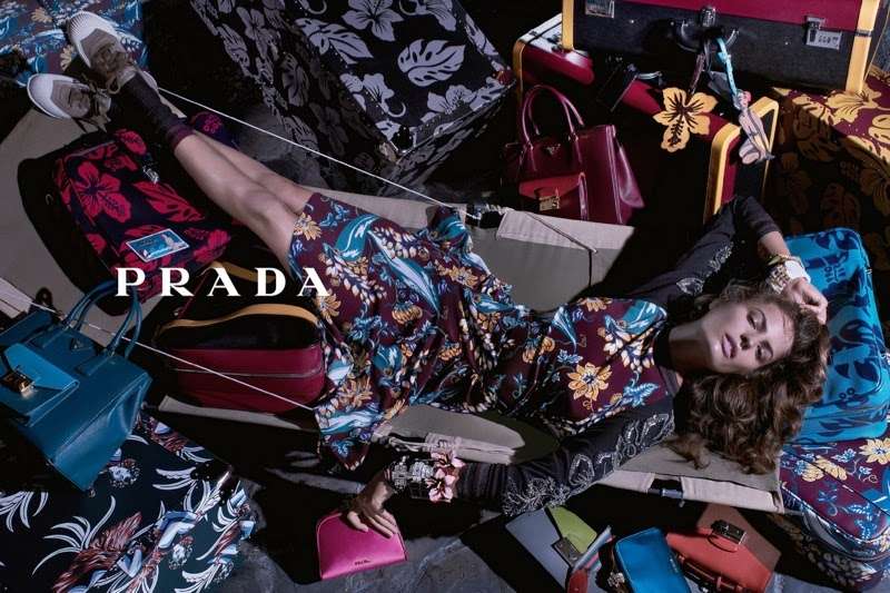
FAQ on Prada Ads
Who shoots Prada ads?
Prada has used a small rotation: Helmut Newton in 1985, Peter Lindbergh in the late 1980s, Glen Luchford from 1996, Steven Meisel from 2004, Willy Vanderperre from 2016, then David Sims and Oliver Hadlee Pearch.
What typeface appears in Prada ads?
The wordmark uses a custom high-contrast serif in the Didone family, with hairline thins against heavy stems and tall narrow capitals.
No secondary typeface appears in most layouts, because the pages carry no headline copy.
Why are Prada ads usually black and white?
Removing color removes warmth, which separates Prada from luxury houses that sell richness.
The contrast also isolates the garment, since nothing in the frame competes with it for attention.
What was the first Prada ad campaign?
A localized Italian campaign in 1985, photographed by Helmut Newton, per The Impression’s Prada advertising archive.
The mood was noir and driven largely by the photographer, since Prada was still a young designer label.
Which model is most associated with 1990s Prada ads?
Amber Valletta. She fronted the Luchford campaigns from 1996 to 1998, including the spring/summer 1997 image of her floating in dark water.
The V&A in London holds that Cibachrome print, donated by the photographer.
What is the Prada Candy ad about?
Two friends compete for the same woman in Paris. Wes Anderson and Roman Coppola directed three episodes in March 2013 for Prada Candy L’Eau, starring Lea Seydoux, built on a Jules et Jim reference.
How long are Prada campaign films?
Short. Roman Polanski’s “A Therapy” runs 4 minutes, each Candy episode roughly 3, and Wes Anderson’s “Castello Cavalcanti” 8.
Length is set by the idea, not by a media buy.
Does Prada use AI-generated ads?
Prada campaigns are commissioned photography and film with named authors.
A 2025 Journal of Advertising Research paper, titled around whether AI sells Prada, found that AI-generated advertising reduces perceived authenticity for luxury brands.
Why does Prada cast actors instead of models?
Actors carry existing narratives and regional followings that a face alone does not.
The 2026 cast ran Carey Mulligan, Nicholas Hoult, Damson Idris and Hunter Schafer, alongside regional ambassadors like Yang Mi and Kim Soo-hyun.
What does the triangle in Prada ads mean?
It started as a luggage label, then absorbed the Savoy coat of arms after the 1919 royal warrant. Milan’s arms replaced the royal symbols in 1949.
The psychology of shapes does the rest: an inverted triangle reads as precise and industrial.
Conclusion
Forty years of Prada ads come down to one habit: cut the frame back until only the essential thing is left standing.
The variables move constantly. Photographers, directors, cast, medium, market.
The constants never do. Black, white, a small serif logotype, and the inverted triangle borrowed from a luggage label.
That split explains why a Steven Meisel group portrait, a National Geographic supply-chain film and an Anne Collier still life all read as the same house.
For anyone working in art direction, the takeaway is uncomfortable but useful.
Consistency does not come from repeating a layout. It comes from defending three or four rules hard enough that new authors can push against them without breaking anything.

Renowned for his expertise in logo design and visual branding, Bogdan has developed a multitude of logos for various clients.
His skills extend to creating posters, vector illustrations, business cards, and brochures. Additionally, Bogdan's UI kits were featured on marketplaces like Visual Hierarchy and UI8.
He also wrote in the past years on sites like Design Your Way, WebDesignerDepot, WPDean, Designmodo, Speckyboy, Slider Revolution, and more.
- The Windsurf Logo History, Colors, Font, And Meaning - 10 October 2026
- How to Remove Background From Product Photos (No Photoshop) - 10 October 2026
- How Designers can Build a Stronger Online Creative Identity - 9 October 2026

Bogdan Sandu is a seasoned designer who has been designing websites since 2008. Renowned for his expertise in logo design and visual branding, Bogdan has developed a multitude of logos for various clients. His skills extend to creating posters, vector illustrations, business cards, and brochures. Additionally, Bogdan's UI kits were featured on marketplaces like Visual Hierarchy and UI8. He also wrote in the past years on sites like Design Your Way, WebDesignerDepot, WPDean, Designmodo, Speckyboy, Slider Revolution, and more.
You Might Also Like