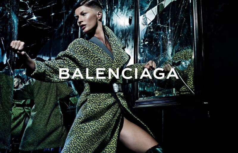
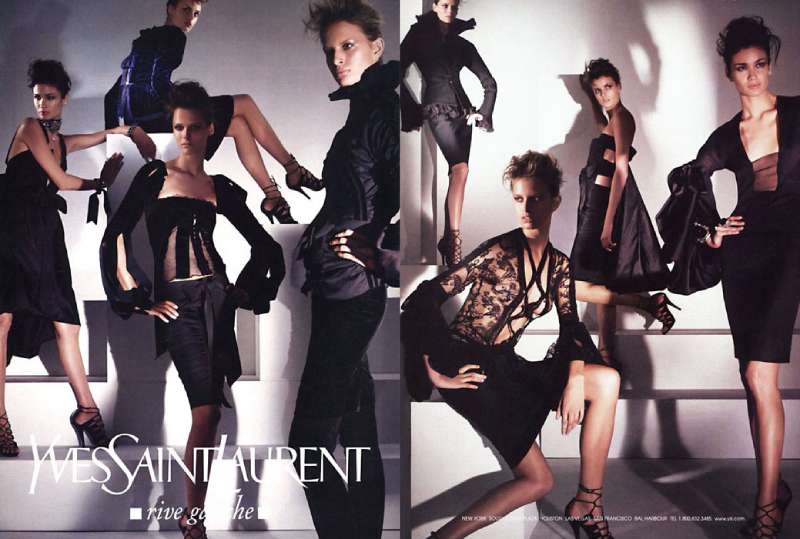
One bottle, one body, one small logotype in the corner. That formula has carried Tom Ford ads through four fashion houses and three decades.
Ford directed Gucci creative from 1994, took the Yves Saint Laurent role in 1999, and launched his own house in 2005.
The campaigns collected here run from the Gucci relaunch imagery shot by Mario Testino to the Spring/Summer 2026 work by Drew Vickers.
Here is what the page covers:
- Campaign by campaign, with photographer, year and market
- The composition, palette and typography behind each print ad
- Regulatory history, from Opium in 2000 to Black Orchid in 2015
- Six rules designers can lift straight into their own layouts
Tom Ford advertising spans 32 years, 4 fashion houses and more than a dozen flagship campaigns, from the Gucci relaunch imagery of the mid-1990s to the Spring/Summer 2026 campaign shot by Drew Vickers.
The work runs on one device throughout: a single body, cropped tight, lit to a high gloss, with the wordmark set small in a corner.
This page covers the campaigns by name, with the photographer, year and market behind each one, plus the composition and type decisions that make them read at a glance.
Tom Ford Advertising at a Glance
Tom Ford has directed advertising since 1994, first at Gucci, then at Yves Saint Laurent, then under his own house from 2005. The best-known campaigns are Opium, the Gucci “G” spread and Tom Ford for Men. The visual signature combines black grounds, gold foil and cropped skin.
| Attribute | Value |
|---|---|
| First major campaign | Gucci relaunch imagery, 1995, shot by Mario Testino |
| Lead photographers | Mario Testino, Steven Meisel, Terry Richardson, Inez and Vinoodh, Mert Alas and Marcus Piggott, Robin Galiegue |
| Best-known campaigns | Opium (2000), Gucci “G” (2003), Tom Ford for Men (2007), Black Orchid (2006 onward) |
| Primary media | Magazine double-page spreads, billboards, in-store beauty counter display, campaign film |
| Regulatory record | 948 ASA complaints for Opium, 16 for the Gucci “G” ad, 2 for Black Orchid in 2015 |
| Visual signature | Black or flesh-tone ground, gold accents, oiled skin, tight crop, small logotype |
| Current owner | The Estee Lauder Companies, sole owner since 2023 |
The Estee Lauder Companies valued the whole enterprise at $2.8 billion when it bought the brand, paying $2.3 billion with a further $250 million from Marcolin, the eyewear licensee.
Which Tom Ford Ad Campaigns Are the Most Famous?
Six bodies of work carry the reputation: the Gucci campaigns of 1995 to 2004, the YSL fragrance ads of 2000 to 2002, Tom Ford for Men in 2007, Black Orchid from 2006 onward, the Beauty lip campaigns from 2010, and the eyewear print ads produced under Marcolin since 2005.
Gucci by Tom Ford (1995-2004)
Ford ran Gucci creative from 1994 to 2004 and used advertising as the main lever for repositioning the house.
The 2003 spread photographed by Mario Testino, styled by Carine Roitfeld and art directed by Doug Lloyd, showed the Gucci G shaved into a model’s body hair. The press nicknamed it “Pubic Enemy”.
What the layout does: the frame sits low, the product is absent, and the logotype does double duty as the subject of the photograph. Nothing competes for the focal point.
Campaign reported that the ASA received only 16 public complaints, despite full-page coverage in the Daily Mail and calls for a ban from Mediawatch UK.
Yves Saint Laurent: Opium and M7 (2000-2002)

Opium, 2000: art directed by Ford, shot by Steven Meisel, model Sophie Dahl reclining nude on black. The ASA logged 948 complaints and ordered the posters withdrawn.
M7, 2002: shot by Solve Sundsbo, full frontal male nudity, model Samuel de Cubber. Pulled from circulation.
Why the pair matters: Opium runs a warm gold-on-black palette, M7 runs cool grey. Same house, same year window, opposite temperature.
The ASA’s own annual report later ranked Opium as the eighth most complained-about advertisement in its history.
Tom Ford for Men (2007)

Terry Richardson shot the launch campaign for the first fragrance under Ford’s own name. Two frames placed the bottle against a model’s body, finished with heavy gloss retouching.
Italy banned it. The UK did not.
The ASA’s 2007 ruling found the images unlikely to cause serious or widespread offence to readers of GQ and Wallpaper, and accepted the argument that the stylised treatment gave the ads artistic rather than salacious quality.
The bottle sits on the vertical axis in both frames. That single decision is what keeps the composition legible at thumbnail size.
Black Orchid (2006 onward)
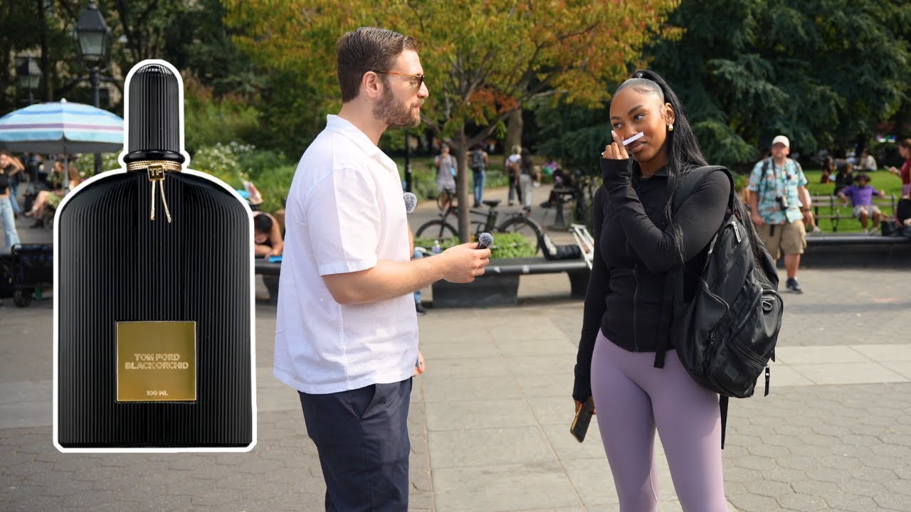
Black Orchid launched in 2006 as the house’s signature fragrance and has carried the most recognisable campaign imagery since.
- 2015: Cara Delevingne nude in a flower-strewn pool, on a billboard at Brick Lane and Hanbury Street in London
- 2025: Tilda Swinton for Black Orchid Reserve, lensed by Inez and Vinoodh, released September 1
Two complaints reached the ASA in 2015. Neither was upheld. The regulator described the pose as sensual and sexually suggestive but not explicit, and Tom Ford Beauty confirmed no school sat within 100 metres of the site.
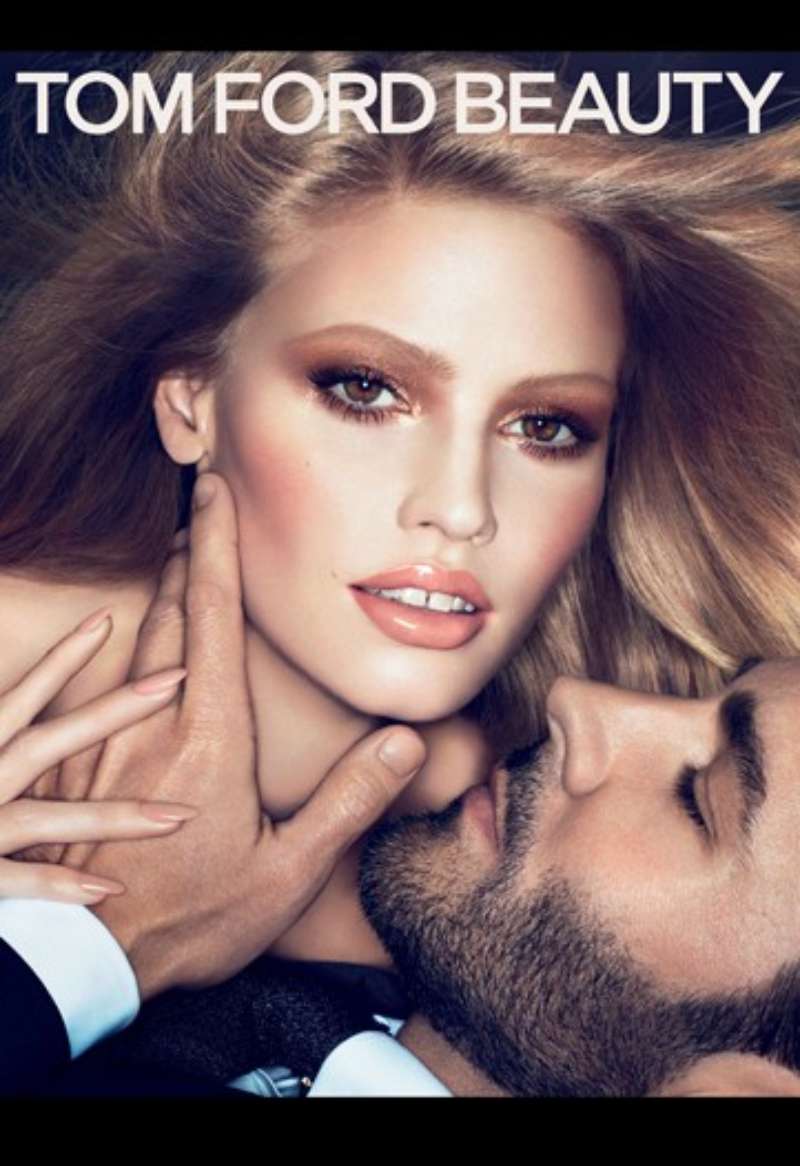
Tom Ford Beauty Lip Campaigns (2010-2024)

The Private Blend lipsticks debuted in 2010 and were refreshed in 2024 as Runway Lip Colour, an 18-shade range of ten existing and eight new colours.
Angelina Jolie fronted the 2024 campaign in shade 16 Scarlet, photographed and directed by Mert Alas and Marcus Piggott.
Guillaume Jesel, president and chief executive of the brand, told WWD that the cinematic quality of the imagery is central to the brand’s identity and that lip colour carries its DNA.
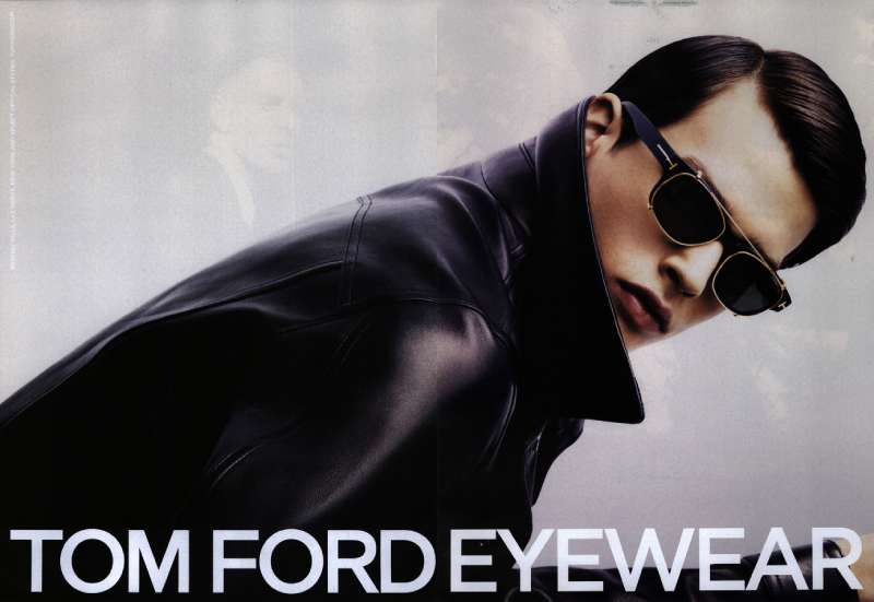
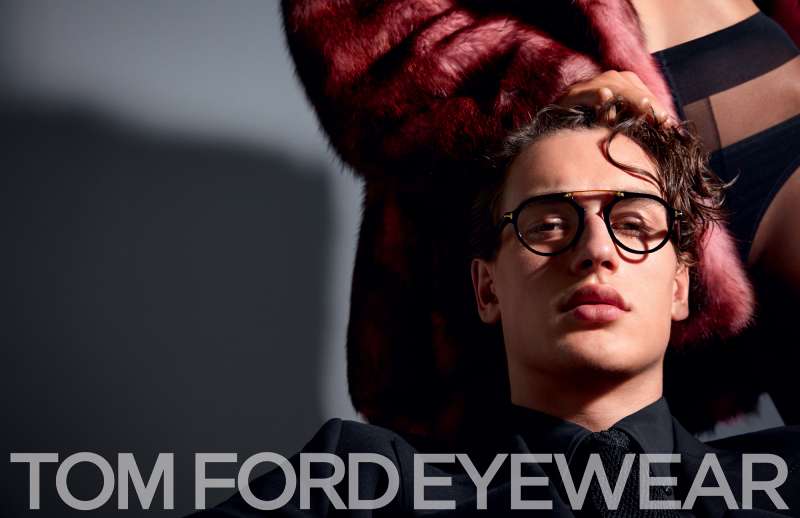
Tom Ford Eyewear Print Ads (2005-present)

Marcolin has held the eyewear licence since 2005 and paid $250 million toward the Estee Lauder acquisition.
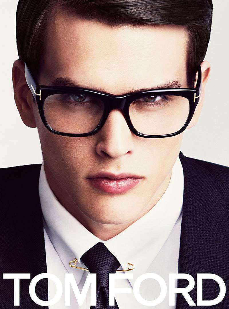
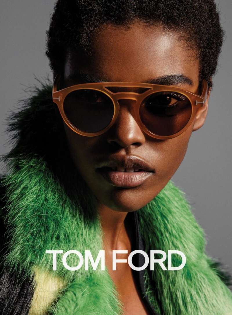
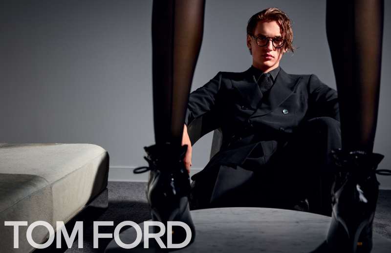
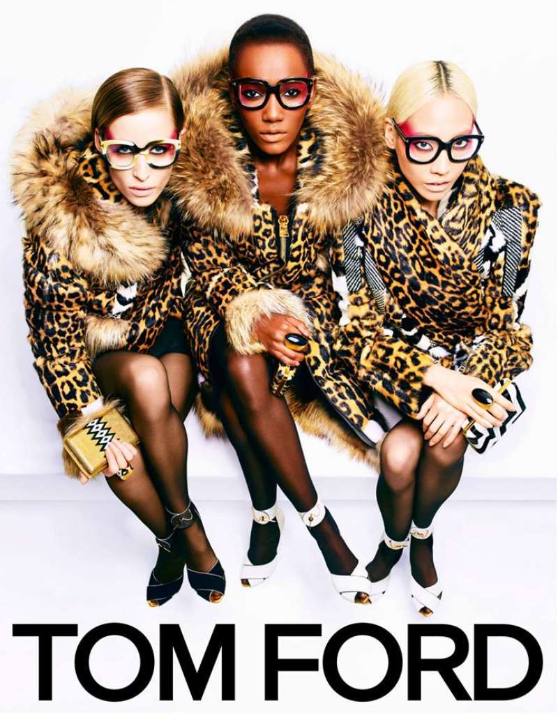
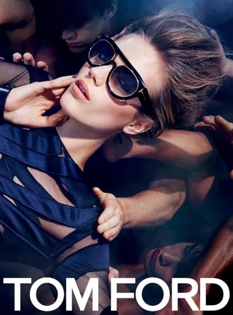
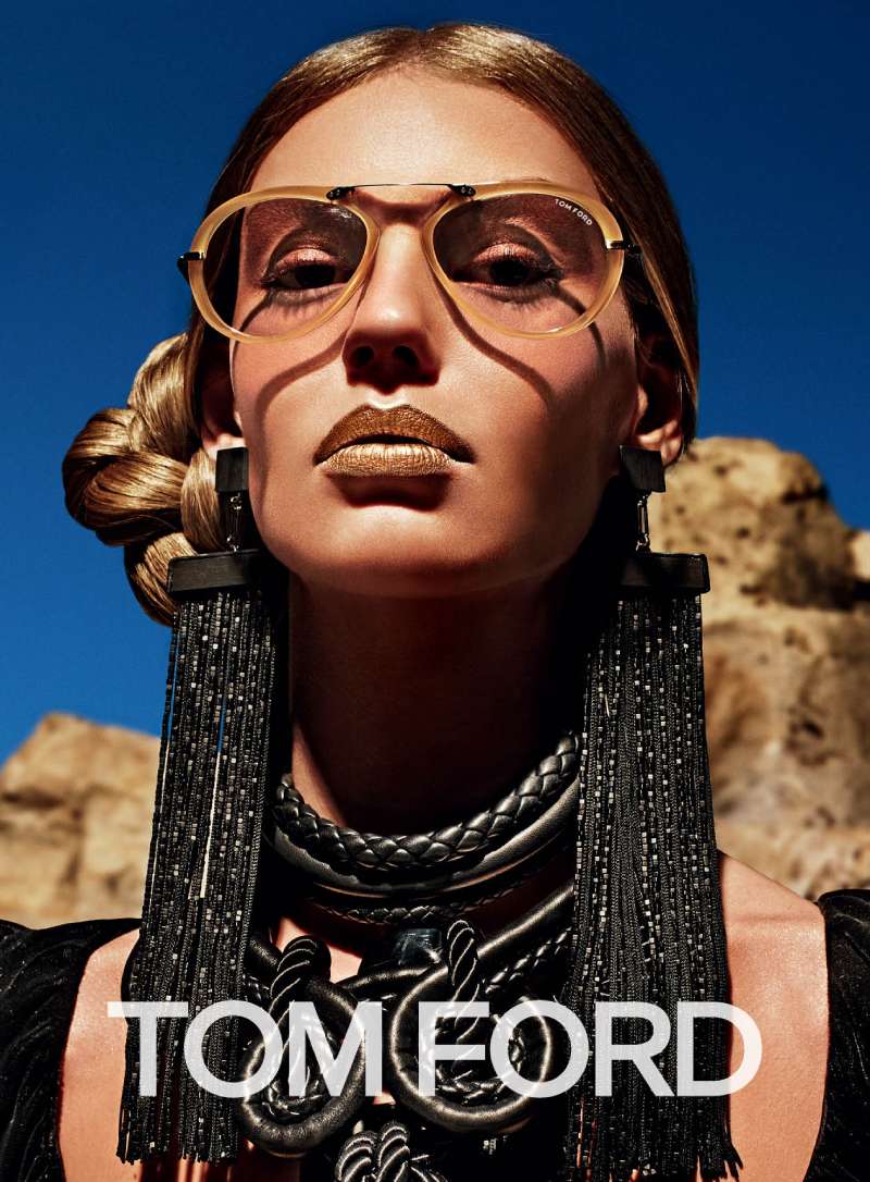
Eyewear ads follow a different rule set from fragrance. The face stays in frame, the crop opens up, and the temple logo does the brand work that a bottle does elsewhere.
The Winter 2024 campaign placed Fei Fei Sun, Rianne Van Rompaey and Meng Yu Qi in Shanghai, shot by Robin Galiegue, pairing eyewear with shearlings and narrow leather coats.
How Do Tom Ford Print Ads Work Visually?
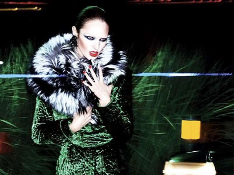
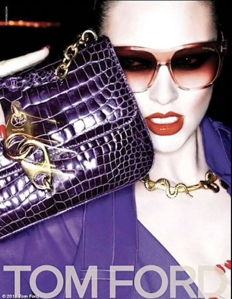
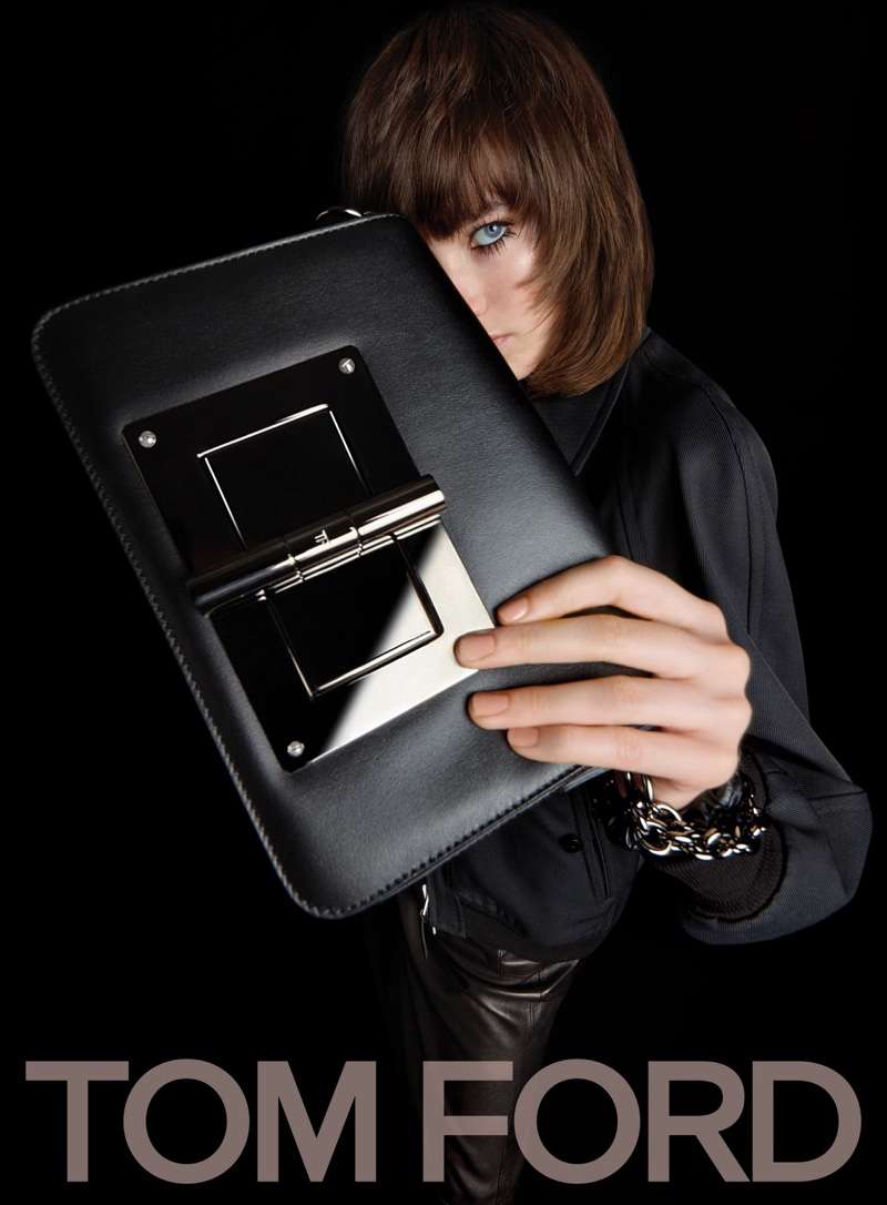
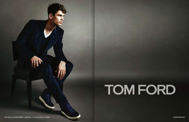
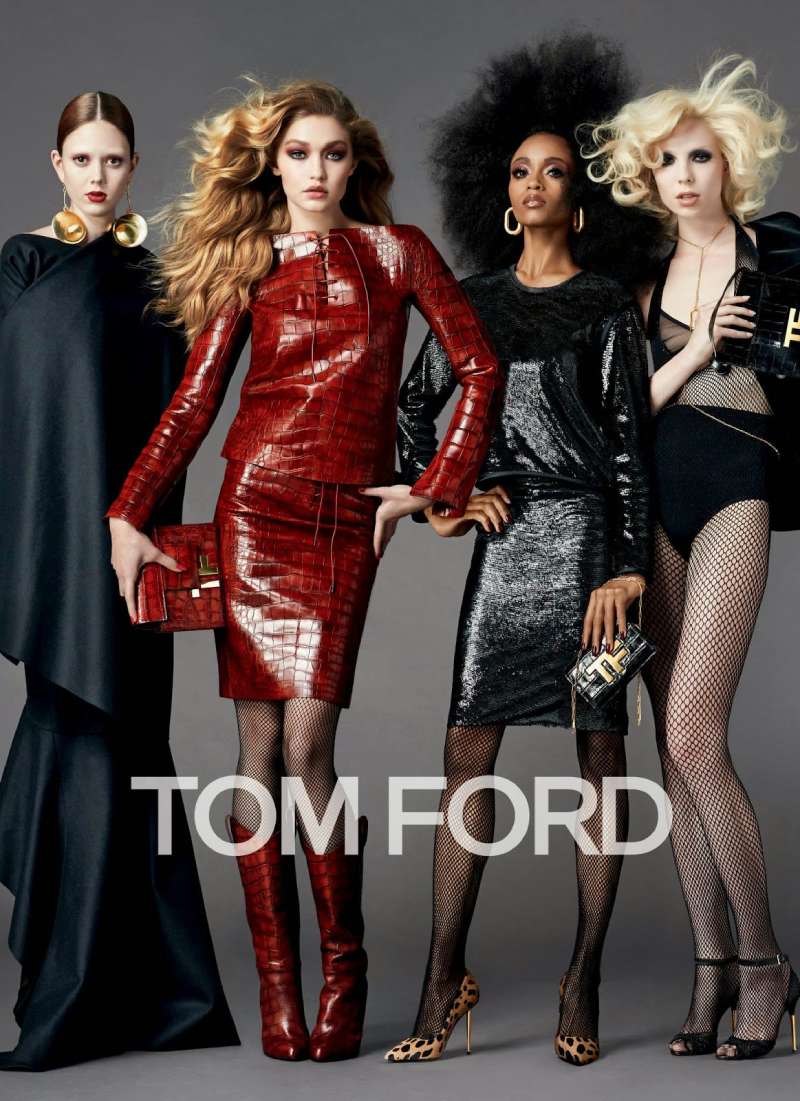
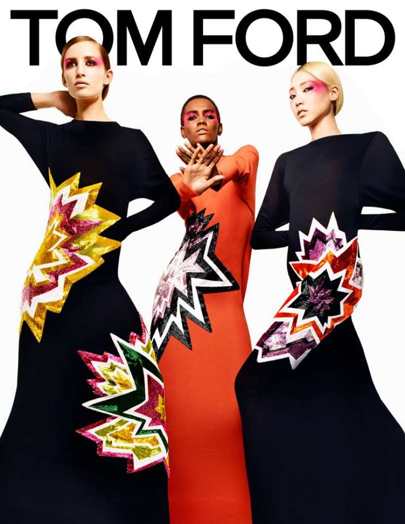
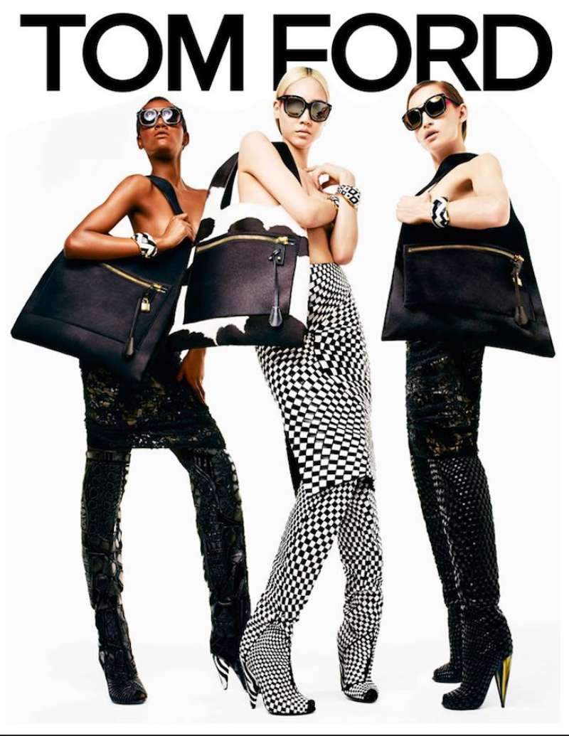
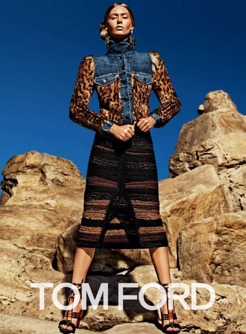
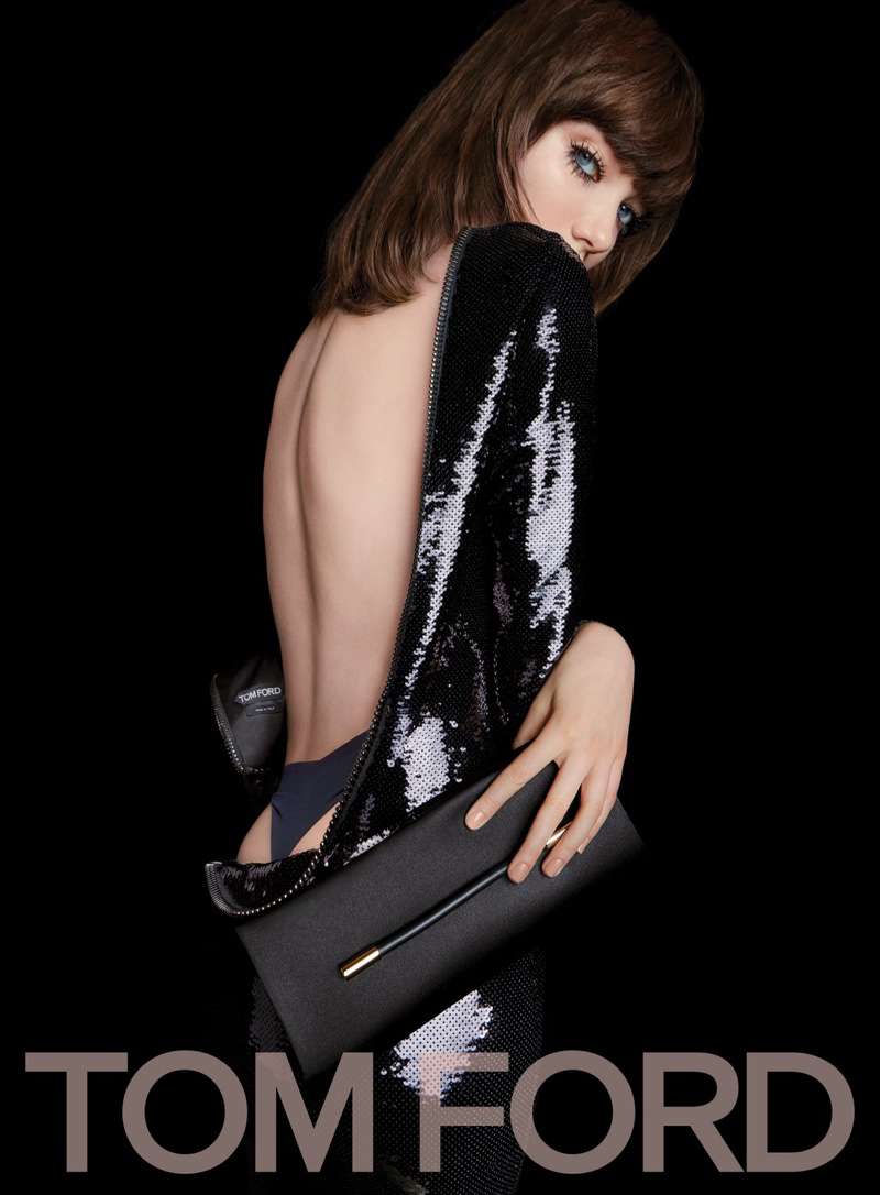
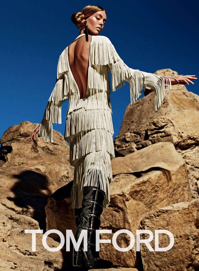
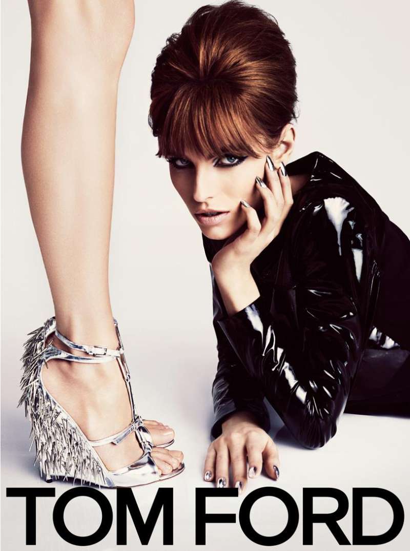
Tom Ford print ads use a four-part system: one subject cropped past the edge of the frame, a two-value palette of black plus skin, a small sans-serif wordmark placed low, and no body copy. The product occupies the optical centre or disappears entirely.
Composition and crop
The crop is the whole argument. Cutting the head out of frame removes identity and forces the eye onto texture, which is why the 2007 fragrance ads read as product photography rather than portraiture.
Framing works by exclusion here rather than by adding a border.
Diagonal limbs create the movement. Horizontal ground lines stop it.
Where the product sits
Fragrance bottles land on the vertical centre line in most executions, which gives the layout a symmetrical spine even when the body is posed off-axis.
Palette and finish
Black ground: used for evening fragrances, Opium and Black Orchid included
Flesh and gold: the recurring warm pairing, close to a monochrome scheme in practice since the two values sit adjacent on the wheel
Cool grey: reserved for masculine launches such as M7 and Grey Vetiver
High-gloss retouching lifts specular highlights on skin, which raises the tonal contrast against matte black without adding a second hue.
Typography and logo placement
The wordmark is set in capitals in a sans-serif face, identified by font-matching archives as Aribau Grotesk Medium from Emtype Foundry.
Letter spacing tightened in the later version of the mark, so the tracking now reads as a single block rather than as spaced capitals.
Copy is almost absent. Product name, brand name, nothing else, which is minimalist practice applied to advertising rather than to a poster.
Space and hierarchy
Ford spends negative space on skin instead of on margin, which inverts the usual luxury layout where the product floats in emptiness.
The visual hierarchy runs image, then product, then logotype. The name is always last and always smallest.
That ordering is unusual for a fragrance house and it is the reason the ads survive being reproduced badly.
How Do Tom Ford TV Commercials Differ From Its Print Ads?
Tom Ford film work adds motion, sound and a face. Print removes identity through cropping. The campaign films do the opposite, holding on the model’s gaze for the length of the spot and building a short narrative around a single gesture.
| Element | Film | |
|---|---|---|
| Subject | Cropped body, often headless | Named face held in close-up |
| Product | Centre of frame | Appears in the final seconds |
| Palette | Two values | Graded warm, more mid-tones |
Runway Lip Colour, 2024, Mert and Marcus. Angelina Jolie moves through a set of close-ups in shade 16 Scarlet. The brand described the film as a portrait of a woman drawing confidence from her signature shade.
Black Orchid Reserve, 2025, Inez and Vinoodh. Tilda Swinton in continuous motion, released alongside the print images on September 1.
Lips and Boys, directed by Tom Munro. Munro has directed commercial work for Dolce and Gabbana, Giorgio Armani and Lancome alongside his Tom Ford films.
Film gives the house room for narrative structure that a single spread cannot carry.
How Has Tom Ford Advertising Evolved Since 1994?
Tom Ford advertising moved through 5 phases in 32 years: the Gucci relaunch, the YSL licence years, the founding of his own house, the beauty scale-up under celebrity casting, and the Estee Lauder ownership period with softened imagery and named creative directors.
| Period | Shift | Representative campaign |
|---|---|---|
| 1994-1999 | Gucci repositioned through advertising | Gucci Fall 1995, Mario Testino |
| 2000-2004 | YSL licence, regulatory clashes | Opium, Steven Meisel |
| 2005-2012 | Own house, fragrance-led launches | Tom Ford for Men, Terry Richardson |
| 2013-2019 | Beauty scale-up, celebrity faces | Black Orchid, Cara Delevingne |
| 2020-2026 | Estee Lauder ownership, softer imagery | Black Orchid Reserve, Tilda Swinton |
Two appointments changed the picture. Peter Hawkings became creative director in 2023 after 25 years working alongside Ford, and Haider Ackermann took the role in 2024.
Ackermann’s Spring/Summer 2026 campaign, shot by Drew Vickers with Susie Cave, keeps the seduction premise but returns the model’s face to the frame.
The house now operates in more than 100 countries and territories and has taken over 20 Fragrance Foundation awards.
Which Agencies Created Tom Ford Advertising?
Tom Ford has never worked through a traditional agency of record. Campaign creative sits in-house with the creative director, supported by named photographers, stylists and art direction studios hired per season.
The core collaborators
Mario Testino photographed the Gucci campaigns of the late 1990s and the 2003 “G” spread.
Carine Roitfeld styled the Gucci and YSL work through that decade, and Doug Lloyd art directed the 2003 campaign.
Steven Meisel shot Opium for YSL in 2000. Terry Richardson shot Tom Ford for Men in 2007 and the Spring/Summer 2008 collection campaign.
The current roster
Robin Galiegue: Spring 2024 and Winter 2024 fashion and eyewear campaigns
Inez van Lamsweerde and Vinoodh Matadin: Black Orchid Reserve, 2025
Mert Alas and Marcus Piggott: Runway Lip Colour with Angelina Jolie, 2024
Drew Vickers: Spring/Summer 2026 under Haider Ackermann
Consistency across four decades and six photographers comes from a fixed set of brand rules, not from a single studio.
What Can Designers Learn From Tom Ford Ads?
Six rules transfer directly from these campaigns to commercial layout work: crop past the frame edge, hold the palette to two values, set the logotype small, place the product on the vertical axis, cut the body copy, and let the image carry the entire message.
- Crop the subject until identity disappears and texture takes over
- Limit the palette to two values plus a metallic accent
- Set the wordmark at the smallest size that still reads at arm’s length
- Place the product on the vertical centre line, whatever the pose does
- Delete the body copy and test whether the layout still communicates
- Push tonal separation through lighting rather than through a third colour
The last one carries the most weight. Adding colour meaning is easy. Getting a black ground to read as luxury rather than as a printing error takes control of the highlight range.
The same discipline applies in editorial layout, where a double-page spread faces the identical problem of one image carrying a whole message.
How Do Tom Ford Ads Compare to Calvin Klein and Dior Ads?
All three houses built their reputations on nudity in advertising, and all three arrived at different formal solutions.
Calvin Klein works in daylight and grain, with the product visible as a waistband or a label, and the logotype set large. Compare that with the Calvin Klein campaigns of the 1990s and the difference in finish is immediate: matte versus gloss.
Dior runs colour, movement and location. The Dior advertising archive leans on celebrity casting and set design where Tom Ford leans on studio lighting and a black backdrop.
The closest formal relative is Ford’s own earlier work. The Gucci ads he directed and the Saint Laurent campaigns from his tenure share the same crop logic, the same absence of copy, and the same regulatory history.
What Makes Tom Ford Advertising Work?
The work holds up because the rule set never moved.
Same crop, same two-value palette, same small wordmark, across four houses, six photographers and three decades. That disciplined repetition is what turns individual spreads into a recognisable visual identity.
The provocation gets the attention. The construction is what makes the images survive being cropped for a phone screen, reprinted badly, or pinned to a mood board twenty years later.
Strip out the nudity and the layout logic still functions: one subject, one light source, one line of type.
Most brands can copy the first part. Almost none hold the second for thirty years.
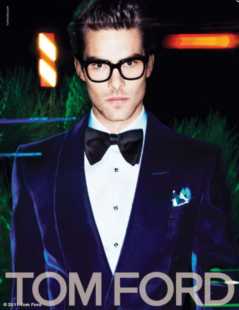
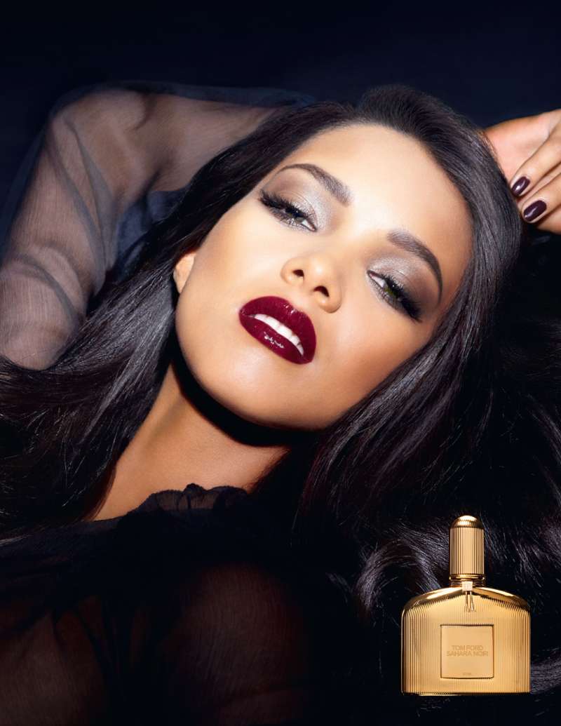
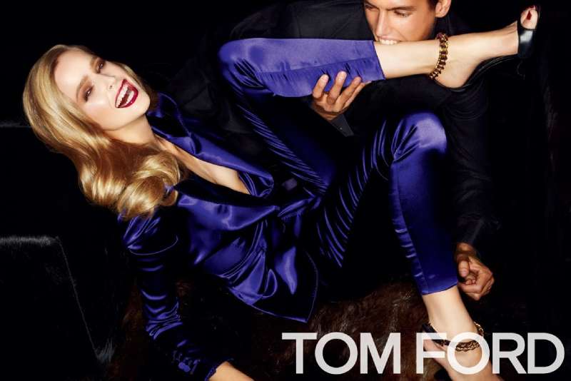
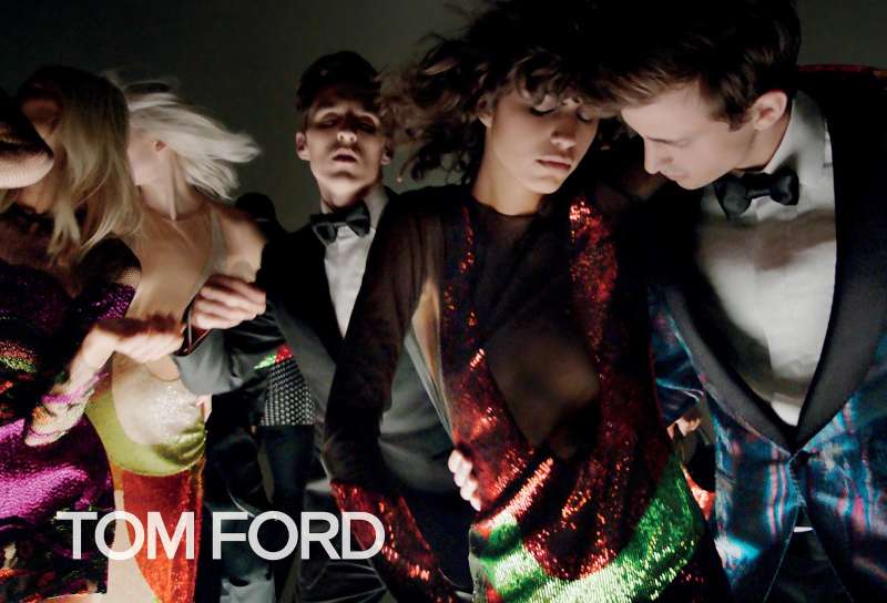
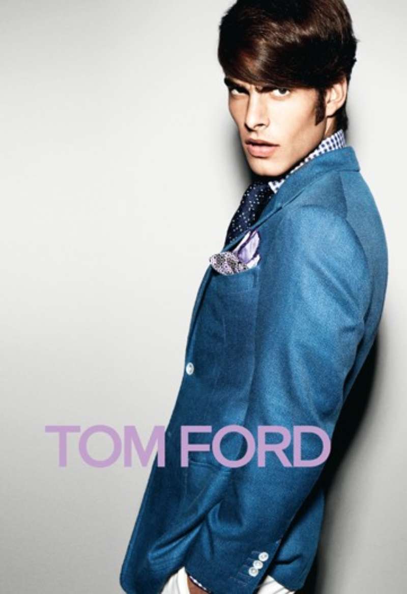
Tom Ford Ads Examples



FAQ on Tom Ford Ads
Why are Tom Ford ads mostly black?
Black holds the evening fragrances: Opium, Black Orchid, Noir. It also solves a printing problem.
A two-value colour palette of black plus skin survives cheap magazine stock, where a third hue would shift.
Which magazines carry Tom Ford ads?
GQ and Wallpaper ran the 2007 fragrance campaign, a placement the ASA cited in its ruling.
WWD reported the Spring/Summer 2012 campaign booked Vogue, Vanity Fair, Elle and Harper’s Bazaar for the March issues.
Who styled the Gucci and Saint Laurent campaigns?
Carine Roitfeld styled the Gucci work through the late 1990s and the 2003 spread, and the Yves Saint Laurent Opium campaign in 2000.
She left the partnership when Ford exited both houses in 2004.
Does Tom Ford still direct the advertising?
No. Ford stayed on as creative visionary only through the end of 2023.
Peter Hawkings took the creative director role in 2023, and Haider Ackermann replaced him in September 2024.
What is the most controversial Tom Ford ad?
The 2000 Opium poster with Sophie Dahl, shot by Steven Meisel under Ford’s art direction.
It drew 948 complaints to the ASA and ranks eighth on the regulator’s all-time most-complained list.
Why is there almost no copy in Tom Ford print ads?
Product name and brand name. Nothing else.
Stripping the text turns the page into a single image, which is unusual advertising design practice and the reason the layouts read at billboard distance.
Who produces Tom Ford eyewear advertising?
Marcolin has held the eyewear licence since 2005 and contributed $250 million toward the Estee Lauder acquisition.
Campaign creative still sits with the house, not the licensee. Robin Galiegue shot the Winter 2024 eyewear images in Shanghai.
Do Tom Ford Beauty ads follow the same rules as the fashion ads?
Not quite. Beauty campaigns keep the face in frame because lip colour has to be visible on the model.
Fashion and fragrance crop tighter and drop the head entirely.
Was any Tom Ford campaign withdrawn in the UK?
Yes, once. The ASA ordered the Opium posters taken down in 2000 for being sexually suggestive in an untargeted medium.
Later rulings went the other way, including Black Orchid in 2015.
Is the model in the 2007 fragrance ad ever named?
No. The campaign never identified her, and her face appears in neither frame.
Critics treated that anonymity as the core problem with the images. Ford treated it as the point.
Conclusion
Tom Ford ads hold their value because the construction outlasts the shock. Provocation dates fast. A tight crop, a controlled highlight range and a small wordmark do not.
The regulatory history proves the point. Opium came down in 2000, the Gucci “G” spread drew 16 complaints, Black Orchid was cleared in 2015, and the imagery still reads as one body of work.
Under Estee Lauder ownership the casting shifted toward named faces like Tilda Swinton and Angelina Jolie. The visual signature stayed put.
For designers, the useful takeaway sits in the layout rather than in the subject matter.
Study the crop, the two-value palette and the logo placement. That system transfers to any brief, including ones with clothes on.

Renowned for his expertise in logo design and visual branding, Bogdan has developed a multitude of logos for various clients.
His skills extend to creating posters, vector illustrations, business cards, and brochures. Additionally, Bogdan's UI kits were featured on marketplaces like Visual Hierarchy and UI8.
He also wrote in the past years on sites like Design Your Way, WebDesignerDepot, WPDean, Designmodo, Speckyboy, Slider Revolution, and more.
- The Windsurf Logo History, Colors, Font, And Meaning - 10 October 2026
- How to Remove Background From Product Photos (No Photoshop) - 10 October 2026
- How Designers can Build a Stronger Online Creative Identity - 9 October 2026

Bogdan Sandu is a seasoned designer who has been designing websites since 2008. Renowned for his expertise in logo design and visual branding, Bogdan has developed a multitude of logos for various clients. His skills extend to creating posters, vector illustrations, business cards, and brochures. Additionally, Bogdan's UI kits were featured on marketplaces like Visual Hierarchy and UI8. He also wrote in the past years on sites like Design Your Way, WebDesignerDepot, WPDean, Designmodo, Speckyboy, Slider Revolution, and more.
You Might Also Like