The Samsung logo stands as one of the most recognized corporate marks in consumer electronics. You see it everywhere. Phones, TVs, refrigerators, monitors. It’s hard to avoid.
This South Korean giant has built a visual identity that communicates reliability and forward-thinking technology. The current blue wordmark, introduced in 1993, replaced earlier versions that looked quite different from what we know today.
Samsung was founded in 1938 by Lee Byung-chul as a trading company. The brand has gone through four major logo iterations since then. Each version reflected where the company was heading and what it wanted customers to feel when they saw that name.
Understanding the logo helps explain how Samsung positioned itself against competitors and built trust across dozens of product categories worldwide.
What is the Samsung Logo?
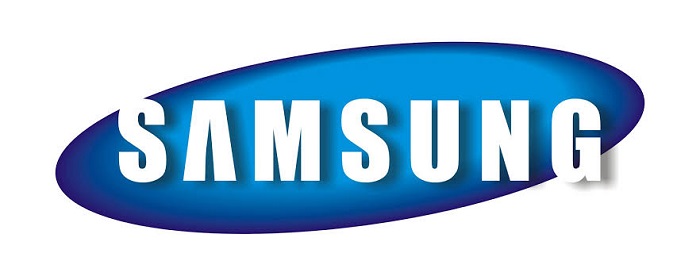
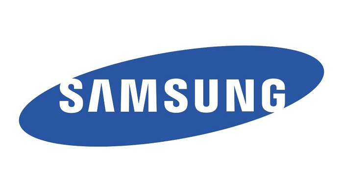
The Samsung logo is a blue elliptical wordmark featuring the company name in a custom sans-serif typeface. Introduced in 1993, this design was created to represent the brand’s global expansion and technological leadership. The tilted letters and open ellipse symbolize innovation, flexibility, and connection with the world.
Design Type: Wordmark within an ellipse (combination mark)
Primary Elements:
- Blue elliptical shape (tilted at an angle)
- White custom lettering spelling “SAMSUNG”
- Open gaps at both ends of the ellipse
- Italicized, forward-leaning typography
Official Introduction Date: 1993
Designer/Agency: In-house Samsung design team
Trademark Status: Registered trademark of Samsung Electronics Co., Ltd. in virtually every major market globally
Color Palette:
- Samsung Blue: #1428A0
- White: #FFFFFF
Usage Context: The logo appears on all Samsung products, retail locations, marketing campaigns, digital platforms, packaging, corporate communications, and sponsorship materials. Different product lines like Galaxy maintain the parent logo while adding sub-brand elements.
How Has the Samsung Logo Evolved Over Time?

Samsung’s visual identity has shifted dramatically since 1938. The company started with Asian-influenced designs before moving toward Western corporate aesthetics.
Four distinct logo eras exist. Each one tells you exactly where Samsung’s head was at during that period.
The progression moved from traditional Korean imagery to abstract global branding. It’s actually a pretty fascinating case study in how Asian companies adapted their identities for international markets.
Original Samsung Logo (1938-1958)
Years Active: 1938-1958
Design Description: The first logo featured three stars arranged in a pattern with Korean characters. “Samsung” translates to “three stars” in Korean, so this was literal interpretation of the name.
Color Scheme: Black and red on white background
Designer: Unknown, likely founder Lee Byung-chul’s direction
Context: Samsung started as a grocery trading store in Daegu, Korea. The logo reflected local business sensibilities of that era. Nothing fancy. Just functional.
Key Changes from Previous: This was the original, so no prior version existed
Cultural Significance: The three stars represented something big, numerous, and powerful in Korean culture. It set the foundation for everything that came later.
Second Samsung Logo (1969-1979)
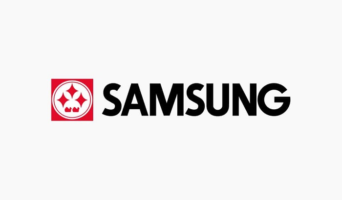
Years Active: 1969-1979
Design Description: A more stylized mark emerged when Samsung entered electronics manufacturing. The design incorporated geometric star shapes with the Samsung name in a blocky typeface.
Color Scheme: Black, sometimes with red accents
Designer: Internal design department
Context: Samsung Electronics was established in 1969. The company needed a more modern look to compete in the technology sector. This version bridged traditional roots with industrial ambition.
Key Changes from Previous: Dropped pure Korean aesthetic for more universal geometric forms
Cultural Significance: Marked Samsung’s transformation from trading company to electronics manufacturer
Third Samsung Logo (1980-1992)
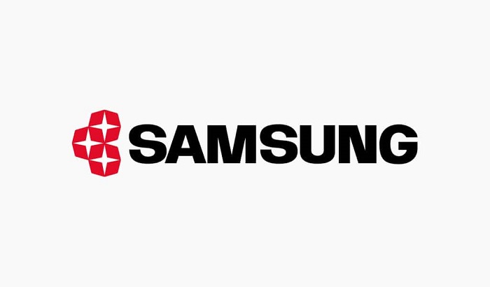
Years Active: 1980-1992
Design Description: A cleaner wordmark appeared with the Samsung name in a bold, straightforward typeface. Some versions retained star imagery, but the focus shifted to the name itself.
Color Scheme: Blue began appearing during this period
Designer: Samsung design team
Context: Global expansion demanded a more internationally readable identity. The three-star concept faded as Samsung pushed into Western markets.
Key Changes from Previous: Typography took center stage over symbolic imagery
Cultural Significance: Represented the company’s serious push into semiconductors and consumer electronics globally
Current Samsung Logo (1993-Present)
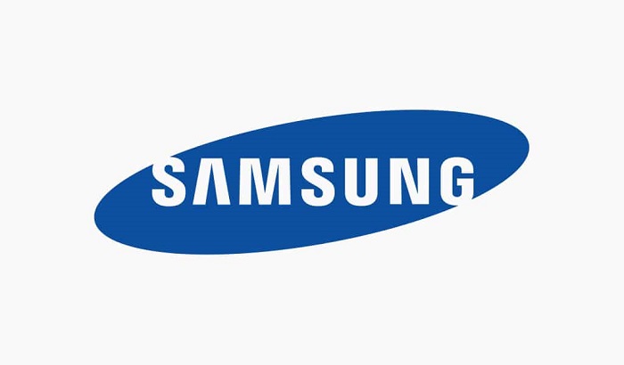
Years Active: 1993-present
Design Description: The iconic blue ellipse with white lettering we all recognize. Letters tilt forward slightly. The ellipse doesn’t fully close, leaving gaps at both ends.
Color Scheme: Samsung Blue (#1428A0) and white
Designer: Samsung’s corporate identity team during the “New Management” initiative under Lee Kun-hee
Context: This redesign coincided with Samsung’s dramatic quality improvement push. Lee Kun-hee famously said “change everything except your wife and children.” The logo change was part of that philosophy.
Key Changes from Previous: Introduced the ellipse, custom italicized typeface, and standardized the blue color
Cultural Significance: Became synonymous with Korean technological achievement and quality electronics worldwide
What Do the Design Elements of the Samsung Logo Mean?
Every piece of the Samsung logo carries intention. The ellipse shape suggests a globe or universe, representing worldwide reach.
The open ends of that ellipse? They communicate openness to change and connection with the outside world.
Forward-tilting letters create a sense of movement and progress. Nothing static here. The whole thing feels like it’s going somewhere.
Why Did Samsung Choose These Specific Colors?
Samsung Blue dominates the identity for good reasons. Blue communicates trust, reliability, and technological competence across cultures.
It’s not an accident that so many tech company logos lean on blue. IBM, Intel, Dell, HP. The color just works for this industry.
Samsung Blue
- Hex: #1428A0
- Pantone: 286 C
- Symbolic meaning: Trust, stability, innovation
- Psychological impact: Creates feelings of security and dependability
- Brand connection: Positions Samsung as a serious, reliable technology partner
White provides contrast and suggests purity, simplicity, and clarity. Together, these two colors create a clean, professional appearance that works across every product category Samsung touches.
What Typography Style Is Used in the Samsung Logo?
Samsung uses a custom sans-serif font designed specifically for the brand. You won’t find this exact typeface anywhere else.
The letters have a slight italic lean, maybe 5 to 7 degrees. This creates forward momentum visually.
Letterforms are clean with consistent stroke widths. No decorative elements. The A and S characters have distinctive shapes that make the wordmark recognizable even at small sizes.
Over time, Samsung has refined the typography slightly for better digital reproduction. But the core characteristics remain unchanged since 1993.
What Are the Hidden Meanings in the Samsung Logo?
The ellipse gaps aren’t random. They supposedly represent Samsung’s willingness to communicate with the world and remain open to new ideas.
Some designers point out that the shape resembles an eye, suggesting vision and watchfulness over technology trends.
The company has never officially confirmed hidden meanings beyond the stated symbolism. But that hasn’t stopped people from finding them.
The forward tilt of letters was intentional. Designers wanted to convey progress and dynamic energy. Standing still wasn’t the message they wanted to send.
How Does the Samsung Logo Compare to Competitor Logos?
Samsung’s blue ellipse sits in interesting company. Apple uses minimalism. Sony goes text-only. LG has that friendly face thing going on.
Samsung landed somewhere in the middle. Not as stark as Apple, not as playful as LG.
The ellipse gives Samsung something Apple lacks: a containing shape that works well on physical products. You can stamp it, emboss it, light it up.
Compared to other blue logos in tech, Samsung’s is more dynamic. Intel’s swoosh feels dated now. IBM’s stripes are classic but static. Samsung’s tilted ellipse suggests movement without being gimmicky.
Against Chinese competitors like Huawei and Xiaomi, Samsung’s logo feels more established and trustworthy. That’s partly the blue, partly the decades of consistency.
What Are the Technical Specifications of the Samsung Logo?
Official Color Codes:
Primary Color: Samsung Blue
Secondary Color: White
- Hex: #FFFFFF
- RGB: (255, 255, 255)
- CMYK: (0, 0, 0, 0)
Dimensions and Proportions:
- Aspect ratio: Approximately 4:1 (width to height)
- Minimum size: 10mm height for print, 50 pixels for digital
- Clear space: Equal to the height of the letter “S” on all sides
Official Usage Guidelines:
- Logo must appear in Samsung Blue on white backgrounds
- White logo permitted on dark or photographic backgrounds
- No rotation, stretching, or color modifications allowed
- Ellipse and wordmark must never be separated
Samsung provides official vector graphics files for authorized partners through their brand portal. These include AI, EPS, and SVG formats for various applications.
What Cultural Impact Has the Samsung Logo Had?
The Samsung logo changed how the world perceived Korean products. Before Samsung’s rise, “Made in Korea” didn’t carry premium connotations.
Now that blue ellipse signals quality. It shows up at the Olympics, on Formula One cars, in Times Square. Everywhere.
For Korean culture, Samsung’s global success represents national pride. The logo became a symbol of the country’s economic transformation.
In design circles, Samsung’s 1993 rebrand is studied as an example of how to transition from regional to global identity without losing character.
How Does the Samsung Logo Fit Into the Overall Brand Identity?
The logo anchors a comprehensive visual system. Samsung’s brand guidelines cover everything from color usage to photography style to voice and tone.
Sub-brands like Galaxy, QLED, and Neo maintain visual consistency with the parent mark. You always know it’s Samsung, even when product branding takes focus.
Typography extends beyond the logo into Samsung Sharp Sans, their corporate typeface. It shares DNA with the logo letterforms.
The blue color appears throughout packaging, retail environments, and advertising. Consistency is almost religious.
How Should the Samsung Logo Be Used?
Official Usage Guidelines:
Do:
- Use official logo files from Samsung’s brand portal
- Maintain required clear space around the logo
- Use approved color combinations only
- Scale proportionally when resizing
Don’t:
- Recreate the logo using fonts or shapes
- Add effects like shadows, gradients, or outlines
- Place on busy backgrounds that reduce legibility
- Combine with other logos without explicit permission
Where to Access Official Logos:
Samsung provides logo files through their official brand portal for authorized partners, media, and retailers. Access requires registration and approval.
Licensing Information:
The Samsung logo is a registered trademark. Unauthorized commercial use is prohibited. Editorial use for news and commentary is generally permitted under fair use guidelines.
Trademark Protection:
Samsung actively protects its trademark worldwide. The company monitors for counterfeit products and unauthorized logo usage. Legal action is common against infringers.
FAQ on The Samsung Logo
What does Samsung mean in Korean?
Samsung translates to “three stars” in Korean. The name was chosen by founder Lee Byung-chul in 1938.
Stars symbolized something powerful and everlasting in Korean culture. The original logo actually featured three stars before the company shifted to wordmark designs.
When was the current Samsung logo introduced?
The current blue ellipse logo launched in 1993. It came during Samsung Electronics’ major corporate restructuring under Lee Kun-hee.
This redesign marked Samsung’s push toward global markets. The logo hasn’t changed since, making it over 30 years old now.
What font does Samsung use in its logo?
Samsung uses a custom typeface designed specifically for the brand. You can’t download it anywhere.
The letterforms feature a slight forward tilt. This creates a sense of movement and technological progress in the Samsung wordmark.
Why is the Samsung logo blue?
Blue communicates trust, reliability, and technology. Samsung chose this color to position itself as a dependable electronics brand worldwide.
The specific shade, Samsung Blue, uses color psychology to build consumer confidence. It works across all their product categories from phones to appliances.
What do the gaps in the Samsung ellipse represent?
The open ends of the ellipse symbolize openness and global connectivity. Samsung wanted to show they’re not closed off.
It represents communication with the world. The company has stated these gaps reflect their willingness to share ideas and innovations globally.
Can I use the Samsung logo for my project?
Not without permission. The Samsung trademark is protected worldwide.
Editorial use for news coverage is generally fine. But commercial use requires explicit authorization from Samsung Electronics through their official brand portal and licensing process.
Where can I download the official Samsung logo?
Samsung provides official logo files through their brand portal. Access requires registration.
Authorized partners, media outlets, and retailers can request high-resolution files in multiple formats. Random downloads from third-party sites often have incorrect colors or proportions.
Has Samsung ever changed its logo colors?
Yes. Early Samsung logos used black and red. Blue didn’t appear until the 1980s.
The current color palette was standardized in 1993. Since then, Samsung Blue has remained consistent across all Samsung brand identity applications worldwide.
What is the Samsung logo’s aspect ratio?
The Samsung logo maintains approximately a 4:1 width-to-height ratio. This proportion stays consistent across all applications.
Clear space requirements equal the height of the letter S. These logo specifications ensure proper visibility on Samsung Galaxy devices, QLED TVs, and marketing materials.
Why doesn’t Samsung use the three stars anymore?
Samsung dropped the star imagery during their global expansion. The visual identity needed to work across cultures.
A clean wordmark design proved more versatile. The minimalist design approach helped Samsung compete with Western tech brands and build international brand recognition.
Conclusion
The Samsung logo represents more than corporate identity. It tells the story of a South Korean trading company that became a global electronics powerhouse.
From three stars to that iconic blue ellipse, every design choice was intentional. The forward-tilting letters, the open gaps, the specific shade of blue.
Samsung Electronics built something lasting here. The 1993 redesign still works today across Galaxy smartphones, QLED displays, and everything in between.
Good logo design principles age well. Samsung proved that.
The trademark has become synonymous with quality technology worldwide. That kind of brand recognition takes decades to build.

Renowned for his expertise in logo design and visual branding, Bogdan has developed a multitude of logos for various clients.
His skills extend to creating posters, vector illustrations, business cards, and brochures. Additionally, Bogdan's UI kits were featured on marketplaces like Visual Hierarchy and UI8.
He also wrote in the past years on sites like Design Your Way, WebDesignerDepot, WPDean, Designmodo, Speckyboy, Slider Revolution, and more.
- Pantone to HEX converter - 21 July 2026
- The Retool Logo History, Colors, Font, And Meaning - 20 July 2026
- CMYK to Pantone Converter - 19 July 2026

Bogdan Sandu is a seasoned designer who has been designing websites since 2008. Renowned for his expertise in logo design and visual branding, Bogdan has developed a multitude of logos for various clients. His skills extend to creating posters, vector illustrations, business cards, and brochures. Additionally, Bogdan's UI kits were featured on marketplaces like Visual Hierarchy and UI8. He also wrote in the past years on sites like Design Your Way, WebDesignerDepot, WPDean, Designmodo, Speckyboy, Slider Revolution, and more.
You Might Also Like