When involved in a branding project, the priority task is to choose the best logo fonts possible to’ obtain an impressive result.
Good logo fonts work in favor of the brand’s identity, and they ought to be both original and legible to distinguish it in any situation.
When choosing good fonts for logos, you should do so with the company’s personality in mind, making sure that you’ve designed something that will last, and that will be practically applicable to represent it in any occasion. The best fonts will assist with creating an identity for the company.
In the best scenario, your client will receive something that is unique (or at least correctly licensed) and enriched with strong fonts people would remember at first sight.
A smart course of action for all designers is to look at free fonts and modern typefaces, as those are usually available for commercial use, and do even for startups with limited budgets. Free commercial fonts offer you a means of experimenting so that you will come up with a unique design for your client.
Best fonts for logos
Butler
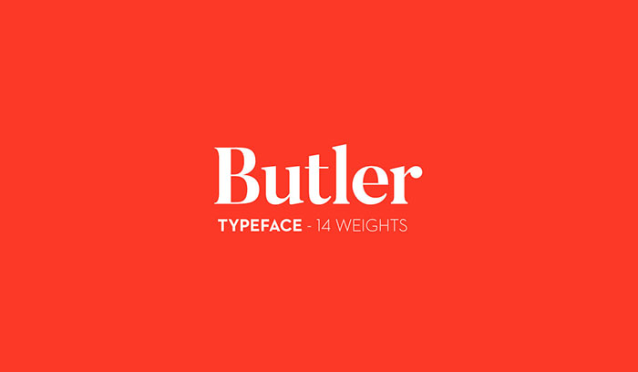
Butler is a free serif typeface inspired by a mix between both Dala Floda & the amazing Bodoni family.
The main goal was to bring a bit of modernism to serif logo fonts by working on the curves of classical serif fonts and adding an extra stencil family.
Great for posters, very big titles, books & fancy stuff, the highly contrasted butler typeface is pleased to be at your service.
The whole Butler family contains a total of 334 characters, 7 regular weights and 7 stencil weights, text figures, ligatures, fractions, and a lot more. It also suits many different languages with its added glyphs. Certainly one of the best modern typefaces available, the Butler family makes great print fonts.
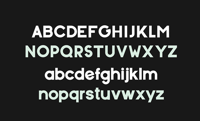
Qualy Logo Font
![]()
Cinzel
Cinzel is a typeface inspired by first-century Roman inscriptions and based on classical proportions. However, it’s not a simple revivalism. While it conveys all the ancient history of the Latin alphabet it also merges a contemporary feel onto it.
This typeface was primarily designed for screen, so while it has a large contrast I ensured that the font would work on a screen.
Cinzel was commissioned by Google Fonts for its web font library, this also means that these designer fonts are available at no cost.
Beaver Typeface
Connect – Font For Logos
Bebas Neue
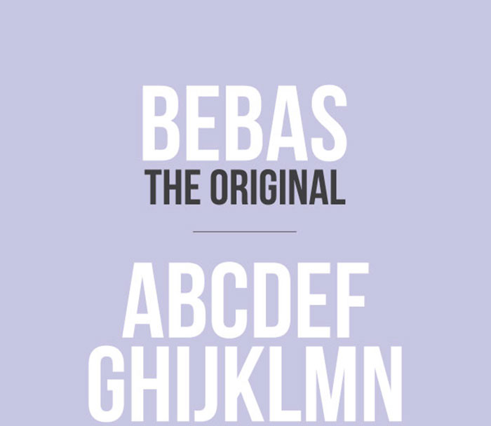
Bebas Neue is a sans serif font family based on the original Bebas Neue free font by Ryoichi Tsunekawa. These amazing fonts have grown in popularity and become something like the “Helvetica of the free fonts”.
Now the family has four new members – Thin, Light, Book, and Regular – added by Fontfabric Type Foundry as new fonts to download.
The new weights stay true to the style and grace of Bebas with the familiar clean lines, elegant shapes, a blend of technical straightforwardness and simple warmth which make it uniformly ideal for web, print, commerce, and art.
Trocchi
‘Trocchi’ is a design derived from a number of old faces from the English typecutter Vincent Figgins (1766-1844) including Nebiolo’s ‘Egiziano’, and Caslon & Co’s ‘Antique No.4′ and ‘Ionic No.2′.
Trocchi derives from these earlier designs to produce a more casual slab serif. Trocchi is designed for use both as text and display type. The font is named after the Scottish novelist Alexander Trocchi and is an excellent business font.
Prelia Logo Font
![]()
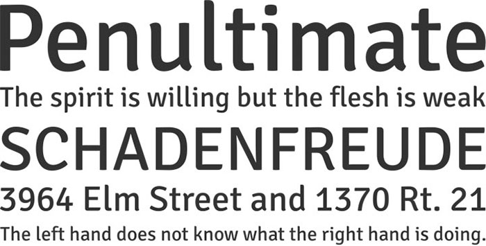
Glober free font
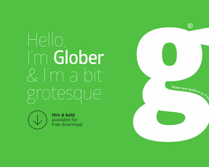
The Glober font family includes 18 weights – nine uprights with nine italics. It is characterized by excellent legibility in both – web & print design areas, well-finished geometric designs, optimized kerning, excellent web-font performance and legibility.
Inspired by the classic grotesque typefaces – Glober has his own unique style in expressed perfect softened geometric forms.
The font family is a strong font most suitable for headlines of all sizes, as well as for text blocks that come in both maximum and minimum variations. Glober font styles are applicable for any type of graphic design in web, print, motion graphics etc and perfect for t-shirts and other items like posters, logos.
Norwester
A condensed geometric sans serif with uppercase, small caps, numbers & an assortment of symbols. By Jamie Wilson. This makes a great font for logo design.
Blackpast – Futuristic Logo Font
![]()
Blackpast is a sans-based font with unique lowercase that will make your design looks futuristic and modern. You can use this font for any purpose, especially to make logotypes. You can mix and match the uppercase and lowercase to make your logo more readable. This font also has special alternates that will make your design more stand-out.
Choplin Free Font
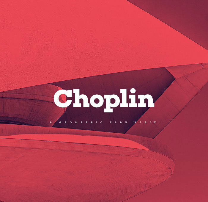
Choplin is a modern and clear geometric slab serif with a sturdy heart.
It was designed based on the Campton Family, with the same principles in mind: geometry, simplicity and neutrality. As a consequence, Choplin could be seen as an immediate companion to the Campton Family.
However, during the process lots of details were changed in order to sharpen the slab serif character which resulted in a slightly different interpretation.
Similar to Campton, this popular font perfectly suited for graphic design applications ranging from editorial, corporate, web, interaction to product design. In addition, it has an extended range of alternative glyphs, ligatures and OpenType features which provide flexibility and uniqueness wherever it is placed.
BONN
BONN is currently available in 3 weights and free to download. This typeface is ideal for logotypes, headings and makes great poster fonts – in general it is great for a big use.
Capri Font Duo
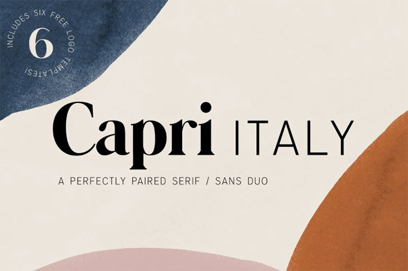
Capri Serif is a classy, bold upper and lowercase typeface that looks incredible in both large and small settings.
Capri Sans is a clean and minimalistic uppercase font that complements Capri Serif beautifully. It also works wonderfully on its own for logos, quotes, and more!
This download also includes six logo templates for Adobe Illustrator and Adobe Photoshop. You can use Illustrator or Photoshop to totally customize the colors and words to perfectly match your brand.
League Spartan
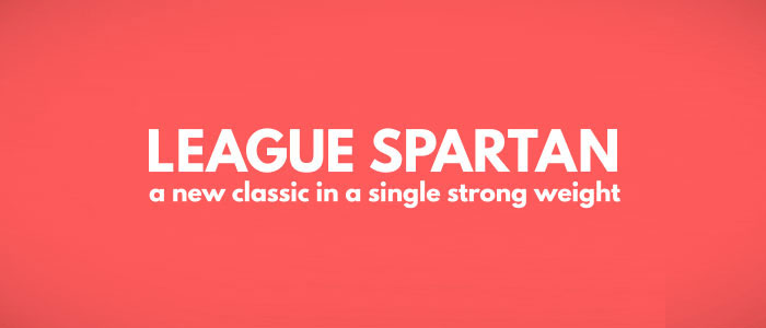
A new classic, this is a bold, modern, geometric sans-serif that has no problem kicking its enemies in the chest.
Taking a strong influence from ATF’s classic Spartan family, we’re starting font designs out with a single strong weight. We’ve put a few unique touches into a beautiful, historical typeface, and made sure to include an extensive characterset – currently totaling over 300 glyphs.
Campton
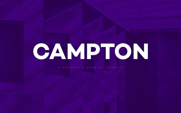
Campton is an unconventional typeface based on the early twentieth century sans serifs. Its character draws inspiration from Gill Sans and Johnston Sans while combining it with contemporary elements to create some cool modern fonts.
The result is a modern and unorthodox family that is perfectly suited for graphic design application ranging from editorial and corporate design to web and interaction design. Campton comes in nine weights with matching italics and is equipped with a wide range of opentype features, making it a great design font.
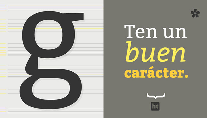
Bitter HT
WalkOn
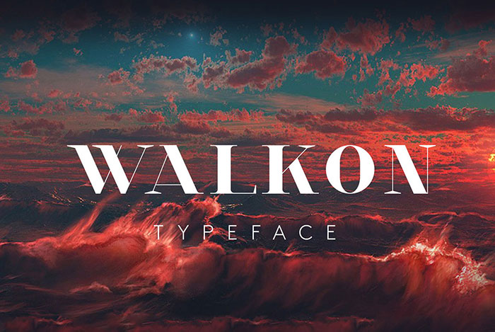
“Walk-On” was originally created as a corporate typeface for the Fashion brand Wang & Lynch.
It takes its inspiration from the eras of Art Deco and Art Nouveau but with a radically contemporary approach. This creative font boasts simple shapes and reduced ornamental structures, yet still yielding an overall art deco -influenced look and feel.
This is a good font for headlines, headlines, but Walk-On can also be utilized for editorial copy due to a vast array of alternate letterforms, numerals, and initials, giving the user multiple options for flexible and exciting text design.
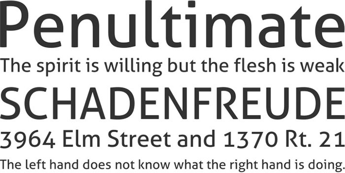
Aller
BONKERS
POIRET
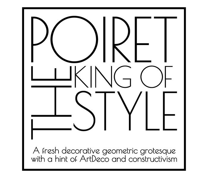
A fresh decorative geometric grotesque with a hint of Art Deco and constructivism. Poiret One is a unique typeface with light forms and pure elegance.
Sleek and simple. Based on geometric forms, it has stylish lines and graceful curves. The font is applicable for large signs, labels, titles, headlines and any type of graphic design on the web, in motion graphics, or in print – from t-shirts to posters and is a good font for logos. It is also well-suited for short texts and advertising where style is desired.
Signika
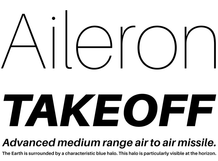
Aileron
SIMPLIFICA Typeface
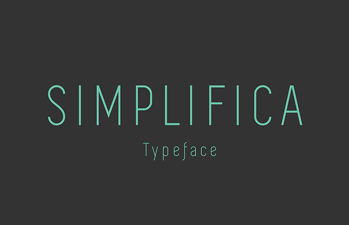
SIMPLIFICA Typeface is a slightly condensed sans-serif typeface featured by a uniform and thin line width. Its high positioned capsheight and ascender favours legibility. A fine, simple and clear font for logos.
Ostrich Sans
A gorgeous modern sans-serif with a very long neck. With a whole slew of styles & weights, these make awesome fonts for logos.
RBNo2 free font
RBNo2 is a new gothic sans serif typeface by fonts designer Rene Bieder for Fontfabric.
It is a unique font inspired by late 19th-century industrial fonts with German roots regarding straightness and geometry. Combined with other sans serifs, slab serifs and serif fonts it catches the eye when used in headlines and short copy texts.
Additionally to the regular styles the alternate versions will turn the font into a perfect partner for modern, technical and contemporary impressions as well as high quality, luxury, and timeless.
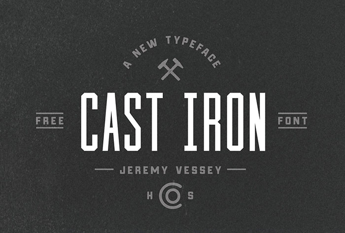
Cast Iron
Economica STD
This artistic font was inspired by the need to save space for publishing texts without any loss of height. Includes a comprehensive set of characters that lets you deal with diverse languages in its four variants.
Economica Pro is a font especially developed for printing in complex situations. It has been tested successfully for use in very small sizes without losing legibility. Its ink traps ensure smooth operation even on low quality papers. It is an ideal font for newspapers.
Sansus Webissimo
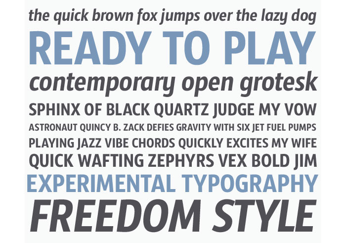
Sansus Webissimo is cool typography created for DesignContest.com Contemporary open grotesque with a wide number of characters that covers Basic Latin, major Latin diacritics, and Cyrillic.
Canter free font
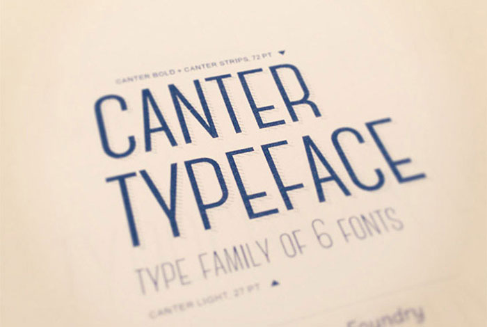
Canter is an all caps, condensed typeface available in six different weights. It is one of the best design fonts for titles, headlines, and posters.
MANIFESTO
Gafata STD
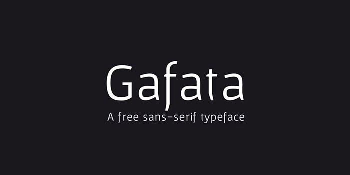
Gafata is a font designed for small sizes in the medium-long text, mixing elegance and readability making this font’s design is great for books, magazines and web pages.
In the process of finding the finest legibility, particular features emerged making this whimsical sans serif different from the rest, creating an original mark to the text its applied to.
Rambla Alt STD
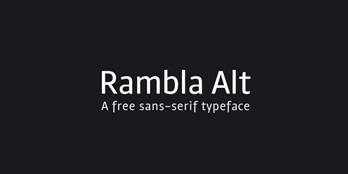
Rambla Alt is a variation of Rambla, which has certain modifications without altering its main structure.
For this reason Rambla Alt is great when used together with Rambla. Rambla Alt is a humanist sans and the combination makes them the best fonts for designers working with medium-long texts. It’s slightly condensed, with a generous x-height and short ascender/descenders.
Its proportions have the objective of gaining space in height and width. It’s elegant in large sizes and legible at the same time, with a lot of rhythm in small sizes.
Certa Sans
Fenix STD
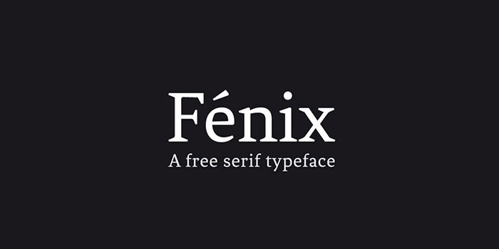
Fenix is a serif typeface designed for display and long texts, its foundations are based in calligraphy, with strong serifs and rough strokes. Its proportions seek to gain space in height and width. Fénix is elegant at large sizes and legible at the same time, with a lot of rhythm in small sizes. These make great traditional company fonts.
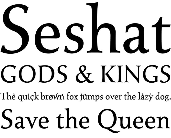
Seshat
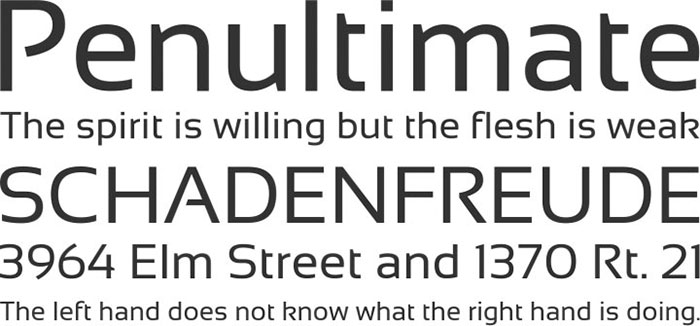
Sansation
Hipstelvetica
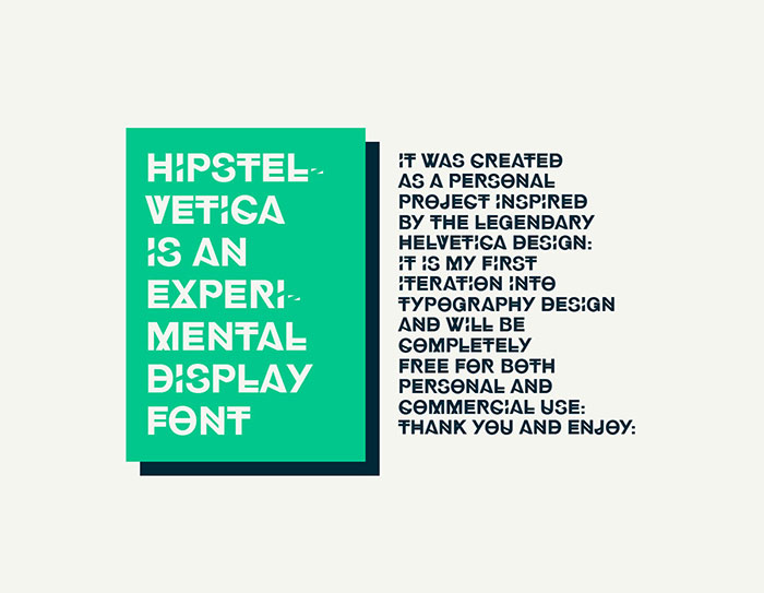
Hipstelvetica is an experimental display font family. It was created as a personal project Inspired by the legendary Helvetica design. These unique fonts ideas will add a touch of interest to a webpage or design.
Marta free font
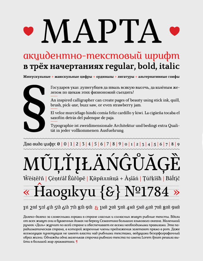
Marta. Eclectic, accidental-text font with wedge serifs. 3 inscription: normal, bold and italic vertically.
Ornamental and expressive cursive version, can use return as a separate font. Font includes the Old Calendar figures, ligatures, ordinals, and alternative forms of signs, thus extending the possibilities of typography. Extended Cyrillic and Latin. Contains over 650 glyphs.
Forum
Antiqua with classic “Roman” proportions. In combination his direct and rounded lines seen principles of classical architecture – vertical climbing pilasters, semi-circular arch, a horizontal cornices. It is intended for titles and headlines but can be used to set body texts too. Extended Latin and Cyrillic. This is one of the nice fonts for logos.
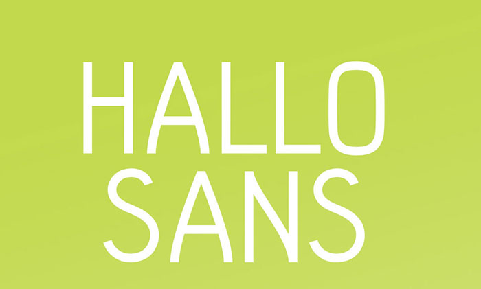
Hallo sans
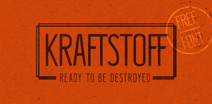
Kraftstoff Typeface
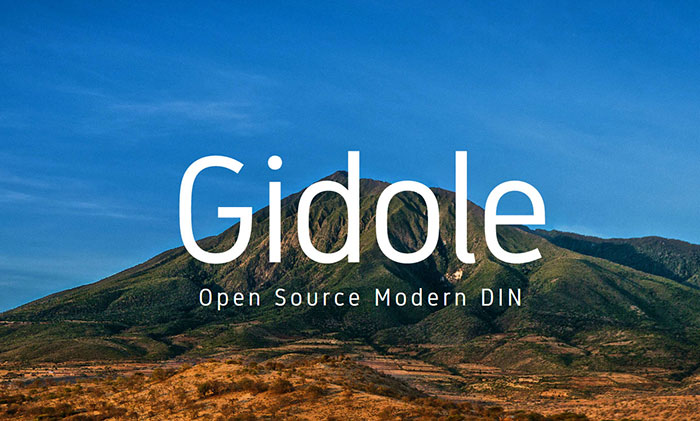
Gidole
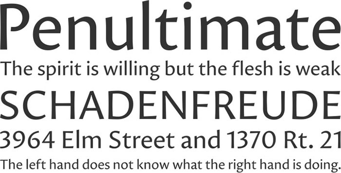
League Gothic
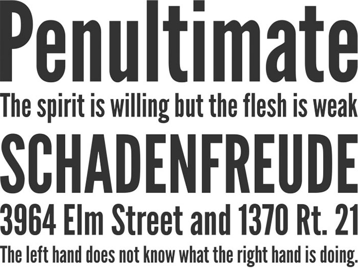
Another popular logo fonts choice is League Gothic. It is a revival of an old classic, and one of our favorite typefaces, Alternate Gothic No.1. It was originally designed by Morris Fuller Benton for the American Type Founders Company (ATF) in 1903.
The company went bankrupt in 1993. And since the original typeface was created before 1923, the typeface is in the public domain.
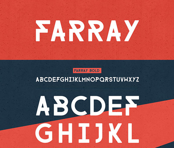
Farray
Overpass

Nougatine
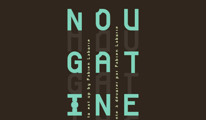
Nougatine is a titling font inspired by the smell of freshly baked cookies. Delivered with 380 glyphs, many ligatures and a panel of alternative letters, it brings to you the power of making great combinations.
Proza
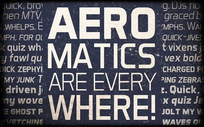
Aero Matics
Gandhi sans

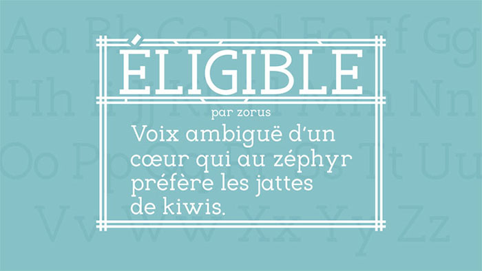
Eligible
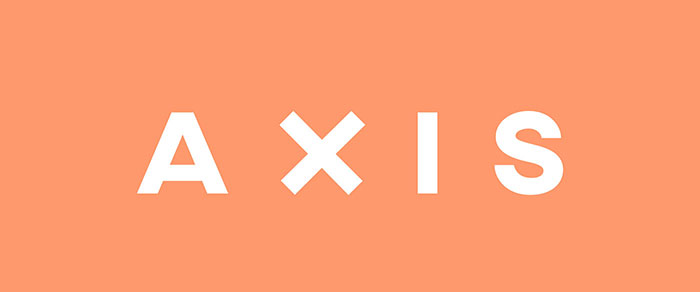
AXIS Typeface
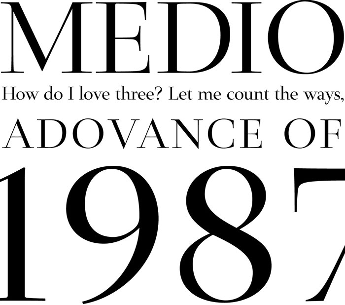
Medio
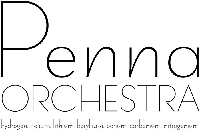
Penna
Dallea
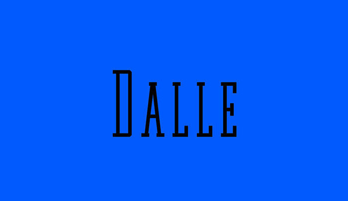
A narrow slab serif typeface, consisting of Caps, Small Caps, Numerals and Punctuation. With every character fitting inside a rectangular frame, the spaces between each letter are defined and consistent, making it one of the best free modern fonts available.
FV Almelo
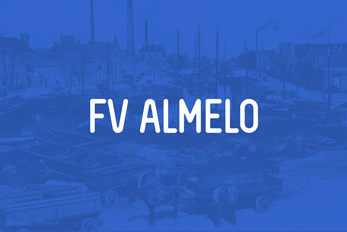
FV Almelo is an all caps condensed rounded makes awesome logo fonts but is also great for packaging, headline or editorial design. The capitals are the standard glyphs, if a character has an alternative you’ll find it using lower case. Because of its nod to the past I named it Almelo, city where I was born.
Cassannet Plus
Tienne
Popular Logo Fonts
If you are designer searching for logo fonts to communicate a brand’s message, you know that this is never an easy task. You’ll search through popular fonts, unique fonts and interesting fonts in what feels like a never ending quest for your perfect choice. At some point, even the coolest fonts will start to blend in, with each typeface beginning to look the same.
So we’re putting together a selection of the best fonts for logos to make your job easier. Even better we’ll be going back in time, with fonts ranging from the 1600s until present times.
You may be inspired by many of these fonts. Remember though that finding a great font is only really a starting point. Once you’ve found the design which speaks to your brand, you can make the alterations you need to make your design unique.
Here are the fonts every designer needs to build up a great collection
Garamond
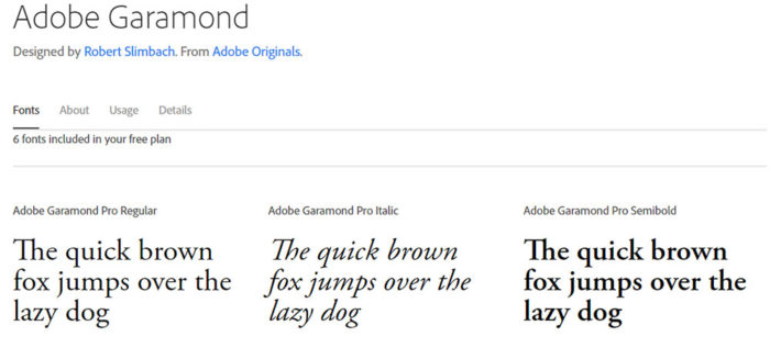
This is not a single, stand-alone font but comes as a family of top fonts. These are good fonts for great readability and they’ll give your work an elegant appearance which will wow your viewers. Typefaces include Adobe Garamond, Stempel Garamond, EB Garamond, Sabon Next and ITC Garamond.
This is a classic font family, released in 1989. Recently voted to be one of the top fonts available, it is often used in the print industry for magazines and textbooks. Websites using large bodies of text also use these great fonts.
Helvetica
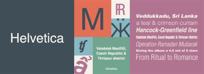
Helvetica is one of the most popular graphic design fonts available and is widely used by professional graphic designers. Criticism against the Helvetica font centers on the tightly spaced letters. However, this is a clean looking and very strong font which will give you the results you need. Helvetica has been included as a PC font choice since 1984 and is one of the top fonts for logo design.
Trajan
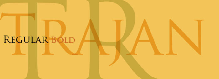
Trajan is one of the more familiar font designs as it is frequently used in Hollywood movie posters. This popular font is used to create a nostalgic feel and designers use it when working with law, religion, marriage or topics related to the past. Trajan is designed by Carol Twombly in 1989. It uses serifs to create a traditional feeling. It is a strong font which has been based on Roman square capitals. It is a dynamic font which will offer up versatile results.
Futura

Futura is a popular font which uses clean graphic shapes (such as circles, squares and triangles). Its clean appearance makes it an excellent option for posters, displays, logos and books. It makes an excellent business font and has often been used in corporate designs as well as small texts.
Bodoni
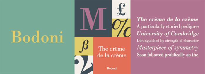
Bodoni makes an excellent logo font but has also been used for headlines and decorative text. It has a narrow structure as well as serifs which are un-bracketed. This font design used both thick and thin strokes to give an aesthetic appeal. It takes a geometric form which adds a great impact to any design. When crowdsourcing or creating a design brief, it is very helpful to make use or Bodoni.
Zorus Serif
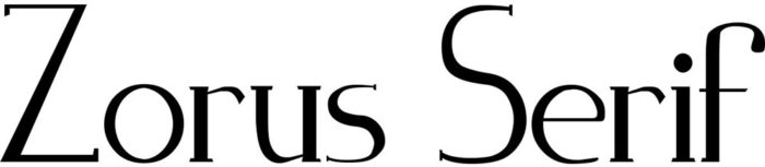
Zorus is a Gaelic style font designed by Jeremie Dupuis, a Canadian graphic designer. Definitely one of the best fonts for evoking memories of days gone by, Zorus also makes an excellent choice for print designs. You can use this font in either italic or standard designs.
Sabo
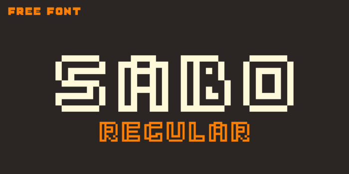
Designer Philippe Moesch created Sabo as a retro style font design. Sabo makes the best logo fonts if you’re looking to create an arcade-style theme. The pixel – style designs have great aesthetic appeal, giving an old-fashioned appeal. You can choose from either inline or filled when using this unique font.
Bobber
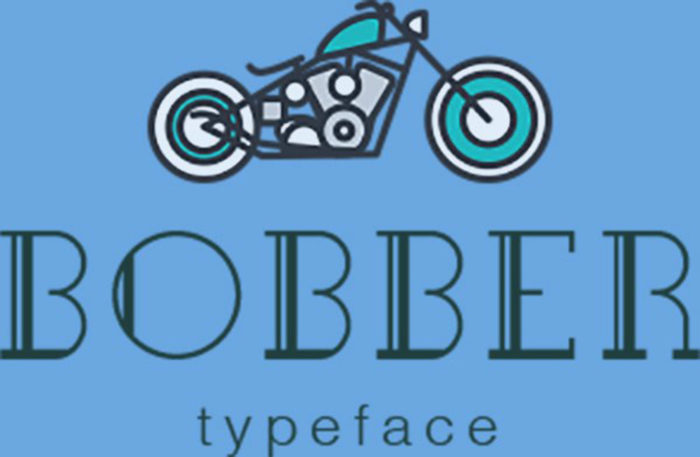
If you’re searching for designer fonts with a cool vintage appeal, Bobber is for you. Inspired by Bobber motorcycles, this is a font which will evoke nostalgia. The cool font designs have a grid base and a slab serif. They make the best fonts for designers working with unique, cool or vintage designs. Lucas Almeida and Dmitry Goloub designed Bobber for both commercial and personal use.
Akura Popo
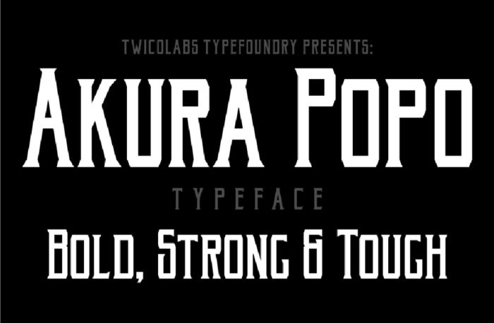
Akura Popo is one of the best looking fonts available at the moment. Tough, bold and very strong, this retro-style design is classic in design. The font makes a great choice when it comes to logos, headlines and letterheads. It is also a great fitness font which can be used with sporty designs or themes.
Berlin
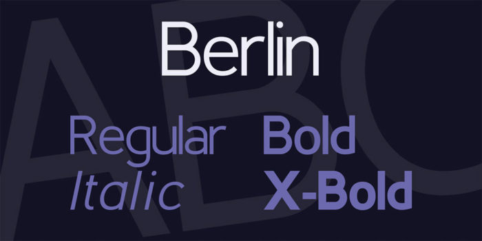
Berlin is a classic font which comes from the early 20th Century. Berlin makes a good font for logos with a geometric feel. The font comes in 4 versions -Berlin, Berlina, Slaberlin and Uberlin – and you can choose between regular, bold and x-bold.
Rockwell
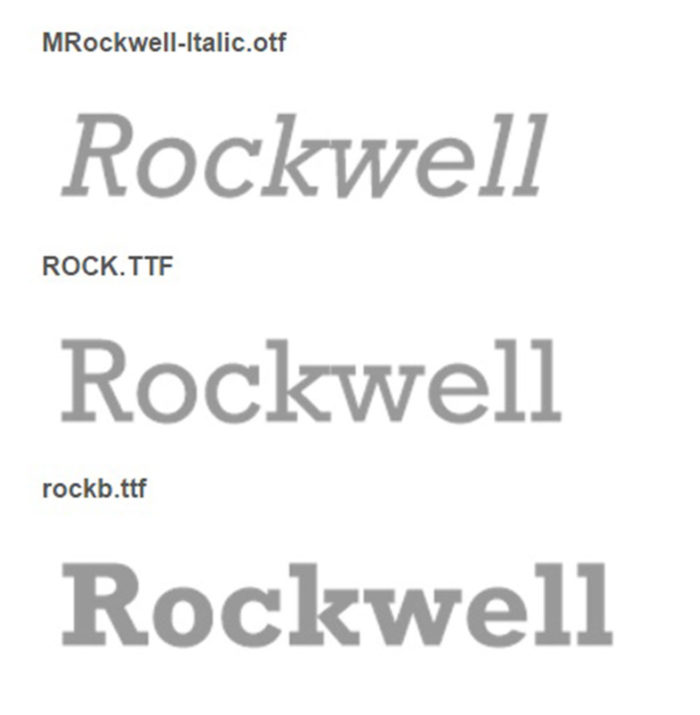
Fonts designers have come up with a great vintage style design font which is both aesthetic and readable. One of the great fonts for logos, headings, and banners.
Didot
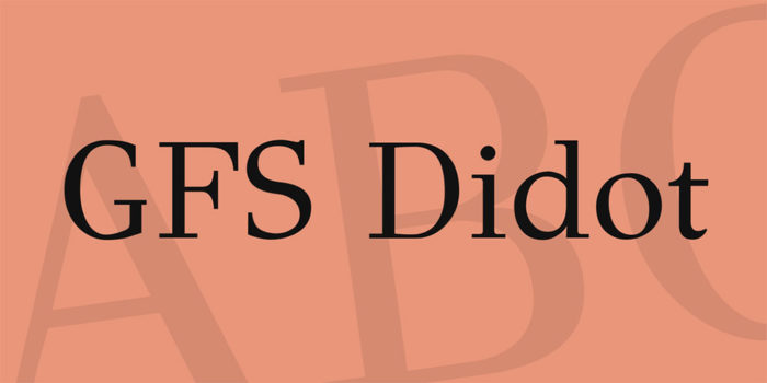
Font designer Didot came up with this design font in 1799, and the font has a prestigious history. Armani used the font in his logo and it is frequently used within the fashion industry. This is a great font to use when making an impression, and particularly when used with dramatic or contrasting colors.
Univers
Univers was designed by Adrian Frutiger in 1954 and makes a cool font for logos. A unique font because of its perfect geometry, Univers is said to be the top font of 20th Century designs. With its clear and detailed form and its impression of steadiness, this is one of the best fonts to use for all styles of design.
ITC Lubalin Graph
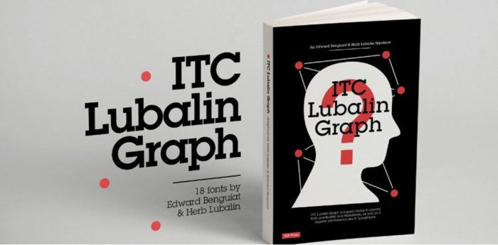
Designed by Herb Lubalin in 1974, the ITC Lubalin Graph is a strong font with a geometric appearance. Slab serifs shape this interesting font and it comes in a variety of different weights.
Frutiger

Font designer Adrian Frutiger completed the 1975 font Frutiger after seven years of work. The font was used at the Charles de Gaulle airport for directional signage. It has also been used on Swiss passports from 1985. The font is sans serif and has a very distinctive typeface. Letters are distinct and easy to read.
ITC Bauhaus
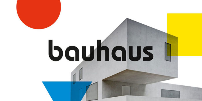
Font designers Edward Benguiat and Victor Caruso in 1975 designed ITC Bauhaus in 1975. The font has a distinctive look and is one of the best fonts for graphic design. With an old-school touch and five different weights, these cool typefaces make great choices for a range of different designs.
FF Meta
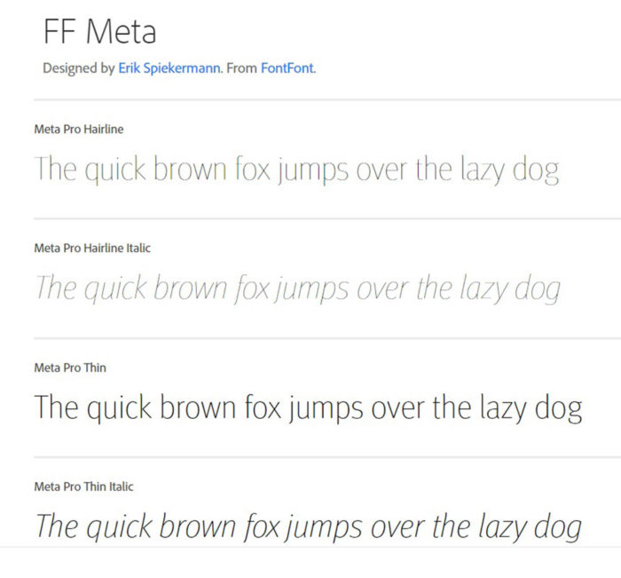
Erik Spiekermann designed FF Meta in reaction to Helvetica, which he found dull and bland. FF Meta was designed in 1991 as a sans serif and comes in 11 different styles. Curved and flexible, its cool typefaces have had a huge impact in the field of graphic design.
FF Blur
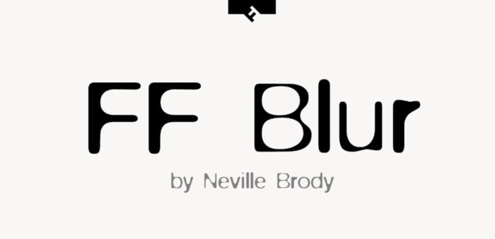
Neville Brody designed FF Blur in 1992 as an experimental and interesting font. The font involves a blurred grotesque which has been manipulated with Photoshop. This was one of the best fonts to use during the 1990s and remains popular. The Museum of Modern Art in New York considered this type logo to be a symbol of the times and included it in a permanent collection of digital fonts. FF Blur is one of only 23 modern logo fonts to be given this honor.
Horizon
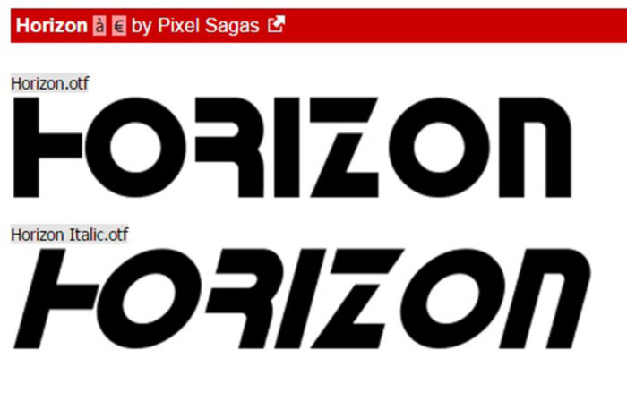
Horizon was created in 1992 by Bitstream as an experimental font. Inspired by the program Star Trek, it has a futuristic appearance and is geometric in style. A sans serif font, Horizon has thick and very sharp angles. It comes in both regular and italics and is best used in futuristic or galactic designs where it remains a popular font.
Big Caslon
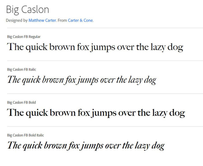
This font has a historical appeal and is inspired by the Caslon font of the 1600’s. Font designer Matthew Carter created the font in 1994. Big Caslon provides an excellent example of a merge of historical lettering and digital technique in order to create designer fonts which shine.
Sackers Gothic
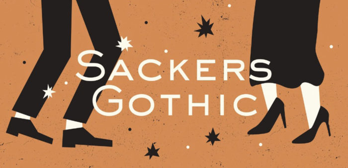
Sackers Gothic was created in 1994 as an engraver font. Often used in book covers, the font doesn’t contain lower case letters. This is one of the font designs which based on Roman letters. As a sans serif font this is one of the best design fonts for logos and social messages.
FF Din
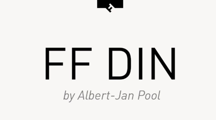
FF Din was created by Albert-Jan Pool in 1995. The typeface has 20 variations and was used for the identification of railroad cars. It was inspired by DIN1451 which was used in German signage for public administration.
Sassoon
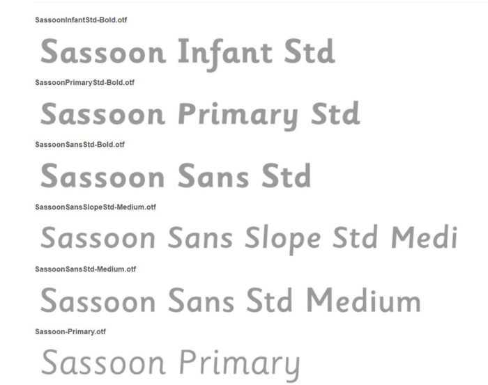
Rosemary Sassoon created this interesting font in 1995. The font is sans serif and has curls woven into the letter formations. The letters are curved and approachable and have often been used in children’s books.
Baltica-2
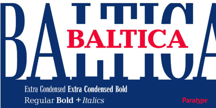
Font designers Vera Chiminova and Isay Slutsker created this slab serif font in 1998. This professional logo font is often used in posters, headlines, comics and magazines.
FF Avance
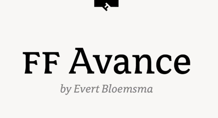
Designed by Evert Bloemsma in 2000, this font stands alone in a design. It is the best font for advertising cars or moving vehicles. As a serif typeface, it has a movement or energy which makes it one of the most effective fonts for graphic design.
Modesto
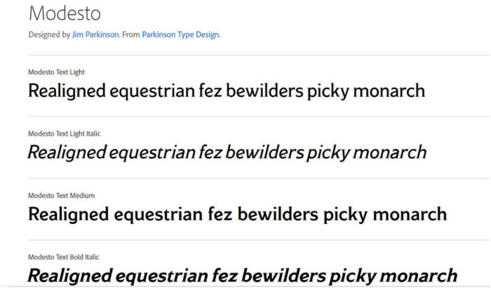
Modesto was created in 2000 by Jim Parkinson and draws on hand-painted circus lettering styles from the 19th and 20th Centuries. Its designs draw on circus lettering from the Barney and Bailey Circus logo. New italic fonts were added in 2014 and add to the number of bold logos which can be created with this outstanding font.
Neo Sans
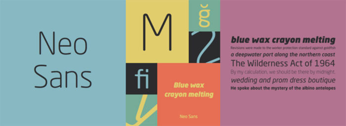
Neo Sans was created by Sebastian Lester in 2004. It was designed as a futuristic font and was quickly picked up by Intel as part of its rebranding campaign which began in 2005. This font is organic, has curved edges and is one of the most used business logo fonts. Kia motors, television channel ITV, Virgin Trains and the British Labour Party have all used this font as part of their branding or advertising campaigns.
Proxima Nova
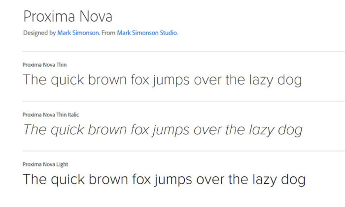
The Proxima Nova typeface family are a re-invention of the Proxima Nova Sans which was created in 1994. Font designer Mark Simonson produced this font family in 2005. These cool modern fonts also draw on classic geometry to give them a distinctive appearance. Spotify and Twitter makes use of this font family. The bold fonts can be used to create cool and interesting logos.
Foco
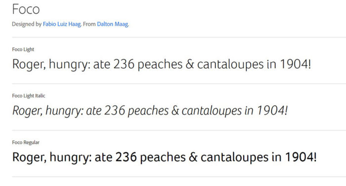
Created by font designers Fabio Haag and VeronikaBurian in 2006 this is an excellent sans serif font with a bold personality. Readability is excellent due to the careful spacing between letters. This font makes a good font for logo design, headers, taglines and subtitles.
Tondo
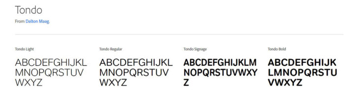
Popular font designer VeronikaBurian created Tondo in 2007. The font is bubbly, fresh and cute. It is a great font for creating a pretty logo and has been used to market the London Marathon. Its bubbly appearance would make this an excellent gym font.
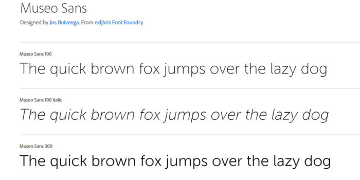
Museo Sans3
Museo Sans3 was created by Jos Buivenga in 2008 and makes a popular typeface for those who love working with lettering. Its spacing and kerning make it a great font for displays. It has a geometric, very aesthetic appearance which is both simple and effective.
Uni Sans
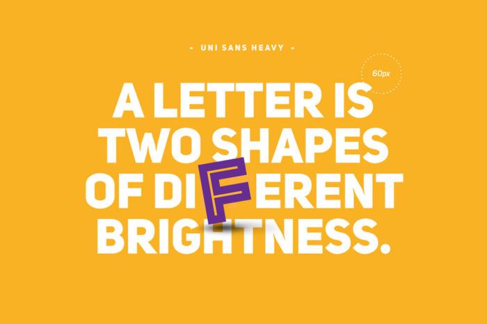
Uni Sans is a popular typeface which makes a good font for logos, t-shirt designs and sports logo fonts. Uni Sans was created by font designers SvetSimov, AniPetrova and VasilStanev in 2008. It makes great fitness fonts or gym fonts.
Neue Swift
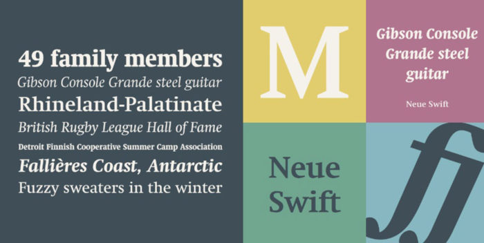
If you’re looking for a logo which uses lots of text, Neue Swift is a great choice. Its easy readability means that large volumes of text are easy to digest. Publishing and magazine industries make use of this popular font. Serifs give this great designer font a traditional feel. It was designed by Gerard Unger in 2009 and is great for producing an old style logo.
Brandon Grotesque
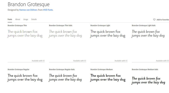
Brandon Grotesque is a sans serif font which has a rounded appearance. It is an elegant logo font which makes it one of the more popular professional business fonts. Created in 2010 by font designer Hannes von Döhren this font has frequently been used for packaging and label designs.
Bodoni Egyptian Pro
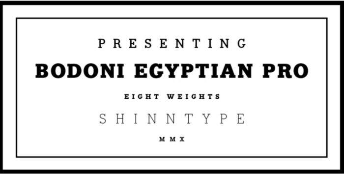
Font designer Nick Shinn created Bodoni Egyptian Pro in 2010. As a very versatile choice, this is one of the popular cool modern fonts. This font is bold, modern and digital. The font has a range of widths in bolds, serifs and capitals.
Revista
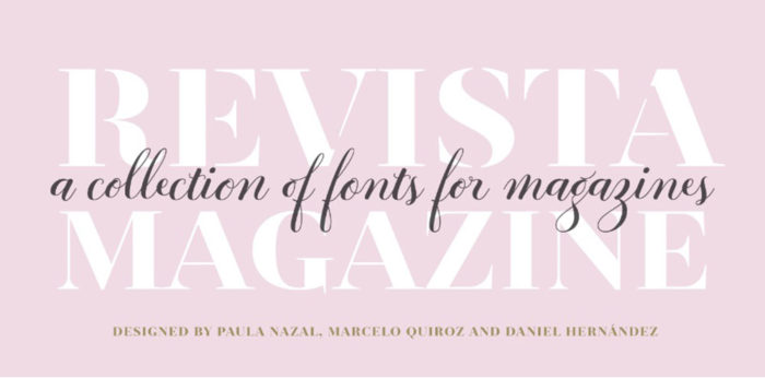
Revista brings back images of stencils and is one of the best fonts to use for fashion orientated or elegant design. This font includes zodiac and technology symbols. It is one of the cool modern fonts frequently used in fashion magazines. Revista was designed by Paula NazalSelaive, Marcelo Quiroz and Daniel Hernández in 2015.
Bambusa Pro
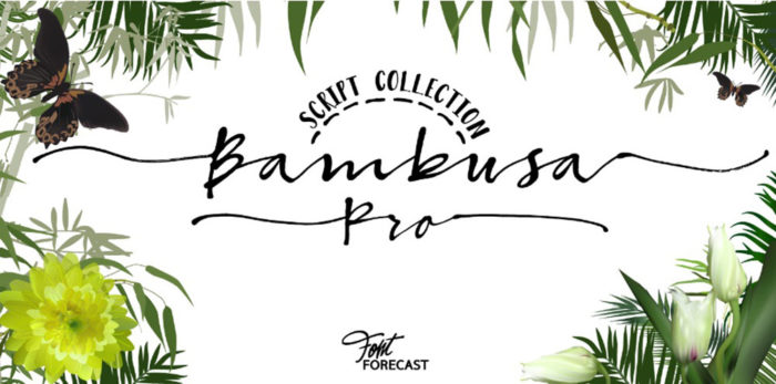
Designed by Hanneke Classen in 2015 Bambusa Pro is a favourite design font amongst professionals. Highly creative, the font has ornate swashes which connect the first and last letters of words. A great choice for logos and headers.
Amsi Pro
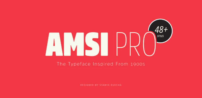
Amsi Pro was designed by StawixRuecha in 2015. Often a top design font for comic books, this retro font brings the feelings of the 1900’s into modern day designs.
Aventura
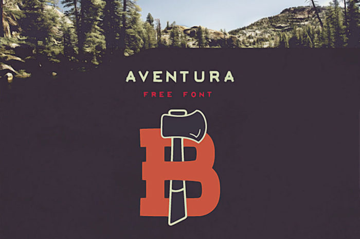
Jimmy Kalman was inspired by the outdoors when he created Aventura. Aventura inspires visions of adventure, free spirit and nature based exploration. This great design font is available free for personal use and can be purchased for commercial reasons. The font comes with numbers, characters and uppercase letters.
Axis
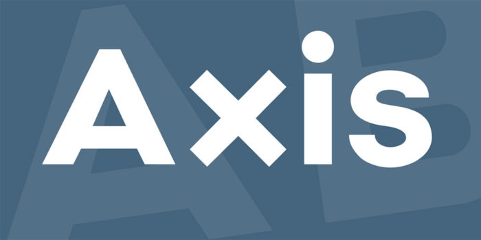
Font designer Jean M Wojciechowski created Axis as a sans serif font. Axis adds an urban element to design and is one of the best business fonts for shopping environments. The font inspires happy feelings and has been used by retailers and supermarkets in order to appeal to customers.
Azedo
Pedro Azedo, a Portuguese font designer, created Azedo as one of the best logo font choices. The font can be used in all areas of graphic design and is frequently used on t-shirts, badges and print designs.
Elegant Lux Pro3
Fonts designer Schoener designed Elegant Lux Pro3 in 2015 after being inspired by the elegant grotesk faces of the 1920s and 1930s. This font is great for creating friendly font logos as it has rounded corners.
Futuracha
Futuracha is an art deco style font for logo and headline design. The edges of these letters are extended to create an art deco element which is great for cards and invitations. This font package includes Greek and Latin characters as well as numbers and symbols.
Our unique collection
These special fonts are often not the most popular fonts. By adding them to your collection you’ll have a range of interesting fonts which will add a unique element to your designs.
The importance of logo fonts for designers

Image source: Eugeny Bochinin
More often than rare, it is the typography fonts as well as the logo fonts hat set the tone of the entire project and the element that influences the most how viewers feel about the design and how they interact with it.
It is the same as if you showed up on an official dinner wearing sweatpants – people will instantly judge who you are based on your appearance.
Building a design career, you can’t afford the luxury of making wrong assumptions about what your clients need or what their brand represents.
Such mistakes are no longer excusable, as clients know how important it is not to distract viewers from the original message they’re trying to send.
How to choose cool logo fonts

Image source: Piotr Gorczyca
The first thing to make sure of is whether the logo font you’re considering match the message your design has to convey. Noting down all important characteristics of your client’s brand is the logical and compulsory precursor for either downloading or buying whatever font you like. Free fonts, as well as popular fonts, can be downloaded online once you have made your choice.
While there are many contemporary fonts, designer communities suggest, the rule of thumb says what works well for other won’t always work well for you.
Basically, what we’re trying to say here is that the best fonts for logos are the ones that match their blueprints, and set the right mood to match their client’s personality.
Sometimes those will be casual, other times serious, but in all cases, end viewers should see the exact same thing you’re trying to tell them.
If the font looks or feels disconnected from the brand, visually it won’t make any sense to the company’s prospective clients.
That’s not exactly the reason why you were hired, so instead of falling for modern fonts and fun choices, put personal preferences away, and ask the client what he expects. More importantly, get ready to accept that your idea of stylish and appropriate may not be a match.
If you get lost in a sea of creative fonts for logos and have no idea how to proceed (odds are good it will happen), stop and think for a while: Does the logo font correspond to the purpose of your project? If it does, you’ve found yourself a winner.
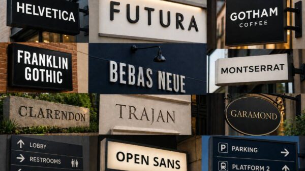
The classic dilemma: Serif or sans serif in logo fonts?

Image source: Christopher Coley
There are two broad groups of fonts to consider: serifs and sans serifs. Both groups offer modern fonts for logos, with the difference that serifs look more official and traditional, with few additional lines attached to the letters.
The most frequently used serif font is Garamond, one of the best serif fonts for printed designs. Yes, Garamond. On the sans serif side, choices are flourish-free and look way more modern, as for instance Helvetica.
Obviously, you could experiment and look for a range of creative fonts, but that’s not exactly the best practice in regular branding.
Instead of undertaking risky experiments, you should consider some of the serifs and sans serifs to give your logo a more traditional or modern vibe. There is a range of good fonts to choose from.
Choose logo fonts that match the brand

Image source: Krivenko Ivan
Back in the Gutenberg era, printing letters in different shapes and sizes had little to do with the characteristics or personality of a business, but that’s no longer the case.
Today, designers have much more to think about than making content legible, as the audience craves quality instead of quantity.
Regardless of how much design has evolved, and how much attention companies are devoting to branding considerations, Gutenberg’s 15th-century philosophy remains unchanged: The fonts for logos are chosen to convey a message and must make that message accessible.
By this, we mean that you have to choose fonts that people find easy to read, and such that help them establish a connection with you and understand your services – if you’re designing for an investment brokerage or a firm offering legal assistance, the best logo fonts should be nowhere close to curlicue or clunky.
Measuring brand-appropriateness is not an easy task, but neither is it an impossible one. There will be a suitable logotype depending on the business or the occasion – had the logo amplified the brand and conveyed the message it was supposed to, the goal will be achieved. At the end of the day, all that will matter is whether viewers understood your goal.
Pick a font that will last

Image source: Alexandar Radulovic
We all remember the coolest fonts from the ‘70s disco era, and how they reminded us of balloon animals.
Nevertheless, it is quite rare to see a logo like that nowadays, as trends become outdated and newer, contemporary fonts take their place. Top fonts, however, stand the test of time.
How can you know that a logo font will last? To start with, avoid trendy fonts, and go for strong fonts that may not be the hottest trend of the season, but still manages to stand out from the crowd.
Legibility comes first in logo fonts

Image source: Leo
The market is packed with creative fonts that look amazing at first sight, but you should give ornamentation a second thought.
Overdone font design is rarely the best choice available, as it ends up being unreadable instead of helping the brand liven up. When looking at display fonts, choose one where spacing is appropriate, and letters are easy to read and to distinguish from each other.
FAQ on the best fonts for logos
What font should I choose for my logo?
Well, that’s a tough one. When selecting a font for your logo, it’s crucial to consider your brand’s personality and the message you want to convey. Look for a typeface that complements your design and embodies your brand’s identity.
It might be helpful to explore different font categories like serif, sans-serif, script, or even hand-lettered styles to see which one resonates with your brand the most.
Do font trends matter for logos?
Hmm, great question. Although it’s essential to be aware of the latest font trends, you don’t have to blindly follow them. Your logo should be timeless and unique, so it’s best to choose a font that reflects your brand’s identity and values, rather than just chasing trends.
However, understanding current trends might inspire you to find a balance between contemporary and classic design elements for a logo that stands the test of time.
How many fonts can I use in my logo?
Alright, so it’s generally recommended to stick with one or two fonts in a logo design. Using multiple fonts can make your logo appear cluttered and confusing.
If you decide to use two fonts, make sure they complement each other and create a harmonious visual balance. Consider using a combination of a serif and a sans-serif font, or a bold and a light typeface to achieve the desired contrast.
Is it better to use free or paid fonts for my logo?
Well, both free and paid fonts can be suitable for logo design, depending on your needs and budget.
Free fonts are an excellent option if you’re on a tight budget or if you’re just starting out.
However, keep in mind that free fonts might be more commonly used, which could affect your logo’s uniqueness. On the other hand, paid fonts usually offer a higher level of quality, uniqueness, and versatility, making them a solid investment for your brand.
Can I customize a font for my logo?
Absolutely! Customizing a font for your logo is a fantastic way to create a unique and memorable brand identity. Feel free to modify letterforms, adjust kerning or spacing, or even combine elements from different fonts to achieve the desired look.
Just make sure you have the appropriate license for the font you’re working with and that you don’t violate any copyright restrictions.
Should I use a serif or sans-serif font for my logo?
The choice between a serif and sans-serif font for your logo depends on your brand’s personality and the message you want to convey. Serif fonts are often associated with tradition, sophistication, and reliability, while sans-serif fonts convey a more modern, clean, and minimalist vibe.
Consider your target audience and your brand’s overall aesthetic to make an informed decision.
What are the best resources for finding fonts for my logo?
There are countless resources available for finding fonts for your logo, both free and paid. Some popular websites include Google Fonts, Adobe Fonts, DaFont, FontSquirrel, and MyFonts.
These platforms offer a wide variety of typefaces in different categories, making it easier to find the perfect font for your logo design. Just make sure to check the licensing terms before using any font in your project.
How important is font readability in logo design?
Readability is crucial in logo design, as it ensures that your audience can easily recognize and remember your brand’s name. Choose a font that is clear and legible, even at smaller sizes. Avoid overly decorative or intricate typefaces, as they might compromise readability and ultimately, your logo’s effectiveness.
Should I avoid trendy fonts for my logo?
While it’s essential to be aware of current font trends, your priority should be creating a logo that’s timeless and unique to your brand. It’s okay to take inspiration from trends, but be careful not to blindly follow them. Instead, focus on selecting a font that genuinely reflects your brand’s personality and values. This will help ensure your logo remains relevant and appealing even as trends come and go. Remember, a well-designed logo should have a lasting impact and withstand the test of time.
Ending thoughts on these logo fonts
Font selection is one of the most significant aspects and it is important to set a font according to the theme. For example, if you own a food blogging website or a travel blog, fun fonts will make your website look more cool and eye-catching.
We hope this article helps you with selecting a great font for your brand or product. When selecting a font, go for creativity but ensure your logo or text is readable at the same time. This will help your brand to stand out as well as make a lasting impression. Try to limit the number of fonts in your design to two or three. This will keep your design looking clean, uncluttered and easy to read. Adjust your font choices to your business goals or needs and your viewers will know they have come to the right place.
If you liked this selection of fonts for logos, you should check out these articles as well:
- Signature Font Examples: Pick The Best Autograph Font
- Typography posters: Tips, Best Practices, And 108 Examples
- Personal Logo Design Ideas: How to Create Your Own
Renowned for his expertise in logo design and visual branding, Bogdan has developed a multitude of logos for various clients.
His skills extend to creating posters, vector illustrations, business cards, and brochures. Additionally, Bogdan's UI kits were featured on marketplaces like Visual Hierarchy and UI8.
He also wrote in the past years on sites like Design Your Way, WebDesignerDepot, WPDean, Designmodo, Speckyboy, Slider Revolution, and more.
- Pantone to HEX converter - 21 July 2026
- The Retool Logo History, Colors, Font, And Meaning - 20 July 2026
- CMYK to Pantone Converter - 19 July 2026
Bogdan Sandu is a seasoned designer who has been designing websites since 2008. Renowned for his expertise in logo design and visual branding, Bogdan has developed a multitude of logos for various clients. His skills extend to creating posters, vector illustrations, business cards, and brochures. Additionally, Bogdan's UI kits were featured on marketplaces like Visual Hierarchy and UI8. He also wrote in the past years on sites like Design Your Way, WebDesignerDepot, WPDean, Designmodo, Speckyboy, Slider Revolution, and more.
You Might Also Like