The Yelp logo stands as one of the most recognizable symbols in the local business review industry. Since 2004, this distinctive burst design has guided millions of consumers toward local dining and service discoveries.
The company was founded by Russel Simmons and Jeremy Stoppelman in San Francisco, and quickly needed a visual identity that captured the excitement of discovering great local businesses. The current logo features a red burst symbol alongside bold black lettering.
This iconic mark represents more than just corporate branding. It embodies the moment when someone finds exactly what they’re looking for.
What is the Yelp Logo?
The Yelp logo features a burst symbol resembling a flower or star alongside the brand name in rounded lowercase letters, developed by Michael Ernst in 2004 as the company’s creative director. The design captures the spirit of discovery and review writing through abstract visual elements.
The logo consists of several distinct components:
Design Type: Combination mark featuring both wordmark and symbol
Primary Elements:
- Abstract burst symbol (five triangular shapes with rounded corners)
- Custom wordmark in rounded sans-serif
- Integrated spacing and proportions
Official Introduction Date: 2004 (shortly after company inception)
Designer: Michael Ernst, hired as creative director by co-founder Jeremy Stoppelman
Trademark Status: Registered trademark owned by Yelp Inc., headquartered in San Francisco, California
Color Palette:
- Primary Red: #FF1A1A (RGB: 255, 26, 26)
- Yelp Red: #af0606 (alternate version)
- Black: #000000
- White: #FFFFFF
Usage Context: Digital platforms, mobile applications, marketing materials, business stickers, social media profiles, and website branding
The burst symbol can be used independently as a favicon or app icon. Yelp provides specific brand guidelines for authorized usage, including “Find us on Yelp” logos for business owners.
How Has the Yelp Logo Evolved Over Time?

The original design was introduced around the company inception and was replaced in several months by a new logo that has remained almost unchanged since then. The evolution showcases refinement rather than radical transformation.
The brand has maintained visual consistency while modernizing key elements. Each iteration improved readability and visual hierarchy without abandoning core identity.
Original Yelp Logo (2004, Early Version)
Years Active: 2004 (brief period)
Design Description: Cartoonish speech bubble logo with yellow capitals and thin black frame, followed by an exclamation mark
Designer: Chad Hurley, cofounder of YouTube
Context: Created during startup phase before formal branding direction established
Key Features: Speech bubble concept, yellow lettering, playful cartoon aesthetic
Cultural Significance: Represented early internet’s informal, user-generated content culture
This version lasted only months before leadership recognized the need for more professional, scalable branding.
Michael Ernst Logo Redesign (2004-2016)
Years Active: 2004-2016
Design Description: Burst symbol with five triangular shapes resembling a star or flower, paired with rounded lowercase letters in the Mesmer typeface
Color Scheme: Dark red (#af0606), black lettering, white background
Designer: Michael Ernst, creative director hired by Jeremy Stoppelman
Context: Ernst was tasked with giving the brand and site a new look after the original speech bubble logo proved too cartoonish
Key Changes from Previous: Shifted from speech bubble to burst symbol, introduced custom typography, established red color identity
Cultural Significance: The burst was inspired by the star symbol that appears above characters’ heads in cartoons during moments of discovery
This version established the foundation for all future iterations. Ernst created approximately 100 sketches before settling on the burst concept.
Refined Logo (2016-2021)
Years Active: 2016-2021
Design Description: Cleaned up and modernized contours, brightened color palette with more vivid red, refined lettering with better balance
Color Scheme: Brighter red shade, maintained black text
Context: Modernization to improve digital display and mobile performance
Key Changes from Previous: Whole composition now outlined creating a white cloud effect around the logo
Cultural Significance: Responded to mobile-first design trends and app icon requirements
The white outline created distinction but added visual complexity. This intermediate step prepared for future simplification.
Current Logo (2021-Present)
Years Active: 2021-present
Design Description: Removed white outline, darkened letters, made proportions more balanced, scarlet red burst symbol
Color Scheme: Bright red (#FF1A1A), deep black (#000000), clean white backgrounds
Context: Part of continued rollout of modernized platform, logo completely redrawn from scratch with more open counters and wider curves
Key Changes from Previous: Removed strange white sticker-like outline, letters darkened and made more proportional
Design Philosophy: Burst symbol refined to be more open and rounded while less boxy, designed in tandem with similar radii to complement one another
This version represents peak refinement. The removal of outlines created cleaner visual presentation across all digital platforms.
What Do the Design Elements of the Yelp Logo Mean?

The burst symbol represents sudden enlightenment, brilliant discovery, and successful thought – inspired by the star from Calvin and Hobbes comics that appeared when characters made discoveries. Every element reinforces the concept of finding and sharing experiences.
The design captures the emotional high of discovery. That moment when you find the perfect restaurant or locate exactly what you need.
The burst functions as visual shorthand for excitement and revelation. Ernst wanted something fun that captured the spirit of writing reviews, something more unique than just a simple exclamation mark.
The abstract nature allows multiple interpretations. Some see a flower, others see pizza slices, many recognize it as a starburst – all valid readings that contribute to memorability.
Why Did Yelp Choose These Specific Colors?
Red (#FF1A1A / #af0606)
The red carries multiple symbolic meanings. It signals urgency and action, encouraging users to engage with reviews and make decisions.
Red also represents passion and energy. The red color represents passion, security, and purity according to the brand’s color psychology.
From a color theory perspective, red creates immediate visual impact. It draws attention in crowded app screens and busy websites.
Black (#000000)
The black color symbolizes security and authority, reinforcing Yelp’s credibility as a trusted source. Black lettering provides maximum readability against light backgrounds.
The contrast between black text and red symbol creates clear emphasis without competing elements.
White (#FFFFFF)
White provides breathing room and clarity. It allows the red and black elements to pop without visual clutter.
White symbolizes purity and openness, reinforcing Yelp’s commitment to honest, transparent reviews.
What Typography Style Is Used in the Yelp Logo?
The wordmark uses the Mesmer typeface, a rounded font created by FontBank, Inc., with custom modifications by Michael Ernst. The designer wanted a fun, lighthearted design with rounded letters.
Ernst originally intended all caps with a lowercase ‘e’ and explored slab serif treatments, but settled on Mesmer with counters in the ‘e’ and ‘p’ offset to give subtle irreverence.
The current version resembles Proxima Nova Soft Bold or Helvetica Rounded Bold. These sans-serif fonts create approachable, friendly communication.
Rounded letterforms soften the brand personality. They feel welcoming rather than corporate or institutional, matching Yelp’s user-generated content focus.
What Are the Hidden Meanings in the Yelp Logo?
The burst contains five distinct triangular shapes. The star consists of five triangles with sharp ends facing inward, rounded corners and outer sides spaced far apart.
One petal extends upward, creating an exclamation mark effect. This subtle detail adds urgency and discovery to the symbol.
Ernst tried multiple times to draw the star but it kept turning into a flower, forcing him to choose an abstract style. This unintentional ambiguity became a strength.
The design incorporates principles from comic book visual language. Speech bubbles, exclamation marks, and discovery symbols all inform the final aesthetic.
How Does the Yelp Logo Compare to Competitor Logos?

According to The San Francisco Chronicle, the site’s popularity soared after it was redesigned in late 2005 with the distinctive burst logo. The design set Yelp apart in a crowded marketplace.
TripAdvisor uses an owl symbol, representing wisdom and observation. Google Business Profile employs a simple location pin. Yelp’s burst creates more emotional resonance than these functional icons.
The abstract burst allows interpretation while maintaining brand recognition. Unlike literal symbols (pins, stars, checks), it captures feeling over function.
Tech company logos increasingly favor minimalism, but Yelp’s design has maintained its distinctive character through refinement rather than simplification.
Among fast food logos and restaurant branding, Yelp’s mark stands out through its connection to the discovery moment rather than product depiction.
What Are the Technical Specifications of the Yelp Logo?

Official Color Codes:
Primary Red:
- Hex: #FF1A1A
- RGB: (255, 26, 26)
- CMYK: (0, 90, 90, 0)
- Pantone: PMS Bright Red C
Yelp Red (Alternate):
- Hex: #af0606
- RGB: (175, 6, 6)
Black:
- Hex: #000000
- RGB: (0, 0, 0)
- CMYK: (60, 40, 40, 100)
- Pantone: PMS Black 6 C
White:
- Hex: #FFFFFF
- RGB: (255, 255, 255)
- CMYK: (0, 0, 0, 0)
Dimensions and Proportions:
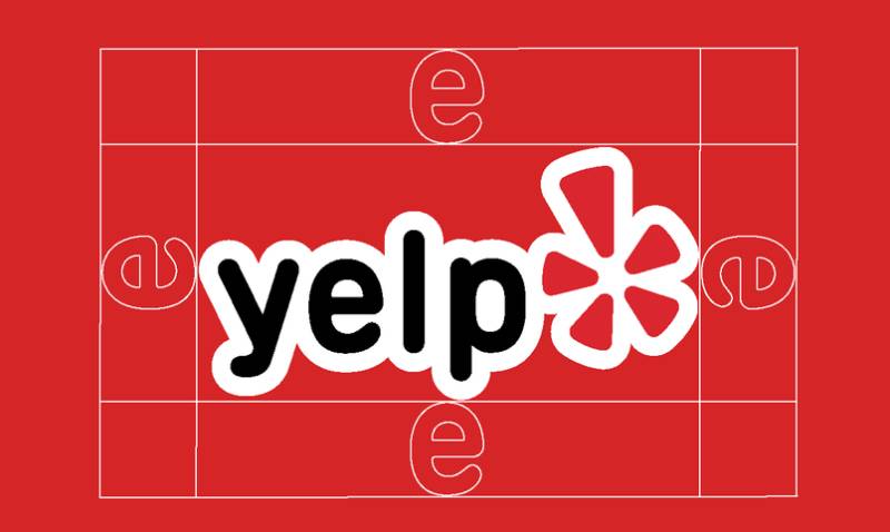
The burst symbol and wordmark maintain specific spacing relationships. The burst and word mark were designed in tandem and use similar radii to complement one another.
Minimum size requirements ensure legibility across platforms. The logo must maintain clear space around all sides to prevent visual crowding.
Clear space specifications prevent logo from touching other elements. Standard practice requires spacing equal to the height of the lowercase ‘y’ in the wordmark.
Official usage guidelines prohibit altering or distorting the logos except to change sizing while preserving original proportions.
What Cultural Impact Has the Yelp Logo Had?
As of December 31, 2024, approximately 308 million reviews had been contributed to Yelp, with over 76 million desktop unique visitors. The logo has become synonymous with consumer reviews and local business discovery.
The burst symbol appears on storefronts worldwide through “Find us on Yelp” stickers. This physical presence extends brand recognition beyond digital platforms.
The design influenced how review platforms approach brand identity. Rather than corporate formality, successful platforms now embrace playful, user-friendly aesthetics.
Yelp’s visual language helped establish conventions for user-generated content platforms. The balance between professional credibility and accessible personality became a model for similar services.
How Does the Yelp Logo Fit Into Overall Brand Identity?

The burst symbol extends beyond the logo into app icon design. Yelp applied a red background to its primary app icon while utilizing white backgrounds for other apps, establishing hierarchy among the apps.
The company introduced a 3D visual style for app icons. This glossy, embossed and rich visual language is unconventional and a bold splash for a digital landscape filled with flat design.
Color consistency reinforces recognition across touchpoints. The red burst appears in notifications, emails, social media, and physical materials.
Typography elements from the logo extend to interface design. Rounded letterforms and approachable spacing characterize the entire user experience.
The burst functions as a focal point across all branded materials, creating visual continuity regardless of application.
How Should the Yelp Logo Be Used?
Official Usage Do’s:
- Use “Find us on Yelp” logo to let consumers know you’re listed on Yelp
- Maintain original proportions when resizing
- Use authorized logo files from official sources
- Apply proper clear space around logo
- Use on appropriate backgrounds (white or red)
Official Usage Don’ts:
- Don’t invent your own logo, statement or imagery incorporating Yelp branding
- Don’t use Yelp branding in a manner that creates confusion as to sponsorship or endorsement
- Don’t use any Yelp branding in connection with comparative advertising
- Don’t alter colors, distort proportions, or add effects
- Don’t incorporate Yelp branding in website URLs or app names
Where to Access Official Logos: Download logos from the official Yelp Brand Center at yelp.com/brand
Licensing Information: For questions regarding Yelp branding, contact trademarks@yelp.com
Trademark Protection: The Yelp name and burst symbol are registered trademarks. Unauthorized use may result in legal action.
Business owners can request official “Find us on Yelp” stickers through the brand center. These maintain proper logo specifications and approved usage.
FAQ About the Yelp Logo
When was the Yelp logo created?
The current Yelp logo was created in 2004 by Michael Ernst, shortly after the company’s founding by Russel Simmons and Jeremy Stoppelman. It replaced an earlier speech bubble design that lasted only months.
Who designed the Yelp logo?
Michael Ernst designed the iconic Yelp logo as the company’s creative director after being hired by co-founder and CEO Jeremy Stoppelman in 2004. Ernst created approximately 100 sketches before finalizing the burst concept.
What do the colors in the Yelp logo mean?
The red color represents passion and energy, the black symbolizes security and authority, and white represents purity and openness. Together, these colors create trust while encouraging user engagement and action.
How many times has the Yelp logo been redesigned?
The Yelp logo has undergone three major iterations since 2004: the original Ernst design, the 2016 refinement with white outlines, and the 2021 modernization that removed outlines. The core burst concept has remained consistent throughout all versions.
Where can I download the official Yelp logo?
Official Yelp logos can be downloaded from the Yelp Brand Center at yelp.com/brand, where business owners can also request “Find us on Yelp” stickers. The brand center provides authorized versions in multiple formats.
Is the Yelp logo trademarked?
Yes, the Yelp name and burst symbol are registered trademarks owned by Yelp Inc. All usage must comply with official brand guidelines, and questions should be directed to trademarks@yelp.com.
What font is used in the Yelp logo?
The original logo used Mesmer typeface by FontBank, Inc., with custom modifications including offset counters in the ‘e’ and ‘p’ letters. The current version resembles Proxima Nova Soft Bold or Helvetica Rounded Bold.
Why did Yelp choose a burst symbol for their logo?
Ernst drew inspiration from Calvin and Hobbes comics, where a little star appeared above characters’ heads during moments of discovery, capturing the surge of energy people feel when finding great local businesses.
Conclusion
The Yelp logo represents one of the most successful brand identities in digital platform design. The burst symbol and rounded wordmark have guided millions through local business discovery since 2004.
Michael Ernst’s design captured the essential moment of finding exactly what you need. The abstract burst allows interpretation while maintaining instant recognition across all platforms.
Three major refinements have modernized the logo while preserving its core identity. The current version achieves optimal balance between simplicity and character.
As Yelp continues evolving its platform and services, the burst remains a constant visual anchor. It demonstrates that effective branding captures emotion over literal representation, creating lasting connections with users worldwide.

Renowned for his expertise in logo design and visual branding, Bogdan has developed a multitude of logos for various clients.
His skills extend to creating posters, vector illustrations, business cards, and brochures. Additionally, Bogdan's UI kits were featured on marketplaces like Visual Hierarchy and UI8.
He also wrote in the past years on sites like Design Your Way, WebDesignerDepot, WPDean, Designmodo, Speckyboy, Slider Revolution, and more.
- The Windsurf Logo History, Colors, Font, And Meaning - 10 October 2026
- How to Remove Background From Product Photos (No Photoshop) - 10 October 2026
- How Designers can Build a Stronger Online Creative Identity - 9 October 2026

Bogdan Sandu is a seasoned designer who has been designing websites since 2008. Renowned for his expertise in logo design and visual branding, Bogdan has developed a multitude of logos for various clients. His skills extend to creating posters, vector illustrations, business cards, and brochures. Additionally, Bogdan's UI kits were featured on marketplaces like Visual Hierarchy and UI8. He also wrote in the past years on sites like Design Your Way, WebDesignerDepot, WPDean, Designmodo, Speckyboy, Slider Revolution, and more.
You Might Also Like