


Mix a bright green with white and it never turns blue, yellow, or anything strange. It just gets softer. So what color do white and green make? A lighter green, the tint we call mint, sage, or seafoam depending on the base you start with.
White adds no new hue. It only raises lightness and drops saturation, so the green identity stays intact.
This guide breaks down the mechanics behind that shift, in both paint and on screens.
You will learn:
- Why adding white makes a tint, not a new color
- The exact shades, hex codes, and RGB values
- How ratios change the result, and what pairs well with mint
What Color Do White and Green Make

White and green make a lighter green. The exact result reads as mint, pastel green, sage, or seafoam depending on the base green you start with. White adds no new hue, so the mix stays inside the green family while brightness climbs and intensity fades.
This lightened result is called a tint. Any color plus white produces one.
The green base decides the personality of the outcome. A cool, blue-leaning green drifts toward the pale sea-glass look of seafoam, while a warm, yellow-leaning green softens into pistachio.
Common names for a white-and-green mix:
- Mint and pastel green for balanced mid-greens
- Sage and celadon for muted, grayish greens
- Seafoam and pistachio for cool and warm variants
None of these turn into a different color. They stay green, just quieter.
Why Does Adding White to Green Make a Lighter Shade
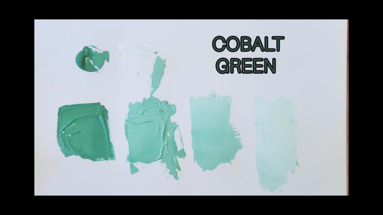
Adding white raises the overall lightness value of green while leaving its hue mostly fixed. White reflects every wavelength, so blending it in pushes the mix toward brightness. The green identity survives, but the color loses depth and reads softer, paler, and less vivid.
Tint: green plus white. The lightening move that creates mint and pastel green.
Shade: green plus black. The darkening move that creates forest or hunter tones.
Tone: green plus gray. A muting move that dulls without pure lightening or darkening.
How Lightness and Saturation Shift
In the HSL model, three values describe any color: hue, saturation, and lightness. White changes two of them.
Hue stays put near the green range (around 120 degrees). Lightness rises toward 100%. Saturation drops as the color pales.
That combination is why a punchy green calms into a soft one without becoming blue, yellow, or anything off-family. If you want to test the shift yourself, a tool that steps a hue through tints and shades shows every stage between vivid green and near-white.
How Does Green Behave in Subtractive Versus Additive Color Mixing
Green behaves differently by system. In subtractive mixing (paint, ink, dye), white pigment physically lightens green into a pastel. In additive mixing (light, screens), pushing green toward white desaturates it. Both roads end at a paler green, but the mechanism is not the same.
| System | Medium | Result of Adding White |
|---|---|---|
| Subtractive | Paint, ink, dye (RYB, CMYK) | Opaque pastel green |
| Additive | Light, RGB screens | Washed-out, desaturated green |
This split matters because the rules governing how colors combine depend entirely on whether you are mixing matter or light.
White in Paint and Pigment Mixing
Not all whites tint the same. Titanium white is opaque and strong, so it lightens green fast into a chalky mint.
Zinc white is more transparent and gives a softer, gentler pastel that builds gradually.
White in Digital and Light-Based Mixing
On an RGB screen, pure green sits at (0, 255, 0). Raising the red and blue channels equally moves it toward white.
The result reads as a faded mint rather than a mixed pigment. Nothing physical blends. The screen just adds light.
What Are the Exact Shades White and Green Produce
White and green produce six recognized shades: mint, pastel green, sage, seafoam, pistachio, and celadon. Each traces back to a specific green base and a rough white ratio. Yellow-green bases lean warm toward pistachio, while blue-green bases cool down toward seafoam.
| Shade | Base Green | Character |
|---|---|---|
| Mint | Balanced green | Fresh, clean, mid-pastel |
| Pastel green | Soft green | Light, gentle, airy |
| Sage | Grayed green | Muted, earthy, calm |
| Seafoam | Blue-green | Cool, watery, pale |
| Pistachio | Yellow-green | Warm, nutty, soft |
| Celadon | Gray-green | Subtle, ceramic, quiet |
The warm-versus-cool split is the whole trick. Nudge the base toward yellow and you land in soft pistachio territory. Nudge it toward blue and you get the muted, ceramic feel of celadon.
What Are the Hex Codes and RGB Values for White and Green Mixes
Pure green baselines at #008000, RGB (0, 128, 0). White is #FFFFFF, RGB (255, 255, 255). A 50/50 mix averages each channel, landing near a soft mid-green. Push more white and every channel climbs toward 255, producing lighter tints.
Sample tints designers actually reach for:
- Mint: #98FF98, RGB (152, 255, 152)
- Pastel green: #C1E1C1, RGB (193, 225, 193)
- Sage: #B2AC88, RGB (178, 172, 136)
How to Replicate These Mixes Digitally
CSS handles this natively. The color-mix() function blends two colors by percentage: color-mix(in srgb, green, white 50%) returns a pastel without manual math.
Prefer to convert by hand? Run a base green through a converter that turns RGB values into hex or reverse it with a hex-to-RGB tool to check each channel.
For full palettes built around one tint, a generator that builds coordinated color sets speeds the process up. Adobe Color and Coolors do the same.
How Much White Changes the Green Result
The white-to-green ratio is the single lever controlling how light the mix becomes. A little white gives a soft, slightly muted green. Equal parts land at a clear mint or pastel. Heavy white produces a near-white tint that borders on off-white.
More white always means lighter and less saturated. There is no ratio that darkens.
Painters add white gradually for a practical reason: tints are hard to reverse. Overshoot into pale mint and you have to rebuild the green from scratch to pull it back.
Working ratio guide:
- 1 part white: subtle softening, green still dominant
- Equal parts: full pastel or mint
- 3+ parts white: barely-there tint, almost white
Where Do Mint and Pastel Green Get Used

Mint and pastel green show up across interiors, weddings, branding, and fashion. The shades read as fresh, calm, and health-adjacent, which is why wellness and spring-driven categories lean on them. Real usage data backs the reach of these soft greens across several industries.
Interior Design
Soft greens moved from accent to main event. Fixr.com’s 2024 trends report found that 46% of design experts named earthy tones the most popular palette, with sage green cited as a leading individual color.
The muted, grayish green known as sage works on cabinetry, walls, and tile. Woman & Home reported the term “sage green aesthetic” pulls over 11,000 monthly searches across the UK and US.
Weddings
Light green ranks near the top of real wedding data. The Knot’s study showed 38% of Gen Z couples embraced pale verdant shades like sage, mint, and celadon.
The Knot’s 2025 findings put light green third overall, with 33% of couples threading it into their palettes. Mint pairs constantly with blush pink and gold in spring and summer setups.
Branding and Web
Color carries real commercial weight. Straits Research reports that 85% of buyers say color is the main reason they pick one product over another, and color lifts brand recognition by up to 80%.
Soft greens signal calm and trust, which is why wellness, fintech, and sustainability brands reach for mint and sage. The emotional meaning colors carry steers those choices more than aesthetics alone.
What Pairs Well With These Tints
Mint plays nicely in several directions. Its opposite on a palette built on opposing hues lands in the soft pink and warm coral range.
Neutral pairing: white, cream, warm wood, gray.
Analogous pairing: other greens and blues, since mint already blends green with a hint of blue and white, the same logic behind what green and blue produce together.
A reliable three-color set: mint, blush, and deep charcoal for grounding contrast.
What Colors Pair Well With White-and-Green Tints

White-and-green tints pair best with three groups: warm complements like blush pink and coral, neutral grounders like white, cream, and gray, and cool neighbors like navy and other greens. Mint’s opposite sits near red on the color wheel, which is why warm accents make it pop.
The whole logic runs on warm-cool balance. Mint reads cool, so it wants either a warm counterpoint or a harmonious cool companion.
Complementary Pairings
Soft blush pink and coral sit across from mint on the wheel designers use to map hue relationships. That opposition creates contrast without tension.
Apartment Therapy notes designers lean on pink-and-green as a pastel play on a classic nature pairing, fresh and easy. Coral brings more energy; blush keeps things romantic and grown-up.
Best rooms: bedrooms, sunrooms, and living spaces that want cheerful warmth.
Neutral Grounding Colors
Neutrals let mint carry a room without fighting it.
- White: sharpens mint and keeps a scheme modern and airy
- Cream: warms the coolness for a softer feel
- Gray and charcoal: add contemporary depth and drama
- Warm wood: oak and birch introduce organic earthiness
Awedeco recommends the 60-30-10 rule: 60% mint, 30% neutral, 10% accent. That ratio stops any single color from taking over.
Analogous and Cool Pairings
Cool neighbors build calm, layered palettes. Deep navy blue shares mint’s cool undertone but contrasts in brightness, which grounds a lighter room.
Other greens and blues stack into a soft ombre effect. Mint already blends green with a touch of blue and white, so it slides naturally into that family.
This approach leans on the way related hues sit together in balance rather than through contrast.
Colors to Avoid
Skip olive, mustard, and bright orange at full saturation. They clash with mint’s cool base or turn the mix muddy.
Lime green competes too closely and flattens the effect.
A Ready-to-Use Palette
One combination works almost anywhere: mint, blush, and charcoal.
Mint carries the space, blush warms it, and charcoal anchors the eye so the pastel never floats. Livingetc points to gray and mint as a designer favorite because the stony tone lets the fresh green stand out.
Swap charcoal for gold hardware when you want a little glamour. Both the crisp freshness of mint green and the gentler feel of pastel green respond well to that metallic warmth.
FAQ on What Color Do White And Green Make
What color do white and green make?
White and green make a lighter green, a tint. The result reads as mint, pastel green, sage, or seafoam depending on the base green. White raises brightness and lowers saturation without changing the hue.
Does white change green into a different color?
No. White never shifts green into blue, yellow, or any new hue. It only lightens. The green stays green while the color grows paler, softer, and less intense with each addition of white.
What is the name of white mixed with green?
The mix has several names. Mint and pastel green are the most common, followed by sage, seafoam, pistachio, and celadon. The exact label depends on the starting green and how much white you blend in.
Why does adding white make green lighter?
White reflects every wavelength of light. Blending it into green raises the overall lightness value while the hue stays fixed near 120 degrees. Saturation drops at the same time, which is why the green pales.
What is a tint versus a shade?
A tint is any color plus white, like mint green. A shade is any color plus black, like forest green. A tone is a color plus gray. White always tints, never darkens.
What hex code does white and green make?
It depends on the ratio. Pure green (#008000) mixed evenly with white (#FFFFFF) lands near a soft mid-green. Common tints include mint at #98FF98 and pastel green at #C1E1C1.
How does mixing work on screens versus paint?
Paint uses subtractive mixing, so white pigment physically lightens green into an opaque pastel. Screens use additive RGB mixing, where raising red and blue channels equally desaturates green toward a washed-out mint.
How much white should I add to green?
Add white gradually. A little softens the green. Equal parts create a clear pastel or mint. Heavy white produces a near-white tint. Tints are hard to reverse, so build up slowly.
What colors go well with mint green?
Mint pairs with blush pink and coral for warm contrast, plus white, cream, and gray as neutrals. Navy and other greens work as cool companions. A reliable trio is mint, blush, and charcoal.
Is mint green warm or cool?
Mint reads cool because it blends green with a hint of blue and white. Warm accents like coral or gold balance it, while cool neighbors like navy deepen the palette without breaking the mood.
Conclusion
So what color do white and green make? Every answer points to the same place: a softer, paler green. The hue holds steady while lightness climbs and saturation falls.
That single move produces mint, sage, seafoam, pistachio, and celadon.
The system decides the texture. Pigment lightens green into an opaque pastel, while additive light on a screen washes it toward a faded tint.
Ratio does the rest. A touch of white barely softens the green. Heavier amounts push it close to off-white.
Reach for named hex values when you need precision, like #98FF98 for mint. Lean on warm blush or grounding neutrals when you build a palette around it.
Green plus white stays green. Just quieter, cleaner, and easier to live with.

Renowned for his expertise in logo design and visual branding, Bogdan has developed a multitude of logos for various clients.
His skills extend to creating posters, vector illustrations, business cards, and brochures. Additionally, Bogdan's UI kits were featured on marketplaces like Visual Hierarchy and UI8.
He also wrote in the past years on sites like Design Your Way, WebDesignerDepot, WPDean, Designmodo, Speckyboy, Slider Revolution, and more.
- The Windsurf Logo History, Colors, Font, And Meaning - 10 October 2026
- How to Remove Background From Product Photos (No Photoshop) - 10 October 2026
- How Designers can Build a Stronger Online Creative Identity - 9 October 2026

Bogdan Sandu is a seasoned designer who has been designing websites since 2008. Renowned for his expertise in logo design and visual branding, Bogdan has developed a multitude of logos for various clients. His skills extend to creating posters, vector illustrations, business cards, and brochures. Additionally, Bogdan's UI kits were featured on marketplaces like Visual Hierarchy and UI8. He also wrote in the past years on sites like Design Your Way, WebDesignerDepot, WPDean, Designmodo, Speckyboy, Slider Revolution, and more.
You Might Also Like


