Grab pink and red, blend them, and you get a warmer, deeper pink. That is the short answer to what color do pink and red make, but the full picture depends on whether you are mixing paint or pixels.
Pink is just red softened with white. So adding red back concentrates the base and pushes the result toward rose or raspberry.
This guide breaks down exactly what happens, and why the shade shifts the way it does.
You will learn:
- The rose and raspberry tones different ratios produce
- How paint mixing and screen mixing give different results
- Exact hex codes for digital work
- Which colors pair well with the blend
By the end, you will know how to mix pink and red with intent, on canvas or on screen.
What Color Do Pink and Red Make
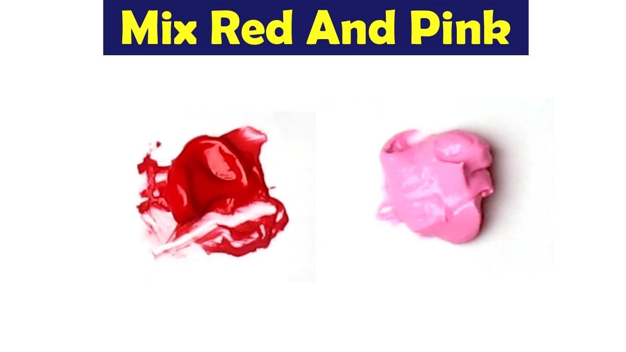
Pink and red make a deeper, warmer pink, landing on a rich rose or raspberry tone. Pink is already red mixed with white, so adding more red pulls the blend back toward red while staying inside the pink family.
The result never becomes a brand-new hue. It just shifts warmer and more saturated.
Most people label the outcome one of four ways:
- Rose: the classic balanced blend
- Raspberry: red-heavy, jammy, slightly cool
- Watermelon: softer, pink-leaning
- Deep coral-pink: when a touch of warmth creeps in
Think of the finished swatch as a warmer rose rather than a separate color.
Why Pink and Red Produce a Warmer Rose Shade

Adding red to pink removes some of the white that made the pink pale. The mix gains red dominance, climbs in intensity, and reads as warm. Since pink is a tint of red, you are concentrating the same base pigment, not introducing a new one.
Tint logic: pink equals red plus white, so extra red cuts the white ratio.
Saturation shift: the blend gets more vivid because there is less white diluting it. That jump in saturation is what your eye reads first.
Hue movement: the hue nudges toward red but stops short of pure red.
This all sits inside standard color theory. Both the RYB (red-yellow-blue) and HSV (hue-saturation-value) models predict the same drift toward a saturated red-pink.
How Paint Mixing and Screen Mixing Give Different Results

Paint uses subtractive mixing and screens use additive mixing, so the same two colors land slightly differently. Pigment absorbs light, so red overpowers white-heavy pink on paper. Light adds up, so red and pink average into a bright rose on a monitor.
| System | How It Mixes | Typical Result |
|---|---|---|
| Subtractive (paint, ink) | Pigments absorb light | Deep, muted raspberry |
| Additive (RGB light) | Light values average | Bright, clean rose |
Paint and Pigment Behavior
Red pigment dominates fast because pink carries so much white.
Brands like Winsor and Newton or Liquitex behave this way across acrylic and watercolor lines. A little red goes a long way.
Digital and RGB Behavior
On screen, the two colors average their RGB values.
Photoshop and Procreate blend them into a warm magenta-leaning rose. Print output later converts through CMYK, which can dull that brightness.
What Shades Result From Different Pink-to-Red Ratios
The final color changes with the proportion of red to pink. More red deepens toward raspberry and cherry-rose. A balanced split gives classic rose. More pink softens the blend into muted, watermelon tones.
| Ratio (Pink:Red) | Result | Character |
|---|---|---|
| 1:1 | Classic rose | Balanced, versatile |
| 2:1 | Soft watermelon | Gentle, pink-forward |
| 1:2 | Deep raspberry | Bold, saturated |
Push it further and you drift into cherry territory. Ease off the red and it warms toward a coral-pink.
Which Hex Codes You Get When Blending Pink and Red
Averaging the hex values of pink and red gives a rose or raspberry code. Start with pure red at #FF0000, then pick your pink and split the difference on each channel.
Common base values:
- Red: #FF0000
- Hot pink: #FF69B4
- Light pink: #FFB6C1
Averaged blends:
- Red + hot pink = #FF345A (deep raspberry-rose)
- Red + light pink = #FF5B60 (warm coral-red)
Tools like Coolors, Adobe Color, or a tint and shade generator let you preview these without doing the math by hand. A RGB to HEX converter helps when you are working from raw channel numbers.
How to Mix Pink and Red in Real Paint

Start with pink on your palette, then add red in tiny increments. Pink is the fragile part of the mix, so you protect it by keeping red as the additive. Build depth slowly instead of dumping red in at once.
Working method:
- Lay down your pink base first
- Add red one small dab at a time
- Lighten with white if it goes too dark
- Deepen with more red for a jammy raspberry
Common mistake: adding red too fast. The pink vanishes and you are left staring at plain red.
Acrylics shift fastest, watercolors stay more transparent, and oils give you the longest working time to correct a crimson red that crept in too strong.
Where Pink and Red Blends Show Up in Design and Fashion

Warm pink-red blends anchor romance palettes, cosmetics, and bold brand identities. Rose and raspberry tones read as passionate without the aggression of pure red, which is why they dominate Valentine and wedding work.
Romance and events: rose and raspberry lead most wedding color palettes.
Cosmetics: lipstick and blush formulas live in this exact zone, from dusty rose to bright raspberry.
Fashion: soft blush pink and deep rose swing between delicate and statement depending on saturation.
Brands lean on it too. Barbie built an empire on warm pink, and telecom identities like T-Mobile ride a magenta-adjacent version of the same family. Pair these blends with teal or green using a complementary color scheme for contrast that pops.
Which Colors Pair Well With Pink-Red Blends

Rose and raspberry blends pair best with greens, teals, and warm neutrals. Green sits opposite red on the wheel, so it delivers instant contrast. Neutrals like cream and charcoal let the pink-red do the talking without competition.
Start with the wheel itself. A quick look at the color wheel shows why these pairings work before you commit to a palette.
| Pairing Type | Match | Effect |
|---|---|---|
| Complementary | Green, teal | High contrast, energetic |
| Analogous | Coral, magenta | Smooth, harmonious |
| Neutral | Cream, charcoal, gold | Grounded, elegant |
Complementary Pairings
Greens and teals sit across from red on the wheel. That opposition makes a rose-red look brighter and more alive.
Analogous Pairings
Neighbors on the wheel blend without friction.
Rose-red flows naturally into coral, fuchsia, and warm pinks. These analogous colors build a monochromatic-leaning palette that reads calm and cohesive.
Great for gradients and layered fashion looks.
Neutral Pairings
Cream, charcoal, and gold anchor the blend. Neutrals give the eye somewhere to rest so the rose-red stays the focal point.
Cream: softens the whole scheme, ideal for weddings and stationery.
Charcoal: adds drama and makes raspberry pop.
Gold: lifts the palette toward luxury.
Browse a set of ready-made pink color palettes if you want combinations that already balance these tones.
FAQ on What Color Do Pink and Red Make
What color do pink and red make when mixed?
Pink and red make a warmer, deeper pink. The result lands on rose or raspberry, since pink is already red plus white. Adding red concentrates the base and shifts it toward a richer, saturated tone.
Do pink and red make a new color?
No. The blend never creates a brand-new hue. It stays inside the red-pink family, just warmer and more intense. You get a deeper version of pink, not a separate color like purple or orange.
Why does pink and red make rose?
Rose appears because red raises the saturation of pink while cutting some white. The mix leans red without going fully red. That balanced middle point reads as a classic rose shade to the eye.
What is the difference between rose and raspberry?
Rose comes from a balanced 1:1 mix. Raspberry needs more red, roughly 1:2, so it looks deeper and jammier. Both sit in the same family, separated only by how much red you add.
Does mixing pink and red look different on screen versus paint?
Yes. Paint uses subtractive mixing, so pigment gives a muted raspberry. Screens use additive RGB light, averaging into a brighter rose. Same two colors, two different-looking results.
What hex code do pink and red make?
Averaging red (#FF0000) with hot pink (#FF69B4) gives roughly #FF345A, a raspberry-rose. Blend red with light pink instead and you land near #FF5B60, a warmer coral-red.
How do I mix pink and red in paint?
Start with pink, then add red one small dab at a time. Lighten with white if it darkens too fast. Adding red too quickly is the most common mistake.
What colors go well with a pink-red blend?
Green and teal give sharp contrast through a complementary color scheme. Cream, charcoal, and gold work as neutrals. Coral and fuchsia pair smoothly as analogous matches.
What ratio of pink to red makes the best shade?
A 1:1 ratio gives versatile rose. Use 1:2 for bold raspberry, or 2:1 for soft watermelon. The right ratio depends on how deep or delicate you want the final tone.
Is the pink-red blend warm or cool?
It reads warm. Concentrating red pulls the hue toward the warm side of the wheel. Raspberry can feel slightly cooler than rose, but the whole family stays on the warm end overall.
Conclusion
So, what color do pink and red make? A warmer, deeper pink that settles into rose or raspberry, never a brand-new hue.
Pink starts as a tint of red, so adding red back just concentrates the pigment and raises the intensity.
The ratio decides everything. Balanced blends give classic rose, red-heavy mixes deepen toward cherry-rose, and pink-forward mixes soften into watermelon.
Your medium matters too. Paint pigment behaves one way, while averaged RGB to HEX values on screen behave another.
Whether you are working with acrylics or building a digital color palette, the same rule holds. Start with pink, add red slowly, and adjust.
Now you can mix with control instead of guesswork.

Renowned for his expertise in logo design and visual branding, Bogdan has developed a multitude of logos for various clients.
His skills extend to creating posters, vector illustrations, business cards, and brochures. Additionally, Bogdan's UI kits were featured on marketplaces like Visual Hierarchy and UI8.
He also wrote in the past years on sites like Design Your Way, WebDesignerDepot, WPDean, Designmodo, Speckyboy, Slider Revolution, and more.
- The Windsurf Logo History, Colors, Font, And Meaning - 10 October 2026
- How to Remove Background From Product Photos (No Photoshop) - 10 October 2026
- How Designers can Build a Stronger Online Creative Identity - 9 October 2026

Bogdan Sandu is a seasoned designer who has been designing websites since 2008. Renowned for his expertise in logo design and visual branding, Bogdan has developed a multitude of logos for various clients. His skills extend to creating posters, vector illustrations, business cards, and brochures. Additionally, Bogdan's UI kits were featured on marketplaces like Visual Hierarchy and UI8. He also wrote in the past years on sites like Design Your Way, WebDesignerDepot, WPDean, Designmodo, Speckyboy, Slider Revolution, and more.
You Might Also Like