Most Photoshop projects don’t fail because of bad design. They fail because of the wrong typeface.
Choosing the best fonts for Photoshop is one of those decisions that affects everything from poster readability to how a brand mockup renders at 300 DPI. The wrong choice at the start costs time, revisions, and sometimes the whole concept.
This guide covers 10 typefaces that hold up across real Photoshop workflows, from display headlines and branding layouts to editorial body copy and photo composites. Each one is evaluated on classification, weight range, rendering performance, and license type.
By the end, you’ll know exactly which font suits your project type, how to pair them, and which ones are free to use in commercial work.
The Best Fonts For Photoshop
Photoshop gives you access to hundreds of typefaces, but most designers keep cycling through the same reliable 10. The reason isn’t habit. It’s that these fonts handle the widest range of Photoshop use cases, from poster headlines and logo concepts to body copy in mockups, without breaking down at extreme sizes or losing clarity in complex compositions.
Below is a detailed breakdown of each one: what it actually is, what it’s built for, and where it falls short.
—
Helvetica
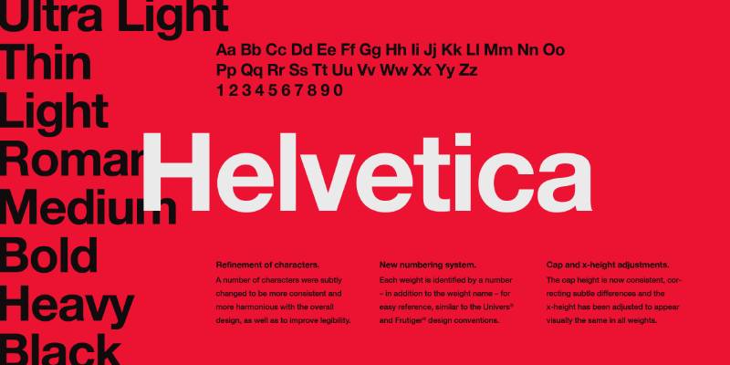
Helvetica is a neo-grotesque sans-serif typeface designed by Max Miedinger and Eduard Hoffmann in 1957, released by Haas Type Foundry (later licensed by Linotype). It delivers neutral, high-legibility typography across print, signage, and screen at any scale.
Helvetica works best for branding, poster design, and layout work in Photoshop because of its unusually tight default letter-spacing and high x-height, which combine to produce dense, readable text blocks even at small sizes.
Brands including Lufthansa, Panasonic, and BMW have used it in corporate identity for decades. It was also chosen for New York City subway signage in the late 1960s, one of the most demanding legibility environments in public design.
What makes Helvetica suitable for Photoshop design work?
Helvetica has a high x-height that keeps lowercase letters readable at sizes as small as 8px. Its stroke terminals terminate on strict horizontal and vertical axes, which reduces visual noise when type is set tightly or overlaid on complex backgrounds.
The original design offers no variable font axis, but Neue Helvetica (1983 revision) expands the family to 51 weights across regular, condensed, and expanded widths.
Key attributes:
| Attribute | Value |
| Classification | Neo-grotesque sans-serif |
| Designer | Max Miedinger & Eduard Hoffmann, 1957 |
| Weight range | Thin 35 – Black 95 (Neue Helvetica, 51 styles) |
| Variable font | Yes (Helvetica Now, 2019) |
| Optical sizes | Yes – Micro, Text, Display (Helvetica Now) |
| Recommended sizes | 8px–14px for captions; 24px+ for headlines |
| Letter-spacing default | Tight |
| License | Commercial – requires purchase |
| Available on | Monotype, MyFonts, Adobe Fonts (via Creative Cloud) |
| Price | Subscription or one-time purchase (varies by version) |
How does Helvetica perform in Photoshop compositions?
Helvetica renders cleanly in Photoshop at both rasterized and vector-scaled sizes. Its tight default spacing means it holds well in condensed headline layouts without additional tracking adjustments.
At very small sizes below 7px in rasterized documents, the tight letter-spacing can cause counters to close up on low-DPI exports.
What are the best pairings for Helvetica in Photoshop?
Helvetica pairs with Garamond for editorial compositions where contrast between a neutral sans and a classical serif font is needed. It also pairs well with Bodoni when high-contrast display type is the goal.
What are the limitations of Helvetica for Photoshop use?
The full Neue Helvetica family requires a commercial license, which adds cost compared to free alternatives like Inter. Helvetica Now (the variable version) is only available through Monotype directly and is not bundled with Adobe Creative Cloud.
Helvetica – Recommended Use Cases Within Photoshop Projects
- Best for: Brand identity mockups, poster headlines, UI wireframes, corporate presentation layouts
- Avoid for: Long-form body copy in print documents below 10pt, decorative or expressive design work
- Optimal weight: Regular 55 for body; Bold 75 for headlines
- Optimal size range: 10px–14px for UI labels; 36px+ for display headlines
—
Futura

Futura is a geometric sans-serif typeface designed by Paul Renner in 1927, released by Bauer Type Foundry. It constructs letterforms from near-perfect circles, triangles, and squares, producing one of the most recognized geometric sans designs in print history.
Futura suits headline and display work in Photoshop because its stroke weight stays nearly uniform throughout, producing high visual consistency across sizes. The Apollo 11 commemorative plaque left on the Moon in 1969 was set in Futura. Stanley Kubrick called it his favorite typeface and used it across multiple films.
What makes Futura suitable for Photoshop design work?
Futura’s near-even stroke weight means it scales to large display sizes without introducing optical distortion between thick and thin strokes. Its long ascenders and classical Roman uppercase proportions give it presence in poster and packaging layouts.
Futura Now (2020, Monotype) expanded the family to 102 styles and added a variable font axis.
| Attribute | Value |
| Classification | Geometric sans-serif |
| Designer | Paul Renner, 1927 |
| Weight range | Light – Extra Bold (22 styles, URW version; 102 styles, Futura Now) |
| Variable font | Yes (Futura Now) |
| Optical sizes | No (standard); Yes in Futura Now |
| Recommended sizes | 18px+ for headlines; not recommended below 10px |
| Letter-spacing default | 0 (moderate open spacing) |
| License | Commercial – Bauer Types / URW; Futura PT available via Adobe Fonts |
| Available on | MyFonts, Fontspring, Adobe Fonts (Futura PT), Monotype |
| Price | Freemium – Futura PT free via Creative Cloud; full family requires purchase |
How does Futura perform in Photoshop at display sizes?
At 36px and above, Futura’s geometric letterforms hold sharp edges in both RGB and CMYK color modes in Photoshop. Its uniform stroke weight means it reproduces well in both screen mockups and high-resolution print exports.
Below 12px, Futura’s near-perfect circles in letters like “o” and “c” can appear slightly unbalanced on low-DPI screens due to pixel grid rounding.
What are the best pairings for Futura in Photoshop?
Futura pairs with Adobe Garamond for a geometry-versus-classical contrast that works in editorial and brand mockups. It pairs with Bodoni when both fonts need similar visual weight at large display sizes.
What are the limitations of Futura for Photoshop use?
The free version (Futura PT via Adobe Fonts) lacks the condensed and extra-bold widths available in the full commercial family. Futura has no true lowercase italic in most versions, limiting its use in mixed-case body text layouts.
Futura – Recommended Use Cases Within Photoshop Projects
- Best for: Poster headlines, packaging design, brand identity concepts, minimalist layouts
- Avoid for: Long body copy below 12px, designs requiring italic text in mixed case
- Optimal weight: Medium for subheadings; Bold or Extra Bold for display
- Optimal size range: 24px–120px for headlines; avoid at UI label sizes
—
Garamond

Garamond is an old-style humanist serif typeface originating from the work of French punch-cutter Claude Garamond in the 1530s. The most used digital version, Adobe Garamond, was designed by Robert Slimbach and released by Adobe in 1989. It delivers refined, optically spaced letterforms suited to editorial and print work.
Garamond works best for editorial layouts, book mockups, and high-end branding in Photoshop because of its low x-height and fine stroke contrast, which produce a refined, classical texture at body copy sizes.
Adobe describes it as “Adobe’s first historical revival.” It has been used in Harry Potter books, Abercrombie & Fitch branding, and Google’s original logo.
What makes Garamond suitable for Photoshop design work?
Garamond’s low x-height makes capitals visually large relative to lowercase, which creates strong typographic hierarchy without size changes. Its bracketed serifs and subtle stroke contrast are preserved faithfully in Adobe Garamond Pro’s OpenType version.
The Adobe Garamond Pro family includes Regular, Italic, Semibold, Semibold Italic, Bold, and Bold Italic. EB Garamond (free, Google Fonts) offers five weights with variable font support.
| Attribute | Value |
| Classification | Old-style humanist serif |
| Designer | Claude Garamond (1530s); Robert Slimbach for Adobe version (1989) |
| Weight range | Regular – Bold with italics (Adobe Garamond Pro, 6 styles) |
| Variable font | Yes (EB Garamond free version) |
| Recommended sizes | 10pt–14pt for print body copy; 24px+ for editorial headings |
| Letter-spacing default | Wide (classical open spacing) |
| License | Commercial (Adobe Garamond Pro via Adobe Fonts); OFL (EB Garamond) |
| Available on | Adobe Fonts (with Creative Cloud), Google Fonts (EB Garamond) |
| Price | Free with Creative Cloud; EB Garamond free |
How does Garamond perform in print-focused Photoshop work?
Adobe Garamond Pro renders with sharp optical spacing in Photoshop at 300 DPI print resolution. Its thin strokes hold well at 10pt–14pt in CMYK print mockups but degrade at screen resolutions below 72 DPI at small sizes.
At sizes below 9pt in screen-resolution Photoshop documents, the thin strokes in letters like “e” and “a” can become difficult to read.
What are the best pairings for Garamond in Photoshop?
Garamond pairs with Futura for a geometry-versus-classical contrast that has been standard in editorial design for decades. It also pairs with Gill Sans when a slightly warmer, less geometric sans-serif is needed for subheadings.
What are the limitations of Garamond for Photoshop use?
Adobe Garamond Pro offers only 6 styles, which limits weight variety in complex hierarchical layouts. The font is not well-suited for screen-rendered UI mockups at small sizes due to its fine stroke contrast and low x-height.
Garamond – Recommended Use Cases Within Photoshop Projects
- Best for: Book cover mockups, print editorial layouts, luxury brand identity, magazine-style compositions at 300 DPI
- Avoid for: UI mockups at small sizes, screen-only designs, designs needing more than 3 weights
- Optimal weight: Regular for body copy; Semibold or Bold for headlines
- Optimal size range: 10pt–14pt for body (print); 30px+ for display (screen)
—
Bebas Neue
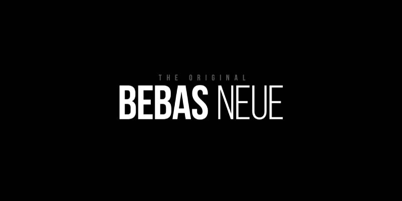
Bebas Neue is a condensed display sans-serif typeface designed by Ryoichi Tsunekawa, originally released in 2005 as Bebas and refined into Bebas Neue in 2010 through Dharma Type. It is available in 5 weights and is uppercase-only in the standard version. Fontfabric expanded it to a full family in 2014. Since 2018, it is open-source under the SIL OFL.
Bebas Neue suits poster headlines, movie title treatments, and branding compositions in Photoshop because of its tightly spaced all-caps letterforms and bold, condensed proportions that pack maximum visual weight into a narrow horizontal footprint.
What makes Bebas Neue suitable for Photoshop headline work?
Tightly spaced uppercase letterforms at a condensed width allow large display sizes without wide horizontal spreads. Bebas Neue’s large x-height (relative to its cap height) keeps the type readable even when reversed out of dark or textured backgrounds in Photoshop composites.
It has been used in the film La La Land’s title treatment and across numerous brand campaigns.
| Attribute | Value |
| Classification | Condensed display sans-serif |
| Designer | Ryoichi Tsunekawa, 2010 (Dharma Type / Fontfabric) |
| Weight range | Thin – Bold (5 weights) |
| Variable font | No |
| Letter-spacing default | Tight |
| License | OFL (free, open source) |
| Available on | Google Fonts, Adobe Fonts, Font Squirrel, Fontfabric |
| Price | Free |
How does Bebas Neue perform in Photoshop at large display sizes?
Bebas Neue renders with clean, high-contrast edges at 48px and above in Photoshop. Its condensed geometry holds at extreme display sizes (120px+) without optical distortion. It also works well in Photoshop text effects like stroke, shadow, and bevel because the letterforms have consistent stroke widths.
What are the best pairings for Bebas Neue in Photoshop?
Bebas Neue pairs with Montserrat for a condensed headline plus geometric sans-serif body combination used widely in agency and event design. It pairs with a humanist sans-serif like Gill Sans when a warmer body font is needed to offset the mechanical feel of the headline.
What are the limitations of Bebas Neue for Photoshop use?
Bebas Neue is uppercase-only in the standard free version (Bebas Neue Pro adds lowercase at a cost), which makes it unusable for mixed-case body copy. It covers only basic Latin characters in the standard release, limiting multilingual Photoshop projects.
Bebas Neue – Recommended Use Cases Within Photoshop Projects
- Best for: Poster and movie title design, event flyer headlines, sport graphics, packaging prototypes
- Avoid for: Body copy, mixed-case text, multilingual designs requiring extended character sets
- Optimal weight: Regular or Bold for most headline use cases
- Optimal size range: 48px–200px for display; 24px minimum for readability
—
Playfair Display

Playfair Display is a transitional serif typeface designed by Claus Eggers Sørensen, released via Google Fonts under the OFL license. It draws from 18th-century type design, featuring high stroke contrast between thick and thin strokes and sharp, unbracketed serifs close to Didot and Bodoni in structure.
Playfair Display works best for headline and editorial design in Photoshop because its high stroke contrast creates strong visual impact at display sizes, particularly in fashion, luxury, and magazine-style compositions.
What makes Playfair Display suitable for Photoshop editorial work?
High contrast between thick uprights and hairline serifs makes Playfair Display visually distinct at 36px and above. Despite its historical inspiration, it has a relatively generous x-height for a high-contrast serif, which gives headlines presence and stability in Photoshop mockups.
Its true italic styles feature distinct calligraphic letterforms rather than slanted roman forms, adding a second typographic texture within the same font family.
| Attribute | Value |
| Classification | Transitional display serif |
| Designer | Claus Eggers Sørensen |
| Weight range | Regular 400 – Black 900 (with italic variants) |
| Variable font | Yes |
| Recommended sizes | 24px+ for headings; avoid below 14px |
| Letter-spacing default | 0 (moderate) |
| License | OFL (free) |
| Available on | Google Fonts, Adobe Fonts |
| Price | Free |
How does Playfair Display perform in high-contrast Photoshop layouts?
At 36px–120px in Photoshop, Playfair Display’s hairline serifs render sharply in high-resolution (300 DPI) documents. The thin strokes degrade noticeably at sizes below 14px in screen-resolution documents, particularly at 72 DPI where the fine serifs blur under anti-aliasing.
What are the best pairings for Playfair Display in Photoshop?
Playfair Display pairs with Montserrat for the most common editorial contrast pairing in modern design. It also pairs with Lato when a slightly warmer, less geometric sans-serif is needed for supporting body copy in magazine and fashion mockups.
What are the limitations of Playfair Display for Photoshop use?
Thin stroke details degrade below 14px at screen resolution, making it unsuitable for UI mockups or small-print body copy. Its high contrast is not suitable for reversed-out text on mid-tone backgrounds, where hairline strokes tend to disappear.
Playfair Display – Recommended Use Cases Within Photoshop Projects
- Best for: Magazine cover headlines, fashion and luxury branding mockups, editorial poster design
- Avoid for: Body text below 14px, reversed-out text on mid-tone or textured backgrounds
- Optimal weight: Regular 400 or Bold 700 for headlines; Black 900 for display-only titles
- Optimal size range: 28px–100px
—
Montserrat
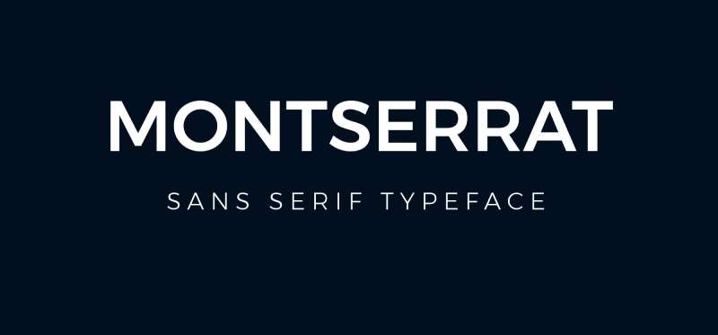
Montserrat is a geometric sans-serif typeface designed by Argentine graphic designer Julieta Ulanovsky, released in 2011, available via Google Fonts under the OFL license. It was inspired by the urban signage typography of the Montserrat neighborhood in Buenos Aires and covers 18 styles from Thin to Black.
Montserrat suits both headline and body text work in Photoshop because its clean geometric structure and wide weight range (Thin 100 to Black 900) support full typographic hierarchy within a single font family.
What makes Montserrat suitable for Photoshop design work?
18 weights from Thin 100 to Black 900 allow designers to build complete visual hierarchy in Photoshop without switching font families. Its moderate x-height and open letter apertures keep it readable at sizes from 10px upward in both RGB screen and CMYK print documents.
| Attribute | Value |
| Classification | Geometric sans-serif |
| Designer | Julieta Ulanovsky, 2011 |
| Weight range | Thin 100 – Black 900 (18 styles) |
| Variable font | Yes |
| Recommended sizes | 10px–16px for body; 24px+ for headings |
| Letter-spacing default | 0 (moderate) |
| License | OFL (free) |
| Available on | Google Fonts, Adobe Fonts |
| Price | Free |
How does Montserrat perform in Photoshop at body and display sizes?
Montserrat renders cleanly in Photoshop at 72 DPI screen resolution down to 10px using the Regular 400 weight. At display sizes (48px+), the Bold and Black weights maintain sharp geometric edges without visual softening.
What are the best pairings for Montserrat in Photoshop?
Montserrat pairs with Playfair Display for editorial contrast, a combination standard in fashion, lifestyle, and magazine mockups. It pairs with Lora when a warmer, calligraphic serif is needed for body copy in content-heavy layouts. For a quick font combination, a font pairing generator can help you test Montserrat against dozens of compatible typefaces in seconds.
What are the limitations of Montserrat for Photoshop use?
Montserrat’s geometric structure gives it a neutral, somewhat generic character that can feel interchangeable with similar typefaces like Futura or Proxima Nova. Very thin weights (Thin 100, ExtraLight 200) are not suitable for rasterized export at small sizes due to stroke width dropping below 1px.
Montserrat – Recommended Use Cases Within Photoshop Projects
- Best for: UI mockups, brand identity design, multi-weight typographic layouts, social media graphic design
- Avoid for: Thin 100–200 weights at sizes below 18px in rasterized output
- Optimal weight: Regular 400 for body; SemiBold 600 or Bold 700 for CTAs and headings
- Optimal size range: 12px–16px for body copy; 28px–80px for headlines
—
Proxima Nova
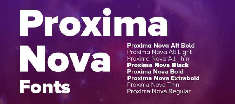
Proxima Nova is a geometric-humanist sans-serif typeface designed by Mark Simonson, released in 2005. It bridges the strict geometry of Futura with the humanist warmth of Akzidenz-Grotesk, producing a typeface that covers 48 styles across 7 weights and 3 widths.
Proxima Nova suits versatile layout work in Photoshop because of its broad weight range and hybrid structure that works at both body copy sizes and large display headlines without losing cohesion.
Proxima Sans (the original 1994 version) was significantly expanded in 2005. The full family totals 48 styles. It became one of the most-used web fonts of the 2010s, appearing widely across news, e-commerce, and SaaS interfaces.
What makes Proxima Nova suitable for Photoshop design work?
Seven weights from Thin to Black with corresponding italic variants give Proxima Nova one of the widest usable ranges in a single family for Photoshop. Its moderate x-height and humanist letter shapes create comfortable readability at 11px–16px in screen-resolution Photoshop documents.
| Attribute | Value |
| Classification | Geometric-humanist sans-serif |
| Designer | Mark Simonson, 2005 |
| Weight range | Thin 100 – Black 900 (48 styles across 3 widths) |
| Variable font | No |
| Recommended sizes | 11px–18px for body; 24px+ for headings |
| Letter-spacing default | 0 (moderate) |
| License | Commercial – included in Adobe Creative Cloud via Adobe Fonts |
| Available on | Adobe Fonts (with Creative Cloud), MyFonts (purchase) |
| Price | Free with Creative Cloud; ~$29+ per style direct |
How does Proxima Nova perform in Photoshop UI and layout work?
Proxima Nova renders with consistent optical spacing in Photoshop across the Regular, Medium, and SemiBold weights at 12px–18px, making it reliable for UI mockup work. Its humanist letter shapes (open “c”, double-story “g”) reduce character confusion at smaller sizes compared to more strictly geometric alternatives.
What are the best pairings for Proxima Nova in Photoshop?
Proxima Nova pairs with Playfair Display for editorial and brand design requiring a polished sans-plus-serif contrast. It pairs with Lora for content-heavy layouts where both fonts need to perform at body copy sizes.
When pairing fonts with Proxima Nova, choosing a serif with moderate stroke contrast avoids visual competition between the headline and body layers.
What are the limitations of Proxima Nova for Photoshop use?
Proxima Nova has no variable font axis, meaning full hierarchy requires loading multiple static font files in Photoshop. Outside of Creative Cloud, individual weight licenses are priced per style, making the full 48-style family expensive.
Proxima Nova – Recommended Use Cases Within Photoshop Projects
- Best for: UI/UX mockups, web design layouts, brand systems requiring wide weight coverage
- Avoid for: Projects outside Adobe Creative Cloud without a commercial license; decorative or expressive design contexts
- Optimal weight: Regular 400 for body; SemiBold 600 for subheadings; Bold 700 for CTAs
- Optimal size range: 12px–18px for body; 24px–60px for headings
—
Gill Sans
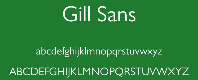
Gill Sans is a humanist sans-serif typeface designed by Eric Gill in 1926 (released by Monotype in 1928). Its uppercase characters are based on Roman capitals modeled after classical inscriptions, while the lowercase follows the Carolingian script tradition. The family includes 14 styles.
Gill Sans suits editorial, institutional, and branding Photoshop work because its humanist construction gives it a warmer reading quality than strictly geometric sans-serifs, while its classical proportions maintain authority in formal layouts.
What makes Gill Sans suitable for Photoshop design work?
The two-story lowercase “a” and “g” in Gill Sans increase character differentiation at small sizes, reducing misread characters in body copy within Photoshop mockups. Its basis in Roman inscriptions gives uppercase letters wider, more optically balanced proportions than geometric alternatives.
Gill Sans is bundled as a system font with macOS (as Gill Sans) and with some Microsoft products (as Gill Sans MT). Gill Sans Nova (Adobe Fonts) expands the family to 43 styles.
| Attribute | Value |
| Classification | Humanist sans-serif |
| Designer | Eric Gill, 1926 (Monotype, 1928) |
| Weight range | Light – ExtraBold (14 styles; 43 in Gill Sans Nova) |
| Variable font | No |
| Recommended sizes | 10px–16px for body; 24px+ for headlines |
| Letter-spacing default | 0 to slightly wide |
| License | Commercial (Gill Sans Nova via Adobe Fonts with Creative Cloud) |
| Available on | Adobe Fonts, Monotype, macOS system font |
| Price | Free with Creative Cloud (Gill Sans Nova); bundled on macOS |
How does Gill Sans perform in Photoshop editorial layouts?
Gill Sans renders with readable optical spacing at 10px–16px in Photoshop screen documents. Its humanist proportions make it less mechanical than Helvetica or Futura in body copy-heavy layouts, which reduces visual monotony across long text blocks in editorial mockups.
What are the best pairings for Gill Sans in Photoshop?
Gill Sans pairs with Garamond for a humanist sans-serif plus old-style serif combination that reads as both authoritative and warm. It also pairs with slab serif typefaces like Rockwell for print-focused designs that need strong visual contrast without sacrificing readability.
What are the limitations of Gill Sans for Photoshop use?
The standard Gill Sans (macOS system version) has a limited weight range compared to Gill Sans Nova. Gill Sans also carries historical controversy around its designer that some clients or brands may want to avoid, depending on project context.
Gill Sans – Recommended Use Cases Within Photoshop Projects
- Best for: Institutional branding, editorial layouts, book cover mockups, formal print design
- Avoid for: Modern tech or startup branding where a more neutral or geometric sans is expected
- Optimal weight: Regular for body copy; Bold or ExtraBold for headlines
- Optimal size range: 10px–16px for body; 28px+ for headlines
—
Lora
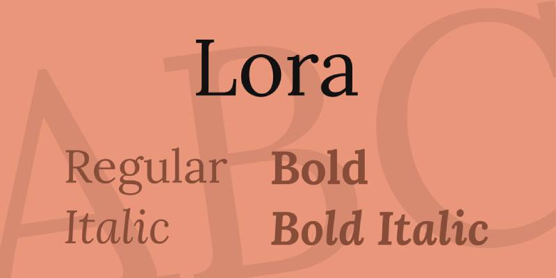
Lora is a contemporary transitional serif typeface designed by Olga Karpushina and released via Google Fonts in 2011 under the OFL license. It combines brushed curves with moderate stroke contrast and bracketed serifs, producing a calligraphic quality suited to editorial and long-form body copy.
Lora suits body copy and editorial headline work in Photoshop because its moderate stroke contrast remains stable at screen sizes from 12px upward, avoiding the rendering problems of high-contrast serifs like Playfair Display at smaller sizes.
What makes Lora suitable for Photoshop body and editorial work?
Lora’s moderate x-height and calligraphic stroke quality keep it readable in Photoshop mockups at sizes where high-contrast serifs break down. Its 4 weights (Regular, Medium, SemiBold, Bold) with matching italics cover the most common hierarchy needs in editorial design.
The variable font version, available on Google Fonts, supports weight adjustments between 400 and 700 on a continuous axis.
How does Lora perform in Photoshop at body copy sizes?
At 12px–18px in screen-resolution Photoshop documents, Lora’s moderate stroke contrast holds up without hairline strokes disappearing under anti-aliasing. Its calligraphic curves give body copy layouts a slightly warmer texture than transitional serifs like Times New Roman, which reads better in lifestyle, editorial, and content-focused mockups.
What are the best pairings for Lora in Photoshop?
Lora pairs with Montserrat for one of the most-used editorial combos available in Photoshop, given both are free and cover body and display sizes effectively. It also pairs with Proxima Nova when the headline font needs a geometric structure that contrasts with Lora’s calligraphic serif warmth.
What are the limitations of Lora for Photoshop use?
Lora’s weight range stops at Bold 700, which means it lacks an extra-bold or black weight for high-impact display work. It is also not recommended as a primary display headline font at sizes above 72px, where its moderate contrast reads as less dramatic than higher-contrast serifs.
Lora – Recommended Use Cases Within Photoshop Projects
- Best for: Body copy in editorial mockups, magazine and blog layouts, book interior mockups, paired-serif in hybrid font systems
- Avoid for: Display headlines above 72px; designs requiring more than 4 weights
- Optimal weight: Regular 400 for body; Bold 700 for pull quotes and subheadings
- Optimal size range: 12px–24px for body copy; up to 48px for editorial headlines
—
Times New Roman
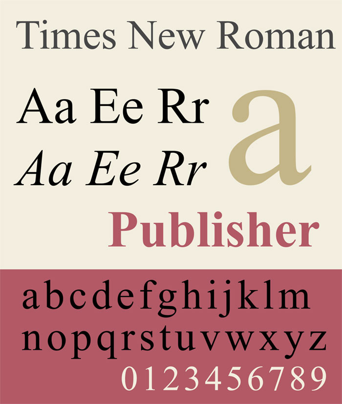
Times New Roman is a transitional serif typeface commissioned by The Times newspaper in 1931 and designed by Stanley Morison with Victor Lardent, released by Monotype. It was engineered specifically for narrow newspaper column widths, producing a compact, high-legibility serif with moderate stroke contrast.
Times New Roman suits print mockups, document design, and formal typographic work in Photoshop because of its compact letter-spacing and efficient use of horizontal space, which makes it one of the most space-efficient serifs available.
It became a digital standard after being included in Apple’s original Macintosh and then bundled with Windows, making it one of the most recognized fonts in the world. Understanding font psychology helps explain why Times New Roman reads as authoritative and formal even in contexts where newer serifs might perform equally well.
What makes Times New Roman suitable for Photoshop formal work?
Times New Roman’s compact default tracking and narrow character widths allow more text per line than most serifs at equivalent size, which is why it remains standard in legal, academic, and editorial mockups. Its moderate stroke contrast (less extreme than Bodoni or Playfair Display) keeps it stable across print and screen rendering in Photoshop.
| Attribute | Value |
| Classification | Transitional serif |
| Designer | Stanley Morison & Victor Lardent, 1931 (Monotype) |
| Weight range | Regular, Italic, Bold, Bold Italic (4 styles) |
| Variable font | No |
| Recommended sizes | 9pt–14pt for print body copy; 16px+ for screen |
| Letter-spacing default | Tight |
| License | Commercial (bundled with Windows and macOS as system font) |
| Available on | Windows system font, macOS, Microsoft Office |
| Price | Free (bundled with operating systems) |
How does Times New Roman perform in Photoshop print mockups?
Times New Roman renders with consistent optical spacing in Photoshop at 300 DPI print resolution from 9pt upward. Its narrow column design means it sets more words per line than Garamond or Lora at equivalent type sizes, which is useful in document mockups with tight column widths.
What are the best pairings for Times New Roman in Photoshop?
Times New Roman pairs with Helvetica for a neutral sans-serif headline plus formal serif body combination standard in newspaper and academic document mockups. It pairs with Georgia when a slightly more screen-optimized serif is needed for the body while Times New Roman handles display or heading roles.
Knowing how serif vs sans-serif fonts interact helps when deciding whether to use Times New Roman as the headline or body typeface in a given Photoshop layout.
What are the limitations of Times New Roman for Photoshop use?
Times New Roman offers only 4 styles (Regular, Italic, Bold, Bold Italic), which limits its use in complex typographic hierarchies requiring more than two weight levels. Its strong association with generic academic and legal documents makes it unsuitable for branding or creative design work where distinctiveness matters.
Times New Roman – Recommended Use Cases Within Photoshop Projects
- Best for: Document and report mockups, academic and legal layouts, newspaper-style editorial compositions
- Avoid for: Brand identity, creative or expressive design work, UI mockups
- Optimal weight: Regular for body copy; Bold for section headings
- Optimal size range: 9pt–14pt for print body copy; 18px–36px for display uses
—
How to Add These Fonts to Photoshop
Most of the fonts listed above are available through Adobe Fonts (included with any Creative Cloud subscription) or Google Fonts (free). Fonts downloaded from Google Fonts or third-party sources need to be installed at the system level before Photoshop can access them.
For a full walkthrough, see the guide on how to add fonts to Photoshop. The process differs slightly between Windows and macOS but takes under two minutes in both cases. Once installed, the font appears in Photoshop’s character panel immediately after restarting the application.
If you work across multiple Adobe apps, knowing how to add fonts to Adobe Illustrator follows the same system-level installation process, so one install covers both programs.
Free fonts for this list include Bebas Neue, Playfair Display, Montserrat, Lora, and EB Garamond. All are available directly from Google Fonts. Helvetica, Futura, Proxima Nova, and Gill Sans Nova require either a Creative Cloud subscription or a separate commercial license. Times New Roman is bundled with Windows and macOS at no cost.
Check font licensing before using any typeface in commercial Photoshop work. OFL and system-bundled fonts generally allow commercial use. Fonts acquired through Adobe Fonts are licensed for use while your Creative Cloud subscription is active.
FAQ on The Best Fonts For Photoshop
What is the best font for Photoshop overall?
Helvetica is the most reliable all-around choice. Its high x-height and tight default spacing hold up across poster design, branding mockups, and UI layouts. It works at both 72 DPI screen resolution and 300 DPI print output without losing legibility.
Which free fonts work best in Photoshop?
Montserrat, Bebas Neue, Playfair Display, Lora, and EB Garamond are all free under the OFL license. Each covers a different use case and performs well in Photoshop at standard screen and print resolutions.
What font does Photoshop use by default?
Photoshop defaults to Myriad Pro on most systems. It is a humanist sans-serif bundled with Adobe Creative Cloud. Most designers replace it immediately with a typeface chosen specifically for the project’s classification and hierarchy needs.
Can I use Google Fonts in Photoshop?
Yes. Download any Google Font, install it at the system level, then restart Photoshop. The font appears in the character panel. All Google Fonts use the OFL license, which permits commercial use in client deliverables and exported files.
What is the best serif font for Photoshop?
Garamond suits editorial and print work. Playfair Display handles high-contrast display headlines. Lora covers body copy at screen resolution. The right choice depends on project type, target output resolution, and whether the design is print or screen.
What is the best sans-serif font for Photoshop?
Helvetica and Montserrat cover the widest range of Photoshop use cases. Futura suits geometric and minimalist layouts. Proxima Nova works well in UI mockups. Bebas Neue is the strongest condensed option for poster and headline work.
Do Adobe Fonts work in Photoshop?
Yes. Any font activated through Adobe Fonts syncs directly to Photoshop via the Creative Cloud app. The full library is included with all paid Creative Cloud plans. Fonts deactivate if the subscription lapses, which affects PSD files opened after expiry.
What font is best for Photoshop poster design?
Bebas Neue, Futura Bold, and Playfair Display Black all perform well at large display sizes. Each holds sharp edges at 300 DPI in CMYK. Bebas Neue suits condensed headline layouts. Playfair Display suits editorial and fashion poster work.
How do I add fonts to Photoshop?
Install the font file at the operating system level, then restart Photoshop. On Windows, right-click the font file and select Install. On macOS, open it with Font Book. Adobe Fonts activate automatically through the Creative Cloud app without a manual install.
What font pairing works best in Photoshop?
Montserrat with Playfair Display is the most-used editorial pairing. Futura with Garamond gives geometric-versus-classical contrast for brand work. For UI mockups, Proxima Nova with Lora covers both headline and body copy without weight or style conflicts.
Conclusion
This conclusion is for an article presenting the best fonts for Photoshop, and the core takeaway is straightforward: typeface selection is a structural decision, not a stylistic one.
Each font in this list was chosen for measurable reasons: x-height, weight range, rendering performance, and font licensing terms that hold up in commercial Photoshop work.
Geometric sans-serifs like Futura and Bebas Neue handle display headlines. Transitional serifs like Garamond and Lora cover editorial body copy. Proxima Nova and Montserrat bridge both.
Check the OFL terms before using any typeface in client deliverables. Understand how Adobe Fonts behaves when a Creative Cloud subscription lapses.
Get the font pairing right, get the sizing right, and the rest of the composition follows.

Renowned for his expertise in logo design and visual branding, Bogdan has developed a multitude of logos for various clients.
His skills extend to creating posters, vector illustrations, business cards, and brochures. Additionally, Bogdan's UI kits were featured on marketplaces like Visual Hierarchy and UI8.
He also wrote in the past years on sites like Design Your Way, WebDesignerDepot, WPDean, Designmodo, Speckyboy, Slider Revolution, and more.
- Bold Space Grotesk Font Pairing for Contemporary Brands - 29 August 2026
- The Notion Calendar Logo History, Colors, Font, And Meaning - 27 August 2026
- How Different Industries Use Digital Signage to Meet Business and Customer Needs - 27 August 2026

Bogdan Sandu is a seasoned designer who has been designing websites since 2008. Renowned for his expertise in logo design and visual branding, Bogdan has developed a multitude of logos for various clients. His skills extend to creating posters, vector illustrations, business cards, and brochures. Additionally, Bogdan's UI kits were featured on marketplaces like Visual Hierarchy and UI8. He also wrote in the past years on sites like Design Your Way, WebDesignerDepot, WPDean, Designmodo, Speckyboy, Slider Revolution, and more.
You Might Also Like