Overwatch uses Big Noodle Too as its primary in-game UI typeface, a condensed geometric sans-serif font designed by James Arboghast and published under Sentinel Type. For the game’s logo, Blizzard Entertainment based the lettering on Bank Sans Caps Bold EF, a geometric sans-serif by Morris Fuller Benton and Günther Flake. The “Origins Edition” subtitle text uses Big Noodle Titling Oblique, also by Arboghast.
Blizzard commissioned a custom version of the original Big Noodle Titling specifically for Overwatch, with extended language coverage including Latin 1, Latin 2, Turkish, Baltic, and Cyrillic character sets.
What Type of Font Is Big Noodle Too?
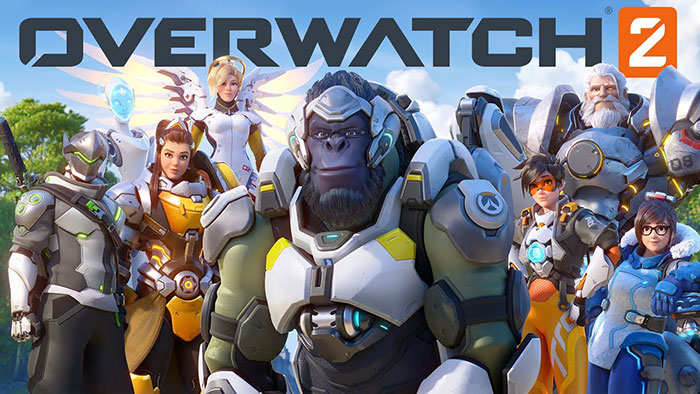
Big Noodle Too is a condensed grotesque sans-serif, sometimes described as a squared linear or gothic even-width typeface. It has a single weight, uniform stroke thickness, and very little contrast between thick and thin strokes.
Key visual characteristics:
- Tight letter spacing suited for condensed display use
- Squared letter body construction
- Oblique style slants at 15 degrees
- Industrial, utilitarian tone with no decorative elements
The squared grotesque structure is what made it practical for gaming interfaces. It reads clearly at small sizes on screen, which matters a lot in a fast-paced HUD environment like Overwatch’s.
The logo lettering (based on Bank Sans Caps Bold EF) falls into the geometric sans-serif category. Bank Gothic, the broader family it draws from, was first released in 1930 through American Type Founders. That history gives it a certain solidity that works well for game branding.
Who Designed the Overwatch Font?
James Arboghast designed both Big Noodle Titling and Big Noodle Too under his studio, Sentinel Type, based in Australia.
The original Big Noodle Titling was released in 2003. Blizzard Entertainment later commissioned Arboghast directly to produce Big Noodle Too, a custom-extended version built specifically to handle the multilingual demands of a global game release. That extended version covers Cyrillic, Turkish, Baltic, and Latin character sets.
Bank Sans Caps Bold EF, the basis for the Overwatch logo, was designed by Morris Fuller Benton and Günther Flake. The overall logo lettering is widely considered to be custom, using those typefaces as reference rather than a direct lift.
Is Big Noodle Titling Free to Use?
Big Noodle Titling (the original version) is free for both personal and commercial use. James Arboghast released it as a freeware font through Sentinel Type, and it is available to download from several font repositories.
Big Noodle Too (the version Blizzard commissioned) is a commercial font sold through MyFonts. Desktop licenses are priced per user.
Quick breakdown:
- Big Noodle Titling: Free, personal and commercial use allowed
- Big Noodle Too: Paid license via MyFonts or Sentinel Type
- Bank Sans Caps Bold EF: Commercial, available through Elsner+Flake
For most fan projects, poster designs, or gaming thumbnails, the free Big Noodle Titling will get you close enough to the Overwatch aesthetic without any font licensing concerns. Just know the oblique version is what appears under the logo.
What Font Did Overwatch Use Before?
This is a bit tricky to answer cleanly because Overwatch launched in 2016 with Big Noodle Too already in place. There was no prior version of the game that used a different typeface.
What did change is the shift from Overwatch to Overwatch 2 in 2022. Blizzard updated portions of the UI with a refreshed design system, introducing a bolder, tighter HUD font for health and ammo readouts. The overall brand identity, including Big Noodle Too for menus and key interface labels, stayed consistent. The logo lettering also remained largely unchanged.
So it is less a story of a rebrand and more a gradual refinement. The core typography held through the transition.
What Are the Best Free Alternatives to Big Noodle Titling?
Since Big Noodle Too requires a paid license and the exact logo lettering is custom, most designers look for alternatives that capture the same condensed, squared-off feel.
| Font | Similarity | License | Source |
| Big Noodle Titling | Direct predecessor, near-identical style | Free | DaFont, FontSquirrel |
| Bebas Neue | Condensed all-caps grotesque | Free | Google Fonts |
| Aldrich | Geometric gothic, slightly rounded | Free | Google Fonts |
| Xolonium | Futuristic, clean, condensed | Free (OFL) | Google Fonts |
| Steelfish | Condensed industrial sans-serif | Free | DaFont |
Bebas Neue is probably the most commonly used substitute in fan art and gaming thumbnails. It is a display font with strong legibility and it works well for headlines and large titles. Xolonium is a good pick if you want something that reads more sci-fi.
For anything closer to the Bank Gothic side of the logo, fonts similar to Impact or Agency FB Extended Black can work as a starting point, though they will need some weight and spacing adjustments.
How to Use a Big Noodle Alternative in Your Design Tools
In Figma: Download Big Noodle Titling as a .ttf file, install it on your system, and it will appear automatically in Figma’s font picker after restarting the app.
In Photoshop: Drop the .ttf or .otf into your system’s Fonts folder. Photoshop reads system fonts on launch, so you will need to restart it. There is a full walkthrough on how to add fonts to Photoshop if you get stuck.
In Canva: Free plan users are limited to Canva’s built-in library. Bebas Neue is available there natively, which makes it the easiest route for quick Overwatch-style text. Canva Pro users can upload fonts to Canva directly.
CSS embed (for web projects):
“ @font-face { font-family: 'BigNoodleTitling'; src: url('bignoodletitling.ttf') format('truetype'); }
h1, h2 { font-family: ‘BigNoodleTitling’, sans-serif; text-transform: uppercase; letter-spacing: 0.05em; } `
Pair it with a neutral body font like Inter or Open Sans. The condensed display style of Big Noodle Titling does not work well at small sizes, so keep it to headings and UI labels only.
Why Did Blizzard Choose This Font for Overwatch?
The choice makes sense once you look at what Big Noodle Too actually does well. Its squared, even-width construction reads clearly at the small sizes typical of a game HUD, even during fast motion on screen.
The condensed proportions also pack more text into tight interface spaces without losing legibility. That is genuinely useful when you need to display character names, ability timers, and stat readouts all at once.
The industrial tone of the typeface also fits the game’s setting. Overwatch is set in a near-future world with advanced military technology, and the font’s utilitarian character supports that visual language without being too aggressively futuristic. It is not trying to look like a sci-fi film title. It just reads clean and direct, which is actually harder to achieve than it looks.
Blizzard’s decision to commission a custom version (Big Noodle Too) with extended language support was a practical call. A game launching across dozens of regions needs Cyrillic, Turkish, and Eastern European characters handled consistently. Doing that through a bespoke commission rather than patching together multiple fonts keeps the typography visually consistent across every localized version.
Other games in the hero shooter genre have taken more expressive typographic routes. Overwatch went the opposite direction, and it worked. The font is recognizable not because it is flashy, but because it shows up consistently everywhere the brand appears.
If you are curious how other games handle their branding, it is worth looking at the Fortnite font or the League of Legends font for comparison. Both take very different approaches to game font selection and brand identity.
FAQ on The What Font Does Overwatch Use
What font does Overwatch use in its UI?
Overwatch uses Big Noodle Too, a condensed grotesque sans-serif commissioned by Blizzard Entertainment from designer James Arboghast.
It appears across menus, HUD elements, and in-game labels throughout both Overwatch and Overwatch 2.
What font is the Overwatch logo based on?
The logo lettering is widely considered custom, but it draws heavily from Bank Sans Caps Bold EF, a geometric sans-serif by Morris Fuller Benton and Günther Flake.
The “Origins Edition” subtitle uses Big Noodle Titling Oblique.
Is the Overwatch font free to download?
Big Noodle Titling (the original version) is free for personal and commercial use. Big Noodle Too, the custom version Blizzard commissioned, requires a paid desktop license through MyFonts.
Who designed the font Overwatch uses?
James Arboghast, a designer and advertising creative based in Australia, created both Big Noodle Titling and Big Noodle Too under his studio, Sentinel Type.
Blizzard commissioned the extended version directly from him.
What type of font is Big Noodle Titling?
It is a condensed linear sans-serif, built on the gothic even-width principle with squared letter forms and uniform stroke weight.
Think industrial, utilitarian, no decorative details whatsoever.
What fonts are similar to the Overwatch font?
Good free alternatives include Bebas Neue, Aldrich, Xolonium, and Steelfish. All share the condensed, all-caps grotesque structure that defines the Overwatch game branding font.
Did Overwatch 2 change the font?
Not significantly. Blizzard refreshed parts of the HUD design in Overwatch 2, but Big Noodle Too remained the core typeface for menus and interface labels.
The visual identity stayed consistent across both titles.
Can I use the Overwatch font style for my own designs?
Yes, using Big Noodle Titling (the free version) is fine for personal projects and fan art. For commercial work, review the font licensing terms carefully before publishing.
Where can I download a font similar to Overwatch?
Bebas Neue is on Google Fonts and works well for Overwatch-style titles. Aldrich and Xolonium are also available there for free, no account required.
Why did Blizzard pick this font for Overwatch?
The squared, condensed structure holds up well at small screen sizes, which matters in a fast-paced game UI. It also supports Cyrillic, Turkish, and Latin character sets, which a global release requires.
Conclusion
If you were asking what font does Overwatch use, the answer comes down to 2 typefaces: Big Noodle Too for the game UI and Bank Sans Caps Bold EF as the basis for the logo lettering.
Blizzard commissioned a custom version from Sentinel Type specifically to handle global language coverage, which is not something most game studios bother doing at that level.
For your own projects, Big Noodle Titling is free, widely available, and close enough to capture that condensed geometric font style. Bebas Neue and Xolonium are solid backup options if you need something on Google Fonts.
The Overwatch typeface works because it is practical first, stylish second. That is a lesson worth taking into any game UI or esports branding project.

Renowned for his expertise in logo design and visual branding, Bogdan has developed a multitude of logos for various clients.
His skills extend to creating posters, vector illustrations, business cards, and brochures. Additionally, Bogdan's UI kits were featured on marketplaces like Visual Hierarchy and UI8.
He also wrote in the past years on sites like Design Your Way, WebDesignerDepot, WPDean, Designmodo, Speckyboy, Slider Revolution, and more.
- From Mockup to Code: How AI-Augmented Development Speeds Up the Design Handoff - 19 September 2026
- The Beehiiv Logo History, Colors, Font, And Meaning - 18 September 2026
- Why Small Teams Wait Too Long to Bring On Specialist Engineers - 17 September 2026

Bogdan Sandu is a seasoned designer who has been designing websites since 2008. Renowned for his expertise in logo design and visual branding, Bogdan has developed a multitude of logos for various clients. His skills extend to creating posters, vector illustrations, business cards, and brochures. Additionally, Bogdan's UI kits were featured on marketplaces like Visual Hierarchy and UI8. He also wrote in the past years on sites like Design Your Way, WebDesignerDepot, WPDean, Designmodo, Speckyboy, Slider Revolution, and more.
You Might Also Like