
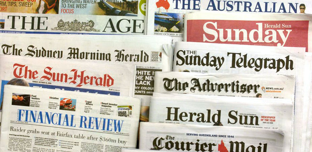
The 20 Most Popular Newspaper Fonts You Can Use
Ever noticed how some text just grabs you, pulls you into a story like there’s no tomorrow? Well, that’s the magic of newspaper fonts at play.
Not just any random squiggles, these little guys are the unsung heroes behind your daily digest of the world, shaping stories into something you can almost taste.
Here’s the low-down: Fonts? They’re like the secret sauce, the spice that chefs sprinkle on a meal to give it just that perfect zing.
And in the bustling kitchen of journalism, where the air is thick with the scent of fresh ink and breaking news, the choice of typeface can make or break the readers’ experience.
You’ll dive into the weave of serif and sans-serif typefaces, stroll through the legibility of print, and decode the typography that helps you tell your tales.
By the end, you’ll be a mini-wizard of editorial design, casting spells with headline type and column typography that keep eyes glued and minds engaged.
Awesome newspaper fonts to try
- Helvetica
- TT Jeanevers
- Franklin Gothic
- Mohave
- Rabiota Font
- Amblas Stylish Font
- Zebrazil
- TT Commons
- Adam.CG Pro
- Anson
- Antic Didone Font
- Haboro Serif
- Building
- Galderglynn 1884 Font Family
- Calendas Plus
- Borobudur Sans Serif Font
- Komoda
- FF Clan
- TT Backwards
- Summit
Helvetica
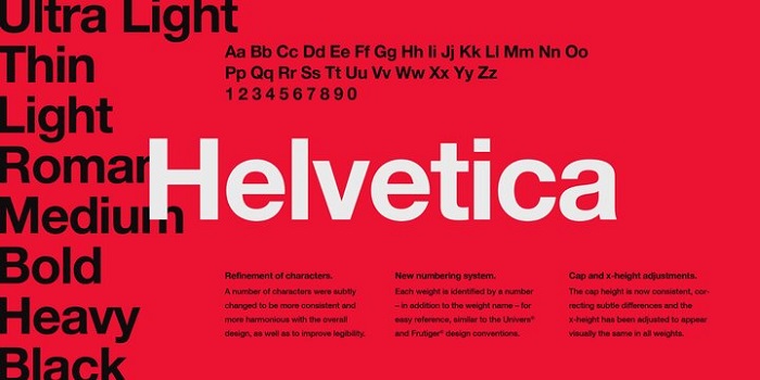
Strong and timeless, that’s Helvetica. This font’s got the power of an ageless classic with a work ethic as solid as print media itself. Fancy that old-school newspaper vibe? Helvetica delivers with its extended forms and bold presence.
TT Jeanevers
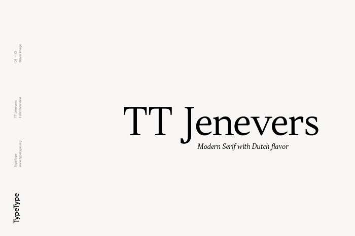
Rooted in Dutch serif fonts, TT Jeanevers gives designers a leg up. It’s like having a dozen design tools just a click away. And hey, two font sets in one? That’s like hitting the editorial typography jackpot for all your column typography needs.
Franklin Gothic
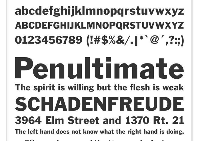
Gothic fonts shout modern design. Enter Franklin Gothic with its dark, monotone vibes—slick for any design looking to turn heads. And yep, it’s still a hot pick among newspapers, making it a solid addition here.
Mohave
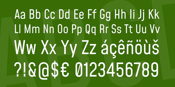
Need an all-caps font that punches above its weight? Mohave slings three weights plus italics. Those weights? They give you the superpower of flexibility—super useful across different design projects.
Rabiota Font
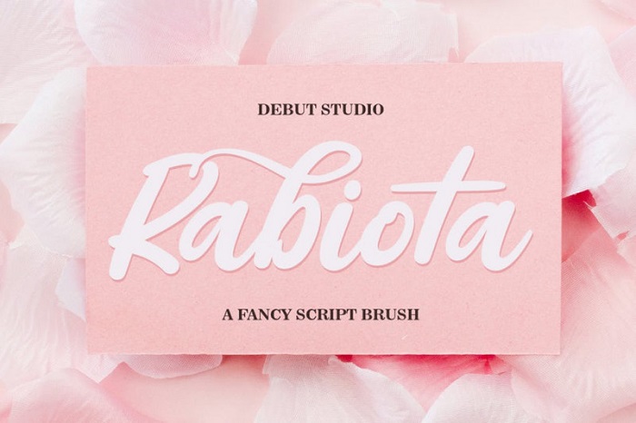
Rabiota stands out in that vast sea of newspaper fonts. It’s got the chops for logos, websites, and beyond. Test it out, bet it clicks with your style.
Amblas Stylish Font
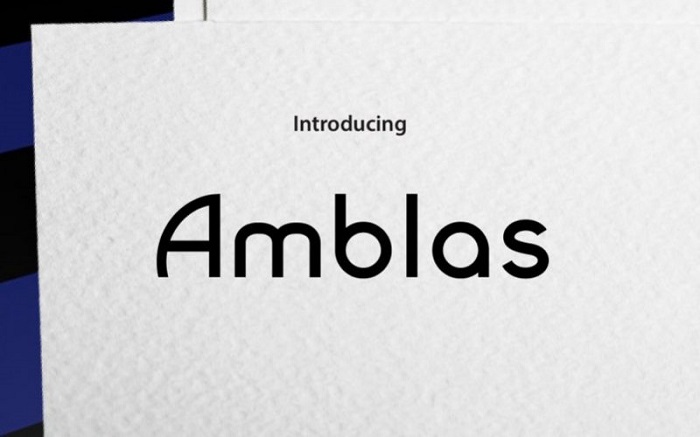
Here’s a versatile player for your design game. Amblas Stylish Font—easy to install, easier to use. Why not give those designs an edge?
Zebrazil
Elegance meets grace with Zebrazil. A delicate touch for any canvas, it’s the subtle accent you didn’t know you needed. Go on, let it catch your eye.
TT Commons
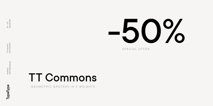
Then there’s TT Commons, minimal yet mighty. Its clear geometric shapes stand tall in any design. And talk about adaptability! TT Commons isn’t just pretty to look at—it works hard across the board.
Adam.CG Pro
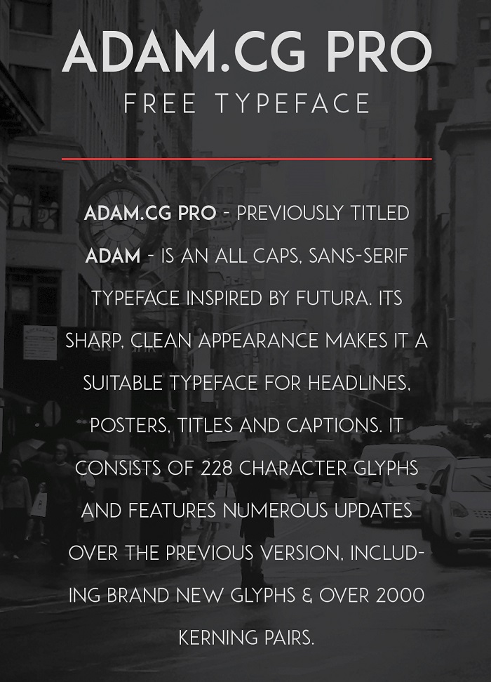
Inspired by Futura, Adam.CG Pro—this typeface is a headline hero. It brings clean lines to the table, perfect for print and more. Sometimes a little extra is all you need.
Anson
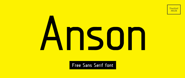
Anson speaks with a clear voice thanks to its clean, sans-serif design. It’s got a vibe that catches attention, so if you want to see if it gels with your vision, give it a whirl.
Antic Didone Font
Antic Didone has that headline-worthy flair, a favorite in the news article fonts category. Use this to add some dynamics to your typography. And hey, it’s perfect for projects on a budget too.
Haboro Serif
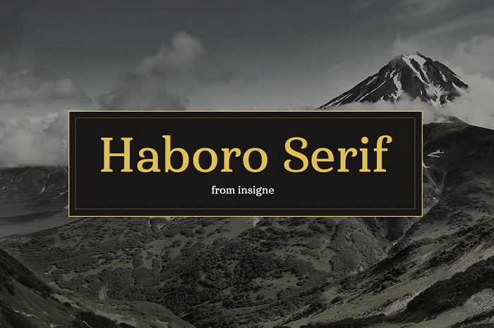
Meet the new kid on the block, Haboro Serif. A refreshing twist on the classic serif, it’s up for grabs for anyone who’s into that traditional look with a twist.
Building
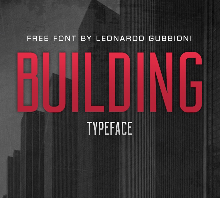
Building, bold and beautiful, a nod to Art Deco and a promise of strength. It’s a no-brainer for designs that need to stand firm.
Galderglynn 1884 Font Family
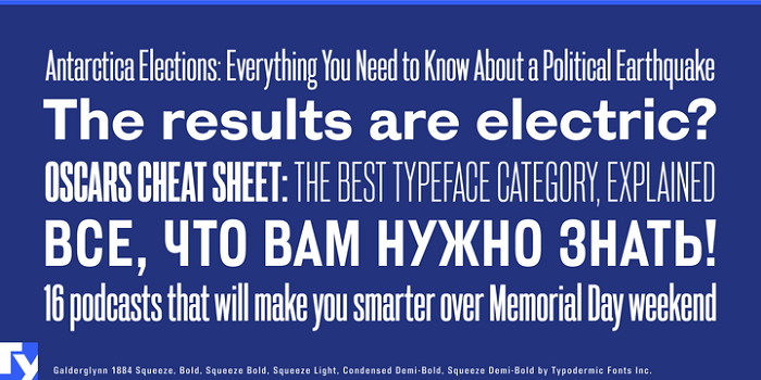
Clear, sharp, and undoubtedly visible, Galderglynn 1884 ticks all the boxes for your newspaper fonts needs. Perfect for design work where legibility is King.
Calendas Plus
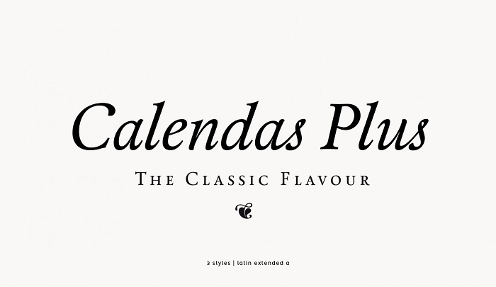
Soft on the eyes but hard on impact, Calendas Plus is versatility at its best. Its many ligatures add a touch of finesse.
Borobudur Sans Serif Font
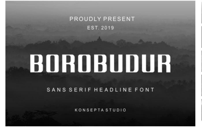
Inspired by wonders, Borobudur Sans Serif Font fits snugly in articles, websites, and blogs alike. A look that adapts and impresses.
Komoda
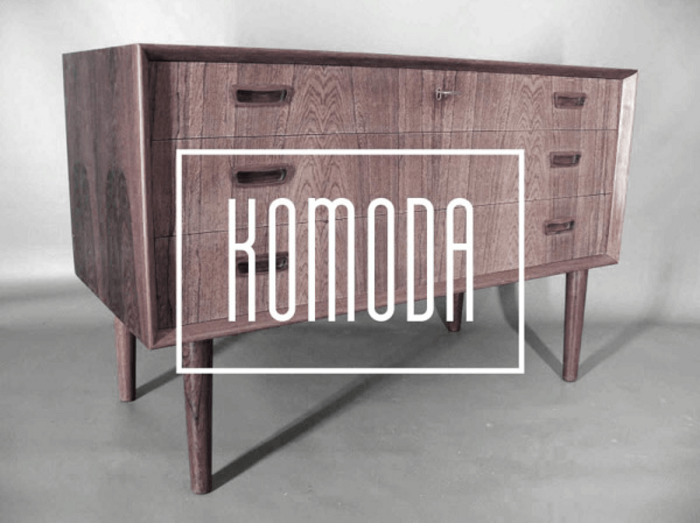
Komoda’s a charm, easy to pair and easier to love. If you need a font that’s versatile yet bold, you’re home.
FF Clan
Next up, FF Clan. Sleek for advertising and packaging, and loaded with nifty features. Don’t miss out on this one.
TT Backwards
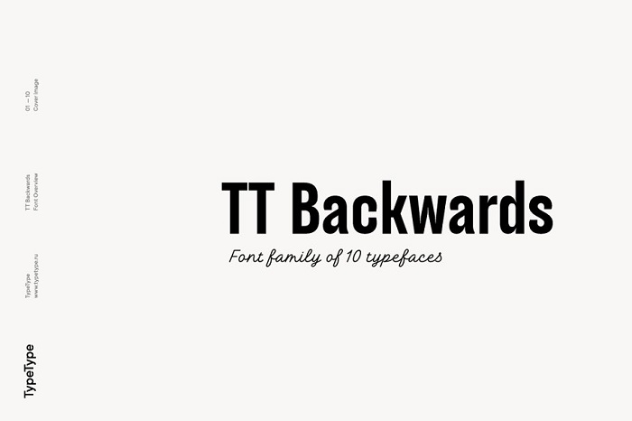
If a unique twist is what you’re after, TT Backwards is calling your name. Give it a test run; it might just surprise you.
Summit
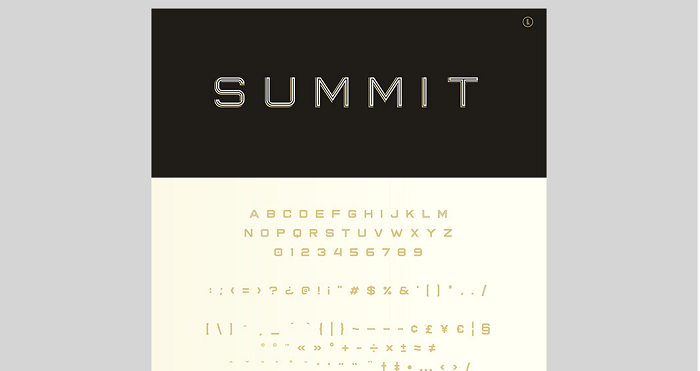
Closing the list is Summit, with a style roster ready for action. Quick install, quick love. Don’t let this one slip by unnoticed.
FAQ about newspaper fonts
Why do newspapers use serif fonts predominantly?
Serif fonts have those little feet, you know? Makes ’em easier to read in print, especially on newsprint. There’s a certain feeling of tradition and credibility they bring. Think Times New Roman—it’s not just classic; it’s like a trusty old friend in the world of typography.
What’s the difference between serif and sans-serif fonts in newspapers?
Now, serif fonts, they’ve got those extra lines, giving readers a bit of hand-holding, guiding ’em through the text. Sans-serifs? Cleaner, no frills. They fit snug in modern designs, whipping out clarity, especially handy in shorter bits like captions or sidebar content.
How do font sizes in newspapers enhance readability?
Font sizes, they’re like the dynamic duo of legibility and hierarchy. Bigger fonts shout for your attention, they’re the headliners. Smaller ones, they’re the storytellers, giving the nitty-gritty without screaming in your face. Together, they organize the chaos, keep things peachy for the eyes.
Can typography affect the mood of a newspaper article?
Oh, absolutely. Fonts pack a punch of personality. A serious headline type sets a somber mood, while something more whimsical can lighten the air. Fonts are the silent whisperers of emotion, really. They set the stage before you even dive into the tale.
What are the challenges of selecting fonts for digital newspapers?
Here’s where it gets funky. Digital means scrutinizing responsiveness and screen legibility, making sure the story reads well on everything from giant desktops to tiny phones. Plus, you gotta wrangle with file sizes and loading times, ’cause no one likes a lagger.
Why is font consistency important in newspaper design?
Consistency is key—it’s the glue holding the visual story together. It breeds familiarity, trust. When your eye hops from section to section, you don’t want jarring changes throwing you off. It’s subtle, but it’s about crafting a seamless reading journey—a sign of a well-oiled editorial design.
What role do fonts play in branding for newspapers?
Listen up: Fonts are major players in branding. The right font is like a suit tailored to perfection—it speaks volumes about who you are. The New York Times? That gothic vibe is no accident. Fonts wrap up your identity in a neat little package.
Are there legal considerations when using fonts in newspapers?
Let’s talk legal jazz. Fonts, they’re not all free-for-all—some are fiercely guarded, with licenses and rights tighter than a drum. Play it safe, get familiar with those font foundries, and always check your usage rights. No one enjoys a cease-and-desist for breakfast.
How has the transition from print to digital affected newspaper font choices?
Shifts to digital, it’s turned the typography game on its head. Readability on screens is the new boss. Fonts have gotta be versatile, easily scalable, and clear as day on a zillion different devices. It’s like a balance beam act, pleasing both the print purists and the digital natives.
What advancements in typography are influencing newspaper font design?
Technology’s pushing boundaries like crazy. Think high-def screens demanding crisper lines and adaptive responsive design changing the game. Font software is smarter, more intuitive. We’re seeing an avalanche of custom fonts, tailored to sing beautifully in both print and digital. It’s a wide new world for the artsy typography folks.
Conclusion
So, we journeyed through the wild world of newspaper fonts, right? It’s been a total deep-dive into that special blend of letter shapes peppering the pages of your go-to daily. The secret? A mix of tradition and new-age savvy, serif getting cozy with sans-serif, all playing their part in the grand theater of print and pixels.
From the headline-grabbing behemoths to the tiny text tales weaving through columns, fonts are the unsung backstage crew, setting the stage for the stories that shape your mornings.
Oh, and that dance they do—scaling up, scaling down across devices—it’s nothing short of a modern design ballet in the digital newsroom.
Tucking into typography is tucking into the soul of the newsprint, really. Who knew those squiggly editorial design bits had so much to say? It’s all about crafting that perfect reader moment where clarity hugs tradition, innovation winks at function, and every word feels right at home.
If you enjoyed reading this article about newspaper fonts, you should read these as well:
- Typography prints: Amazing examples you should check out
- Car Ads: 70 Creative And Clever Print Advertisements
- Need some wedding fonts? Try these options for your print
Bogdan Sandu, a seasoned designer with 15 years of diverse experience, has been designing websites since 2008.
Renowned for his expertise in logo design and visual branding, Bogdan has developed a multitude of logos for various clients.
His skills extend to creating posters, vector illustrations, business cards, and brochures. Additionally, Bogdan's UI kits were featured on marketplaces like Visual Hierarchy and UI8.
Latest posts by Bogdan Sandu (see all)
- Spread Joy: Happy Color Palettes for Uplifting Designs - 24 April 2024
- The Konami Logo History, Colors, Font, And Meaning - 23 April 2024
- Summer Color Palettes for Hot Designs: 40 Examples - 23 April 2024