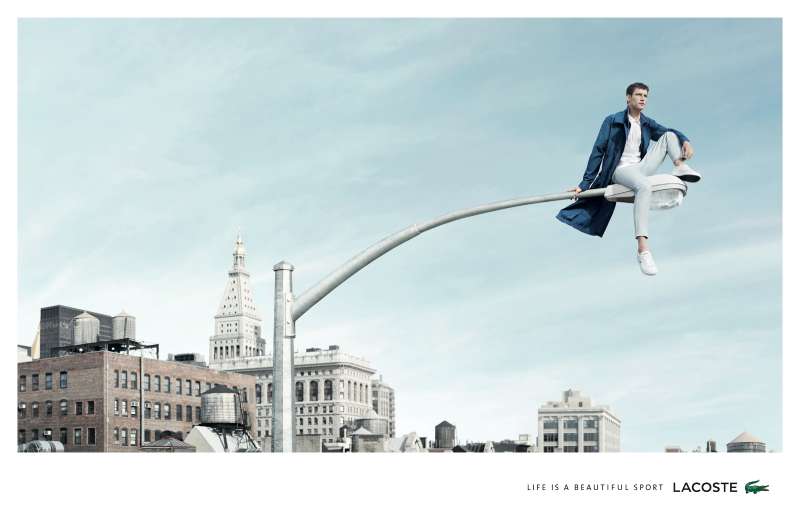
TOMS ads almost never show a shoe doing anything. A canvas slip-on on flat white, one line of copy, a small flag mark low in the corner. That restraint carried the brand from a 2006 trip to Argentina to 100 million pairs given.
The catalogue runs through One for One, One Day Without Shoes, End Gun Violence Together and Wear Good, made by BBDO, And/Or, Red Antler and Nemo Design.
What follows:
- Every major campaign, with its agency, years and market
- The composition, typography and palette decisions inside the layouts
- How the 2021 giving change forced a rewrite of every asset the brand owned
TOMS advertising spans 20 years, 5 flagship campaigns and a full strategic reset, running from the One for One launch in 2006 to the Wear Good platform that Nemo Design built in 2023. The work is built on documentary photography, bare feet and almost no product copy.
This page covers the campaigns by name, with the agency, year and market behind each one, plus the composition and type choices that made a canvas slip-on carry a moral argument.
TOMS Advertising at a Glance
TOMS has advertised since 2006, working with BBDO, And/Or, Red Antler and Nemo Design. Its best-known campaigns are One for One, One Day Without Shoes and Wear Good. The visual signature combines barefoot documentary photography, heavy negative space and a single blue flag mark.
| Attribute | Value |
|---|---|
| First major campaign | “One for One” (2006) |
| Lead agencies | BBDO, And/Or (New York), Red Antler, Nemo Design (Portland), HarrimanSteel |
| Best-known taglines | “One for One” (2006-2021), “Wear Good” (2023-present) |
| Primary media | Social, print, in-store, VR, streaming, OOH, email and SMS |
| Recognition | Shorty Awards finalist (2016), Cooper-Hewitt People’s Design Award (2007) |
| Visual signature | Flag wordmark, soft blue palette, barefoot imagery, generous margins |
| Primary markets | United States, plus giving programs across 82 countries |
| Measurable result | 100 million pairs given in 14 years (Footwear News) |
Which TOMS Ad Campaigns Are the Most Famous?
Six campaigns define TOMS advertising: One for One (2006-2021), One Day Without Shoes (2008-2017), A Walk in Their Shoes (2016), End Gun Violence Together (2018-2019), Stand for Tomorrow (2019-2021) and Wear Good (2023-present). Each one shifted the medium before it shifted the message.
One for One (2006-2021)

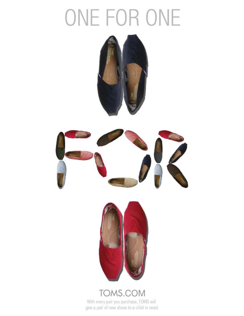
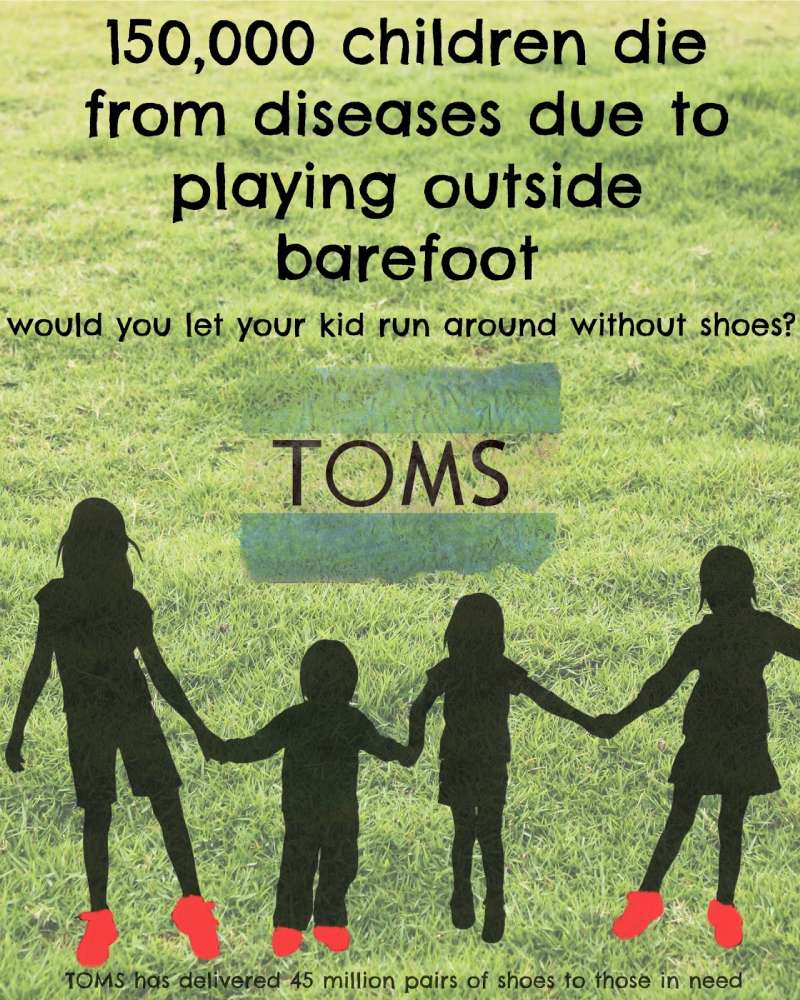
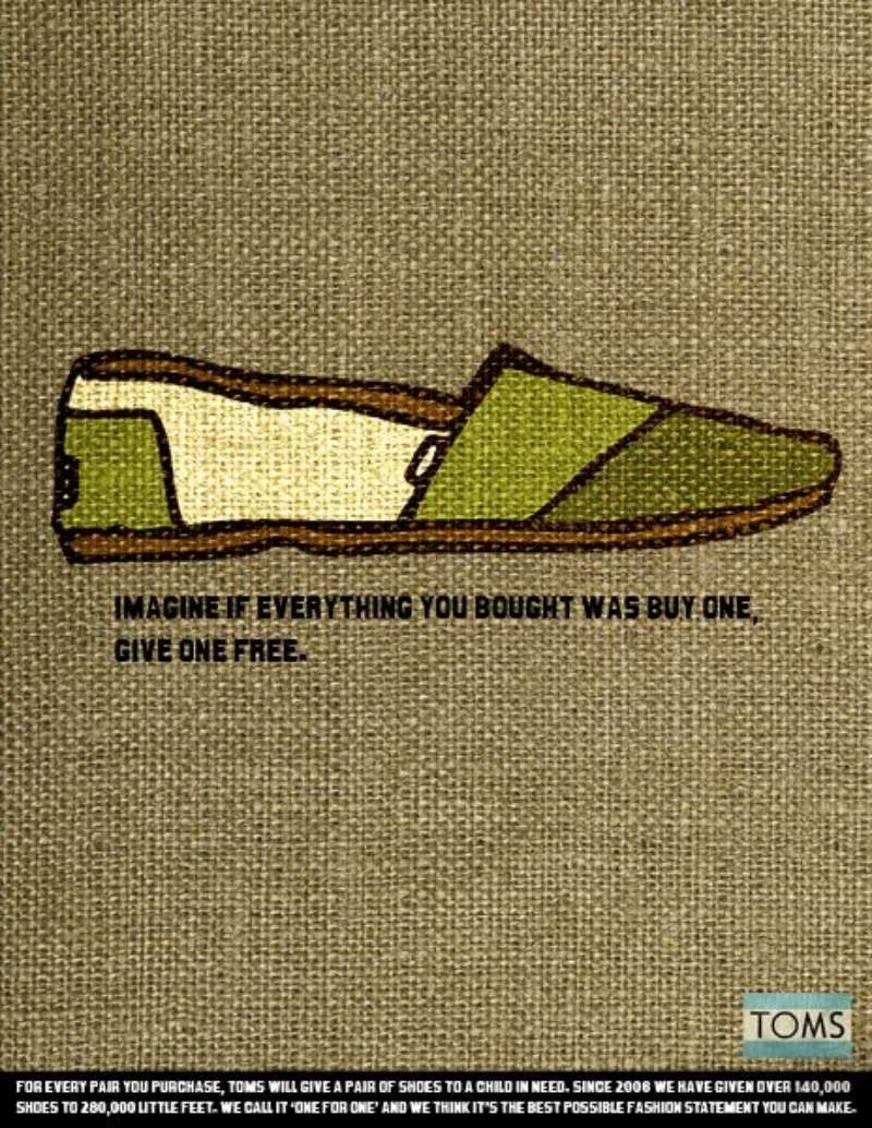
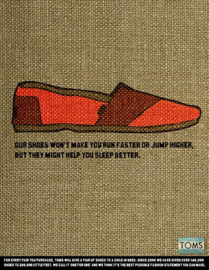
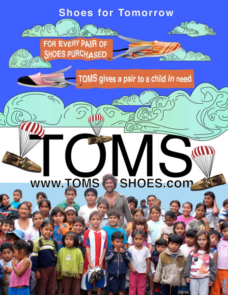
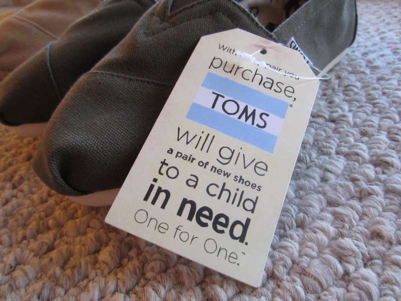
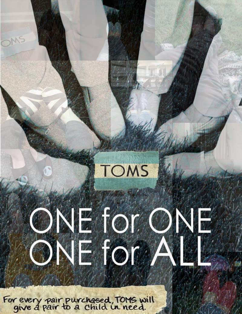
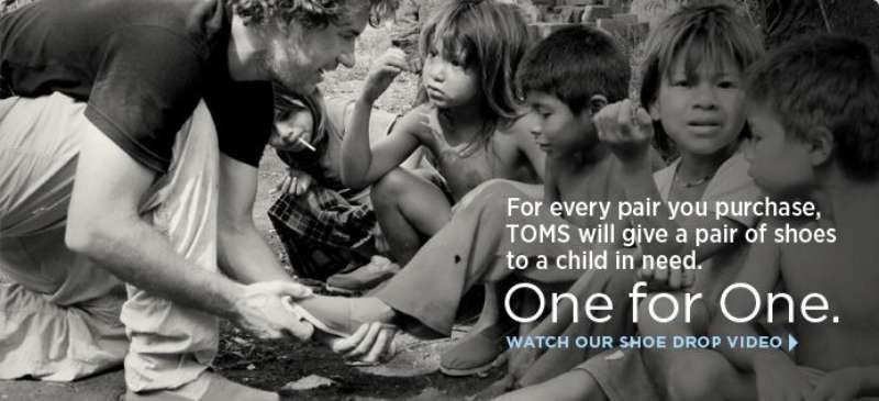
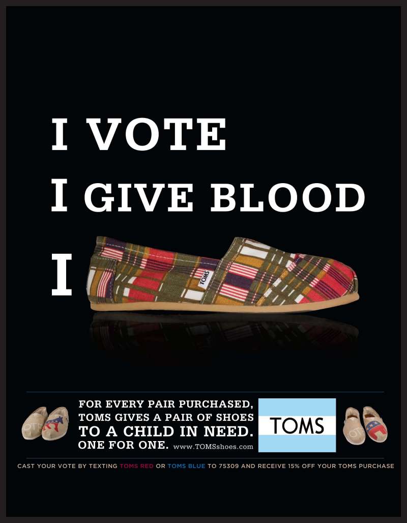
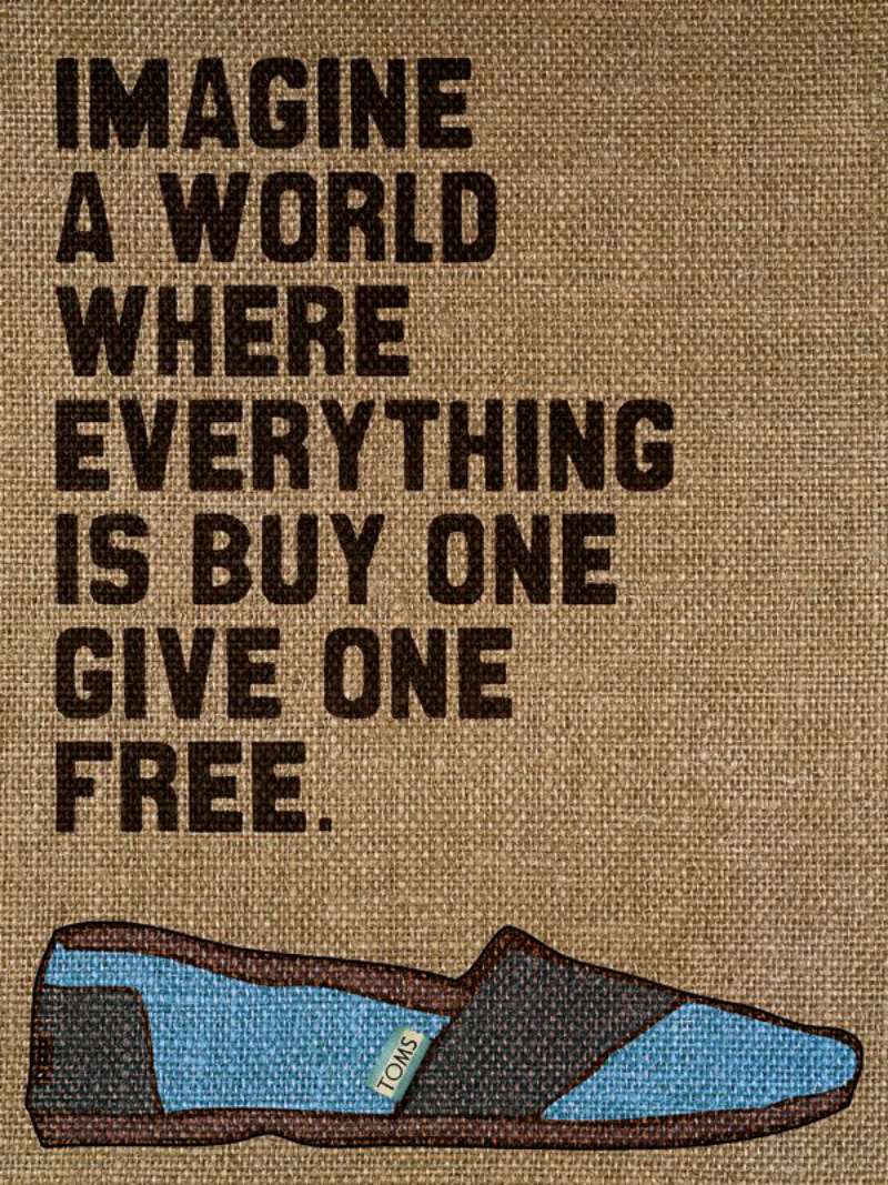
One for One ran for 15 years across the United States and became the brand’s entire advertising proposition. Every pair bought triggered a pair given. The line appeared on hangtags, shoeboxes, storefronts and print.
Layout rule: product shot high, giving statement low, nothing in between.
The ads leaned hard on white space in design, with the canvas slip-on floating on flat white and the copy set small enough to feel like a footnote rather than a pitch.
Toms surpassed 2 million pairs given across 40 countries by 2012, according to Causeartist.
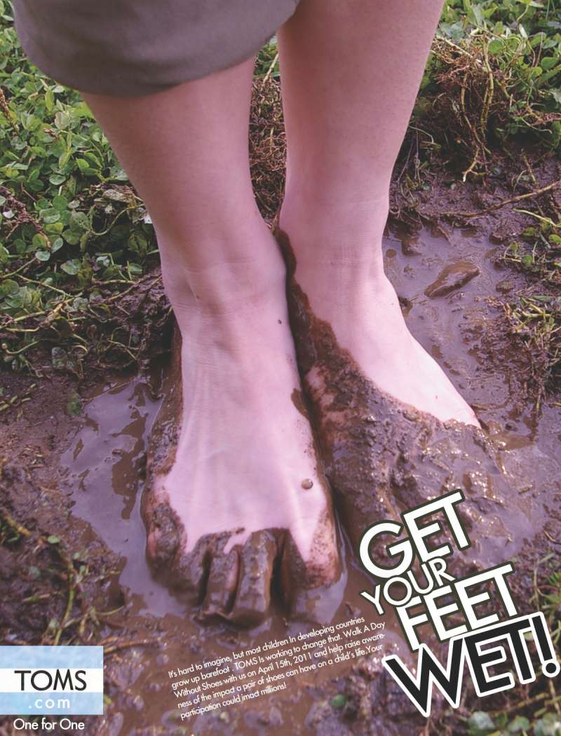
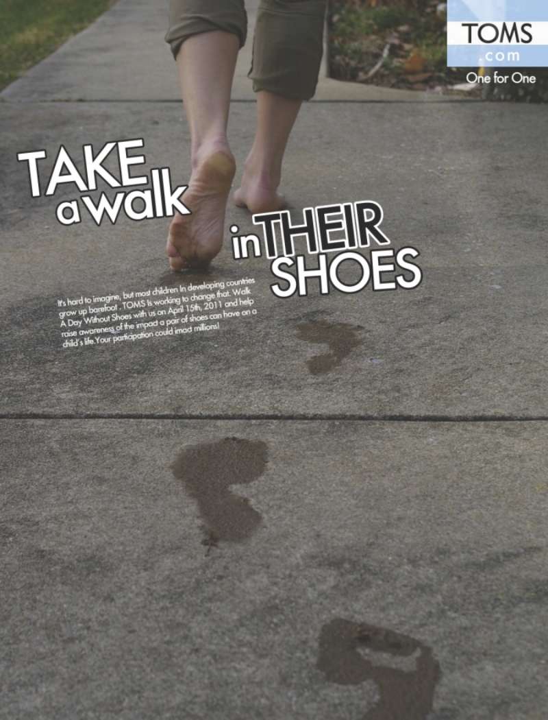
One Day Without Shoes (2008-2017)

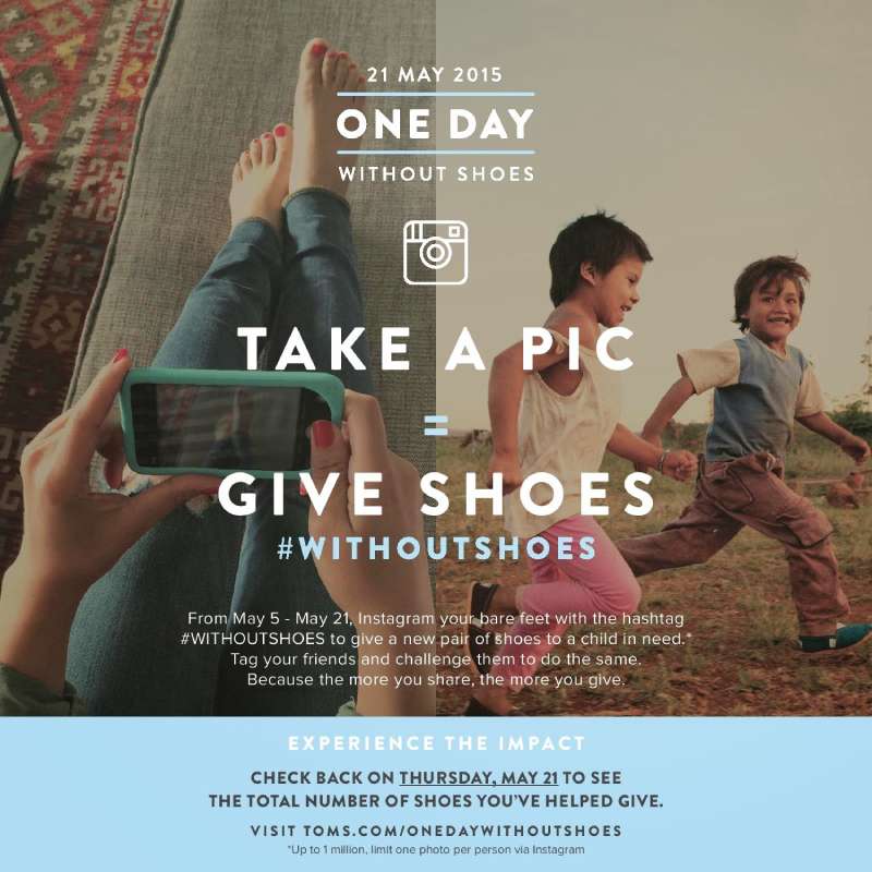
Origin: ideated in 2008 by students in Pepperdine University’s Surf Club, then adopted by the brand as an annual event.
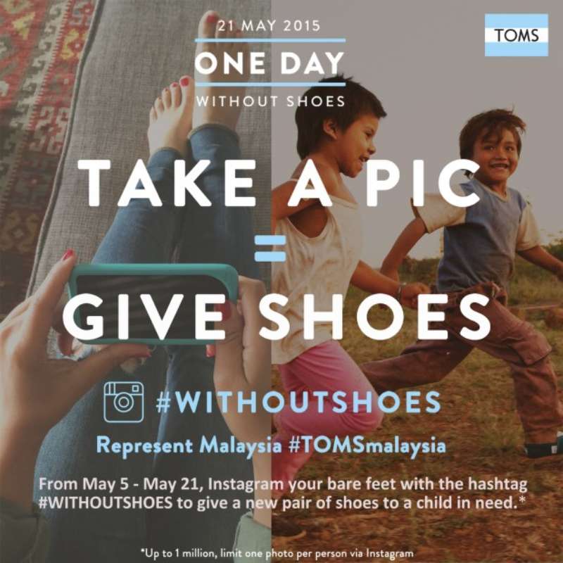
Peak year: the 2015 #WithoutShoes push ran May 5-21 and produced 296,243 giving pairs from Instagram photos in over 30 countries (Shorty Awards).
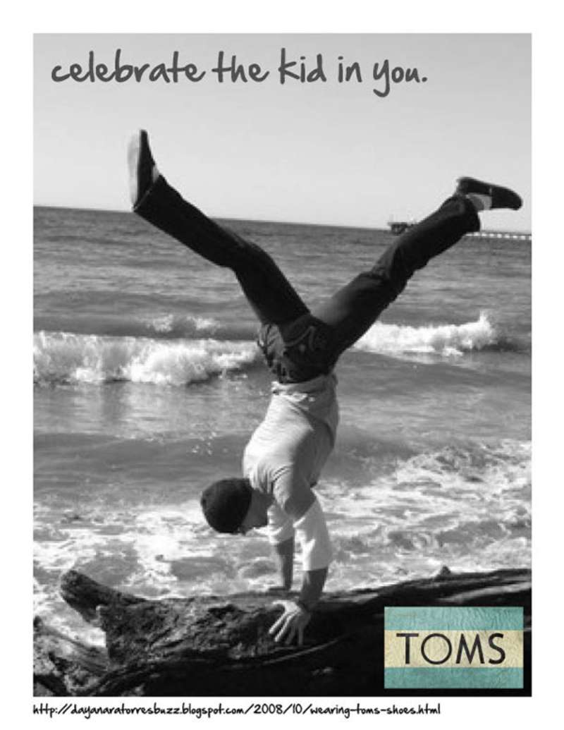
Format: user-generated barefoot photos, no purchase required, no studio photography commissioned at all.
The hashtag cleared 99,000 posts within three days. Marketing Week reported the initiative engaged 3.5 million people in a single day at its height.
A Walk in Their Shoes (2016)

BBDO published this digital campaign in the United States in May 2016 for TOMS and AT&T, marking ten years of partnership. The 360-degree film follows one California customer to Colombia to meet the boy who received his shoes.
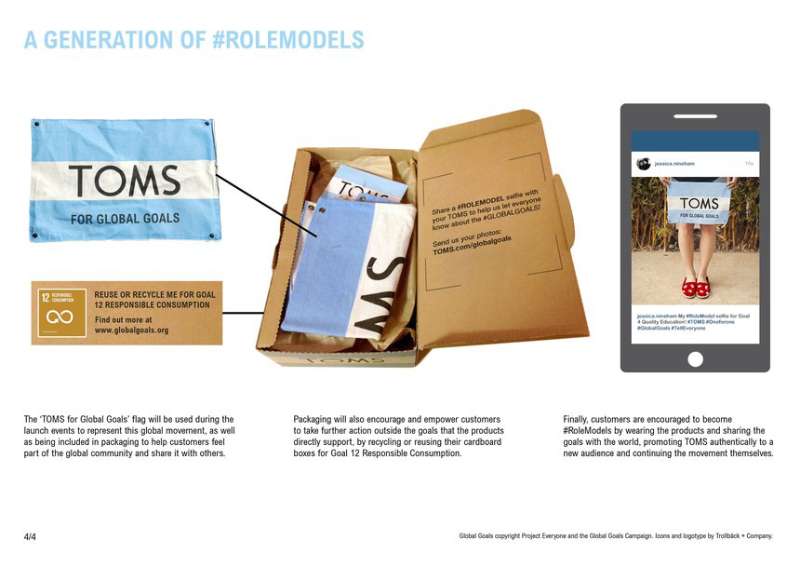
The brand seeded 100,000 Google Cardboard viewers inside online orders and built a walk-in shoebox on the Santa Monica Pier for May 6-7.
Mycoskie told Fast Company that VR was the strongest empathy tool he had seen. An earlier 2015 version put a Peru giving trip inside the Venice Beach flagship.
End Gun Violence Together (2018-2019)
TOMS launched End Gun Violence Together on 19 November 2018, announced by Blake Mycoskie on The Tonight Show Starring Jimmy Fallon, with $5 million committed to seven organizations including Everytown for Gun Safety, March for Our Lives and Moms Demand Action.
The identity was a single flat hand making a peace sign, set with the campaign line in caps. No shoes anywhere. The brand turned its homepage into a postcard tool and gave the initiative more real estate than its Giving Tuesday retail ads, PR News noted at the time.
Over 700,000 postcards reached Congress. WeTransfer donated $1 million in platform advertising.
Stand for Tomorrow (2019-2021)

Launched May 2019 with the line “Pick your Style. Pick your Stand.” Customers chose which of six issues their purchase funded, from safe water to mental health.
Media: national TV through OMD West, plus site and packaging, per iSpot records.
Design consequence: six causes meant six color routes, which fractured the palette and gave the brand its first real modular system problem.
Wear Good (2023-present)
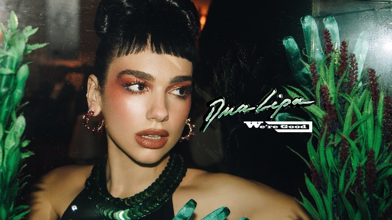
Nemo Design took a phrase already in circulation and rebuilt the brand around it in 2023, delivering strategy, art direction, copywriting and a documented set of brand guidelines.
The SS24 campaign starred six mental health advocates: MILCK, Christian Cowan, Jacqueline Garcia, Tay Lautner, Millana Snow and Mandy Teefey.
It ran across social, streaming, influencer, SMS and email alongside a 12-shoe collection. Ads of the World logged the follow-up, “How Do You Wear Good?”, as an integrated campaign in October 2024.
TOMS Eyewear Print Ads (2011-2016)

TOMS Eyewear launched June 2011 at a public event in Santa Monica with three frame styles and the same one-for-one promise applied to sight.
Print approach: face-forward portraits, frames as the focal point of the composition, giving-partner credit set in small caps at the base.
The Seva Foundation partnership had restored sight for 780,000 people across 14 countries by 2019, according to WWD.
How Do TOMS Print Ads Work Visually?
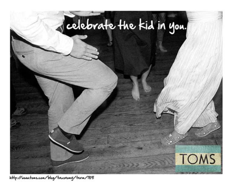
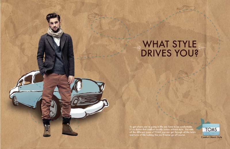
TOMS print ads run on a three-part formula: one photographic subject, one line of copy, one flag mark. Backgrounds stay flat. Typography stays at a single weight. The product occupies roughly a third of the frame and the rest is deliberately empty.
Composition and framing
Most layouts sit the subject slightly off-center, closer to a thirds-based placement than dead middle.
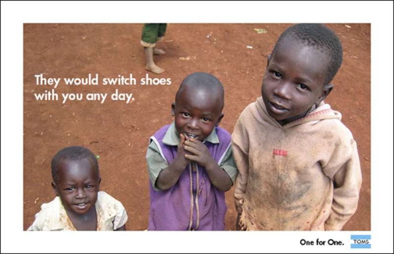
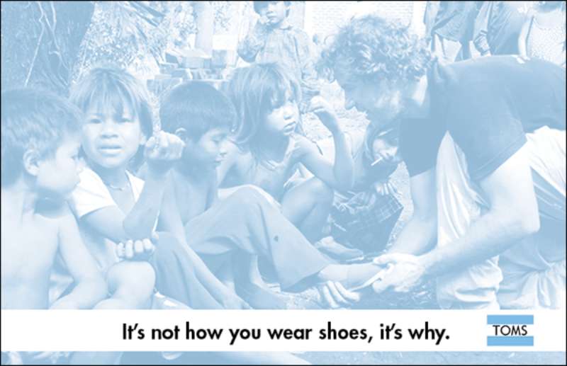
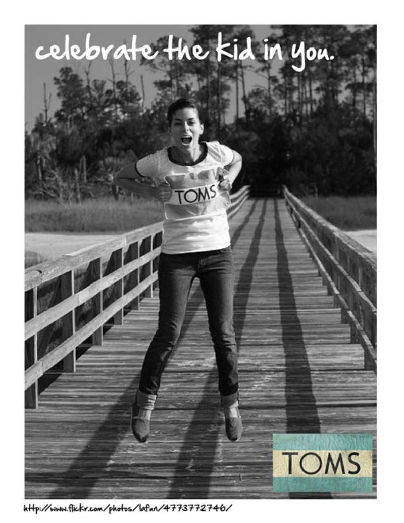
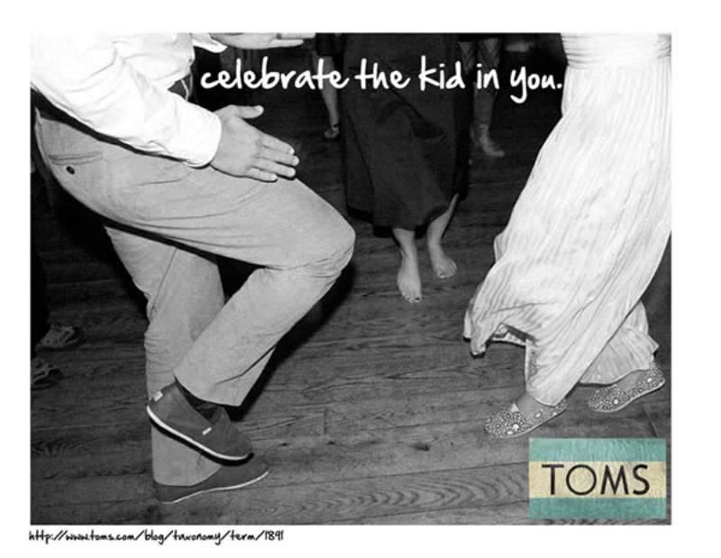
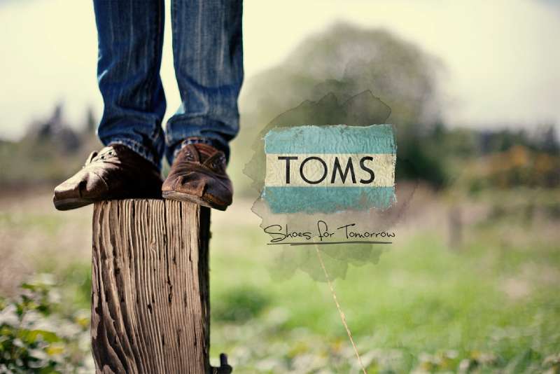
Feet, ankles and hems dominate the crop. Faces come second. That crop choice is the whole argument: you are looking at what the shoe protects, not the shoe.
Result: the giving line reads as caption rather than headline, which is why the ads never feel like they are selling.
Typography
The wordmark uses a rounded geometric sans with a soft, low-contrast structure. Campaign copy follows it.
Weight discipline: one weight per layout, occasionally two.
Case: sentence case for brand lines, all caps reserved for advocacy work like End Gun Violence Together.
Nothing about the hierarchy of type on the page is complicated, and that is the point. Two levels, sometimes three.
Color
Nemo described the 2023 direction as leaning into what it called TOMS’ OG blue, softened into a warmer, more welcoming range that lets product colors sit forward.
Working palette: brand blue, off-white, black text, plus whatever the season’s canvas dye happens to be.
Blue does a specific job here. Color psychology ties it to reliability, and a brand asking you to trust its giving math needs exactly that.
The flag mark
The logo pairs a waving flag with a four-letter wordmark, a nod to the Argentine origin of the alpargata silhouette.
Placement is consistent: bottom right or bottom center, small, never competing with the photograph.
This restraint is what makes the system readable at billboard scale and at 320px, and it is a decent case study in minimalist graphic design holding up across 20 years.
How Do TOMS TV Commercials Differ From Its Print Ads?
TOMS broadcast work adds two things print cannot carry: a narrator and a journey. The spots use handheld footage from actual giving trips, first-person voiceover and no product close-ups until the final frame. Print states the promise. Film proves it.
Stand for Tomorrow (2019)
The national spot walks viewers through the six causes a purchase can fund, ending on the choose-your-stand mechanic. Media was handled by OMD West.
Cut structure: issue, face, shoe, repeat. Roughly 30 seconds, no music swell.
TOMS Giving (2019)

And/Or of New York produced this film for the brand, submitted to Ads of the World through Red Setter. The piece stays documentary throughout and treats the giving partner footage as the primary asset rather than B-roll.
A Walk in Their Shoes 360 (2016)

Distribution: Oculus Video on Samsung Gear VR, the App Store, TOMS Community Outposts and AT&T’s YouTube channel in flat 360.
Because a viewer can look anywhere, the crew composed for a full sphere instead of a frame. That kills the visual hierarchy tools a designer normally relies on, and TOMS solved it with sound: you follow the voice.
Wear Good films (2024)
The SS24 spots feature the six advocates speaking to camera about their own mental health, shot in natural light against plain backdrops.
Notable choice: the shoes are visible but never discussed. Modern Retail reported the brand also pushed the same campaign into podcasts and live events that year.
How Has TOMS Advertising Evolved Since 2006?
TOMS advertising moved through four distinct eras: founder-led storytelling (2006-2012), social activation (2013-2017), political advocacy (2018-2020) and the post-one-for-one brand reset (2021-present). Each shift followed a change in the giving model, not a change in creative fashion.
| Period | Strategic shift | Representative campaign |
|---|---|---|
| 2006-2012 | Founder as chief storyteller, earned media over paid | “One for One” |
| 2013-2017 | Participation replaces purchase, Instagram becomes the medium | “#WithoutShoes” |
| 2018-2020 | Advocacy over commerce, homepage becomes a petition | “End Gun Violence Together” |
| 2021-2026 | One-third of profits, mental health focus, full identity refresh | “Wear Good” |
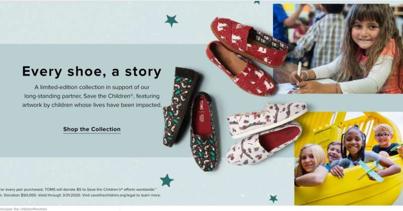
The 2021 break was the real one. TOMS retired the one-for-one model that had defined it since 2006, moving to a one-third-of-profits commitment after a period Forbes described as a near-bankruptcy in 2019.
That forced a rewrite of every ad the brand owned. You cannot run “one for one” copy when the arithmetic no longer applies.
By that point the numbers were substantial. CEO Magnus Wedhammer told Footwear News the company had given over 100 million shoes in its first 14 years, with products reaching 82 countries.
Which Agencies Created TOMS Advertising?
Five agencies shaped TOMS advertising between 2016 and 2024. BBDO created A Walk in Their Shoes with AT&T in 2016. And/Or produced the TOMS Giving film in New York. Red Antler rebuilt the logo and creative direction. Nemo Design authored the Wear Good platform in 2023.
| Agency | Work | Year |
|---|---|---|
| BBDO | “A Walk in Their Shoes,” digital and VR | 2016 |
| And/Or, New York | “TOMS Giving,” film | 2019 |
| Red Antler | Logo, creative direction, styling | 2021 |
| Nemo Design, Portland | “Wear Good” platform, identity, messaging framework | 2023 |
| HarrimanSteel | “TOMS x Gucci Gang Changemakers: Stand for Respect” | 2020 |
The Nemo brief is the most instructive. The agency ran research and interviews to redefine the core audience, then built a flexible system for what it called the complexities of a modern multi-channel marketing plan.
Red Antler’s contribution came earlier. A TOMS representative told the Stan Richards School of Advertising the agency revamped everything from the logo to creative direction and styling.
Media buying for the Stand for Tomorrow broadcast ran through OMD West.
What Can Designers Learn From TOMS Ads?
TOMS ads teach five transferable lessons: crop to the consequence rather than the product, hold the palette to two colors plus black, keep the mark subordinate to the photograph, set the claim as caption rather than headline, and build the system before the campaign.
- Crop to the human consequence of the product, not the product
- Limit the working palette to one brand color, one neutral, one text black
- Set the tagline at a single weight and resist a second one
- Place the mark small and low, then leave it alone across every execution
- Build a written messaging framework before commissioning a single photograph
- Let user-generated imagery carry a campaign when the message is participation
The commercial case is not soft. Glow and NielsenIQ found 64% of US consumers willing to pay more for products with social impact, with nearly 8 in 10 saying they repurchase more often from purpose-driven brands.
PwC’s 2024 Voice of the Consumer Survey put the sustainability premium consumers will accept at 9.7%.
Worth saying plainly: none of this works if the claim is not true. TOMS spent 15 years publishing giving numbers before it asked anyone to believe a tagline, and that sequence is the actual lesson in storytelling through design.
How Do TOMS Ads Compare to Vans and Converse Ads?
TOMS, Vans and Converse all sell canvas footwear to a similar buyer, and all three built identities around a wearer rather than a technology. The advertising diverges completely.
Vans advertises subculture. Its work is loud, photographic, skate-documented, and the checkerboard does most of the identity work. Vans ads put the wearer mid-action and let the environment shout.
Converse advertises self-expression and collaboration, cycling through artists and musicians while the Chuck Taylor silhouette stays fixed. Converse ads treat the shoe as a blank canvas the customer finishes.
TOMS advertises a transaction with a moral outcome. The shoe is almost incidental to the frame.
Design consequence: Vans and Converse can afford visual noise because their marks survive it. TOMS cannot, which is why its layouts stay quiet and its contrast comes from empty space rather than color.
Comfort-led rivals sit somewhere between. Birkenstock advertising sells material honesty and cork-and-leather close-ups, while Skechers ads lean on celebrity and price messaging with far denser layouts.
What Makes TOMS Advertising Work?
TOMS advertising works because the layout never oversells what the copy already claims.
A shoe photographed against flat white, a line of small type, a mark in the corner. That restraint reads as confidence, and confidence is what a giving claim needs to survive scrutiny.
The weakness sits in the same place as the strength. When the giving model changed, every asset the brand owned went stale overnight, because the narrative running through the brand was load-bearing rather than decorative.
Designers borrowing from this playbook should note the trade. Build a system that says one true thing, keep it quiet, and accept that the day the thing stops being true, you are starting over.
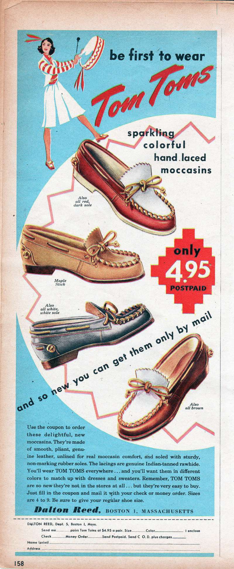
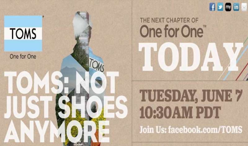
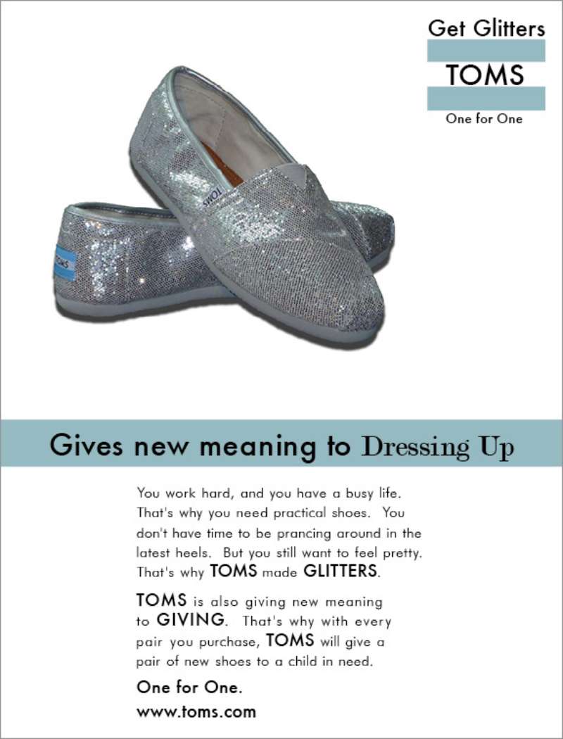
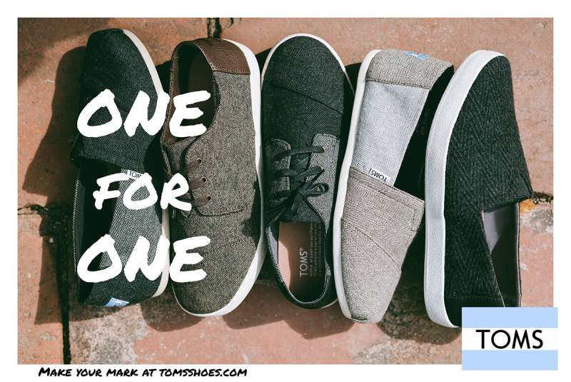
TOMS Ads Examples
FAQ on TOMS Ads
What is the most famous TOMS ad campaign?
One Day Without Shoes is the most recognized. The 2015 #WithoutShoes edition ran 5 to 21 May, drew barefoot photos from over 30 countries, and produced 296,243 giving pairs, according to the Shorty Awards.
What is the TOMS tagline?
Wear Good, introduced in 2023. It replaced One for One, which ran from 2006 until the giving model changed in April 2021.
Who founded TOMS, and why does that matter to the advertising?
Blake Mycoskie founded TOMS in 2006 after a trip to Argentina. He became the brand’s primary spokesman through TED talks and TV appearances, which meant TOMS bought very little media in its first decade.
What does the TOMS flag mark mean?
The waving flag references the Argentine alpargata that inspired the original slip-on. Paired with a four-letter wordmark, it anchors the visual identity at small scale without competing with photography.
Are TOMS ads mostly print or digital?
Digital, by a wide margin. Social, email, SMS and streaming carry the current work. Print appeared mainly through editorial placements and in-store material rather than paid magazine spreads.
How did the #WithoutShoes hashtag actually work?
Post a barefoot photo on Instagram, tag it, and TOMS gave a pair. No purchase required. The hashtag cleared 99,000 posts within three days of launch in 2015.
Which agency created the Wear Good campaign?
Nemo Design in Portland built the platform in 2023, covering research, strategy, art direction, copywriting and brand guidelines. The agency described its job as making the system survive a multi-channel plan.
Did TOMS Eyewear get its own advertising?
Yes. TOMS Eyewear launched June 2011 at a Santa Monica event with three frame styles. Its ads used face-forward portraits and credited the Seva Foundation as sight-giving partner.
How much did End Gun Violence Together cost TOMS?
$5 million in grants across seven organizations, announced on The Tonight Show in November 2018. WeTransfer added $1 million in donated advertising space on its own platform.
What can a small brand copy from TOMS ads?
The discipline, not the cause. One subject, one claim, one mark, held across every execution. TOMS proved a quiet print design approach outperforms clutter when the message is already strong.
Conclusion
TOMS ads are worth studying for one reason: the brand made cause marketing legible at a glance, then spent five years unlearning it.
The alpargata carried a promise Blake Mycoskie could state in five words. #WithoutShoes proved participation beats production budget.
Stand for Tomorrow and the TOMS Eyewear work show where the strain appeared. Six causes fractured a palette built to carry one.
Read these layouts as advertising design before reading them as activism. Documentary photography, wide margins, the mark held small and low, no gradient or texture anywhere.
That system survived two ownership changes and a full rewrite of the giving claim. Not many purpose-driven brands out of Los Angeles can say the same.

Renowned for his expertise in logo design and visual branding, Bogdan has developed a multitude of logos for various clients.
His skills extend to creating posters, vector illustrations, business cards, and brochures. Additionally, Bogdan's UI kits were featured on marketplaces like Visual Hierarchy and UI8.
He also wrote in the past years on sites like Design Your Way, WebDesignerDepot, WPDean, Designmodo, Speckyboy, Slider Revolution, and more.
- The Windsurf Logo History, Colors, Font, And Meaning - 10 October 2026
- How to Remove Background From Product Photos (No Photoshop) - 10 October 2026
- How Designers can Build a Stronger Online Creative Identity - 9 October 2026

Bogdan Sandu is a seasoned designer who has been designing websites since 2008. Renowned for his expertise in logo design and visual branding, Bogdan has developed a multitude of logos for various clients. His skills extend to creating posters, vector illustrations, business cards, and brochures. Additionally, Bogdan's UI kits were featured on marketplaces like Visual Hierarchy and UI8. He also wrote in the past years on sites like Design Your Way, WebDesignerDepot, WPDean, Designmodo, Speckyboy, Slider Revolution, and more.
You Might Also Like