In 1979 a Birkenstock ad sold cork-footbed sandals as a fix for the gas crunch. Self-deprecation has run through Birkenstock ads ever since.
The brand spent two centuries being called ugly, then built a EUR 2.1 billion business by agreeing out loud in print.
This page covers the campaigns by name, with the agency, year and market behind each one, plus the design analysis most ad galleries skip.
What you get here:
- Named campaigns from Doremus in 1984 to T Brand Studio in 2022
- Layout, palette and typography breakdowns of the print work
- Why the documentary films argue differently than the ads
Birkenstock advertising covers 6 decades of paid work, 4 named agencies and 5 flagship campaigns, from the first US mail-order catalog in 1968 to the UTTI LACE & ICONS push in 2026.
The work runs on two devices: self-deprecating humor and anatomical proof.
Print, catalogs and paid editorial carry most of it. This page covers the campaigns by name, with the agency, year and market behind each one, plus the layout, palette and type decisions that make them work.
Birkenstock Advertising at a Glance
Birkenstock has produced promotional material since 1958 and paid consumer advertising since the 1970s, working with Doremus, Duncan Channon and T Brand Studio. Its best-known campaigns are Funny Looking BIRKENSTOCK Sandals, the Personality Campaign and Ugly for a Reason.
| Attribute | Value |
|---|---|
| First major campaign | “Funny Looking BIRKENSTOCK Sandals,” 1984, US market |
| Lead agencies | Doremus (1984), Duncan Channon (2005 onward), T Brand Studio (2022-2023) |
| Best-known taglines | “5,000 miles to a single pair of soles!” (1979), “Get into the habit!” (1982), “Ugly for a Reason” (2022) |
| Primary media | Catalog, print, OOH, paid editorial, digital video, social |
| Awards | Drum Awards for Content, Video and Film (2023); MUSE Award; World Media Award (2023) |
| Visual signature | Bare feet, cork and suede texture, taupe and earth tones, condensed sans-serif wordmark |
Which Birkenstock Ad Campaigns Are the Most Famous?
Five campaigns define Birkenstock advertising: Funny Looking BIRKENSTOCK Sandals (1984), the Red Bern print series (2006-2010), the Personality Campaign (2018-2020), Ugly for a Reason (2022-2023) and UTTI LACE & ICONS (2026). Every one of them sells the footbed before the fashion.
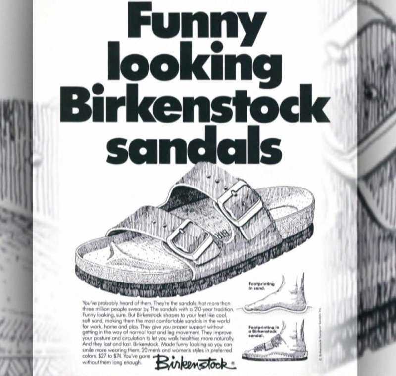
Funny Looking BIRKENSTOCK Sandals (1984)
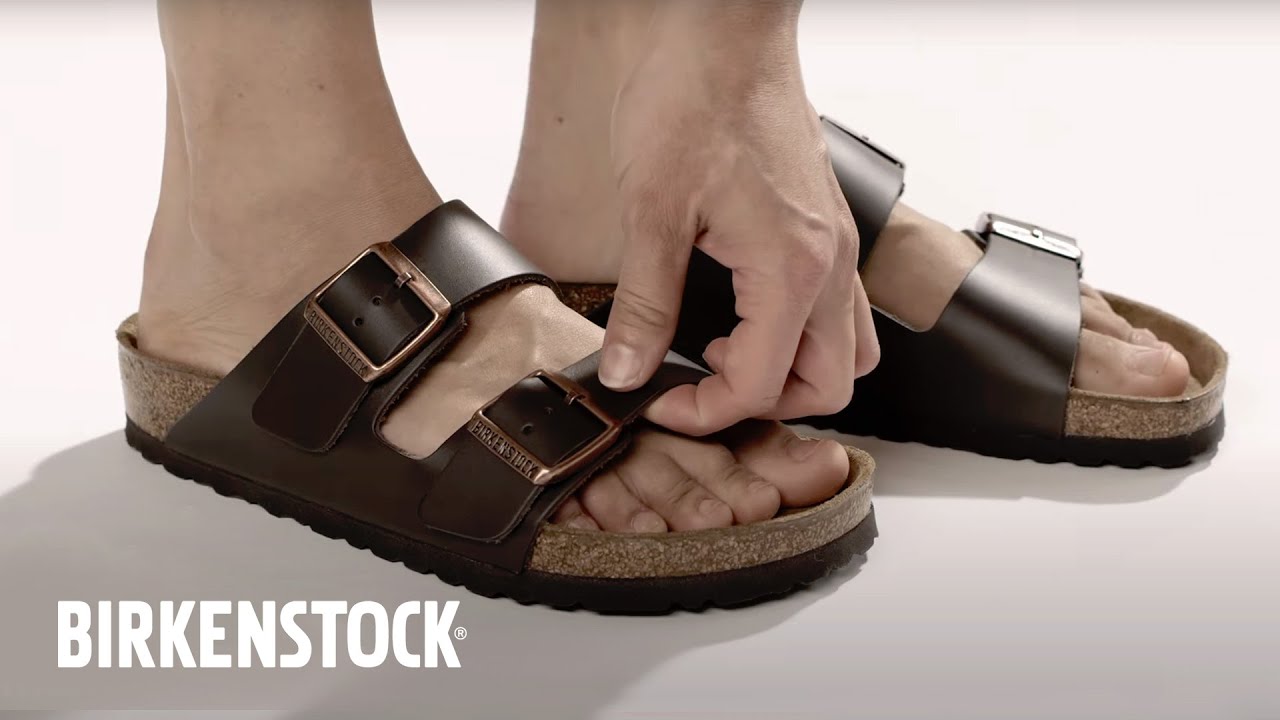
Birkenstock USA hired New York agency Doremus in 1984 to run the “Funny Looking BIRKENSTOCK Sandals” campaign across US consumer print.
The line admits the shape is odd, then argues the shape is the point. Naming your own flaw in the headline removes the critic’s only line of attack.
Context worth knowing: when Karl Birkenstock showed the original footbed sandal at the 1963 Dusseldorf shoe fair, the company took zero orders and called itself the laughingstock of the event.
The Red Bern Print Series (2006-2010)

Agency: Duncan Channon, appointed Birkenstock USA agency of record in December 2005.
Creative team: Anne Elisco-Lemme (art director), Parker Channon (writer), Amy Guip (illustrator), Jacqueline Fodor (producer).
Media: high-profile fashion titles, the first time the brand bought that inventory.
The agency kept the earthy associations and added styling cues. Birkenstock reported selling out completely for the first time in its 236-year history (Communication Arts).
The Personality Campaign (2018-2020)

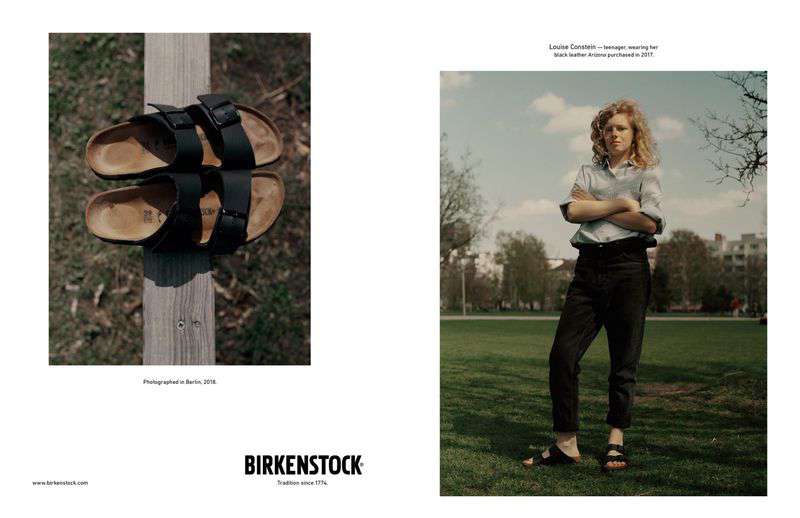
Nobody in this campaign wears new product. British photographer Jack Davison shot real owners in their own worn pairs, in their own rooms, without styling or briefing.
- Ryan McGinley, photographer, black suede and sheepskin Boston bought in 2015
- Thomas Sudhof, Nobel laureate in Medicine, black leather Milano bought in 2018
- Romany Pajdak, Royal Ballet dancer, shot in a London training room
- Manolo Blahnik and Kristina Blahnik, added for Spring/Summer 2020
The product plays a supporting role in every frame. Four to five minute video portraits ran alongside the stills under the name Birkenstories.
Ugly for a Reason (2022-2023)

This was Birkenstock’s first global brand campaign, produced with T Brand Studio, the content arm of New York Times Advertising.
A three-part documentary about the human foot ran from July to September 2022, backed by print cover wraps, audio spots and digital takeovers. Birkenstock crowdsourced photos of real people’s feet for the print work.
The campaign reached over 140 million people worldwide and won Video and Film at The Drum Awards for Content.
UTTI LACE & ICONS (2026)

The SS26 campaign places the new UTTI LACE next to the Arizona and the Boston, arguing all three run on the same footbed logic.
Palette: New Navy, Pink Clay, Cork Brown. Product range referenced: more than 700 models.
It follows SS25’s “Any City, Any Season”, which pushed closed-toe styles in a single taupe palette. Closed-toe shoes hit 38% of Birkenstock revenue in fiscal 2025, up 500 basis points year over year, so the media weight follows the money.
Birkenstock Print Ads From the 1970s and 1980s
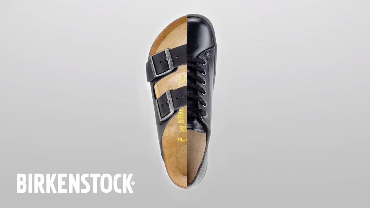
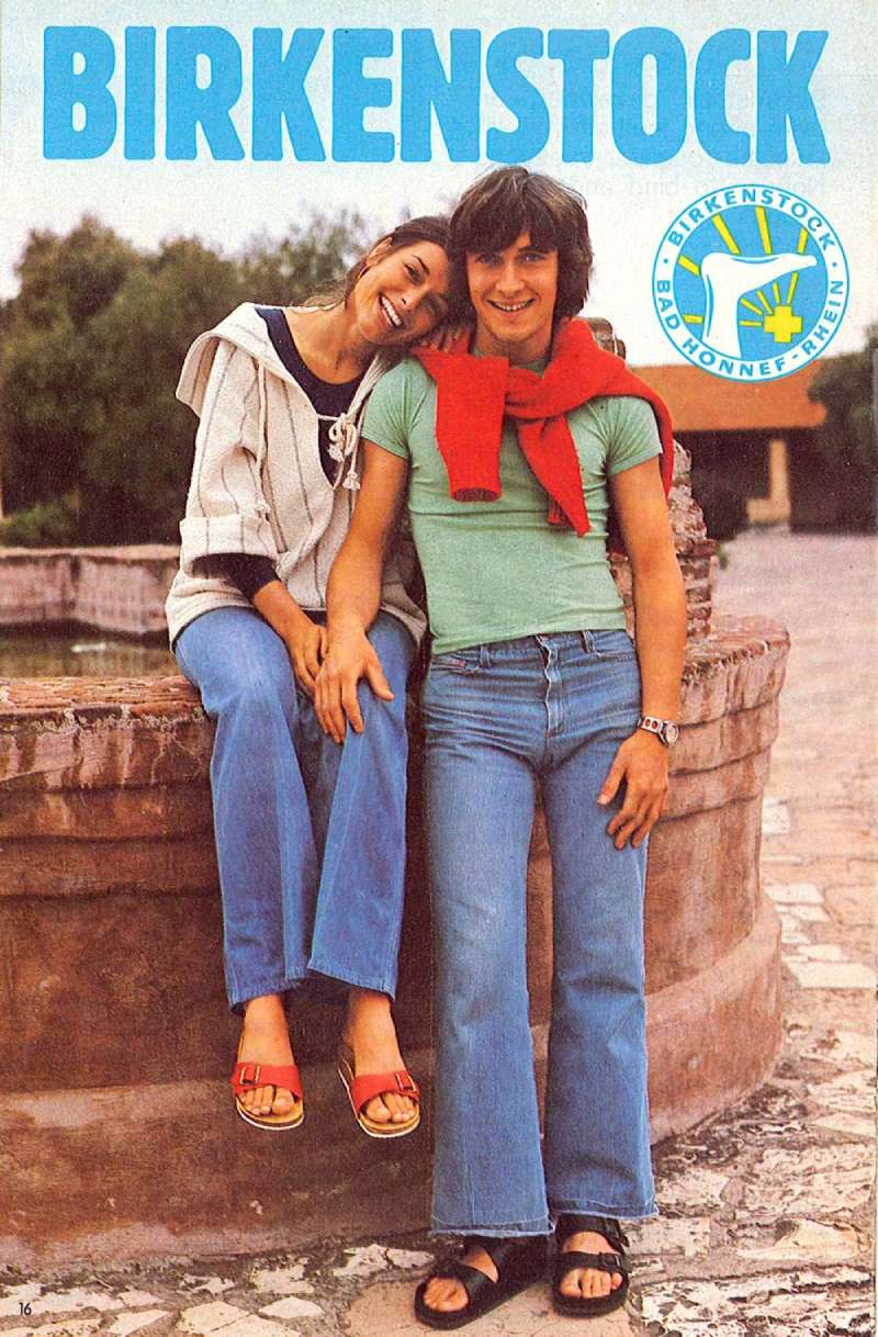
The US ads of this period read like editorial jokes with a product shot attached.
- 1979: sandals sold as a fix for the gas crunch, tagline “5,000 miles to a single pair of soles!”
- 1982: a group of sandal-wearing nuns under “Get into the habit!”
- 1968: the first known US catalog, selling the EXQUISIT sandal on the argument that it pays to buy the best
Wordplay carried these. No lifestyle photography, no aspirational casting.
Birkenstock Ads for the 1774 Line and Luxury Collaborations

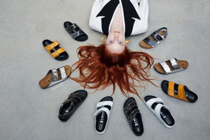
The 1774 label handles the fashion tier, and its campaign imagery borrows the codes of the partner house rather than the parent brand.
Kim Jones showed DIOR by BIRKENSTOCK at Paris Fashion Week in January 2022, reworking the Milano and Tokio in Dior gray felt with the Oblique monogram cut into Birkenstock’s bone-pattern sole.
Roe Ethridge shot the Birkenstock x Valentino campaign film starring Ryan McGinley and Lili Sumner in New York. Rick Owens, Proenza Schouler and Jil Sander have all had a turn.
How Do Birkenstock Print Ads Work Visually?
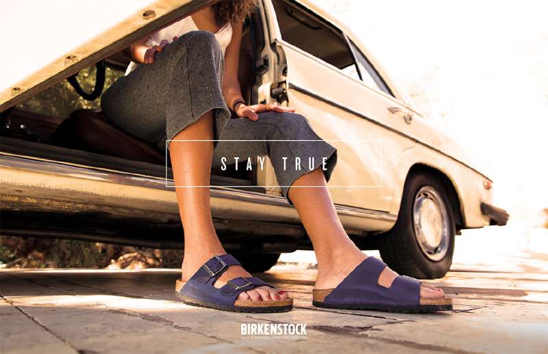
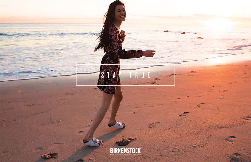
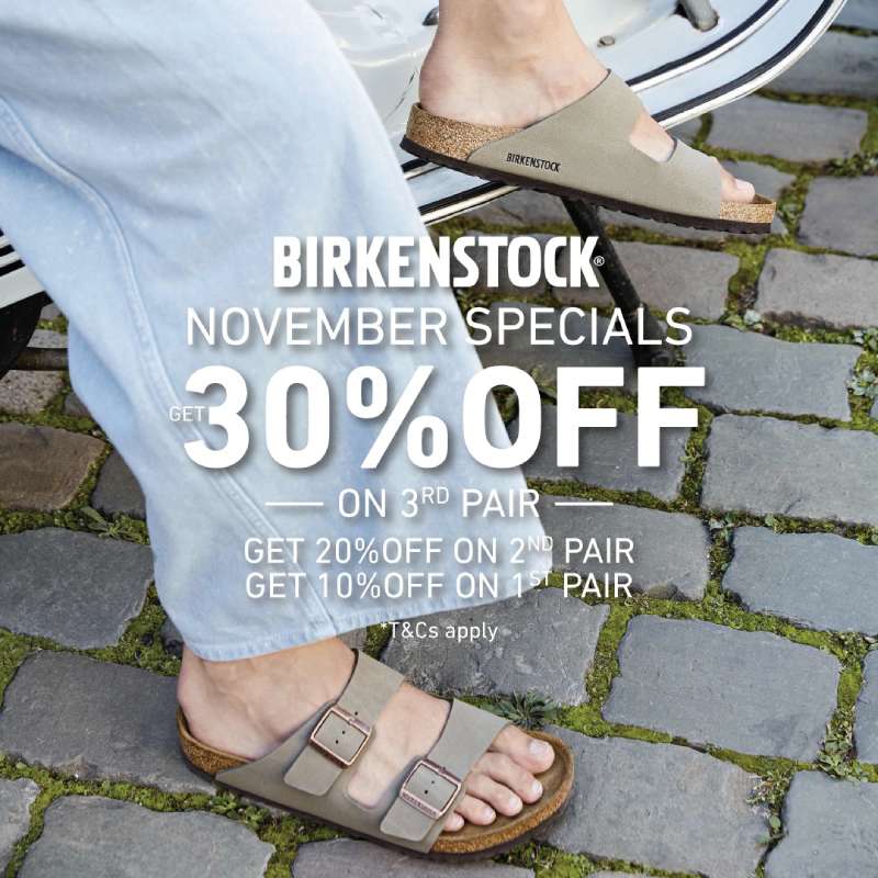
Birkenstock print ads put the product or a bare foot at the optical center, hold the palette to 2 neutrals, set copy in a condensed sans-serif at one weight, and leave the rest of the page empty. The footbed profile does the identifying work, not the wordmark.
The visual hierarchy is unusually flat for footwear. One object, one line, one mark. Most competitors stack three or four competing elements.
Texture carries the difference instead. Cork grain, suede nap and pressed leather give the layout its contrast without needing a second color, which is why the color palette can stay in taupe, sand and brown across an entire season.
The wordmark is a heavy condensed sans-serif with squeezed counters and rounded stem joints, usually set small and pushed to a corner.
Generous white space around the shoe reads as confidence in the object. It also keeps the focal point unambiguous when the same layout gets cropped for a billboard, a magazine spread or a 1:1 social frame.
Honest limitation: this discipline makes the ads quiet. In a crowded fashion book they can get flipped past.
How Do Birkenstock TV Commercials Differ From Its Print Ads?
Birkenstock’s video work is documentary, not commercial. The films run 4 to 20 minutes, feature academics and real owners rather than actors, and mention product late. Print states the claim; video proves it with interviews and archive material.
How Feet Made Us Human (2022, T Brand Studio): Episode one of Ugly for a Reason. Academics discuss the evolution of the human foot, with footage of dancers, runners and everyday walkers. Product appears in the final third.
Rethinking Footwear, Redefining Aesthetics (2022, T Brand Studio): Episode three, released 21 November. Fashion figures and historians explain how the Madrid, the brand’s first orthopedic sandal, changed the industry’s idea of what a shoe should look like.
Birkenstories (2018 onward, in-house crew): Four to five minute portraits shot for owned channels only. The subject talks about their life. The sandals sit in the frame without being sold.
CEO Oliver Reichert framed the whole approach around foot health rather than footwear, telling audiences that most people are born with healthy feet and then damage them with badly fitted shoes.
How Has Birkenstock Advertising Evolved Since 1958?
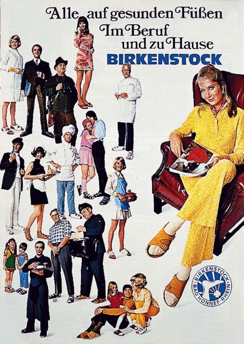
Birkenstock advertising moved through 5 phases: retailer education (1958-1966), mail-order catalogs (1968-1978), self-deprecating US consumer print (1979-1989), fashion press placement (2005-2015) and purpose-led paid editorial (2018 onward).
| Period | Strategic shift | Representative work |
|---|---|---|
| 1958-1966 | Educating retailers and orthopedists | “BIRKENSTOCK Post,” 16 editions |
| 1968-1982 | Direct mail plus joke-led print | EXQUISIT catalog; gas crunch ad |
| 1984-2004 | Owning the “funny looking” label | Doremus campaign |
| 2005-2017 | Buying fashion inventory | Red Bern series; BIRKENSTOCK Box |
| 2018-2026 | Documentary and portraiture | Personality Campaign; “Ugly for a Reason” |
The BIRKENSTOCK Post pamphlets pulled their layouts from Bauhaus design and carried endorsements from orthopedic specialists. Function-first, decades before that became a marketing position.
Two moments sit outside the paid plan. Kate Moss wore a pair on a 1990s fashion shoot. Greta Gerwig put the Arizona Big Buckle in Barbie in 2023 with no money changing hands, and Lyst recorded a 110% jump in searches for Birkenstock Arizonas after release.
Which Agencies Created Birkenstock Advertising?
Four named shops built the brand’s advertising: Doremus made the 1984 US campaign, Duncan Channon handled the account from 2005, T Brand Studio produced Ugly for a Reason in 2022, and KIT Studio designed the Your Blank Canvas identity in 2026.
| Agency | Years | Work |
|---|---|---|
| Doremus, New York | 1984 | “Funny Looking BIRKENSTOCK Sandals” |
| Duncan Channon, San Francisco | 2005 onward | “Red Bern” print series |
| T Brand Studio, New York | 2022-2023 | “Ugly for a Reason” |
| KIT Studio, London | 2026 | “Your Blank Canvas” identity |
Jack Davison shot the Personality Campaign for Birkenstock from 2018. Roe Ethridge directed the Valentino collaboration film. Pierre Jorge Gonzalez and Judith Haase, Berlin architects, built the BIRKENSTOCK Box pop-up from two chrome-plated freight containers in 2017.
KIT Studio’s 2026 system introduces a custom rounded typeface and 3 mascots tied to the Arizona, Utti and Boston. That is a sharp break from the brand’s usual restraint, and it is confined to the customization platform rather than the master brand.
What Can Designers Learn From Birkenstock Ads?
Six rules travel out of this body of work and into other briefs, most of them about restraint and about naming your weakness first.
- Name the flaw in the headline before a critic gets to it
- Hold the palette to two neutrals plus black, and let material texture supply the contrast
- Set the tagline in one weight of a condensed sans-serif, small, in a corner
- Cast real owners in their own worn pairs instead of models in new product
- Give the object 60% of the frame and leave the remainder empty
- Build the layout on a repeatable grid system so one composition survives crops from billboard to social
The Ugly for a Reason work also shows what minimalist design buys you at scale. Same 3 elements, 140 million people, no campaign fatigue.
How Do Birkenstock Ads Compare to Crocs Ads?
Both brands turned an ugly-shoe reputation into a market position, then went in opposite creative directions. Birkenstock argues from anatomy. Crocs argues from play.
| Dimension | Birkenstock | Crocs |
|---|---|---|
| Core device | Anatomical proof, documentary | Collectible customization, collab drops |
| Casting | Real owners, unstyled | Celebrities and licensed IP |
| Palette | Taupe, cork, earth tones | Saturated brights |
Crocs ads lean on Jibbitz charms and partnerships with Pokemon, MLB, Hello Kitty and Millie Bobby Brown, per the company’s fiscal 2025 filing. Jibbitz alone made up roughly 8% of revenue in 2024. Birkenstock ran the opposite bet and put a Nobel laureate in a Milano.
The comfort-first field is crowded now. UGG ads use heritage casting and seasonal film, while New Balance ads mined the same dad-shoe irony that Birkenstock got to first in 1984.
What Makes Birkenstock Advertising Work?
Every ad since 1979 makes the same argument in a different medium: the shape looks odd because the foot is odd.
That one claim survives a joke about nuns, a fashion-magazine buy, a documentary series and an in-store customization platform. Most brands rewrite the proposition every time the account moves.
The design consequence is a system nobody has to redraw. One object, one line, one mark, held in neutrals, cropping cleanly from a spread to a phone screen.
Designers borrowing from this should borrow the discipline, not the taupe. The palette is a result of the argument. Copy the palette without the argument and you get a beige ad that says nothing.
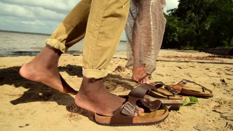
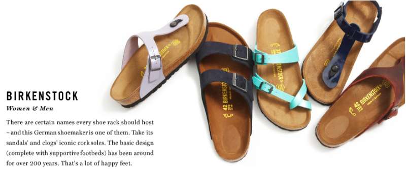
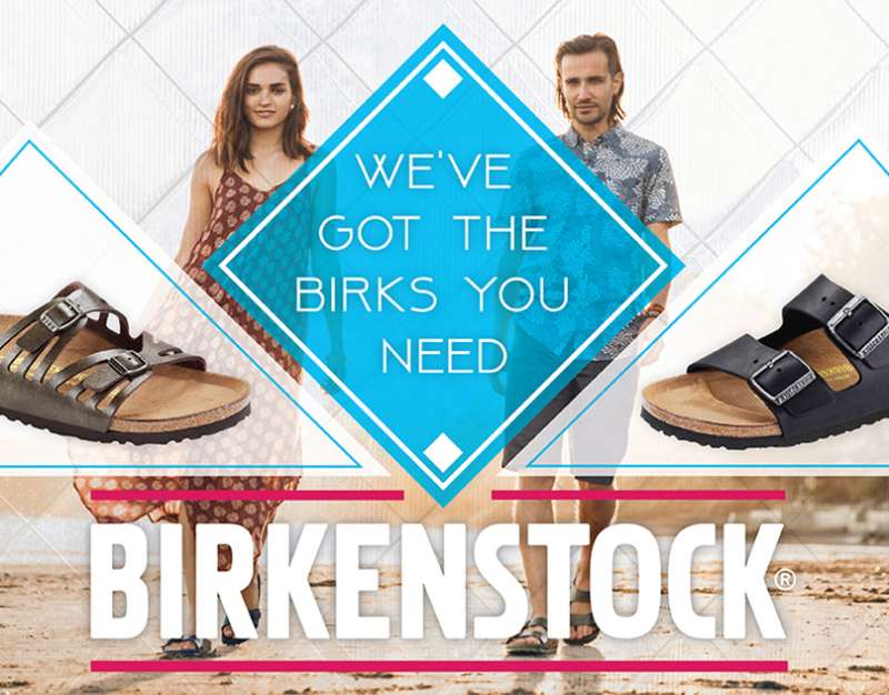
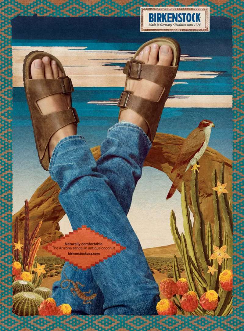
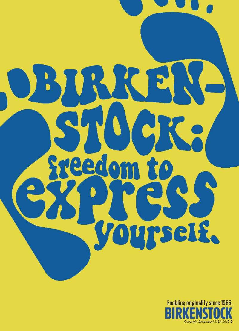
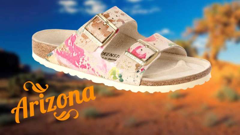
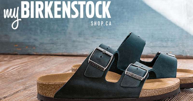
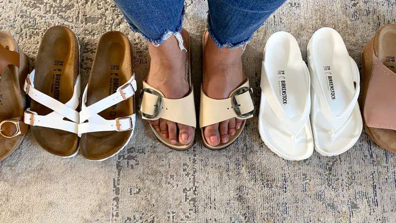
Birkenstock Ads Examples
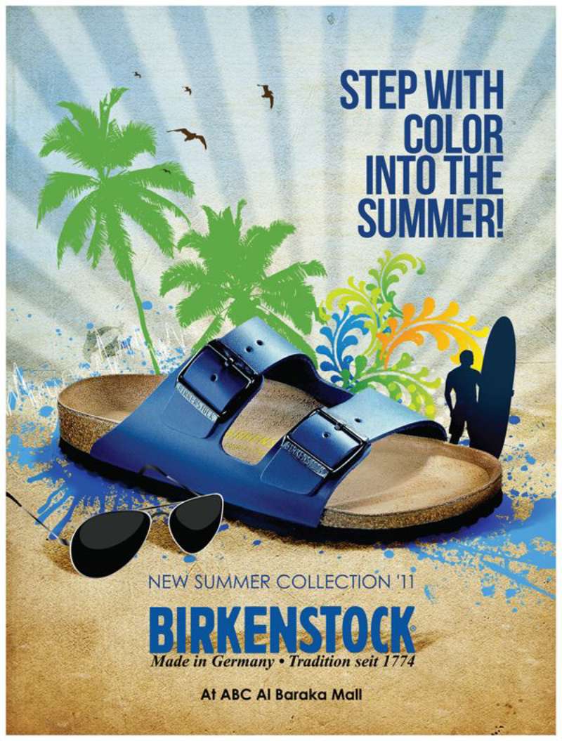
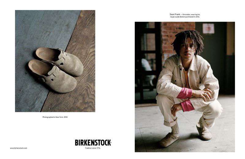

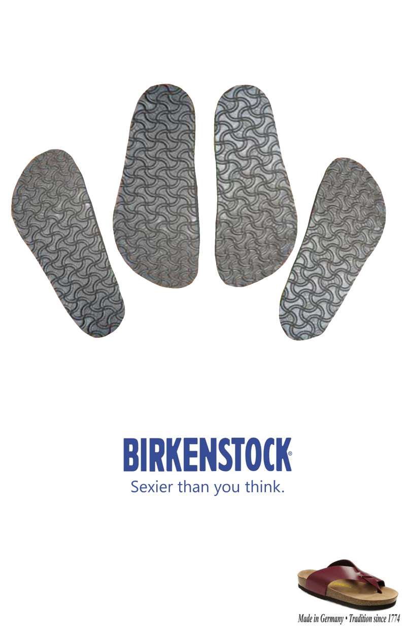
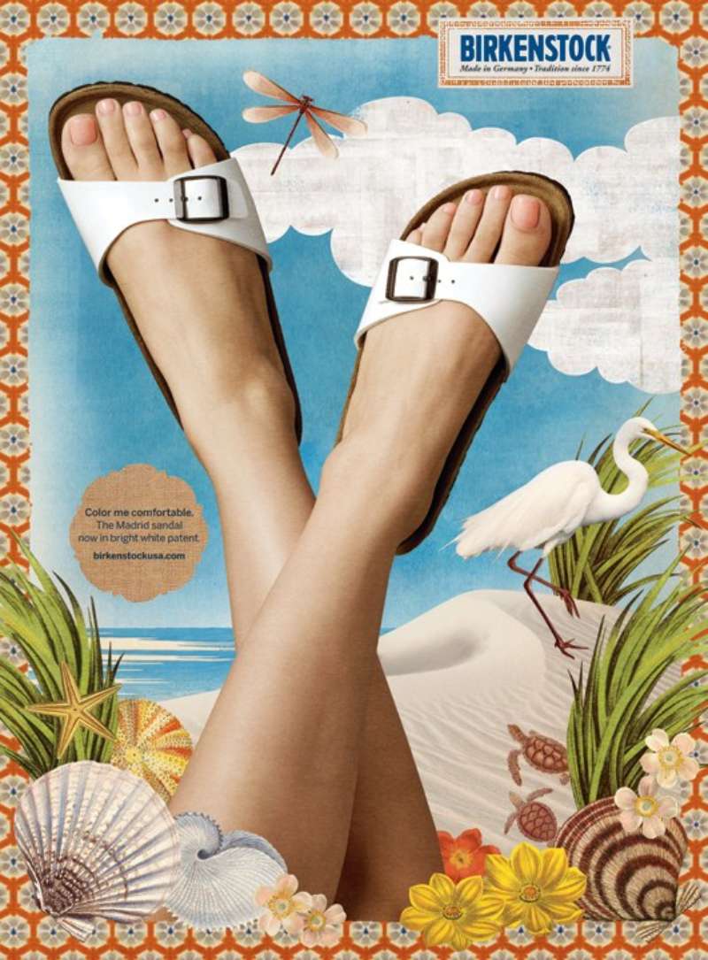
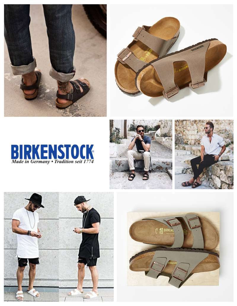

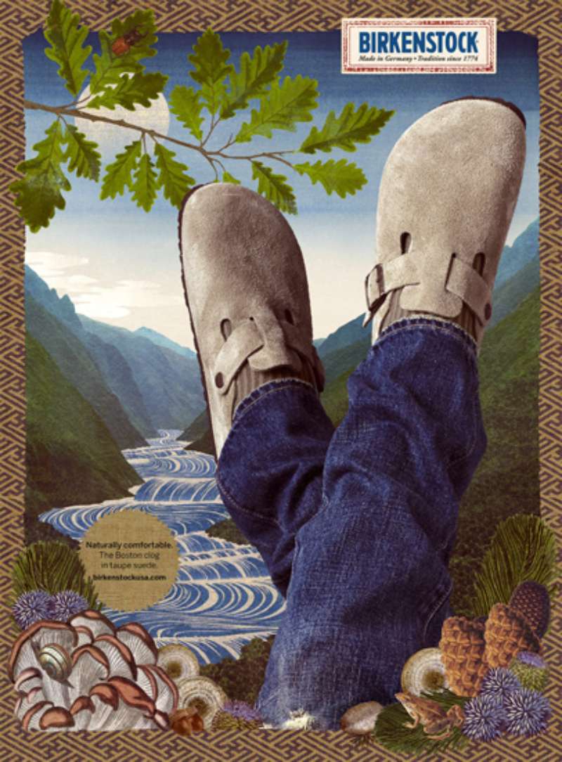
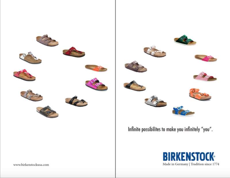
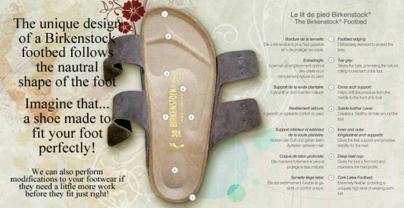


FAQ on Birkenstock Ads
What was the first Birkenstock ad?
The BIRKENSTOCK Post came first, a pamphlet printed from 1958 that ran 16 editions until 1966.
The first known US catalog landed in mailboxes in 1968, selling the EXQUISIT sandal on quality rather than price.
Why does Birkenstock call its own shoes ugly?
Because the wide toe box, cork arch and thick sole exist for anatomical reasons, not aesthetic ones.
CEO Oliver Reichert frames the whole argument around foot health, telling audiences most people damage healthy feet with badly fitted shoes.
Which photographers have shot Birkenstock campaigns?
Jack Davison shot the portrait series from 2018. Roe Ethridge directed the Valentino collaboration film in New York.
Henry Leutwyler made the 140 photographs for the travelling Walk This Way exhibition, and Juergen Teller contributed to the Old Mills Never Die photo book set.
Which fashion houses appear in Birkenstock campaign imagery?
- Dior, reworked by Kim Jones in 2022
- Valentino, under Pierpaolo Piccioli
- Rick Owens, Proenza Schouler and Jil Sander
- Manolo Blahnik, who appeared as a subject rather than a designer
Which markets do Birkenstock ads target most?
The Americas produced 52% of fiscal 2025 revenue, EMEA 37% and APAC 11%.
Media weight follows that split, though APAC grew 31% year over year, which is where new spend is heading.
Has Birkenstock advertising won any awards?
Yes. Ugly for a Reason took Video and Film at The Drum Awards for Content plus a MUSE Award and a World Media Award.
The 250-year archive project won a Wood Pencil at D&AD 2025 and a Webby for photography.
What is the BIRKENSTOCK Box?
A travelling pop-up store built in 2017 from two interlocking chrome-plated freight containers by Berlin architects Pierre Jorge Gonzalez and Judith Haase.
It ran through Berlin Fashion Week, Barneys New York, 10 Corso Como in Milan and Rick Owens in Los Angeles.
What is Your Blank Canvas?
An in-store customization platform launched in early 2026 at the King’s Road flagship in London, offering charms, laces and heat stamping.
KIT Studio built the visual identity around rounded custom lettering and 3 mascots tied to the Arizona, Utti and Boston.
Did Kate Moss ever appear in a Birkenstock ad?
No. Moss wore a pair on a 1990s fashion shoot, which is editorial coverage rather than paid advertising.
That single image did more for the brand’s fashion credibility than any media buy of the decade.
How many shoe models does Birkenstock advertise?
The portfolio runs to more than 700 silhouettes, though campaign imagery keeps circling the same handful.
Arizona, Boston, Madrid, Gizeh, Milano and Zurich carry most of the advertising, with UTTI LACE added for Spring/Summer 2026.
Conclusion
Birkenstock ads hold up because the argument never moved. Orthopedic footwear, sold as anti-fashion, from the Arizona sandal to the Boston clog.
Jack Davison’s unstyled portraits and the luxury collaboration imagery pull in opposite directions. Both still lead with the footbed.
The lesson for designers sits in the restraint. Earth-tone palette, heavy negative space, one line of copy, a small mark pushed into a corner.
Worth watching next: how the closed-toe push and the 2026 customization work reshape a print campaign layout that was built for sandals and bare feet.
Brand heritage did the heavy lifting here, but only because every ad said the same thing for 40 years.
Copy the discipline. The taupe is optional.

Renowned for his expertise in logo design and visual branding, Bogdan has developed a multitude of logos for various clients.
His skills extend to creating posters, vector illustrations, business cards, and brochures. Additionally, Bogdan's UI kits were featured on marketplaces like Visual Hierarchy and UI8.
He also wrote in the past years on sites like Design Your Way, WebDesignerDepot, WPDean, Designmodo, Speckyboy, Slider Revolution, and more.
- The Windsurf Logo History, Colors, Font, And Meaning - 10 October 2026
- How to Remove Background From Product Photos (No Photoshop) - 10 October 2026
- How Designers can Build a Stronger Online Creative Identity - 9 October 2026

Bogdan Sandu is a seasoned designer who has been designing websites since 2008. Renowned for his expertise in logo design and visual branding, Bogdan has developed a multitude of logos for various clients. His skills extend to creating posters, vector illustrations, business cards, and brochures. Additionally, Bogdan's UI kits were featured on marketplaces like Visual Hierarchy and UI8. He also wrote in the past years on sites like Design Your Way, WebDesignerDepot, WPDean, Designmodo, Speckyboy, Slider Revolution, and more.
You Might Also Like