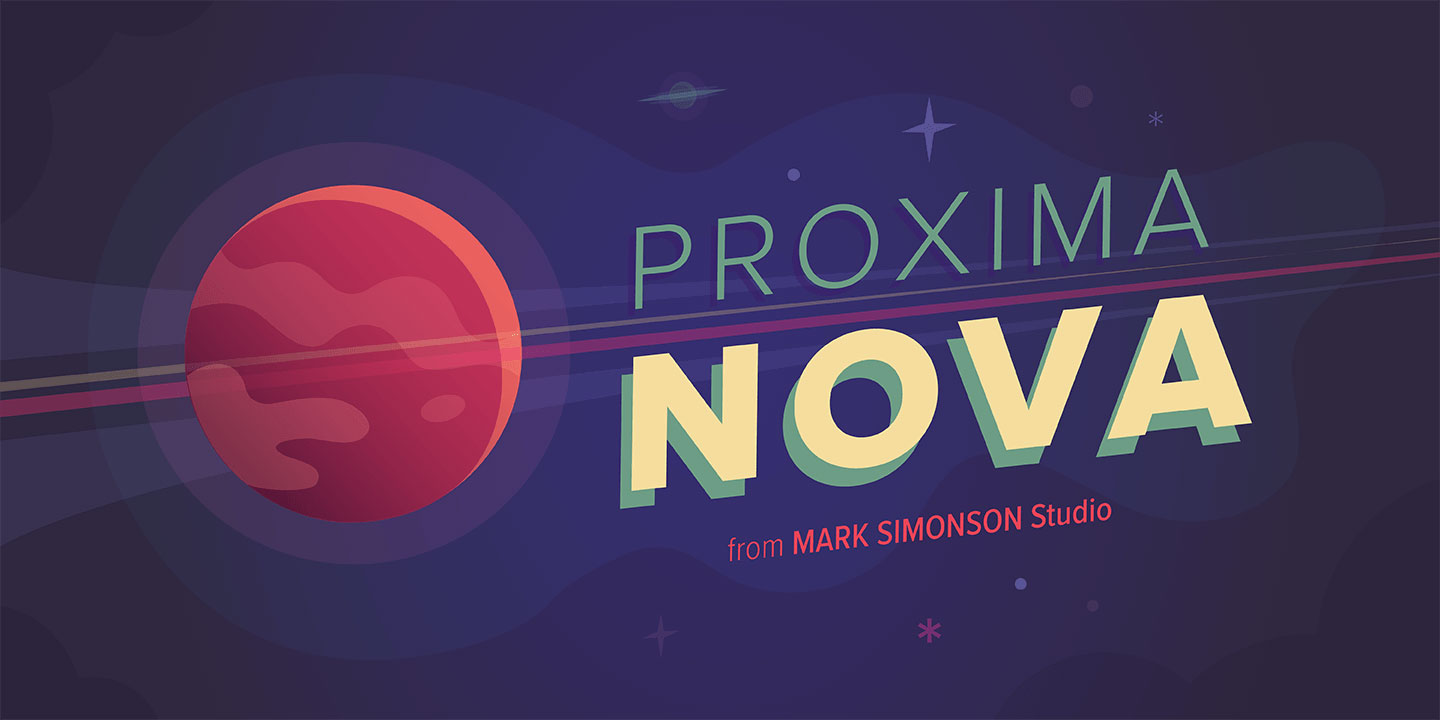
Proxima Nova costs money. That’s the problem.
You need a clean, professional sans-serif typeface for your project, but licensing fees don’t fit the budget. Or maybe you just want options that bring something different to the table while maintaining that same geometric-humanist balance.
Fonts similar to Proxima Nova exist across every price point and licensing model. Some are free through Google Fonts. Others are premium alternatives with unique characteristics that might actually work better for your specific needs.
This guide covers 20 typefaces that share Proxima Nova’s core strengths: excellent legibility, versatile weight ranges, and that crucial balance between geometric structure and humanist warmth. You’ll find technical specifications, visual comparisons, and practical use cases for each option.
Whether you’re building a brand identity, designing an interface, or setting body text, there’s an alternative here worth considering.
Fonts Similar To Proxima Nova
| Font Name | Design Character | Best Context | Key Distinction |
|---|---|---|---|
| Gotham | Geometric sans-serif with wide letterforms | Editorial, branding, headlines | Authoritative masculine tone |
| Montserrat | Urban geometric with rounded terminals | Web interfaces, modern apps | Open-source Google Fonts |
| Avenir | Humanist geometric with organic warmth | Corporate identity, premium brands | Balances geometry with humanity |
| Nunito Sans | Rounded humanist with soft terminals | UI design, friendly interfaces | Approachable readability |
| Metropolis | Contemporary geometric with tall x-height | Tech startups, modern web | Clean minimal aesthetic |
| Helvetica Neue | Neo-grotesque with neutral character | Professional documentation, systems | Industry standard versatility |
| Open Sans | Humanist with upright stress | Body text, long-form content | Optimized screen legibility |
| Raleway | Elegant geometric with thin weights | Fashion, luxury, headers | Display-oriented sophistication |
| Muli | Minimalist humanist with low contrast | Mobile apps, simple interfaces | Subtle understated presence |
| Aktiv Grotesk | Contemporary neo-grotesque revival | Editorial, modern branding | Refined professional character |
| Sofia Pro | Geometric with subtle stroke variation | Startups, creative agencies | Fresh contemporary feel |
| Cera Pro | Geometric with rounded corners | Tech products, SaaS platforms | Warm approachable geometry |
| Geomanist | Modular geometric construction | Digital products, modern interfaces | Precise mathematical structure |
| TT Norms Pro | Neo-grotesque with softened edges | Corporate communications, UI | Balanced neutrality |
| TT Commons Pro | Humanist grotesque hybrid | Corporate identity, websites | Versatile family range |
| Goldplay | Geometric with sharp terminals | Branding, posters, displays | Bold distinctive personality |
| Greycliff CF | Geometric with high contrast weights | Headlines, luxury branding | Dramatic weight variations |
| Franklin Gothic | American grotesque with sturdy build | Traditional print, newspapers | Historical American character |
| Forma DJR | Geometric with humanist proportions | Editorial, magazine design | Readable geometric harmony |
| Shapiro | Modern geometric with unique curves | Creative projects, branding | Distinctive angular terminals |
Gotham
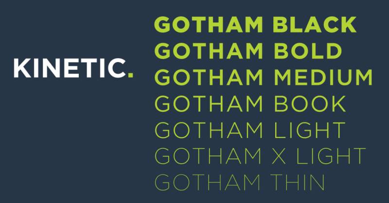
This geometric sans-serif shares Proxima Nova’s humanist structure but adds a distinctly American character.
Designed by Tobias Frere-Jones in 2000, Gotham features architectural inspiration from mid-century New York signage.
Key Characteristics
Geometric letterforms with subtle humanist touches differentiate Gotham from purely mechanical designs.
The large x-height and open counters match Proxima Nova’s legibility standards. Stroke width shows more contrast than Proxima Nova, particularly visible in characters like ‘O’ and ‘e’.
Visual Comparison
The double-story ‘a’ matches Proxima Nova’s structure.
The ‘g’ features an ear similar to Proxima Nova but with slightly more pronounced geometric construction. Capital letters like ‘R’ and ‘Q’ display bolder, more architectural qualities than Proxima Nova’s refined terminals.
Use Cases
Corporate branding and political campaigns (Obama 2008) demonstrate its authoritative presence.
Ideal for headlines and display typography where you need confidence without cold formality. Works across print and digital, though heavier weights excel in large-format applications.
Technical Details
Eight weights from Thin to Ultra, plus four width variations (Normal, Narrow, Extra Narrow, Condensed).
Available in OpenType format with extensive language support including Greek and Cyrillic. Desktop and web font licensing through Hoefler & Co. Premium pricing reflects its professional pedigree.
Best Paired With
Georgia for serif contrast in editorial layouts.
Freight Text balances Gotham’s geometric precision. Sentinel creates sophisticated magazine-style hierarchies.
Montserrat
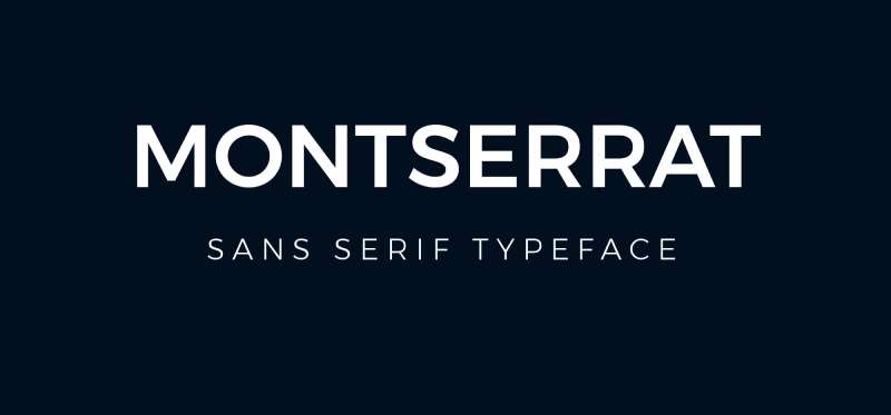
Free Google Font inspired by Buenos Aires signage that channels Proxima Nova’s geometric warmth at zero cost.
Designed by Julieta Ulanovsky, this typeface captures urban typography’s honest charm.
Key Characteristics
Large x-height and short descenders boost screen legibility.
Wide apertures prevent character confusion at small sizes. Slightly condensed letterforms pack more efficiently than Proxima Nova while maintaining readability.
Visual Comparison
Characters are more geometric than Proxima Nova but avoid Futura’s strict circles.
The ‘a’ and ‘g’ use single-story construction (alternates available). Stroke terminals are more abrupt than Proxima Nova’s subtle curves, giving sharper edges overall.
Use Cases
Web design where budget constraints meet professional standards.
Branding for tech startups and modern businesses. The nine weights (Thin to Black) with italics handle everything from body text to bold headlines.
Available through Google Fonts makes it perfect for projects requiring extensive language support without licensing fees.
Technical Details
Nine weights with full italic sets available free through Google Fonts.
Supports Latin, Cyrillic, and Vietnamese scripts. Variable font version provides infinite weight adjustments. OFL license permits commercial use and modification.
Best Paired With
Lora adds serif elegance for editorial content.
Merriweather works for longer reading experiences. Stick with Montserrat across weights for cohesive single-family hierarchies.
Avenir
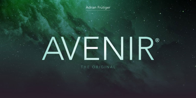
Adrian Frutiger’s humanist interpretation of geometric principles predates Proxima Nova and influenced its design philosophy.
Released in 1988, Avenir means “future” in French.
Key Characteristics
Optically corrected circles and curves rather than pure geometric shapes create more refined letterforms.
The two-story ‘a’ and ‘t’ with bottom curl add traditional touches. Slightly smaller x-height than Proxima Nova emphasizes ascenders and descenders for distinctive word shapes.
Key Characteristics
Optically corrected circles create more refined letterforms than strict geometric construction.
Two-story ‘a’ and ‘t’ with bottom curl. Vertical stress in rounded characters like ‘o’ improves readability versus perfect circles.
Visual Comparison
More humanist than Proxima Nova despite geometric foundation.
Characters feel warmer and less mechanical. The ‘g’ features a distinctive loop structure. Numerals are particularly elegant with refined proportions.
Use Cases
Corporate identities requiring sophistication without cold formality.
System font on macOS and iOS since 2012 makes it ubiquitous. Print applications benefit from its refined typographic hierarchy and optical corrections.
Technical Details
Avenir Next offers eight weights (Ultra Light to Heavy) in two widths with italics.
32 fonts total in complete family. Desktop licensing through Linotype/Monotype. Available as system font on Apple devices. Extensive OpenType features include small caps and multiple figure styles.
Best Paired With
Georgia creates classic editorial combinations.
Freight Text provides warm serif contrast. Avenir works across weights for minimal type palettes.
Nunito Sans
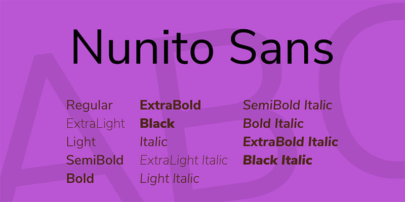
Vernon Adams created this rounded terminal sans-serif that balances Proxima Nova’s professionalism with approachable friendliness.
Jacques Le Bailly expanded it to a full family.
Key Characteristics
Rounded terminals soften geometric structure without sacrificing clarity.
High x-height enhances digital legibility. Even stroke width and consistent spacing create harmonious texture. More open than Nunito (the rounded version).
Visual Comparison
Terminals are squared rather than rounded like its sibling Nunito.
Less geometric than Proxima Nova with subtle humanist influences. Character widths feel slightly more generous. The ‘a’ and ‘g’ use simplified single-story forms.
Use Cases
Web interfaces requiring friendly yet professional tone.
Mobile applications benefit from clear differentiation at small sizes. Eight weights (ExtraLight to Black) with italics provide flexibility for complex information hierarchies.
Technical Details
Eight weights with full italic support available free via Google Fonts.
Variable font axes include weight, width, and optical size adjustments. SIL Open Font License permits modification. Extensive language support covers Latin, Cyrillic, and Vietnamese.
Best Paired With
Merriweather for warm serif combinations.
Lora adds elegance for editorial content. PT Serif creates approachable reading experiences.
Metropolis

Open-source geometric sans-serif designed as a free Proxima Nova alternative with nine weights.
Created by Chris Simpson and influenced by modern minimalist typefaces.
Key Characteristics
Geometric construction with minimal decoration prioritizes function.
Large x-height optimizes small-size readability. Near-monoline strokes create even typographic color. Slightly condensed proportions save space without compromising legibility.
Visual Comparison
More geometric and less refined than Proxima Nova.
Simpler letterform construction reduces optical corrections. The ‘a’ and ‘g’ use basic geometric shapes. Terminals are blunt rather than Proxima Nova’s subtle tapers.
Use Cases
Startup branding where budget limitations meet modern aesthetics.
Web applications requiring clean interface typography. Nine weights (Thin to Black) handle diverse design needs across digital and print.
Technical Details
Nine weights with matching italics under SIL Open Font License.
Available through NPM packages and GitHub. OpenType, TrueType, and webfont formats. Free for commercial use and modification.
Best Paired With
Crimson Text provides serif contrast.
Libre Baskerville adds traditional warmth. Source Serif Pro creates professional document hierarchies.
Helvetica Neue
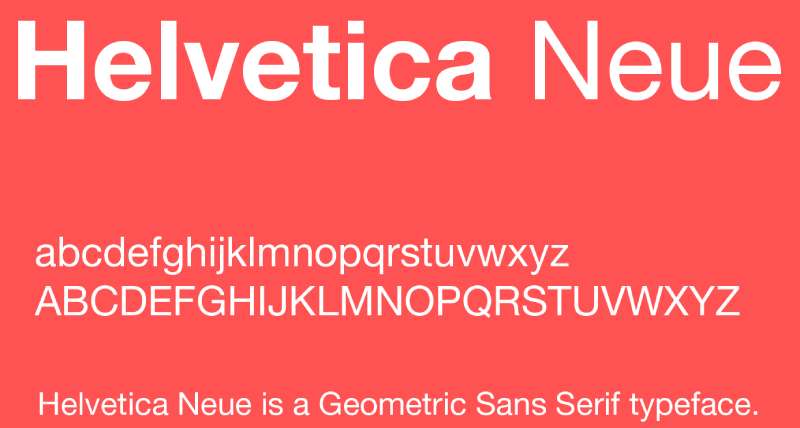
The refined version of history’s most ubiquitous typeface offers neutral professionalism similar to Proxima Nova.
Max Miedinger’s original Helvetica was redesigned in 1983 by D. Stempel AG.
Key Characteristics
Neutral expression makes it invisible yet highly functional.
Tighter spacing than original Helvetica. Large x-height with short ascenders and descenders maximizes body text efficiency. Nearly perfect circles in characters like ‘o’.
Visual Comparison
More mechanical and less warm than Proxima Nova.
Tighter letter spacing creates denser texture. Characters like ‘a’ and ‘g’ use simpler, more geometric construction. The overall feel is cooler and more Swiss than Proxima Nova’s humanist warmth.
Use Cases
Corporate communications requiring absolute neutrality.
System font on Apple devices until San Francisco replaced it. Works for any application where typography shouldn’t draw attention but must remain perfectly legible.
Technical Details
Multiple weights and widths spanning dozens of styles.
Standard weights include Light, Regular, Medium, Bold, and Black with italics. Available through various licensing options. System font on older Apple devices.
Best Paired With
Times New Roman for traditional document hierarchies.
Garamond creates classic editorial combinations. Georgia adds warmth for web applications.
Open Sans

Google’s humanist sans-serif designed specifically for screen legibility shares Proxima Nova’s clarity mission.
Commissioned from Steve Matteson, this expansion of Droid Sans prioritizes readability.
Key Characteristics
Wide apertures prevent character confusion at small sizes.
Large x-height with open counters optimizes screen rendering. Low stroke contrast reduces rendering issues across devices. Upright italic maintains readability better than slanted forms.
Visual Comparison
More open and less refined than Proxima Nova.
Characters feel wider with more breathing room. The ‘a’ uses a simple single-story form. Overall texture is lighter and more neutral than Proxima Nova’s subtle personality.
Use Cases
Web body text where readability trumps personality.
Digital interfaces requiring maximum clarity. Ten weights from Light to ExtraBold with full italics provide extensive flexibility for complex information design.
Technical Details
Ten weights with italics available free through Google Fonts.
Variable font version offers continuous weight adjustment. Apache 2.0 license permits commercial use. Extensive character set covers 897 glyphs including Greek and Cyrillic.
Best Paired With
Lora creates clean editorial hierarchies.
Merriweather provides warm serif contrast. Roboto Slab adds geometric serif structure.
Raleway
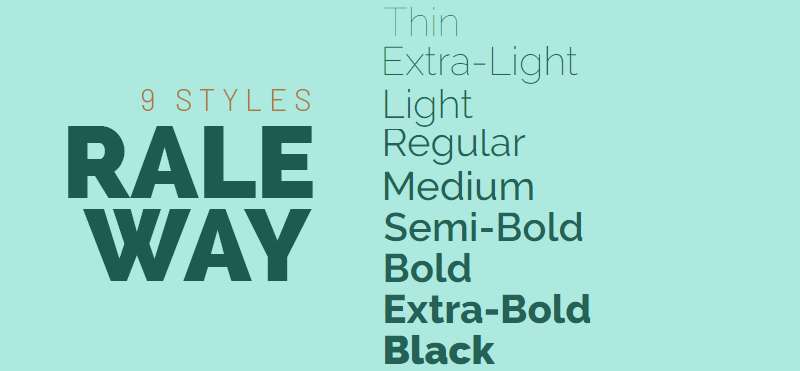
Elegant sans-serif that started as a single thin weight and evolved into a comprehensive family similar to Proxima Nova’s range.
Matt McInerney’s original design was expanded by Pablo Impallari and Rodrigo Fuenzalida.
Key Characteristics
Neo-grotesque structure with geometric influences creates sophisticated letterforms.
Distinctive ‘W’ uses intersecting strokes rather than separated. Slightly condensed proportions feel more elegant than Proxima Nova. Both old-style and lining figures available.
Visual Comparison
More refined and elegant than Proxima Nova, especially in lighter weights.
Thin weight is genuinely usable unlike many superficial thin cuts. Characters have subtle personality without calling attention to themselves. The ‘a’ uses classic two-story construction.
Use Cases
Display typography for fashion, lifestyle, and creative industries.
Headings where elegance matters more than maximum legibility. Eighteen weights (nine romans plus italics) span from Thin to Black for comprehensive type systems.
Technical Details
Eighteen styles (nine weights with italics) free through Google Fonts.
Variable font version includes weight axis. SIL Open Font License. Extensive language support includes Latin and Cyrillic scripts.
Best Paired With
Lora for elegant editorial combinations.
Libre Baskerville adds classical structure. Crimson Text creates sophisticated reading experiences.
Muli
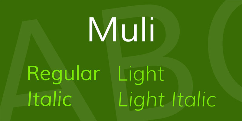
Lightweight sans-serif designed for display use that evolved into a text-friendly family similar to Proxima Nova’s versatility.
Originally created by Vernon Adams, later expanded into the Mulish family.
Key Characteristics
Minimalist structure reduces letterforms to essential elements.
Slightly narrow proportions conserve space without sacrificing clarity. Low stroke contrast maintains readability across weights. Simple, clean terminals without ornamentation.
Visual Comparison
Simpler and more minimalist than Proxima Nova.
Characters feel slightly condensed. The ‘a’ uses basic geometric construction. Overall personality is quiet and functional rather than distinctive.
Use Cases
Modern web design prioritizing clean aesthetics.
Interface typography where simplicity supports content. Seven weights provide adequate range for basic typographic hierarchies without overwhelming options.
Technical Details
Seven weights available through Google Fonts (now rebranded as Mulish with expanded weights).
SIL Open Font License permits commercial use. Latin Extended character support. Variable font version offers continuous weight adjustment.
Best Paired With
Merriweather creates approachable combinations.
PT Serif adds warmth. Lora works for editorial applications.
Aktiv Grotesk
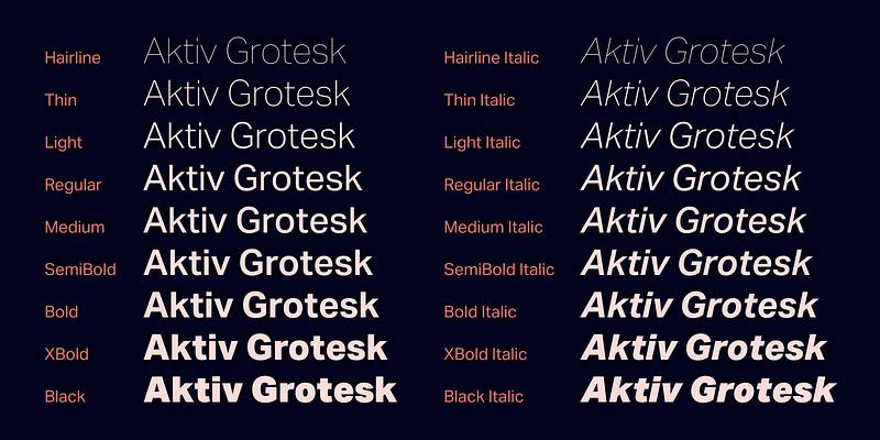
Contemporary grotesque by Dalton Maag that modernizes classic sans-serif structure with Proxima Nova-like versatility.
Comprehensive language support makes it suitable for global applications.
Key Characteristics
Classic grotesque structure updated with contemporary refinements.
Slightly condensed proportions. Moderate x-height balances legibility with elegant proportions. Near-vertical terminals in characters like ‘a’ and ‘c’.
Visual Comparison
More traditional grotesque structure than Proxima Nova’s geometric leanings.
Characters have subtle personality without excessive distinction. Numerals are particularly well-designed. Overall feel is Swiss precision with warmer undertones than Helvetica.
Use Cases
Corporate branding requiring international language support.
Editorial design where traditional grotesque aesthetic meets modern requirements. Multiple weights and widths handle complex typographic systems.
Technical Details
Variable font with weight and width axes.
Extensive language support including Arabic, Hebrew, Cyrillic, Greek, Thai, and Devanagari. Professional licensing through Dalton Maag. Wide range of weights from Hairline to Black.
Best Paired With
Freight Text for editorial sophistication.
Charter adds readable serif structure. Tisa Pro creates professional document systems.
Sofia Pro
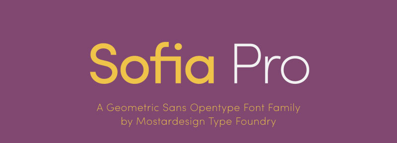
Geometric sans-serif with subtle personality that shares Proxima Nova’s balance between function and character.
Designed by Olivier Gourvat with friendly, approachable letterforms.
Key Characteristics
Rounded geometric construction creates warm, inviting texture.
Slightly wide proportions give comfortable spacing. Moderate x-height with generous counters. Subtle humanist touches soften strict geometry.
Visual Comparison
Warmer and friendlier than Proxima Nova.
Characters feel slightly wider and more open. The ‘a’ and ‘g’ use soft, rounded forms. Overall personality is more approachable than Proxima Nova’s neutral professionalism.
Use Cases
Brand identities for lifestyle, wellness, and consumer products.
Digital products requiring friendly interface typography. Multiple weights support both headline and text applications.
Technical Details
Eight weights from Light to Black available through commercial licensing.
OpenType features include multiple figure styles and fractions. Professional licensing through foundries like MyFonts.
Best Paired With
Freight Text balances geometric and organic.
Minion Pro adds classical serif structure. Source Serif Pro creates professional hierarchies.
Cera Pro
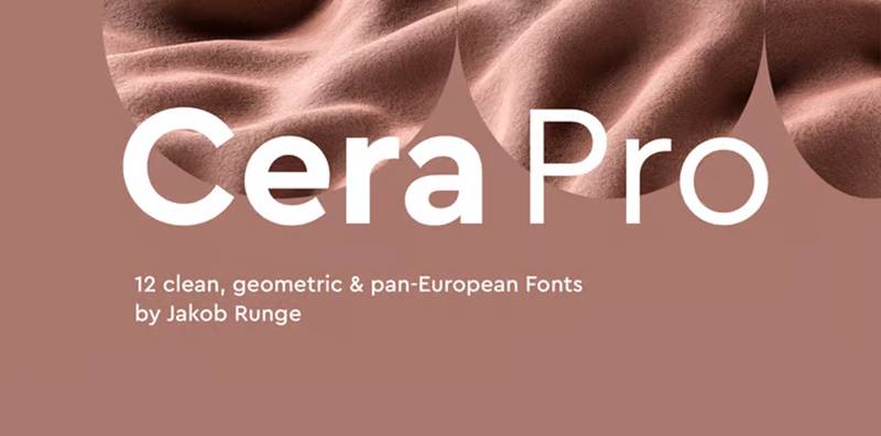
Elementary geometric sans-serif that distills shapes to essential forms while maintaining Proxima Nova’s warmth.
Designed by TypeMates with focus on simplicity and elegance.
Key Characteristics
Pure geometric construction from basic shapes creates clean, minimal aesthetic.
Six weights provide core typographic range. 10-degree italic adds dynamic option without excessive slant. Simple terminals without ornamentation.
Visual Comparison
More purely geometric than Proxima Nova with less humanist influence.
Characters use circular and rectangular basic shapes. Simpler construction than Proxima Nova’s optically corrected forms. The overall effect is clean but warmer than cold geometric faces.
Use Cases
Minimalist branding where simplicity communicates sophistication.
Clean interface design. Headlines requiring geometric precision with approachable warmth.
Technical Details
Six weights with 10-degree italics.
OpenType features include fractions and multiple figure styles. Commercial licensing through TypeMates. Latin Extended character support.
Best Paired With
Freight Text adds organic counterpoint.
Source Serif Pro creates balanced hierarchies. Lyon Text provides elegant serif contrast.
Geomanist
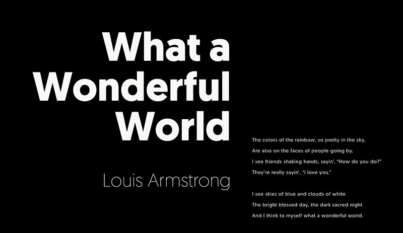
Geometric sans-serif that references Futura while incorporating contemporary refinements similar to Proxima Nova’s approach.
Designed by Atipo with focus on versatility and modern functionality.
Key Characteristics
Geometric foundation with optical corrections improves readability over strict circles.
Multiple weights from Ultra Light to Black. Rounded and straight-cut versions offer stylistic flexibility. Moderate x-height balances elegance with function.
Visual Comparison
More geometric than Proxima Nova with clear Futura influence.
Circular ‘o’ and geometric construction throughout. Slightly taller ascenders create more elegant proportions. Characters feel more European than Proxima Nova’s international neutrality.
Use Cases
Modern branding requiring geometric precision.
Editorial design where Futura’s aesthetic meets contemporary needs. Both text and display applications work across the weight range.
Technical Details
Ten weights with italics plus rounded variants.
Commercial licensing through foundries. OpenType features. Latin Extended support.
Best Paired With
Minion Pro adds classical serif refinement.
Freight Text creates editorial combinations. Charter works for professional documents.
TT Norms Pro
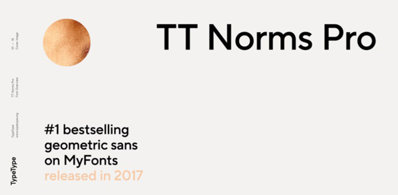
Contemporary grotesque by TypeType that modernizes classic sans-serif structure with extensive language support.
Comprehensive family designed for professional applications.
Key Characteristics
Neo-grotesque structure with contemporary refinements.
Moderate x-height creates elegant proportions. Clean, simple terminals. Near-monoline strokes with subtle contrast.
Visual Comparison
More traditional grotesque than Proxima Nova’s geometric-humanist blend.
Characters maintain classic proportions with modern polish. Slightly more mechanical than Proxima Nova but warmer than Helvetica. Numbers and punctuation particularly well-designed.
Use Cases
Professional branding requiring extensive weight options.
Corporate communications and editorial design. Wide weight range handles complex typographic systems.
Technical Details
Multiple weights from Thin to Black with italics.
Variable font versions available. Extensive language support including Cyrillic. Commercial licensing through TypeType foundry.
Best Paired With
Freight Text creates sophisticated combinations.
Lyon Text adds elegant serif structure. Tisa Pro works for professional documents.
TT Commons Pro
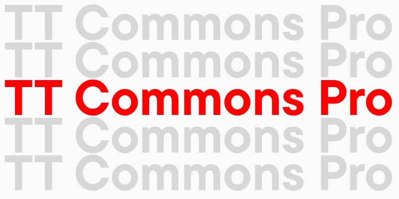
Versatile sans-serif family by TypeType that balances Proxima Nova’s neutrality with Swiss precision.
Designed for maximum flexibility across applications.
Key Characteristics
Neutral grotesque structure with subtle personality.
Large x-height optimizes screen legibility. Clean construction without excessive character. Multiple weights provide comprehensive range.
Visual Comparison
More neutral than Proxima Nova with less distinctive features.
Characters prioritize function over personality. Simpler letterforms create invisible typography. Overall aesthetic is Swiss precision with contemporary polish.
Use Cases
Corporate systems requiring neutral professionalism.
Digital interfaces where clarity matters most. Extensive weight range supports complex hierarchies.
Technical Details
Multiple weights with italics and variable font options.
Commercial licensing through TypeType. Extensive language support. OpenType features include multiple figure styles.
Best Paired With
Freight Text adds organic warmth.
Source Serif Pro creates clean hierarchies. Charter works for document design.
Goldplay
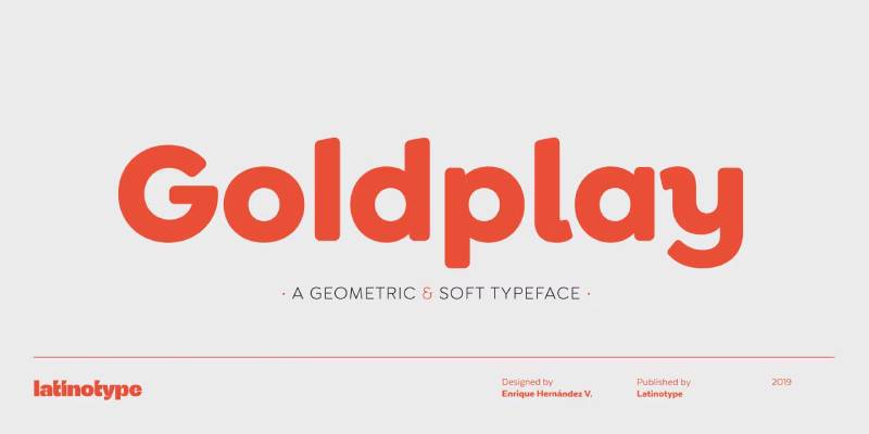
Geometric sans-serif with distinctive character that adds personality while maintaining Proxima Nova’s functionality.
Modern design with unique details.
Key Characteristics
Geometric construction with distinctive features.
Unique character shapes add memorable personality. Moderate x-height balances readability with elegant proportions.
Visual Comparison
More distinctive than Proxima Nova with unique character details.
Geometric foundation with personality-driven adjustments. Characters have recognizable quirks without excessive decoration.
Use Cases
Brand identities requiring memorable typography.
Headlines and display applications where personality matters. Multiple weights handle various applications.
Technical Details
Multiple weights available through commercial licensing.
OpenType features. Standard language support.
Best Paired With
Freight Text balances geometric and organic.
Source Serif Pro creates professional combinations. Lyon Text adds elegance.
Greycliff CF
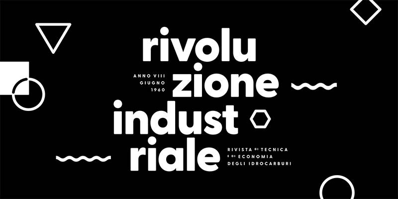
Geometric sans-serif with softened edges that creates warmer personality than typical geometric faces.
Designed by Connary Fagen with versatile applications in mind.
Key Characteristics
Geometric construction with rounded corners softens mechanical precision.
Nine weights from Thin to Heavy. Tall x-height with open shapes. Near-monoline construction with subtle variations.
Visual Comparison
Softer and warmer than Proxima Nova’s clean terminals.
Rounded edges throughout create approachable character. More geometric than Proxima Nova but less cold than Futura. Characters feel contemporary without trendy gimmicks.
Use Cases
User interfaces and digital products requiring friendly professionalism.
Signage and wayfinding where clarity meets approachability. Nine weights with obliques provide extensive flexibility.
Technical Details
Nine weights with obliques (18 styles total).
Extensive language support including Greek, Cyrillic, Arabic, Hebrew, and others. Commercial licensing through Connary Fagen. OpenType features.
Best Paired With
Freight Text creates sophisticated editorial combinations.
Lyon Text adds elegant serif contrast. Charter works for professional applications.
Franklin Gothic
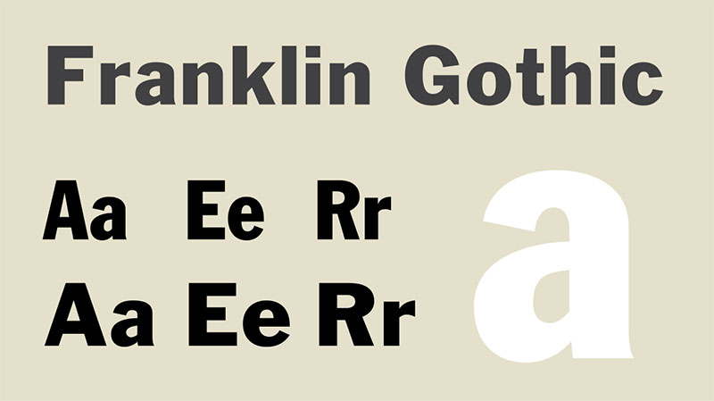
Classic American grotesque designed in 1904 that predates Proxima Nova but shares similar applications.
Morris Fuller Benton’s design remains relevant over a century later.
Key Characteristics
Double-story ‘a’ and ‘g’ distinguish it from European geometric faces.
Bold, direct character with moderate stroke contrast. Wide letterforms create strong presence. Traditional grotesque structure predates neo-grotesque refinement.
Visual Comparison
Bolder and more assertive than Proxima Nova.
Characters have more personality and less refinement. The ‘Q’ tail and ‘g’ ear create distinctive recognition. Overall texture is denser and more impactful.
Use Cases
Headlines and display typography requiring bold American character.
Editorial design where traditional grotesque aesthetic communicates authority. Various weights handle different applications though heavier weights dominate.
Technical Details
ITC version offers Book, Medium, Demi, and Heavy weights with italics.
Condensed and compressed variants expand the family. Microsoft bundles Franklin Gothic Medium with Windows. Commercial licensing through various foundries.
Best Paired With
Garamond creates classic editorial combinations.
Caslon adds traditional serif structure. Baskerville works for professional documents.
Forma DJR
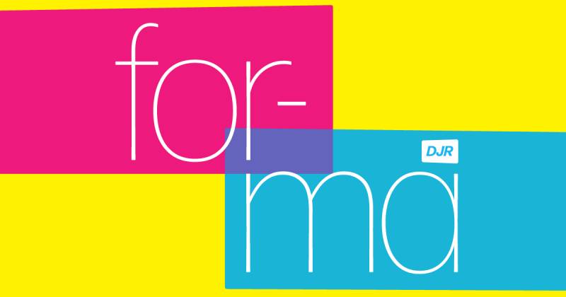
Revival of Aldo Novarese’s 1968 Forma that brings mid-century Italian design to contemporary applications.
David Jonathan Ross expanded it into comprehensive family with optical sizes.
Key Characteristics
Five optical sizes (Banner, Display, Deck, Text, Micro) adapt to different uses.
Tapering stems and rounded corners add warmth. Dense texture requires careful spacing. Multiple weights from Hairline to Black.
Visual Comparison
More distinctive and characterful than Proxima Nova.
Tapered strokes create dynamic letterforms. Slightly condensed proportions pack efficiently. Overall personality references 1960s Italian modernism while feeling contemporary.
Use Cases
Editorial design where personality and sophistication matter.
Brand identities requiring distinctive character. Optical sizes optimize performance from large headlines to tiny footnotes.
Technical Details
Five optical sizes with weights from Hairline to Black.
Variable font versions available. Extensive language support including multiple scripts. Professional licensing through Type Network.
Best Paired With
Freight Text creates sophisticated editorial systems.
Lyon Text adds elegant serif contrast. Minion Pro works for traditional applications.
Shapiro
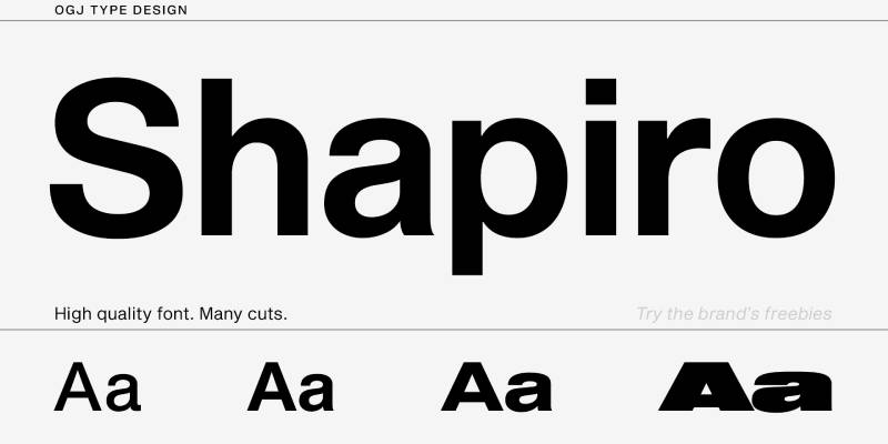
Neo-grotesque sans-serif by OGJ Type that references Helvetica while adding contemporary refinements.
Modern take on classic Swiss typography.
Key Characteristics
Nearly monolinear strokes create clean, modern appearance.
Seven weights with two widths (normal and extended). Sharp, precise construction. Moderate x-height balances legibility with elegant proportions.
Visual Comparison
More refined than Helvetica but similar in spirit.
Cleaner than Proxima Nova with less humanist influence. Characters maintain Swiss precision with contemporary polish. Overall feel is modern interpretation of classic grotesque.
Use Cases
Corporate branding requiring Swiss precision.
Editorial and advertising where clean aesthetics matter. Variable fonts multiply typographic options for fine-tuned control.
Technical Details
Seven weights in two widths with italics.
Variable font versions available. Commercial licensing through OGJ Type. Standard language support with OpenType features.
Best Paired With
Freight Text adds warmth to Swiss precision.
Lyon Text creates sophisticated combinations. Charter works for professional documents.
FAQ on Fonts Similar To Proxima Nova
What is the closest free font to Proxima Nova?
Montserrat delivers the closest match among free options. Designed by Julieta Ulanovsky and available through Google Fonts, it shares Proxima Nova’s geometric structure, large x-height, and nine-weight range. The geometric construction feels slightly sharper but maintains similar versatility.
Can I use Gotham instead of Proxima Nova?
Yes, but expect different personality. Gotham carries more architectural weight and American character than Proxima Nova’s international neutrality. It works brilliantly for headlines and corporate branding but costs more. The letterforms are bolder and more assertive across comparable weights.
Is Avenir better than Proxima Nova?
Different, not better. Avenir predates Proxima Nova and offers more humanist warmth through optical corrections rather than pure geometry. Adrian Frutiger’s design feels more refined and traditional. Choose Avenir for elegance, Proxima Nova for versatility and screen optimization.
What font does Airbnb use instead of Proxima Nova?
Airbnb commissioned Cereal, a custom typeface replacing Proxima Nova in their rebrand. The proprietary font isn’t publicly available. For similar results, consider Sofia Pro or TT Norms Pro, which offer comparable warmth and geometric-humanist balance for brand applications.
Are there any Proxima Nova alternatives on Google Fonts?
Multiple options exist. Montserrat matches closest in structure. Open Sans prioritizes screen legibility. Nunito Sans adds rounded friendliness. Raleway brings elegance. All offer free licensing and extensive weight ranges suitable for professional projects without Proxima Nova’s cost.
How does Helvetica Neue compare to Proxima Nova?
Helvetica Neue feels colder and more mechanical. It lacks Proxima Nova’s humanist warmth and geometric precision balance. The neutral expression works for corporate applications requiring invisibility, but Proxima Nova offers more character and better screen optimization through its design refinements.
What’s the difference between Proxima Nova and Metropolis?
Metropolis is free and more purely geometric. It lacks Proxima Nova’s optical corrections and refined terminals. The open-source alternative works well for startups and budget projects but feels less polished. Nine weights provide adequate range without Proxima Nova’s professional pedigree.
Can I pair Proxima Nova alternatives with serif fonts?
Absolutely. Freight Text pairs well with most geometric sans alternatives. Lora works for web applications. Garamond creates classic editorial combinations. Merriweather adds warmth for approachable reading experiences. The key is balancing geometric precision with organic serif structure.
Which Proxima Nova alternative works best for body text?
Open Sans excels for screen body text with wide apertures and optimized rendering. Avenir works beautifully in print. Nunito Sans balances friendliness with clarity. The choice depends on medium and tone, but prioritize large x-height and open counters for extended reading.
Do I need variable fonts or are static weights enough?
Static weights suffice for most projects. Variable fonts offer fine-tuned control for advanced applications but increase complexity. Montserrat, Nunito Sans, and others provide variable versions if needed. Start with static weights unless your design system requires precise intermediate adjustments.
Conclusion
These fonts similar to Proxima Nova span every budget and aesthetic need. From Montserrat’s free geometric warmth to Gotham’s architectural precision, each alternative brings distinct character while maintaining professional standards.
Your choice depends on specific requirements. Need extensive language support? Consider Aktiv Grotesk or Greycliff CF.
Working within tight budgets? Metropolis and Nunito Sans deliver without licensing costs.
The geometric sans-serif landscape offers remarkable depth. Some alternatives like Avenir predate Proxima Nova and influenced its design philosophy. Others like Forma DJR bring mid-century Italian character to contemporary applications.
Typography choices shape brand perception and user experience more than most realize. Test these typefaces in your actual layouts. What works for interface design might fail in print, and vice versa.
The perfect alternative exists somewhere in this collection.
If you enjoyed reading this article about fonts similar to Proxima Nova, you should check out these articles with fonts similar to Bodoni, Comic Sans, Avenir, Lato, Papyrus, Old English, Century Gothic, Minion Pro, Gill Sans, and Eurostile.

Renowned for his expertise in logo design and visual branding, Bogdan has developed a multitude of logos for various clients.
His skills extend to creating posters, vector illustrations, business cards, and brochures. Additionally, Bogdan's UI kits were featured on marketplaces like Visual Hierarchy and UI8.
He also wrote in the past years on sites like Design Your Way, WebDesignerDepot, WPDean, Designmodo, Speckyboy, Slider Revolution, and more.
- Canva vs Photoshop: When Does Each Make Sense? - 12 September 2026
- Briefing 3D Game Animation: Rigs, Clip Lists and Engine Handoffs - 11 September 2026
- The Webflow Logo History, Colors, Font, And Meaning - 10 September 2026

Bogdan Sandu is a seasoned designer who has been designing websites since 2008. Renowned for his expertise in logo design and visual branding, Bogdan has developed a multitude of logos for various clients. His skills extend to creating posters, vector illustrations, business cards, and brochures. Additionally, Bogdan's UI kits were featured on marketplaces like Visual Hierarchy and UI8. He also wrote in the past years on sites like Design Your Way, WebDesignerDepot, WPDean, Designmodo, Speckyboy, Slider Revolution, and more.
You Might Also Like