The Amazon logo, its meaning and the history behind it
Picture this – one simple curve igniting a world of commerce, beckoning a journey from ‘A’ to ‘Z’. That’s the Amazon logo: an emblem that encapsulates the boundless shopping odyssey.
In a glance, it whispers tales of relentless innovation, boundless online retail, and a customer experience that starts with a smile. It’s not merely a brand identity; it’s the signal of a global marketplace at your fingertips.
Dive in, and we’re going to unravel the threads that weave this powerful visual identity. We’ll decode color choices, the subtle nod to branding strategy, and, yes, the notorious smile arrow.
Unpack the essence of E-commerce symbols and why that swift, sly icon makes billions of hearts skip a beat.
By the time we wrap up, you’ll grasp not just the what, but the astonishing why behind the shapes and shades that have become synonymous with undeniable brand recognition.
Prepare to view this familiar company emblem through a prism of design elements and graphic design principles that could very well redefine your next creative venture.
In recent years, Amazon has become more than just an online store. Since its inception in 1994, it has become an innovator of many important technologies that are now spread all over the world. Innovations like the voice recognition system, a personal assistant like the Amazon Alexa and the use of drones to deliver packages to customers have since become a popular hit in the industry.
The logo of the company has certainly been an important factor in the growth of the company. In this article, we will take a look at the Amazon logo and how it has evolved over time.
Amazon is today a big player in the e-commerce industry. But it was certainly not always like that. Since 1994, Amazon has grown from a tiny little online bookstore into a big franchise that sells all kinds of things. From books to films, DVD,s and other tech stuff, you can find virtually anything on Amazon.
Not only that, but Amazon has developed some additional services, like the streaming service Amazon Prime, where you can find high-quality movies and shows, as well as the Kindle, which allows you to read all the books with a gadget. And it is still growing and is showing no signs of slowing down.
In 2016, the company recorded its highest-ever revenues of 513 billion dollars. The growth of Amazon has certainly been a fascinating journey, as has the development of the Amazon logo.
History of Amazon

Founded in 1994 by Jeff Bezos, the company’s name was initially not Amazon, but “Cadabra”. That name has been shifted out over time, as it sounded unappealing and resembled the word cadaver. That is why Bezos changed the name in 1995 to Amazon, and the name has remained to this day.
Amazon was initially a book store, but it made an instant impact. In the first couple of months alone, the company made 20 thousand dollars of profit. Since then, it has grown into an international corporation that is known to almost every person on the planet.
The Amazon logo
![]()
The Amazon logo has certainly been an important part of the success of the company. Every time you think of a large, international company, you instantly think of the logo of the company. It is what makes the company great and helps companies to remain in the minds of the customers for a long time.
Nowadays, the Amazon symbol is becoming a cult logo that can compete with logos from other larger companies. It’s what makes the company special and memorable to the users. The image of the Amazon logo will stick to the minds of its customers. Even the Amazon Prime logo is becoming more and more popular.
What does the logo represent?
![]()
The Amazon logo is actually quite simple. It is made of the letters that are in the word Amazon, and the letters a and z are connected with an arrow. This arrow has two implications: the first is that the Amazon store contains everything from a to z, and the second is that the arrow looks like a smile, which means that the customers will be happy when they will use Amazon.
The design and the simplicity of this logo is what makes this logo so special. It is memorable and the colors certainly help with that – a combination of black and orange. It’s so easy to do that you can do it yourself with a graphic design software.
What do the colors mean?
![]()
The colors of the logo are black and orange, and they too represent certain values that Amazon try to stick to. The black color is the representation of the dominance and elegance of Amazon, while the orange color tries to convey happiness and pride.
These colors certainly add an important value to the logo. The meaning of the logo, as discussed above, is that Amazon sells everything from a to z and that they will make the customers happy.
![]()
The Font Used in the Amazon Logo
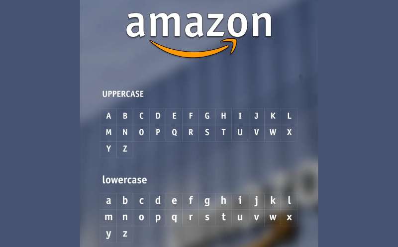
What about that font, huh? It’s friendly. It’s approachable. But it’s not just any font.
Meet Officina Sans
That’s right, the Amazon logo’s font has a name – Officina Sans. It’s got those smooth, rounded letters that make you feel like you’re in good hands. Like you’re chatting with a buddy, not a giant corporation.
How the Amazon logo developed through the years
The first logo was in 1994
![]() The first logo of Amazon was quite different from the logo of today. The Amazon logo of 1994 was a big A letter with a river flowing through it. Beneath the logo were the words: Earth’s biggest bookstore. And it was only a bookstore back in 1994, but that was about to change quickly. The entire logo was covered with water effects that were meant to separate Amazon from the rest.
The first logo of Amazon was quite different from the logo of today. The Amazon logo of 1994 was a big A letter with a river flowing through it. Beneath the logo were the words: Earth’s biggest bookstore. And it was only a bookstore back in 1994, but that was about to change quickly. The entire logo was covered with water effects that were meant to separate Amazon from the rest.
The first Amazon logo was designed and created by Turner Duckworth, who was asked by Jeff Bezos to design it.
New logo in 1998
![]()
The logo changed significantly in 1998, and it was much more similar to the logo of Amazon that is in place today. The only difference between the two is that the line below the amazon word was longer and golden, and that there was a sign above the word amazon which read: books, music &more.
This logo was more simplistic and it was more popular than the first one.
A to Z arrow in 2000
![]()
In 2000, the Amazon logo changed ever so slightly compared to the 1998 version of it. The logo contained the domain of the Amazon website (amazon.com), while the arrow was shortened and it connected letters a and z. This added a meaning to the logo, which was that you could find everything from a to z on the website.
The current logo – 2002
The logo from 2000 was looking very similar to the logo that is in place today, but there were some differences between the two. The 2002 logo saw the addition of the slogan “and you’re done”, which was added to the bottom left corner of the logo. This logo has remained in existence ever since and it is one of the most popular logos.
The popularity of the Amazon logo

It is important for companies to base their logo design around their branding and how the company works. This is exactly what Amazon has managed to achieve with this logo. The addition of a good and meaningful slogan is also very important and serves as an interpretation of what to expect of the company itself.
In Amazon’s case, the smile has achieved a double meaning when the company started the smile program, within which the company donates money to various charities. This is a great marketing move by Amazon. Who knows what the future holds for the Amazon logo; it remains to be seen how and if it will change in the future.
FAQ On The Amazon Logo
What’s the story behind the Amazon logo?
The logo’s like a visual handshake, right? You’ve got that cheeky arrow linking A to Z, showcasing how Amazon’s the go-to for everything. It’s about choice, satisfaction—a customer’s mini-journey. Plus, that curve? Totally a smile, ’cause they’re all about keeping us shoppers happy.
How has the Amazon logo evolved over time?
It’s had a glow-up, honestly. Started pretty basic—just the name with a river. But now? It’s sleek, meaningful. The arrow-smile combo taps into branding evolution, signaling Amazon’s rise from a bookstore to an everything store. Each tweak’s been a step up in logo design.
What do the arrow and the smile in the Amazon logo mean?
They’re not just for looks. The arrow links A to Z, which is Amazon’s way of saying, “We’ve got it all.” And the smile? Well, it’s a nod to stellar customer service. It’s like their whole brand ethos squeezed into one clever graphic.
Does the Amazon logo represent anything specific about the company’s values?
You bet it does. It shouts, brand consistency and customer focus. The smile and arrow aren’t just friendly; they’re a pact—a promise that you’ll find what you need. It’s a clever wrap-up of visual marketing and their mission, all in one.
Why did Amazon choose that particular color for their logo?
Color’s a big deal, right? That orange in the Amazon logo, it’s energetic, warm, inviting—like the burst of joy from a good buy. It’s no random choice; it’s careful branding strategy, speaking volumes without saying a word, tapping right into color psychology.
Is the Amazon logo a registered trademark?
Oh, absolutely. That logo’s a major asset, a trademark, protected like the crown jewels. You don’t want copycats diluting your brand identity or confusing your customers. Keeping that logo under lock and key—it’s critical for corporate branding.
How does the Amazon logo impact customer perception?
The logo’s like the company’s face—it’s what we remember. That mix of simplicity and meaning, it’s designed for impact. It builds brand loyalty, trust, and recognition. One glance and it’s “Ah, Amazon”—classic case of visual identity doing its thing.
What’s the significance of the Amazon logo in the e-commerce industry?
In the sea of E-commerce platforms, that logo’s a lighthouse. It’s become a symbol of online retail, raising the bar for brand recognition. It’s not just any logo—it’s a benchmark, an icon that other companies look to when they think of success.
Can you explain the typographic choices in the Amazon logo?
Typography, it’s the unsung hero. The font’s clean, modern, accessible—echoes the user experience. It’s not just about looking good; it’s readable, scalable, perfectly practical for online shopping experiences. It’s a font that works hard behind the scenes.
How often does Amazon update their logo?
Not too often—why mess with a good thing, right? Amazon’s smart about it; they’ve tweaked their logo only when they’ve needed to stay fresh and relevant. Remember, each update’s a major decision; it can shake up the whole branding consistency. They do it, but with care.
Conclusion
And there you have it, the grand tour of the Amazon logo. It’s fascinating, isn’t it? How a simple mark, a couple of colors, and a bit of creative genius can embody the heart of a global giant.
- The smile—more than a curve, it’s your trusty guide from A to Z.
- The arrow—not just pointing you in the right direction, but showcasing a universe of products.
- The color—orange, bright as a midday sun, warm like a fireside chat.
We’ve peeled back layers; delved into design, meaning, and psyche. The takeaway? It’s more than a logo. It’s a statement, a philosophy, a silent whisper of customer satisfaction.
When you next see that familiar symbol, give a nod to branding brilliance. It’s a cornerstone of a narrative that stretches far beyond the browser window, reaching into the very essence of modern E-commerce. Keep on creating, keep on innovating; maybe your design will be the next to capture the world’s imagination just like Amazon’s emblem has.
If you liked this article about the Amazon logo, you should check out this article about the new Patreon logo.
There are also similar articles discussing the Facebook logo, the Apple logo, the Twitter logo, and the Netflix logo.
And let’s not forget about articles on the Microsoft logo, the Samsung logo, the Airbnb logo, and the IBM logo.
Bogdan Sandu, a seasoned designer with 15 years of diverse experience, has been designing websites since 2008.
Renowned for his expertise in logo design and visual branding, Bogdan has developed a multitude of logos for various clients.
His skills extend to creating posters, vector illustrations, business cards, and brochures. Additionally, Bogdan's UI kits were featured on marketplaces like Visual Hierarchy and UI8.
Latest posts by Bogdan Sandu (see all)
- Rainbow Color Palettes for Joyful Designs - 29 April 2024
- The Bethesda Logo History, Colors, Font, And Meaning - 28 April 2024
- Out of This World: Space Color Palettes for Cosmic Designs - 28 April 2024