


The FC Augsburg logo is the official visual identity of FC Augsburg, a professional football club based in Augsburg, Bavaria, Germany. It functions as a logo that represents the club’s identity across all platforms, from matchday kits to digital media. The emblem draws directly from the city’s heraldic tradition, making it one of the more grounded badge designs in German football.
German football club badges have long reflected civic pride and regional heritage, and FC Augsburg’s crest sits firmly in that tradition. Founded in 1907, the club has gone through several badge iterations over its history, with the current version reinforcing its connection to the city of Augsburg itself.
What Is the FC Augsburg Logo?
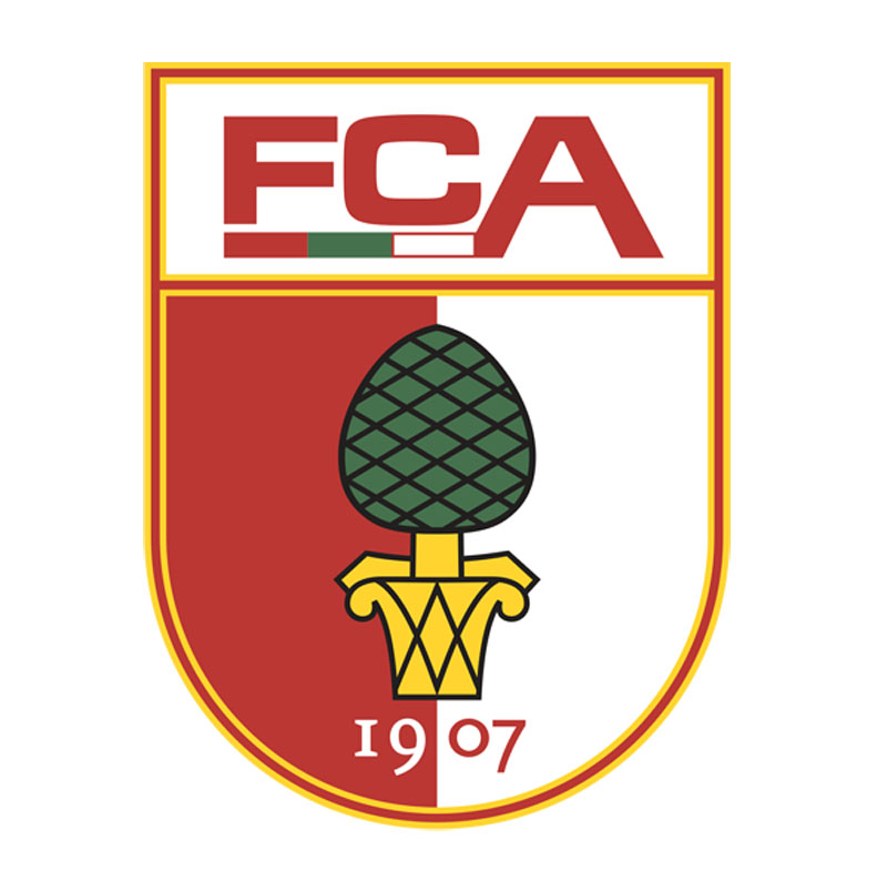
The FC Augsburg logo is a shield-shaped emblem featuring the Augsburg pine cone symbol, the club’s green and white colors, and the letters “FCA.” The current version was introduced in the early 2000s and reflects the city’s coat of arms heritage, combining civic symbolism with modern football branding.
- Design Type: Emblem / combination mark (shield with symbol and lettering)
- Primary Elements: Pine cone symbol (taken from Augsburg’s city coat of arms), “FCA” abbreviation, shield outline, horizontal color bands
- Official Introduction Date: Current version formalized circa 2006, with incremental refinements since
- Designer/Agency: No publicly credited external agency; developed in-house by club management
- Trademark Status: Registered trademark held by FC Augsburg GmbH & Co. KGaA
- Color Palette: Forest green (#3A7D44 approx.), white (#FFFFFF), red (#CC0000 approx.) used as accent
- Usage Context: Match kits, stadium signage, official website, merchandise, social media, and marketing materials
How Has the FC Augsburg Logo Evolved Over Time?

Since the club’s founding in 1907, the FC Augsburg badge has gone through multiple redesigns, shifting from early amateur-era emblems to a more refined, shield-based crest that directly references the city’s heraldic symbols.
Each version has moved closer to the visual language of Augsburg itself.
The pine cone, central to the city’s identity, became a consistent anchor in the badge as the club’s identity matured.
Original FC Augsburg Logo (1907-1960s)
- Years Active: 1907 to approximately the 1960s
- Design Description: Simple circular badge with basic lettering and early shield motifs; minimal graphic complexity typical of the era
- Color Scheme: Green and white, consistent with club founding colors
- Designer: Unknown
- Context: Club was founded in 1907 and operated in the lower tiers of German football for decades; branding was functional rather than strategic
- Key Changes from Previous: N/A (founding version)
- Cultural Significance: Established the green and white color identity that has remained ever since
Mid-Era FC Augsburg Logo (1960s-1990s)
- Years Active: Approximately 1960s through 1990s
- Design Description: More structured shield shape introduced; pine cone element began appearing more prominently alongside club lettering
- Color Scheme: Green, white, with occasional red accent elements
- Designer: Unknown
- Context: Reflects broader German football club branding shifts during this period, moving toward more defined heraldic styles
- Key Changes from Previous: Shield structure became more defined; typography updated
- Cultural Significance: Strengthened the connection between the club and Augsburg’s civic identity
Modern FC Augsburg Logo (2000s-Present)
- Years Active: Approximately 2006 to present
- Design Description: Clean shield with bold green and white horizontal bands, a stylized pine cone at center, and “FCA” lettering. Balanced, readable at small sizes
- Color Scheme: Forest green, white, with red accent
- Designer: In-house; no external agency credited publicly
- Context: Coincided with the club’s push toward Bundesliga promotion, which happened in 2011
- Key Changes from Previous: Cleaner lines, more consistent proportions, better scalability across digital formats
- Cultural Significance: Now the version most associated with FC Augsburg’s Bundesliga era
What Do the Design Elements of the FC Augsburg Logo Mean?
Every element in the FC Augsburg crest connects back to either the city’s history or the club’s identity. The pine cone is not decorative. It is a direct reference to Augsburg’s coat of arms, one of the oldest city symbols in Bavaria.
The shield shape places the badge firmly in European football’s heraldic tradition.
Green and white have been the club’s colors since founding, making them non-negotiable for any badge iteration.
What Does the Pine Cone in the FC Augsburg Logo Represent?
The pine cone is the central symbol of the city of Augsburg itself.
It appears in the city’s official coat of arms and has been associated with Augsburg for centuries.
By using it in the badge, FC Augsburg signals that the club belongs to the city, not just geographically, but historically.
It is a quiet but confident statement of local identity.
What Is the Historical Context Behind the Badge Design?
Augsburg is one of the oldest cities in Germany, with Roman origins dating back over 2,000 years.
The city’s coat of arms, featuring the pine cone, has been used in various forms since the medieval period.
FC Augsburg borrowing this symbol gives the badge a weight that purely invented logos cannot match.
It ties the club to something much larger than football.
Why Did FC Augsburg Choose These Specific Colors?

- Forest Green
- Hex: approximately #3A7D44
- Pantone: approximately Pantone 356 C
- Symbolic meaning: Growth, stability, regional identity
- Psychological impact: Calm, reliable, grounded; green in sports color psychology often signals endurance
- Brand connection: Club founding color, inseparable from FC Augsburg’s identity
- White
- Hex: #FFFFFF
- Symbolic meaning: Clarity, tradition, clean visual contrast
- Psychological impact: Creates strong readability against green; adds brightness to the overall badge
- Brand connection: Paired with green since the club’s founding; forms the core color palette
- Red (accent)
- Hex: approximately #CC0000
- Symbolic meaning: Energy, urgency, passion
- Psychological impact: Draws the eye; adds tension and energy to an otherwise composed badge
- Brand connection: Used sparingly as an accent, referencing elements of the Augsburg city flag
What Typography Style Is Used in the FC Augsburg Logo?
The “FCA” lettering in the badge uses a bold, condensed sans-serif style.
No custom typeface has been publicly credited, but the letterforms are clean and built for legibility at small sizes.
This matters a lot on a match kit badge, where the logo might be just a few centimeters wide.
Earlier versions used slightly different letterforms, but the current iteration has settled into something consistent and sturdy.
What Are the Hidden Meanings in the FC Augsburg Logo?
The pine cone’s placement at the center is intentional. It is not a background element. It is the focal point, which mirrors how central Augsburg’s civic identity is to the club.
The shield shape itself carries subliminal meaning. Shields in heraldry suggest protection, strength, and history.
There are no publicly documented hidden design tricks (no negative space figures, no concealed initials), but the badge’s restraint is itself a design choice. It does not try to be clever. That’s actually harder to pull off than it looks.
How Does the FC Augsburg Logo Compare to Competitor Logos?
Among Bundesliga clubs, FC Augsburg’s badge is mid-complexity. It avoids the maximalism of some historic German crests while still carrying more symbolic weight than purely typographic club identities.
Compared to clubs like Borussia Dortmund, whose badge is bold and immediately recognizable at a distance, FC Augsburg’s crest is more restrained.
Bayer Leverkusen uses a circular emblem with pharmaceutical heritage baked in. FC Augsburg’s shield format feels more traditionally football.
Regionally, VfB Stuttgart and SC Freiburg also use shield-based crests with civic references, so FC Augsburg sits comfortably in that southern German football aesthetic.
What separates the Augsburg badge is the pine cone. Most clubs use animals, abstract shapes, or pure letterforms. A pine cone is specific. Specific is memorable.
What Are the Technical Specifications of the FC Augsburg Logo?
Official Color Codes
- Primary Color: Forest Green
- Hex: #3A7D44
- RGB: (58, 125, 68)
- CMYK: (54, 0, 46, 51)
- Pantone: approximately 356 C
- Secondary Color: White
- Hex: #FFFFFF
- RGB: (255, 255, 255)
- CMYK: (0, 0, 0, 0)
- Accent Color: Red
- Hex: #CC0000
- RGB: (204, 0, 0)
- CMYK: (0, 100, 100, 20)
- Pantone: approximately 485 C
Dimensions and Proportions
- Aspect ratio: Roughly 4:5 (portrait-oriented shield)
- Minimum size requirements: Not officially published; standard practice for Bundesliga clubs is a minimum of 20px height for digital use
- Clear space specifications: Typically one badge-width of clear space on all sides (official specs not publicly released)
- Official usage guidelines: Governed by FC Augsburg’s brand and licensing terms; commercial use requires written club approval
- File formats available: Vector graphics (SVG, EPS, AI) for official partners; JPEG and PNG versions distributed for press and editorial use
What Cultural Impact Has the FC Augsburg Logo Had?
For a mid-table Bundesliga club, FC Augsburg’s badge punches above its weight culturally. It is widely recognized in Bavaria and carries genuine civic meaning for residents of Augsburg.
When the club reached the UEFA Europa League in 2015/16, the crest appeared on a European stage for the first time, significantly expanding its recognition beyond Germany.
The pine cone symbol, borrowed from the city’s identity, has helped the badge resonate with non-football audiences in Augsburg itself. Locals recognize it as something that belongs to their city, not just to football fans.
In terms of merchandise and fan culture, the crest appears on everything from scarves to street art in the city. That kind of organic adoption is something you cannot manufacture through a rebrand.
How Does the FC Augsburg Logo Fit Into the Overall Brand Identity?

The badge is the anchor of FC Augsburg’s entire visual identity system, connecting the club’s kit design, stadium branding, digital platforms, and merchandise into a coherent whole.
The green and white color system runs through every touchpoint, from the WWK Arena’s interior design to the club’s social media presence.
The pine cone motif occasionally appears as a standalone graphic element in club communications, separate from the full badge. This shows the symbol has enough recognition to work independently, which is a sign of a mature brand.
The club’s overall approach follows basic brand guidelines logic. Consistent colors, consistent crest, consistent typography across applications. Nothing groundbreaking, but executed reliably. That consistency is what builds long-term recognition, especially for a club competing for attention against Bayern Munich in its own region.
How Should the FC Augsburg Logo Be Used?
Official Usage Do’s
- Use the full-color version on white or light backgrounds
- Use the white/reversed version on dark or green backgrounds
- Maintain the clear space zone around the badge at all times
- Source logo files directly from FC Augsburg’s official press portal or through licensed partnerships
- Use vector file formats for print; ensure sufficient DPI for high-resolution print applications (minimum 300 DPI)
Official Usage Don’ts
- Do not alter the badge colors outside official specifications
- Do not stretch, skew, or distort the proportions
- Do not place the badge on visually busy backgrounds without a clear container
- Do not use the badge for commercial purposes without written authorization from the club
- Do not recreate or approximate the badge from memory; always use official source files
Where to Access the Official Logo
- Press kit: Available through FC Augsburg’s official media and press section at fcaugsburg.de
- Licensed partners: Kit manufacturers and official sponsors receive files directly from the club
- Editorial use: Press-quality PNG files are generally available through the club’s media relations team
Licensing and Trademark Details
- The FC Augsburg badge is a registered trademark of FC Augsburg GmbH & Co. KGaA
- Any use beyond personal, non-commercial purposes requires explicit club approval
- Fan-made uses (non-commercial) generally fall under standard fan content tolerance policies, but this is not a formal license
- Unauthorized commercial use of the badge constitutes trademark infringement under German and EU law
FAQ on the FC Augsburg Logo
What Does the FC Augsburg Logo Look Like?
It is a shield-shaped emblem featuring a pine cone at the center, horizontal green and white bands, and the “FCA” abbreviation.
The crest is clean, heraldic in style, and immediately tied to the city of Augsburg visually.
What Does the Pine Cone in the FC Augsburg Badge Mean?
The pine cone comes directly from Augsburg’s official city coat of arms.
It has represented the city for centuries. FC Augsburg uses it to signal civic identity, not just football club branding. It is the most meaningful element in the entire crest.
What Colors Does the FC Augsburg Crest Use?
The club’s official colors are forest green and white, with red used sparingly as an accent.
These have been the club’s colors since its founding in 1907. The green hex code sits around #3A7D44.
When Was the Current FC Augsburg Logo Introduced?
The current version of the badge was formalized around 2006.
It has seen minor refinements since, but the core design, the shield, pine cone, and FCA lettering, has stayed consistent through the club’s Bundesliga era starting in 2011.
Who Designed the FC Augsburg Football Club Emblem?
No external design agency has been publicly credited.
The badge was developed in-house by club management. This is fairly common among German football clubs, particularly those outside the top commercial tier of the league.
Is the FC Augsburg Logo Available as a Vector File?
Official vector files are available to licensed partners and press contacts through the club’s media portal at fcaugsburg.de.
SVG and EPS formats exist for professional use. For editorial purposes, high-resolution PNG files are typically distributed on request.
How Many Times Has the FC Augsburg Badge Changed?
The club has gone through several logo iterations since its founding in 1907.
The logo evolution moved from simple amateur-era designs toward the refined, shield-based crest used today. The pine cone became a permanent fixture as the club’s identity matured over decades.
How Does the FC Augsburg Logo Compare to Other Bundesliga Club Crests?
It is more restrained than most. Clubs like FC Koln use animal mascots; others lean on abstract shapes.
FC Augsburg’s use of a civic symbol, the pine cone, gives the badge a grounded, specific quality that generic football crests lack.
Can I Use the FC Augsburg Logo for Commercial Purposes?
No. The badge is a registered trademark of FC Augsburg GmbH and Co. KGaA.
Any commercial use requires written authorization from the club. Personal, non-commercial fan use is generally tolerated but carries no formal license. Unauthorized commercial use is a trademark violation under German and EU law.
What Font Is Used in the FC Augsburg Logo?
The “FCA” lettering uses a bold, condensed sans-serif font.
No custom typeface has been officially named. The letterforms prioritize legibility at small sizes, which matters on a match kit badge where the crest might be just a few centimeters wide.
Conclusion
The FC Augsburg logo is more than a badge on a kit. It carries the weight of a city’s history, a founding year of 1907, and a pine cone symbol that connects the club to Augsburg’s civic identity in a way few football crests manage.
The shield design, green and white color scheme, and FCA lettering have stayed consistent through decades of logo evolution.
For anyone looking at Bundesliga club branding, this crest is a solid example of how regional symbolism and football identity can work together without overcomplicating things.

Renowned for his expertise in logo design and visual branding, Bogdan has developed a multitude of logos for various clients.
His skills extend to creating posters, vector illustrations, business cards, and brochures. Additionally, Bogdan's UI kits were featured on marketplaces like Visual Hierarchy and UI8.
He also wrote in the past years on sites like Design Your Way, WebDesignerDepot, WPDean, Designmodo, Speckyboy, Slider Revolution, and more.
- The Windsurf Logo History, Colors, Font, And Meaning - 10 October 2026
- How to Remove Background From Product Photos (No Photoshop) - 10 October 2026
- How Designers can Build a Stronger Online Creative Identity - 9 October 2026

Bogdan Sandu is a seasoned designer who has been designing websites since 2008. Renowned for his expertise in logo design and visual branding, Bogdan has developed a multitude of logos for various clients. His skills extend to creating posters, vector illustrations, business cards, and brochures. Additionally, Bogdan's UI kits were featured on marketplaces like Visual Hierarchy and UI8. He also wrote in the past years on sites like Design Your Way, WebDesignerDepot, WPDean, Designmodo, Speckyboy, Slider Revolution, and more.
You Might Also Like


