


The Werder Bremen logo is the official badge of SV Werder Bremen, one of Germany’s oldest and most recognized football clubs. It features a distinctive diamond shape in green and white, the club’s traditional colors. The emblem has gone through several changes since the club’s founding, but has always kept its core identity tied to the city of Bremen and the Weser River.
Within the broader history of graphic design movements in sports, Werder Bremen’s crest sits in an interesting spot. German football clubs developed their visual identities largely in the early-to-mid 20th century, often leaning on heraldic traditions and local symbolism rather than purely commercial design thinking. Werder is no different.
The current version of the badge was introduced in 2000 and remains in use today. The club was founded in 1899, and the logo has gone through roughly six to eight major iterations over its history.
What is the Werder Bremen Logo?
The Werder Bremen logo is an emblem-style badge featuring a green and white diamond shape with the letters “SVW” and a five-pointed star, officially introduced in its current form in 2000. It represents the club’s identity, city ties, and century-long football heritage.
Design Type: Emblem / crest
Primary Elements: Diamond shape, “SVW” lettering, five-pointed star, green and white color split
Official Introduction Date: 2000 (current version)
Designer/Agency: Not publicly credited
Trademark Status: Registered trademark of SV Werder Bremen GmbH & Co KGaA
Color Palette:
- Werder Green: #1D6F42 (approximate official green)
- White: #FFFFFF
- Black: #000000 (used in outlines and detail work)
Usage Context: Match kits, stadium signage, merchandise, digital platforms, marketing materials, official club communications
How Has the Werder Bremen Logo Evolved Over Time?

The Werder Bremen badge has changed significantly since 1899, moving from simple heraldic lettering to a more structured diamond emblem, with the five-pointed star added to mark championship wins and the current version settling into a clean, modern form in 2000.
Original Werder Bremen Logo (1899-1920s)
- Years Active: 1899 – early 1920s
- Design Description: Simple typographic badge, initials-based, minimal graphic elements
- Color Scheme: Green and white
- Designer: Unknown
- Context: Club founding period, identity was basic and functional
- Key Changes from Previous: N/A – original version
- Cultural Significance: Established green and white as the club’s permanent colors
Early Diamond Era (1920s-1950s)
- Years Active: 1920s – 1950s
- Design Description: Introduction of the diamond shape with SVW lettering inside
- Color Scheme: Green and white, with black outline
- Designer: Unknown
- Context: Growing club profile in German football, need for a more structured identity
- Key Changes from Previous: Diamond geometry introduced, replacing pure typographic approach
- Cultural Significance: The diamond became the lasting visual anchor of the brand
Mid-Century Refinements (1950s-1980s)
- Years Active: 1950s – 1980s
- Design Description: Diamond refined, typography updated, proportions adjusted across multiple small revisions
- Color Scheme: Green and white
- Designer: Unknown
- Context: Post-war German football rebuilding, club competing at top domestic level
- Key Changes from Previous: Cleaner lines, more consistent proportions
- Cultural Significance: Badge became widely recognized across the Bundesliga
Star Addition Era (1980s-2000)
- Years Active: 1980s – 2000
- Design Description: Five-pointed star added above the diamond to mark Bundesliga title wins
- Color Scheme: Green, white, black
- Designer: Unknown
- Context: Club won Bundesliga titles in 1988 and 1993, earning the right to display stars
- Key Changes from Previous: Star element added, badge became slightly more complex
- Cultural Significance: The star reinforced the club’s status as genuine Bundesliga contenders
Current Logo (2000-Present)
- Years Active: 2000 – present
- Design Description: Streamlined diamond badge, SVW lettering, star above, clean two-color split
- Color Scheme: Werder Green (#1D6F42) and White (#FFFFFF)
- Designer: Not publicly credited
- Context: Modernization for digital media and commercial use
- Key Changes from Previous: Cleaner geometry, improved legibility at small sizes, more consistent proportions
- Cultural Significance: The version most associated with the club’s peak European football period in the mid-2000s
What Do the Design Elements of the Werder Bremen Logo Mean?
The Werder Bremen badge uses a diamond shape, the letters SVW, a five-pointed star, and a green-white color split. Each element connects to the club’s history, its city, and its football achievements.
The diamond is the core visual element. It has no single confirmed origin story, but it visually echoes heraldic shield traditions common in German sports club design. It creates strong visual symmetry, which gives the badge a stable, balanced feel.
The “SVW” stands for “Sport-Verein Werder Bremen von 1899.” It grounds the badge in the club’s full official name and founding year.
The star above the diamond represents Bundesliga championships. German football clubs earn one star per two national titles. Werder’s two stars reflect their 1965, 1988, 1993, and 2004 Bundesliga wins.
Why Did Werder Bremen Choose These Specific Colors?
Green
- Hex: #1D6F42 (approximate)
- Pantone: Pantone 356 C (approximate match)
- Symbolic meaning: Connected to the Weser meadows and the natural landscape around Bremen
- Psychological impact: Associated with growth, stability, and reliability. Among green logos in sports, it reads as grounded and traditional rather than flashy
- Brand connection: Green has been Werder’s color since the club’s earliest years. It’s inseparable from the club’s identity
White
- Hex: #FFFFFF
- Symbolic meaning: Clarity, simplicity, contrast
- Psychological impact: Makes the green pop, gives the badge visual breathing room
- Brand connection: The green-white combination is one of the most recognized kit color pairings in German football
What Typography Style Is Used in the Werder Bremen Logo?

The “SVW” lettering inside the diamond uses a bold, condensed sans-serif style.
It prioritizes legibility over personality. At small badge sizes (on a kit collar, for instance), the letters need to read clearly. A decorative or script approach would fail at that scale.
The sans-serif font choice also keeps the badge looking clean and modern. It doesn’t feel dated despite being largely unchanged since 2000.
No custom typeface has been publicly documented for this logo. The letterforms appear to be a modified or closely adapted standard condensed sans-serif.
What Are the Hidden Meanings in the Werder Bremen Logo?
There are no widely documented “hidden” design tricks in the Werder badge in the way some logos (like the FedEx arrow) have well-known subliminal elements.
The diamond shape itself is sometimes linked to the “Wustelknoten,” a traditional Bremen decorative motif. Whether this was an intentional design reference or coincidental is not confirmed.
The color split within the diamond (green on one half, white on the other) mirrors the home kit design. This is intentional, connecting the badge directly to the physical kit identity.
How Does the Werder Bremen Logo Compare to Competitor Logos?
Compared to other Bundesliga clubs, Werder Bremen’s badge sits in the traditional-emblem category, alongside clubs like FC Schalke 04 and Hamburger SV, using simple geometric shapes and initials rather than complex figurative imagery.
Borussia Dortmund’s logo uses a circular badge with a “BVB” wordmark. It’s also initials-based but feels more modern and commercially polished.
Bayer Leverkusen’s badge incorporates the pharmaceutical company’s corporate design language, making it feel distinctly different from the more traditional club crests.
Bayern Munich’s logo uses a circular design with a diamond pattern inside, but leans harder into the Bavarian flag colors (blue and white). It’s more internationally commercial in feel.
Eintracht Frankfurt’s eagle crest takes a very different approach with a figurative mascot design. Werder’s geometric simplicity reads as cleaner but less dramatically striking in comparison.
Among all German clubs, Werder’s green is one of the most distinctive color choices. Most top Bundesliga clubs favor blue, red, or yellow. That color difference alone makes the badge stand out.
What Are the Technical Specifications of the Werder Bremen Logo?
Official Color Codes:
Primary Color: Werder Green
- Hex: #1D6F42
- RGB: (29, 111, 66)
- CMYK: (74, 0, 41, 56)
- Pantone: 356 C (approximate)
Secondary Color: White
- Hex: #FFFFFF
- RGB: (255, 255, 255)
- CMYK: (0, 0, 0, 0)
- Pantone: N/A
Accent Color: Black
- Hex: #000000
- RGB: (0, 0, 0)
- CMYK: (0, 0, 0, 100)
- Pantone: Black C
Dimensions and Proportions:
- Aspect ratio: Approximately 1:1.2 (width to height)
- Minimum size requirements: Not officially published; standard practice for football badges is a minimum of 20px height for digital use
- Clear space specifications: Not officially published; standard practice recommends clear space equal to 10% of badge height on all sides
- Official usage guidelines: Available through SV Werder Bremen’s commercial partnerships department; not publicly documented in full detail
- File formats available: The club provides official vector graphics to licensed partners; JPEG and PNG versions are used across digital channels
What Cultural Impact Has the Werder Bremen Logo Had?
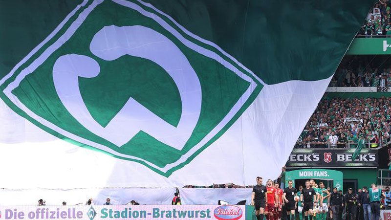
The Werder Bremen badge is one of the most recognizable crests in German football, tied to a club that has represented the northern German city of Bremen on the European stage, including a UEFA Cup win in 1992 and a Champions League run in 2005-06.
The green diamond is genuinely iconic within the Bundesliga.
Among supporters, the badge carries strong regional identity. Bremen is a historically working-class port city. The club’s identity, including its badge, reflects that straightforward, no-nonsense character.
The logo appears regularly on green-branded sports merchandise that fans across Germany recognize immediately. It doesn’t need the club name alongside it to be identified by most German football followers.
After the club’s relegation to the 2. Bundesliga in 2021 and subsequent promotion back in 2023, the badge stayed completely unchanged. That kind of stability is actually relatively rare. It signals how settled and confident the club is in its visual identity.
How Does the Werder Bremen Logo Fit Into the Overall Brand Identity?

The logo sits at the center of a broader brand system that includes the green-white kit, stadium identity at Wohninvest Weserstadion, official merchandise, and digital channels. Every element of the club’s public-facing identity connects back to the diamond badge and its green-white color system.
The brand guidelines around the badge govern how it appears on partner materials, kits, and commercial licensing deals.
The typography used across club communications generally sticks to clean, modern sans-serif typefaces that match the badge’s no-fuss character.
Kit manufacturers (currently Umbro) work within the club’s established color and badge system. The badge placement, sizing, and surrounding design all follow consistent rules across home, away, and third kits.
Compared to clubs that have built elaborate secondary logos, lifestyle sub-brands, or alternative badge versions, Werder keeps things simple. One badge. One color combination. It works.
How Should the Werder Bremen Logo Be Used?

Official Usage Do’s:
- Use the badge on licensed merchandise only
- Maintain correct color values (green and white, with black outline)
- Keep clear space around the badge to avoid visual clutter
- Use official vector files provided by the club for print and large-format applications to avoid bitmap quality loss
- Follow DPI requirements for print (minimum 300 DPI for physical materials)
Official Usage Don’ts:
- Do not alter the badge colors, proportions, or design elements
- Do not use the badge for commercial purposes without a licensing agreement from SV Werder Bremen
- Do not place the badge on backgrounds that reduce its legibility
- Do not create unofficial “alternate” versions of the badge
- Do not use the badge in contexts that could imply official club endorsement without authorization
Where to Access Official Logos:
- Licensed partners receive official files directly from the club’s commercial department
- Press and media can request official assets through the club’s press office at werder.de
- Fan and non-commercial use falls under a separate set of informal guidelines; the club generally tolerates personal fan use but not commercial exploitation
Licensing Information:
- The badge is a registered trademark of SV Werder Bremen GmbH & Co KGaA
- Commercial use requires a formal licensing agreement
- Unauthorized commercial use is subject to trademark enforcement
Trademark Protection:
- Registered in Germany and within the EU
- Protected under German trademark law and EU intellectual property regulations
- The club actively monitors and enforces unauthorized use, particularly on merchandise platforms
FAQ on The Werder Bremen Logo
What does the Werder Bremen logo represent?
The badge represents SV Werder Bremen’s identity as a club rooted in the city of Bremen.
The diamond shape, green and white colors, and SVW lettering all connect to the club’s history, founding in 1899, and its ties to the Weser River region.
What shape is the Werder Bremen crest?
The crest uses a diamond shape, which has been the foundation of the badge since the early 20th century.
It’s a geometric emblem design, not a traditional shield or circular badge like many other Bundesliga clubs use.
What do the colors on the Werder Bremen badge mean?
Green and white are the club’s traditional colors, used since its founding.
Werder green is linked to the meadows along the Weser River. White provides contrast and keeps the badge clean and legible across all sizes and surfaces.
What does SVW stand for in the Werder Bremen logo?
“SVW” stands for Sport-Verein Werder Bremen von 1899.
It’s the club’s full official name condensed into three letters. The founding year, 1899, is part of that name but doesn’t always appear on the badge itself.
Why does the Werder Bremen logo have a star?
The star above the diamond reflects Bundesliga championship wins.
German football clubs earn one star for every two national titles. Werder’s titles in 1965, 1988, 1993, and 2004 account for the two stars displayed on the club crest.
When was the current Werder Bremen logo introduced?
The current version of the badge has been in use since 2000.
It was a modernization of the previous design, cleaned up for better legibility on digital platforms and smaller-scale applications like kit badges and merchandise.
How many times has the Werder Bremen badge changed?
The badge has gone through roughly six to eight major iterations since 1899.
Most changes were gradual refinements rather than complete redesigns. The diamond shape and green-white color scheme have stayed consistent throughout the club’s entire logo evolution.
How does the Werder Bremen emblem compare to other Bundesliga badges?
It sits firmly in the traditional-emblem category alongside clubs like FC Koln and VfL Wolfsburg.
What makes it stand out is the color. Green is rare at the top of German football, which gives the Werder Bremen visual identity an instantly recognizable quality among sports club badges globally.
Is the Werder Bremen logo trademarked?
Yes. The badge is a registered trademark of SV Werder Bremen GmbH and Co KGaA.
It’s protected under German and EU trademark law. Commercial use without a licensing agreement from the club is not permitted and is actively enforced.
Where can I download the official Werder Bremen logo?
Official files are not available for public download.
Licensed partners and press contacts can request assets directly through the club’s commercial and press departments at werder.de. Unofficial versions circulate online, but only files sourced from the club should be used for any professional or commercial purpose.
Werder Bremen Logo FAQ
Conclusion
The Werder Bremen logo is a case study in how a football club badge can stay relevant across more than a century without losing its core identity.
The green-white diamond, the SVW lettering, the championship stars. Each element earns its place.
Few Bundesliga club crests have maintained this level of consistency across so many logo iterations while still feeling current.
The club badge evolution shows that good sports branding doesn’t need constant reinvention. It needs clarity, restraint, and a genuine connection to where the club comes from.

Renowned for his expertise in logo design and visual branding, Bogdan has developed a multitude of logos for various clients.
His skills extend to creating posters, vector illustrations, business cards, and brochures. Additionally, Bogdan's UI kits were featured on marketplaces like Visual Hierarchy and UI8.
He also wrote in the past years on sites like Design Your Way, WebDesignerDepot, WPDean, Designmodo, Speckyboy, Slider Revolution, and more.
- The Windsurf Logo History, Colors, Font, And Meaning - 10 October 2026
- How to Remove Background From Product Photos (No Photoshop) - 10 October 2026
- How Designers can Build a Stronger Online Creative Identity - 9 October 2026

Bogdan Sandu is a seasoned designer who has been designing websites since 2008. Renowned for his expertise in logo design and visual branding, Bogdan has developed a multitude of logos for various clients. His skills extend to creating posters, vector illustrations, business cards, and brochures. Additionally, Bogdan's UI kits were featured on marketplaces like Visual Hierarchy and UI8. He also wrote in the past years on sites like Design Your Way, WebDesignerDepot, WPDean, Designmodo, Speckyboy, Slider Revolution, and more.
You Might Also Like


