The wrong font can kill a flyer before anyone reads a single word.
Choosing the best fonts for flyers is a structural decision, not a stylistic one. Your typeface determines whether a headline holds at 10 feet, whether body copy survives ink spread on uncoated stock, and whether the overall layout communicates its message in the two seconds it gets.
Print ads already produce a 70–80% higher recall rate than digital advertising. Good flyer typography is what makes that advantage real.
This guide covers the 10 most effective fonts for flyer design, from bold display fonts like Bebas Neue and Oswald to elegant serif options like Playfair Display and Lora. You’ll also find practical guidance on font hierarchy, print vs. digital performance, font pairing, and licensing so every choice you make holds up in production.
The Best Fonts For Flyers
Choosing a font for a flyer isn’t just a visual decision. It’s a structural one. The wrong typeface kills readability at a glance, and flyers only get a glance.
The ten options below cover display headlines, body copy, event promotions, and professional flyer design across nearly every use case you’ll encounter in print and digital formats.
—
Bebas Neue
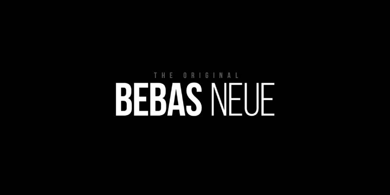
Bebas Neue is a geometric condensed display font designed by Ryoichi Tsunekawa in 2010, released by Dharma Type. It delivers maximum visual impact through all-caps letterforms in a single weight.
Bebas Neue suits event flyer headlines because its tall x-height and tight letter-spacing keep text readable at large print sizes without breaking apart at scale. It appeared in the title sequence of the film La La Land, showing its range from mass-market print to premium visual contexts.
What makes Bebas Neue suitable for flyers?
The condensed letterforms allow longer phrases to fit across narrow column widths without sacrificing size. Monolinear stroke weight (no thick-thin contrast) ensures consistent ink spread on standard paper stocks. At 48px or larger, it renders without distortion on both digital and printed promotional materials.
Key attributes:
| Attribute | Value |
| Classification | Geometric condensed sans-serif (display) |
| Designer | Ryoichi Tsunekawa, 2010 |
| Weight range | Thin 100 – Bold 700 (Fontfabric expansion) |
| Variable font | No |
| Recommended sizes | 36px+ for headlines; not suited for body text |
| Letter-spacing default | Tight |
| License | OFL (free for personal and commercial use) |
| Available on | Google Fonts, Adobe Fonts, Font Squirrel |
| Price | Free |
How does Bebas Neue perform at flyer headline use?
At 60px+, Bebas Neue renders with high visual weight and strong horizontal rhythm, making it readable from 3–5 feet away on standard A5 or A4 print formats. The monolinear strokes hold up on coated and uncoated stock equally well.
Narrow apertures limit its legibility below 24px, and the all-caps-only character set restricts it to headlines and short-form display copy. Not a body text option.
What are the best pairings for Bebas Neue in flyers?
Bebas Neue pairs with Montserrat for a consistent geometric tone across headline and body hierarchy, and with Lora when a warmer, calligraphic contrast is needed for event descriptions or supporting text.
What are the limitations of Bebas Neue for flyers?
All-caps only. No lowercase characters exist in the base version (lowercase requires Bebas Neue Pro, which is a paid upgrade). Useless for body copy below 24px.
Bebas Neue – Recommended Use Cases Within Flyer Design
- Best for: Event headlines, concert flyers, promotional banners, nightclub flyers
- Avoid for: Body text, children’s event flyers, formal or luxury contexts
- Optimal weight: Bold 700 for headlines; Regular 400 for subheadings
- Optimal size range: 48px–120px for flyer titles; 36px minimum for subheadings
—
Montserrat
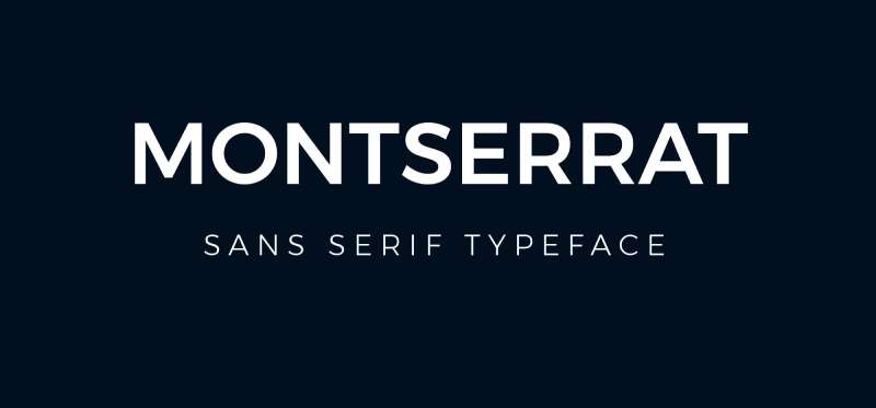
Montserrat is a geometric sans-serif font designed by Julieta Ulanovsky in 2011, released through Google Fonts. It covers the full weight spectrum from Thin to Black across 18 styles and supports both headings and body text in flyer layouts.
Montserrat’s large x-height, short descenders, and wide apertures produce high legibility at sizes as small as 10px, making it one of the most flexible typefaces for multi-use print and digital flyer design. It is used on over 19 million websites and serves as the official typeface of the Government of Mexico since 2018.
What makes Montserrat suitable for flyers?
Nine weights from Thin 100 to Black 900 give designers full control over typographic hierarchy in a single typeface family. Wide apertures in letters like “c,” “e,” and “a” prevent misreads at smaller sizes. Short descenders mean it can be set with tighter leading without collisions, useful for compact flyer layouts.
Key attributes:
| Attribute | Value |
| Classification | Geometric sans-serif |
| Designer | Julieta Ulanovsky, 2011 |
| Weight range | Thin 100 – Black 900 (9 weights, 18 styles with italics) |
| Variable font | Yes |
| Recommended sizes | 10px–16px for body; 24px+ for headlines |
| Letter-spacing default | Normal (0) |
| License | OFL (free for personal and commercial use) |
| Available on | Google Fonts, Adobe Fonts |
| Price | Free |
How does Montserrat perform at flyer typography?
Montserrat Bold (700) to Black (900) at 24px–48px holds strong visual impact for flyer headlines. At Regular (400) and 10px–14px, it maintains clean legibility for event details, dates, and body copy. The geometric structure keeps stroke weight consistent across print outputs, reducing CMYK rendering issues on coated stock.
What are the best pairings for Montserrat in flyers?
Montserrat pairs with Playfair Display for contrast between geometric structure and high-contrast serif elegance, and with Lora when calligraphic warmth is needed in longer body sections of event or business flyers.
What are the limitations of Montserrat for flyers?
Montserrat is now one of the most-used typefaces on the web. Flyers using it without a strong secondary typeface risk looking generic. Its geometric character also means it lacks warmth, making it a poor standalone choice for personal or emotional event flyers (weddings, memorials).
Montserrat – Recommended Use Cases Within Flyer Design
- Best for: Business flyers, real estate flyers, fitness and wellness promotions, digital flyer templates
- Avoid for: Luxury event flyers where high contrast serif fonts are expected; overly casual kids’ events
- Optimal weight: SemiBold 600–Bold 700 for headlines; Regular 400 for body copy
- Optimal size range: 10px–14px body; 24px–60px for headlines
—
Oswald
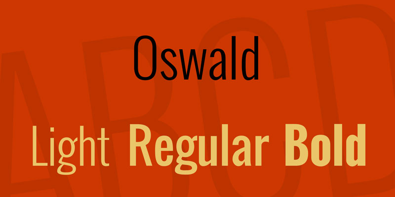
Oswald is a condensed sans-serif designed by Vernon Adams in 2011, available through Google Fonts. It is a reworking of classic Alternate Gothic and grotesque styles, redrawn for digital screen rendering.
Oswald works for flyer headlines because its condensed letterforms and tall x-height allow large-size display text to maintain legibility at distance. The font has received billions of views globally and is a standard choice for event posters and sports promotional flyers.
What makes Oswald suitable for flyers?
The condensed structure allows more text per horizontal line at headline sizes (36px+), useful for flyers with longer event names or multi-word titles. Oswald’s tall x-height maintains legibility even at arm’s length. Six weights from ExtraLight 200 to Bold 700 provide enough range for clear headline-to-subheading hierarchy on a single flyer.
Key attributes:
| Attribute | Value |
| Classification | Condensed sans-serif (grotesque) |
| Designer | Vernon Adams, 2011 |
| Weight range | ExtraLight 200 – Bold 700 (6 weights) |
| Variable font | Yes (updated 2019) |
| Recommended sizes | 24px+ for headlines; 12px minimum for body copy |
| Letter-spacing default | Normal |
| License | OFL (free for personal and commercial use) |
| Available on | Google Fonts, Adobe Fonts |
| Price | Free |
How does Oswald perform at flyer headline use?
At Bold 700 and 36px–72px, Oswald delivers high visual weight with strong vertical rhythm. The condensed proportions create a clear reading path for event names, dates, and location lines stacked vertically. Performance drops below 12px where condensed letterforms start to compress legibility.
What are the best pairings for Oswald in flyers?
Oswald pairs with Open Sans for a clean, modern editorial contrast in body copy, and with Playfair Display when an event flyer needs a tension between bold condensed headlines and high-contrast serif elegance. The Oswald + Open Sans combination is standard practice in event flyer design.
What are the limitations of Oswald for flyers?
Only 6 weights available, no true italic (oblique only), which limits expressive hierarchy options in complex flyer layouts. Not suited for body text below 12px on printed materials.
Oswald – Recommended Use Cases Within Flyer Design
- Best for: Sports event flyers, concert and festival promotions, political flyer headlines
- Avoid for: Luxury branding flyers, body text at small sizes, wedding or formal invitations
- Optimal weight: Bold 700 for titles; Regular 400 for subheadings
- Optimal size range: 36px–80px for main headlines; 18px–24px for secondary text
—
Playfair Display

Playfair Display is a transitional serif font designed by Claus Eggers Sørensen in 2011, released through Google Fonts under the OFL. Its high contrast between thick and thin strokes positions it as the standard for editorial-style flyer headlines. Version 2 (2022) added a full variable font format with axes for weight, width, and optical size.
Playfair Display suits formal and luxury flyer design because its extreme stroke contrast and sharp serifs read as premium-grade typography at display sizes. It has been adopted across fashion, wedding, and cultural event branding globally.
What makes Playfair Display suitable for flyers?
The extra-large x-height and short descenders allow tight leading in headline stacks without cramping. High contrast between thick and thin strokes (dramatically modulated, in the tradition of Bodoni and Didot) creates instant visual drama at 24px+. The variable font version adds optical size control, letting designers fine-tune stroke rendering for specific print conditions.
Key attributes:
| Attribute | Value |
| Classification | Transitional serif (display) |
| Designer | Claus Eggers Sørensen, 2011 |
| Weight range | Regular 400 – Black 900 (6 weights) |
| Variable font | Yes (v2, 2022 — weight, width, optical size axes) |
| Optical sizes | Yes — Needlepoint, Hairline, Titling, Display, Headline, Trumpet |
| Recommended sizes | 18px+ for display; 16px minimum; not for body below 14px |
| Letter-spacing default | Normal |
| License | OFL (free for personal and commercial use) |
| Available on | Google Fonts, Adobe Fonts |
| Price | Free |
How does Playfair Display perform at flyer headline use?
At Regular 400 to Black 900 and 24px–72px, Playfair Display renders with theatrical stroke contrast that reads clearly on high-quality coated paper. The thin hairline strokes are vulnerable to ink spread on uncoated or recycled paper stocks, which can cause visual breakup at 18px or below.
What are the best pairings for Playfair Display in flyers?
Playfair Display pairs with Montserrat for a clean geometric sans contrast in body copy (standard editorial practice), and with Roboto when a more neutral, screen-optimized body text is needed for digital flyer formats. The Playfair Display + Montserrat combination appears across luxury brand flyers and magazine-style promotions.
What are the limitations of Playfair Display for flyers?
The thin strokes fail on low-resolution printing and absorbent paper stocks, where ink spread fills in the hairlines. Unsuitable for body text below 16px on any output format. Bold weights can look heavy at very large sizes (80px+) if not carefully tracked.
Playfair Display – Recommended Use Cases Within Flyer Design
- Best for: Wedding flyers, luxury event promotions, fashion show invitations, theater and arts programs
- Avoid for: Fast-food or discount sale flyers; body text below 16px; low-resolution print runs
- Optimal weight: Regular 400–Bold 700 for headlines; Black 900 for very large display titles
- Optimal size range: 24px–72px for flyer headlines; 18px minimum for sub-headings
—
Helvetica

Helvetica is a neo-grotesque sans-serif typeface designed by Max Miedinger and Eduard Hoffmann in 1957, developed at the Haas Type Foundry in Switzerland. It is distributed commercially by Monotype and has never been available for free.
Helvetica works for professional and business flyers because its tall x-height, tight letter-spacing, and uniform stroke weight produce a neutral, authoritative appearance that supports any visual system without competing with it. BMW, Lufthansa, and NASA use it in printed materials.
What makes Helvetica suitable for flyers?
Stroke terminals cut horizontally and vertically rather than at angles, which produces clean endpoints that photograph and print sharply. The tight default spacing creates a dense, solid appearance that holds visual weight at headline sizes. Available in 34+ weights including condensed variants, though most print flyer usage stays within Regular, Bold, and Condensed variants.
Key attributes:
| Attribute | Value |
| Classification | Neo-grotesque sans-serif |
| Designer | Max Miedinger and Eduard Hoffmann, 1957 |
| Weight range | 34+ weights including condensed, compressed, extended variants |
| Variable font | No (Helvetica Now, 2019 update, adds three optical sizes) |
| Optical sizes | Yes (Helvetica Now — Micro, Text, Display) |
| Recommended sizes | 12px+ for body; 24px+ for headlines |
| Letter-spacing default | Tight |
| License | Commercial (Monotype license required) |
| Available on | Monotype, Adobe Fonts (via subscription), MyFonts |
| Price | Paid (desktop license from Monotype) |
How does Helvetica perform at flyer typography?
Narrow apertures in letters like “c” and “e” can reduce legibility at small sizes (below 10px on screen; below 8pt in print). At headline sizes (24pt+), the tight default spacing delivers a compact, professional headline block. Helvetica Now’s Display optical size improves large-scale rendering for high-end print work.
What are the best pairings for Helvetica in flyers?
Helvetica pairs with Garamond for classic Swiss-style typographic contrast between geometric sans and old-style serif. It pairs with Georgia for digital flyers requiring a web-safe, screen-optimized body serif. These pairings are conventional in corporate and institutional flyer design.
What are the limitations of Helvetica for flyers?
Requires a paid commercial license — not a viable choice for budget flyer projects. Narrow apertures limit small-size legibility compared to more open alternatives like Roboto or Montserrat. Its ubiquity in corporate design can make flyers look generic without strong visual differentiation.
Helvetica – Recommended Use Cases Within Flyer Design
- Best for: Corporate business flyers, institutional event announcements, government or nonprofit promotional materials
- Avoid for: Body copy below 9pt in print; budget or personal projects without a commercial license
- Optimal weight: Regular for body; Bold or Heavy for headlines
- Optimal size range: 10pt–12pt for body copy in print; 24pt+ for display headlines
—
Roboto

Roboto is a neo-grotesque sans-serif designed by Christian Robertson in 2011, released by Google as the Android system typeface. It has a geometric skeleton with humanist letter curves, available in 12 styles across 6 weights.
Roboto’s dual geometric-humanist structure makes it effective for flyer body copy and supporting text, where readability at 10px–14px is more critical than visual drama. As Google’s Material Design system font, it is used across billions of interfaces and printed materials globally.
What makes Roboto suitable for flyers?
Open apertures combined with a double-story lowercase “a” and “g” improve character distinction in small-size body text. The generous x-height holds legibility at 10px–12px in print. Six weights with matching obliques provide basic hierarchy options, though no true italic is available.
Key attributes:
| Attribute | Value |
| Classification | Neo-grotesque sans-serif |
| Designer | Christian Robertson, 2011 |
| Weight range | Thin 100 – Black 900 (6 weights + condensed variants) |
| Variable font | Yes (Roboto Flex, released 2022) |
| Recommended sizes | 10px–16px for body; 20px+ for subheadings |
| Letter-spacing default | Normal |
| License | Apache 2.0 (free for personal and commercial use) |
| Available on | Google Fonts, Adobe Fonts |
| Price | Free |
How does Roboto perform at flyer body text?
At Regular 400 and 10px–14px, Roboto renders clearly on both screen and print, with consistent stroke weight across common paper stocks. Its mechanical structure makes it less expressive than humanist alternatives like Lato, but more neutral and systematic, which works well in content-dense flyers where the information takes priority over typographic personality.
What are the best pairings for Roboto in flyers?
Roboto pairs with Playfair Display for an editorial contrast between high-contrast serif headlines and neutral sans body copy. It also pairs with Oswald for an all-sans approach with strong weight contrast between condensed headline and open body text.
What are the limitations of Roboto for flyers?
Roboto has no true italic, only obliques, which limits expressive typographic options in flyers requiring italic emphasis in body copy. Its neutral character makes it a weak standalone choice for display headlines where visual personality is needed.
Roboto – Recommended Use Cases Within Flyer Design
- Best for: Digital flyers, business event descriptions, body text in promotional materials, technology and startup promotions
- Avoid for: Luxury event flyers; body text requiring true italic; large-scale headline display
- Optimal weight: Regular 400 for body; Medium 500 for subheadings
- Optimal size range: 10px–16px for body; 18px–24px for secondary headings
—
Garamond

Garamond is an old-style serif typeface originating from designs by French punch-cutter Claude Garamond in the 1540s, with modern digital versions including Adobe Garamond (Robert Slimbach, 1989) and EB Garamond (Georg Duffner, 2011).
Garamond suits formal and traditional flyer typography because its organic stroke structure, derived from broad-nib pen calligraphy, carries authoritative warmth at display sizes. Publishers and academic institutions have used Garamond-style typefaces for centuries, and it remains a reliable option for professional print flyer design requiring a classic aesthetic.
What makes Garamond suitable for flyers?
Low stroke contrast relative to transitional serifs (like Playfair Display) means it tolerates ink spread on uncoated paper stocks better. Clear, sharp terminals and organic letter structures improve legibility in body copy at 10pt–12pt. The diagonal stress axis gives it a calligraphic quality that reads as authoritative rather than decorative.
Key attributes:
| Attribute | Value |
| Classification | Old-style serif (Garalde) |
| Designer | Claude Garamond (c. 1540); Adobe Garamond: Robert Slimbach, 1989; EB Garamond: Georg Duffner, 2011 |
| Variable font | Yes (EB Garamond variable version available) |
| Recommended sizes | 10pt–12pt for body; 18pt+ for display headings |
| Letter-spacing default | Normal |
| License | Adobe Garamond: commercial (Adobe subscription); EB Garamond: OFL (free) |
| Available on | Adobe Fonts (Adobe Garamond); Google Fonts (EB Garamond) |
| Price | Free (EB Garamond) / Subscription (Adobe Garamond via Adobe Fonts) |
How does Garamond perform at flyer body text and headlines?
In body copy at 10pt–12pt on coated stock, Garamond holds legibility through consistent letter-spacing and moderate contrast. At headline sizes (18pt–48pt), it projects a classical, trustworthy tone without the theatrical drama of high-contrast modern serifs. Performance drops on low-resolution digital screens where fine serifs render inconsistently below 14px.
What are the best pairings for Garamond in flyers?
Garamond pairs with Futura for one of the most recognized classic typographic contrasts (geometric sans headline against humanist serif body), and with Helvetica for corporate and institutional print contexts where a neutral sans and classical serif share hierarchy cleanly.
What are the limitations of Garamond for flyers?
Fine serifs and relatively low x-height make Garamond poorly suited for flyers printed at small sizes or on textured, absorbent paper. Digital rendering below 14px produces inconsistent results without careful hinting.
Garamond – Recommended Use Cases Within Flyer Design
- Best for: Formal event flyers, cultural institution promotions, academic and editorial print materials
- Avoid for: Small-size digital flyers; flyers printed on recycled or absorbent stock; bold event promotions needing high impact
- Optimal weight: Regular for body; Bold or Semibold for headings
- Optimal size range: 10pt–12pt for body in print; 18pt–48pt for display headings
—
Lora
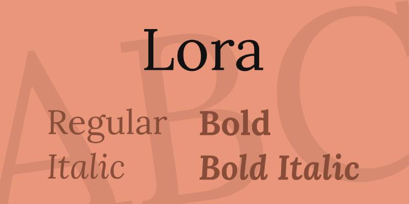
Lora is a contemporary serif font with calligraphic roots, designed by Olga Karpushina for Cyreal in 2011, released through Google Fonts. It was built specifically for screen readability with a variable weight axis added in later versions.
Lora works for flyer body copy because its moderate stroke contrast, brushed curves, and cupped serifs maintain legibility across both digital and print formats. It is a quieter option than Playfair Display, suited to flyers where body text needs to carry as much weight as the headline.
What makes Lora suitable for flyers?
Moderate stroke contrast (lower than Playfair Display, higher than Garamond) means Lora tolerates a range of paper stocks without losing definition. Open counters in letters like “o,” “e,” and “c” reduce fill-in risk at small print sizes. Available in 4 weights from Regular to Bold, with variable font support for fine-grained weight control.
Key attributes:
| Attribute | Value |
| Classification | Contemporary serif (calligraphic roots) |
| Designer | Olga Karpushina / Cyreal, 2011 |
| Weight range | Regular 400 – Bold 700 (4 styles + variable) |
| Variable font | Yes (weight axis) |
| Recommended sizes | 10px–16px for body; 20px+ for display headings |
| Letter-spacing default | Normal |
| License | OFL (free for personal and commercial use) |
| Available on | Google Fonts, Adobe Fonts |
| Price | Free |
How does Lora perform at flyer body text?
At Regular 400 and 10px–14px, Lora renders with consistent letterform definition on both screen and coated print stock. Its calligraphic stroke quality adds organic warmth to text-heavy flyer layouts without introducing the legibility risks of high-contrast serifs at small sizes. Performance on uncoated or textured stocks is better than Playfair Display but requires at least 10pt to maintain clean serif detail.
What are the best pairings for Lora in flyers?
Lora pairs with Montserrat for a modern geometric contrast between structured sans headlines and calligraphic serif body copy, and with Raleway for a more refined, editorial-quality combination suited to cultural or arts event flyers. Both are standard practice in content-focused flyer design.
What are the limitations of Lora for flyers?
Only 4 weights available, which limits headline hierarchy options when used as the sole typeface. Bold 700 at large display sizes (60px+) can look heavy without careful tracking adjustments.
Lora – Recommended Use Cases Within Flyer Design
- Best for: Event descriptions and supporting body text; charity and nonprofit flyers; arts, culture, and literary event promotions
- Avoid for: High-impact sports or nightclub headlines; standalone headline-only flyer layouts
- Optimal weight: Regular 400 for body; Bold 700 for subheadings and pull quotes
- Optimal size range: 10px–16px for body copy; 20px–36px for secondary headings
—
Raleway
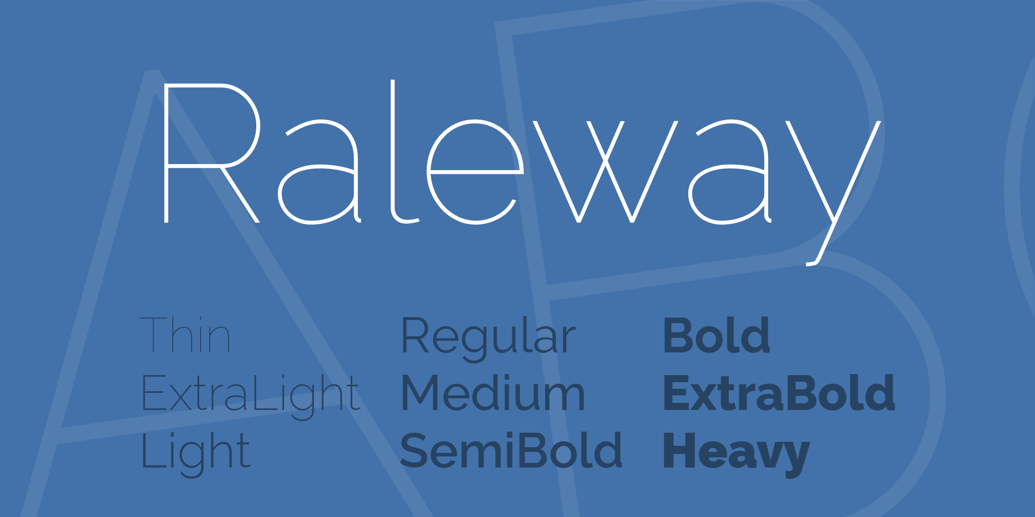
Raleway is a geometric sans-serif font initially designed by Matt McInerney in 2010 as a single thin weight, later expanded to 9 weights with italics by Pablo Impallari and Rodrigo Fuenzalida in 2012, released through The League of Moveable Type and Google Fonts.
Raleway suits elegant and minimalist flyer typography because its unique “W” ligature, thin default weights, and geometric structure read as refined and design-conscious. It is a strong choice for fashion event flyers, gallery openings, and premium lifestyle promotions where visual lightness is the goal.
What makes Raleway suitable for flyers?
Nine weights from Thin 100 to Black 900 provide full hierarchy control. The thin default stroke weight (Thin 100 to Light 300) creates an airy, premium feel at large display sizes (48px+), while ExtraBold 800 and Black 900 deliver strong impact for bold event titles. Distinctive letterform details like the unique “W” add typographic personality without sacrificing legibility.
Key attributes:
| Attribute | Value |
| Classification | Geometric sans-serif |
| Designer | Matt McInerney, 2010; expanded by Pablo Impallari & Rodrigo Fuenzalida, 2012 |
| Weight range | Thin 100 – Black 900 (9 weights) |
| Variable font | No |
| Recommended sizes | Light at 48px+ for display; Medium 500 for body at 12px+ |
| Letter-spacing default | Wide (especially in lighter weights) |
| License | OFL (free for personal and commercial use) |
| Available on | Google Fonts, Adobe Fonts |
| Price | Free |
How does Raleway perform at flyer headline use?
At Thin 100 to Light 300 and 48px–96px, Raleway creates high-impact visual space with minimal optical weight. This works on premium flyers where whitespace and elegance take priority over density. At ExtraBold 800 and above, it holds strong visual weight for bold promotions. Thin weights below 24px on uncoated paper stock risk hairline breakup.
What are the best pairings for Raleway in flyers?
Raleway pairs with Lora for a refined editorial combination (geometric sans headline against calligraphic serif body), and with Montserrat for a geometric consistency when a single-family hierarchy is not viable and two distinct sans voices are needed.
What are the limitations of Raleway for flyers?
No variable font available, requiring separate font files for each weight. Thin weights (100–300) are fragile on low-quality print outputs and uncoated stock, where hairline strokes drop out. Wide default letter-spacing in thin weights increases horizontal space requirements.
Raleway – Recommended Use Cases Within Flyer Design
- Best for: Fashion event flyers, gallery and arts promotions, minimalist product launch flyers, upscale lifestyle marketing
- Avoid for: Flyers printed on low-quality stock (thin weights); body copy below 12px; casual or youth-oriented events
- Optimal weight: Light 300 for elegant display; Bold 700–Black 900 for strong headlines; Medium 500 for body copy
- Optimal size range: 48px+ for light-weight display headlines; 12px–16px for body text
—
Futura

Futura is a geometric sans-serif typeface designed by Paul Renner in 1927, published by the Bauer Type Foundry. Built from circles, triangles, and straight lines in the spirit of the Bauhaus movement, it remains one of the most widely used display typefaces in premium print advertising and flyer design.
Futura works for high-impact flyer headlines because its pure geometric construction and low x-height create a distinctive, authoritative visual presence at large display sizes. Wes Anderson uses it in nearly every film title; Nike, Louis Vuitton, and FedEx have all used it in print campaigns. It is a commercial font requiring a paid license, available through Monotype.
What makes Futura suitable for flyers?
The geometric purity of circular “O,” “C,” and “G” letterforms creates high visual cohesion in headlines, where letters group into clean, legible blocks at 36pt+. Futura’s low x-height delivers elegant proportions at large sizes, a contrast to the tall x-height of sans-serifs like Roboto or Montserrat. Multiple weights from Light to ExtraBold support strong typographic hierarchy in promotional materials.
Key attributes:
| Attribute | Value |
| Classification | Geometric sans-serif |
| Designer | Paul Renner, 1927 |
| Weight range | Light to ExtraBold (including condensed variants) |
| Variable font | Yes (Futura Now, 2023 Monotype update) |
| Recommended sizes | 18pt+ for display; not optimal for body below 10pt |
| Letter-spacing default | Normal to wide (especially in light weights) |
| License | Commercial (Monotype license required) |
| Available on | Monotype, Adobe Fonts (via subscription) |
| Price | Paid |
How does Futura perform at flyer headline use?
At Bold to ExtraBold and 24pt–72pt, Futura renders with high geometric authority on coated print stock. The circular letterforms create even optical spacing without manual kerning corrections, a practical advantage in fast-turnaround flyer production. Low x-height limits legibility in body copy below 10pt, where the proportions become cramped.
What are the best pairings for Futura in flyers?
Futura pairs with Garamond for the classic contrast between modernist geometric and Renaissance humanist serif, used across luxury brand print materials for decades. It also pairs with Bodoni for an all-display, high-contrast approach suited to fashion event flyers.
What are the limitations of Futura for flyers?
Requires a paid commercial license through Monotype. The low x-height that gives it elegance at display sizes also makes it harder to read in body copy at 10pt or below. Free alternatives like Nunito or League Spartan provide a similar geometric structure without licensing costs.
Futura – Recommended Use Cases Within Flyer Design
- Best for: Luxury brand event flyers, fashion show promotions, architectural and design studio announcements
- Avoid for: Body text below 10pt; budget projects without a commercial license; casual or youth-market promotions
- Optimal weight: Bold for headlines; Medium for subheadings; Light for elegant secondary text at large sizes
- Optimal size range: 24pt–72pt for headlines; 14pt–18pt for subheadings
—
How To Choose The Right Font For Your Flyer
The right font depends on three structural decisions: the print context, the hierarchy level (headline vs. body), and the event type. Getting pairing fonts right matters as much as the individual typeface choice.
Here’s a quick reference for matching font to flyer type:
| Flyer Type | Recommended Headline | Recommended Body |
| Concert / Nightclub | Bebas Neue, Oswald | Roboto, Montserrat |
| Wedding / Formal Event | Playfair Display, Raleway | Lora, Garamond |
| Business / Corporate | Helvetica, Montserrat | Roboto, Garamond |
| Luxury / Fashion | Futura, Raleway | Garamond, Lora |
| Sports / Fitness | Bebas Neue, Oswald | Montserrat, Roboto |
One rule holds across all flyer types: limit your layout to two typefaces. One for display, one for body. If you need more contrast, change the weight or size, not the typeface. Understanding font psychology can also help you choose a typeface that matches the emotional tone of your event or promotion.
And if you’re unsure how two fonts will look together before committing, a font pairing generator can help you test combinations quickly without opening InDesign or Canva.
What Makes a Font Work for Flyers?
Most font choices fail in flyer design because they’re made at 100% zoom on a screen. Flyers get read at arm’s length, in motion, under variable lighting, and on paper stock that fights thin strokes.
Three structural attributes determine whether a font survives those conditions: x-height, stroke weight, and aperture width.
X-height is the height of lowercase letters relative to capitals. Research from the Royal Danish Academy’s Centre for Visibility Design confirms that fonts with higher x-heights produce better letter recognition under constrained viewing conditions. For flyers, a tall x-height keeps body text readable at 10pt and headlines recognizable from 10 feet away.
Stroke weight controls how a letterform behaves under print conditions. Thin strokes below 0.5pt collapse when ink spreads on uncoated or recycled paper stock. Ink spread alone can render an elegant hairline serif unreadable after printing, which is why high-contrast typefaces like Playfair Display require coated stock to perform as designed.
Aperture width is the opening in letters like “c,” “e,” and “a.” Wide apertures prevent these openings from filling in during print and keep characters distinct at small sizes. A 2023 review published in the International Journal of Research and Innovation in Social Science confirmed that optimizing letter spacing can make smaller characters up to 20% easier to read compared to default settings.
Font psychology adds a fourth dimension: how the structural classification of a typeface signals tone before a reader processes a single word. A condensed gothic display font communicates urgency. A high-contrast transitional serif signals luxury. Neither is universally correct. Both are structurally specific choices.
Print adds constraints that screen design does not. CMYK conversion reduces color contrast, which affects light-weight type on colored backgrounds. Textured or recycled paper stock softens stroke edges. And unlike a screen, a printed flyer cannot be zoomed.
The distinction between a serif font and a sans-serif font maps directly to flyer function. Serifs add horizontal stroke guidance that helps the eye track across a line, useful in body-heavy layouts. Sans-serifs hold up at extreme display sizes and distances where individual letter recognition matters more than line-reading rhythm. According to Toner Buzz’s analysis of 1,000 websites, 85% of designers prefer sans-serif fonts for primary display, with 76% prioritizing readability and accessibility over stylistic expression (Monotype Global Font Survey 2024).
—
How Font Hierarchy Affects Flyer Readability
A flyer without clear typographic hierarchy forces the reader to decide what matters. That decision takes longer than the average attention window allows. Printed ads hold attention 118% longer than digital advertising (NextDayFlyers), but only when the visual order is clear within the first glance.
Three tiers cover every text element in a professional flyer layout:
- Display headline: 36pt–72pt, maximum 1–3 words or a short phrase. This tier earns attention.
- Secondary text: 18pt–24pt, event name, date, location. This tier delivers the core message.
- Body or detail copy: 10pt–12pt, supporting information, URLs, disclaimers. This tier serves readers who are already interested.
Weight contrast is the most efficient hierarchy tool. Switching from Regular 400 to Bold 700 within a single typeface family creates a visible tier shift without introducing a second font. A Montserrat Bold headline against Montserrat Regular body copy achieves clear hierarchy with zero font-pairing risk.
Two fonts maximum is the professional standard. One handles display; one handles body. Three fonts in a single flyer layout almost always introduces visual competition rather than hierarchy. The Monotype 2024 Global Font Survey found that 76% of designers prioritize readability, and the discipline to limit font count is one of the most direct ways to serve it.
Size ratios matter more than most designers expect. A 2:1 ratio between headline and body (e.g., 24pt headline against 12pt body) creates a clear reading order. A 1.5:1 ratio reads as a weak distinction. The Toptal typographic scale, derived from Robert Bringhurst’s work, defines intervals that create natural visual progression: 12, 14, 18, 24, 30, 36, 48.
Line spacing reinforces hierarchy at every tier. Typography research cited by adoc-studio shows that increasing line spacing from 100% to 120% improves reading accuracy by up to 20% and reduces eye strain by 30%. In flyer layouts, headlines tolerate tight leading (1.1x–1.2x); body copy needs at least 1.4x to remain comfortable.
The squint test remains the most practical quality check. Squint at a flyer until all text becomes blurry. The most visually prominent element should be the headline. The second most prominent should be the secondary text tier. If any body copy element appears equal in weight to the headline at this view, the hierarchy has failed.
—
How Print and Digital Flyer Formats Change Font Performance
The same font can perform well in one output format and fail in another. Raleway Thin at 60pt on a high-resolution digital flyer looks precise and elegant. The same file printed on uncoated 80gsm paper produces broken hairlines and vanishing strokes. These are not the same design problem.
Font Selection for Printed Flyers
Print introduces four variables that screen design does not: paper stock, ink spread, CMYK color rendering, and viewing distance.
Coated stock (gloss or matte laminate) is required for high-contrast serifs like Playfair Display and Garamond. Ink sits on the surface and holds hairline strokes. Uncoated stock absorbs ink, spreading it by 5%–10% of stroke width. At small sizes, this fills in fine details and collapses thin strokes entirely.
Minimum safe sizes for print:
- Body copy: 9pt–10pt minimum on coated; 11pt minimum on uncoated
- Display headlines: 24pt+ on any stock
- Reversed-out text (white on dark): add 1pt–2pt to every minimum threshold
CMYK printing reduces perceived contrast compared to RGB screen display. A font that appears crisp at 100% black on screen may render with slightly reduced definition in print. Heavier weights (Medium 500, SemiBold 600) compensate for this at body sizes. Thin or Light weights below 300 are high-risk in any print context below 18pt.
Print ads produce a 70–80% higher recall rate than digital advertising (Persuasion Nation, 2025), which makes getting the typography right in print a directly measurable business decision. Poor print legibility undercuts one of print’s core advantages.
Font Selection for Digital and Social Media Flyers
72 DPI is the standard screen resolution for social media flyers. At this resolution, thin strokes below 2px collapse on lower-end mobile screens. JPEG compression, applied automatically by most social platforms, introduces artifacts around high-contrast edges. Bold weights and wider apertures survive compression better than thin or high-contrast designs.
| Output Format | Safe Weight Range | Risk Fonts | Strong Performers |
| Coated print | Thin 100 – Black 900 | None if stock is right | Playfair Display, Raleway, Garamond |
| Uncoated print | Regular 400 – Black 900 | Thin/Light weights below 18pt | Bebas Neue, Montserrat, Oswald |
| Social media (JPEG) | Medium 500 – Black 900 | High-contrast serifs, hairline display | Roboto, Montserrat Bold, Oswald |
| PDF digital flyer | Light 300 – Black 900 | Sub-10px body copy | Lora, Garamond, Roboto, Raleway |
Reversed-out text performs differently on screen versus print. On screen, white text on a dark background increases contrast and remains crisp at most weights. In print, ink from adjacent dark areas bleeds into white text zones, narrowing thin letterforms. Reversed body copy in print below 12pt is almost always a legibility failure.
Font spacing also behaves differently by format. The font spacing settings that look clean on screen often need adjustment for print. Tracking that looks open on screen can feel loose in a printed layout where optical distances shift with paper texture and ink density.
—
Which Font Types Suit Which Flyer Categories?
Flyer category determines which structural font attributes matter most. A nightclub promotion measured in seconds of attention has different requirements than a wedding invitation read closely and kept for weeks. 59% of consumers have made a purchase based on a printed flyer (ZipDo, cited in Chilli Printing 2025), which means the design decision carries direct commercial weight.
| Flyer Category | Primary Font Type | Key Structural Attribute | Examples |
| Concert / Nightclub | Condensed display sans | High x-height, tight spacing | Bebas Neue, Oswald |
| Wedding / Formal event | High-contrast serif or thin geometric sans | Stroke contrast, wide aperture | Playfair Display, Raleway, Lora |
| Business / Corporate | Neutral sans-serif | Open apertures, wide weight range | Helvetica, Montserrat, Roboto |
| Luxury / Fashion | Geometric sans (thin) or transitional serif | Low x-height, refined spacing | Futura, Raleway, Playfair Display |
| Sports / Fitness | Bold condensed sans | Maximum stroke weight, tall x-height | Bebas Neue, Oswald Bold |
Event and nightclub flyers require fonts legible from across a room, often pinned to a board or handed off mid-conversation. Condensed display typefaces like Bebas Neue and Oswald fit more words per line at large point sizes, keeping the headline readable without scaling down. Tight letter-spacing and tall x-height deliver fast recognition under low-contrast viewing conditions.
Business flyers need consistency across varied print runs and paper stocks. Neutral sans-serifs like Montserrat and Roboto hold up equally on laser-printed office stock and professionally printed coated paper. Three-quarters of Fortune 500 companies choose sans-serif fonts for their core branding (Toner Buzz), which reflects the same reasoning: neutrality and stock resilience over expressiveness.
Luxury and fashion flyer design depends on restraint. Futura’s geometric purity at Light or Regular weight creates visual premium through whitespace and precision, not through decorative stroke detail. Nike, Louis Vuitton, and FedEx have used Futura in print campaigns, demonstrating that geometric simplicity reads as high-value when paired with quality paper stock and tight print execution.
Wedding flyers are the one category where body copy legibility frequently competes with visual tone. Lora and Garamond maintain calligraphic warmth that communicates formality while staying readable at 10pt–12pt. Playfair Display, though beautiful at headline size, fails in body copy contexts below 16pt due to hairline stroke collapse.
—
What Are the Most Effective Font Pairings for Flyers?
Font pairing in flyer design is not about finding two fonts that look similar. It is about finding two fonts that perform different structural jobs without competing. Pairing fonts correctly requires contrast in classification, not just contrast in weight.
The foundational principle: one font earns attention (display), one font delivers information (body). When both fonts compete for the same visual tier, hierarchy breaks down and the reader has no clear reading path.
Five proven combinations for flyer typography:
- Bebas Neue + Roboto: Condensed all-caps display against neutral open sans body. Strong contrast in weight and structure. Works on any stock.
- Playfair Display + Montserrat: High-contrast transitional serif headline against geometric sans body. Standard editorial pairing. Requires coated stock for Playfair at small sizes.
- Oswald Bold + Open Sans Regular: Condensed gothic headline against humanist sans body. The combination appears across event flyers because both fonts hold up under production printing conditions.
- Raleway + Lora: Thin geometric sans headline against calligraphic serif body. Refined, literary quality. Best on coated stock; Raleway thin weights risk hairline collapse on uncoated.
- Futura + Garamond: Geometric sans headline against Renaissance humanist serif body. One of the most referenced classic pairings in print design, used across luxury brand materials for decades.
A font pairing generator can surface combinations before committing to a full layout, saving revision time when working under tight production deadlines.
Single-family hierarchy is a valid alternative when time is limited. Montserrat Black at 48pt against Montserrat Regular at 11pt uses weight contrast alone to create clear hierarchy within a single typeface. This approach eliminates pairing risk entirely and works especially well for digital flyers where consistency across multiple versions matters more than typographic personality.
Common pairing failures in flyer design:
- Mismatched x-heights: two fonts at the same point size can appear dramatically different in perceived size if their x-heights differ significantly (Garamond at 12pt looks smaller than Georgia at 12pt)
- Competing display weights: using two bold fonts for different tiers creates visual noise, not hierarchy
- Italic abuse: italic styles used for extended body copy reduce readability in print below 10pt
The distance test confirms pairing performance before final print. Place the flyer on the floor and look at it from standing height. The hierarchy should be immediately obvious. If it is not, the pairing is not the problem. The weight distribution between tiers is.
Variable fonts simplify pairing decisions for designers working across multiple flyer versions. Montserrat and Playfair Display both offer variable font versions, allowing a single font file to cover every weight tier without switching families. According to the HTTP Archive Web Almanac 2024, Montserrat appeared on 9%–10% of all websites using variable fonts, reflecting its position as a practical default for multi-weight typographic systems.
—
How to Choose a Flyer Font Based on License and Availability
Font licensing is the decision layer most designers skip until a client or a printer flags a problem. 47% of designers cite font licensing as challenging to navigate and manage (Monotype Global Font Survey 2024). In commercial flyer production, the consequences of skipping this step are real: print distribution of unlicensed fonts can constitute infringement regardless of the design context.
Two license types cover the majority of flyer typography decisions:
OFL (SIL Open Font License): Covers personal and commercial use with no restrictions on print run size, client work, or distribution. Bebas Neue, Montserrat, Oswald, Playfair Display, Roboto, Lora, and Raleway are all OFL-licensed. These are the free fonts that carry no legal risk in any commercial flyer project.
Commercial license: Required for Helvetica (Monotype) and Futura (also Monotype). Desktop licenses permit printing but restrict the number of users and devices. Large print runs, template resale, and multi-site agency use require extended licensing. Font licensing terms vary significantly between foundries, and misreading a desktop license as covering print distribution is a common error.
According to Linearity research, 80% of professional designers pay for at least one font license, and small businesses spend an average of $300 per year on font licensing. The 20% who do not pay are either working exclusively with OFL fonts or are operating outside license terms.
Source options by license type:
- Google Fonts: All OFL, free for commercial print and digital use, 1,826 font families as of May 2025 (Photutorial)
- Adobe Fonts: Covered under Creative Cloud subscription for desktop and web use; print distribution covered for most families
- Monotype: Commercial licenses for Helvetica, Futura, and premium families; pricing by user count and use type
- Font Squirrel: Curates only fonts cleared for commercial use; a reliable filter for OFL and permissive licenses
Free alternatives exist for both major commercial fonts. League Spartan and Nunito deliver geometric structure comparable to Futura without licensing costs. Inter and Roboto cover the same ground as Helvetica for digital-first flyer formats. The structural differences are real but small; the licensing difference is total.
Template resale creates a distinct licensing category. Selling flyer templates on platforms like Etsy or Creative Market requires that all embedded fonts either carry OFL licenses or come with explicit commercial resale rights. Standard desktop licenses do not cover this use case. Font Squirrel’s commercial use filter and OFL-only Google Fonts are the safest choices for template designers. The iconic fonts most associated with specific brands (Helvetica with corporate identity, Futura with luxury print) carry the licensing complexity that comes with their reputation.
FAQ on The Best Fonts For Flyers
What is the best font for flyers?
There is no single answer. Bebas Neue and Montserrat dominate event and business flyer design because of their high x-height and strong weight range. The best choice depends on your flyer category, print stock, and whether the layout prioritizes headline impact or body readability.
How many fonts should a flyer use?
Two fonts maximum. One display font for headlines, one for body copy. Three fonts usually creates visual competition rather than hierarchy. If you need more contrast, adjust weight or size within the same typeface family instead of adding a third.
What font size should a flyer headline be?
pt to 72pt for printed flyer headlines. Digital flyers follow the same range in pixels. Secondary text sits at 18pt–24pt. Body copy and event details land at 10pt–12pt minimum. Going below 9pt in print risks legibility on any paper stock.
Are serif or sans-serif fonts better for flyers?
Both work, but for different jobs. Sans-serif fonts like Oswald and Montserrat handle display headlines and distance legibility better. Serif fonts like Lora and Garamond suit formal event body copy. The structural attributes of each classification matter more than the category itself.
What fonts work best for event flyers?
Bebas Neue and Oswald are standard choices for concert and nightclub flyers due to their condensed letterforms and tall x-height. Playfair Display and Raleway suit formal events. Montserrat covers everything in between and holds up across both print and digital output formats.
Can I use Google Fonts for commercial flyers?
Yes. All Google Fonts are released under the SIL Open Font License, which covers personal and commercial use with no restrictions on print run size or client work. Montserrat, Bebas Neue, Oswald, Roboto, Lora, and Raleway are all available there at no cost.
What is the best font pairing for flyers?
Playfair Display paired with Montserrat is the most-used editorial combination. Bebas Neue with Roboto works for bold, modern layouts. Oswald Bold with Open Sans suits event promotions. Use a font pairing generator to test combinations before committing to a full layout.
What fonts should I avoid on flyers?
Avoid thin-weight display fonts on uncoated paper stock. Avoid decorative script fonts for body copy below 14pt. Comic Sans, Papyrus, and similar novelty typefaces undermine credibility in most professional flyer contexts. Legibility at distance is the primary filter for any elimination decision.
Does font choice affect flyer print quality?
Directly. High-contrast serifs with hairline strokes fail on uncoated or recycled stock because ink spread fills in fine details. Bold, monolinear fonts like Bebas Neue and Oswald tolerate a wider range of paper stocks. Coated stock is required for Playfair Display and Garamond at small sizes.
Do I need a license to use Helvetica or Futura on a flyer?
Yes. Both require a commercial license from Monotype. Free alternatives exist: Inter and Roboto cover Helvetica’s neutral sans-serif function; League Spartan and Nunito approximate Futura’s geometric structure. Font licensing terms matter especially for client work and template resale projects.
Conclusion
This conclusion is for an article presenting the best fonts for flyers as a structural decision, not a decorative one.
Typeface selection determines whether your promotional flyer typography holds up at distance, survives print production, and guides the reader through a clear visual hierarchy.
Condensed sans-serifs like Bebas Neue and Oswald deliver impact for event and concert flyers. Transitional serifs like Playfair Display and Lora handle formal and wedding contexts. Neutral options like Montserrat and Roboto stay reliable across every output format.
Keep your layout to two fonts. Prioritize x-height, stroke weight, and aperture width over aesthetics alone. And always verify your font licensing before going to print.
The right typeface won’t just look good. It will work.

Renowned for his expertise in logo design and visual branding, Bogdan has developed a multitude of logos for various clients.
His skills extend to creating posters, vector illustrations, business cards, and brochures. Additionally, Bogdan's UI kits were featured on marketplaces like Visual Hierarchy and UI8.
He also wrote in the past years on sites like Design Your Way, WebDesignerDepot, WPDean, Designmodo, Speckyboy, Slider Revolution, and more.
- The Windsurf Logo History, Colors, Font, And Meaning - 10 October 2026
- How to Remove Background From Product Photos (No Photoshop) - 10 October 2026
- How Designers can Build a Stronger Online Creative Identity - 9 October 2026

Bogdan Sandu is a seasoned designer who has been designing websites since 2008. Renowned for his expertise in logo design and visual branding, Bogdan has developed a multitude of logos for various clients. His skills extend to creating posters, vector illustrations, business cards, and brochures. Additionally, Bogdan's UI kits were featured on marketplaces like Visual Hierarchy and UI8. He also wrote in the past years on sites like Design Your Way, WebDesignerDepot, WPDean, Designmodo, Speckyboy, Slider Revolution, and more.
You Might Also Like