Most dashboards fail before anyone reads a single number. Dashboard UI design decides whether a screen full of metrics turns into a fast decision, or into a wall of noise nobody bothers acting on.
There’s actual research behind that claim. A 2024 peer-reviewed study in Data & Knowledge Engineering tested how 167 users respond to dashboard load and clutter, and found that heavier informational and representational load lowers both perceived quality and how likely someone is to keep using the tool.
That finding matters more to business intelligence teams than most of them realize. A chart that looks impressive but buries the one number a viewer actually needs has weak visual hierarchy, and it works against the exact decision the screen was built to support.
None of this is about making a dashboard look nice. It’s about whether the numbers on screen lead to something happening, or just sit there getting glanced at and ignored.
What Is Dashboard UI Design
Arrange metrics, charts, and controls onto a single screen so someone can make a decision fast and get it right, that’s the actual job. Nobody needs decoration here. What they need is compression, taking scattered numbers and turning them into something a person can read in five seconds and act on.
Stephen Few’s 2006 book “Information Dashboard Design” set the terms most designers still lean on: visual clutter, data density, the single-screen constraint. It’s still the field’s reference text, two decades later.
Most of what shows up in dashboard work traces back to broader graphic design principles, just applied to data that moves instead of a static image.
Dashboard vs Report
A report tells you what already happened. That’s basically its whole job, summarize the past and hand it over. Dashboards work differently. They show what’s happening now, and the better ones let you click into a number to see why it moved.
Once a monthly PDF report gets exported, it’s frozen. A dashboard panel keeps updating as long as the data behind it does, sometimes hourly, sometimes every second.
- Reports stay static: scheduled, exported, and handed around as files.
- Dashboards stay live and on demand, usually sitting embedded right inside whatever tool or app people already use.
What Are the Core Principles of Dashboard UI Design
Most dashboard layouts come down to keeping visual noise low, giving the page a clear hierarchy, grouping related numbers together, and holding back secondary metrics until someone actually asks for them. Skip any one of those and the screen either overwhelms whoever’s looking at it, or hides the number they came for in the first place.
Data-Ink Ratio and Chart Junk
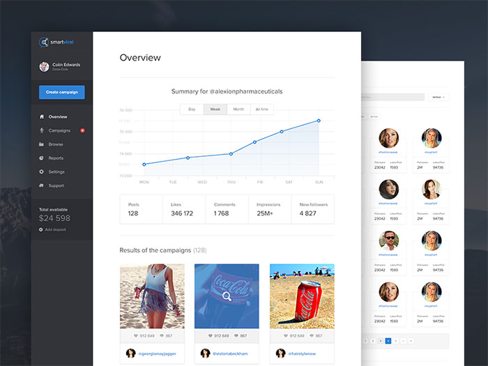
Image source: Krzysiek Kozioł
Edward Tufte coined the term data-ink ratio in his 1983 book “The Visual Display of Quantitative Information,” the share of pixels on a chart that represent actual data, measured against the total pixels used.
He called the leftover part chart junk, and dashboards are full of it. Drop shadows on bars, 3D pie wedges, heavy gridlines running through every chart, none of it adds information, and all of it eats screen space that could go toward an actual number.
- Cut a legend once direct labels are already doing the same job.
- Pull gridlines once the axis labels carry enough of a reference point on their own.
- Skip 3D effects entirely, since they distort how big something actually looks.
Visual Hierarchy and Scanning Patterns

Size, weight, and position are what tell someone’s eye where to look first, and that combination is what people mean by visual hierarchy. In practice, the most important number ends up as the biggest, boldest thing on the page, sitting closest to the top left corner.
Everything secondary gets smaller and sits lower down. If someone only checks a number once in a while, it doesn’t belong on the main view at all, put it behind a click instead.
There’s a color theory angle buried in here too. Weight and hue are both fighting for the same attention, so a screen really can’t spend both of them on a number that doesn’t matter that much.
Grouping and Proximity
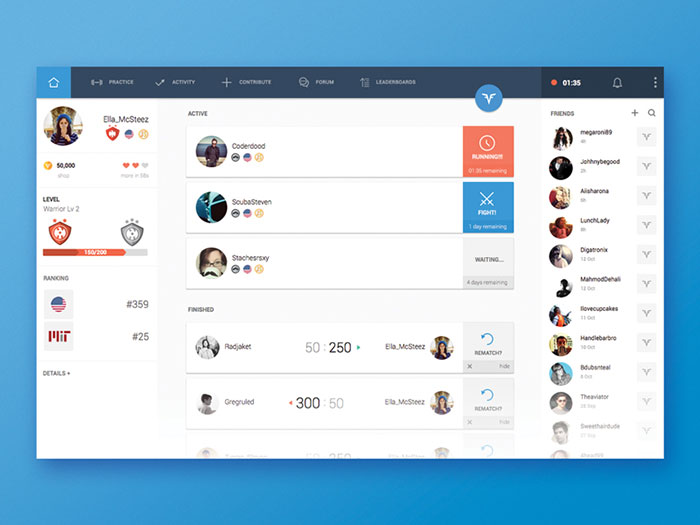
Image source: Garrett Godsey
Numbers that relate to each other need to sit together. Revenue, cost, and margin all belong in the same card, since they’re really one story. Server uptime doesn’t belong anywhere near them.
There’s a name for why this works: Gestalt principles, specifically proximity and common region. Put things close together, or box them inside the same border, and people’s brains read it as one group whether you tell them to or not.
- Group cards by business function, not by which chart type happens to be inside them.
- A shared border or a background tint is usually enough to signal that things belong together.
Which Layout and Grid Systems Work Best for Dashboards
A 12-column grid runs under most dashboards you’ll ever build, the same structure that shows up in grid systems across web and print design generally.
Bootstrap and Material Design both default to 12 columns, and there’s a practical reason for that. Twelve splits cleanly into halves, thirds, and quarters, which covers most card-width combinations without anyone needing to do custom math.
F-Pattern and Z-Pattern Reading Behavior
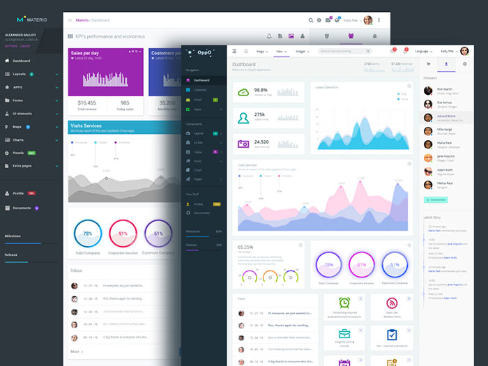
Image source: Yavick Zaytsev
Nielsen Norman Group’s 2006 eye-tracking study followed 232 participants and found people scan pages in roughly the shape of the letter F, across the top, down a bit, across again, then trailing down the left edge.
That lines up with a separate Nielsen Norman Group analysis from 2008, which found readers absorb only about 20 to 28 percent of the words on an average page. The F-pattern gets cited like gospel more often than it probably deserves, though on a screen that’s mostly numbers instead of paragraphs, it does hold up.
Dashboards lean on this pretty directly. The highest-priority metric sits top left, exactly where that first horizontal scan lands, while secondary charts trail off to the right and down the page.
Card-Based and Modular Layouts
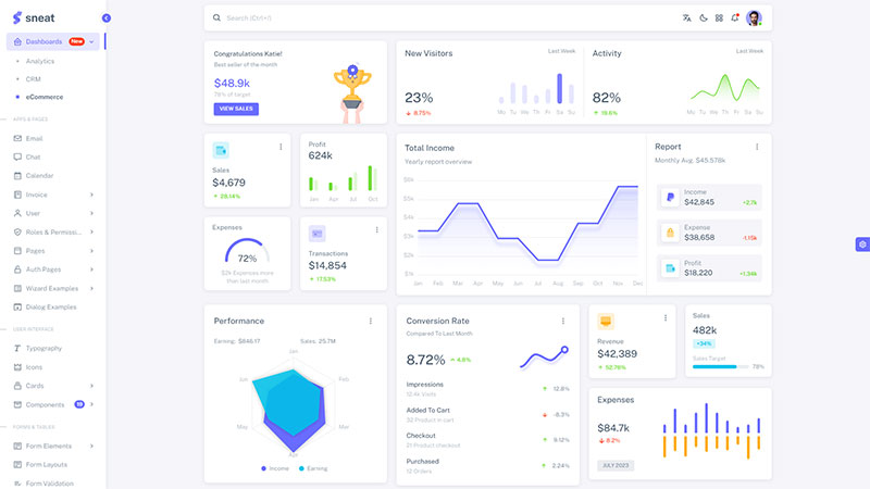
Put one metric or chart per card, keep the corner radius and shadow depth the same across every card, and a dashboard stays calm even with a dozen panels crammed onto it.
- Cards snap to the grid so alignment holds steady across every row.
- Uneven card heights throw off the scanning rhythm. Pad the short ones instead of letting them float.
- Responsive breakpoints collapse the grid from 12 columns down to 4, then eventually to 1, as the screen shrinks.
Material Design’s component library standardizes this exact card pattern across its whole system, and Salesforce borrows the same approach for its Lightning dashboards.
Which Chart Types Fit Which Data Type
Match the chart to the actual shape of the data. Get that wrong and the visualization starts actively misleading whoever’s looking at it, no matter how clean it looks on screen.
| Data Type | Best Chart | Avoid |
|---|---|---|
| Comparison | Bar, bullet chart | Pie chart with many slices |
| Trend over time | Line chart, sparkline | Pie chart, stacked bar |
| Part-to-whole | Stacked bar, treemap | 3D pie chart |
| Distribution | Histogram, box plot | Single bar average |
Comparison and Ranking Charts
Bar charts beat almost every other chart type for comparing values across categories, mostly because length is the one visual property people can judge accurately without even trying.
Bullet charts do roughly the same job but add a target line on top, handy when tracking a metric against a goal rather than just against other categories.
Sort the bars by value. Not alphabetically, that just hides the ranking the whole chart exists to show in the first place.
Trend and Time-Series Charts
Line charts are still the default for anything measured over time: revenue by month, uptime by hour, active users by day.
- Sparklines squeeze a full trend line into a handful of pixels, useful tucked inside a card header.
- Keep the y-axis consistent across any charts being compared side by side.
- Stop at 4 to 5 lines on one chart. Past that, the colors start blurring into each other.
Tableau and Power BI both default new time-based fields to a line chart automatically, their built-in chart recommendation engines make that call without anyone asking.
Part-to-Whole and Distribution Charts
Pie charts fall apart fast once categories pile up. Datawrapper Academy’s own guidance caps a pie chart at four values, since judging angle differences gets unreliable past that point.
A stacked bar or a treemap can tell the same part-to-whole story with far more categories, and without the guessing.
Distribution is a different problem entirely, and that’s where histograms and box plots come in. They show where most values cluster and where the outliers sit, something a single bar average could never show.
How Do Dashboards Use Color and Contrast
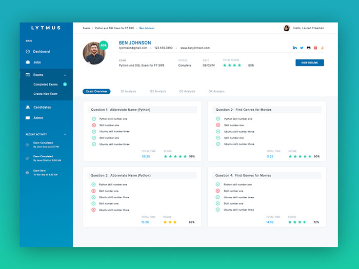
Color moves faster than anything else on a dashboard, and it’s also the easiest element to overdo. Whatever a status color means, it needs to mean that same thing everywhere on the screen, every single time.
Text and icons need enough contrast against whatever’s behind them too, or none of it stays legible. WCAG 2.2 sets the floor here.
| Element | WCAG AA Minimum | WCAG AAA Minimum |
|---|---|---|
| Normal text | 4.5:1 | 7:1 |
| Large text (18pt+) | 3:1 | 4.5:1 |
| Icons and UI components | 3:1 | not defined |
Traffic-light coding (red, amber, green) remains the standard way to show status. That’s basic color psychology at work, since red reads as danger almost everywhere and green reads as safe.
A sequential scale, basically one hue stretched from light to dark, suits intensity data like a heat map. Diverging scales work differently, two hues spreading out from a neutral midpoint, and those suit data that can swing positive or negative instead.
ColorBrewer and Viridis, both built into tools like D3.js and matplotlib, generate these scales pre-tested for colorblind safety already baked in.
About 1 in 12 men, roughly 8 percent, have some form of color vision deficiency, according to Colour Blind Awareness. Red-green happens to be the most common status-color pairing there is, and it’s also the exact pairing most colorblind viewers struggle to tell apart. Not ideal.
Cap the working color palette at 5 to 7 functional colors. Go past that and nobody can hold the color-to-meaning mapping in their head while also trying to read the actual numbers.
How Many Metrics Belong on a Dashboard
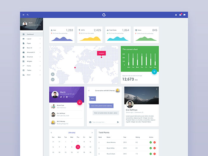
George Miller’s 1956 paper “The Magical Number Seven, Plus or Minus Two” put short-term working memory at 5 to 9 chunks of information. That figure is old, but it still shapes dashboard density decisions today.
A 2001 study by cognitive psychologist Nelson Cowan revised that estimate down further, to roughly 4 chunks once rehearsal support is stripped away. Either way, the ceiling is low.
Executive dashboards that actually get used tend to stay inside a 5 to 9 metric range. Cross it and viewers stop processing new numbers, they just skim past them instead.
One number gets to be the focal point. It sits bigger and higher than everything else on the page, and everything else exists purely to support it.
Amplitude turned this into a framework they call the North Star Metric, one number the whole team rallies behind, with secondary metrics feeding into it instead of competing with it for attention.
- Put the North Star metric top left and make it the largest thing on the page.
- Push secondary numbers into a drill-down panel, or a second tab, out of the main view.
- Don’t show two metrics as equally prominent unless they’re actually equal in priority. That’s rare.
What Are the Different Types of Dashboards
Who’s looking at the dashboard, and how often the underlying data changes, decides most of the design from there. A factory floor monitor and a quarterly board deck are solving completely different problems, even if both technically count as “dashboards.”
| Type | Audience | Refresh Cadence | Example Tool |
|---|---|---|---|
| Operational | Engineers, on-call staff | Seconds to minutes | Grafana, Datadog |
| Analytical | Analysts, researchers | On-demand | Tableau, Looker Studio |
| Strategic | Executives | Monthly, quarterly | Power BI |
| Tactical | Department managers | Weekly | Power BI, Looker Studio |
Operational and Analytical Dashboards
Operational dashboards watch systems in real time. Grafana’s own documentation lets users pick a refresh interval, though the platform enforces a 5-second floor on that interval by default, just to protect backend load.
Datadog runs on the same real-time monitoring model, just for infrastructure and application metrics instead.
Analytical dashboards give up that real-time speed for depth instead. Built in Tableau or Looker Studio, they’re meant for analysts filtering, pivoting, and drilling into a dataset rather than watching it update live. It’s a business intelligence workflow more than a monitoring one, really.
Strategic and Tactical Dashboards
Strategic dashboards serve executives on a monthly or quarterly rhythm: revenue, market share, retention, the handful of numbers that sum up whether the company is healthy.
- Strategic dashboards track company-wide metrics at a low refresh frequency, built for context rather than speed.
- Tactical dashboards track department-level metrics (marketing, sales, support) and usually refresh weekly.
A support team’s tactical dashboard might track ticket volume and response time. Nobody would ever put those same numbers on a strategic board deck though.
How Does Real-Time Data Affect Dashboard Design
Real-time data changes what the design job even is. A dashboard isn’t just showing numbers anymore, it’s showing numbers that move while somebody is actively looking at them.
WebSocket connections push updates from server to browser the moment new data exists, over a single connection that stays open the whole time. Polling works differently, it asks the server on a fixed schedule, whether or not anything actually changed.
Server-Sent Events land somewhere in between: one-way push from server to client, simpler to set up than a full WebSocket, though without the two-way channel WebSockets offer.
| Method | Direction | Best For |
|---|---|---|
| WebSocket | Two-way | Trading dashboards, live chat |
| Server-Sent Events | Server to client only | Activity feeds, status panels |
| Polling | Client-initiated | Non-critical metrics, simple builds |
Freshness indicators matter just as much as the update mechanism itself. A small “last updated” timestamp tells the viewer whether they’re looking at this second’s data, or last hour’s.
Without one, a frozen panel and a live panel look identical. Nobody can tell which is which until something actually breaks.
- Animate value changes with a brief fade or a count-up, never a hard jump.
- Throttle re-renders so updates read as smooth movement instead of flicker.
- Don’t animate every panel at once, simultaneous motion reads as noise instead of information.
Grafana’s own streaming feature, Grafana Live, pushes panel updates over WebSocket rather than waiting on a polling interval.
Real-time updates create a separate problem for screen reader users too, since a value that changes silently on screen changes just as silently for them.
What Makes a Dashboard Accessible
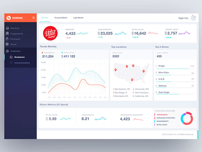
A genuinely accessible dashboard works the same whether someone’s using a screen reader, navigating by keyboard only, or dealing with color blindness. Same experience, not a stripped-down version of one.
Most teams stop at a color-contrast checklist and call it done. Contrast is one piece of this. It’s nowhere close to the whole picture.
Screen readers need some way of knowing when a chart actually updates. MDN’s documentation on ARIA live regions lays out two settings: “polite” waits for a natural pause before announcing anything, “assertive” interrupts right away.
A revenue panel updating every few seconds should stay polite about it. An error alert on a monitoring dashboard is one of the rare cases where assertive actually earns its place.
ARIA doesn’t fix everything by default, though. The 2026 WebAIM Million report found homepages using ARIA carried more detected errors on average (59.1) than pages without it (42), which says a lot about how often ARIA gets misapplied versus applied correctly.
- Every interactive control (filter, tab, drill-down) needs full keyboard navigation. Mouse or touch support alone isn’t enough.
- Charts need a data table fallback for anyone who can’t parse a visual chart at all.
- Anything conveyed only through color needs a second signal next to it, an icon or a text label.
That last point loops right back to the red-green status coding from earlier. Color alone shuts out a meaningful share of the people looking at the screen.
WebAIM’s own WAVE tool is still the standard way most teams test a dashboard’s markup against these requirements before shipping.
How Do Dashboards Adapt for Mobile and Small Screens
A dashboard built for a 27-inch monitor breaks completely on a phone screen. Adapting it actually means rethinking the layout, not shrinking the same one down.
| Breakpoint | Bootstrap Width | Typical Device |
|---|---|---|
| sm | 576px | Large phone |
| md | 768px | Tablet |
| lg | 992px | Small laptop |
| xl | 1200px | Desktop |
Bootstrap’s documented breakpoints reflow the grid from 12 columns down to a single column as the viewport narrows past each threshold.
Touch targets need to grow too. Apple’s Human Interface Guidelines set a minimum tappable area of 44 by 44 points for every interactive control, buttons, filters, and chart legends included.
- Hover states don’t exist on touch, so tooltips need to become tap-to-reveal panels instead.
- Sparklines replace full line charts inside narrow cards, holding a trend in a fraction of the space.
- Stack cards vertically in strict priority order, since horizontal scanning isn’t possible on a narrow screen.
Padding shrinks on mobile too, though rarely all the way to zero. Tight white space between cards still keeps panels from blurring into each other on a small screen.
Secondary metrics get pushed behind a drill-down tap far more aggressively on mobile than on desktop. Screen space is just the scarcest resource in the room at that point.
What Are Common Mistakes in Dashboard UI Design
Most bad dashboards fail for a small, repeatable set of reasons.
- Vanity metrics sitting in the top spot. A number that looks impressive but doesn’t map to any real decision, occupying the top-left position that should belong to whatever actually matters most.
- Inconsistent scales. Two bar charts on the same screen running different y-axis ranges, so a small change ends up looking identical to a big one.
- Chart junk that never got removed. 3D effects, drop shadows, decorative icons, all of it adding weight without adding a single bit of information.
- Color doing all the work alone. Status conveyed by hue with nothing else backing it up, invisible to a meaningful share of the people looking at the screen.
- Numbers nobody would act on. Data sitting there that wouldn’t change a single decision whether it went up or down.
Nielsen Norman Group defines a vanity metric as one that looks impressive without reflecting the real health of the product underneath it, often because it’s a number that only ever climbs regardless of how the business is actually doing.
Pie charts stuffed with too many slices are still the single most common chart junk offender shipping in production dashboards right now.
None of these mistakes need a full redesign to fix. Most of them come down to a five-minute audit. Check the top-left metric, check the axes, check the color legend, and you’ve usually found the problem.
Which Tools Are Used to Build Dashboard Interfaces
Different tools own different parts of building a dashboard, everything from the first wireframe down to the production data feed.
| Tool | Purpose | Best For |
|---|---|---|
| Figma | Prototyping, design systems | Designers, early-stage mockups |
| Tableau, Power BI | Business intelligence dashboards | Analysts, executives |
| Grafana, Datadog | Operational monitoring | Engineers, on-call teams |
| D3.js, Chart.js | Custom-coded visualization | Developers, bespoke products |
Figma handles the design phase. Wireframing card layouts, building out a reusable component library, prototyping interactions, all of it happens before a single line of dashboard code gets written.
D3.js and Chart.js sit at opposite ends of the coding-effort spectrum. D3 hands you full control over every pixel of a custom chart. Chart.js ships pre-built chart types that render with a few lines of configuration instead.
That tradeoff matters differently depending on who’s asking. A team building something genuinely bespoke needs D3’s control. A team that just needs a working line chart by Friday needs Chart.js.
Looker Studio, Google’s free business intelligence tool, connects straight to Google Analytics and Google Sheets without a paid license, which is basically why it shows up so much in marketing and small-business reporting.
- Grafana and Datadog are built for engineers watching infrastructure, not executives reading a monthly summary.
- Tableau and Power BI are built for analysts who need to filter and pivot a dataset before presenting it.
No single tool covers the whole pipeline. Most real dashboard projects move through two or three of these before anything reaches a production screen.
Dashboard UI Inspiration
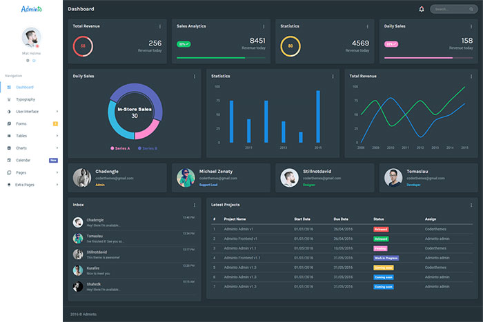
Adminto – Responsive Admin Dashboard
Code Exam Dashboard design
Logged-In Dashboard design
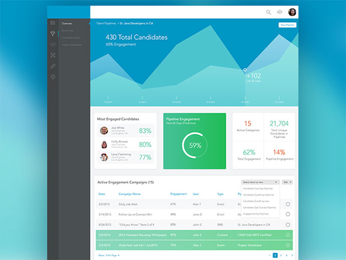
Smart Admin Dashboard
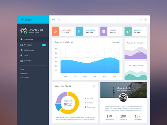
B2B Dashboard
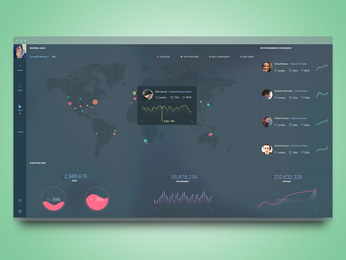
Dashboard for Employee fitness app
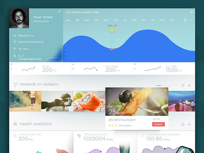
Dashboard
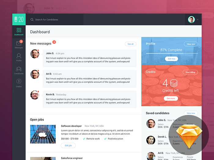
Dashboard by Sketch 3
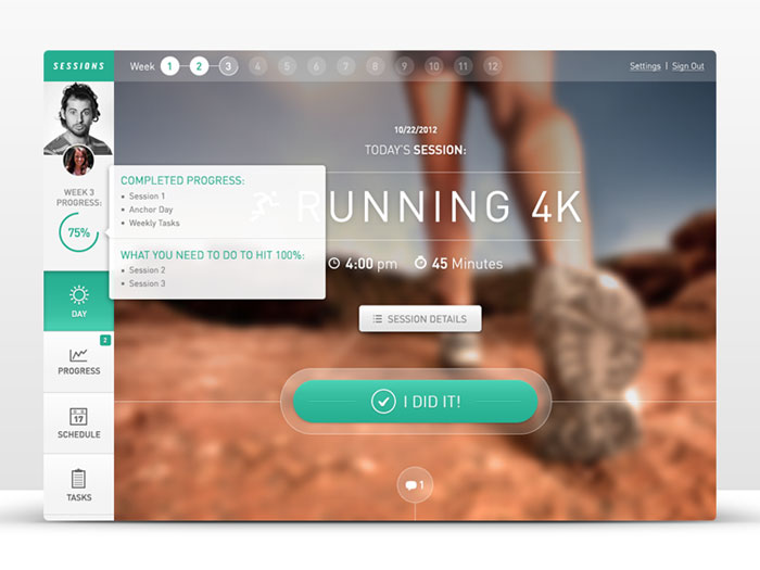
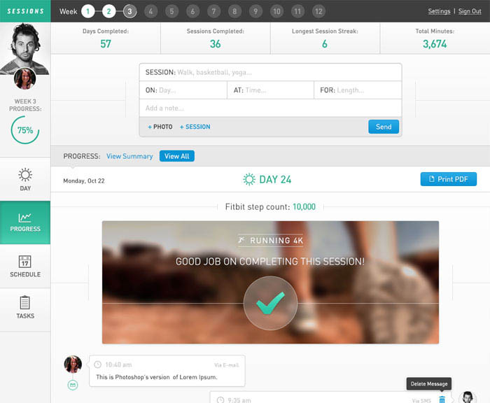
Fitness Web App: Sessions
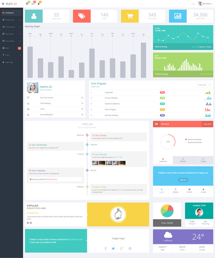
FlatLab – Flat & Responsive Admin Template
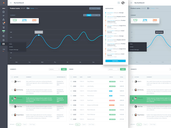
Website Analytics Dashboard
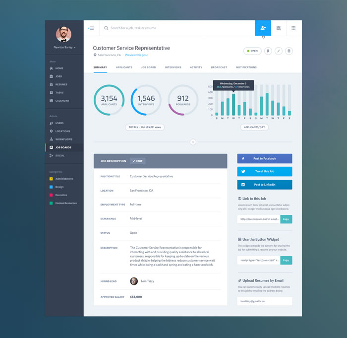
Dashboard Web App UI: Job Summary
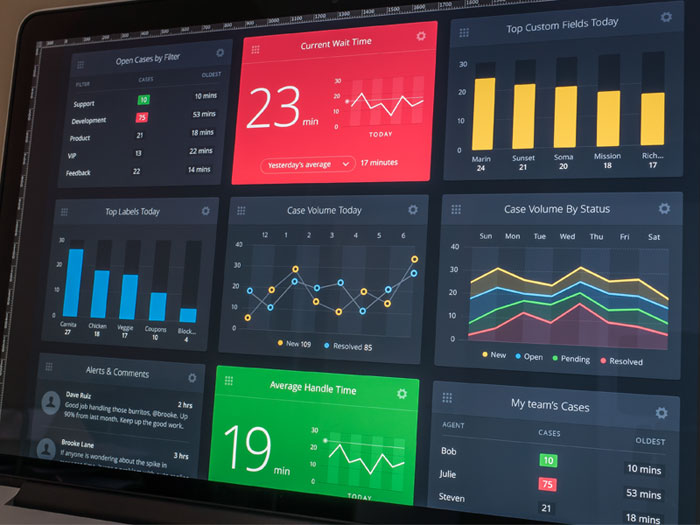
Desk.com Dashboard design
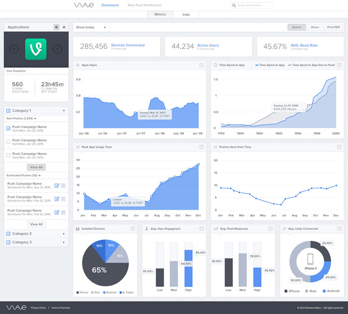
Element Wave Dashboard Update
I love Dashboards
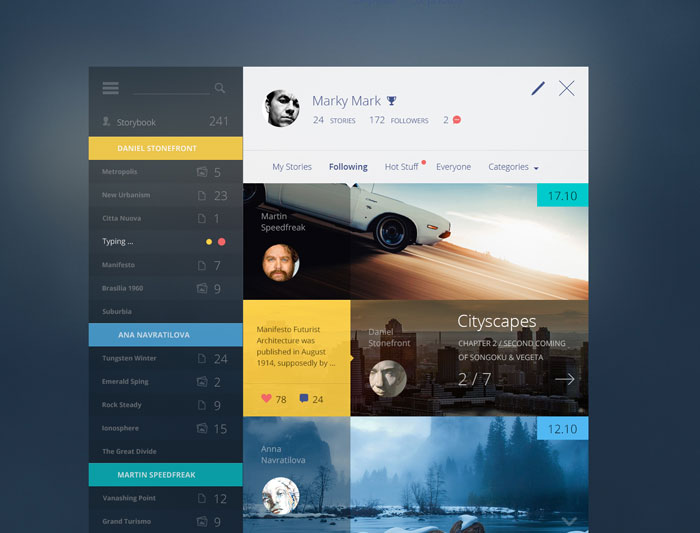
Story Book
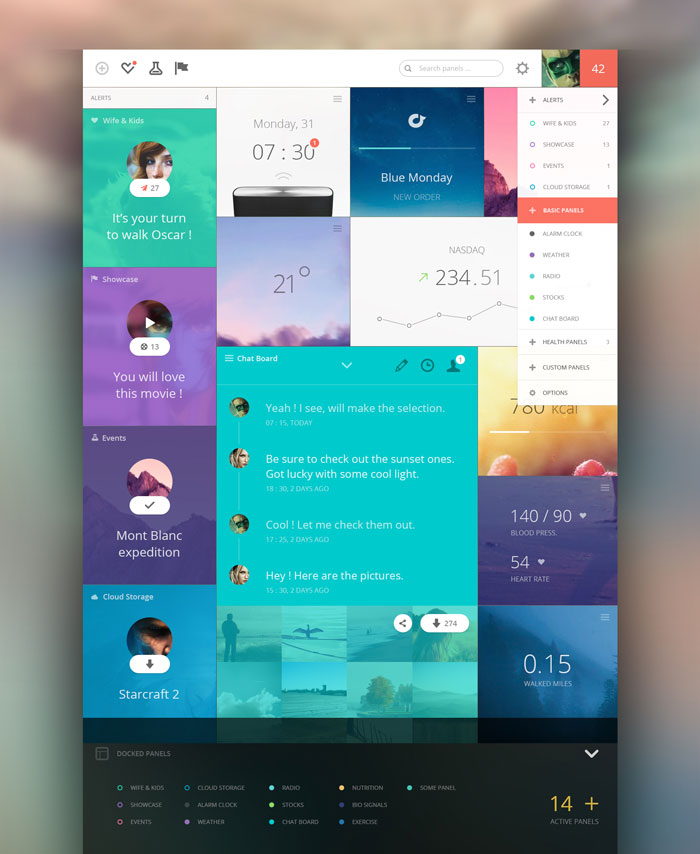
Panels Dashboard design
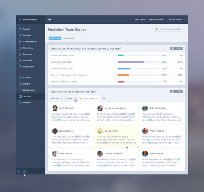
Mixpanel Survey Analytics UI/UX
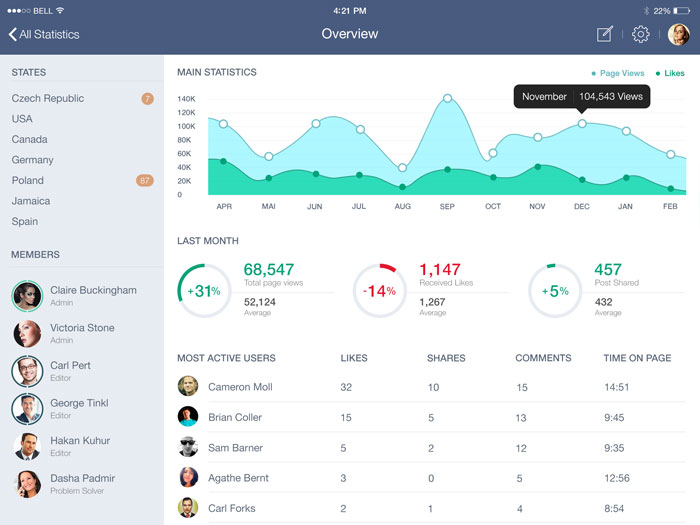
Home Statistics Dashboard design
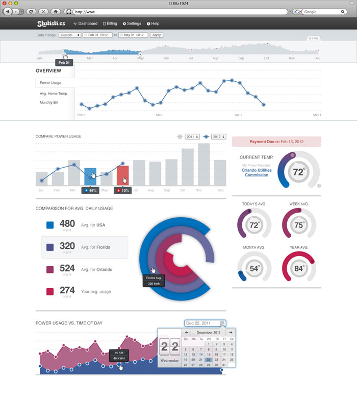
MB Dashboard
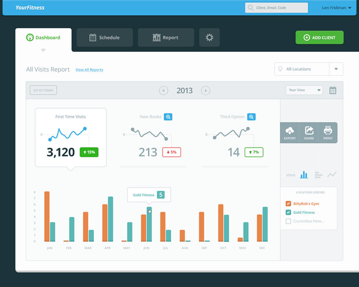
To-Do Dashboard
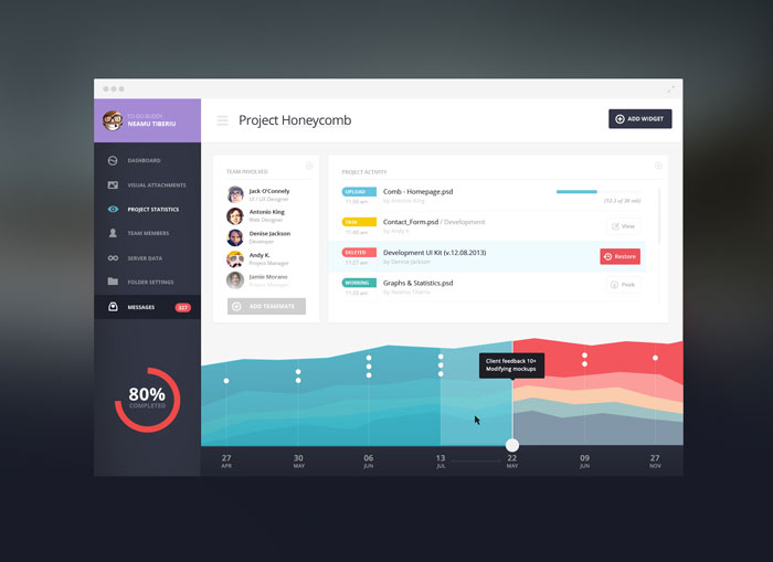
Some Analytics
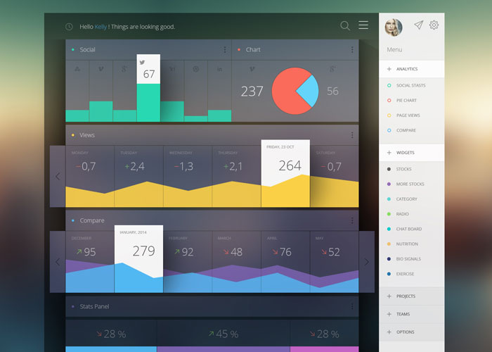
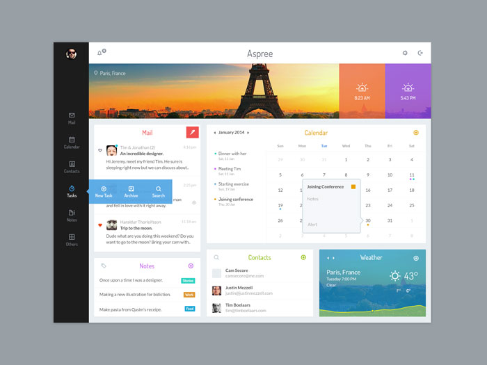
Aspree
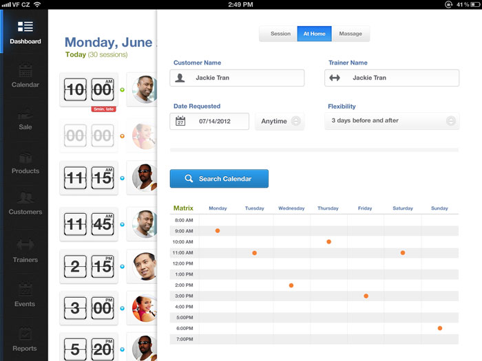
iPad UI Design
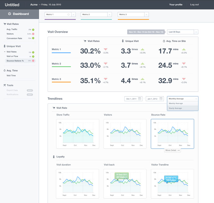
Dashboard Full 2
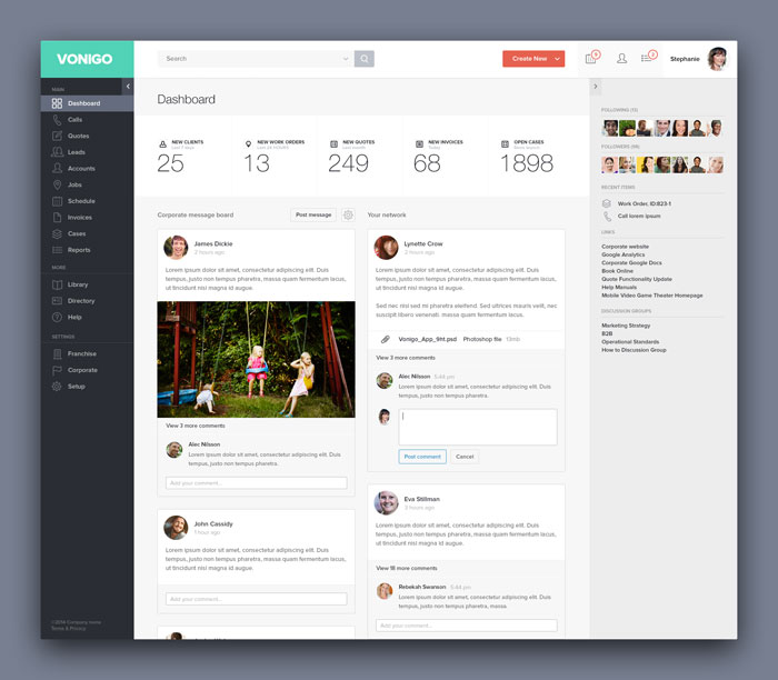
Vonigo – Dashboard
Accent Dash II
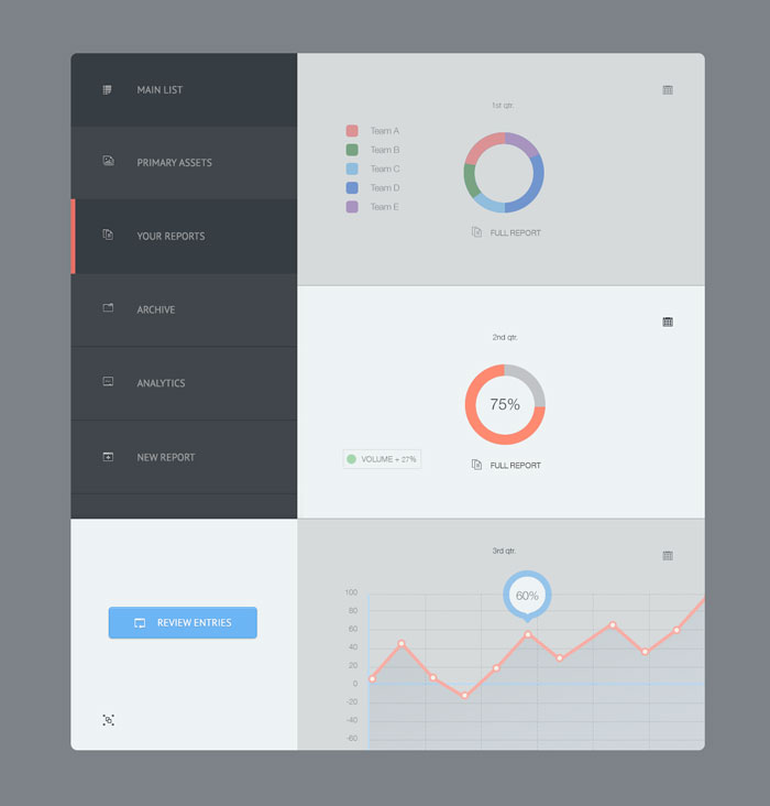
Dashboard WordPress
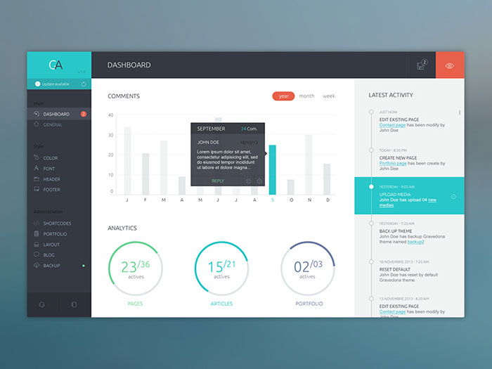
Flat Dashboard
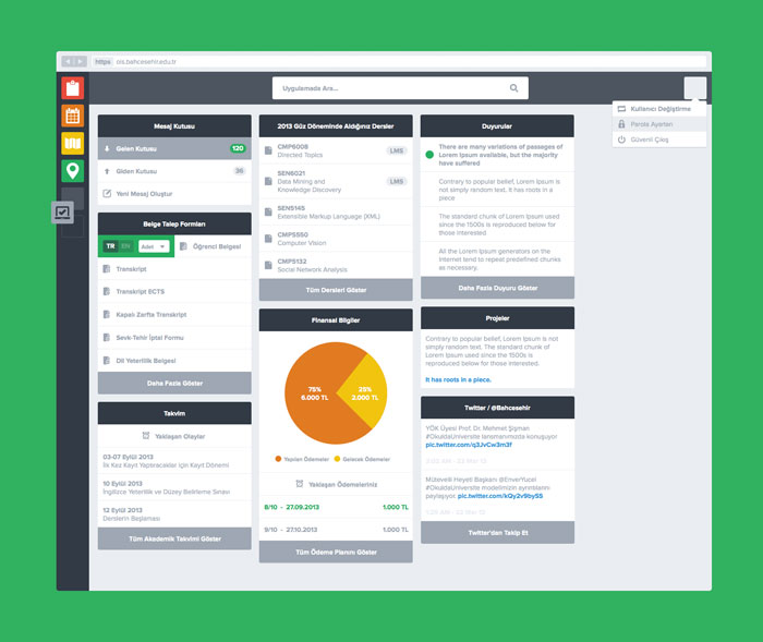
Webapp Dashboard
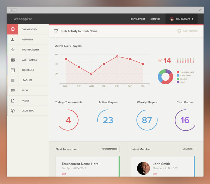
Rolodex Dashboard
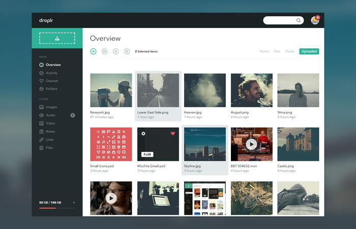
Droplr Dashboard
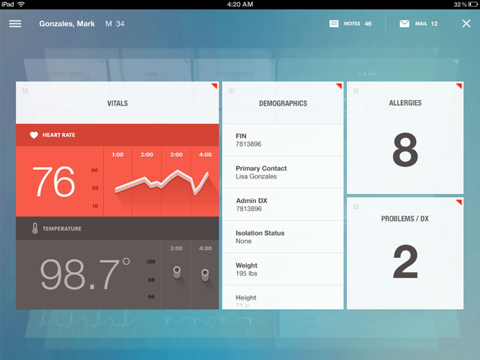
Dashboard
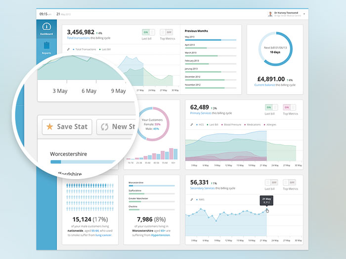
Health Analytics Dashboard Preview
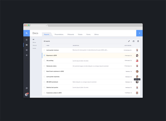
A dashboard design
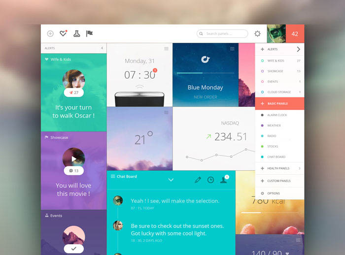
Panels Dashboard
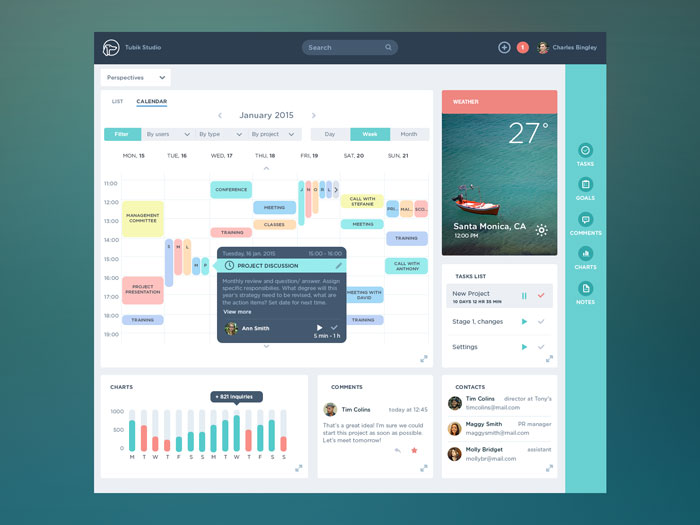
Task Management App
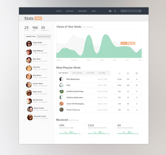
Dashboard UI Stats
Product Dashboard design, Activity Feed UI/UX
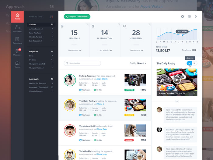
To-Do Dashboard design
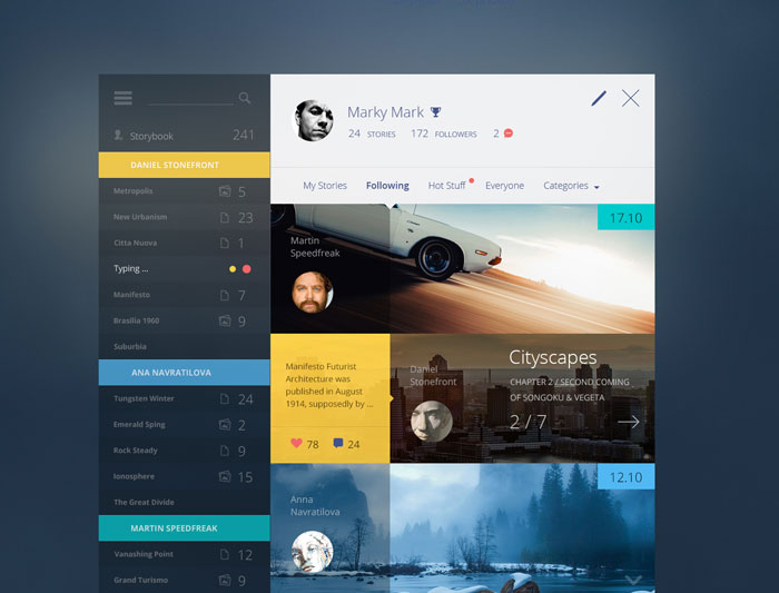
Story Book
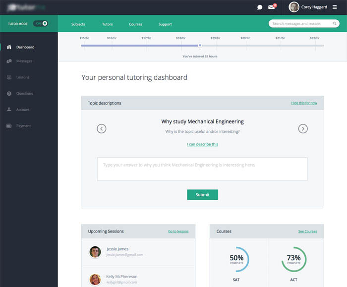
Tutor App UI
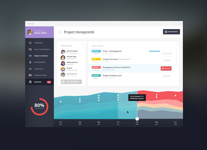
PhotoLytics Dashboard UI
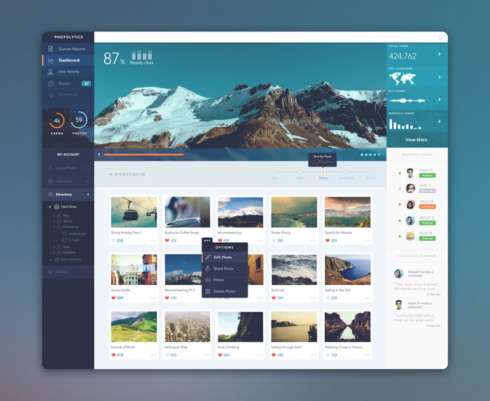
Dashboard
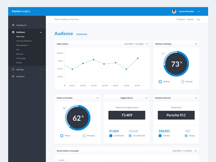
Dark Analytics Dashboard design
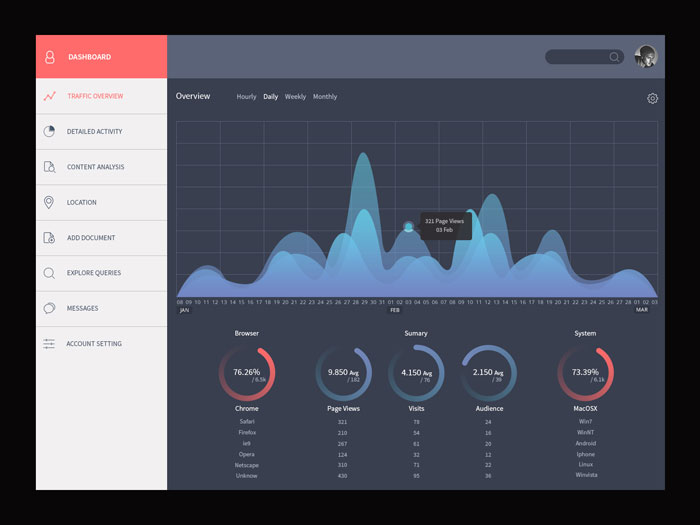
Xonom
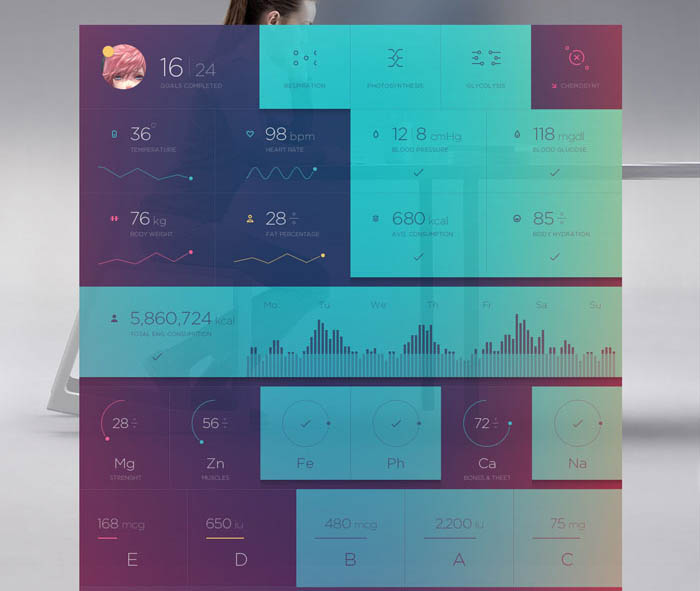
Health app
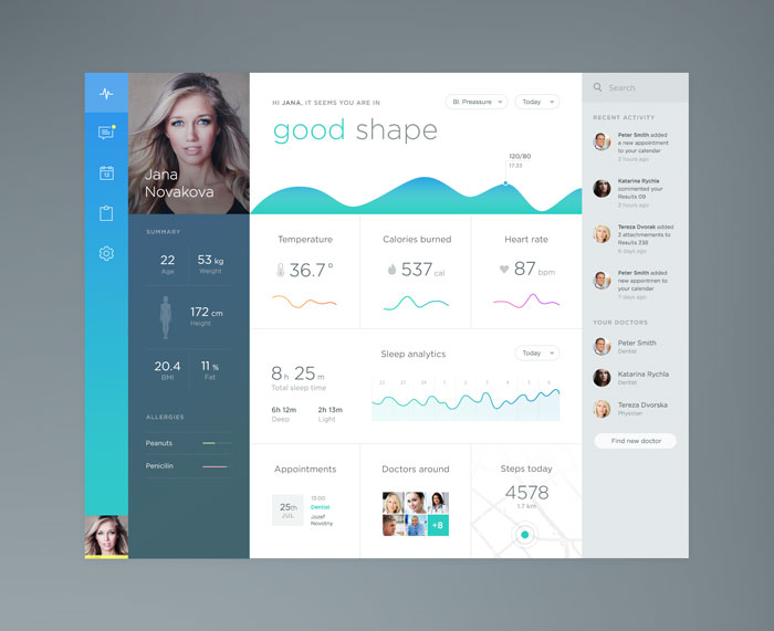
Pastel Projects
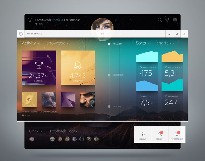
Aspree

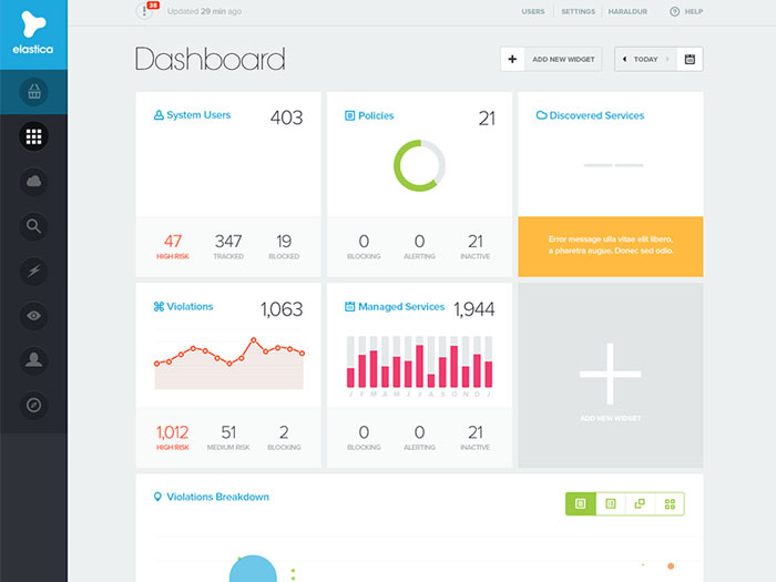
Elastica – Dashboard
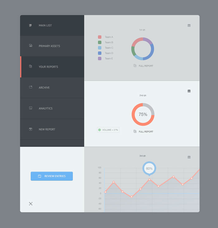
Accent Dash II
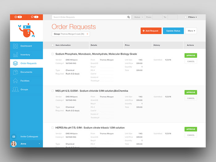
Quartzy – Order Requests
Progress View
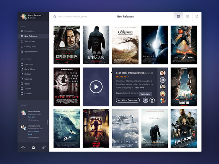
Movie App Final
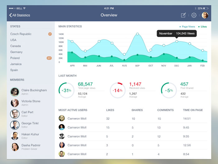
I love Dashboards
How To Design And Code An Admin Dashboard? Like These Examples
Designing a mobile dashboard can challenge you a little bit due tot the fact that you have to put only the absolutely essential elements in there. Space isn’t unlimited on a mobile device screen and you must be aware of that.
On the web, however, things aren’t like that. There is a lot of space, but this doesn’t mean that you must put stats for absolutely everything. You still have to constrain yourself a little bit, but you get the big advantage of having a big wide screen where to put your dashboard elements.
What I like the most about designing dashboards for websites and web apps is that you can make responsive web design your advantage and can display multiple fields above the fold on big monitors.
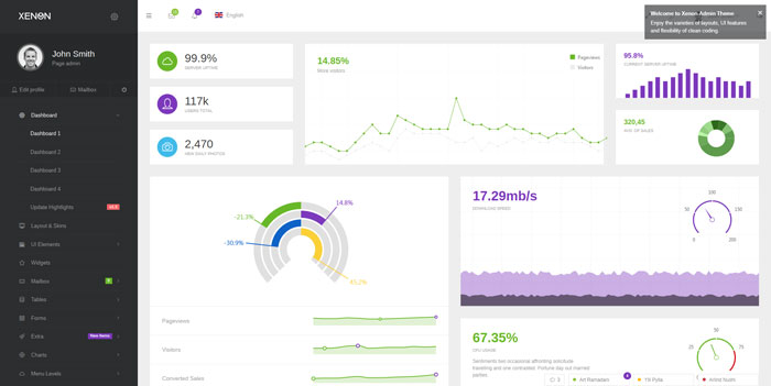
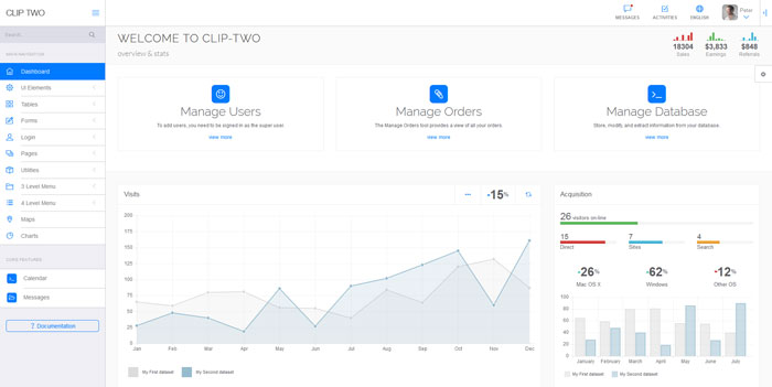
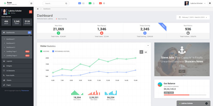
Now check out the following dashboards and look at how they were designed and coded. This might give you an idea of how you should do the next dashboard task that is sent to you by your clients.
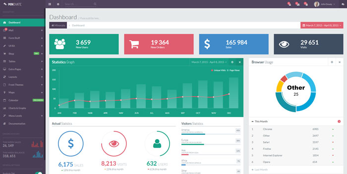
Minovate
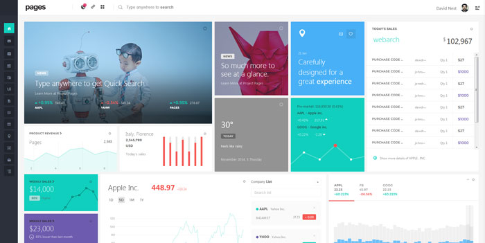
Pages
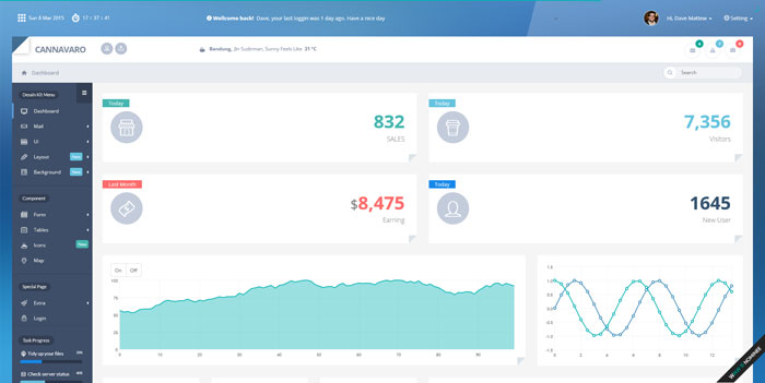
Cannavaro
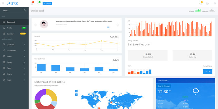
Mtek
Xenon
Clip-two
Azan
Pleasure
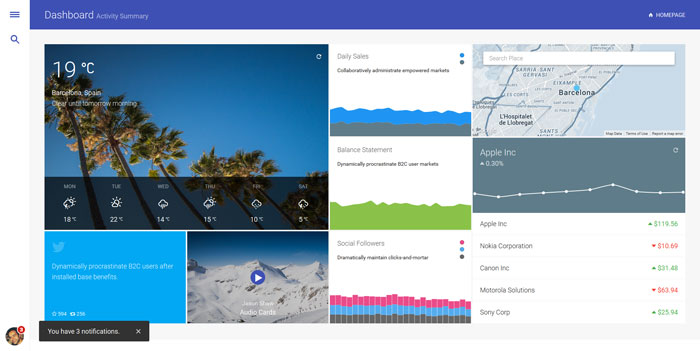
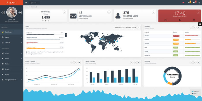
Atlant
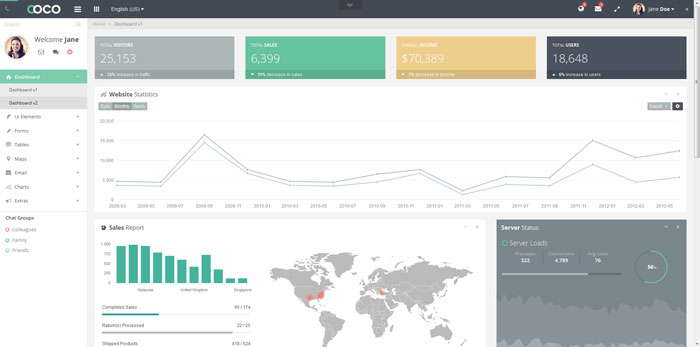
Coco
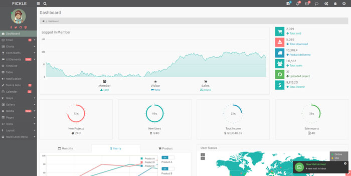
Fickle
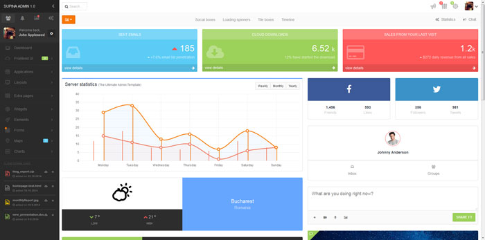
Supina
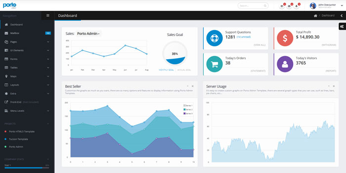
Porto
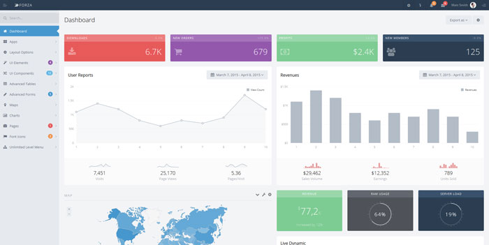
Forza
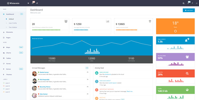
Wintermin
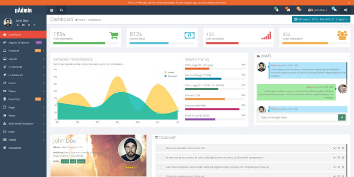
uAdmin
FAQ on Dashboard UI Design
What Is Dashboard Fatigue
A viewer eventually stops trusting or even opening a dashboard that constantly changes, overwhelms them with numbers, or never actually ties back to a decision. That’s dashboard fatigue, and it shows up first as declining logins, then as people quietly falling back on manual reports instead.
Should a Dashboard Scroll or Fit on One Screen
Zero scrolling, ideally, for executive and operational dashboards, since the whole point is a single glance and nothing more. Analytical dashboards get more slack here. Built for exploration in tools like Tableau or Power BI, they can scroll or paginate once someone’s actually digging into the data.
What Is a Single Pane of Glass Dashboard
Pulling data from multiple systems, servers, applications, and security tools into one unified screen is what people mean by single pane of glass. IT and operations teams use the term specifically for monitoring tools like Datadog, ones that replace switching between a dozen separate consoles.
Do Dashboards Need Dark Mode
Not always. It helps though, cutting down eye strain during long monitoring shifts, common enough on operational dashboards people watch for hours at a stretch. Dark mode also makes status colors like red and green pop harder against a dark background than they ever do on white.
Should Large Numbers Be Rounded on a Dashboard
Yes. “$1.2M” reads faster than “$1,234,567.89” and supports exactly the same decision either way. Save the precise figures for a drill-down or an export. The main dashboard UI design surface is about scanning speed, not decimal accuracy.
How Do You Handle Empty or Missing Data on a Dashboard
Use a clear “no data” state instead of leaving a blank card, or worse, showing a zero that reads like an actual measured value. A missing data point and a true zero mean two completely different things, and the interface shouldn’t ever blur that line.
What Is the Five-Second Test for Dashboards
Sit someone who’s never seen the dashboard down in front of it, and ask them to name the single most important number on screen within five seconds. If they can’t, the visual hierarchy is broken, and whatever’s supposed to be the top-priority metric needs to move, or grow, or both.
How Often Should a Dashboard Be Redesigned
There’s no fixed schedule for this. Redesign when the underlying metrics change, when user feedback keeps flagging confusion, or when a new data source needs somewhere to live. A cosmetic refresh with no functional reason behind it just wastes design effort that could go somewhere else.
What Is the Difference Between a KPI and a Metric
Any number tracked over time counts as a metric, page views, server response time, whatever. A KPI is narrower, a metric that’s actually tied to a business goal and gets reported on regularly. Every KPI counts as a metric. Most metrics never become a KPI.
How Do You Test a Dashboard Before Launch
Start with the five-second test, then hand it to real users and watch them complete an actual task, finding this week’s revenue, say, without any guidance. Formal usability testing is what catches the confusing labels and buried metrics a design team stops noticing after staring at the same mockups for weeks.
Conclusion
Good dashboard UI design actually starts backward. Name the exact decision the screen needs to support before a single chart or color gets picked.
Everything else follows from that one constraint. Chart type, color palette, how many metrics make the cut, none of it matters much if nobody ever named the underlying decision.
Treat information density like a budget instead of a wish list. Want to add one more panel? Something else has to earn its way off the screen first.
A dashboard that answers one question clearly beats one that surfaces twenty poorly, every time. Ship the narrow version first, then expand only once real usage actually proves the gap exists.
Give the top metric a single owner, not a committee. Shared ownership is exactly how dashboards drift back into clutter within a quarter.

Renowned for his expertise in logo design and visual branding, Bogdan has developed a multitude of logos for various clients.
His skills extend to creating posters, vector illustrations, business cards, and brochures. Additionally, Bogdan's UI kits were featured on marketplaces like Visual Hierarchy and UI8.
He also wrote in the past years on sites like Design Your Way, WebDesignerDepot, WPDean, Designmodo, Speckyboy, Slider Revolution, and more.
- Why Final Rendering Becomes a Bottleneck in 3D Design Projects - 17 October 2026
- Stussy Font Generator - 16 October 2026
- What B2B Buyers Check on a Website Before They Ever Talk to Sales - 16 October 2026

Bogdan Sandu is a seasoned designer who has been designing websites since 2008. Renowned for his expertise in logo design and visual branding, Bogdan has developed a multitude of logos for various clients. His skills extend to creating posters, vector illustrations, business cards, and brochures. Additionally, Bogdan's UI kits were featured on marketplaces like Visual Hierarchy and UI8. He also wrote in the past years on sites like Design Your Way, WebDesignerDepot, WPDean, Designmodo, Speckyboy, Slider Revolution, and more.
You Might Also Like