Discover the enchanting world of shades of green, where every hue tells a story and transforms your surroundings. From the serene depths of emerald green to the vibrant energy of lime green, the spectrum of green hues offers endless possibilities for creativity and expression.
Understanding these shades isn’t just about knowing their names; it’s about appreciating their role in color theory and how they interact with RGB and CMYK models to create harmonious designs.
Whether you’re planning an interior makeover, designing a garden, or simply exploring the beauty of nature, mastering the art of green can elevate your projects.
By the end of this article, you’ll not only be able to identify different greens like moss green, sage green, and chartreuse, but also learn how to apply them effectively in interior design, fashion, and even environmentalism.
Get ready to immerse yourself in the rich, varied world of green and discover how these shades can inspire and transform your work.
Popular Shades of Green
| Shade Name | HEX Code | RGB Values | Description |
|---|---|---|---|
| Forest Green | #228B22 | (34, 139, 34) | A dark green, similar to the color of dense forest foliage. |
| Lime Green | #32CD32 | (50, 205, 50) | A bright and vibrant green, like the color of limes. |
| Olive Green | #808000 | (128, 128, 0) | A muted green with a yellowish tinge, often associated with olives. |
| Sea Green | #2E8B57 | (46, 139, 87) | A medium green with a hint of blue, reminiscent of seaweed. |
| Mint Green | #98FF98 | (152, 255, 152) | A light and refreshing green, like the color of mint leaves. |
| Emerald Green | #50C878 | (80, 200, 120) | A bright and rich green, similar to the gemstone emerald. |
| Sage Green | #9DC183 | (157, 193, 131) | A soft and muted green, with a grayish tint, like the herb sage. |
| Jade Green | #00A86B | (0, 168, 107) | A vivid green, like the gemstone jade. |
| Pistachio | #93C572 | (147, 197, 114) | A light green with a hint of yellow, like the color of pistachios. |
| Chartreuse | #7FFF00 | (127, 255, 0) | A bright and luminous yellow-green. |
| Kelly Green | #4CBB17 | (76, 187, 23) | A strong and vibrant green, often associated with St. Patrick’s Day. |
| Moss Green | #8A9A5B | (138, 154, 91) | A soft and muted green, similar to the color of moss. |
| Hunter Green | #355E3B | (53, 94, 59) | A dark green, often associated with hunting gear. |
| Fern Green | #4F7942 | (79, 121, 66) | A medium green, like the color of fern leaves. |
| Lawn Green | #7CFC00 | (124, 252, 0) | A bright and vivid green, similar to a well-maintained lawn. |
| Spring Green | #00FF7F | (0, 255, 127) | A bright and fresh green, like the color of new spring growth. |
| Dark Olive Green | #556B2F | (85, 107, 47) | A dark green with a hint of brown, like the color of olive trees. |
| Pale Green | #98FB98 | (152, 251, 152) | A soft and delicate green, like young leaves. |
| Medium Sea Green | #3CB371 | (60, 179, 113) | A medium green with a hint of blue, like the color of shallow sea water. |
| Light Green | #90EE90 | (144, 238, 144) | A pale and soothing green, often associated with calmness. |
| Yellow Green | #9ACD32 | (154, 205, 50) | A medium green with a strong yellow tint. |
| Dark Green | #006400 | (0, 100, 0) | A very dark and intense green. |
| Lime | #00FF00 | (0, 255, 0) | The purest form of green, very bright and vivid. |
| Teal | #008080 | (0, 128, 128) | A medium to dark blue-green, often seen in nature. |
| Neon Green | #39FF14 | (57, 255, 20) | A very bright and fluorescent green. |
| Army Green | #4B5320 | (75, 83, 32) | A muted green, commonly used in military uniforms. |
| Apple Green | #8DB600 | (141, 182, 0) | A bright and fresh green, like the color of green apples. |
| Avocado Green | #568203 | (86, 130, 3) | A dark green with a yellow tint, like the color of avocados. |
Shades of green – using a green color palette
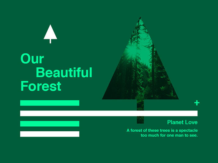
When you use a green color, you’ll be drawing on a firm favourite. Green shades are seen to be one of the most popular colors, coming second only to blue. When you use green colors in your design you’ll therefore appeal to a wide audience. Both men and women love green shades.
People who are color blind may struggle to discern between shades of green and blue. By keeping this in mind when you are designing you’ll be able to work around it, placing blue and green together only when there is enough of a contrast to be able to distinguish two different shades.
Shades of green make people feel positive
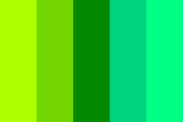
Green is generally seen to be a very soothing color, although this may depend on the shades of green used. When you use a green color you’ll evoke images of nature. Green colors remind us of summer picnics on fresh grass or the emerald green color of Christmastime. As a result, green colors generally make people feel very positive.
Green represents new leaves in springtime, renewal and vitality. Although green and blue are both soothing colors, green can also balance the overall look of a page. Bright greens (with more yellow) show the freshness and vitality of youth. Darker colors of green, such as an olive green color, remind us of the stability of evergreen leaves or the elegance of the oak.
Combining green shades with other colors
It is often highly effective to combine a green color with other colors as the green of nature naturally mixes with a wide range of other colors. However, when mixing colors with shades of green, do ensure they work well together.
Green is so soothing that clashing colors will feel uncomfortable for a site visitor. Draw on the different shades of green in your color palette, mixing colors that work well together. You can auto-generate the most suitable shades of green using your palette tool to ensure that your colors work well together.
Green color shades help to identify your brand
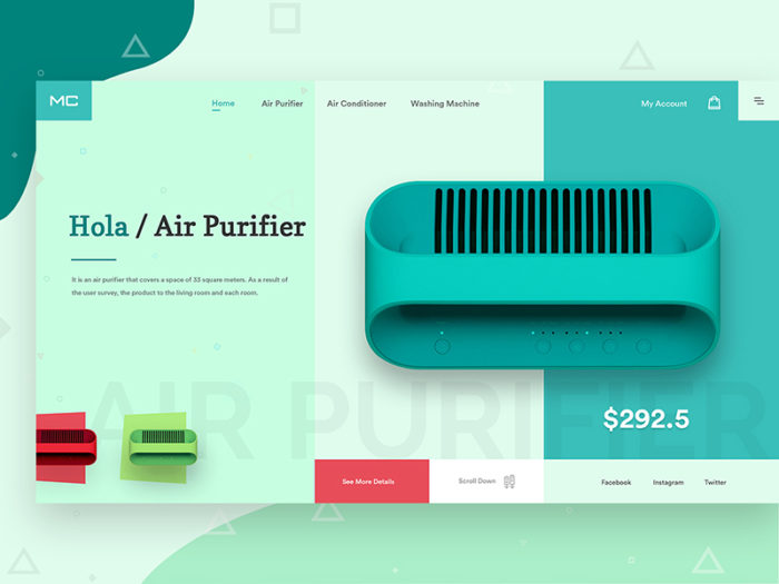
If you believe that the color green can be incorporated into your brand in order to communicate an effective message, remember to use it on all of your branding materials. Your logo, website, social media profile and print advertising will become instantly identifiable if you keep your colors consistent.
Green (used alone or in combination with other colors) will send out a message attracting the right type of clients for your brand. The more consistent your color choice, the more recognizable your brand will become.
Shades of green – getting to know the green color palette
Your clients may love green and you might have decided to use a green color as a part of your brand. However, with each shade of green sending out a different message, how will you know the best color combinations to use? Would you prefer to go for a youthful and vibrant yellow-green or a sophisticated and stable deep green?
Different shades of green will have different meanings. Darker greens are often associated with finance, wealth, ambition and even greed. Yellow greens may relate to feelings of jealousy, illness, and even cowardliness. Do you remember the phrase ‘extending the olive branch?’ It’s no surprise that olive shades of the green color symbolize peace.
Forest Green
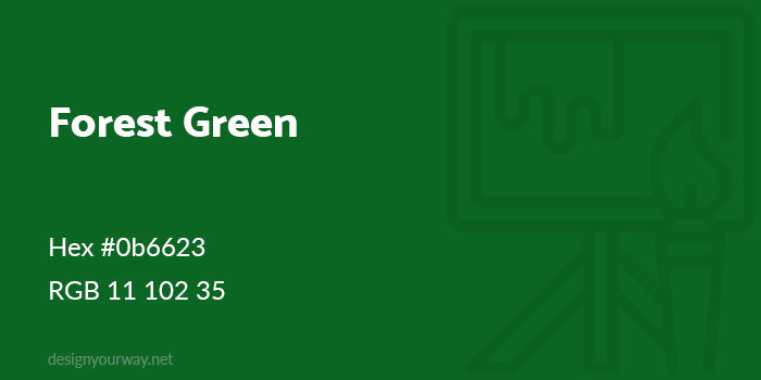
Hex #0b6623
RGB 11 102 35
Sage Green
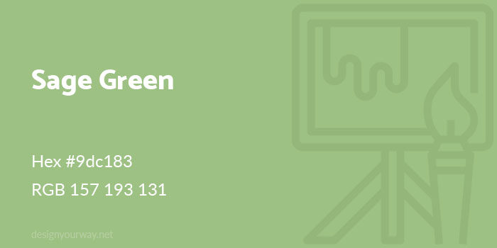
Hex #9dc183
RGB 157 193 131
Olive Green
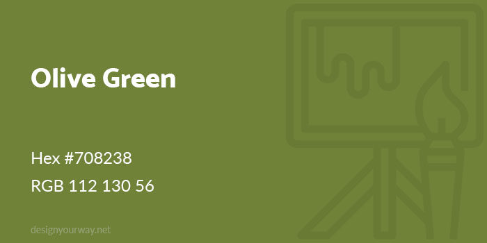
Hex #708238
RGB 112 130 56
Lime Green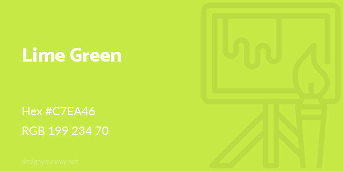
Hex #c7ea46
RGB 199 234 70
Hunter Green

Hex #3f704d
RGB 63 122 77
Jade Green

Hex #00A86B
RGB 0 168 107
Artichoke Green
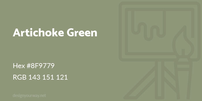
Hex #8F9779
RGB 143 151 121
Fern Green
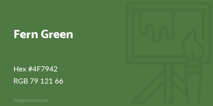
Hex #4F7942
RGB 79 121 66
Jungle Green
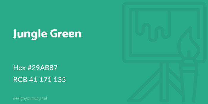
Hex #29AB87
RGB 41 171 135
Laurel Green
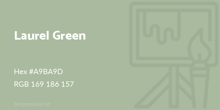
Hex #A9BA9D
RGB 169 186 157
Moss Green
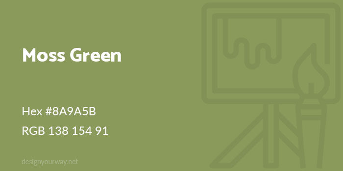
Hex #8A9A5B
RGB 138 154 91
Mint Green
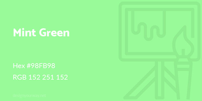
Hex #98FB98
RGB 152 251 152
Pine Green
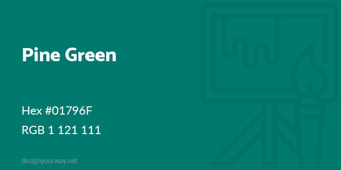
Hex #01796F
RGB 1 121 111
Tea Green
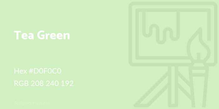
Hex #D0F0C0
RGB 208 240 192
Persian Green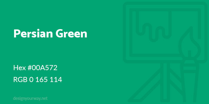
Hex #00A572
RGB 0 165 114
Army Green
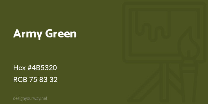
Hex #4B5320
RGB 75 83 32
Emerald Green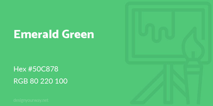
Hex #50C878
RGB 80 220 100
Kelly Green
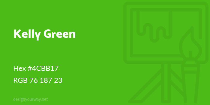
Hex #4CBB17
RGB 76 187 23
Neon Green
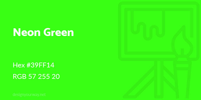
Hex #39FF14
RGB 57 255 20
Uniform Green
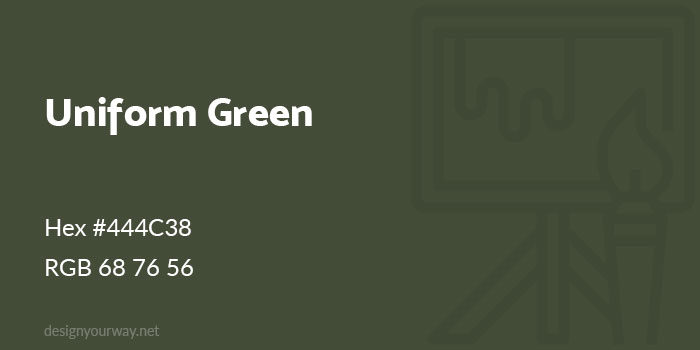
Hex #444C38
RGB 68 76 56
Sacramento Green
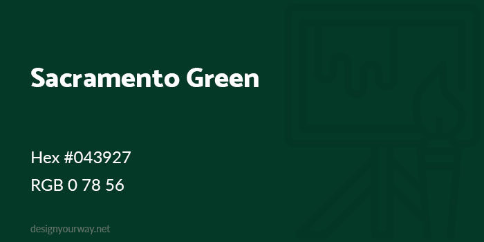
Hex #043927
RGB 0 78 56
Russian Green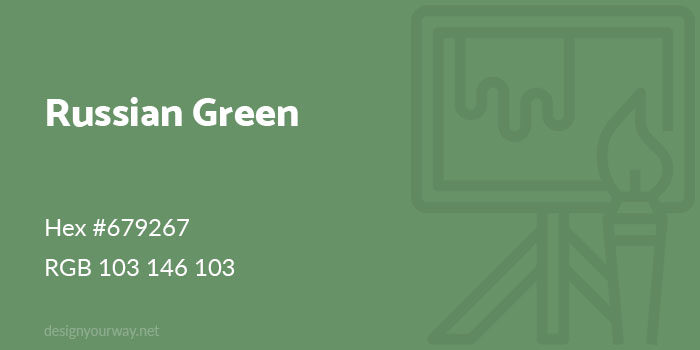
Hex #679267
RGB 103 146 103
Sea Green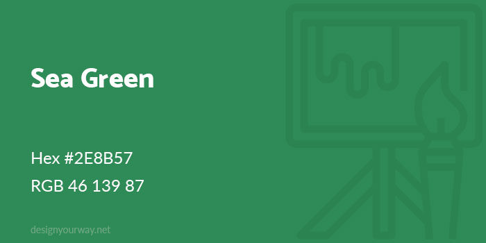
Hex #2E8B57
RGB 46 139 87
Paris Green
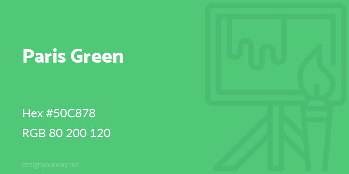
Hex #50C878
RGB 80 200 120
How to use green shades for best results in your designs
Sage Green
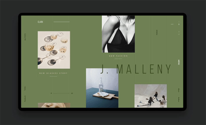
The sage green color is a muted, subtle green with a touch of grey. Sage green is relaxed and washed out. Like a Mediterranean garden waiting patiently for water it will add an atmosphere of dryness to your designs.
Lime Green
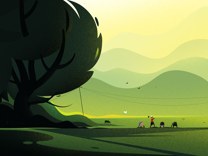
Juicy and citrusy, the lime green color is vibrant and alive. Lime blends green with yellow and has a summery touch. Choose a lime green color when you’re looking for a young, fun and slightly raw element for your designs.
Olive Green
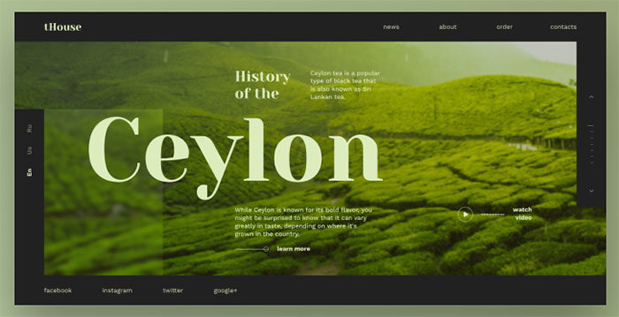
When you think of an olive tree, you’ll probably imagine a dusty climate. No surprise then that the olive green colour is a shade of green which has been mixed with brown. Olive green can be a peaceful and even sophisticated. Olive green sometimes has an old world charm and has been associated with antiquity.
Emerald Green

Like the gem, the emerald green color promises luxury. Rich but very alive, this shade of green is associated with extravagance, wealth and even royalty.
Pear Green
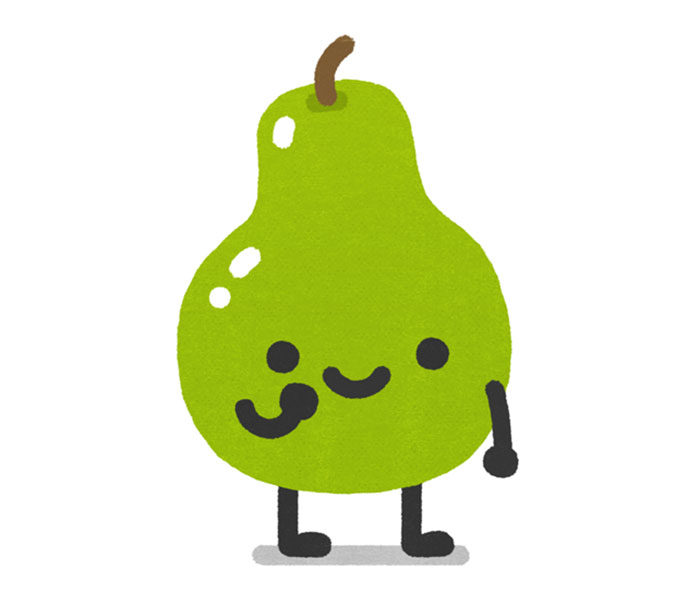
Named after the fruit, pear green is a light green color which blends green with yellow. The color is youthful and happy.
Seafoam green
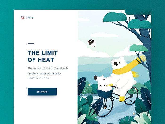
If you’d love to add a touch of beauty to your designs, Seafoam is the perfect choice. From the green color palette, Seafoam reminds viewers of heavenly waters and images of paradise.
Parakeet
Parakeet is a striking choice from the green color palette. This green color is so vivid it appears almost unnatural and yet very vibrant. Use Parakeet designs while working on quirky or unconventional projects which are designed to grab attention.
Mint green

The mint green color code is most similar to traditional green. Like the plant itself, mint is fresh and very alive. It will remind your viewers of springtime days.
Seaweed Green

Perhaps one of the least vibrant choices within the green color codes, seaweed green is dull and very grey. Use this green color when trying to communicate a cool, wintery atmosphere.
Pickle green
Are you using the green color palette to create a traditional and worn in design? If so pickle green would make the perfect choice. The result is juicy but sophisticated.
Crocodile
Can you imagine a green shade of leather? Crocodile is the perfect leathery shade of green for a natural and worn in appearance.
Chartreuse
If you’re looking for a glossy and sophisticated choice amongst the hues of green, Chartreuse is a great choice. Named after liquor, this green color is shared by Absinthe. You’ll love the impact this green color has on your designs.
FAQ about shades of green
What are the different shades of green?
Green isn’t just one color. Explore emerald green, mint green, lime green, forest green, olive green, jade green, moss green, sage green, and more. Each shade carries unique undertones and vibrancy, influencing everything from interior design to fashion trends and even gardening aesthetics.
How do I choose the right shade of green for my home?
Consider the room’s lighting and purpose. For a calming effect, opt for sage green or moss green. If you want energy and vibrancy, lime green or emerald green works well. Utilize Pantone swatches to visualize and ensure harmony with existing decor.
Can green shades be used in seasonal color palettes?
Absolutely! Spring green and lime green for fresh, lively spring decor. Olive green and hunter green fit perfectly into autumn palettes. In fashion trends, green hues are versatile across seasons, offering both warmth and vibrancy depending on the chosen shade.
How do different shades of green affect mood and atmosphere?
Green shades can influence mood significantly. Mint green and sage green promote calm and relaxation, ideal for bedrooms and living areas. Neon green and lime green energize and invigorate, perfect for creative spaces or accent pieces. Color psychology plays a crucial role here.
How do I mix different shades of green in a room?
Start with a dominant shade like forest green on walls. Complement with mint green or olive green in furniture and decor. Use chartreuse green or lime green for accents. Balance is key in interior design to create a cohesive and inviting space.
Are there eco-friendly paint options in shades of green?
Yes, many brands offer eco-friendly paints in various green shades. Look for low-VOC or zero-VOC options to minimize environmental impact. Popular shades like emerald green, sage green, and moss green are available in sustainable formulations, perfect for green architecture projects.
What is the significance of green in nature and gardening?
Green is synonymous with nature. It symbolizes growth, renewal, and vitality. In gardening, shades of green like jade green and mint green highlight different plant varieties and foliage, enhancing the garden’s aesthetic. Understanding green’s role in botany enriches garden design.
How can green be used in fashion design?
Green is a versatile color in fashion design. Emerald green and forest green are popular for elegant attire. Neon green and lime green bring a bold statement to streetwear. Incorporating green hues can add a fresh, dynamic element to any wardrobe, aligning with current fashion trends.
What are the best practices for using green in graphic design?
In graphic design, green can convey freshness and innovation. Use RGB values for digital media: lime green (50, 205, 50) for energetic designs, emerald green (80, 200, 120) for sophistication. Incorporate green hues strategically to create visually appealing and meaningful designs, leveraging color psychology.
Conclusion
xploring the shades of green unveils a world where color meets emotion, design, and nature. Each hue, from emerald green to moss green, carries its unique charm and utility. Whether you’re enhancing your interior design, creating standout graphic design, or delving into fashion trends, understanding these shades is key.
Green’s versatility is unmatched. It can invigorate a space with lime green, soothe with sage green, or evoke elegance with forest green. In gardening, green’s presence is a testament to life and growth, while in art and design, it adds depth and dimension.
Remember, selecting the right green isn’t just about color; it’s about context, mood, and purpose. By mastering the nuances of green, you can transform any project, ensuring it resonates with the desired ambiance and message.
Embrace the spectrum of green. Let it inspire your creativity and enhance your work, making every project a vivid masterpiece.
If you enjoyed reading this article about using a green color palette, you should check out these about HTML color names, shades of blue, shades of red, yellow color palettes, orange color palettes, and shades of pink.

Renowned for his expertise in logo design and visual branding, Bogdan has developed a multitude of logos for various clients.
His skills extend to creating posters, vector illustrations, business cards, and brochures. Additionally, Bogdan's UI kits were featured on marketplaces like Visual Hierarchy and UI8.
He also wrote in the past years on sites like Design Your Way, WebDesignerDepot, WPDean, Designmodo, Speckyboy, Slider Revolution, and more.
- Canva vs PowerPoint: Which Is Better for Presentations? - 22 September 2026
- How to Install Fonts on Mac (Step-by-Step Guide) - 20 September 2026
- From Mockup to Code: How AI-Augmented Development Speeds Up the Design Handoff - 19 September 2026

Bogdan Sandu is a seasoned designer who has been designing websites since 2008. Renowned for his expertise in logo design and visual branding, Bogdan has developed a multitude of logos for various clients. His skills extend to creating posters, vector illustrations, business cards, and brochures. Additionally, Bogdan's UI kits were featured on marketplaces like Visual Hierarchy and UI8. He also wrote in the past years on sites like Design Your Way, WebDesignerDepot, WPDean, Designmodo, Speckyboy, Slider Revolution, and more.
You Might Also Like