Evernote uses Inter as its default UI font, a neo-grotesque sans-serif font designed by Rasmus Andersson. Evernote adopted Inter in January 2024 as part of…
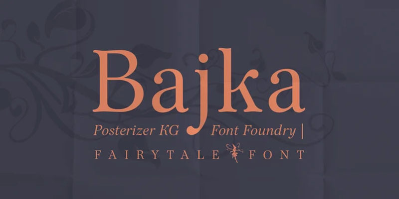
Those flowing, whiplash curves aren’t just pretty decoration. They’re visual echoes of a movement that transformed design forever. Art nouveau fonts capture the organic elegance…
MLA format uses Times New Roman at 12-point size as its standard recommended typeface. It’s a transitional serif font with moderate stroke contrast and bracketed…
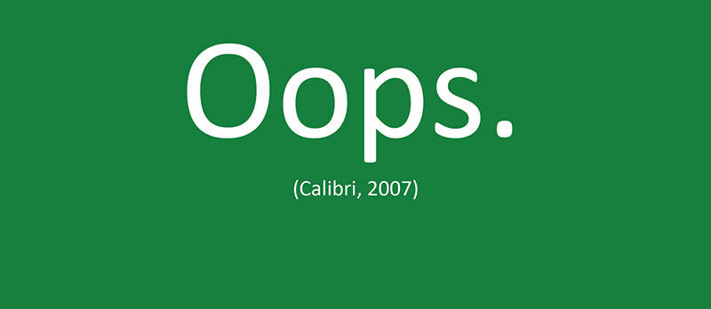
A cover letter should use a clean, readable font set between 10 and 12 points. The most widely recommended options are Calibri, Arial, Times New…
Microsoft Office uses Aptos, a neo-grotesque sans-serif font commissioned by Microsoft and designed by type designer Steve Matteson. Microsoft adopted Aptos in 2023 as the…
Walk past any vintage cinema and you’ll notice something beyond the glowing marquee. The letters themselves tell a story. Movie theater fonts shaped how audiences…
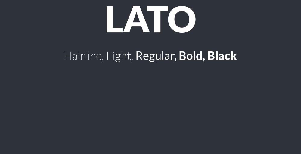
Lato sits in your Google Fonts library waiting to do something interesting, but pairing it wrong turns clean design into visual chaos. This humanist sans-serif…
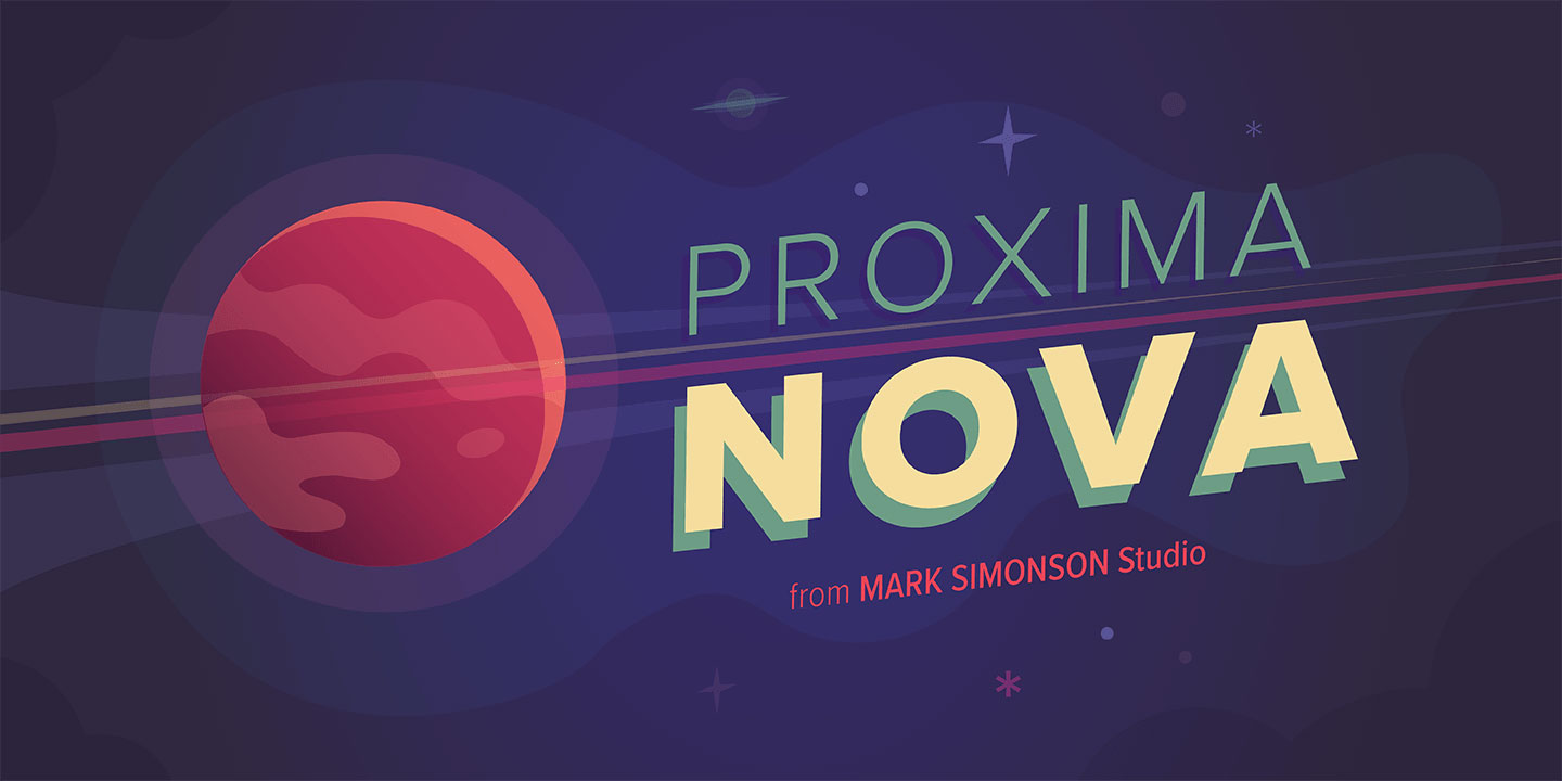
Asana uses Proxima Nova as its primary UI and product font, a geometric sans-serif font designed by Mark Simonson of Mark Simonson Studio. Asana confirmed…
Comics use a range of purpose-built display typefaces designed to mimic hand lettering, with CC Wild Words (by Comicraft) and fonts from Blambot being the…
Skype’s original logo used Arial Rounded MT Bold, a commercial sans-serif font designed by Robin Nicholas and Patricia Saunders, published by Monotype in 1993. For…
APA format does not require a single font. The APA Publication Manual (7th edition) lists 6 approved typefaces, all chosen for legibility and accessibility. Times…
WhatsApp uses Helvetica Neue for its logo wordmark, a neo-grotesque sans-serif font published by Linotype and originally designed by Max Miedinger and Eduard Hoffmann. For…
The Friends logo uses a custom-designed handwritten typeface created specifically for the show. The closest publicly available recreation of it is Gabriel Weiss’ Friends Font,…
The Eras Tour promotional materials use Pistilli Roman, a high-contrast Didone serif font originally designed by Herb Lubalin and John Pistilli in 1964. For the…
Most printed books use serif fonts for body text, with Garamond, Baskerville, Caslon, and Minion Pro being the most common choices across traditional publishing. The…
The Harry Potter book series (US editions) uses Adobe Garamond for body text, set at 12-point size. This is a classic serif font designed by…
Eurostile’s squared letterforms and retro-futuristic aesthetic have dominated tech branding and gaming interfaces since 1962. But licensing costs, overuse, and limited weight options send designers…
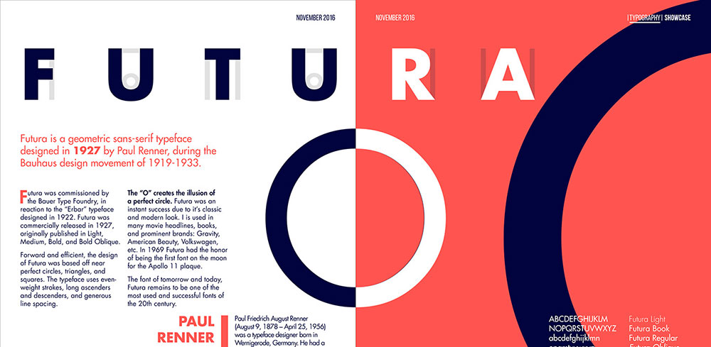
Futura looks stunning on its own, but pair it wrong and your design falls flat. This geometric sans serif typeface demands thoughtful companions. The clean…
There is no single font the Bible is written in. The answer changes depending on the edition, the century, and the publisher. Historically, the Gutenberg…
Your logo fonts speak before your designs ever do. Fashion fonts determine whether brands read as haute couture or fast fashion, luxury or accessible, timeless…
US street signs use Highway Gothic, a sans-serif typeface developed by the Federal Highway Administration (FHWA) and formally called the Standard Alphabets for Traffic Control…
Most sports jerseys use bold, condensed athletic typefaces – either custom fonts built specifically for a team or well-known display fonts like Varsity, Jersey M54,…
Screenplays are written in Courier 12pt, a monospaced slab serif typeface originally designed for IBM typewriters in 1955. Most professional screenwriting software defaults to this…
Doctors most commonly use Arial, a neo-grotesque sans-serif font designed by Robin Nicholas and Patricia Saunders at Monotype Typography in 1982. Arial is the default…
Most diplomas use blackletter typefaces like Old English Text MT for the institution name, paired with a classic serif font like Garamond or Times New…
Lawyers most commonly use Times New Roman, Century Schoolbook, and Garamond for legal documents. The choice depends on the jurisdiction, the document type, and whether…
There is no single font the military uses across all branches and contexts. Different branches, different purposes, and different documents each follow their own typography…
The wrong font can make a banner invisible, even at full size. Whether you’re designing for a trade show display, a vinyl outdoor sign, or…
As of 2025, Walmart uses a custom sans-serif font called Everyday Sans across its stores, digital platforms, and marketing materials. Everyday Sans is a proprietary…
Bluey uses Hello Headline, a bold rounded display typeface designed by Veneta Rangelova and published by DearType, as the primary font across its title cards,…