eBay uses Market Sans, a custom geometric sans-serif font designed exclusively for the brand.
Market Sans was created through a collaboration between eBay’s in-house design team and Dalton Maag, a London-based type design studio. eBay introduced it as part of its broader brand identity system, with the goal of creating a typeface that matched the marketplace’s open, friendly, and global character.
For internal documents and presentations where Market Sans is unavailable, eBay falls back to Poppins, and then to Arial as a secondary fallback. On Android devices, strings in unsupported languages render in Google Sans. On iOS, those same strings switch to San Francisco.
—
What Type of Font Is Market Sans?
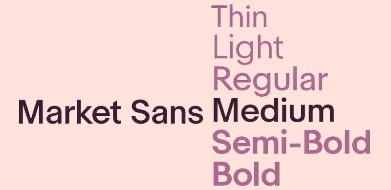
Market Sans sits in a category that mixes two distinct influences: grotesque and geometric design traditions.
Some letterforms echo the structure of classic grotesques like Univers. Others lean into geometric construction, with the open, circular shapes you’d expect from something like GT Walsheim. The result is a typeface that feels clean but not cold.
A few details worth noting:
- The lowercase “u” is spurless, resembling the uppercase version
- Terminal cuts on letters like “c,” “e,” “f,” and “r” are horizontal and vertical, giving the face a structured, stocky feel
- Open letterforms reinforce legibility at small sizes across digital interfaces
eBay uses both Regular and Bold weights across all applications. The typeface supports 10 languages natively: English, German, French, Italian, Spanish, Polish, Portuguese, Czech, Hungarian, and Russian.
Left-aligned type is the standard across eBay’s UI. According to the eBay Playbook, this supports scan-reading and keeps layouts consistent. The baseline and x-height of Market Sans are calibrated for screen readability, particularly at the small sizes common in product listing pages.
—
Who Designed Market Sans?
Dalton Maag designed Market Sans in collaboration with eBay’s internal design team. Dalton Maag is an independent type design studio founded in 1991, based in London with an office in São Paulo.
The foundry has a strong track record in custom corporate typefaces. Their client list includes Nokia, Intel, BMW, Amazon (Bookerly for Kindle), and the Rio 2016 Olympic Games.
Key fact: Market Sans was built specifically for eBay. It is not a licensed or adapted version of an existing retail typeface. It is a wholly proprietary asset created to reflect what eBay describes as a “confident, open marketplace.”
eBay’s engineering team also built a dedicated font-loading module, ebay-font, open-sourced on GitHub, to handle Market Sans delivery efficiently across the platform without affecting page performance.
—
Is Market Sans Free to Use?
No. Market Sans is a proprietary typeface. It is not available for download on Google Fonts, Adobe Fonts, or any public font repository.
eBay owns the typeface outright and does not distribute it under any public license. Designers looking to replicate the visual tone of Market Sans will need to choose an alternative.
The eBay brand guidelines specify Poppins as the official internal substitute when Market Sans is unavailable, so that’s actually the closest officially approved replacement.
—
What Font Did eBay Use Before Market Sans?
eBay’s typographic history has three distinct phases:
| Period | Font | Notes |
| 1995–1997 | Times New Roman | The “AuctionWeb” era; basic, all-caps wordmark with no formal design. |
| 1999–2012 | Univers (Bold) | The iconic “overlapping” logo; symbolized the playful energy of the community. |
| 2012–Present | Univers 53 Extended | Redesigned by Lippincott; cleaner, non-overlapping, and aligned. |
The 2012 rebrand, handled by New York brand consultancy Lippincott, kept Univers for the logo itself but shifted the overall brand system toward a more minimal, structured feel. Market Sans came later as eBay’s UI typeface for the full digital experience.
The original Times New Roman phase is easy to overlook, but it matters for context. eBay started as AuctionWeb in 1995, and the earliest identity was barely a logo at all: just the company name in a default serif font. No designer involved. No brand intent. Just text.
—
What Are the Best Free Alternatives to Market Sans?
Since Market Sans is proprietary, here are 5 typefaces that get close in character and are available at no cost:
| Font | Similarity | License | Source |
| Poppins | Geometric, rounded, clean stroke weight | Free (OFL) | Google Fonts |
| DM Sans | Low-contrast, open apertures, similar feel at small sizes | Free (OFL) | Google Fonts |
| Inter | Designed for screen legibility, very similar x-height | Free (OFL) | Google Fonts |
| Nunito | Rounded terminals, approachable weight distribution | Free (OFL) | Google Fonts |
| Work Sans | Grotesque base, optimized for screen use | Free (OFL) | Google Fonts |
Poppins is the most direct substitute. eBay itself recommends it as the fallback, which tells you something. Inter is probably the better choice if screen legibility is the priority over warmth.
All 5 are available through Google Fonts and cleared for commercial use.
—
How to Use Market Sans Alternatives in Design Tools
In Figma and Sketch
Inter and DM Sans are available natively through Google Fonts integration in Figma. No installation needed. Just search the font name in the text panel.
If you’re using a local install, adding fonts to Figma requires the Figma desktop app. Install the font system-wide first, then restart the app.
In Canva
Poppins and Nunito are both available in Canva’s default font library. If you have a Canva Pro account, you can also upload custom fonts to Canva and use them across brand kits.
For Web Use (CSS)
Here’s a basic font-stack that mirrors eBay’s approach, using Inter as the primary custom font:
“ font-family: "Inter", "Helvetica Neue", Arial, sans-serif; `
eBay’s own fallback stack in its open-source ebay-font module is: Market Sans, Arial, sans-serif. Swap Market Sans for Inter or DM Sans and you get a near-identical rendering behavior on most operating systems.
Google Fonts provides a straightforward embed method. Add the import link to your stylesheet, then call the font by name in your CSS rules.
—
Why Did eBay Choose Market Sans?
The short answer: Univers worked for the logo, but it wasn’t built for a digital-first product experience at scale.
eBay’s design team commissioned Market Sans to solve a specific problem: they needed a typeface that could carry the brand across every touchpoint, from app notifications to seller hub dashboards, without losing legibility or warmth.
Three design decisions behind the choice:
- Open geometry: The wide apertures and circular shapes keep letterforms distinct at small pixel sizes, important for mobile product listings
- Personality without quirkiness: eBay’s platform is used by both casual buyers and high-volume sellers. The typeface needed to feel approachable but not casual
- Global character support: Market Sans covers eBay’s 10 major market languages within a single consistent design system
According to eBay’s Playbook, the font is described as “consistent, familiar, and open.” Those aren’t just marketing words. They map directly to specific type decisions: the uniform stroke weight, the lack of decorative serifs, the neutral but not sterile letterforms.
Understanding how font psychology shapes user perception helps explain this. A geometric sans-serif at this weight reads as trustworthy and modern. A serif font would have read as formal. A heavily humanist face might have felt too casual for a marketplace handling millions of transactions daily.
The visual hierarchy across eBay’s interface relies entirely on Market Sans weight variations, Regular for body copy and Bold for product titles, prices, and calls to action. No second typeface needed. That’s actually the cleaner approach for a brand identity system at this scale.
Other major marketplaces and payment platforms have taken a similar path. The PayPal font and Amazon font both follow a custom or semi-custom sans-serif approach for the same reasons: consistency across devices, legibility at scale, and brand differentiation without visual noise.
If you’re curious how this compares to other major platforms, the Etsy font and Walmart font both made similar moves toward clean, purpose-built sans-serif typefaces as their digital interfaces matured.
FAQ on The What Font Does eBay Use
What is the official font used by eBay?
eBay uses Market Sans, a custom geometric sans-serif typeface.
It was designed exclusively for eBay by the London-based type studio Dalton Maag, in collaboration with eBay’s internal design team. It is not available to the public.
Is Market Sans available for free download?
No. Market Sans is a proprietary typeface owned by eBay Inc.
It is not listed on Google Fonts, Adobe Fonts, or any public font repository. You cannot legally download or use it outside of eBay’s brand system.
What font does the eBay logo use?
The eBay logo uses Univers 53 Extended, a neo-grotesque sans-serif font designed by Adrian Frutiger.
Lippincott, a New York brand consultancy, applied it during the 2012 rebrand. The logo typeface is separate from Market Sans, which covers the broader UI and brand system.
What font is closest to Market Sans?
Poppins is the closest free alternative. eBay officially recommends it as the internal fallback when Market Sans is unavailable.
DM Sans and Inter are strong alternatives too, especially for screen-focused design work.
Who designed the Market Sans typeface?
Dalton Maag designed Market Sans alongside eBay’s in-house design team.
Dalton Maag is an independent London foundry known for custom corporate typefaces, including work for Nokia, Amazon Kindle, and the Rio 2016 Olympic Games.
What font did eBay use before Market Sans?
The eBay logo has used Univers since 1999, first in a bold overlapping style, then in the cleaner 53 Extended weight from 2012 onward.
Before that, the earliest eBay wordmark used Times New Roman, a basic serif font with no formal design intent behind it.
What fallback fonts does eBay use on its website?
eBay’s CSS font stack is: Market Sans, Arial, sans-serif.
For internal documents and presentations, eBay specifies Poppins first, then Arial. On Android, unsupported language strings fall back to Google Sans. On iOS, they switch to San Francisco.
What type classification is Market Sans?
Market Sans blends grotesque and geometric design traditions.
It has uniform stroke weight, open letterforms, and spurless terminals. The result sits between a clean functional grotesque and the rounder feel of a geometric sans-serif.
Does eBay use the same font on mobile and desktop?
Yes, Market Sans is used across both desktop and mobile platforms wherever supported.
For languages outside Market Sans’s character set, Dutch, Chinese, Japanese, and Korean, the app falls back to Google Sans on Android and San Francisco on iOS automatically.
How does eBay’s font choice compare to other marketplaces?
Most major platforms have moved toward custom or semi-custom geometric sans-serif typefaces for the same reasons eBay did: screen legibility, brand consistency, and typographic hierarchy without a second typeface.
The Etsy font and Amazon font follow a comparable approach across their digital interfaces.
Conclusion
If you’ve been asking what font does eBay use, the answer is Market Sans, a proprietary geometric sans-serif typeface built specifically for the eBay brand system by Dalton Maag.
The eBay logo itself runs on Univers 53 Extended, while Poppins serves as the official fallback across internal documents and presentations.
Neither typeface is publicly available, but free alternatives like Inter and Work Sans come close in weight, aperture, and overall screen font behavior.
For any project where eBay’s clean, marketplace-ready typography is the reference point, those are your best starting options.

Renowned for his expertise in logo design and visual branding, Bogdan has developed a multitude of logos for various clients.
His skills extend to creating posters, vector illustrations, business cards, and brochures. Additionally, Bogdan's UI kits were featured on marketplaces like Visual Hierarchy and UI8.
He also wrote in the past years on sites like Design Your Way, WebDesignerDepot, WPDean, Designmodo, Speckyboy, Slider Revolution, and more.
- Best Visual Regression Testing Tools for Web and App Design in 2026 - 13 October 2026
- Jujutsu Kaisen Font Generator - 12 October 2026
- The Windsurf Logo History, Colors, Font, And Meaning - 10 October 2026

Bogdan Sandu is a seasoned designer who has been designing websites since 2008. Renowned for his expertise in logo design and visual branding, Bogdan has developed a multitude of logos for various clients. His skills extend to creating posters, vector illustrations, business cards, and brochures. Additionally, Bogdan's UI kits were featured on marketplaces like Visual Hierarchy and UI8. He also wrote in the past years on sites like Design Your Way, WebDesignerDepot, WPDean, Designmodo, Speckyboy, Slider Revolution, and more.
You Might Also Like