Times New Roman dominated office documents and academic papers for decades, but it’s far from your only option.
If you need fonts similar to Times New Roman, you’re probably looking for that same professional serif elegance without the overused appearance. Maybe you’re tired of the default, or you need something that performs better on screens, or you just want to stand out slightly while maintaining traditional credibility.
This guide presents 17 serif alternatives that share Times New Roman’s core strengths: readability at text sizes, formal authority, and reliable performance across print and digital applications.
You’ll discover everything from classic Renaissance revivals like Garamond and Baskerville to modern screen-optimized options like Georgia and Cambria. Each entry breaks down the specific characteristics, use cases, and availability so you can choose the right typeface for your project.
Whether you’re designing a resume, formatting an academic paper, or building a content-heavy website, these alternatives deliver professional results.
Fonts Similar To Times New Roman
| Font Name | Classification | Best Use Case | Availability |
|---|---|---|---|
| Georgia | Transitional serif, wider letterforms | Digital screens, web typography | System font (Windows/Mac) |
| Garamond | Old-style serif, refined elegance | Books, luxury branding, editorial | System font (varies by version) |
| EB Garamond | Open-source Garamond revival | Web projects, free alternatives | Free (Google Fonts) |
| Palatino | Old-style serif, humanist design | Academic papers, body text | System font (Mac/Windows) |
| Minion Pro | Professional old-style serif | Professional publishing, magazines | Adobe Fonts subscription |
| Book Antiqua | Palatino-inspired alternative | Business documents, reports | System font (Windows) |
| Plantin | Old-style serif, Renaissance-inspired | High-end printing, literature | Commercial license required |
| Cambria | Modern serif, screen-optimized | Microsoft Office documents | System font (Windows/Office) |
| Merriweather | Transitional serif, large x-height | Web readability, blog posts | Free (Google Fonts) |
| PT Serif | Transitional serif, Cyrillic support | Multilingual content, web text | Free (Google Fonts) |
| Source Serif | Open-source transitional serif | Code documentation, technical writing | Free (Adobe/Google Fonts) |
| Bodoni | Modern serif, high contrast | Fashion, luxury displays, headers | Various (system/commercial) |
| Nimbus Roman | Times New Roman clone | Open-source projects, LaTeX | Free (URW++) |
| Arno Pro | Professional old-style serif | Book typography, long-form text | Adobe Fonts subscription |
| Baskerville | Transitional serif, sharp details | Literary works, editorial design | System font (Mac) |
| Libre Baskerville | Open-source Baskerville variant | Web typography, free projects | Free (Google Fonts) |
| Charis SIL | Multilingual serif, extensive glyphs | Linguistic research, international text | Free (SIL Open Font License) |
Georgia
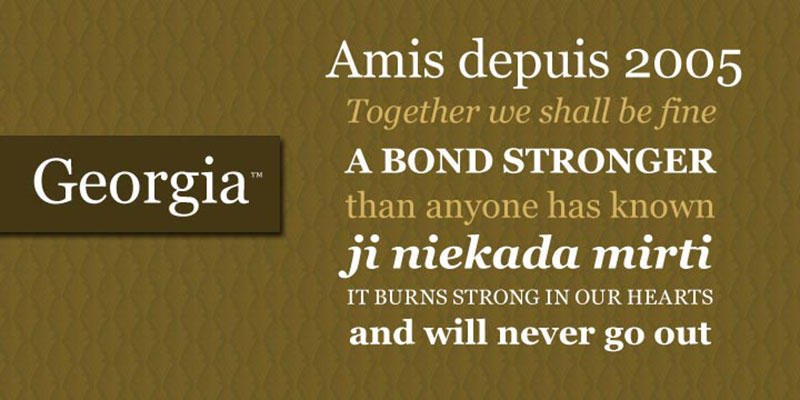
Georgia is a transitional serif typeface designed by Matthew Carter in 1993 and released by Microsoft in 1996 as part of the Core Fonts for the Web collection.
Key Characteristics
Large x-height enhances screen legibility.
Carter designed thicker hairlines and reduced stroke contrast compared to print-optimized serifs. Strong horizontal top serifs on lowercase letters like b, d, h, k, and l reference Scotch Roman models from the early 1800s.
Ball terminals appear on characters like lowercase a and c. The design uses text figures (old-style numerals) that blend naturally into running text.
Rounded, open letterforms with substantial counters maintain clarity at small sizes. Georgia’s darker color and taller stance distinguish it from more delicate Renaissance revivals.
Similarity to Times New Roman
Both are transitional serif designs optimized for text use. Georgia shares Times New Roman’s workhorse versatility across print and digital applications.
The larger x-height and bolder weight make Georgia appear taller and more robust at matching point sizes. Where Times New Roman uses lining figures, Georgia defaults to text figures.
Carter’s design diverges from Times New Roman by prioritizing screen display over print density. Georgia’s reduced stroke contrast prevents thin strokes from disappearing on low-resolution screens.
Best Use Cases
Body text for websites and digital publications (New York Times switched from Times New Roman to Georgia in 2007).
Long-form articles, blog posts, and online magazines where extended reading occurs on screens. Resumes and business correspondence where clarity matters more than conserving space.
Print applications including books and wedding invitations. The typeface scales well from caption sizes to display use.
Readability & Performance
Engineered specifically for low-resolution screen display in the 1990s. Higher x-height improves legibility at small sizes compared to Times New Roman.
Even texture across paragraphs due to open counters and balanced proportions. True italic with single-story a and g, not just slanted roman characters.
Availability & Licensing
Pre-installed on Windows and macOS systems. Available through Adobe Fonts, Google Fonts alternatives exist.
Georgia Pro (released 2011) includes additional weights, condensed variants, and extended character sets but requires purchase or Windows 10+ download.
Notable Differences from Times New Roman
8-10% wider at the same point size.
Ascenders rise above cap height. Flatter serif endings rather than Times New Roman’s sharper terminations.
Diagonal axis less pronounced in characters like lowercase g.
Garamond

Garamond represents multiple typeface revivals based on 16th-century designs by French punchcutter Claude Garamond, working circa 1530-1561.
Key Characteristics
Old-style serif structure with organic, pen-influenced letterforms. Moderate stroke contrast between thick and thin elements.
Scooped and rounded serifs, particularly visible on lowercase letters. Slanted stress angle reflecting broad-nib pen construction.
Small, delicate proportions compared to later transitional designs. Lowercase e features a distinctively slanted crossbar reminiscent of handwriting.
Top serifs on lowercase b, d, h, k, and l curve back gracefully. Relatively low x-height with long ascenders and descenders.
Similarity to Times New Roman
Both serve as reliable text typefaces for extended reading. Traditional serif structure conveys authority and formality in professional documents.
Garamond influenced many later designs, including aspects of Times New Roman’s structure. The two share applicability for book typography and scholarly publishing.
Best Use Cases
Book body text, particularly for literary works and fine editions. Academic publications, textbooks, and dissertations.
Corporate communications where understated elegance matters. Magazine layouts and editorial design for sophisticated audiences.
Readability & Performance
Highly legible at text sizes when properly spaced. Requires careful leading due to low x-height.
Works best in print or high-resolution digital displays. Thin strokes can appear weak on low-resolution screens.
Availability & Licensing
Multiple versions exist: Adobe Garamond (Robert Slimbach, 1989), Garamond Premier Pro, ITC Garamond, Stempel Garamond. System versions included with various operating systems and Adobe applications.
EB Garamond available as open-source alternative.
Notable Differences from Times New Roman
More delicate and refined appearance. Lower x-height requires larger point sizes for equivalent readability.
Less stroke contrast and lighter overall color. Garamond’s Renaissance origins predate Times New Roman’s 1930s design by centuries.
EB Garamond
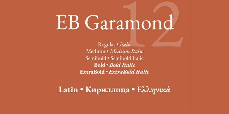
EB Garamond is an open-source digital revival of Claude Garamond’s work, developed as a community project and released under the SIL Open Font License.
Key Characteristics
Based on historical specimens from the Egenolff-Berner foundry (1592). Classic old-style proportions with moderate contrast.
Delicate serifs and calligraphic character reflect Renaissance origins. Multiple weights and optical sizes available in recent releases.
Extensive character set supports numerous languages. True italics based on Robert Granjon’s designs, not Garamond’s work.
Similarity to Times New Roman
Shares traditional serif structure suitable for long-form text. Both function as workhorse typefaces for professional documents.
EB Garamond’s historical authenticity contrasts with Times New Roman’s 20th-century efficiency, but both serve similar roles in typography.
Best Use Cases
Digital publications requiring authentic period character. Print books, especially literary editions and historical texts.
Projects needing cost-free licensing with extensive language support. Websites and applications prioritizing traditional aesthetics.
Readability & Performance
Performs best at 10pt and larger for body text. Requires high-resolution displays or print for optimal rendering.
Delicate strokes may appear thin on standard screens. Generous spacing improves performance at text sizes.
Availability & Licensing
Free download from Google Fonts and other repositories. SIL Open Font License permits commercial and personal use without restrictions.
Notable Differences from Times New Roman
Significantly lighter weight and more refined appearance. Lower x-height than Times New Roman demands larger sizes.
More historical character versus Times New Roman’s newspaper practicality.
Palatino
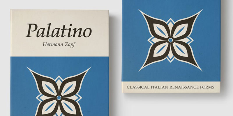
Palatino is an old-style serif typeface designed by Hermann Zapf between 1948-1950 for D. Stempel AG, named after 16th-century Italian calligrapher Giambattista Palatino.
Key Characteristics
Based on humanist typefaces of the Italian Renaissance with calligraphic influences. Larger x-height than most Renaissance revivals improves legibility.
Moderate stroke contrast with flared serifs. Open counters and balanced proportions optimize readability.
Distinctive sharp kink at the base of lowercase a. Uppercase Q features a descender connected only tangentially.
Shallow bowls rising from the left on lowercase letters like c, d, and f. Unusual “palm Y” capital inspired by Greek upsilon.
Similarity to Times New Roman
Both function as versatile text typefaces across print and digital media. Palatino matches Times New Roman’s professional tone without appearing dated.
The two share moderate proportions and reliable performance at text sizes. Palatino became one of the core PostScript fonts alongside Times New Roman in 1984.
Best Use Cases
Book typography, particularly for text-heavy publications. Academic documents, reports, and dissertations.
Business correspondence where traditional appearance matters. Headings and subheadings in mixed-typography layouts.
Readability & Performance
Optimized for legibility even on inferior post-WWII paper quality. Performs well across print and digital applications.
Larger proportions than typical Renaissance revivals reduce eyestrain. Well-suited for extended reading sessions.
Availability & Licensing
Included with macOS and many Adobe applications. Palatino Linotype bundled with Windows 2000 and later.
Various versions exist: Palatino Nova (redesigned by Zapf and Akira Kobayashi), Book Antiqua (Microsoft’s version), URW Palladio (open-source alternative).
Notable Differences from Times New Roman
Wider character width and more calligraphic personality. Less compact than Times New Roman, consuming more space at equivalent sizes.
Warmer, more organic appearance versus Times New Roman’s efficient crispness.
Minion Pro
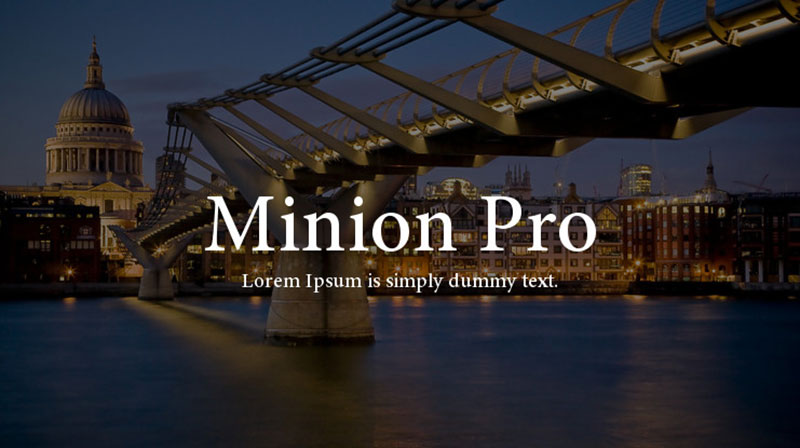
Minion Pro is an Adobe Originals typeface designed by Robert Slimbach, first released in 1990 and expanded to OpenType format in 2000.
Key Characteristics
Inspired by late Renaissance typefaces, particularly Aldine romans. Old-style serif with moderate proportions and slightly condensed width.
Simplified structure prioritizes readability while maintaining period character. Large counters and apertures enhance legibility.
Four optical sizes: Caption, Regular, Subhead, and Display. Multiple weights from Regular to Bold, with corresponding italics.
Extensive OpenType features include small caps, old-style figures, swashes, ligatures. Supports Latin, Greek, and Cyrillic scripts.
Similarity to Times New Roman
Both serve as reliable text faces for professional documents. Minion shares Times New Roman’s neutrality without calling attention to itself.
Similar functionality for books, magazines, and reports. The two typefaces compare closely in practical applications like academic publications.
Best Use Cases
Book body text across fiction and non-fiction genres. Academic publications, textbooks, and scholarly journals.
Corporate identity materials and annual reports. Long-form digital documents and e-books.
Used by Smithsonian, multiple universities (Leiden, Otago, Brown), and publishers like John Benjamins.
Readability & Performance
Designed specifically for legibility in extended text. Optical size variants optimize appearance at different scales.
Balanced, even texture across paragraphs. Works effectively in both print and high-quality digital displays.
Availability & Licensing
Available through Adobe Fonts subscription. Included with Adobe Creative Cloud applications.
Separate licensing available for embedding in applications and e-books.
Notable Differences from Times New Roman
Slightly narrower width conserves space without sacrificing readability. More refined details and sophisticated character design.
Higher x-height than traditional Renaissance models but still lower than Times New Roman. Richer feature set through OpenType capabilities.
Book Antiqua
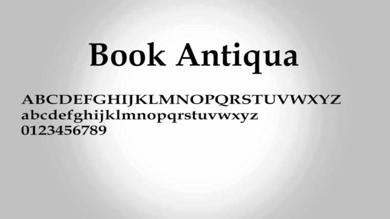
Book Antiqua is Monotype’s PostScript clone of Palatino, distributed with Microsoft Windows and Office beginning in the 1990s.
Key Characteristics
Based on Palatino’s Renaissance-influenced design. Old-style serif with moderate contrast and balanced proportions.
Open counters and humanist construction. Nearly indistinguishable from Palatino apart from subtle detail differences.
Available in Regular, Italic, Bold, and Bold Italic weights. Standard character set for Western European languages.
Similarity to Times New Roman
Functions as a traditional text typeface for professional documents. Both come pre-installed on Windows systems.
Book Antiqua provides similar formality and authority to Times New Roman. The two serve comparable roles in business and academic contexts.
Best Use Cases
Resumes and cover letters where distinctive but professional appearance helps. Reports and presentations when variety from Times New Roman desired.
Print documents requiring traditional serif aesthetics. Projects where Palatino licensing unavailable but similar appearance needed.
Readability & Performance
Shares Palatino’s legibility characteristics. Performs well in print and high-resolution digital displays.
Wider than Times New Roman, creating more open appearance. Works best at 10pt and larger for body text.
Availability & Licensing
Pre-installed with Microsoft Office applications. Included with Windows operating systems.
Licensed by Monotype for system distribution.
Notable Differences from Times New Roman
More calligraphic character and humanist warmth. Slightly larger at matching point sizes.
Book Antiqua’s Renaissance influences contrast with Times New Roman’s 20th-century efficiency.
Plantin
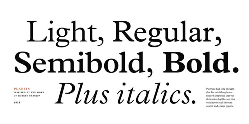
Plantin is a Linotype typeface designed by F.H. Pierpont around 1913, named after 16th-century Antwerp printer Christophe Plantin.
Key Characteristics
Old-style serif based on 16th-century French types. Moderate stroke contrast with sturdy construction.
Larger x-height than many Renaissance revivals. Robust serifs withstand printing on coated papers.
Slightly condensed proportions. Strong vertical stress with organic character details.
Originally designed for letterpress printing on coated stock.
Similarity to Times New Roman
Both provide reliable text performance across printing conditions. Stanley Morison used Plantin as the model when designing Times New Roman.
Times New Roman essentially represents a compressed, refined version of Plantin. The family relationship explains many structural similarities.
Best Use Cases
Magazine and newspaper body text. Books printed on coated paper stock.
Corporate communications and marketing materials. Print advertising where traditional serif aesthetics required.
Readability & Performance
Excellent legibility in print applications. Sturdy construction prevents delicate details from filling in.
Performs well at small sizes typical of magazine text. Higher x-height aids readability compared to Renaissance models.
Availability & Licensing
Available through Monotype and Adobe font libraries. Not typically included as system font.
Requires commercial license for most applications.
Notable Differences from Times New Roman
Less condensed width requires more space. Slightly warmer, more organic character than Times New Roman’s crispness.
Plantin maintains Renaissance charm while Times New Roman emphasizes efficiency.
Cambria
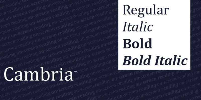
Cambria is a transitional serif typeface designed by Dutch designer Jelle Bosma in 2004 with input from Steve Matteson and Robin Nicholas, commissioned by Microsoft as part of the ClearType Font Collection.
Key Characteristics
Transitional design with vertical stress. Moderate stroke contrast balances screen and print performance.
Strong diagonal and vertical hairlines and serifs. Small horizontal serifs emphasize stroke endings rather than standing out independently.
Even spacing and proportions create uniform text texture. Open apertures aid legibility at small sizes.
Designed for optimal rendering with Microsoft ClearType technology. Available in Regular, Italic, Bold, and Bold Italic weights.
Cambria Math variant supports mathematical and scientific notation.
Similarity to Times New Roman
Bosma designed Cambria as a potential Times New Roman replacement. Both function as versatile workhorses for text in diverse applications.
Share transitional classification and vertical stress. Similar professional tone suitable for formal documents.
Both come bundled with Windows and Office, ensuring universal availability.
Best Use Cases
Business documents, reports, and presentations. Academic papers and theses across disciplines.
On-screen reading in digital documents. Mathematical and technical writing using Cambria Math.
Body text in both print and digital formats. Default choice in many European technical standards (including EN 301 549).
Readability & Performance
Optimized for screen display at 11-14 pixel heights. Performs well when printed at small sizes.
Even texture across paragraphs prevents visual fatigue. Some designers find it monotonous in extended print use.
Availability & Licensing
Bundled with Windows Vista and later operating systems. Included with Microsoft Office applications.
Available through Adobe Fonts. Licensed by Ascender Corporation and Monotype Imaging for device manufacturers.
Notable Differences from Times New Roman
Wider character width creates more open appearance. Reduced contrast compared to Times New Roman.
More contemporary design reflecting early 21st-century aesthetics. Cambria’s vertical stress more pronounced than Times New Roman’s subtle diagonal.
Merriweather
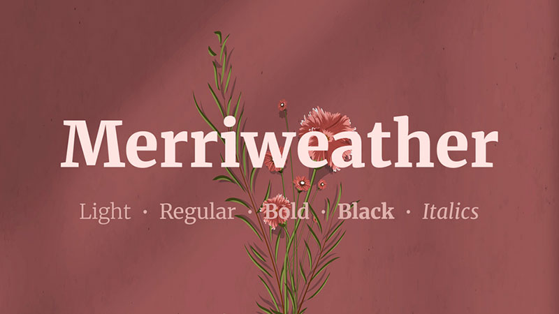
Merriweather is an open-source serif typeface designed by Eben Sorkin, commissioned by Google Fonts and released in 2013.
Key Characteristics
Large x-height and slightly condensed proportions. Semi-condensed character widths optimize space efficiency.
Moderate contrast with sturdy serifs. Open apertures and generous spacing enhance screen legibility.
Available in Regular, Italic, Bold, Bold Italic, Light, Light Italic, Black, and Black Italic. Includes both lining and old-style figures.
Designed specifically for comfortable on-screen reading.
Similarity to Times New Roman
Both prioritize legibility in text-size applications. Semi-condensed proportions echo Times New Roman’s space-efficient design.
Traditional serif structure appeals to similar audiences. Merriweather provides modern alternative maintaining Times New Roman’s functional benefits.
Best Use Cases
Website body text and long-form digital articles. Blog posts and content-heavy web applications.
E-books and digital publications. Screen-first projects requiring open-source licensing.
Print materials when free licensing required.
Readability & Performance
Designed for LCD screens with extensive testing at text sizes. Large x-height maintains legibility at smaller point sizes.
Performs adequately in print though optimized for screens. Slightly heavier weight than Times New Roman aids screen rendering.
Availability & Licensing
Free through Google Fonts. SIL Open Font License permits commercial use without restrictions.
Easy integration into web projects via Google Fonts API.
Notable Differences from Times New Roman
More condensed than Times New Roman despite larger x-height. Slightly darker overall color on page.
Contemporary design lacking Times New Roman’s mid-century character. More suitable for digital-first applications than print.
PT Serif

PT Serif is an open-source transitional serif typeface designed by Alexandra Korolkova, Olga Umpeleva, and Vladimir Yefimov at ParaType, released in 2010 as part of the “Public Types of Russian Federation” project.
Key Characteristics
Transitional serif design with moderate contrast. Humanist terminals rather than ball terminals distinguish it from similar designs.
Large x-height optimized for text legibility. Open counters and generous apertures.
Available in Regular, Italic, Bold, and Bold Italic weights. Includes PT Serif Caption variant for small sizes.
Extensive language support including Cyrillic and Latin scripts. Designed to support literacy initiatives across Russian Federation.
Similarity to Times New Roman
Both transitional designs suitable for extended text reading. Similar professional appearance for formal documents.
PT Serif matches Times New Roman’s reliability across print and digital media. The two function as interchange options in multilingual contexts.
Best Use Cases
Multilingual documents requiring Cyrillic support. Website body text, particularly for content in multiple languages.
Educational materials and textbooks. Government and institutional communications.
Print publications when open-source licensing required.
Readability & Performance
Designed explicitly for high legibility across media. Caption variant optimizes appearance at small sizes.
Large x-height aids readability at text sizes. Works well in both print and screen applications.
Availability & Licensing
Free via Google Fonts. SIL Open Font License allows commercial and personal use.
ParaType offers additional font families in PT suite.
Notable Differences from Times New Roman
Humanist terminals create softer appearance. Slightly more contemporary feel than Times New Roman.
PT Serif’s Cyrillic script development received equal attention to Latin characters.
Source Serif
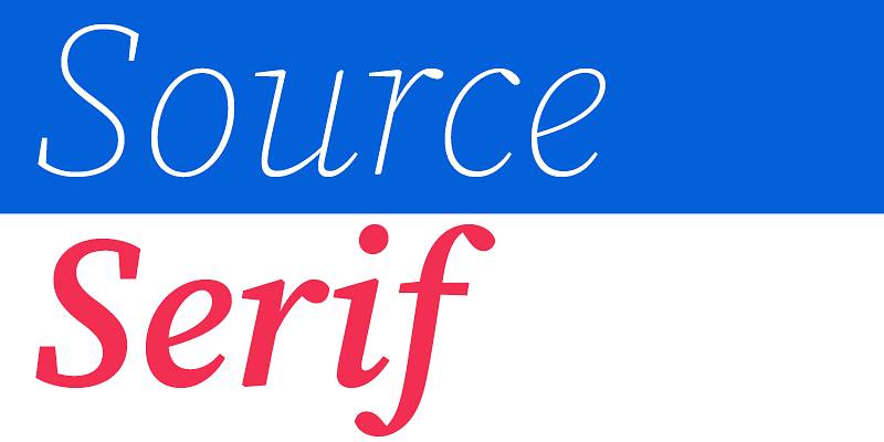
Source Serif is an open-source serif typeface designed by Frank Grießhammer and released by Adobe in 2014 as a companion to Source Sans.
Key Characteristics
Transitional design with moderate stroke contrast. Relatively large x-height for improved legibility.
Calligraphic details derived from broad-nib pen writing. Multiple weights: ExtraLight through Black with corresponding italics.
Optical size variants optimize appearance at different scales. Extensive OpenType features including alternates, fractions, ligatures.
Supports broad range of languages and writing systems.
Similarity to Times New Roman
Both serve as versatile text typefaces for professional use. Transitional classification provides similar formality and authority.
Source Serif offers modern interpretation of traditional serif principles Times New Roman embodies. The two function comparably in print and digital documents.
Best Use Cases
Body text for books, magazines, and reports. Academic documents and scholarly publications.
Digital publications and e-books. Websites requiring elegant serif option with open-source license.
Print materials across commercial and editorial contexts.
Readability & Performance
Designed for clarity at text sizes. Optical size variants maintain quality across size ranges.
Large x-height aids legibility especially in smaller sizes. Performs well in both print and screen applications.
Availability & Licensing
Free via Adobe Fonts and Google Fonts. SIL Open Font License permits commercial use.
GitHub repository allows customization and contribution.
Notable Differences from Times New Roman
More contemporary design reflecting early 21st-century aesthetics. Slightly wider proportions than Times New Roman.
Richer feature set through OpenType capabilities. Multiple optical sizes versus Times New Roman’s single design.
Bodoni
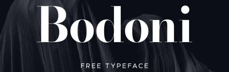
Bodoni represents multiple typeface revivals based on designs by Italian punchcutter Giambattista Bodoni (1740-1813).
Key Characteristics
Modern classification with high stroke contrast. Vertical stress with mathematical precision.
Hairline serifs with minimal bracketing. Dramatic difference between thick and thin strokes.
Geometric, constructed letterforms rather than calligraphic origins. Elegant, refined appearance intended for display applications.
Various digital versions: ITC Bodoni, Bodoni MT, Bauer Bodoni, others.
Similarity to Times New Roman
Both serve as traditional serif options for formal contexts. Times New Roman incorporates some modern features though classified as transitional.
The two share use in prestigious publications requiring authoritative appearance. Both represent specific historical moments in type design evolution.
Best Use Cases
Headlines and display typography in fashion, luxury branding. Magazine mastheads and section openers.
Wedding invitations and formal announcements. Limited use in body text at larger sizes.
Logos and branding requiring elegance and sophistication.
Readability & Performance
Not optimal for extended body text due to high contrast. Thin strokes can disappear at small sizes or on screens.
Excellent in display applications at large sizes. Works best in print rather than digital contexts.
Availability & Licensing
Various versions available through commercial foundries. Some variants included with Adobe applications.
Public domain versions exist with varying quality levels.
Notable Differences from Times New Roman
Significantly higher stroke contrast. Bodoni’s modern classification versus Times New Roman’s transitional design.
More suitable for display than text. Bodoni’s neoclassical elegance contrasts with Times New Roman’s newspaper practicality.
Nimbus Roman
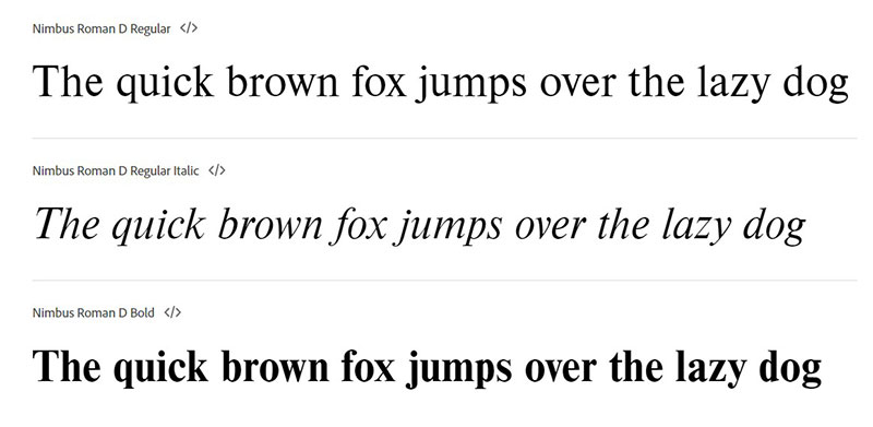
Nimbus Roman is URW++’s PostScript alternative to Times Roman, developed as part of the Ghostscript project.
Key Characteristics
Transitional serif based on Times New Roman/Times Roman structure. Moderate stroke contrast with diagonal stress.
Economical character width optimized for space efficiency. Standard weights: Regular, Italic, Bold, Bold Italic.
Designed as metric-compatible alternative to Times. Released under open-source license for Ghostscript use.
Similarity to Times New Roman
Intentionally designed to match Times New Roman proportions and appearance. Nearly identical metrics allow document substitution without reflow.
Both serve identical functional roles in documents. Nimbus Roman provides open-source alternative where Times New Roman licensing unavailable.
Best Use Cases
Open-source software applications requiring Times New Roman substitute. Linux and Unix system documents.
PDF generation where Times licensing creates issues. Projects requiring free alternative to Times New Roman.
Readability & Performance
Matches Times New Roman’s proven legibility characteristics. Performs similarly across print and digital applications.
Suitable for same contexts as Times New Roman.
Availability & Licensing
Available through URW++ and Ghostscript. Various open-source licenses depending on version.
Included with many Linux distributions.
Notable Differences from Times New Roman
Minimal differences in appearance and function. Some subtle distinctions in character details.
Open licensing versus Times New Roman’s commercial restrictions.
Arno Pro
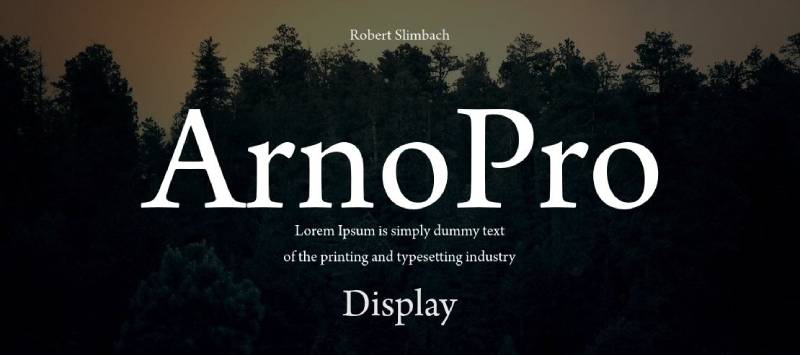
Arno Pro is an Adobe Originals typeface designed by Robert Slimbach and released in 2007.
Key Characteristics
Old-style serif inspired by Venetian types of 15th-16th centuries. Multiple optical sizes from Caption through Display.
Eight weights from Regular through Black with italics. Calligraphic details reflect broad-nib pen construction.
Extensive OpenType features including small caps, alternates, swashes, ornaments. Supports Western, Central European, and Cyrillic scripts.
More decorative and eclectic than Slimbach’s Minion design.
Similarity to Times New Roman
Both function as text typefaces for professional publications. Traditional serif structure provides similar authority and formality.
Arno Pro’s Venetian roots parallel Times New Roman’s historical references. The two serve comparable roles in book typography.
Best Use Cases
Fine book typography and literary editions. Magazine editorial design and feature articles.
Corporate reports and annual publications. Print advertising requiring sophisticated serif character.
Projects where decorative details enhance rather than distract.
Readability & Performance
Designed for extended reading at text sizes. Optical size variants optimize different applications.
Performs best in print or high-resolution displays. Delicate details require quality rendering.
Availability & Licensing
Available through Adobe Fonts subscription. Licensed separately for embedding and server use.
Requires Adobe Creative Cloud or separate purchase.
Notable Differences from Times New Roman
More eccentric and decorative character. Lower x-height requires larger point sizes.
Venetian Renaissance influences versus Times New Roman’s 20th-century efficiency. Richer details and more extensive feature set.
Baskerville

Baskerville represents multiple revivals of typefaces designed by English printer John Baskerville in the 1750s.
Key Characteristics
Transitional serif bridging old-style and modern classifications. Increased stroke contrast compared to earlier designs.
Vertical stress with precise, geometric construction. Sharp, delicate serifs with minimal bracketing.
Higher contrast between thick and thin strokes than old-style predecessors. Elegant proportions reflecting Enlightenment aesthetics.
Various digital versions: Baskerville Old Face, New Baskerville, Mrs Eaves (looser interpretation).
Similarity to Times New Roman
Both transitional designs combining traditional and modern elements. Baskerville influenced many later typefaces including aspects of Times New Roman structure.
Similar formality and authority for professional documents. The two share use in book typography and serious publications.
Best Use Cases
Book text, particularly literary and scholarly works. Magazine body copy and feature articles.
Professional correspondence and business documents. Print applications where elegance matters.
Marketing materials for traditional brands.
Readability & Performance
Highly legible at text sizes in print. Higher contrast can challenge screen rendering at small sizes.
Performs best in high-resolution print applications. Delicate details require careful handling in digital contexts.
Availability & Licensing
Various versions through commercial foundries. Some variants included with operating systems.
Libre Baskerville available as open-source alternative through Google Fonts.
Notable Differences from Times New Roman
More refined and elegant appearance. Higher stroke contrast creates more delicate character.
Baskerville’s 18th-century origins versus Times New Roman’s 20th-century design. More suitable for quality printing than newspaper production.
Libre Baskerville
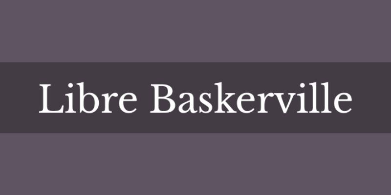
Libre Baskerville is an open-source web font optimized for body text, designed by Pablo Impallari based on 1941 ATF Baskerville specimens.
Key Characteristics
Transitional serif based on Baskerville tradition. Slightly larger x-height than historical models improves screen legibility.
Available in Regular, Italic, and Bold weights. Optimized specifically for web typography and screen reading.
Open design with generous spacing for digital contexts. Extended Latin character set supports numerous languages.
Similarity to Times New Roman
Both function as reliable text faces for professional documents. Transitional classification provides similar formal character.
Libre Baskerville offers elegant alternative while maintaining Times New Roman’s practical benefits. Free licensing parallels Times New Roman’s universal availability.
Best Use Cases
Website body text for content-heavy sites. Blog posts and online articles.
Digital publications and web-based magazines. E-books and screen-first documents.
Projects requiring elegant serif with open-source license.
Readability & Performance
Designed explicitly for screen rendering and web use. Slightly heavier weight than traditional Baskerville aids digital legibility.
Large x-height improves performance at text sizes. Works adequately in print though optimized for screens.
Availability & Licensing
Free through Google Fonts. SIL Open Font License permits commercial use.
Easy web integration via Google Fonts API.
Notable Differences from Times New Roman
More elegant and refined appearance. Slightly larger proportions than Times New Roman.
Contemporary web optimization versus Times New Roman’s mid-century newspaper origins. Higher contrast creates more delicate character.
Charis SIL

Charis SIL is an open-source serif typeface designed by SIL International, released in 2003 as part of their literacy and linguistic documentation work.
Key Characteristics
Transitional serif with moderate stroke contrast. Designed specifically for extended reading and linguistic notation.
Large x-height and open counters maximize legibility. Extensive character set supporting over 2,700 characters and 4,000+ glyphs.
Includes full International Phonetic Alphabet (IPA) support. Available in Regular, Italic, Bold, and Bold Italic weights.
Optimized for minority language documentation and literacy materials. Based on Bitstream Charter design principles.
Similarity to Times New Roman
Both serve as versatile text typefaces for professional and educational use. Transitional classification provides similar traditional authority.
Charis SIL matches Times New Roman’s functionality while adding extensive linguistic support. The two function comparably in standard document contexts.
Best Use Cases
Linguistic documentation and field research. Academic papers involving phonetic transcription.
Multilingual educational materials. Bible translations and religious texts.
Documents requiring extensive character and diacritic support. Print and digital materials for language learning.
Readability & Performance
Designed explicitly for maximum legibility across contexts. Large x-height aids reading at text sizes.
Performs well in both print and digital applications. Open design works effectively across various rendering conditions.
Availability & Licensing
Free download from SIL International website. SIL Open Font License permits modification and redistribution.
Actively maintained with regular updates and improvements.
Notable Differences from Times New Roman
Substantially more extensive character coverage. Optimized for linguistic rather than commercial applications.
Slightly warmer, more open character than Times New Roman. Special design considerations for phonetic notation not found in Times New Roman.
FAQ on Fonts Similar To Times New Roman
What font is most similar to Times New Roman?
Georgia and Cambria closely match Times New Roman’s functionality. Georgia offers slightly larger x-height and better screen performance, while Cambria provides modern refinement with similar proportions. Both come pre-installed on Windows and serve identical professional roles.
What is a good replacement for Times New Roman?
Garamond works excellently for elegant documents, Georgia for digital content, and Palatino for versatile applications. Consider Book Antiqua for immediate availability or Libre Baskerville for web projects. Each maintains professional credibility while reducing Times New Roman fatigue.
Is Calibri better than Times New Roman?
They serve different purposes. Calibri is a sans-serif font optimized for screen reading and informal communication. Times New Roman and its serif alternatives suit formal documents, academic papers, and traditional publishing. Choose based on context rather than superiority.
What font do professional documents use?
Professional documents commonly use Times New Roman, Georgia, Garamond, Palatino, or Cambria. Law firms and academic institutions often prefer traditional serif fonts like Times New Roman or Garamond. Corporate communications increasingly favor Georgia or Cambria for better screen readability.
Why is Times New Roman so popular?
Universal availability drove adoption. Bundled with Microsoft Office since the 1990s, Times New Roman became the default choice for millions of users. Its compact width saves space in documents while maintaining legibility, making it practical for business and academic applications.
What fonts are similar to Times New Roman for resumes?
Georgia, Cambria, Garamond, and Book Antiqua work well for resumes. These professional fonts maintain traditional authority while appearing slightly more distinctive than Times New Roman. Avoid overly decorative options; hiring managers value clarity over creativity in resume typography.
Is Georgia a good alternative to Times New Roman?
Yes. Georgia was designed by Matthew Carter specifically for screen reading with larger proportions and improved legibility. The New York Times switched from Times New Roman to Georgia in 2007, validating its effectiveness for professional publishing applications.
What is the difference between serif and sans-serif fonts?
Serif fonts include small decorative strokes at letter endings; sans-serif fonts omit these details. Times New Roman, Garamond, and Palatino are serif typefaces conveying tradition and formality. Arial and Calibri exemplify sans-serif designs suited for casual or screen-based contexts.
Can I use Times New Roman alternatives for academic papers?
Check your style guide requirements first. Most academic formats (APA, MLA, Chicago) accept serif typefaces like Garamond, Georgia, or Cambria as alternatives. Universities may specify acceptable fonts in their thesis guidelines. When in doubt, Times New Roman remains universally accepted.
Where can I download free fonts similar to Times New Roman?
Google Fonts offers Libre Baskerville, EB Garamond, Merriweather, PT Serif, and Source Serif as free alternatives. These open-source options provide professional quality with SIL Open Font License, permitting commercial use without restrictions. Download directly from fonts.google.com or repository sites.
Conclusion
Finding fonts similar to Times New Roman doesn’t mean sacrificing professionalism or readability. Each alternative in this guide brings distinct character while maintaining the traditional authority your documents require.
Georgia excels for digital content with superior screen performance. Garamond and Baskerville deliver Renaissance elegance for print applications. Cambria modernizes the classic serif for contemporary business use.
Your choice depends on context. Academic papers might favor traditional options like Palatino or Book Antiqua. Websites benefit from screen-optimized designs like Merriweather or PT Serif. Resumes stand out slightly with Georgia or Libre Baskerville.
Don’t default to Times New Roman out of habit. These typeface alternatives offer better performance for specific applications while maintaining the formal, readable characteristics that made Times New Roman the standard for decades.
Experiment with different options to find what works best for your projects.
If you enjoyed reading this article about fonts similar to Times New Roman, you should check out these articles with fonts similar to Gotham, Garamond, Helvetica, Futura, Lato, Raleway, Bodoni, Roboto, and Optima.

Renowned for his expertise in logo design and visual branding, Bogdan has developed a multitude of logos for various clients.
His skills extend to creating posters, vector illustrations, business cards, and brochures. Additionally, Bogdan's UI kits were featured on marketplaces like Visual Hierarchy and UI8.
He also wrote in the past years on sites like Design Your Way, WebDesignerDepot, WPDean, Designmodo, Speckyboy, Slider Revolution, and more.
- The Substack Logo History, Colors, Font, And Meaning - 2 October 2026
- How UX Design Impacts SaaS User Retention and Churn - 1 October 2026
- How to Embed Fonts in PDF for Reliable Printing - 30 September 2026

Bogdan Sandu is a seasoned designer who has been designing websites since 2008. Renowned for his expertise in logo design and visual branding, Bogdan has developed a multitude of logos for various clients. His skills extend to creating posters, vector illustrations, business cards, and brochures. Additionally, Bogdan's UI kits were featured on marketplaces like Visual Hierarchy and UI8. He also wrote in the past years on sites like Design Your Way, WebDesignerDepot, WPDean, Designmodo, Speckyboy, Slider Revolution, and more.
You Might Also Like