


You’re crafting a document, and the vibe’s gotta scream professional. Enter Times New Roman—the comfort food of fonts. But, the world’s moved on; we’re craving fonts similar to Times New Roman. Something that whispers classic without feeling like yesterday’s newsprint.
Picture this: a lineup of typefaces, echoing Time New Roman’s clarity, but strutting their own subtle flair. Serif fonts taking center stage, showcasing timeless sophistication, ready to elevate your work from good to “Can you be my designer?”. That’s what’s cooking here.
By journey’s end, you’ll have your font menu tailored to taste; Garnished with typography design, and served with a pinch of font pairing finesse. Imagine sprinkling the perfect legible text styles across digital pages or showering printed projects with a downpour of font alternatives that won’t leave readers squinting.
No designer jargon, just straight-up, easy picks. Dive in, and let’s find that typeface that makes your text pop.
Best fonts similar to Times New Roman
| Font | Serif Style | Readability | Usage Context | Distinct Features |
|---|---|---|---|---|
| Georgia | Transitional | High | Digital/Web | Wider and bolder than TNR; designed for screens |
| Palatino | Old-Style | High | Print/Broad Use | Larger x-height; Renaissance origins |
| Minion Pro | Old-Style | High | Professional/Publishing | More condensed; inspired by late Renaissance |
| Garamond Premier Pro | Old-Style | High | Professional/Publishing | Sixteenth-century design; elegant and classic |
| Quincy CF | Old-Style/Transitional | Moderate | Professional/Publishing | Old-style proportions with some modern twists |
Georgia
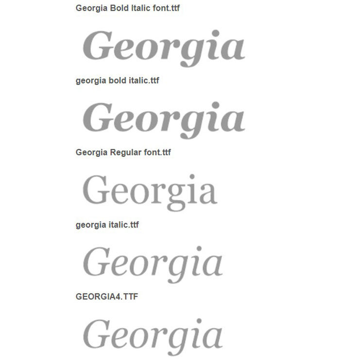

As a serif font, Georgia sits comfortably on the throne of readable text styles, earning its spot among typography design staples that stand shoulder-to-shoulder with Times New Roman. Birthed in ’93 to grace low-res screens with legibility and a dash of elegance, it’s maintained its popularity, particularly in formal or academic writing circles. Inspired by 19th century charm, it’s adaptable and clean—a professional font through and through.
Manhattan – A High-Class Serif
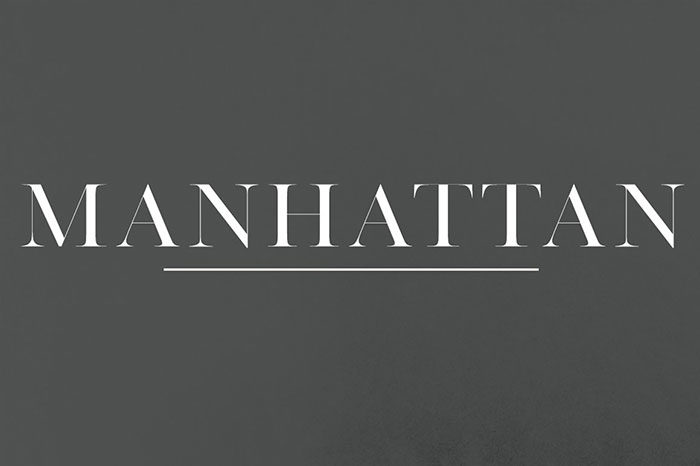

Manhattan struts its classic typeface finesse with understated simplicity, carving a niche among those serif fonts that echo the propriety of Times New Roman. Its understated elegance is its secret sauce, making it a font alternative compatible with multitudes of design scenarios and diverse font families.
Arno Pro


Drawing on Venetian roots but with a modern twist, Arno pro melds historical artistry with functionality—landing it squarely in web-safe font territory. Available in Adobe fonts, it’s a legible text style beacon for a plethora of European dialects, sprinkling in support for Cyrillic and polytonic Greek. With its sleek contours, Arno Pro offers a contemporary spin on document formatting, rivaling the versatility of Times New Roman.
Butler
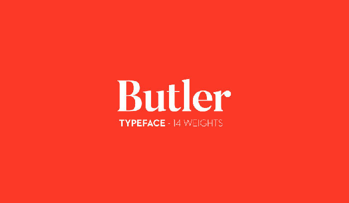

Blending Dala Floda and Bodoni family genes, Butler serves vintage typographical standards with a modern garnish. Better yet, it’s toll-free for all your creative escapades. Sporting 334 characters, this hybrid flexes adaptability across print fonts territory and digital realms, standing tall as a Times New Roman surrogate.
Lara – sophisticated serif typeface
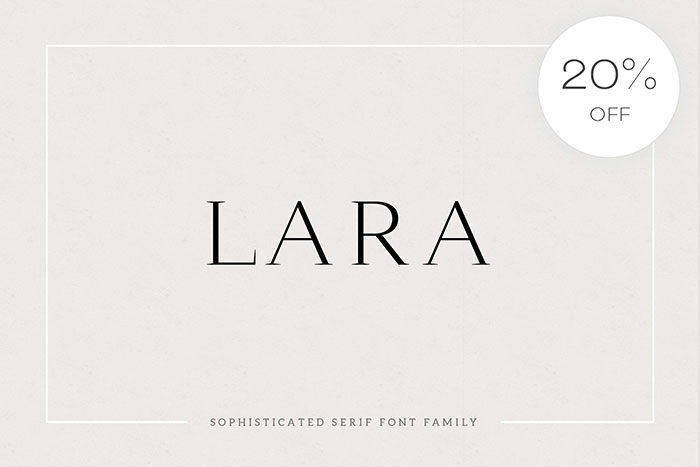

Lara parades the hallmarks of font licensing freedom while sporting every Latin curve and numeral you could need. It’s a font pairing dream, bringing that Times New Roman elegance to tabletops and headers alike—with a whisper of Renaissance and the promise of modern flexibility.
Palatino
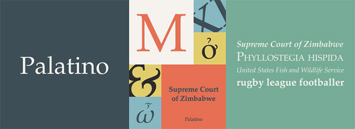

Palatino is a tale of two eras: an Italian Renaissance heart with a contemporary beat. Known for its wider build, it’s a web-safe font that champions print readability—a finely balanced act between historical allure and present-day pragmatism.
Giveny – Classy Serif Font
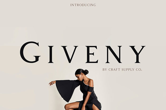
Embodying the ethos of typography standards, Giveny stands poised with squared edges and rounded forms. Crafted for those who plot branding adventures, it upholds structural integrity and optical balance—qualities befitting a traditional font that shakes hands with modernity, replacing Times New Roman’s reliable grasp.
Minion Pro


Channeling the Renaissance, Minion Pro tempers classical grace with desktop publishing utility, promising a reading experience as smooth as an orchard’s finest apple—sans any strain. A font family that’s as multifaceted as it is heritage-rich, bridging continents with its linguistic embrace.
Antique – Luxury serif typeface
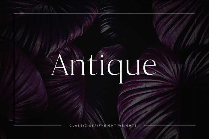
Antique weaves a tapestry of classical typeface nuance with a unique twist, promising exclusivity in every curved line. It stands as a testament to the elegance of print and the grandeur of tradition, a quintessential entity for those in search of an alternative to the mainstay that is Times New Roman.
Garamond Premier Pro


Garamond, with roots dug deep into the 16th century soil, marries visual aesthetics with pragmatic readability. It emerges as a font alternative to Times New Roman, donned in sophistication that’s been weathered and cultured across the ages.
Joliet
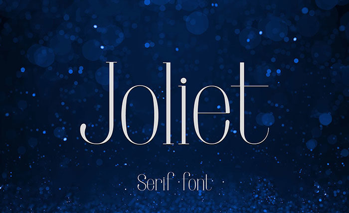

Joliet brings a co-star dynamism when teamed with sans-serif counterparts, climbing the headline charts and logo marquees with seamless elegance. It’s readability and charm bundle up to offer a professional font alternative that would make even Times New Roman take notes.
Quincy CF: vintage serif font family
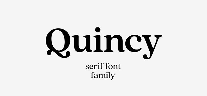

Quincy CF dons a vintage cloak, steeped in a typographic tradition reminiscent of Times New Roman, but with a dash more character. With a smooth and readable demeanor, it steps up as a credible alternative to classical typefaces, ideal for those hankering after a sprinkle of nostalgia with their modern mix.
FAQs about fonts similar to Times New Roman
What fonts are closest to Times New Roman?
They say imitation is the sincerest form of flattery, right? Fonts like Georgia and Garamond walk in Times’ shoes pretty well. Stick to these, and your documents will have that classic feel without it being a copy-paste case.
Are there any free alternatives to Times New Roman?
Oh, plenty! A safe bet? Try Libre Baskerville. Open-source, free for commercial use, and it gives off that same serious, academic vibe. It’s like hitting the jackpot without spending a dime.
How do I choose a font similar to Times New Roman for web design?
Look for web-safe fonts, friends. That’s your golden ticket. Georgia is a go-to; it’s like Times New Roman’s cousin who’s internet-savvy. Another pro tip? Check out CSS Font Stacks that recommend stacks with Times-like alternatives.
Which fonts similar to Times New Roman are best for readability?
For print, Garamond is your buddy—easy on the eyes for those long reads. On screens, Georgia reigns supreme with its slightly larger x-height, making it super legible even at smaller sizes.
What serif fonts are considered professional like Times New Roman?
Corporate world swears by a few names besides the mighty Times. Cambria and PT Serif strut in on that list, wielding the mighty sword of professionalism. They scream ‘I mean business’ without scaring away creativity.
Can I use fonts like Times New Roman in logos?
Of course! Think more upscale, less Comic Sans circus, right? Baskerville is a good shout for a logo with gravitas. Just make sure it meshes with your brand’s personality—a font speaks a thousand words.
What fonts pair well with Times New Roman?
Pairing time! Think opposite attraction. A clean sans-serif like Arial balances out Times’ serif sophistication. Mixing in a contrasting font spices up your design without throwing off the readers.
Are there fonts similar to Times New Roman that offer better on-screen readability?
Absolutely. Screen squinters, meet your savior: Verdana. It’s like someone took Times, pumped up the volume, and sharpened the edges for a crisper on-screen read.
How do Times New Roman and its similar fonts impact document presentation?
Fonts like Times shape your doc’s vibe significantly—straight-laced and polished. Slot in a Times doppelgänger like PT Serif, and your document still holds that authoritative handshake, promising content that’s dressed to the nines.
What’s the importance of licensing for fonts similar to Times New Roman?
Here’s the lowdown: Licensing is like a rulebook for how you can use a font. Some, like Adobe Fonts, require a subscription but give peace of mind on legal fronts. Rule of thumb? Always check the fine print to keep it all above board.
Ending Thoughts on Times New Roman Alternatives
Alright. Dive deep into the world of serif fonts, and it’s easy to see why classics never go out of style. We’ve explored a treasure trove of font alternatives that channel the same timeless look.
- There’s Georgia, unfailingly sharp for screens.
- Or Garamond, when you want your pages to whisper elegance.
Handpicked typefaces, each one a nod to that academic chic we know and love, but with a fresh twist. Your eyes won’t tire, your style stays on point, and those reading will notice the subtle shift without missing a beat.
Licensing? Checked that box too, ensuring the creative freedom’s all yours. Your projects now have a whole new palette of typographic tones to play with. And hey, whether it’s for print classics, digital frontiers, or even logos with gravitas, you’ve got the arsenal to make each character count.
Time to close this chapter. Go ahead, stamp your next masterpiece with a font that rings as true as Times New Roman, but sings your own tune.
If you enjoyed reading this article about fonts similar to Times New Roman, you should check out these articles with fonts similar to Gotham, Garamond, Helvetica, Futura, Lato, Raleway, Bodoni, Roboto, and Optima.