


Ever found yourself lost in the labyrinth of typefaces, seeking that perfect match for your project? Fonts similar to Roboto aren’t just about filling the negative space; they’re the silent ambassadors of your design language. Imagine breathing life into your virtual canvas, that’s what picking the right typeface does — it conveys your message with clarity and personality.
Dive into this guide, and you’ll uncover gems in the world of sans-serif masterpieces.
It’s not just a stroll through the typography gardens; it’s a quest for legibility, a hunt for that user interface charm. You need the fonts that stand tall, shoulder-to-shoulder with Roboto, without the price tag or the hassle.
By the end of our journey, yo’ll be armed with an arsenal of open-source fonts, savvy on font pairing, and clear on why Material Design standards and Helvetica Neue alternatives are the talk of the town.
Whether you’re crafting a digital empire or sprucing up a blog, unravel the secrets to fonts that make your text pop, sans the fluff.
Fonts similar to Roboto
| Fonts Similar to Roboto | Category | Designer/Foundry | Release Date | Notable Characteristics |
|---|---|---|---|---|
| Noto Sans | Sans-serif | 2013 | Internationalist, wide language support | |
| Helvetica | Sans-serif | Max Miedinger, Eduard Hoffmann | 1957 | Clean, Modern, Wide usage |
| Comic Sans MS | Script, Casual | Vincent Connare | 1994 | Informal, Comic book speech bubbles |
| Open Sans | Sans-serif | Steve Matteson | 2011 | Clean, Legible, Web and print friendly |
| Interstate | Sans-serif | Tobias Frere-Jones | 1993 | Inspired by highway signage |
| DIN | Sans-serif | DIN Institute | 1931 | German standardization, Technical |
| Georgia | Serif | Matthew Carter | 1993 | Great legibility, Screen-optimized |
| Univers | Sans-serif | Adrian Frutiger | 1957 | Large family, Clear and functional |
| Cabin | Sans-serif | Impallari Type | 2010 | Humanist, Open-source |
| AktivGrotesk | Sans-serif | Dalton Maag | 2010 | Grotesque style, Functionality focus |
| Neue Haas Unica | Sans-serif | Toshi Omagari | Original 1980, Neue Haas Unica 2014 | Unica redesign, Clarity, Workhorse |
| Nimbus Sans | Sans-serif | URW Type Foundry | 1987 | Similar to Helvetica, versatile |
| Highway Gothic | Sans-serif | United States Federal Highway Administration | 1940s | U.S. road signage, narrow design |
| Swiss 721 | Sans-serif | Bitstream | 1982 | Adaption of Helvetica, same lineage |
| Transport | Sans-serif | Jock Kinneir & Margaret Calvert | 1963 | UK road signage, Clear and legible |
| Verdana | Sans-serif | Matthew Carter | 1996 | Designed for screens, Generous spacing |
Noto Sans
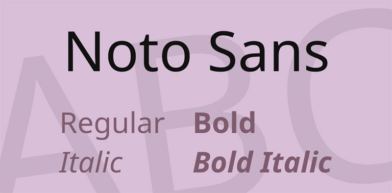

Typography’s Swiss Army knife? That’s Noto Sans. A jack-of-all-trades in the Google Fonts library and a champ at tackling language barriers. Where Roboto plates up modulated curves, Noto Sans lays down the law with an even keel and an impressive glyph count to cover everything from Han ideograms to the pillars of ISO Latin.
The font’s roots are steeped in the rich strokes of Chinese characters. But it doesn’t stop there — with arms wide open to Latin, Greek, and Korean, this one’s got diversity in spades.
Helvetica

Helvetica isn’t just an icon in the font world; it’s timeless – a hefty kit packed with serif variations that warm up any design. Sure, it’s familiar and has been spun into countless contexts, but it continues to be a creative north star. Missing the mark isn’t in its dictionary. It flexes compatibility like a champ.
Comic Sans MS
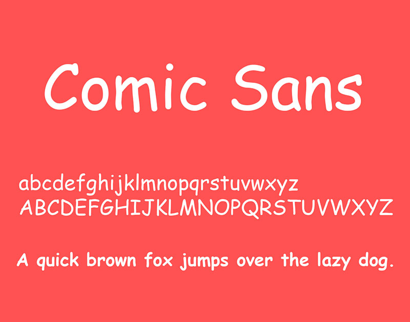

Ah, Comic Sans MS, the quirky character that danced onto screens with Windows 95. It’s got a playful heart but it’s serious about readability. A glance, and your brain breathes “I can read this all day.” So yeah, for small titles, there aren’t many sans-serifs that keep eyes glued quite like it.
Hermit

Enter Hermit, the monospaced marvel notching up Roboto’s game. This isn’t just another font cousin. Designed with laser precision, it’s a minimalist’s dream that marries easy-on-the-eye aesthetics with hardcore programming functionality. With adequate space, unique specials, and ‘you got this’ legibility, Hermit’s your backstage tech guru. And it’s on the house, really.
Akkurat

Akkurat steps out of the 2004 timeline, sporting the grotesque sans serif badge with quiet confidence. This Lineto brainchild isn’t here to scream from rooftops; it’s the understated genius that commands respect in the print world. In the ring with other Roboto cousins, its toolset might seem lean, but it’s got gusto where it counts.
Open Sans
Welcoming and unassumingly stylish, that’s Open Sans for you. Crafted by Steve Matteson, this Type Director’s gem is a Google Fonts staple that’s gone ahead and befriended Cyrillic and Greek scripts, standing on the shoulders of ISO Latin. Your search for legibility with a neutral tone ends with Open Sans.
Interstate

Inspired by the open road, Interstate was dreamt up with the spirit of US highway signs in mind. Typography that’s meant to catch your eye, even when you’re flying by at 65mph. Since ’93, Tobias Frere-Jones’ vision has only climbed the charts. For legible letterforms from a distance, Interstate picks up the pace.
DIN
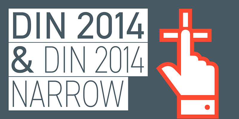
DIN carries the torch of vintage elegance, enduring for nearly a hundred years and never missing a beat in technical applications. Raw and unrefined to the modern lens, it still draws crowds like a classic car show. It’s got that time-tested magnetism.
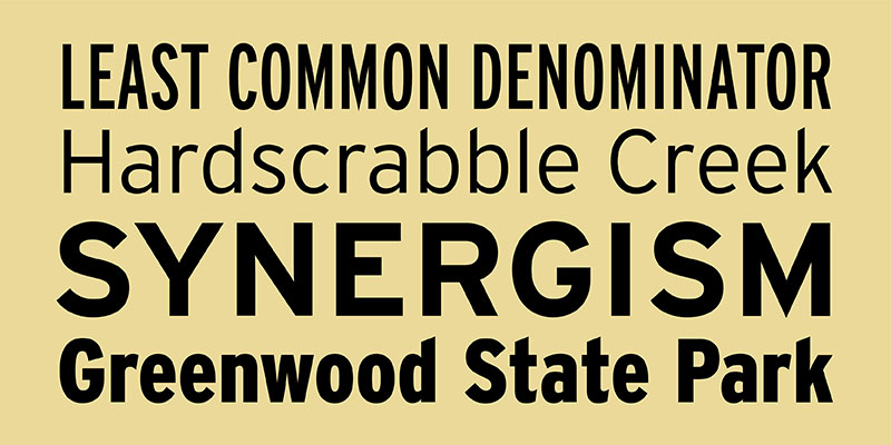
Nudista
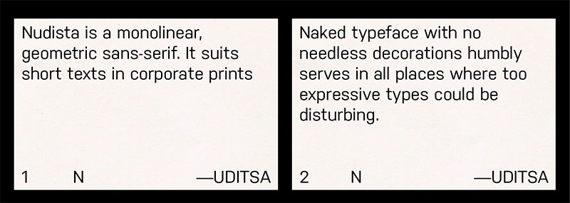

Taking cues from DIN’s geometric structure, Nudista graces 2009 with monolinear charm and a stash of oval-indulgent letters that play nice with technicalities. TomášBrousil’s design turns heads with five weights and their italics. It’s fresh; it’s not yet a crowd repeater. Grab the spotlight.
Georgia
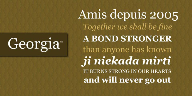
Georgia is the nod to yesteryear—19th-century nuances, calligraphic flair, thick-and-thin strokes—they’re all there. This typographic dignitary doesn’t just show up; it embodies tradition. Political stumping? Georgia’s got your back.
Univers

Univers pours Swiss neo-grotesque elegance into a mold that broke just after. This Helvetica kin gives you a Goldilocks assortment of widths and weights. Designer Adrian Frutiger took a leap beyond his era, making Univers a flexible companion in the type game.
Cabin
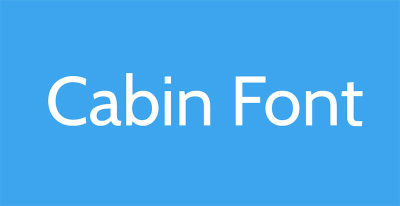

Cabin circles back to humanist roots in a modern sans-serif package. It’s crafted with subtle optical tweaks and broad versatility. Curated by Eric Gill and Edward Jonson, this type delivers a one-of-a-kind flavor that’s hard to miss.
AktivGrotesk
AktivGrotesk lands a brave punch, aiming to dethrone Helvetica. Dalton Maag’s creation sweeps in with cool Univers vibes, cooking up an inviting aura. It’s memorable, and not because it’s trying too hard, but because it just fits right.
Neue Haas Unica

Neue Haas Unica brings to the table what AktivGrotesk leaves behind—a crisp, fine-tuned finish. ToshiOmagari’s craft employs narrower forms and space to breathe, serving up a nine-weight feast. It’s unica in its league.
Nimbus Sans
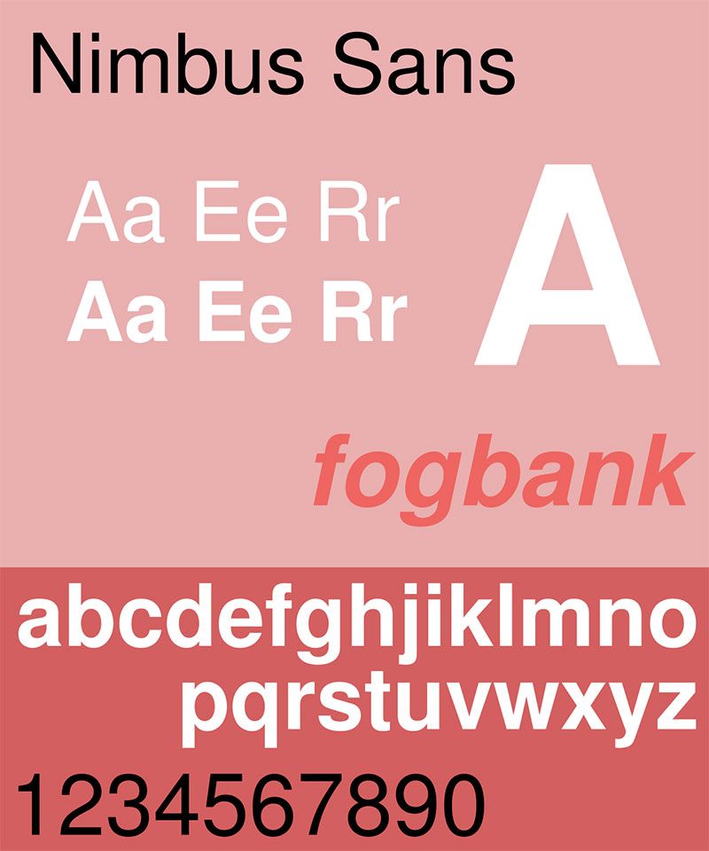

Nimbus Sans: Germany’s answer to Helvetica’s elusive charm, presented by URW++. Distilled to perfection, this one spreads its wings across a multitude of styles, delivering extended and condensed forms with finesse.
Highway Gothic
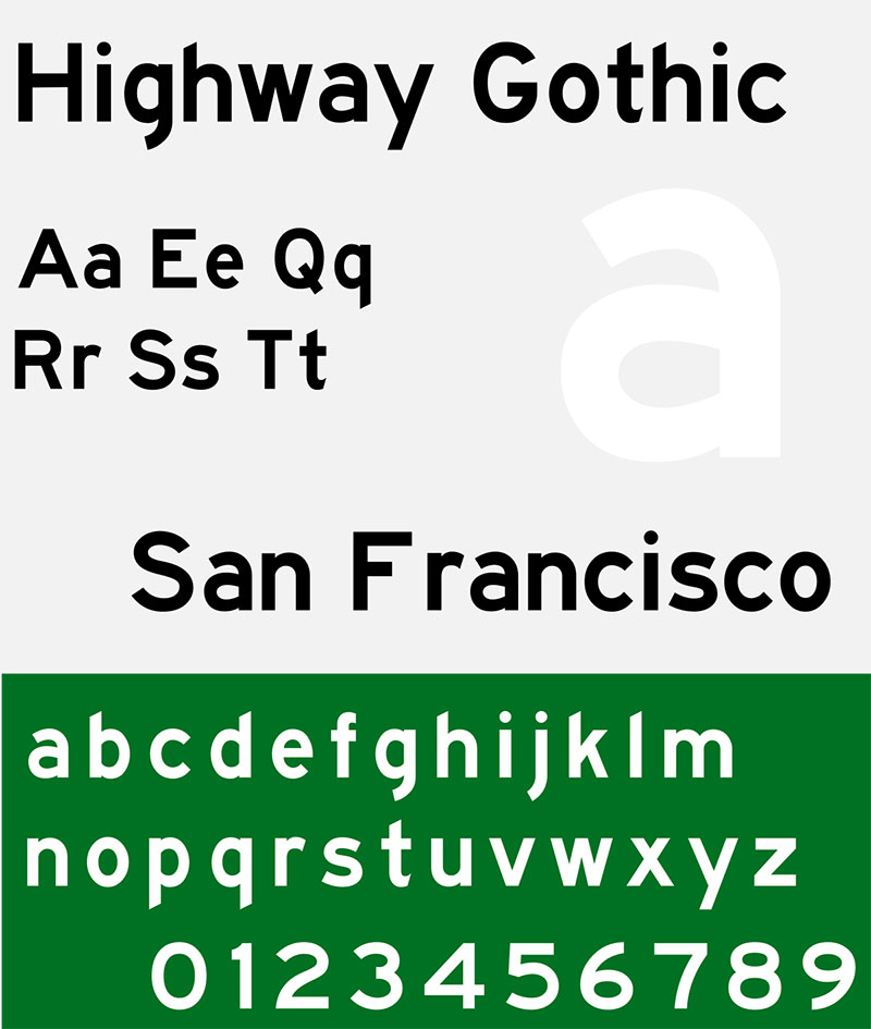

Highway Gothic paints its narrative right off US freeways. Its FHWA roots anchor it in sign clarity and it’s navigated its way into global use, becoming a mainstream player in the sans serif highway.
Swiss 721

Bitstream’s call to arms against Helvetica, Swiss 721, stands tall with its buffet of widths and a septet of weights, each preening for the spotlight.
Transport

Transport is a British phenomenon designed for clarity on the move, and its evolution is now a bolder, six-weight series called New Transport, refined yet keeping its foundational spirit.
Verdana
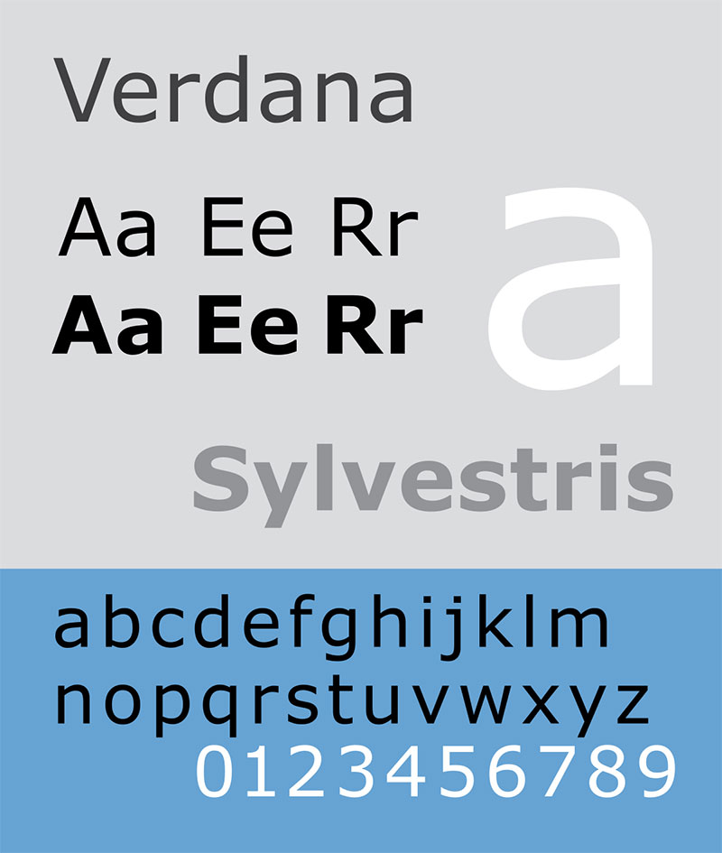
Verdana is a web design jewel, a TrueType trailblazer that turns web readability up a notch, an ensemble crafted by Matthew Carter and Tom Rickner that’s known to iron out on-screen text wrinkles.
Choosing the perfect font is a commitment to your reader — a bridge between your message and their understanding. Make it resonate, make it stand, or you may watch a brilliant design lose its spark. Yet, when it clicks, when that font underscores your ethics, don’t be surprised if little miracles start unfolding in your design endeavors.
FAQ on Fonts Similar to Roboto
What’s the closest free font to Roboto?
Looking around, Montserrat steps up. It’s crisp, versatile, and a crowd-favorite. Hailing from the Google Fonts ensemble, it’s a weighty contender for that clean, geometric vibe. Good for web design, seriously ace for UI projects.
Are there any serif fonts similar to Roboto’s style?
Roboto Slab is the serif counterpart kicking the same genes. It’s free, hail to open-source, and a fine pick for when you’re after some heft. It’s a nod to tradition with a modern twist, for those digging a bit of old-school in their typography.
Which is more popular, Roboto or Open Sans?
Open Sans usually edges out — it’s like the bread and butter of web-safe fonts. It’s on websites, apps, you name it. Both nail the readability factor, but Open Sans got adopted early and wide, lending it an edge in the popularity stakes.
How do fonts like Roboto affect user experience?
They’re MVPs in user interface design. Fonts akin to Roboto ensure clarity and simplicity, which reduces user strain. Readability means users stick around, get comfy with the content. And happy users? That’s the gold medal in UX design.
Can I use fonts similar to Roboto for a logo?
Absolutely. Clean, sans-serif typefaces scream modernity and are dynamite for logos. They’re a solid backbone for a strong brand identity. Think timeless, think versatile. That’s your design flex right there.
What’s the difference between Roboto and Helvetica?
It’s like two chefs, same dish, different spice. Roboto dishes out a more mechanical feel, tailored for digital screens. Helvetica, though, it’s the OG of sans-serifs — broader and rounder. It’s all about the subtle curves and the space each character owns.
Is Roboto a good font for mobile apps?
Absolutely. Born in the crucible of Material Design, it is crafted for the crisp pixels of mobile interfaces. Sturdy, legible, and airy — it’s a no-brainer for apps craving that clean, mobile-friendly look.
Do Google Fonts like Roboto cost anything?
Google’s like the cool kid giving away toys. Google Fonts? Totally free. Zero strings attached. Dive in, and fish out Roboto or its kin without dropping a cent. Bless open-source fonts for keeping wallets happy.
Does pairing Roboto with a contrasting font work well?
That’s the art of font pairing – grabbing two types and making them tango. Roboto swings well with contrast. Match it up with a serif for headlines or a quirky display font — and boom, you’ve got a conversation between elements.
How does font choice impact brand identity?
Think of fonts as the suit or dress your brand wears. Typographic design sets the mood, pitches the voice. Pick web-safe fonts like Roboto’s kin, and you’re whispering “modern” and “approachable.” Every letter tugs at the emotional strings of your audience.
Conclusion on These Roboto Alternatives
And so we zip up this design journey, a hop and a skip across the landscape of fonts similar to Roboto. Who knew the right glyphs could give your project that glow-up? It’s like a well-tailored outfit, crisp and defining. Sparkling in our toolkit, we’ve got those open-source wonders, the typography aficionados, and the sans-serif champions that stand by ready to play ball.
Bold and smooth, sans the ornamental fluff — these typefaces are the quiet heroes that make your text sing. From web design canvases to the punchy headlines that stop ’em in their tracks, remember that font choice is king. Strike with roboto-esque precision, and watch your designs do the talking.
Heads up, keep those Visual hierarchy notes close. Let’s not forget, the type we pick whispers volumes about the brand stories we tell. So, choose wisely, pair thoughtfully, and let ’em wonder where the magic comes from.
If you enjoyed reading this article on fonts similar to Roboto, you should check out these articles with fonts similar to Gotham, Garamond, Helvetica, Futura, Times New Roman, Raleway, Bodoni, Lato, and Optima.