


Ever stumbled upon the unmistakable elegance of Garamond and thought, what else is out there that dances the same visual tango? We’re slicing through the font jungle to uncover gems that share that classic, yet undeniably sharp Garamond DNA.
Nestling amidst the Renaissance typography reawakening, Garamond has long held its ground as the go-to for typography that breathes sophistication and readability into print and pixels.
Yet, the terrain teems with serif stars reaching for that pinnacle of professional lettering.
This scavenger hunt is all about unearthing those typography treasures and laying ‘em out in the sun. By the end of this trail, you’ll have a backpack full of fonts similar to Garamond as rich in history and style as the venerable Garamond itself.
Dive into this exploration to discover typefaces that stand tall in readability, echo classic font design, and keep the print design torch burning bright in the digital age. Prepare to be regaled with stories of font legibility and digital typesetting that shape how we read, write, and connect.
Fonts similar to Garamond
| Font | Serif Style | Era/Designer | Notable Features | Usage/Application |
|---|---|---|---|---|
| Garamond Premier Pro | Old-style | Claude Garamond/Rober Slimbach (Adobe) | Refined, extended glyph set | Books, extensive text |
| Adobe Garamond | Old-style | Claude Garamond/Robert Slimbach (Adobe) | Faithful to the original Garamond | Print material, digital publishing |
| Stempel Garamond | Old-style | Claude Garamond (Stempel AG foundry) | Less refined, some variations | Classic print material |
| Monotype Garamond | Old-style | Claude Garamond (Monotype) | Monotype’s interpretation, legibility-focused | Both print and digital text |
| Caslon | Old-style | William Caslon | Stronger contrast than Garamond, British typeface | Body text, particularly historical documents |
| Bembo | Old-style, Renaissance | Francesco Griffo/Aldus Manutius | Renaissance elegance, clean lines | Book typesetting, high-end printing |
| Berkeley | Transitional | Frederic W. Goudy | More modern compared to Garamond, American typeface | Academic work, university press |
| Jannon | Old-style | Jean Jannon | Sharper, more condensed than Garamond | Academic publications, fine book printing |
| Sabon | Old-style | Jan Tschichold/Claude Garamond | Good for body text, inspired by Garamond typefaces | Book typography, body text |
| Berling | Transitional | Karl-Erik Forsberg | Scandinavian design, open and light appearance | Newspapers, magazines, corporate communication |
| ITC Galliard | Old-style | Matthew Carter | Lively and robust, Carter‘s interpretation | Multifunctional, from books to corporate branding |
| Granjon | Old-style | George W. Jones/Claude Garamond | Elegant, similar to Garamond but with its own twist | Books, especially fine book printing |
| Goudy Old Style | Old-style | Frederic W. Goudy | Artistic and decorative, not directly Garamond-like | Advertising, display use |
| Times (New Roman) | Transitional | Stanley Morison | Designed for newspapers, highly legible | General typesetting, especially newspapers |
| Minion | Old-style | Robert Slimbach (Adobe) | Modern, versatile, large family | Book text, editorial work, branding |
| Palatino | Old-style | Hermann Zapf | Very legible, strong design, Renaissance inspiration | Book text, academic papers, magazines |
Garamond Premier Pro
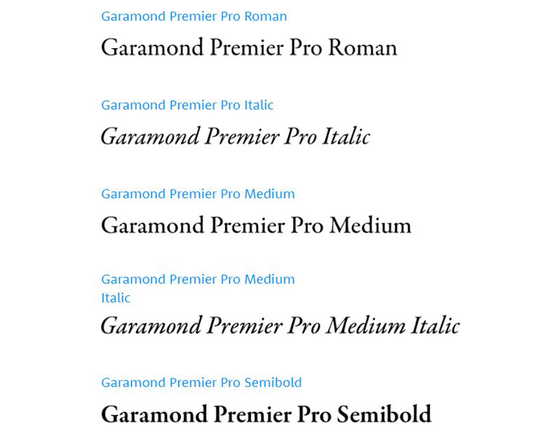

Serving as a true Renaissance typography revival, the Garamond Premier Pro, a sparkling gem in the Adobe fonts similar to Garamond, is drenched in history. Crafted by the artful hands of Robert Slimbach in 1988, it’s a labor of love paying homage to those classic typeface roots, a visit to Antwerp’s museum home to Garamond’s legacy breathing life into its digital typesetting.
Adobe Garamond Font Family
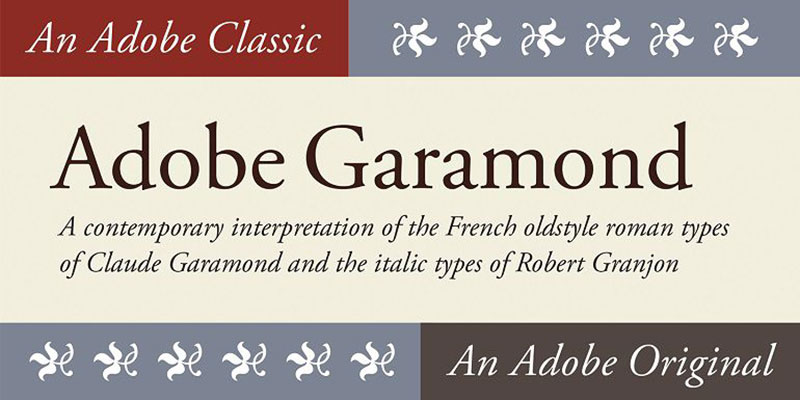

Not just a single star but a constellation, the Adobe Garamond Font Family beams bright since its 1989 inception by Robert Slimbach. This deciduous font family flourished with the addition of italic styles akin to Robert Granjon’s touch, along with a treasure trove of typographic treats like small caps and swash caps, all nodding to the refined 15th and 16th-century fonts.
Stempel Garamond
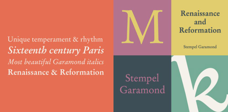

Boldly stepping out of Germany, Stempel Garamond contrasts with legible printing fonts with brief descenders, distinguishing itself from the original Garamond. Transcending mere typography design; its roots dig into Garamond’s work, rendering itself a professional lettering option with unique twists.
Monotype Garamond
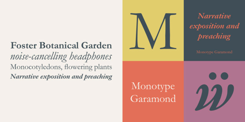
Birthed from the creative soil tilled by Jean Jannon, Monotype Garamond blesses the page with nuanced flair drawn from both Garamond and the Venetian engravers of the 15th century. This eclectic blend of styles cements the Monotype Garamond as a humanist typeface, ripe with distinctive features.
Fonts Similar to Garamond
Caslon
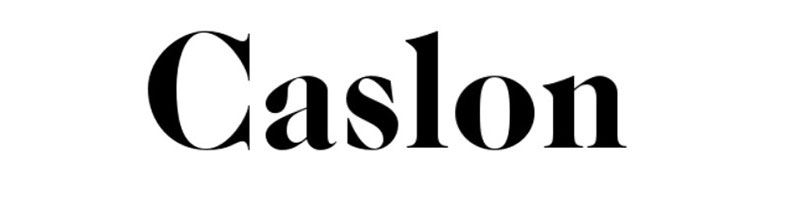

Stepping out of 1722 London, Caslon echoes the old-style serif mode that shares a kindred spirit with Garamond. Admired by England and beyond for its functional beauty, the Caslon typefaces meld 17th century Dutch typefaces into an exquisitely readable web font that dances through history’s pages.
Bembo
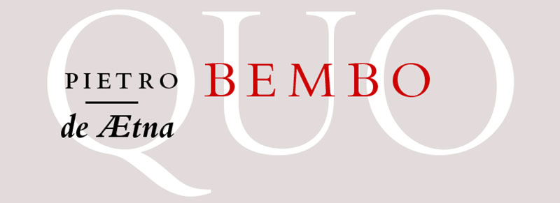

Crafted in the 1920s, Bembo is a storied British export from the Monotype Corporation. Its lineage traces back to Griffo’s 1495 designs, knitting a tapestry of typography design that aligns with the Garamond aesthetic while offering its own legible typeface to the world of publishing.
Berkeley
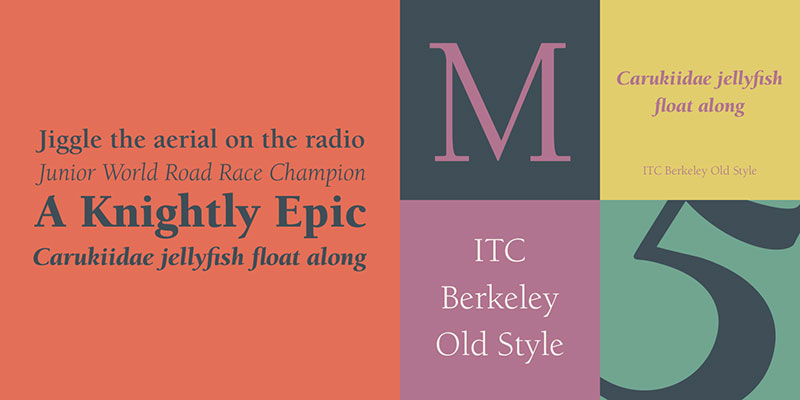
The ITC Berkeley, a revival of the California Old Style from 1983, stands tall with elongated descenders and a brush with lightness. This font harvests legibility and classic x-height from typographic fields, presenting it as a Garamond-style typeface ripe for long reads and elegant text.
Jannon
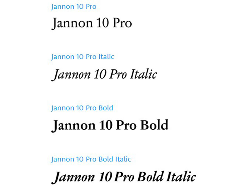

Jannon often dons Garamond’s cloak of similarity so convincingly that it has been mistaken for it. With well-developed italics and a closely matched design, it stands as a testament to the interwoven history and Renaissance style shared with Garamond.
Sabon
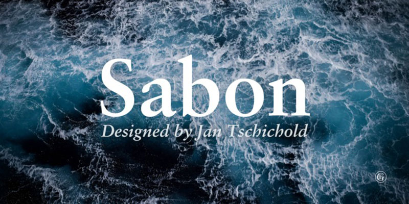
Sabon tiptoes around being an outright homage to Garamond, yet it’s an entity all its own—a modern font echoing the historical resonance of an age-old style. It’s a font that whispers tales of tradition, donned in a readable font cloak for today’s texts.
Berling
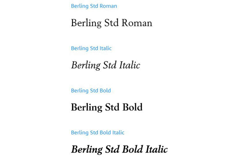

1951 witnessed the birth of Berling, a Karl-Erik Forsberg creation for the Berling foundry. It proudly parades its high legibility and high contrast, making it a belle of the bibliophile’s ball. It’s a delicate weave of old-style and humanist qualities, as unique as a readable web font.
ITC Galliard
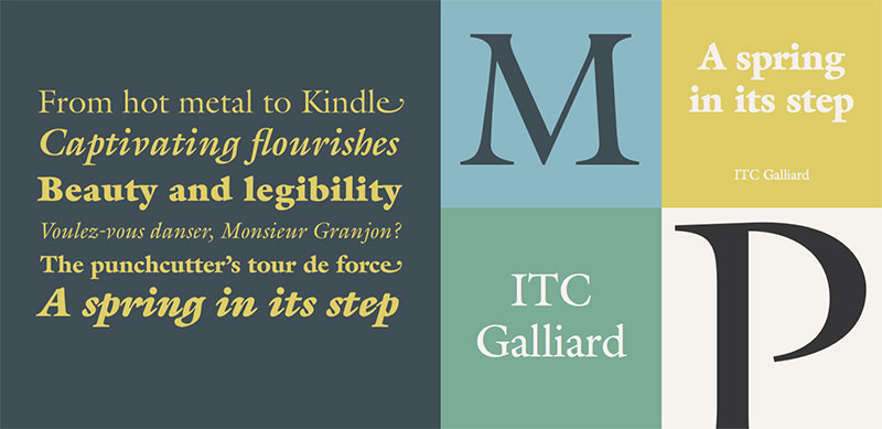

Chronicling the point where history meets modernity, ITC Galliard arrives as a photo composition font echo of Robert Granjon’s revered 16th-century works. With a distinctive italic version, this font quenches the thirst for those seeking a Garamond humanist serif style in their narratives.
Granjon
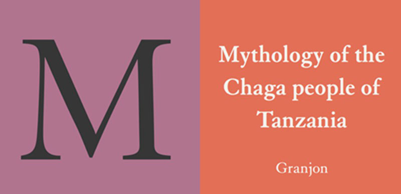

Namesake to the storied engraver, Granjon wraps itself in the cloak of Garamond’s legacy while weaving in threads of Caslon’s characteristics. It’s a font that stands at the crossroads of history and modernity, a Garamond-style edition to the literary world.
Goudy

Goudy, hailing from 1915, is an American epoch that translates the Renaissance typefaces into a serif of distinction. It delivers its thespian prowess best in both text and display, echoing the Italian finesse of epochs past, a true serif sentinel beside Garamond.
Times
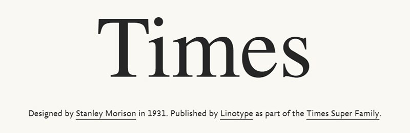

Universally lauded, Times stands as a versatile font, brandishing small-caps borrowed from the old-style lexicon. It offers itself as a Garamond kin, with multiple weights and a presence that spans across a variety of platforms, showcasing its status as a legible web font.
Minion
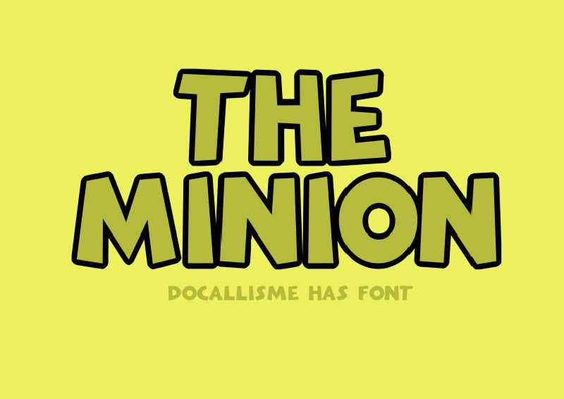
Emerging from the Adobe foundry, Minion was birthed in 1990 by the esteemed Robert Slimbach. Designed for the printed page and the pulsating screens of our digital realm, Minion offers high readability and a classic style that plays well with smaller sizes, a nod to the finesse of Garamond.
Palatino
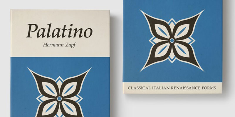
Last, Palatino, crafted by Hermann Zapf in 1949, transcends its display roots, embodying qualities intimate with Garamond. Whether draped across a printed page or glowing softly from a screen, Palatino stands firm as a classic typeface, naturally finding its way into our curated collection.
FAQs about fonts similar to Garamond
What are some classic typefaces similar to Garamond?
Garamond’s grace is a tough act to follow, right? Check out Baskerville for that timeless vibe and Caslon for a hint of robustness with elegance. Craving more? Adobe Garamond Pro nods respectfully to the original but adds its own digital-era flair.
In terms of readability, which fonts compete with Garamond?
Oh, the quest for clarity! Look no further than Times New Roman—it’s like Garamond’s cousin, twice removed, with that clear, academic look. And if you’re all about that serif life, give Palatino a whirl. It’s like reading with glasses on for the first time.
How does the digital typesetting of fonts similar to Garamond compare?
Digital typesetting has been a game-changer. Fonts like Georgia have picked up the serif torch and run with it, championing screen readability. They’re optimized for the web, meaning they’re crisp on your screens, even at smaller sizes. It’s like Garamond got a tech upgrade.
Are there any free Garamond-style typefaces out there?
Absolutely, and aren’t freebies the best? EB Garamond is your go-to here. Quit squinting at price tags and revel in this royalty-free masterpiece. It’s a win for your wallet and your designs—a true serif superhero saving the day.
What font pairs well with Garamond for a professional look?
For that sharp-dressed man vibe of fonts, pair Garamond with a clean sans-serif like Helvetica or Gotham. It’s like a power suit for your text—Garamond brings the class, the sans-serif nails the modern twist. That combo? It means business.
Can Garamond and its similar fonts be used for web design?
Sure, they’ve got more screen time than some celebrities! Garamond itself, and other serif fonts like Merriweather, jive well with the whole web aesthetic. They bring that print-quality sophistication straight to your browser. Plus, they’re like a breath of fresh air amid the sea of sans-serifs online.
What should I consider when choosing a Garamond alternative for book typesetting?
Imagine your book crying out for that perfect typeface. It seeks readability, an elegant text style, and a classic feel. Weigh options like Minion Pro and Jenson; they’ve got that old-style finesse that makes them great for long reads just like Garamond.
Which modern fonts capture the humanist qualities of Garamond?
Modern with a soul—yes, please! Dive into the likes of Arno Pro and Minion. They ooze that humanist charm with their calligraphic undertones and warm, approachable aesthetics. It’s like Garamond’s wisdom got passed down to the digital natives.
How does Adobe Garamond Pro differ from the original Garamond?
Imagine Garamond got a makeover. Adobe Garamond Pro tweaks the original’s proportions for better suitability on modern platforms, enhancing legibility. It’s faithful to the spirit of Garamond—that French origin typeface—but it’s polished to shine in today’s typesetting shindig.
Are there any sans-serif fonts that complement the style of Garamond?
Now here’s a curveball—mixing serifs with sans! Partner Garamond with the understated simplicity of Futura or Avenir. It’s an unexpected handshake between tradition and modernity. This duo balances old-school charm with new-age minimalism, creating a visual synergy that’s oh-so-easy on the eyes.
Conclusion on These Garamond Alternatives
And there you have it – a stylish roundup of fonts similar to Garamond, each bringing its own flavor to the table. Serenity in serif, that’s what these typefaces are about. They’re like the trustworthy friends you turn to when you need that classy touch in your designs, from the crisp pages of a book to the vast stretches of the web.
Remember, fonts are more than just letters; they’re the voice of your words. Whether you lean towards the Classic typeface feel of Caslon, the humanist typeface warmth of Minion, or get adventurous with the digital crispness of Adobe Garamond Pro, know this: typography is a silent conversation.
As you step back into the world, spooling through the selections you’ve just made, tell your story with these time-honored companions. Let the legible printing fonts and the elegant text styles you’ve met today enrich your narrative. Take pride in your typography design decisions; they shape how your message unfurls in the minds of readers everywhere.
If you enjoyed reading this article about fonts similar to Garamond, you should check out these articles with fonts similar to Gotham, Lato, Helvetica, Futura, Times New Roman, Raleway, Bodoni, Roboto, and Optima.