Eurostile’s squared letterforms and retro-futuristic aesthetic have dominated tech branding and gaming interfaces since 1962. But licensing costs, overuse, and limited weight options send designers searching for alternatives.
Fonts similar to Eurostile share that distinctive geometric sans-serif DNA, the wide proportions, mechanical terminals, and architectural stability that scream “future.” Some pursue identical squared aesthetics. Others soften the edges while maintaining technical credibility.
This guide examines 32 typefaces spanning free Google Fonts to premium commercial families. You’ll discover which alternatives match Eurostile’s display impact, which handle body text better, and which expand functionality with variable fonts technology.
Whether you’re designing a gaming interface, tech startup identity, or science fiction poster design project, you’ll find squared geometric options that deliver Eurostile’s industrial character without the baggage.
Let’s explore the alternatives.
Fonts Similar To Eurostile
| Font Name | Style Characteristics | Best Use Case | Availability |
|---|---|---|---|
| Microgramma | Geometric sans-serif, square letterforms, uniform stroke width, uppercase-focused design | Technological branding, futuristic headlines, sci-fi design projects | Commercial |
| Square 721 | Angular geometric forms, squared terminals, condensed proportions, technical appearance | Industrial design, technical documentation, automotive branding | Commercial |
| Roboto | Neo-grotesque sans-serif, dual nature design, mechanical skeleton with geometric forms | Digital interfaces, Android applications, web design with extensive text | Free (Google Fonts) |
| Futura | Pure geometric construction, circular letterforms, elegant modernist aesthetic | Fashion branding, minimalist design, editorial headlines | Commercial |
| DIN | German industrial standard, high legibility, uniform stroke width, neutral character | Signage systems, technical specifications, transportation design | Commercial |
| Avenir | Humanist geometric sans-serif, organic curves, balanced proportions | Corporate identity, editorial design, professional presentations | Commercial |
| Exo / Exo 2 | Technological geometric sans-serif, sharp angles, contemporary digital aesthetic | Digital products, tech startups, modern web applications | Free (Google Fonts) |
| Maven Pro | Low-contrast sans-serif, squared oval forms, distinctive terminals | User interfaces, digital content, clean web typography | Free (Google Fonts) |
| Open Sans | Humanist sans-serif, neutral appearance, excellent screen readability | Body text for web and mobile, accessible design, extensive multilingual support | Free (Google Fonts) |
| Oswald | Condensed sans-serif, tall narrow letterforms, strong vertical emphasis | Display headlines, posters, space-efficient titling | Free (Google Fonts) |
| Proxima Nova | Modern geometric sans-serif, balanced proportions, warm professional character | Premium branding, corporate websites, high-end design projects | Commercial |
| PT Sans | Humanist sans-serif, open apertures, pan-Slavic character support | Multilingual content, public information systems, educational materials | Free (Google Fonts) |
| Quicksand | Rounded geometric sans-serif, friendly approachable design, soft terminals | Casual branding, children’s content, friendly user interfaces | Free (Google Fonts) |
| Raleway | Elegant geometric sans-serif, refined thin weights, sophisticated aesthetic | Luxury branding, fashion websites, elegant headlines | Free (Google Fonts) |
| Sansation | Geometric construction, clean minimal forms, technical precision | Tech interfaces, modern minimalist design, digital applications | Free |
| Teko | Condensed sans-serif, geometric structure, efficient vertical space usage | Sports branding, compact headlines, mobile-first design | Free (Google Fonts) |
| Titillium Web | Modern sans-serif, slight condensed proportions, technological character | Web interfaces, digital platforms, screen-optimized content | Free (Google Fonts) |
| Ubuntu | Humanist sans-serif, distinctive personality, warm accessible design | Open-source projects, software interfaces, community-driven platforms | Free (Google Fonts) |
| Neuzeit S | Classic geometric sans-serif, rational construction, German design heritage | Editorial design, museum exhibits, architectural branding | Commercial |
| Tactic Sans | Squared geometric forms, technical precision, industrial aesthetic | Technical branding, engineering documentation, industrial design | Commercial |
| Neographik | Retro-futuristic design, angular letterforms, vintage technological character | Retro branding, gaming graphics, nostalgic tech aesthetics | Commercial |
| TT Norms Pro | Contemporary geometric sans-serif, neutral versatile design, extended character set | Versatile branding, editorial layouts, professional presentations | Commercial |
| TT Commons Pro | Neo-grotesque sans-serif, balanced proportions, professional neutral tone | Corporate communications, business documents, multi-platform design | Commercial |
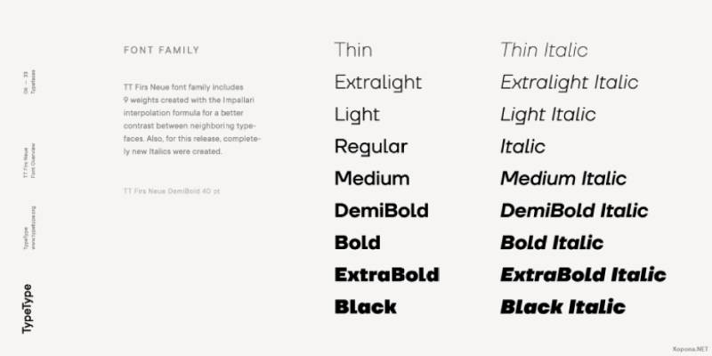
| TT Firs Neue | Modern grotesque sans-serif, humanist touches, elegant contemporary design | Premium branding, editorial content, sophisticated digital experiences | Commercial |
| TT Neoris | Sharp geometric sans-serif, angular terminals, contemporary technical aesthetic | Tech branding, futuristic design, digital innovation projects | Commercial |
| TT Supermolot Neue | Condensed geometric construction, extended family, flexible system | Flexible branding systems, space-efficient layouts, multi-format design | Commercial |
| Frank | Condensed grotesque sans-serif, industrial character, strong vertical structure | Industrial branding, architectural signage, utilitarian design | Commercial |
| Brinnan | Geometric squared design, technical precision, modern industrial aesthetic | Tech products, industrial design, contemporary branding | Commercial |
| Thrifty | Condensed sans-serif, space-efficient design, pragmatic construction | Budget-conscious projects, compact layouts, efficient typography | Commercial |
| Mensch | Humanist geometric sans-serif, friendly proportions, accessible design | Human-centered design, educational content, approachable branding | Free |
| QT Eurotype | Squared geometric forms, technological aesthetic, Eurostile-inspired design | Direct Eurostile alternative, tech branding, sci-fi applications | Commercial |
| PT Magistral | Condensed geometric sans-serif, Russian typographic tradition, strong structure | Multilingual projects, Cyrillic text support, transportation design | Free |
Microgramma

Microgramma is Eurostile’s direct predecessor, designed by the same creators Aldo Novarese and Alessandro Butti for Nebiolo in 1952. Originally released as an all-caps typeface, it shares Eurostile’s squared geometric DNA but predates the lowercase addition.
Visual Characteristics
Square letterforms with distinctive geometric construction dominate the design. Uppercase characters feature wide proportions and mechanical terminals.
The x-height in later versions aligns closely with Eurostile’s proportions. Apertures remain closed on characters like ‘C’ and ‘G’, creating that signature tech-forward appearance.
Extended and bold extended variants are the most commonly used styles. Character strokes maintain consistent weight with minimal contrast.
Primary Use Cases
Tech industry branding heavily favored Microgramma during the 1960s and 1970s. Science fiction film titles and futuristic poster design projects frequently deploy this face.
Aviation companies and aerospace brands still reference it for that vintage space-age aesthetic. Not suitable for body text due to its display-oriented design and limited lowercase availability in original versions.
Technical Specifications
Available weights include Regular and Bold, with Extended variants adding width options. Later digital versions by Linotype and URW added lowercase characters (making them functionally identical to Eurostile).
The typeface contains approximately 220-260 glyphs depending on the version. Language support covers Western European character sets primarily.
Format availability spans OpenType and TrueType across modern distributions.
Relationship to Eurostile
Microgramma preceded Eurostile by exactly 10 years. Eurostile was essentially Microgramma with lowercase letters, condensed weights, and refined proportions.
If you need an all-caps retro-futuristic look, Microgramma delivers authentic 1950s sci-fi vibes. For full alphabet functionality with better text hierarchy options, choose Eurostile instead.
The squared geometry and technical aesthetic remain identical between both faces.
Licensing & Availability
Commercial licensing required through Linotype, URW++, and other foundries. Desktop licenses typically start around $35-50 per weight.
Free versions exist but often lack proper Unicode support and full character sets. MyFonts and Adobe Fonts offer the typeface through subscription or individual purchase models.
Square 721
Square 721 is Bitstream’s digital interpretation of Eurostile, created as a more accessible alternative while maintaining the core geometric structure. Released by Bitstream in 1990, it offers similar technological character without brand name licensing costs.
Visual Characteristics
Squared letterforms with rounded inner corners define the design. Geometric sans construction follows Eurostile’s blueprint closely.
Proportions lean slightly wider than Eurostile in some weights. Terminals and stroke endings maintain mechanical precision.
Character apertures and counter spaces mirror the original Eurostile design philosophy. Available in both Roman and Condensed widths, plus Extended variants.
Primary Use Cases
Corporate identity systems for tech startups and software companies frequently specify Square 721. Digital interface design benefits from its clean geometric structure and excellent screen rendering.
Logo designers working with limited budgets often select this as their go-to Eurostile substitute. Gaming interfaces and sci-fi themed projects work well with this face.
Less suitable for long-form body text, though short captions and UI labels perform adequately.
Technical Specifications
Family includes 6 styles: Roman, Roman Condensed, Roman Extended, Bold, Bold Condensed, and Bold Extended. Character set contains approximately 250-280 glyphs per font.
Latin script support with basic punctuation and numerals. OpenType and TrueType formats available depending on vendor.
No true italics exist in this family (obliques only in some versions).
Relationship to Eurostile
Square 721 functions as a metrically compatible clone of Eurostile. Letterforms match so closely that distinguishing them requires side-by-side comparison.
Minor differences appear in specific character details and spacing metrics. Bitstream created this specifically to offer Eurostile’s aesthetic without Linotype licensing.
Use Square 721 when budget constraints prevent Eurostile licensing, or when working on projects where the distinction won’t matter to end users.
Licensing & Availability
Bitstream offers commercial licenses starting around $30-40 per weight. Desktop EULA covers standard print and digital design applications.
Some versions bundled with software packages or system fonts. Verify licensing before commercial deployment, as free versions often carry restrictions.
Roboto
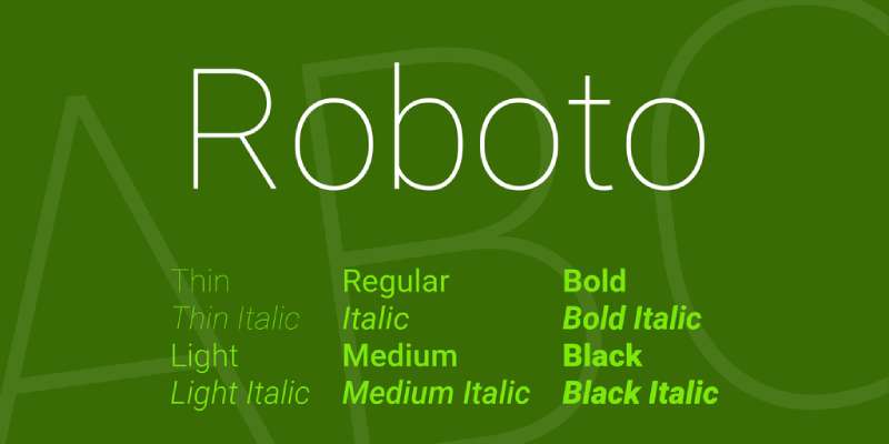
Roboto emerged as Google’s Android system font in 2011, designed by Christian Robertson. This sans-serif font blends geometric principles with humanist warmth, sharing Eurostile’s mechanical skeleton but softening the aesthetic for extensive digital reading.
Visual Characteristics
Geometric letterform construction with dual nature design. The mechanical skeleton uses largely geometric forms, but curves remain friendly and open rather than rigidly squared.
Letters settle into natural widths instead of forcing rigid rhythm. Tall ascenders rise above the cap line in lowercase forms.
The typeface avoids pure geometric circles, opting for slightly flattened curves that improve legibility. Terminals show subtle humanist influences while maintaining tech-forward appearance.
Primary Use Cases
Android OS interface design represents the primary application. Mobile app UI and responsive web design projects heavily favor Roboto.
Body text for digital products excels with this family due to optimized on-screen readability. Pairing fonts with Roboto works well because of its neutral character.
Material Design projects specify Roboto as the default choice. Tech company documentation and user interfaces rely on its clarity.
Technical Specifications
Massive family spanning 12+ weights from Thin (100) to Black (900). Both upright and true italic styles available across the weight spectrum.
Roboto Condensed provides narrower variants. Roboto Slab offers a slab serif font companion. Roboto Mono delivers monospaced functionality.
Roboto Flex introduces variable fonts with 12 adjustable axes including optical size. Character set includes Latin, Greek, and Cyrillic (1,000+ glyphs in extended versions).
Relationship to Eurostile
Roboto shares geometric underpinnings with Eurostile but diverges significantly in overall feel. Where Eurostile emphasizes squared mechanical aesthetics, Roboto softens edges for warmth.
Both work for tech branding, but Roboto’s humanist touches make it superior for sustained reading. Eurostile wins for retro-futuristic headlines and display applications.
Choose Roboto when you need comprehensive language support and extensive weight options in a modern geometric sans.
Licensing & Availability
Completely free under Apache License 2.0 (later versions under SIL OFL). Google Fonts hosts the full family with instant web embedding.
Adobe Fonts includes Roboto for Creative Cloud subscribers. No restrictions on commercial use whatsoever.
Download directly from GitHub or Google Fonts for desktop installation.
Futura

Paul Renner’s 1927 masterpiece Futura represents pure geometric sans-serif design based on circles, triangles, and squares. While predating Eurostile, its Bauhaus-inspired geometry influenced the entire category of technical typefaces.
Visual Characteristics
Near-perfect geometric circles form the basis of round characters. Letterforms built from fundamental shapes rather than handwriting models.
Single-storey ‘a’ and ‘g’ maintain geometric purity. Strokes exhibit low contrast with near-even weight throughout.
Tall ascenders extend above the cap height significantly. Uppercase proportions reference classical Roman capitals.
The design rejects 19th-century grotesque approaches in favor of mathematical precision.
Primary Use Cases
Print design for fashion magazines and editorial layouts frequently specifies Futura. High-end branding projects value its timeless geometric elegance.
Display typography and large-scale headlines showcase Futura’s distinctive character. Film posters and entertainment industry marketing lean heavily on this face.
NASA used Futura for the Apollo 11 lunar plaque. Corporate identities from Volkswagen to Supreme reference its iconic forms.
Technical Specifications
Extensive family includes Light, Book, Medium, Bold, and Extra Bold weights. Condensed and extended widths expand utility.
Futura Now (2020 Monotype release) offers 102 styles total, including variable font options. Character sets support Latin, Greek, and Cyrillic depending on version.
Historical metal type versions differ from digital revivals in subtle weight and proportion details. Multiple vendors offer slightly different interpretations.
Relationship to Eurostile
Both embrace geometric construction, but Futura pursues pure circular forms while Eurostile adds squareness. Futura predates Eurostile by 35 years and influenced its development.
Futura reads as classic modernist; Eurostile reads as retro-futuristic tech. The former suits luxury branding while the latter targets technology and innovation sectors.
Use Futura when geometric purity and cultural cache matter more than sci-fi associations.
Licensing & Availability
Premium licensing through Monotype, Adobe Fonts, and other major foundries. Individual weights typically cost $40-60; complete families run $300-400+.
Futura Now variable fonts require specialized licensing. Some free alternatives exist (League Spartan under SIL OFL) but lack Futura’s refined details.
Widely available but always requires commercial licensing for business use.
DIN
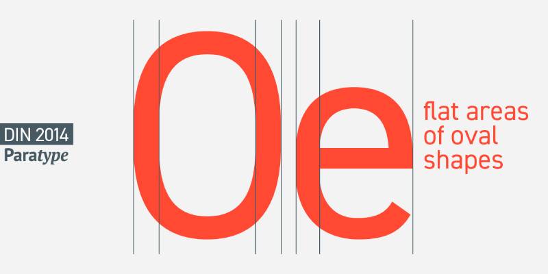
Originally designed for German road signage and industrial applications, DIN evolved into a versatile geometric sans with technical credibility. The condensed, efficient letterforms share Eurostile’s engineered aesthetic while maintaining superior legibility at small sizes.
Visual Characteristics
Condensed letterforms with geometric construction and technical precision. Closed apertures and compact letter spacing create density.
Uniform stroke weight and mechanical terminals reinforce industrial character. Straight-sided curves on characters like ‘o’ and ‘e’ create distinctive technical appearance.
Tall x-height maximizes legibility in compact spaces. Character proportions optimized for information density rather than elegance.
Primary Use Cases
Technical documentation and engineering diagrams traditionally employ DIN variants. Transportation signage and wayfinding systems rely on its clarity.
Automotive industry branding frequently references DIN’s industrial heritage. Modern tech interfaces value the combination of compact width and readability.
Works exceptionally well for data visualization and infographic typography. Better for body text than Eurostile due to more open counters.
Technical Specifications
DIN 1451 represents the original specification standard. DIN 2014 and DIN Next offer expanded commercial families with multiple weights.
Typically includes Light, Regular, Medium, Bold, and Black weights across both normal and condensed widths. Modern versions add language support beyond basic Latin.
Character sets range from 300-600 glyphs depending on version. OpenType features include proportional and tabular figures in premium versions.
Relationship to Eurostile
DIN shares Eurostile’s technical DNA but pursues narrower proportions and higher information density. Both convey industrial precision and engineering credibility.
DIN excels in applications requiring compact, legible text. Eurostile dominates when wider, more dramatic display typography matters.
For modern tech branding needing versatility, DIN’s expanded weight range offers more typographic hierarchy options than classic Eurostile.
Licensing & Availability
Commercial versions available through major foundries including Linotype, Monotype, and FontFont. URW DIN exists in Adobe Fonts library.
Desktop licenses typically $35-50 per weight. Complete families with all weights and widths run $200-300.
Some free interpretations exist but lack professional refinement and full language support.
Avenir
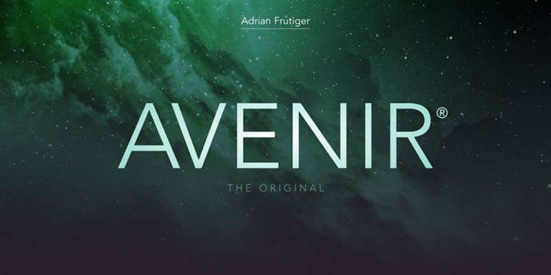
Adrian Frutiger designed Avenir in 1988 as his geometric sans interpretation, acknowledging Futura as inspiration while adding humanist refinement. The name means “future” in French, signaling its forward-looking character while maintaining readability that Eurostile’s pure geometry sacrifices.
Visual Characteristics
Geometric forms softened with organic touches create warmth and approachability. Letter proportions derive from classical models rather than pure mathematical shapes.
Vertical terminals on characters like ‘a’ and ‘t’ show humanist influence. Stroke endings vary subtly rather than maintaining absolute consistency.
The O-forms use slightly flattened curves rather than perfect circles. Counters and apertures remain more open than strict geometric designs.
Primary Use Cases
Corporate identity systems value Avenir’s professional warmth. Editorial design for magazines and publications benefits from its versatility.
Signage systems, including Dallas Fort Worth and Hong Kong airports, deploy Avenir for wayfinding. Amsterdam’s city branding relies on this typeface.
Performs equally well in headlines and body text across print and digital media. Brand guidelines frequently specify Avenir for its balance of personality and neutrality.
Technical Specifications
Comprehensive family includes 6 weights from Light to Black. Both Roman and Oblique styles available across the weight range.
Avenir Next expands the family with additional weights (Thin, Ultra Light) and true italics. Character sets support Latin, Greek, and Cyrillic scripts.
Premium versions include small caps and multiple figure styles. Glyph counts typically exceed 800 in complete OpenType fonts.
Relationship to Eurostile
Avenir and Eurostile share geometric foundations but diverge dramatically in personality. Avenir’s humanist warmth contrasts with Eurostile’s mechanical coldness.
Both work for tech companies, but Avenir suits consumer-facing brands while Eurostile targets industrial and gaming sectors. Avenir handles body text far better due to improved readability.
Choose Avenir when you need geometric structure without sacrificing approachability and reading comfort.
Licensing & Availability
Licensed through Linotype and available via Adobe Fonts subscriptions. Individual weights cost $40-50; complete families $250-350.
Avenir Next pricing similar with slightly higher costs for expanded character set. Commercial licensing covers print, web, and app usage.
Widely available through professional font licensing platforms.
Exo/Exo 2
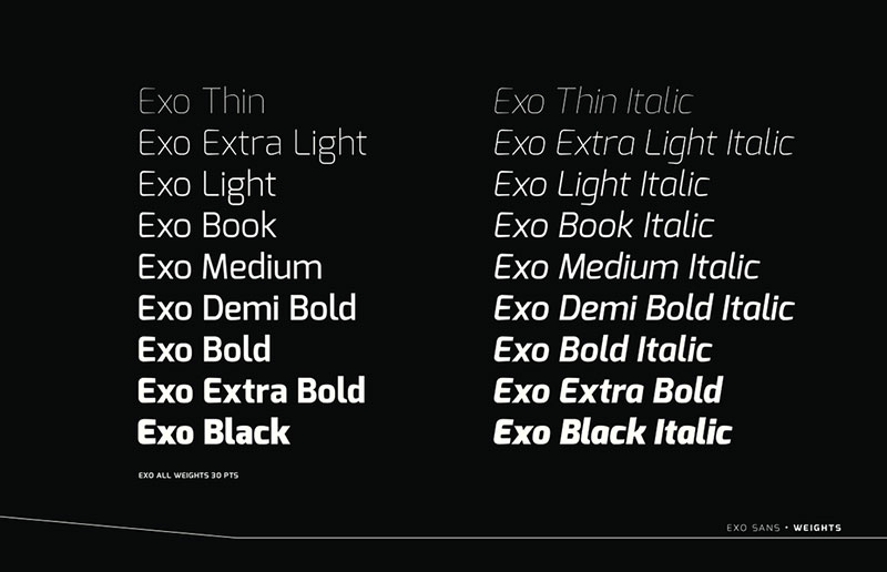
Exo and its refined successor Exo 2 deliver contemporary geometric sans-serif design with strong display orientation. Created by Natanael Gama and released via Google Fonts, these families offer Eurostile-adjacent aesthetics with modern functionality and free licensing.
Visual Characteristics
Geometric letterforms with slightly condensed proportions and modern terminals. Character construction emphasizes clean lines and technical precision.
Stroke contrast remains minimal, following neo-grotesque traditions. Lowercase forms feature moderate x-height and subtle humanist touches in curve resolution.
Exo 2 refined spacing and improved character consistency compared to the original. Both versions maintain that tech-forward appearance suitable for futuristic branding.
Primary Use Cases
Digital product interfaces and app design frequently deploy Exo families. Gaming companies and esports brands favor the energetic, technical aesthetic.
Display typography for tech conferences and event materials works well. Web headers and navigation elements benefit from the condensed widths.
Can function for body text at larger sizes, though extended reading may tire users. Best reserved for headlines, UI elements, and short text blocks.
Technical Specifications
Exo 2 includes 18 styles spanning 9 weights (Thin to Black) with matching italics. Extensive language support includes Latin, Greek, Cyrillic, and Vietnamese.
Character set contains 600+ glyphs with OpenType features. Variable font version available offering fluid weight and width adjustments.
Both families support proportional and tabular figures. Web font formats optimized for fast loading.
Relationship to Eurostile
Exo shares Eurostile’s geometric construction and tech aesthetic but with narrower default proportions. Both convey modernity and innovation through form.
Exo feels more contemporary and less retro-futuristic than Eurostile. The free availability makes Exo attractive for budget-conscious projects requiring similar visual impact.
Use Exo when you need Eurostile’s technical vibe with better body text performance and no licensing costs.
Licensing & Availability
Completely free under SIL Open Font License via Google Fonts. No restrictions on commercial use.
Available for immediate web embedding or desktop download. Variable font versions accessible through Google Fonts API.
Maven Pro
Maven Pro offers a unique geometric sans with rounded terminals and contemporary proportions. Designed by Joe Prince, this Google Fonts release provides approachable tech aesthetic distinct from Eurostile’s sharp edges while maintaining geometric foundations.
Visual Characteristics
Geometric construction with rounded stroke terminals softens the technical appearance. Medium x-height and open counters improve readability over pure geometric faces.
Character widths vary naturally rather than forcing uniform rhythm. The lowercase ‘a’ and ‘g’ use two-storey forms, departing from strict geometric single-storey conventions.
Stroke weight maintains consistency with low contrast. Curved forms reference circles but adjust for optical balance.
Primary Use Cases
Web typography for modern tech startups and digital agencies. Mobile app interfaces benefit from its friendly geometric character.
UI elements and button text work exceptionally well. Brand identity systems seeking warmth within geometric structure.
Body text performs adequately at standard sizes, though not optimized for extended reading. Short paragraphs, captions, and callouts represent ideal applications.
Technical Specifications
Available in 5 weights from Regular to Black. Variable font version allows continuous weight adjustment.
Character set supports Latin with diacritics, covering most European languages. Approximately 350-400 glyphs per font.
OpenType features include proportional and tabular numerals. Web font formats optimize performance.
Relationship to Eurostile
Maven Pro shares geometric DNA with Eurostile but pursues entirely different personality through rounded terminals. Both communicate technical competence, but Maven Pro adds friendliness.
Eurostile’s sharp corners and squared forms create retro-futuristic tension; Maven Pro’s soft edges feel contemporary and welcoming. For consumer-facing tech products, Maven Pro often works better.
Choose Maven Pro when geometric structure matters but harsh mechanical aesthetics would alienate audiences.
Licensing & Availability
Free via Google Fonts under SIL Open Font License. Unrestricted commercial use.
Instant web embedding or desktop download. Variable font version available.
Open Sans
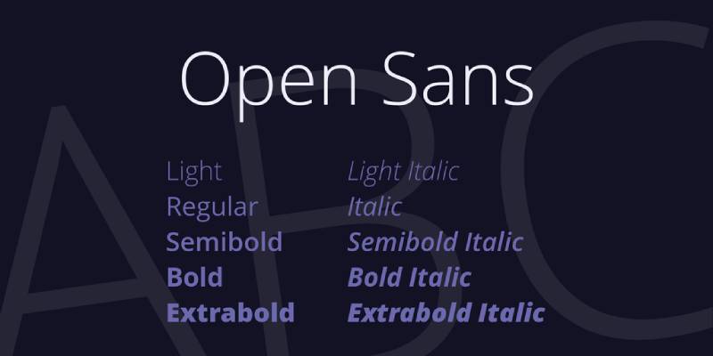
Steve Matteson’s Open Sans provides humanist geometric sans-serif design optimized for digital interfaces and high legibility. While not geometrically squared like Eurostile, it shares neutrality and technical clarity that work for similar applications.
Visual Characteristics
Open letterforms with generous apertures and wide counters. Geometric underpinnings refined with humanist details and optical adjustments.
Neutral character that avoids distinctive personality. Upright stress and vertical terminals maintain clean, modern appearance.
True italics show calligraphic influence rather than simple slanting. Character widths varied for natural reading rhythm.
Primary Use Cases
Web body text across countless websites due to Google Fonts ubiquity. Government and civic websites value the accessible, neutral character.
Mobile apps and responsive layouts benefit from optimized screen rendering. Long-form content and documentation perform excellently.
UI labels, forms, and data displays maintain clarity at various sizes. Typography for accessibility needs often specifies Open Sans.
Technical Specifications
Comprehensive family spans 10 styles with 5 weights (Light to Extra Bold) plus italics. Extended character sets include Latin, Greek, Cyrillic, and Vietnamese.
Over 800 glyphs in complete fonts. OpenType features provide extensive typographic control.
Condensed variants available as separate family. Web font optimization includes hinting for Windows ClearType.
Relationship to Eurostile
Open Sans and Eurostile occupy different typographic territories despite both being geometric sans faces. Open Sans pursues legibility and warmth; Eurostile emphasizes display impact and retro aesthetics.
For tech projects needing body text, Open Sans excels. For branding and display typography, Eurostile dominates. They could pair well together with Eurostile handling headlines and Open Sans managing body copy.
Licensing & Availability
Free under Apache License 2.0 via Google Fonts. Unrestricted commercial use.
Widely available across web platforms and included in many system font libraries. Desktop installation straightforward.
Oswald
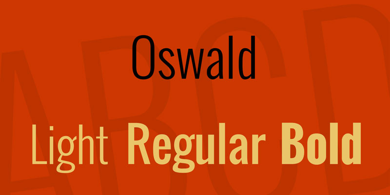
Vernon Adams designed Oswald as a reworking of classic “Alternate Gothic” sans-serifs, optimized for web use. The condensed, bold character shares Eurostile’s architectural strength while maintaining different geometric principles.
Visual Characteristics
Condensed proportions with strong vertical emphasis. Geometric construction with squared-off forms and mechanical precision.
Heavy weight creates strong presence even at smaller sizes. Character widths compressed for space efficiency.
Stroke weight remains largely consistent. Sharp terminals and closed apertures echo Eurostile’s technical aesthetic.
Primary Use Cases
Headlines and display typography for web publications and blogs. Impact-driven design projects benefit from the bold, condensed nature.
Navigation headers and menu systems use Oswald’s efficient space usage. Poster-style layouts and promotional materials.
Not suitable for body text due to condensed widths reducing readability. Best reserved for large headlines and short text blocks.
Technical Specifications
Available in 6 weights from Extra Light to Bold. Variable font version enables continuous weight adjustment.
Character support includes Latin with basic diacritics. Approximately 300-350 glyphs per weight.
OpenType features limited compared to commercial families. Optimized for web rendering.
Relationship to Eurostile
Both pursue geometric strength and architectural presence. Oswald’s condensed proportions differ from Eurostile’s wider stance.
Eurostile’s retro-futuristic character contrasts with Oswald’s more traditional Gothic roots. Both work for tech-adjacent projects but signal different eras and attitudes.
Use Oswald when you need Eurostile-like impact in tighter horizontal spaces.
Licensing & Availability
Free via Google Fonts under SIL Open Font License. Commercial use unrestricted.
Web embedding immediate; desktop installation simple.
Proxima Nova
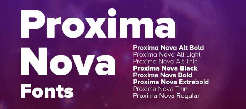
Mark Simonson’s Proxima Nova bridges geometric and humanist sans-serif design, creating versatile modern workhorse with broad appeal. While softer than Eurostile, it shares architectural stability and contemporary tech aesthetic.
Visual Characteristics
Geometric forms balanced with humanist proportions. Slightly condensed default width creates efficiency without cramping.
Three x-heights (Proxima Nova, Alt, and Extra Condensed) provide flexibility. Stroke terminals show subtle tapering rather than pure geometric cuts.
Open apertures and counters maintain clarity. Character widths varied for natural rhythm rather than forced consistency.
Primary Use Cases
Brand identity systems across industries from tech to retail. Web typography for both headlines and body text.
Marketing materials and advertising campaigns value the modern, professional character. App interfaces and digital products frequently specify Proxima Nova.
Corporate communications and presentations benefit from the versatile weight range. Works across print and digital seamlessly.
Technical Specifications
Extensive family includes 48 fonts spanning 7 weights (Thin to Black) with three width variants. True italics across all weights.
Character sets support extended Latin, Greek, and Cyrillic. Over 900 glyphs in complete fonts.
OpenType features include multiple figure styles, fractions, ordinals. Condensed and Extra Condensed variants extend utility.
Relationship to Eurostile
Proxima Nova and Eurostile both communicate contemporary professionalism but through different approaches. Proxima Nova’s warmth contrasts with Eurostile’s mechanical coldness.
Both work for tech branding, but Proxima Nova’s versatility makes it superior for comprehensive brand systems needing body text capabilities. Eurostile wins for pure display impact and retro appeal.
Choose Proxima Nova when you need a complete typographic system; choose Eurostile when you need distinctive character in headlines.
Licensing & Availability
Commercial licensing through Adobe Fonts and other major platforms. Individual weights $35-45; complete family approximately $200.
Widely available and frequently included in professional font subscriptions. Web font licensing separate.
PT Sans
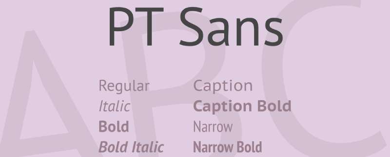
Alexandra Korolkova designed PT Sans as part of the Public Types of Russian Federation project, creating a free geometric sans optimized for Cyrillic alongside Latin scripts. The neutral, technical character provides Eurostile-adjacent functionality without display-oriented extremes.
Visual Characteristics
Geometric sans construction with humanist touches. Medium x-height and open counters prioritize readability.
Neutral forms avoid distinctive personality. Stroke endings remain mechanical but not aggressively squared.
Character proportions suit both display and text settings. True italics include subtle calligraphic details.
Primary Use Cases
Multilingual projects requiring Cyrillic support alongside Latin. Government and educational materials utilize the public domain status.
Web typography for international audiences. Body text in digital products and documentation.
Signage systems and wayfinding benefit from clarity. Business presentations and corporate communications.
Technical Specifications
Family includes 8 styles: Regular, Italic, Bold, Bold Italic, plus Narrow variants. Character set emphasizes Cyrillic but includes comprehensive Latin.
Approximately 700-800 glyphs per font. OpenType features include localized forms and multiple figure styles.
Free under SIL OFL through ParaType and Google Fonts. No licensing restrictions.
Relationship to Eurostile
PT Sans occupies neutral territory where Eurostile claims bold personality. Both communicate technical competence through geometric construction.
PT Sans handles multilingual body text far better than Eurostile. For headline impact and retro-futuristic character, Eurostile dominates.
Use PT Sans when Cyrillic support matters or when you need readable body text with technical undertones.
Licensing & Availability
Free under SIL Open Font License via Google Fonts and ParaType. Commercial use unrestricted.
Widely available and easily accessible.
Quicksand
Andrew Paglinawan designed Quicksand as a geometric sans with display orientation and friendly rounded character. While geometrically structured like Eurostile, the rounded terminals create entirely different personality suited to different applications.
Visual Characteristics
Geometric letterforms with rounded stroke terminals throughout. Circular basis for curved forms creates harmonious proportions.
Low contrast with consistent stroke weight. Open counters and generous spacing enhance readability.
Modern, friendly aesthetic through soft geometry. Character widths relatively uniform following geometric principles.
Primary Use Cases
Youth-oriented brands and consumer products. Web headers and display typography for approachable tech companies.
Children’s content and educational materials benefit from friendly character. Mobile apps targeting casual audiences.
Not ideal for body text despite readability; personality too distinctive for extended reading. Headlines, logos, and short text blocks work best.
Technical Specifications
Available in 6 weights from Light to Bold. Variable font version enables fluid weight adjustment.
Character set supports Latin with diacritics. Approximately 400 glyphs per font.
OpenType features basic but functional. Web font formats optimized.
Relationship to Eurostile
Quicksand and Eurostile share geometric foundations but pursue opposite personalities. Eurostile’s sharp corners create tech tension; Quicksand’s rounds create friendliness.
Both work for tech-adjacent branding, but target different audiences. Eurostile suits gaming, industrial, and retro-futuristic projects. Quicksand fits lifestyle apps, consumer tech, and youth markets.
Choose Quicksand when geometric structure needs friendly softness instead of mechanical edge.
Licensing & Availability
Free via Google Fonts under SIL Open Font License. Commercial use unrestricted.
Easy web embedding and desktop installation.
Raleway
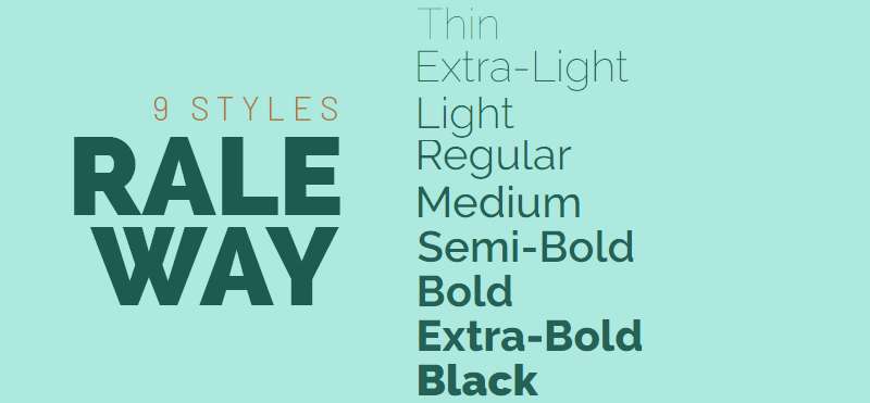
Matt McInerney designed Raleway as an elegant geometric sans with display orientation. The thin weights and refined details create sophisticated character distinct from Eurostile’s industrial ruggedness while maintaining geometric clarity.
Visual Characteristics
Geometric construction with elegant, elongated proportions. Thin weights showcase delicate lines and refined terminals.
Relatively low x-height creates elegant appearance. Single-storey ‘a’ maintains geometric purity.
Open counters and generous spacing enhance clarity. Character forms reference art deco and fashion typography traditions.
Primary Use Cases
Fashion and luxury brand typography. Editorial design for lifestyle magazines and high-end publications.
Display headlines requiring elegance and sophistication. Portfolio websites and creative agency branding.
Can function for body text in heavier weights, though personality remains distinctive. Best reserved for headlines and short text where character matters.
Technical Specifications
Extensive family includes 18 styles spanning 9 weights (Thin to Black) with italics. Variable font version available.
Character set supports Latin with extended diacritics. Approximately 600 glyphs in complete fonts.
OpenType features include stylistic alternates and multiple figure styles. Web font optimization maintained across weights.
Relationship to Eurostile
Raleway and Eurostile both embrace geometric sans-serif principles but target opposite markets. Raleway pursues elegance; Eurostile emphasizes industrial strength.
Raleway’s thin weights would be illegible for technical applications where Eurostile thrives. Eurostile’s squared forms lack Raleway’s sophistication for luxury contexts.
Choose Raleway when geometric structure needs refinement and elegance rather than technical prowess.
Licensing & Availability
Free via Google Fonts under SIL Open Font License. Commercial use unrestricted.
Web and desktop availability immediate.
Sansation
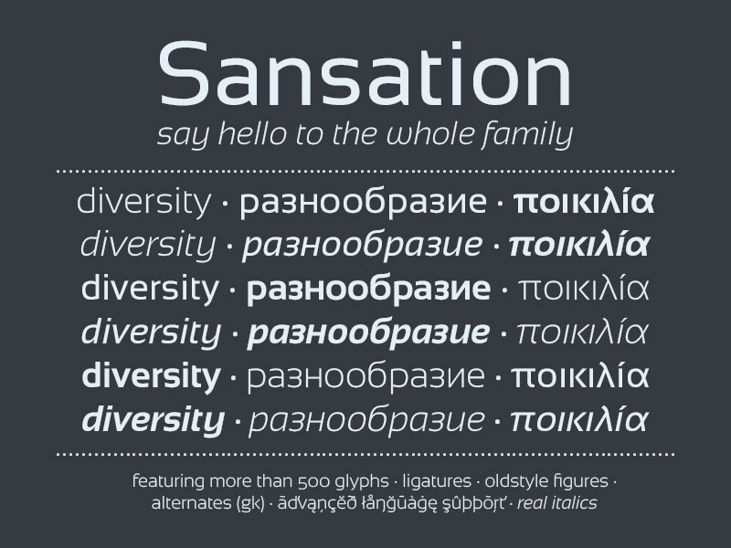
Bernd Montag created Sansation as a free geometric sans with wide proportions and modern character. The extended letterforms share Eurostile’s architectural presence while maintaining different geometric resolution.
Visual Characteristics
Wide geometric proportions with low contrast. Stroke endings show subtle rounding rather than sharp mechanical cuts.
Open counters and generous spacing. Characters maintain consistent width creating stable, grounded appearance.
Geometric construction balanced with readable proportions. Curved forms reference circles but adjust for optical correction.
Primary Use Cases
Branding projects requiring modern geometric character without licensing costs. Web typography for tech startups and digital agencies.
Poster design and promotional materials benefit from wide proportions. Display headers and navigation elements.
Can work for body text in Regular weight, though personality remains present. Better suited to headlines and short text blocks.
Technical Specifications
Available in 3 weights: Light, Regular, and Bold. No italic variants in standard distribution.
Character set covers basic Latin with limited diacritics. Approximately 250-300 glyphs per font.
OpenType features minimal. Format availability includes TrueType and OpenType.
Relationship to Eurostile
Sansation shares Eurostile’s wide proportions and geometric foundation. Both communicate modern, technical character through form.
Eurostile’s squared geometry creates more distinctive personality; Sansation’s softer approach feels more neutral. For retro-futuristic projects, Eurostile dominates. For contemporary geometric needs on budget, Sansation functions adequately.
Use Sansation when you need wide geometric sans character with free licensing.
Licensing & Availability
Free for personal and commercial use. Available from various font repositories.
License terms vary by distribution source; verify before commercial deployment. Generally permissive for most applications.
Teko

Indian Type Foundry created Teko as an ultra-condensed display family with strong vertical emphasis. While geometrically different from Eurostile’s wide stance, both share architectural strength and modern technical aesthetic.
Visual Characteristics
Extremely condensed proportions maximize vertical space. Geometric construction with mechanical precision.
Uniform stroke weight with minimal contrast. Tall x-height compensates for narrow widths.
Characters maintain legibility despite extreme condensation through open counters. Sharp terminals echo Eurostile’s technical character.
Primary Use Cases
Vertical navigation menus and sidebar typography. Dense information displays requiring space efficiency.
Sports graphics and motion design benefit from strong vertical forms. Banner ads and social media posts with constrained widths.
Headlines in narrow columns and magazine layouts. Not suitable for body text due to extreme condensation.
Technical Specifications
Available in 5 weights from Light to Bold. Variable font version enables continuous adjustment.
Character set supports Latin, Devanagari, and limited additional scripts. Approximately 400-500 glyphs depending on weight.
OpenType features basic. Web font optimization for Google Fonts platform.
Relationship to Eurostile
Teko and Eurostile occupy opposite ends of width spectrum while sharing geometric technical character. Eurostile’s width creates bold presence; Teko’s condensation creates vertical drama.
Both work for tech-adjacent projects but solve different spatial problems. Eurostile excels in wide formats; Teko dominates in constrained horizontal spaces.
Use Teko when vertical emphasis and space efficiency matter more than Eurostile’s architectural stability.
Licensing & Availability
Free via Google Fonts under SIL Open Font License. Commercial use unrestricted.
Immediate web and desktop access.
Titillium Web
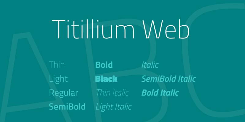
Accademia di Belle Arti di Urbino developed Titillium Web through a collaborative type design workshop. This geometric sans with tech aesthetic offers extensive weight range and free licensing for digital applications.
Visual Characteristics
Geometric letterforms with moderate width and technical precision. Character construction emphasizes clean lines and modern terminals.
Open apertures and counters maintain clarity across weights. Stroke endings show subtle angular cuts creating technical vibe.
Multiple weights maintain proportional consistency. True italics with subtle slant angle.
Primary Use Cases
Web interfaces and digital product design. Tech company branding and marketing materials.
Open-source project documentation frequently uses Titillium. UI elements and form controls benefit from clarity.
Body text performs adequately in Regular through Medium weights. Headlines work across full weight spectrum.
Technical Specifications
Family includes 11 styles spanning 6 weights with italics (Light through Black). Extensive character set supports Latin with comprehensive diacritics.
Approximately 500-600 glyphs per font. OpenType features include ligatures and multiple numeral styles.
Web font formats optimized for performance. Hinting improved for screen rendering.
Relationship to Eurostile
Titillium Web shares Eurostile’s geometric tech aesthetic but with more normalized proportions. Both communicate modernity and technical sophistication.
Titillium handles body text better due to less extreme geometric character. Eurostile provides more distinctive display personality.
Choose Titillium when you need complete typographic system with tech character and free licensing; choose Eurostile for pure display impact.
Licensing & Availability
Free via Google Fonts under SIL Open Font License. Commercial use unrestricted.
Web embedding instant; desktop download straightforward.
Ubuntu

Canonical commissioned Ubuntu from Dalton Maag for the Ubuntu operating system. This humanist sans with geometric influences provides approachable tech aesthetic distinct from Eurostile’s mechanical coldness.
Visual Characteristics
Humanist geometric hybrid with unique rounded square character. Terminals show distinctive circular dot endings creating recognizable personality.
Open counters and generous proportions enhance readability. Lowercase forms include subtle calligraphic details.
Stroke weight varies slightly following humanist traditions. Character widths natural rather than forced geometric consistency.
Primary Use Cases
Linux and open-source project interfaces. Tech company branding seeking friendly approachability.
Documentation and technical writing benefit from readability. Web typography for international audiences.
Body text performs excellently across sizes. UI elements and system fonts in Ubuntu OS and derivatives.
Technical Specifications
Family includes 8 styles: Regular, Italic, Medium, Medium Italic, Bold, Bold Italic, Light, Light Italic. Ubuntu Condensed and Ubuntu Mono extend the family.
Character set supports extended Latin with comprehensive coverage. Approximately 700-800 glyphs in complete fonts.
OpenType features provide typographic refinement. Hinting optimized for Linux rendering engines.
Relationship to Eurostile
Ubuntu and Eurostile both serve tech contexts but with opposite approaches to personality. Ubuntu’s warmth contrasts with Eurostile’s mechanical precision.
Eurostile targets gaming, industrial, and retro-futuristic aesthetics. Ubuntu fits consumer Linux, accessible tech, and friendly digital products.
Choose Ubuntu when humanist warmth within geometric structure matters; choose Eurostile for pure geometric display impact.
Licensing & Availability
Free under Ubuntu Font License. Commercial use permitted with some restrictions (primarily around selling font itself).
Available via Google Fonts and direct from Ubuntu. Desktop installation simple.
Neuzeit S
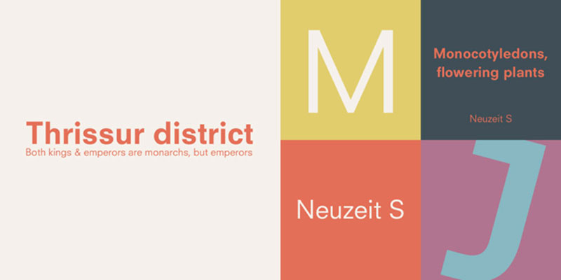
Originally designed in 1928 by Wilhelm Pischner for Stempel foundry, Neuzeit S represents German geometric sans-serif traditions. URW++ later digitized it, creating a contemporary alternative with roots in the same modernist movement that influenced Eurostile’s development.
Visual Characteristics
Geometric construction with moderate width and clean lines. Letterforms derive from circles and straight lines following Bauhaus principles.
Consistent stroke weight with mechanical terminals. Open counters and generous spacing enhance clarity.
The design balances geometric purity with optical adjustments for readability. Character proportions suit both display and text applications.
Technical Specifications
Family includes multiple weights from Light through Bold. Extended character set covers Latin with some Cyrillic support.
OpenType features include ligatures and multiple numeral styles. Available in both TrueType and PostScript formats.
Primary Use Cases
German engineering and industrial design projects reference the typeface’s heritage. Corporate branding for manufacturing and technology sectors.
Technical manuals and engineering documentation benefit from clarity and precision. Signage systems requiring geometric structure.
Relationship to Eurostile
Neuzeit S shares historical lineage with Eurostile through common geometric modernist roots. Both emerged from similar design philosophies emphasizing functionality and mathematical purity.
Neuzeit S predates Eurostile and lacks the squared future-forward character. For authentic 1920s Bauhaus aesthetic, Neuzeit S delivers; for 1960s space-age tech, Eurostile dominates.
Licensing & Availability
Commercial licensing through URW++ and other foundries. Individual weights typically $30-50.
Less widely available than more popular geometric alternatives. Check Adobe Fonts and professional font platforms.
Tactic Sans
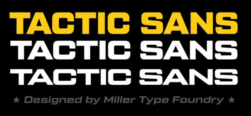
Tactic Sans delivers contemporary geometric sans-serif design with strong display orientation and architectural presence. The squared letterforms and technical precision create clear kinship with Eurostile’s industrial aesthetic.
Visual Characteristics
Squared geometric forms with consistent stroke weight. Character construction emphasizes architectural stability through strong verticals and horizontals.
Mechanical terminals create technical character. Open counters balance the squared exterior forms.
Multiple weights maintain proportional consistency. The design feels engineered rather than handwritten.
Technical Specifications
Available in several weights from Light through Black. Character set supports Latin scripts with extended European coverage.
OpenType features provide professional typographic control. Format availability includes both web and desktop versions.
Primary Use Cases
Tech startup branding and digital product interfaces. Gaming industry materials and esports graphics.
Industrial design portfolios and architecture websites. Display typography for technical conferences and presentations.
Relationship to Eurostile
Tactic Sans pursues similar squared geometric aesthetic as Eurostile with contemporary refinement. Both communicate technical sophistication through form.
The typefaces could easily substitute for each other in many applications. Subtle proportional differences and terminal details distinguish them upon close inspection.
Licensing & Availability
Commercial licensing typically required through type foundries. Pricing varies by vendor and usage scope.
Availability through professional font platforms. Verify specific licensing terms before deployment.
Neographik
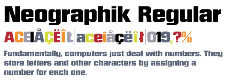
Neographik explores geometric sans territory with distinct personality and modern edge. The squared forms and technical precision place it firmly in Eurostile’s stylistic neighborhood while maintaining unique character details.
Visual Characteristics
Geometric construction with squared letterforms and mechanical details. Character widths lean toward condensed proportions.
Low contrast with consistent stroke weight. Terminals show technical precision with sharp, clean cuts.
The design emphasizes modernity through bold geometric statements. Counter spaces remain open despite squared exterior forms.
Technical Specifications
Multiple weights available spanning Light through Bold spectrum. Character support includes Latin with basic diacritics.
OpenType features provide standard typographic functionality. Available in digital formats for desktop and web use.
Primary Use Cases
Display typography for tech-forward brands. Gaming interfaces and digital product design.
Poster design and promotional materials requiring geometric impact. Short-form editorial work and magazine headlines.
Relationship to Eurostile
Neographik occupies similar stylistic space as Eurostile with squared geometry and technical character. Both work for futuristic and industrial applications.
The typefaces share core aesthetic principles while differing in specific execution details. Either could fulfill similar design briefs effectively.
Licensing & Availability
Commercial licensing through type foundries specializing in contemporary designs. Pricing follows standard industry models.
Check major font platforms for availability and specific terms.
TT Norms Pro
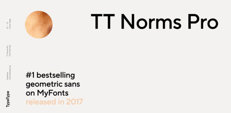
TypeType foundry developed TT Norms Pro as a modern geometric sans with exceptional versatility and extensive weight range. While less squared than Eurostile, it shares architectural stability and contemporary tech aesthetic.
Visual Characteristics
Geometric foundation with humanist refinement. Letterforms balance mathematical precision with optical adjustments.
Wide weight range maintains proportional consistency. Character construction emphasizes clarity and legibility.
Stroke endings show subtle technical character without extreme mechanical styling. Open counters and generous proportions enhance readability.
Technical Specifications
Massive family spanning 20+ weights from Thin through Black with matching italics. Character set includes extended Latin, Cyrillic, and Greek.
Over 1,000 glyphs in complete versions. OpenType features extensive including stylistic sets and contextual alternates.
Variable font versions available offering fluid axis control. Professional hinting for all rendering environments.
Primary Use Cases
Comprehensive brand identity systems requiring wide weight range. Corporate communications across print and digital media.
Web typography from body text through headlines. App interfaces and digital products.
Technical documentation that balances clarity with personality. Marketing materials and advertising campaigns.
Relationship to Eurostile
TT Norms Pro and Eurostile both serve tech contexts but TT Norms pursues broader utility through extensive weights and improved text performance. Eurostile emphasizes display character and retro appeal.
For complete typographic systems, TT Norms Pro’s versatility excels. For distinctive headline impact with geometric squared aesthetic, Eurostile remains unmatched.
Licensing & Availability
Commercial licensing through TypeType. Pricing structures include desktop, web, and app licenses.
Complete family represents significant investment. Individual weights available for budget-conscious projects.
TT Commons Pro
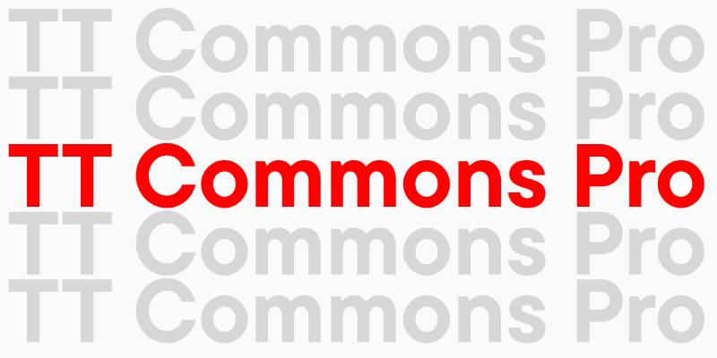
TypeType’s TT Commons Pro provides geometric sans functionality with neutral character and extensive technical capabilities. The squared proportions create distant kinship with Eurostile while maintaining more normalized geometric approach.
Visual Characteristics
Geometric construction with balanced proportions. Squared letterforms without extreme geometric exaggeration.
Multiple masters ensure optical consistency across sizes. Character set comprehensive with extensive language support.
Stroke weight consistent with subtle humanist adjustments. Technical precision balanced with readability optimization.
Technical Specifications
Family includes 20+ styles across 10 weights with italics. Character sets exceed 1,000 glyphs supporting Latin, Cyrillic, Greek.
OpenType features extensive including small caps and multiple numeral sets. Variable fonts provide continuous adjustment.
Web font optimization maintained across all weights. Professional hinting for cross-platform rendering.
Primary Use Cases
Enterprise branding and corporate identity systems. Financial services and professional service firms.
Technical platforms and B2B software interfaces. Documentation and long-form editorial projects.
Performs equally well in body text and display applications.
Relationship to Eurostile
TT Commons Pro shares geometric foundations with Eurostile but pursues neutral professionalism over distinctive character. Both work for tech sectors with different priority balances.
Eurostile creates memorable brand identity through unique squared forms. TT Commons Pro provides comprehensive system functionality.
Licensing & Availability
Commercial licensing through TypeType foundry. Standard pricing for professional geometric sans families.
Desktop, web, and app licenses available separately or bundled.
TT Firs Neue
TypeType’s TT Firs Neue brings grotesque geometric sans traditions into contemporary context with technical precision. The architectural stability echoes Eurostile’s engineering aesthetic through different formal approach.
Visual Characteristics
Geometric grotesque construction with squared tendencies. Letterforms show technical precision and architectural stability.
Character proportions balanced between condensed and extended. Stroke weight consistent across all glyphs.
Multiple widths expand versatility. Terminals show mechanical precision.
Technical Specifications
Comprehensive family with multiple weights and widths. Character support includes extended Latin, Cyrillic, Greek.
OpenType features professional-grade. Variable font options available.
Extensive glyph sets exceed 1,000 characters.
Primary Use Cases
Tech industry branding and interface design. Engineering firms and industrial design studios.
Technical documentation requiring clarity and professionalism. Web platforms needing versatile geometric sans.
Relationship to Eurostile
TT Firs Neue and Eurostile share geometric technical DNA. TT Firs offers more weights and widths for comprehensive systems; Eurostile provides distinctive retro-futuristic character.
Licensing & Availability
Commercial licensing through TypeType. Professional pricing structures.
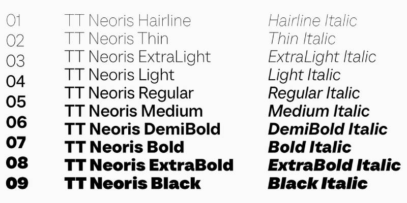
TT Neoris
TypeType developed TT Neoris as a geometric sans with distinctive squared character directly comparable to Eurostile. The modern interpretation maintains retro-futuristic essence while adding contemporary refinement.
Visual Characteristics
Squared geometric letterforms with mechanical precision. Character construction emphasizes technical character and architectural stability.
Strong horizontal and vertical emphasis creates engineered appearance. Terminals sharp and precise.
Counter spaces remain open despite squared exteriors. Multiple weights maintain consistent character.
Technical Specifications
Family includes extensive weight range. Character sets support multiple scripts including Latin, Cyrillic.
OpenType features comprehensive. Variable font versions available.
Professional-grade hinting and optimization.
Primary Use Cases
Gaming industry branding and esports graphics. Tech startups seeking retro-futuristic aesthetic.
Science fiction and technology-themed projects. Display typography for conferences and events.
Relationship to Eurostile
TT Neoris directly competes with Eurostile in the squared geometric technical category. Both deliver similar aesthetic impact with different refinement levels.
Eurostile carries historical cache and widespread recognition. TT Neoris offers modern technical execution with expanded language support.
Licensing & Availability
Commercial licensing through TypeType foundry. Standard professional pricing.
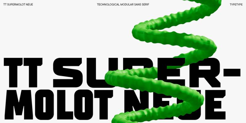
TT Supermolot Neue
TypeType’s TT Supermolot Neue explores squared geometric sans territory with bold display orientation. The mechanical character and architectural forms align closely with Eurostile’s industrial aesthetic.
Visual Characteristics
Squared geometric forms with strong display character. Bold weights dominate the family offering.
Mechanical terminals and consistent stroke weight. Character proportions emphasize impact over subtle refinement.
Technical precision evident in letterform construction. Counters remain open balancing squared exteriors.
Technical Specifications
Multiple weights focused on bolder spectrum. Character support includes extended European languages.
OpenType features provide professional functionality. Desktop and web formats available.
Primary Use Cases
Display headlines and impact typography. Gaming graphics and entertainment industry materials.
Tech branding requiring bold geometric presence. Short-form advertising and promotional design.
Relationship to Eurostile
TT Supermolot Neue shares Eurostile’s squared geometry and mechanical precision. Both work for similar futuristic and technical applications.
The typefaces occupy parallel aesthetic territory with subtle execution differences.
Licensing & Availability
Commercial licensing through TypeType. Professional foundry pricing.
Frank
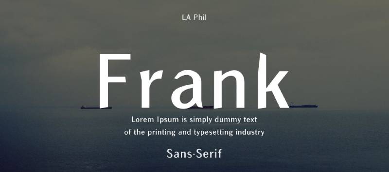
Frank explores geometric sans design with influences from DIN, Eurostile, and Futura. This hybrid approach creates distinctive character while maintaining technical credibility shared across its inspirations.
Visual Characteristics
Geometric construction drawing from multiple classic sources. Squared forms reference Eurostile while maintaining unique proportions.
Character widths balanced between condensed and extended. Stroke weight consistent with mechanical precision.
Open counters and clear apertures enhance readability. Technical details create engineered appearance.
Technical Specifications
Available in 5 weights with 3 width variants. Character set supports extended Latin.
OpenType features include standard typographic functionality. Web font versions optimized for performance.
Primary Use Cases
Tech branding seeking character with geometric foundation. Web typography for digital products and agencies.
Display headlines and poster design. Marketing materials requiring modern technical aesthetic.
Relationship to Eurostile
Frank acknowledges Eurostile influence while pursuing distinctive personality. Both share geometric technical foundations.
Eurostile provides pure squared retro-futuristic impact. Frank offers contemporary hybrid approach with multiple influences balanced.
Licensing & Availability
Commercial licensing through type foundries. Web fonts included with desktop licenses.
Brinnan
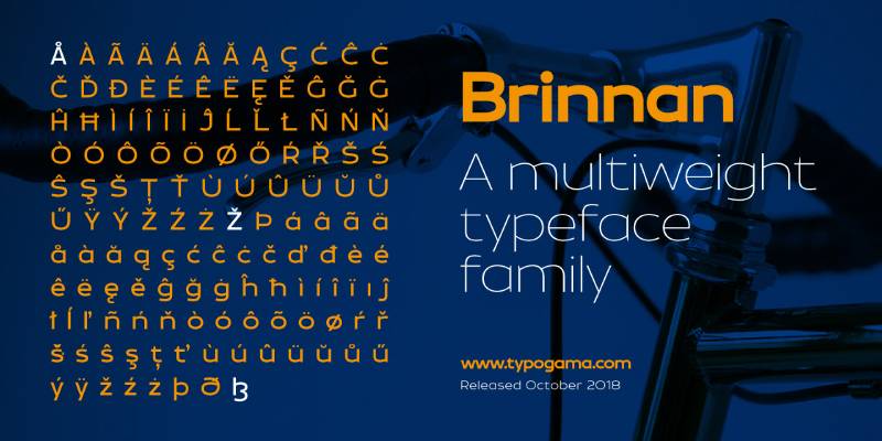
Brinnan delivers geometric sans character with display orientation. The squared forms and technical precision place it within Eurostile’s stylistic family.
Visual Characteristics
Squared geometric letterforms with modern refinement. Strong horizontal and vertical emphasis.
Consistent stroke weight throughout. Mechanical terminals create technical vibe.
Character proportions balanced for display applications. Counter spaces open and clear.
Primary Use Cases
Display typography for tech brands. Gaming industry graphics and promotional materials.
Short-form editorial headlines. Tech conference materials and presentations.
Relationship to Eurostile
Brinnan occupies similar aesthetic territory as Eurostile with squared geometry. Both work for technical and futuristic applications.
Licensing & Availability
Commercial licensing through independent foundries or font marketplaces.
Thrifty
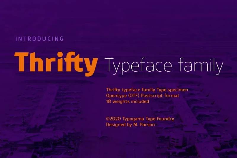
Thrifty provides geometric sans functionality with efficient character and technical precision. The squared tendencies create connection to Eurostile’s industrial aesthetic.
Visual Characteristics
Geometric construction with squared elements. Efficient proportions maximize space usage.
Technical character through mechanical details. Stroke weight consistent and clean.
Primary Use Cases
Budget-conscious branding projects requiring geometric character. Web typography with technical aesthetic.
Display applications where squared geometry communicates innovation.
Relationship to Eurostile
Thrifty shares Eurostile’s squared geometric foundation with focus on utility and efficiency.
Licensing & Availability
Typically available at lower price points than premium alternatives.
Mensch
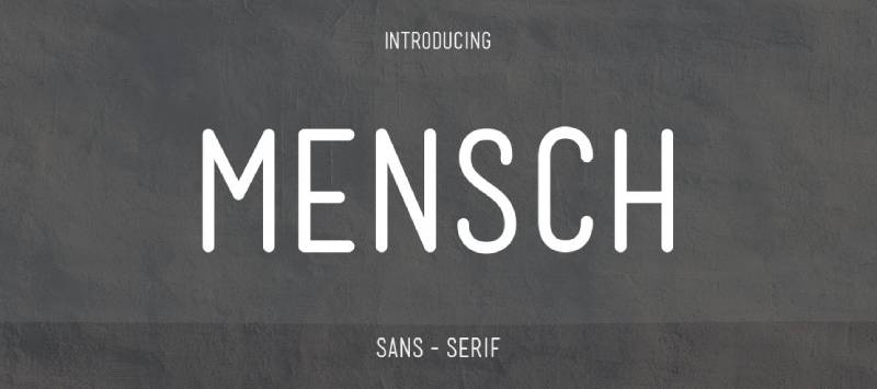
Mensch explores humanist geometric sans territory with technical undertones. While less squared than Eurostile, it shares architectural stability and contemporary character.
Visual Characteristics
Geometric foundation with humanist refinement. Character proportions balanced and readable.
Technical details create modern professional appearance. Stroke consistency maintained throughout.
Primary Use Cases
Corporate branding and professional services. Technical documentation and business communications.
Web interfaces requiring both character and readability.
Relationship to Eurostile
Mensch and Eurostile share geometric technical foundations but Mensch pursues more humanist accessibility while Eurostile emphasizes mechanical precision.
Licensing & Availability
Commercial licensing through professional foundries.
QT Eurotype
QT Eurotype directly references Eurostile in its name and design approach. This geometric sans provides squared letterforms and technical precision closely aligned with its namesake inspiration.
Visual Characteristics
Squared geometric forms with mechanical precision. Character construction directly echoes Eurostile design principles.
Consistent stroke weight throughout. Sharp terminals create technical character.
Proportions maintain Eurostile-adjacent width and spacing. Counter spaces balanced against squared exteriors.
Technical Specifications
Available weights span standard display font range. Character support focuses on Latin scripts.
OpenType features provide basic professional functionality. Desktop font formats standard.
Primary Use Cases
Projects seeking Eurostile aesthetic with alternative licensing. Gaming industry graphics and tech branding.
Retro-futuristic design applications. Display typography for technology themes.
Relationship to Eurostile
QT Eurotype exists as direct Eurostile alternative, sharing virtually identical aesthetic goals. The typefaces work interchangeably in most applications.
Name recognition and historical significance favor Eurostile. QT Eurotype provides similar functionality with different licensing terms.
Licensing & Availability
Commercial licensing through specialized foundries. Pricing typically competitive with other Eurostile alternatives.
PT Magistral
ParaType developed PT Magistral as part of Public Types project, creating geometric sans with squared technical character. The engineering precision aligns with Eurostile’s industrial aesthetic while maintaining distinct Russian design heritage.
Visual Characteristics
Squared geometric letterforms with technical precision. Character construction emphasizes architectural stability.
Strong vertical and horizontal strokes. Mechanical terminals throughout.
Cyrillic and Latin scripts both designed with equal attention. Counter spaces remain open and clear.
Technical Specifications
Family includes multiple weights. Extensive Cyrillic character support alongside Latin.
OpenType features standard for professional typeface. Available through ParaType and font repositories.
Primary Use Cases
Russian tech branding and interface design. Multilingual projects requiring Cyrillic alongside geometric sans aesthetic.
Industrial design communications. Technical documentation for engineering sectors.
Relationship to Eurostile
PT Magistral shares Eurostile’s squared geometry and technical precision. Both work for similar applications with PT Magistral offering superior Cyrillic support.
Eurostile carries stronger Western market recognition. PT Magistral excels in multilingual Russian-Western contexts.
Licensing & Availability
Free under SIL Open Font License through ParaType. Commercial use unrestricted.
Desktop and web formats readily available.
FAQ on Fonts Similar To Eurostile
What free font looks most like Eurostile?
Square 721 from Bitstream offers the closest free match to Eurostile’s squared geometry. Exo 2 on Google Fonts provides similar tech aesthetics with better weight options. Both deliver that retro-futuristic character without licensing costs.
Can I use Eurostile alternatives for commercial projects?
Depends on the font licensing model. Google Fonts like Roboto and Exo 2 allow unrestricted commercial use. Premium alternatives like Proxima Nova and Avenir require paid licenses. Always verify specific EULA terms before deployment.
Which Eurostile alternative works best for body text?
Roboto excels for digital body text with its humanist warmth and extensive weight range. DIN handles print documentation well due to compact proportions. Eurostile itself struggles with extended reading, making most alternatives superior for lengthy content.
Is Microgramma the same as Eurostile?
Microgramma preceded Eurostile by 10 years as its all-caps predecessor. Eurostile added lowercase letters, condensed weights, and refined proportions. Later Microgramma versions added lowercase, making them functionally identical to Eurostile in digital formats.
What font does NASA use instead of Eurostile?
NASA historically used Futura for the Apollo 11 lunar plaque and various missions. Modern NASA branding employs custom variations of Helvetica and DIN for technical documentation. Both share Eurostile’s geometric clarity and professional credibility.
Do variable fonts exist for Eurostile-style typefaces?
Roboto Flex offers 12 adjustable axes including weight and width. Exo 2 provides variable font versions through Google Fonts. TT Norms Pro and other TypeType families include variable options. These deliver infinite style variations in single files.
Which gaming companies use fonts similar to Eurostile?
Electronic Arts, Ubisoft, and Activision frequently deploy squared geometric sans faces for gaming interfaces. Square 721, Bank Gothic, and custom Eurostile variants dominate esports graphics. The squared aesthetic signals futuristic technology perfectly.
Can I pair Eurostile alternatives with serif fonts?
Geometric sans faces pair excellently with slab serif fonts like Rockwell for industrial projects. Roboto Slab complements Roboto perfectly. The key lies in contrasting geometric headlines with warmer body text. Avoid pairing similar geometric faces together.
What’s the difference between Eurostile and Bank Gothic?
Bank Gothic features taller, more condensed proportions with distinctive uppercase styling. Eurostile offers wider letterforms with lowercase functionality. Both share squared geometry, but Bank Gothic reads more vintage-industrial while Eurostile leans retro-futuristic and space-age.
Are there condensed versions of Eurostile alternatives?
Eurostile itself includes Condensed variants. Square 721 offers condensed widths. Roboto Condensed provides a complete narrower family. DIN naturally runs condensed. Teko delivers ultra-condensed proportions. Most modern geometric sans families include width variations for flexibility.
Conclusion
Fonts similar to Eurostile span from free Google Fonts to premium commercial families, each bringing squared geometric character to your projects. Microgramma delivers authentic vintage sci-fi vibes. Roboto handles modern interface design with superior readability.
Budget constraints don’t limit options. Square 721, Exo 2, and Teko provide that mechanical aesthetic without licensing fees.
Premium choices like Proxima Nova and TT Norms Pro offer comprehensive typographic hierarchy with extensive weights and variable fonts technology. DIN and Avenir balance geometric structure with humanist warmth for broader applications.
Your choice depends on project needs. Gaming and tech branding demand bold display impact. Corporate systems require versatile body text performance. Aviation and industrial sectors benefit from authentic engineering aesthetics.
Match the typeface to your context. The alternatives exist.
If you enjoyed reading this article on fonts similar to Eurostile, you should check out these articles with fonts similar to Proxima Nova, Avenir, Lato, Papyrus, Old English, Century Gothic, Minion Pro, Gill Sans, and Comic Sans.
Renowned for his expertise in logo design and visual branding, Bogdan has developed a multitude of logos for various clients.
His skills extend to creating posters, vector illustrations, business cards, and brochures. Additionally, Bogdan's UI kits were featured on marketplaces like Visual Hierarchy and UI8.
He also wrote in the past years on sites like Design Your Way, WebDesignerDepot, WPDean, Designmodo, Speckyboy, Slider Revolution, and more.
- The Figma Logo History, Colors, Font, And Meaning - 25 July 2026
- Canva for Teams Review: Is It Worth the Business Plan? - 24 July 2026
- 5 Brand Compliance Checkpoints Every Enterprise Should Automate - 23 July 2026
Bogdan Sandu is a seasoned designer who has been designing websites since 2008. Renowned for his expertise in logo design and visual branding, Bogdan has developed a multitude of logos for various clients. His skills extend to creating posters, vector illustrations, business cards, and brochures. Additionally, Bogdan's UI kits were featured on marketplaces like Visual Hierarchy and UI8. He also wrote in the past years on sites like Design Your Way, WebDesignerDepot, WPDean, Designmodo, Speckyboy, Slider Revolution, and more.
You Might Also Like