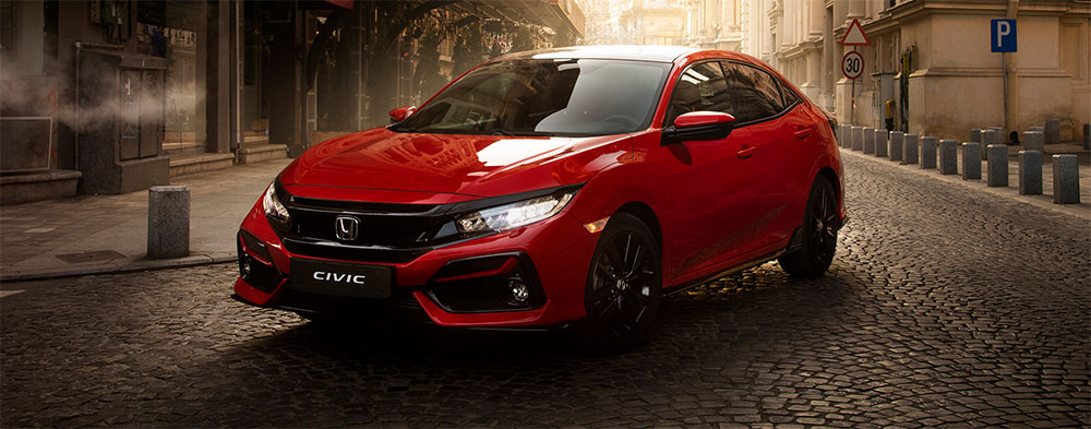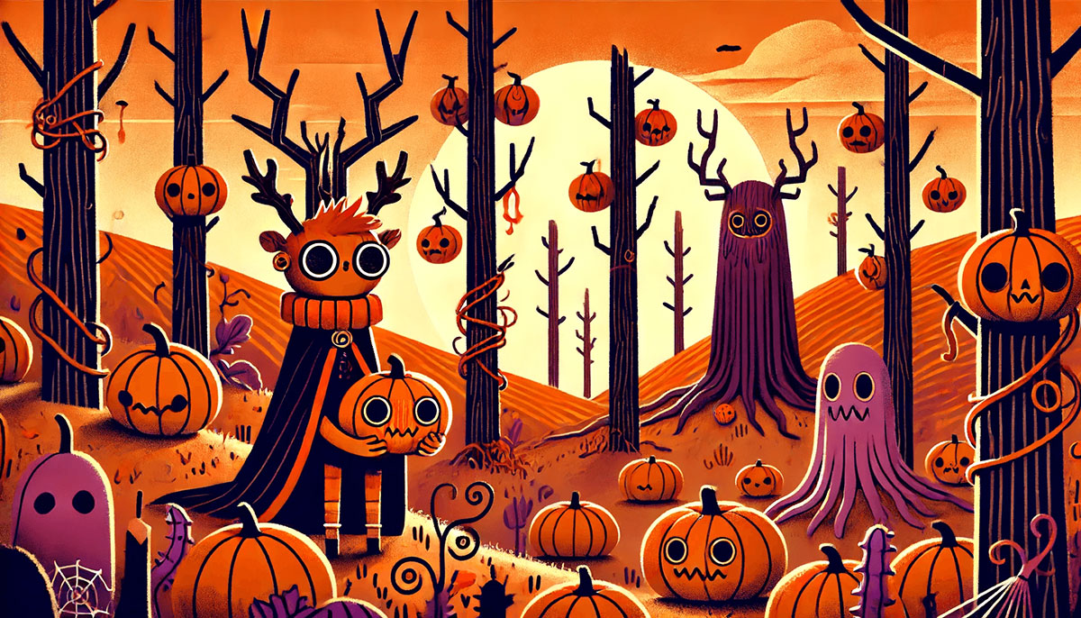
The power of color cannot be overstated-especially when it comes to the vibrant shades of orange. Imagine the fiery hues of a sunset, the rich tones of autumn leaves, or the bold pops of color in a trendy graphic design. Orange is not just a color; it’s a statement.
Orange hues like tangerine, coral, and burnt orange bring warmth, energy, and creativity to any palette.
But how do you choose the right shade for your project? Whether you’re diving into color theory for your next interior design masterpiece, or picking the perfect Pantone color for a brand refresh, understanding the spectrum of orange is crucial.
In this article, we’ll explore the diverse color palette of orange, delve into color psychology, and reveal how these vibrant tones can transform your designs.
By the end, you’ll not only recognize every shade of orange but also master their application in graphic design and beyond.
Popular Shades of Orange
| Shade Name | HEX Code | RGB Values | Description |
|---|---|---|---|
| Tangerine | #F28500 | (242, 133, 0) | A bright and vibrant orange, similar to the fruit tangerine. |
| Pumpkin | #FF7518 | (255, 117, 24) | A medium orange with a hint of brown, like the color of pumpkins. |
| Coral | #FF7F50 | (255, 127, 80) | A bright orange with a slight pink tint, similar to coral reefs. |
| Peach | #FFE5B4 | (255, 229, 180) | A soft and pale orange, like the color of peaches. |
| Apricot | #FBCEB1 | (251, 206, 177) | A light and warm orange, similar to the fruit apricot. |
| Amber | #FFBF00 | (255, 191, 0) | A medium to dark orange, like the color of amber resin. |
| Burnt Orange | #CC5500 | (204, 85, 0) | A dark and deep orange, like the color of burnt clay. |
| Carrot Orange | #ED9121 | (237, 145, 33) | A bright and vivid orange, similar to the color of carrots. |
| Salmon | #FA8072 | (250, 128, 114) | A light and soft orange with a hint of pink, like the color of salmon flesh. |
| Dark Orange | #FF8C00 | (255, 140, 0) | A deep and rich orange, very vibrant. |
| Light Salmon | #FFA07A | (255, 160, 122) | A pale and soft orange with a hint of pink. |
| Saffron | #F4C430 | (244, 196, 48) | A medium yellow-orange, like the color of saffron spice. |
| Orange | #FFA500 | (255, 165, 0) | The purest form of orange, very bright and vivid. |
| Papaya Whip | #FFEFD5 | (255, 239, 213) | A very pale orange, like the color of papaya flesh. |
| Mango Tango | #FF8243 | (255, 130, 67) | A bright and vibrant orange, similar to the color of ripe mangoes. |
| Coral Reef | #FD7C6E | (253, 124, 110) | A soft orange with a hint of pink, like the color of coral reefs. |
| Atomic Tangerine | #FF9966 | (255, 153, 102) | A bright and intense orange, reminiscent of tangerine. |
| Bittersweet | #FE6F5E | (254, 111, 94) | A medium orange with a slight red tint. |
| Goldfish Orange | #FF9933 | (255, 153, 51) | A bright orange, like the color of goldfish. |
| Vermilion | #E34234 | (227, 66, 52) | A bright and vivid orange with a red undertone. |
| Atomic Orange | #FF9218 | (255, 146, 24) | A bright and intense orange, almost neon. |
| Honey Orange | #FFA07A | (255, 160, 122) | A soft and warm orange, like the color of honey. |
| Cantaloupe | #FFA62B | (255, 166, 43) | A medium orange, similar to the color of cantaloupe flesh. |
| Yellow Orange | #FFAE42 | (255, 174, 66) | A bright orange with a strong yellow tint. |
| Cadmium Orange | #ED872D | (237, 135, 45) | A deep and rich orange, like the cadmium pigment. |
| Outrageous Orange | #FF6E4A | (255, 110, 74) | A bright and bold orange, very vibrant. |
| Princeton Orange | #F58025 | (245, 128, 37) | A bright and vibrant orange, similar to the Princeton University color. |
| Sunset Orange | #FD5E53 | (253, 94, 83) | A warm and bright orange, reminiscent of sunset. |
| Persimmon | #EC5800 | (236, 88, 0) | A medium orange with a strong red tint, similar to the fruit persimmon. |
| International Orange | #FF4F00 | (255, 79, 0) | A bright and intense orange, used in aerospace and engineering. |
| Tangerine Yellow | #FFCC00 | (255, 204, 0) | A bright and warm yellow-orange. |
Exploring the orange color palette
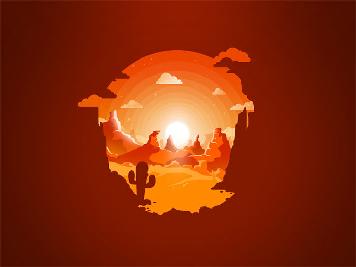
Orange was named after the bright and popular citrus fruit but it is not only associated with fruitiness. The orange color reminds people of fire, beautiful sunsets, flowers, warmth and even foods such as jams or carrots. The orange color is also associated with the pumpkin color of Halloween costumes or lanterns, life jackets, and even traffic cones.
Orange is a vital color which symbolizes warmth and excitement. It has been associated with health and vitality. As a mixture of red and yellow, orange combines the action of red with the warmth of yellow, bringing a feeling of happiness. Pure orange may sometimes feel loud and overpowering and some people may associate it with ‘brassiness’ or a lack of sophistication.
Orange was very popular in the 1970’s but faded away. During the 1990’s Forbes magazine associated orange with value or cheapness. Although orange was associated with value for money, the connotation stuck and some people may believe that orange lacks sophistication. Lately, however the orange color has started to become more popular and is even considered trendy.
Meanings associated with the color orange
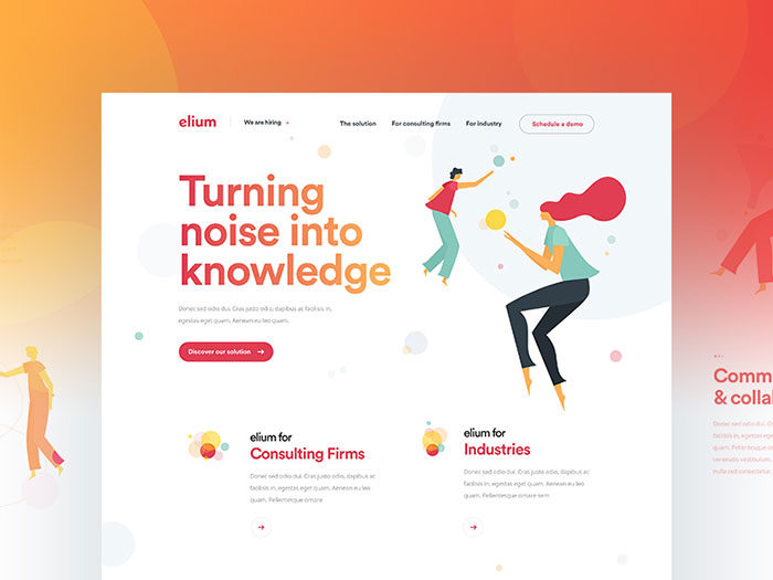
Orange colors represent warmth and creativity. Like the fruit, orange represents wellness and good health. On an emotional level orange is symbolic of compassion and care. Not as passionate as red, orange has a sunny passion and vitality. Colors of orange are seen to help people recover from emotional pain, disappointment or loss of pride.
The color orange is a warm color. As a combination of red and yellow and the color of flame, it offers up heat. The summer sun may often appear to be an orange color. Likewise, orange reminds us of autumn leaves, harvest fields and pumpkins.
Images of food are associated with the orange color. Carrot cake or butternut soup comes in shades of orange. It is no wonder that orange stimulates the appetite. Painting a kitchen or dining room in a shade of orange will keep friends and family eating and chatting for a long time.
Restaurants often use shades of orange to attract and keep their clientele. Terracotta, burnt orange, peach and apricot are all popular choices for restaurants and coffee shop interiors. Shades of orange are not as dramatic as reds and yet, like red, they increase the appetite. The orange color is also social which means that people will enjoy interacting or chatting while at a restaurant. This keeps them ordering food and drink while they enjoy an evening together.
If you’re on a diet, avoid using orange in your kitchen or dining room!
Alternate meanings shared by the color orange
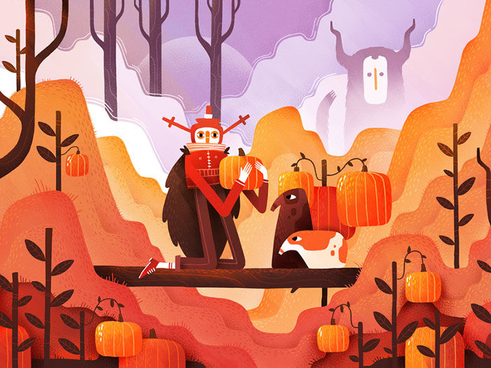
- When combined with black, orange reminds us of Halloween! Think of pumpkins, spiders and vivid orange costumes.
- Orange sunsets are a transition between day and night. Likewise, the color orange is seen in autumn time before the leaves turn brown. As a result, orange is seen to be a color of change.
- When combined with blue, orange becomes vibrant and attractive. Blue and orange are complimentary colors and when they combine they form a contrast of warmth and coolness. Imagine hot summer days combined with cool, sparkling sea water, summer holidays and plenty of fun. This is the message behind blue and orange color schemes.
- Yellow and orange create a vivid image of flame and fire or oranges and lemons. Mix in a fresh green with this orange color combination and you’ll be able to imagine summer holiday adventures in a tropical paradise.
The effects of using an orange color scheme
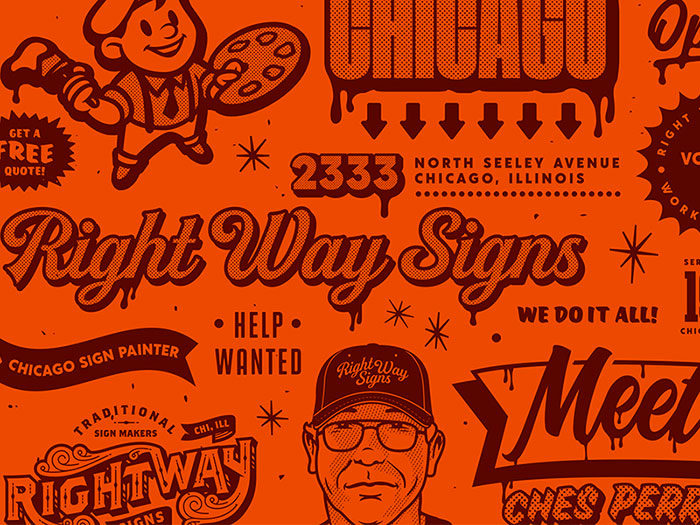
- Vibrancy: orange is bright, alive and very uninhibited.
- Healing: orange shades create energetic balance and harmony.
- Stimulation: although not as intense as red, orange color schemes will still stimulate the appetite as well as keep social interactions alive.
- Courage: the orange palette adds the passion of red to trembling yellow, helping us to look at our lives, assess them and make the changes we need to move forward.
- Vitality: not as passionate as red, the orange color still has a movement and vitality which encourages us to take action.
Global meanings of orange
Orange color shades have similar meanings around the globe.
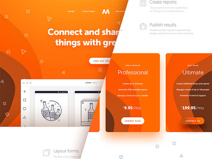
- Bright shades of orange are a reminder of a tangy, juicy citrus fruit.
- Orange is associated with health, vitality and much-needed Vitamin C.
- Orange reminds us of autumn leaves and seasonal transition.
- Using an orange color palette will appeal to children.
- Bright orange is highly visible and has been used for life jackets, police vests and road hazard cones.
How the orange color affects vision
The color orange contrasts very brightly with the blue of sea or sky. This is why orange has often been used in safety features such as road hazard cones. Orange will always be able to catch attention. Very bright shades of orange have therefore sometimes been called safety colors
All the shades of orange
The basic orange color
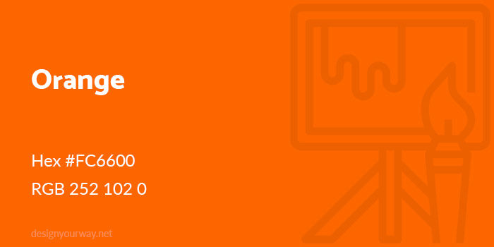
Hex #FC6600
RGB 252 102 0
Royal Orange Color
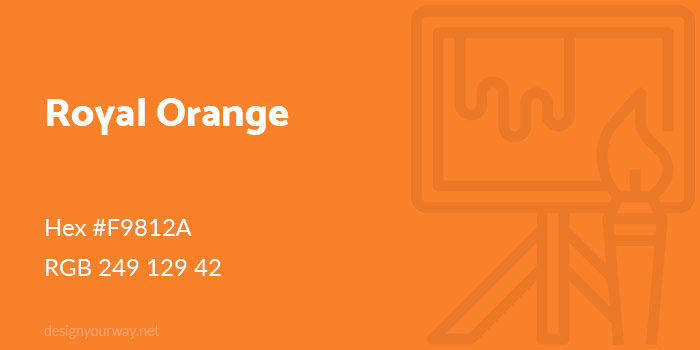
Hex #F9812A
RGB 249 129 42
Rust Color
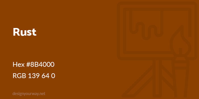
Hex #8B4000
RGB 139 64 0
Golden Orange Color
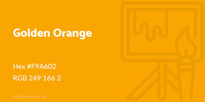
Hex #F9A602
RGB 249 166 2
Tiger Color
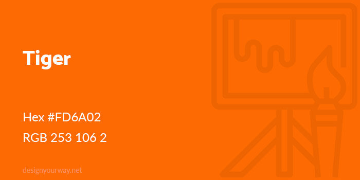
Hex #FD6A02
RGB 253 106 2
Dark Amber Color
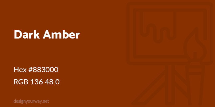
Hex #883000
RGB 136 48 0
Honey Color
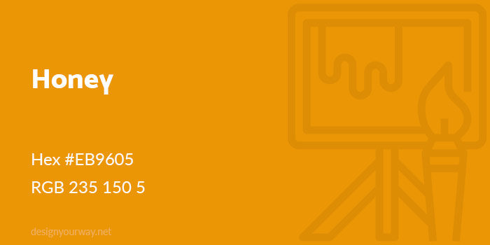
Hex #EB9605
RGB 235 150 5
Spice Color
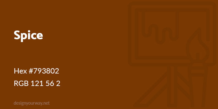
Hex #793802
RGB 121 56 2
Pumpkin Color
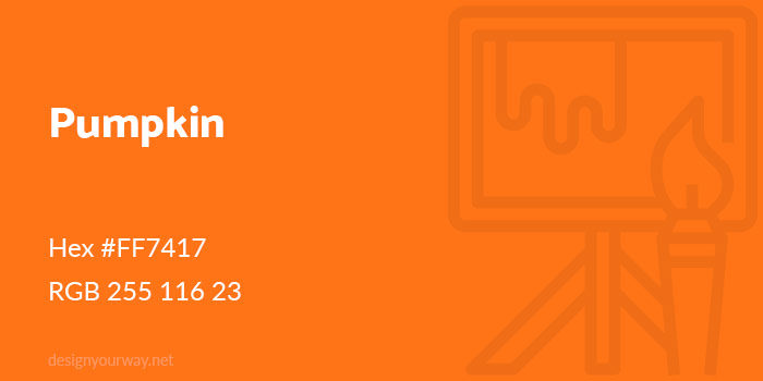
Hex #FF7417
RGB 255 116 23
Burnt Orange Color
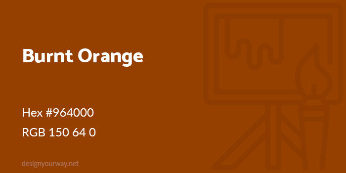
Hex #964000
RGB 150 64 0
Carrot Color
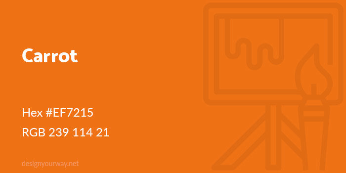
Hex #EF7215
RGB 239 114 21
Fire Color
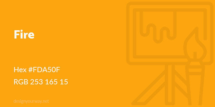
Hex #FDA50F
RGB 253 165 15
Ochre Color
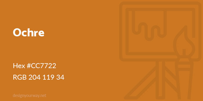
Hex #CC7722
RGB 204 119 34
Bright Amber Color
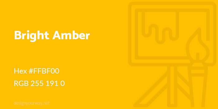
Hex #FFBF00
RGB 255 191 0
Apricot Color
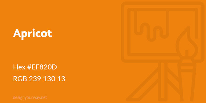
Hex #EF820D
RGB 239 130 13
Clay Color
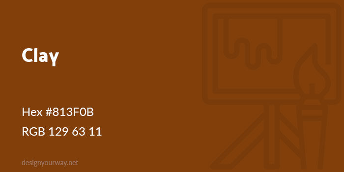
Hex #813F0B
RGB 129 63 11
Bronze Color
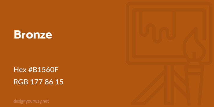
Hex #B1560F
RGB 177 86 15
Cider Color
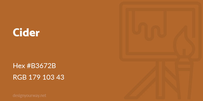
Hex #B3672B
RGB 179 103 43
Squash Color
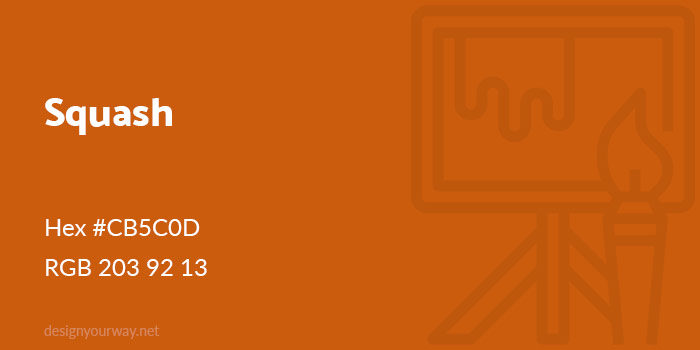
Hex #CB5C0D
RGB 203 92 13
Sandstone Color
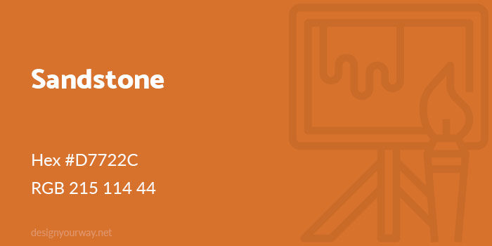
Hex #D7722C
RGB 215 114 44
Ginger Color
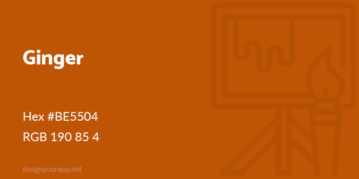
Hex #BE5504
RGB 190 85 4
Salamander Color
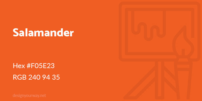
Hex #F05E23
RGB 240 94 35
Melon Color
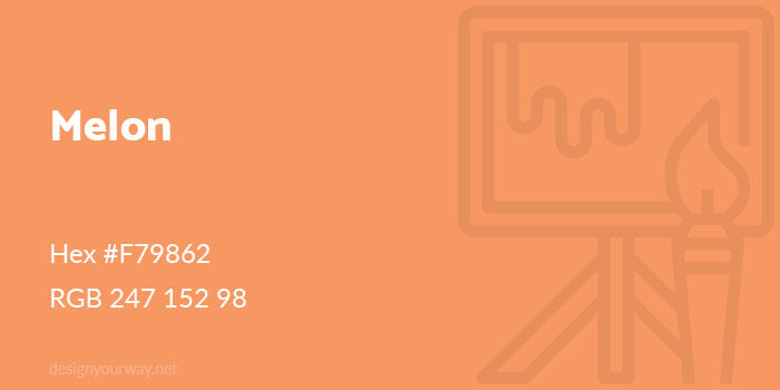
Hex #F79862
RGB 247 152 98
FAQ on Shades of Orange
What are the different shades of orange?
Shades of orange vary from tangerine and coral to burnt orange and amber. Each shade carries its unique tone and feel. Peach and pumpkin bring softness and warmth, while rust and golden orange add depth and richness. The spectrum of orange is vast and versatile.
How do I use shades of orange in graphic design?
In graphic design, orange can highlight elements, convey energy, and evoke emotions. Use bright orange for attention-grabbing features. Incorporate softer shades like peach for background elements. Balance is key-pair orange hues with complementary colors to create visual harmony and maintain readability.
What is the significance of orange in color psychology?
Orange represents creativity, enthusiasm, and warmth. It’s an energetic color that stimulates mental activity and evokes a sense of excitement. In color psychology, shades of orange are often used to uplift moods and create a welcoming atmosphere, making them ideal for interior design and branding.
How can I create a cohesive color palette with orange?
Start with a primary shade of orange and build around it. Use complementary colors like blues or analogous colors like reds and yellows. Incorporate neutral tones to balance the vibrancy. Tools like the color wheel and Pantone color guides can assist in creating a harmonious palette.
What are some common uses for orange in interior design?
In interior design, orange adds warmth and vibrancy to spaces. Use burnt orange for accent walls, peach for soft furnishings, and tangerine for decorative elements. Autumn colors and color psychology principles guide the effective use of orange, making spaces feel inviting and energetic.
What are the RGB and CMYK values for shades of orange?
RGB and CMYK values define colors in digital and print media. For instance, tangerine (RGB: 255, 132, 0; CMYK: 0, 48, 100, 0) and coral (RGB: 255, 127, 80; CMYK: 0, 50, 69, 0). These values ensure consistent color representation across different platforms and materials.
How can I incorporate shades of orange in fashion?
Orange is a bold choice in fashion. Use rust orange for a sophisticated look, bright orange for statement pieces, and peach for subtle elegance. Seasonal colors like autumn hues work well for accessories. Fashion trends often dictate how these shades are best utilized.
What are some popular brands associated with the color orange?
Brands like Pantone, Sherwin-Williams, and Crayola often feature shades of orange in their color collections. These entities use orange to signify creativity and vibrancy. Recognizing these brands’ use of orange can inspire your own design choices and help in selecting the right shade.
How does orange affect user experience in web design?
Orange in web design attracts attention and guides users through the site. Use vibrant orange for call-to-action buttons and softer shades for background elements. Consider color psychology to create an engaging and user-friendly interface. Ensure that orange enhances readability and navigation.
Can orange be used effectively in digital design?
Absolutely. In digital design, shades of orange can highlight key areas, evoke emotions, and create a dynamic look. From graphic design to app interfaces, the strategic use of orange hues ensures a vibrant and engaging visual experience. Balance it with other colors for optimal impact.
Conclusion
Embracing the shades of orange in your designs opens up a world of creativity and warmth. These hues-ranging from vibrant tangerine to subtle peach-offer endless possibilities for enhancing visual appeal.
Orange isn’t just a color; it’s a statement. From graphic design to interior design, using orange hues effectively can transform ordinary spaces and visuals into extraordinary experiences. Understanding the color psychology behind orange helps in creating designs that evoke energy, warmth, and enthusiasm.
By integrating semantic keywords like color palette, complementary colors, and color spectrum, your content becomes richer and more engaging. Utilizing tools like the color wheel and Pantone colors ensures your designs are both cohesive and compelling.
Incorporate the diverse shades of orange into your work to add vibrancy, depth, and a touch of boldness. The right balance can elevate any project, making it stand out and resonate with audiences.
If you enjoyed reading this article about using an orange color palette, you should check out these about HTML color names, shades of blue, shades of red, green color palettes, yellow color palettes, and shades of pink.

Renowned for his expertise in logo design and visual branding, Bogdan has developed a multitude of logos for various clients.
His skills extend to creating posters, vector illustrations, business cards, and brochures. Additionally, Bogdan's UI kits were featured on marketplaces like Visual Hierarchy and UI8.
He also wrote in the past years on sites like Design Your Way, WebDesignerDepot, WPDean, Designmodo, Speckyboy, Slider Revolution, and more.
- The Framer Logo History, Colors, Font, And Meaning - 14 October 2026
- 9 Best Motion Graphics Companies for Startups - 14 October 2026
- Best Visual Regression Testing Tools for Web and App Design in 2026 - 13 October 2026

Bogdan Sandu is a seasoned designer who has been designing websites since 2008. Renowned for his expertise in logo design and visual branding, Bogdan has developed a multitude of logos for various clients. His skills extend to creating posters, vector illustrations, business cards, and brochures. Additionally, Bogdan's UI kits were featured on marketplaces like Visual Hierarchy and UI8. He also wrote in the past years on sites like Design Your Way, WebDesignerDepot, WPDean, Designmodo, Speckyboy, Slider Revolution, and more.
You Might Also Like