Ever glanced at a website and immediately wanted to hit the back button, wondering why it felt so wrong? Often, the culprit is something you might overlook: the font.
As a seasoned designer, I’ve seen how typography can make or break a project. The wrong typeface can turn an otherwise stunning design into a visual disaster, sending your audience running for the hills.
We’ll delve into the worst fonts, including the notorious Comic Sans and the infamous Papyrus, examining their flaws and why they drive both designers and users up the wall.
You’ll gain insights from typography experts, learn about graphic design principles, and discover how poor typeface choices impact readability and user experience (UX).
By the end, you’ll know which fonts to banish from your toolbox, saving your next project from the jaws of awful font choices.
What Is The Worst Font?
The worst fonts are often characterized by their overuse, poor legibility, and unprofessional aesthetics. The following fonts are frequently cited as the most undesirable choices in design:
- Comic Sans: Widely regarded as the worst font, Comic Sans is criticized for its childish appearance and association with amateurism. Originally designed for comic book dialogue, its overuse has rendered it a symbol of poor design choices, making it unsuitable for serious contexts.
- Papyrus: This font gained notoriety for its use in the film “Avatar” and is often labeled as tacky and clichéd. Its handwritten style can appear unrefined, and it is frequently associated with low-quality design work.
- Curlz: Known for its exaggerated loops and curls, Curlz is seen as juvenile and unsophisticated. While it may fit certain playful contexts, it lacks professionalism and can be difficult to read.
- Arial: Once the default font in Microsoft applications, Arial is considered overused and boring. Its generic nature makes it a lazy choice for designers looking to stand out.
- Times New Roman: Often described as the “sweatpants” of fonts, Times New Roman is seen as outdated and unoriginal, making it less effective for modern resumes and professional documents.
- Trajan: Although it has a dignified appearance, Trajan is criticized for being overused in movie posters, leading to a loss of its impact and making it unsuitable for most design projects.
- Bleeding Cowboys: This gothic-style font is overused in horror-themed designs, making it a cliché choice that can alienate audiences.
- Bradley Hand: Designed to mimic casual handwriting, this font is often viewed as unprofessional and lacks the versatility needed for formal designs.
Looking Into The Worst Fonts
You know the feeling when a website feels off, right?
Often, that sensation comes down to the font. Some fonts are universally hated in the design world, and for good reason. Let’s talk about Comic Sans and Papyrus, two fonts infamous for their design crimes.
Comic Sans
Comic Sans was designed to look like comic book lettering. But, let’s be real-it has no place in most serious designs. It’s casual, almost childish, which makes it a terrible choice for professional documents or websites targeting an adult audience. Imagine reading a legal document typed in Comic Sans. Horrifying, right?
Comic Sans is often considered one of the worst fonts due to its overuse and improper application. It’s like a party crasher who shows up everywhere uninvited. From business presentations to academic papers, it just doesn’t fit. It screams unprofessionalism and lacks the elegance required for serious content.
Papyrus
Papyrus is another font design aficionado often frown upon. Used in “Avatar” movie posters, it’s become the poster child for bad font choices. Its faux-ancient, rustic look may seem appealing for a fantasy novel, but it’s been misused so often that it’s become a cliché.
Papyrus is neither here nor there-trying to evoke an ancient charm while failing spectacularly in most modern applications. Web developers and graphic designers avoid it because it’s overused and lacks originality. If you want your design to stand out, Papyrus is a font to steer clear of.
Alternatives Fonts to Use
Choosing the right font can make or break a design. Here are some alternatives that won’t leave your audience scratching their heads.
Arial

Arial might sound boring, but it’s a workhorse. Used correctly, it ensures readability and doesn’t distract from the content. It’s clean, professional, and widely accepted in both digital and print media.
Helvetica

Helvetica is a favorite among designers for a reason. It’s versatile, clean, and exudes professionalism. It’s great for both headers and body text, making it a reliable choice for many types of content.
Times New Roman

Times New Roman is another classic choice. It brings a touch of formality without being overbearing. This font stands the test of time, literally and figuratively, making it a solid alternative to more problematic fonts.
Roboto
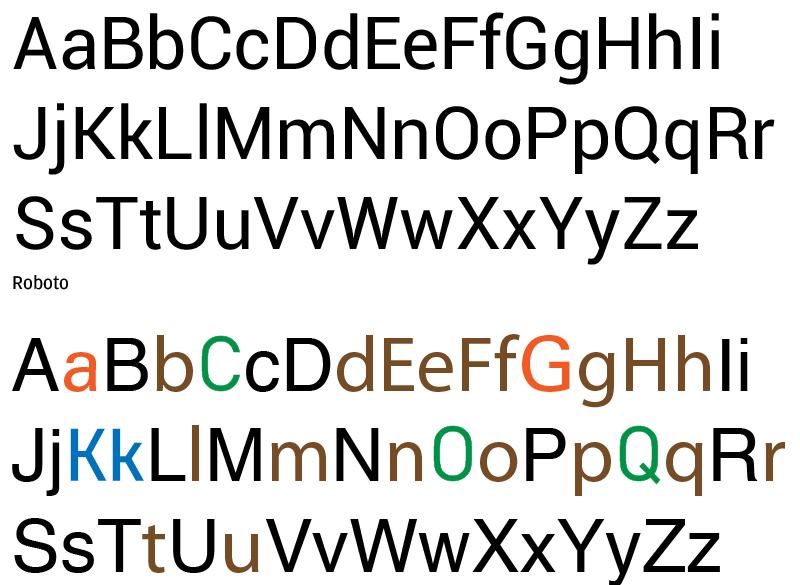
Roboto is the modern web designer’s go-to. It’s sleek and adaptable, perfect for both mobile and desktop interfaces. Its readability and versatility make it a fantastic alternative to clunky, outdated fonts.
What Makes a Bad Font Choice
Picking a font isn’t just about aesthetics. It’s about readability, context, and user experience.
Readability
Readability is crucial. Your audience needs to be able to read the text easily, which means avoiding fonts that are too stylized or overly ornate. Fonts like Comic Sans and Papyrus fail in this regard because they are harder to read in bulk text.
Context
Context is key. Using a fun, casual font might be perfect for a kid’s birthday invitation but disastrous on a corporate website. Knowing the context of your content helps you choose a font that fits seamlessly.
User Experience
User experience (UX) is another vital factor. A good font contributes to a pleasant reading experience, while a bad one can lead to user frustration and increased bounce rates. UX designers often steer clear of controversial fonts because they can detract from the overall experience.
The Impact on Branding
Believe it or not, the font you choose can impact your brand’s perception.
Professionalism
Professionalism is often judged by the initial look of your website or document. Using a universally ridiculed font can make it appear that you don’t pay attention to detail, which can harm your brand.
Emotional Response
Emotional response matters. Fonts have psychological impacts. A poor font choice can invoke feelings of distrust or disinterest, whereas a well-chosen font can make your brand seem reliable and engaging.
Visual Appeal
Visual appeal cannot be overstated. A good font enhances the overall design, making your content inviting and easier to digest. This keeps users on your site longer and increases the likelihood they’ll return.
Common Font Mistakes
Avoiding the worst fonts is just the start. There are other pitfalls to watch out for.
Overuse of Stylized Fonts
Overuse of stylized fonts can clutter your design. Less is more. Stick to one or two complementary fonts to maintain a clean, professional look.
Poor Font Pairing
Poor font pairing is another common mistake. Some fonts just don’t work well together. Using font pairing guides can help you find combinations that complement each other rather than clash.
Ignoring Accessibility
Ignoring accessibility can alienate a portion of your audience. Choose fonts that are readable even for those with visual impairments. This means avoiding overly light or thin fonts that are hard to see.
By avoiding these common mistakes and steering clear of the worst fonts, you can elevate your design and create a better user experience for your audience.
FAQ On The Worst Fonts
Why is Comic Sans considered the worst font?
Comic Sans gets a bad rep due to its overuse and inappropriate applications. Originally designed for comic-style speech bubbles, it’s often misused in professional contexts. This makes it appear amateurish and unprofessional, which frustrates designers and users alike.
Is Papyrus really that bad?
Papyrus is notorious for its over-embellished, pseudo-ancient look. It has been overused in contexts that don’t fit its aesthetic, making it seem dated and unoriginal. The design community frowns upon its lack of versatility and elegance.
What makes a font unreadable?
Unreadability stems from poor design choices like overly intricate details or disproportionate letter spacing.
Bad fonts make it hard for the user to quickly and easily grasp the content. Readability is a key factor in any successful design, enhancing the user experience (UX).
Are there other fonts considered bad?
Yes, there are several fonts-to-avoid in professional design, like Arial in inappropriate contexts and Courier New. These fonts either lack originality, are overused, or simply don’t offer good readability, leading to poor user engagement.
How do bad fonts affect user experience?
Bad fonts can significantly deteriorate the user experience (UX) by making content hard to read or visually unappealing. This often results in higher bounce rates and lower engagement metrics, deterring users from returning to your site.
Why do designers hate certain fonts?
Designers detest fonts like Comic Sans and Papyrus because they undermine professional aesthetics. Such fonts convey a lack of attention to detail and can make even the best content seem amateurish. Fonts are crucial in web design, and poor choices can ruin a project.
Can bad fonts harm a brand?
Using poorly chosen fonts can definitely harm your brand’s professionalism and credibility. Typography is often the first impression people get of your brand. Bad fonts can make you appear as if you don’t care about quality, tarnishing your brand’s image.
What are some professional alternatives to Comic Sans?
If you want to steer clear of Comic Sans, consider fonts like Arial or Helvetica. These are clean, professional, and widely used in both digital and print media. They ensure your content looks polished and accessible, improving overall readability.
How can one avoid font mistakes?
Avoid font mistakes by sticking to best practices in typography. Choose fonts that match the tone and purpose of your content.
Utilize font pairing guides and avoid stylized fonts for large bodies of text. Test readability on various devices to ensure a seamless user experience.
Why is it important to understand font psychology?
Font psychology is important because fonts elicit emotional responses and can influence how your audience perceives your content.
The right font can evoke feelings of trust and authority, while a poor choice can lead to mistrust and disengagement. Understanding this enhances branding.
Conclusion
In the grand scheme of design, fonts are more than just letters on a screen-they’re visual storytellers. A poorly chosen font like Comic Sans or Papyrus can disrupt the narrative, pulling viewers away from the intended message.
The impact of bad typography is profound. It affects readability, user experience (UX), and even your brand’s credibility. By understanding the pitfalls of bad fonts and opting for more professional alternatives like Arial, Roboto, or Helvetica, you enhance both the aesthetic and functional dimensions of your design.
Professionalism in typography is key. Utilize best practices in typeface selection, and pay attention to context and visual appeal. Avoiding common font mistakes and embracing a more refined selection of fonts will not only elevate your designs but also ensure your content is received as intended.
Remember, the right font can make all the difference. Choose wisely, and let your typography speak volumes about your expertise.
If you liked this article about the worst fonts, you should check out this article about the font that is used on jerseys.
There are also similar articles discussing the font that is used for street signs, the font that the Bible is written in, the font that Harry Potter is written in, and the font that most books are written in.
And let’s not forget about articles on the font that is used for the Eras Tour, the font that is in the Friends logo, the font that is used in APA format, and the font that comics use.

Renowned for his expertise in logo design and visual branding, Bogdan has developed a multitude of logos for various clients.
His skills extend to creating posters, vector illustrations, business cards, and brochures. Additionally, Bogdan's UI kits were featured on marketplaces like Visual Hierarchy and UI8.
He also wrote in the past years on sites like Design Your Way, WebDesignerDepot, WPDean, Designmodo, Speckyboy, Slider Revolution, and more.
- Versatile Georgia Font Pairing for Timeless Layouts - 24 October 2026
- How to Turn Inconsistent UI into One Design System (Without a Full Redesign) - 24 October 2026
- Beautiful Fonts Similar to Poppins You Should Try - 22 October 2026

Bogdan Sandu is a seasoned designer who has been designing websites since 2008. Renowned for his expertise in logo design and visual branding, Bogdan has developed a multitude of logos for various clients. His skills extend to creating posters, vector illustrations, business cards, and brochures. Additionally, Bogdan's UI kits were featured on marketplaces like Visual Hierarchy and UI8. He also wrote in the past years on sites like Design Your Way, WebDesignerDepot, WPDean, Designmodo, Speckyboy, Slider Revolution, and more.
You Might Also Like