Ever pause mid-scroll, captivated by a crisp, clean-cut resume? That magnetic pull? It’s often the power of resume fonts at play. Fonts do more than just spell out your credentials; they are the unsung heroes that can make or break that crucial first impression.
Diving in, you’ll discover the subtle art of selecting the perfect typeface to catch any recruiter’s eye. It’s like picking the right outfit for an interview, only here, we dress up your words.
Now, imagine your resume is that one guest at a party everyone wants to talk to-approachable yet striking, easy on the eyes, and impossible to ignore. That’s what the right typography can do for you. So settle in as we unravel the mysteries of serifs, line spacing, and the elusive font pairings that could set you leagues apart in the job race.
Ready to amp up your resume game? Let’s march those letters to perfection and turn that maybe into a solid yes from your dream employer.
The best resume fonts to use
- Cambria
- Garamond
- Gill Sans
- Calibri
- Didot
- Constantia
- Lato
- Georgia
- Helvetica
- Arial
- Book Antiqua
- Trebuchet MS
- Verdana
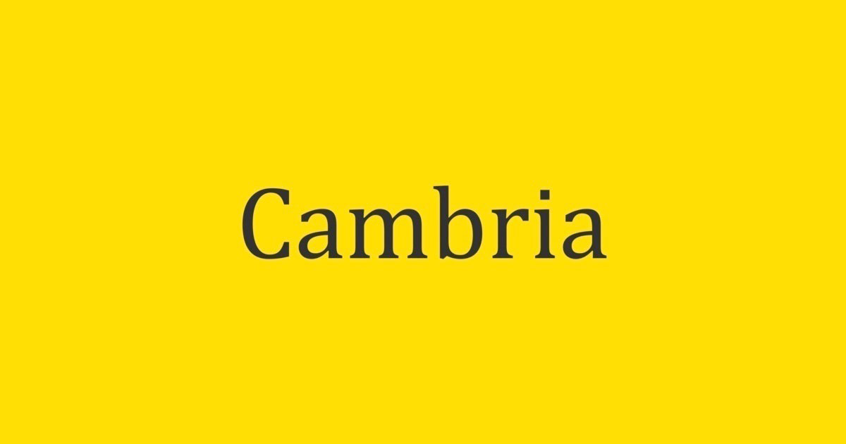
Cambria
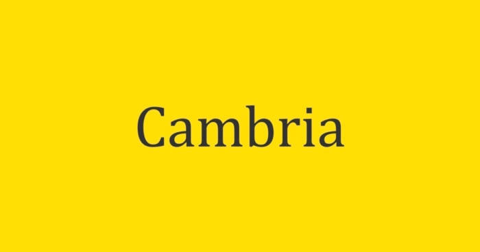
Chosen by Microsoft for its on-screen reading clarity, Cambria stands out as a staple serif font. With its professional appeal, it enhances the typography of any resume, balancing legibility with elegant typeface design. While great for printed text, especially in small sizes, its traditional feel may not align with ultra-modern industries. Still, its timeless nature makes it an excellent choice for traditional and trust-heavy professions.
Garamond
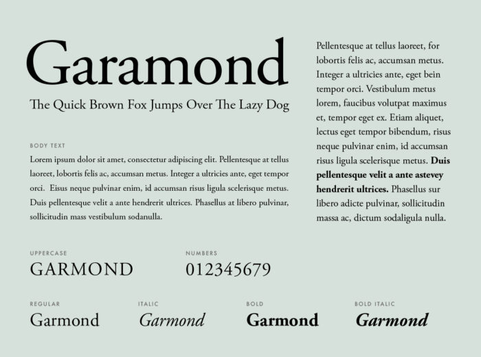
A timeless classic, Garamond steps in as a sophisticated serif alternative to the overutilized New Times Roman. Breathing historical richness into your resume, this font promotes elegance over five centuries old. For positions of classical academic or professional nature, Garamond speaks volumes of tradition and reliability. The font’s scalable typeface selections allow for flexible formatting options, perfect for resumes aiming to impress without overwhelming.
Gill Sans
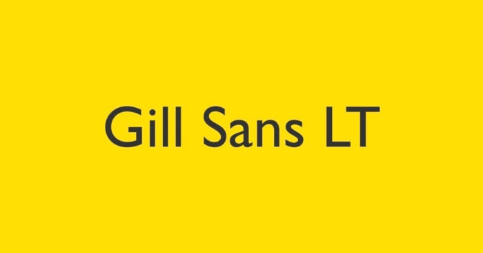
Gill Sans, with its modern yet simple demeanor, has made its mark as a sophisticated sans-serif choice. Its usage signals a balance between professional qualifications and approachability, a font that addresses both digital documents and print formats seamlessly. The historical presence and trendiness of Gill Sans make it one of the stylish font alternatives for an array of professional documents.
Calibri
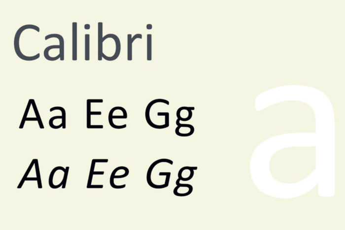
As Microsoft’s modern champion for clarity and legibility, Calibri shines in the realm of resume typography. Its sans-serif design ensures excellent readability, marking it as a safe choice for job applications. Yet, its popularity may lead to a blend-in effect, so use Calibri when seeking a professional yet neutral vibe in your documents. Balance this with distinct formatting and content structure, and you’ll leverage one of the most approachable yet professional fonts.
Didot
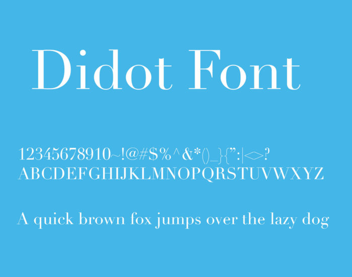
For those in artistic industries, Didot symbolizes creative flair. As a stunning header serif font, it carves an elegant aesthetic into any resume, especially when paired with design elements that emphasize flair over function. Its Renaissance roots echo through its use in high-fashion and visual brands. Remember, its distinct style serves creative resumes best, and is most impactful in bold, striking headers.
Constantia
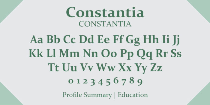
Striking a fine balance between friendly and professional, Constantia’s rounded letters infuse resume content with a warm, inviting tone. Its adaptability makes it an excellent choice for a resume or cover letter font. The rounded serifs aid legibility in both digital and printed content, recommending itself as a versatile font suitable for multifaceted application processes.
Lato
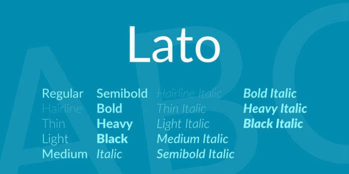
Having its origins in corporate branding, Lato stands out as a neutral sans-serif font, embodying a professional yet accessible impression. With varied weights and styles, it caters to different levels of typographic hierarchy on a resume. Whether displayed in Google Docs or Word, Lato adds a hint of modern sophistication without overpowering the document’s content.
Georgia
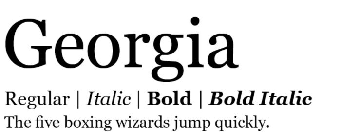
Georgia offers a serif twist to the often preferred Times New Roman. It’s one of the fonts that excels in legibility on screen and has the bonus of being ubiquitous across different operating systems. Utilize Georgia to give your resume a professional and classic look without falling into the trap of the commonplace, thus leaving a memorable impression.
Helvetica
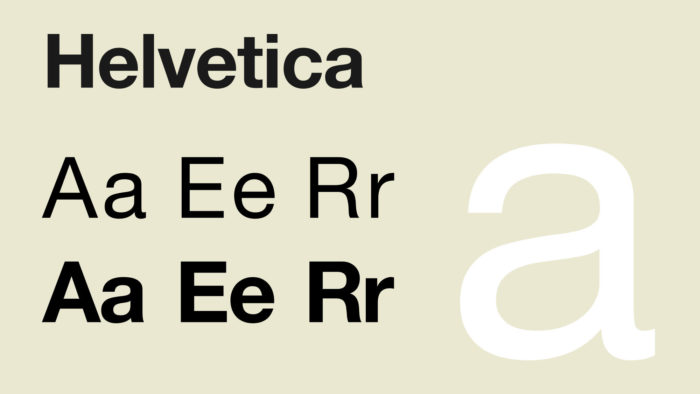
A staple in the design world, Helvetica elevates a resume with its clean, modern sans-serif aesthetics. Favored for its professionalism and versatility in branding, its inclusion on a resume suggests a blend of formality and modern sleekness. Keep in mind that while Helvetica is pre-installed on Macs, Windows users will need to acquire it, but it is a worthy investment for a standout resume.
Arial
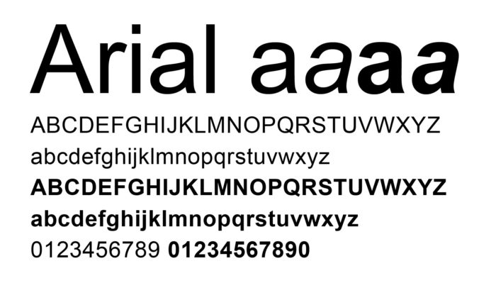
Arial, renowned for its straightforward sans-serif makeup, presents a no-frills, professional option. As one of the most readable and widely accepted fonts, it projects clarity in both print and digital formats. Consider Arial if you seek a resume font that is simply legible and universally accessible, but be prepared for potential similarity with other applicants’ materials.
Book Antiqua
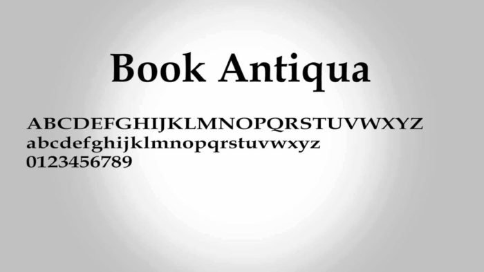
Book Antiqua brings a distinct and gentle serif touch to resumes. It stands apart from traditional Times New Roman, ensuring your document captures attention while retaining a professional polish. Compatible with most operating systems, this font underlines the content, assuring that its presence complements rather than overshadows your professional story.
Trebuchet MS
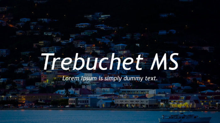
Trebuchet MS signifies a fresh sans-serif choice, known for its easy on-screen readability and distinctive character. It’s one of the more exceptional typeface selections suitable for anyone aiming to gently stand out. The modern yet friendly look of Trebuchet MS positions it among the top fonts to enhance a resume’s clarity and individuality.
Verdana
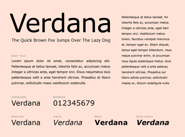
Designed for seamless screen reading, Verdana stands out with its spacious, clear sans-serif lettering. As a relative to Georgia, it’s constructed to be easily read in small print or on low-resolution screens, making it an excellent pick for digital resumes. While Verdana’s simplicity and clarity are reputable, its commonality could dissolve the unique traits of your resume.
FAQ on Resume Fonts
What exactly sets serif from sans-serif fonts apart?
Simply put, serifs are those little feet at the end of the letter strokes; think Times New Roman, classic and formal. Sans-serif, like Arial, is straight-edged, no extra flairs-modern, clean, and perfect for digital legibility. Each sets a tone for your resume, reputable or sleek.
How critical is font choice in a resume?
Heads up, it’s a big deal. Font choice is your silent communicator-it conveys professionalism and attention to detail. Pick wrong, and despite your stellar skills, you might not land that first interview. Right font equals readability, personality, and an uncluttered look that speaks volumes before you do.
Do fonts really affect how my resume is perceived?
Absolutely. Your chosen font whispers tales about your work ethic and style. A well-selected typeface positions you as an organized, thoughtful candidate. Think of it as the thoughtful tie you choose for an interview, it subtly complements the whole attire.
What’s the best font size for my resume?
Aim for the sweet spot-between 10 and 12 points. It’s the Goldilocks zone; not too teeny to strain the eyes, not too large to shout. It ensures your words are scanned effortlessly by human eyes and Applicant Tracking Systems alike-crisp, clear, professional.
Can I use different fonts on my resume for variety?
Tread lightly here. A single font maintains coherence, but you might highlight headers with a complementary font. Remember, it’s a resume, not a circus poster. Two’s company, three’s a crowd. After all, you want to showcase your expertise, not your font collection.
Is there a difference in font choice for print vs. online resumes?
For sure, print demands sturdier fonts like Garamond, while screens love the clarity of sans-serifs like Helvetica. Think of print like a handshake-it leaves a tangible impression. Online? It’s your avatar-pixels over paper, so clarity and readability take the virtual stage.
What about the color of the font for my resume?
Stick to black; it’s timeless and universally readable. If the creative industry is your playground, hints of dark blues or grays can slide. But drift too bright, and you risk the unprofessional label. Remember, elegance in simplicity.
Are there specific fonts that work better for Applicant Tracking Systems?
Yes! Some fonts swing with the technical crowd better. Stick to the classics-Calibri, Arial, or Helvetica. They’re like the extroverts at a party-mix in well with ATS algorithms, ensuring your resume dances through the filters effortlessly.
How do I know if a font is too distracting for a resume?
Here’s the thing-if you squint, it ain’t it. Fonts must be the wind beneath your resume’s wings, not a tornado through it. Selection should blend into the background; it should elevate the content, not compete with it. If it’s stealing the show, dial it back.
Is it okay to use trendy fonts in my resume?
It might be tempting, but hold that thought. Trendy fonts roll in and out like the tides. Stick to the evergreens, the fonts that have stood the test of time. Your resume isn’t a fashion statement; it’s a testament to reliability and professionalism. Go with what’s tested, not just what’s tasted.
Conclusion on These Fonts for Your Resume
So, resume fonts, right? Here’s the wrap-up. Sifting through this chat, you’ve grabbed the golden nuggets – the fonts that make your resume pop. Fonts should be like your wingman, subtly persuasive yet never overpowering. They need to showcase the content, not upstage it.
- Stick to clear, professional fonts: your Times New Roman, Arial, you know the drill.
- Keep that font size in the 10 to 12 range – easy on the eyes, kind to detail.
- Color? Black or dark hues. No flashy disco vibes, just elegance.
Finally, consider those ATS-friendly choices. Make sure your resume’s not just speaking to humans but to those pesky bots too. Remember, a well-dressed resume in the right font can open doors with its silent charm. So strut out with typography that lands that job – it’s like that firm, confident handshake at the end of an interview.
If you enjoyed reading this article about these resume fonts, you should read these as well:
- Free Cute Fonts to Use in Your Thematic Designs
- Google font pairings: Font combinations that look good
- Best free fonts for logos: 72 modern and creative logo fonts
- Retro Fonts: 90 Free Vintage Fonts To Download
- Best Thin Fonts: Free Light Fonts To Download
- The Best Free Smoke Font Examples for Creative Designs
- Stencil font examples that you can download
Renowned for his expertise in logo design and visual branding, Bogdan has developed a multitude of logos for various clients.
His skills extend to creating posters, vector illustrations, business cards, and brochures. Additionally, Bogdan's UI kits were featured on marketplaces like Visual Hierarchy and UI8.
He also wrote in the past years on sites like Design Your Way, WebDesignerDepot, WPDean, Designmodo, Speckyboy, Slider Revolution, and more.
- 5 Brand Compliance Checkpoints Every Enterprise Should Automate - 23 July 2026
- Timeless Open Sans Font Pairing for Any Project - 22 July 2026
- Pantone to HEX converter - 21 July 2026
Bogdan Sandu is a seasoned designer who has been designing websites since 2008. Renowned for his expertise in logo design and visual branding, Bogdan has developed a multitude of logos for various clients. His skills extend to creating posters, vector illustrations, business cards, and brochures. Additionally, Bogdan's UI kits were featured on marketplaces like Visual Hierarchy and UI8. He also wrote in the past years on sites like Design Your Way, WebDesignerDepot, WPDean, Designmodo, Speckyboy, Slider Revolution, and more.
You Might Also Like