Charts on mobile break in ways a desktop screen never shows.
Mobile sessions bounce at nearly 60%, roughly ten points higher than desktop, according to Semrush’s own Traffic Analytics data. A chart nobody can actually read is often the reason someone leaves before they get to a single number.
More than half of global web traffic now loads on a phone. A chart built for a mouse and a wide monitor rarely survives that shift without real changes to touch targets, layout, and data density.
- Legends crash straight into axis labels
- Tooltips built for a mouse hover, which a thumb can’t trigger
- Data density tuned for a monitor, then crammed into a palm anyway
- Sometimes the chart just doesn’t load fast enough to matter
Whether any of that data gets read at all comes down to getting this right, not to whether the chart looks nice in a screenshot.
What Is a Mobile-Optimized Chart?
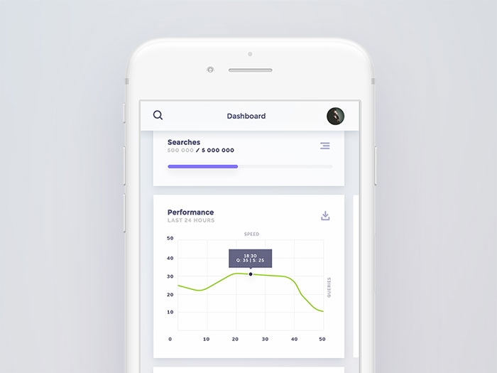
Shrinking a desktop chart down to phone width isn’t the same thing as optimizing it for mobile. That’s just resizing, and resizing on its own leaves the legend, the label density, and the whole interaction model untouched. A chart built for mobile adjusts its layout, its interaction model, and its information density for a small screen and a finger instead of a mouse.
Mobile devices accounted for 51.48% of global website traffic in the second quarter of 2026, according to StatCounter data reported by Statista. That’s almost exactly half of everyone visiting a website worldwide, phone in hand instead of sitting at a desk.
There’s a real difference between a chart that resizes and one that’s been redesigned. A responsive chart scales its container down and calls it done. A mobile-optimized chart goes further and rebuilds the visual hierarchy so the most important number reads first, with the supporting detail sitting one tap away.
The viewport meta tag and CSS media queries handle the technical side of this. They tell the browser how wide the screen actually is, and a stylesheet uses that information to swap chart configurations at set breakpoints.
| Approach | What Changes | What Stays Fixed |
|---|---|---|
| Responsive chart | Container width and height | Data density, label count, legend position |
| Mobile-optimized chart | Layout, interaction model, data density | The core message, delivered at every size |
Desktop design leans on a mouse: hover states, dense legends, tiny labels a cursor can land on precisely without much effort. None of that holds up on a phone. There’s no hover, the column is narrower, and the only pointing device is a thumb that’s nowhere near as accurate as a cursor tip.
Why Do Charts Break on Small Screens?
The math doesn’t work. Squeeze the same number of labels, the same legend, the same data points into a fraction of the horizontal space, and something has to give. Add an interaction model built around a mouse cursor, one that doesn’t exist on a touchscreen, and two separate problems start stacking on top of each other.
360px and 375px together account for well over half of global mobile visits, based on aggregated viewport data reported across 2025 and 2026 industry benchmarks. A chart built for a 1200px desktop canvas has to work inside roughly a third of that space.
Legend and Label Overlap
Legends collide with labels once horizontal space drops below about 400px. A five-series legend that sits comfortably beside a desktop chart has nowhere left to go on a phone.
- Category labels on the x-axis start overlapping once you’re past 5 to 7 categories
- Long product names or date strings get clipped mid-word, sometimes mid-number too
- Push the legend below the chart and it eats straight into the vertical space the data needed
Tooltip and Hover Failures
Touch screens don’t have a hover state, so any tooltip wired to a mouseover event simply never fires on a phone.
The fix is tap-to-reveal, not hover-to-reveal.
Chart.js, Highcharts, and most other libraries default to hover-triggered tooltips out of the box, built for a cursor most mobile visitors don’t have.
Viewport Clipping and Forced Scrolling
Chart.js ships with maintainAspectRatio set to true by default, according to its official configuration reference. That means a chart keeps its original width-to-height ratio unless a developer explicitly turns the option off.
- Leave it on, and the chart either shrinks into an unreadable sliver or spills right off the edge of the screen
- Fixed pixel widths clip content outright on anything narrower than that fixed value
Both problems disappear once the container, not the canvas, controls the final size.
How Does Touch Interaction Change Chart Design?
A mouse gives you pixel-level precision. A finger doesn’t, not even close, and chart design has to plan around that gap instead of pretending it isn’t there. Interaction shifts from hover-triggered detail to tap-triggered detail, and every interactive element needs to clear a minimum physical size rather than hit some pixel-perfect target.
Tap-to-Reveal Tooltips
Tapping a data point should surface the same detail a desktop hover would show. Just a different event triggering it.
A tapped tooltip needs a visible way to close, since there’s no mouse to just move away and dismiss it.
- Tap once to reveal it, tap again (or tap somewhere else) to dismiss it
- Keep the tooltip inside the viewport so it doesn’t clip off the edge of the screen
Touch Target Sizing Standards
Apple’s Human Interface Guidelines set a minimum tappable area of 44 by 44 points for any interactive control on iOS. That standard applies directly to tappable chart points, legend toggles, and zoom controls.
Google’s Material Design guidelines set the floor slightly higher, at 48 by 48 density-independent pixels, which works out to roughly 9mm regardless of screen density. Not a huge gap between the two, but enough that a control sized for one platform’s minimum can feel a touch cramped on the other.
| Standard | Minimum Size | Governing Body |
|---|---|---|
| Apple HIG | 44 x 44 pt | Apple |
| Material Design | 48 x 48 dp | |
| WCAG 2.5.8 (Level AA) | 24 x 24 CSS px | W3C |
WCAG’s enhanced criterion, Success Criterion 2.5.5 at Level AAA, pushes that floor to 44 by 44 CSS pixels, matching Apple’s number almost exactly.
Gesture Support for Zoom and Scroll
Pinch-to-zoom, swipe-to-scroll, and long-press for a detail view are native touch gestures. A chart that ignores all three forces people to zoom the entire page instead of just the chart, blurring everything else around it in the process.
Long-press works especially well for dense scatter plots or heat maps, where a single tap can’t reliably isolate one point among dozens crammed into a small area.
Which Chart Types Work Best on Mobile Screens?
Complexity is the enemy here. A bar chart or a simple line holds up fine on a five-inch screen. Scatter plots and heat maps mostly don’t, and multi-series line charts fall apart somewhere in between, depending on how many series you’re asking someone to track at once.
Chart Types That Scale Well
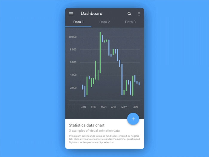
The simplest shapes are the ones that survive a small screen most easily.
A bar chart with four to six categories, a single trend line, or a donut showing one proportion all hold up because they center attention on one focal point instead of spreading it around, whether that’s the tallest bar or the biggest slice.
Bar charts stay readable down to about three or four categories before the labels need rotating. A single-line chart holds its shape surprisingly well even compressed to a third of its desktop width, mostly because there’s only one line to track. Donut and pie charts work for two to four segments. Eight is already too many; nobody is comparing that many slice angles on a screen the size of a deck of cards.
Stacked bar charts also hold up better than grouped bar charts on mobile, since stacking removes the need to compare bar heights side by side across a narrow column.
Chart Types That Lose Legibility Below Tablet Width
Scatter plots depend on precise spatial position to mean anything, and that precision collapses the moment dozens of points get squeezed into maybe 350 pixels of width. Heat maps hit the same wall, just in two dimensions instead of one.
Nielsen Norman Group’s guidance on chart clarity applies directly here. Cutting unnecessary visual elements (chart junk, in their terms) matters even more once there’s less room to spare.
A multi-series line chart with more than three lines tends to blur into a tangle on mobile. A simplified version, usually just the top two or three series with everything else bucketed as other, tends to communicate more than the full set ever does.
How Is Data Simplified for Mobile Charts?
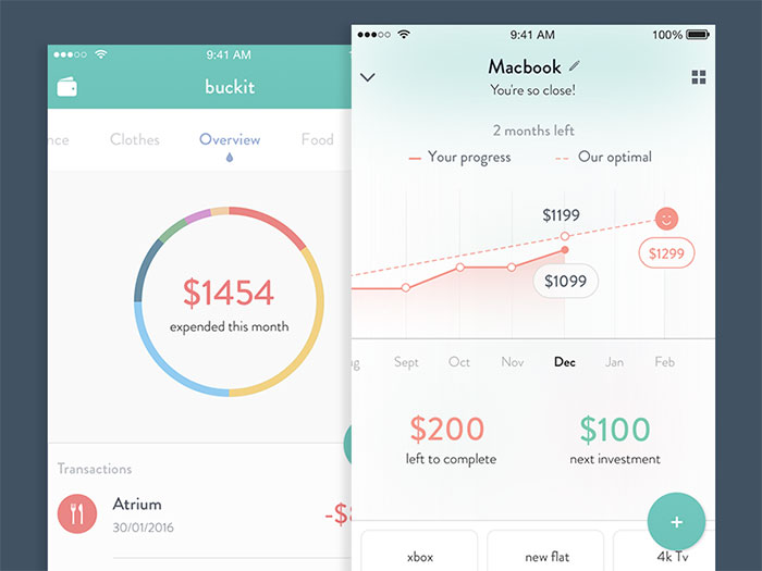
Simplification has to happen before the data ever reaches the chart, not after. Aggregation rolls fine-grained records into broader buckets. Sampling cuts the total point count down without losing the shape of the trend underneath it.
Aggregation and Sampling Methods
Aggregation trades granularity for clarity. Roll daily data points into weekly or monthly summaries and the point count drops by a factor of 7 or 30, while the overall trend line stays intact.
Sampling works differently. Instead of grouping points together, it picks a representative subset.
Chart.js’s built-in decimation plugin automates this with two algorithms, largest-triangle-three-buckets and min-max, both documented as ways to bring tens of thousands of points down to a threshold the canvas can render smoothly.
Top-N-plus-other bucketing applies the same idea to categories: show the top five or six, fold everything else into a single other segment.
Progressive Disclosure and Drill-Down
Show the summary first. Save the detail for whoever actually taps for it.
A mobile chart opens with one number, or one simplified trend line, surrounded by generous white space. A tap opens the full breakdown from there. Apple’s own Health app follows exactly this pattern, a single trend line loads first, and tapping it expands into the full daily or hourly view.
The summary view sticks to one metric and as little visual clutter as possible. The drill-down view is where everything else lives: full axis labels, the complete legend, all the data density that got stripped out of the first screen.
How Are Labels, Legends, and Axes Formatted for Small Screens?
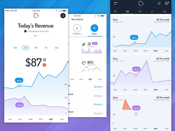
Fitting the same information into a much smaller space usually comes down to rotating labels, truncating the ones still too long after that, abbreviating numbers, and moving the legend somewhere that doesn’t compete with the chart itself. None of it hides information. It just finds room for it.
Axis Label Rotation and Truncation
Rotating axis labels to 45 degrees buys back horizontal space without dropping a single category from view. Full vertical rotation (90 degrees) reads more slowly, since it forces the eye to tilt.
Truncation with an ellipsis handles labels that stay too long even after rotation: September becomes Sep, Product Description Long becomes Product Desc…
Chart.js handles the tick side of this automatically. Its documentation describes a built-in auto-skip feature that detects overlapping labels and removes every nth one, controlled through the maxTicksLimit option.
Legend Placement and Number Abbreviation
Legends move below the chart, not beside it, once the screen narrows enough.
Highcharts documents this exact behavior through its responsive rules API. A maxWidth condition can reposition the legend from a vertical sidebar into a horizontal strip under the chart. Grouping a legend directly beneath its chart follows the Gestalt principle of proximity: put things close together and people read them as related.
- Numbers get shorter: 1,200 becomes 1.2k, 3,400,000 becomes 3.4M
- Legend labels shrink to single words or short codes, with the full name a tap away
What Are the Minimum Font Size and Contrast Standards for Mobile Charts?
None of this comes down to taste. The contrast numbers come from WCAG, the type sizes come from each platform’s own typography guidelines, and a chart label has to clear the same bar body text does. There’s no separate, lower standard just because it’s technically a chart.
Contrast Ratio Requirements
WCAG’s Success Criterion 1.4.3 requires a 4.5:1 contrast ratio for normal text against its background. That drops to 3:1 for large text (18pt, or 14pt bold, and up) under the Level AA standard most sites target.
The enhanced Level AAA criterion, 1.4.6, raises that bar to 7:1 for normal text and 4.5:1 for large text.
| Level | Normal Text | Large Text |
|---|---|---|
| AA (minimum) | 4.5:1 | 3:1 |
| AAA (enhanced) | 7:1 | 4.5:1 |
Color alone can’t carry the distinction between data series. Two lines that are only distinguishable by hue fail for colorblind users no matter how well they score on the contrast numbers. A pattern, a marker shape, or a direct label needs to back up whatever the color is doing.
Minimum Font Size Thresholds
Apple’s Human Interface Guidelines set an 11pt floor for any text in an iOS app, with body text recommended at 17pt. Google’s Material Design guidelines recommend 16sp for body text on Android, close enough to Apple’s number that the two platforms basically agree.
Chart labels sit below body text in the hierarchy, and dropping far under that 11pt floor costs legibility fast.
Legibility at small sizes depends heavily on x-height (the height of a font’s lowercase letters relative to its capitals). A typeface with a taller x-height stays legible at sizes where a shorter one turns to mush.
Bold text gets a pass to a smaller size under WCAG’s large-text exception: 14pt bold clears the 18pt normal-text threshold, worth knowing when a chart’s key number needs to stay small but still pass contrast checks.
Which Chart Libraries Support Responsive Mobile Rendering?
Chart.js, Highcharts, and Recharts build responsive behavior straight into their core APIs. D3.js ships with no built-in resize handling at all, and Apache ECharts lands somewhere between the two camps.
Airbnb’s engineering team evaluated more than a dozen charting libraries before building visx, an open-source layer combining D3.js with React components, after most of them fell short in at least one area its frontend engineers cared about, whether that was learnability, expressiveness, or how fast the thing actually rendered.
| Library | Rendering Engine | Bundle Size (gzip) | License |
|---|---|---|---|
| D3.js | SVG | 90 KB | Open source (ISC) |
| Chart.js | Canvas | 67 KB | Open source (MIT) |
| Highcharts | SVG | 100 KB | Commercial (free non-commercial) |
| Apache ECharts | Canvas | 359 KB | Open source (Apache 2.0) |
Libraries With Built-in Responsive Support
Chart.js pulls 54.0 million npm downloads a month and ships a 67 KB gzipped canvas renderer, according to ApexCharts’ 2026 charting library research.
Highcharts carries a heavier 100 KB gzipped footprint, and it only stays free for personal or non-commercial projects. Commercial use needs a paid license.
Recharts takes a third approach. Its ResponsiveContainer component uses the browser’s ResizeObserver API to track its parent element’s size, according to the library’s own source documentation.
Libraries That Require Manual Setup
D3.js isn’t really a charting library at all. It’s a low-level toolkit for binding data to the DOM, and its 59.0 million monthly downloads and 113,200 GitHub stars reflect that foundational role rather than direct chart-building use, per the same 2026 research.
Developers who build charts with D3.js end up writing their own resize handler, tying the SVG’s viewBox and preserveAspectRatio attributes to the window’s resize event. That flexibility is genuinely useful when you need it. For a standard bar chart it’s often more setup work than most teams actually want to sign up for.
Apache ECharts sits closer to the built-in camp. It renders to canvas by default, with an SVG renderer available, and has backing from the Apache Software Foundation. Google Charts also renders to SVG, though its documentation offers far less granular breakpoint control than Highcharts’ rules API.
How Does Chart Rendering Affect Mobile Performance?
Chart performance on a phone comes down to two things that don’t have much to do with each other: how the browser draws the shapes, SVG or canvas, and how much JavaScript has to land on the device before anything draws at all.
SVG vs Canvas Rendering Trade-offs
SVG hits a ceiling somewhere in the low thousands of individual marks, according to ApexCharts’ 2026 rendering research, because every point becomes its own DOM node the browser has to lay out and paint.
Canvas draws straight to a bitmap and holds a flat rendering cost no matter how many points get drawn. The catch is you lose individually inspectable elements.
Uber’s data visualization team built deck.gl, a WebGL-powered rendering layer, specifically for data-dense mapping and visualization work that neither plain SVG nor canvas could handle, according to Uber’s own engineering blog.
Lazy Loading and Bundle Size Impact
The Intersection Observer API lets a browser detect when a chart’s container enters the viewport without a manual scroll listener, per MDN’s official documentation.
That matters because a good Largest Contentful Paint needs to land at 2.5 seconds or less, at the 75th percentile of page loads, according to Google’s web.dev guidance.
A chart sitting below the fold can wait. Defer the library import until its container is nearly visible. A chart above the fold doesn’t get that luxury: load the renderer right away, just keep the bundle itself lean.
Bundle weight feeds straight into that budget. Apache ECharts’ 359 KB full build costs far more render-blocking time on a throttled mobile connection than Chart.js’s 67 KB core does, from the same 2026 bundle measurements.
How Are Mobile Charts Tested Across Devices?
Testing usually starts fast and cheap, an emulator pass right inside the browser, before moving to real hardware for anything the emulator can’t reproduce.
Emulator and DevTools Testing
Chrome DevTools’ Device Mode simulates viewport dimensions, device pixel ratios, and touch input directly inside the browser, according to Chrome for Developers’ own documentation.
Google’s own documentation is upfront about the limits: device mode can’t replicate GPU rendering, system fonts, or real mobile CPU architecture, and it recommends remote debugging on an actual device whenever results are in doubt.
- Check the narrow end first, around 320px
- Then a mid-range width, somewhere near 390px
- And the wider phablet-style screens too, around 428px
Real Device Testing
Emulators can’t reproduce everything a physical device does. More than 24,000 distinct Android device models remain in active use worldwide, according to device analytics platforms such as DeviceAtlas and Scientia Mobile, which is one reason a chart that renders cleanly in DevTools can still misbehave on a specific phone’s GPU or touch digitizer.
Browser history adds another wrinkle. Chrome’s own engineering blog documented a 350 millisecond delay before single taps activated links on iOS Safari, not resolved until iOS 9.3 in March 2016.
Chrome fixed its equivalent 300 millisecond delay for mobile-optimized pages years earlier, in Chrome 32 back in 2014, according to the Chrome for Developers blog.
Services like BrowserStack give teams access to physical iOS and Android hardware without buying a drawer full of test phones.
What Are the Most Common Mobile Chart Design Mistakes?
Most mobile chart failures come back to the same handful of patterns, and each one maps to a specific accessibility or performance rule that’s already written down somewhere.
| Mistake | Consequence | Fix |
|---|---|---|
| Forcing two-dimensional scrolling | Fails WCAG’s Reflow criterion at 320 CSS pixels | Let the layout reflow into one column |
| Animating chart entrances regardless of motion settings | Triggers discomfort for users with vestibular disorders | Respect prefers-reduced-motion and shorten the animation |
| Sending the full desktop data payload to mobile clients | Adds render-blocking network weight before first paint | Aggregate or paginate the payload server-side |
| Reusing tablet breakpoints for phone layouts | Treats a 768px tablet view the same as a 390px phone | Set a dedicated breakpoint tier for phone widths |
| Locking labels to a fixed pixel size | Fails WCAG’s 200% text resize requirement | Use relative units like em or rem for chart text |
WCAG’s Reflow criterion, Success Criterion 1.4.10, carves out an exception for content that genuinely needs two-dimensional layout, such as data tables, maps, and diagrams, according to the W3C’s own guidance. A dense table with dozens of columns might legitimately qualify. A simple bar or line chart almost never does.
The reduced-motion preference is a system-level setting, not something a website toggles on its own. iOS, Android, and every major desktop browser expose it, and the CSS media feature that reads it has shipped across browsers since 2020. A chart library that plays its full entrance animation regardless of that setting is ignoring a signal the operating system is actively sending.
Mobile charts examples
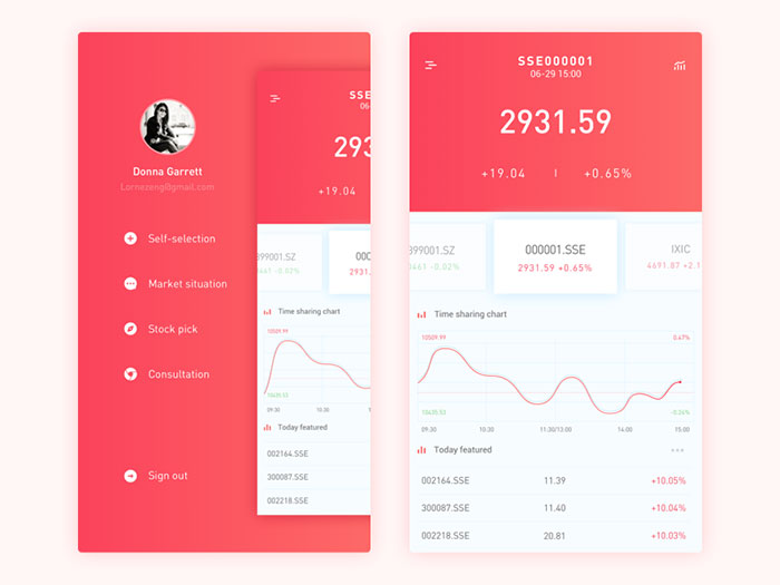
Stock App Design
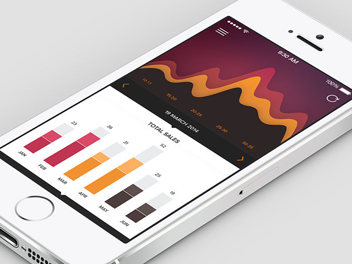
Analytics
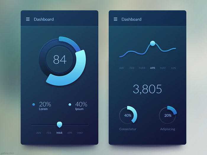
Mobile Dashboard
Optimize – Stats
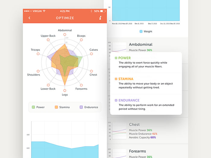
Charts and graphs in mobile UI
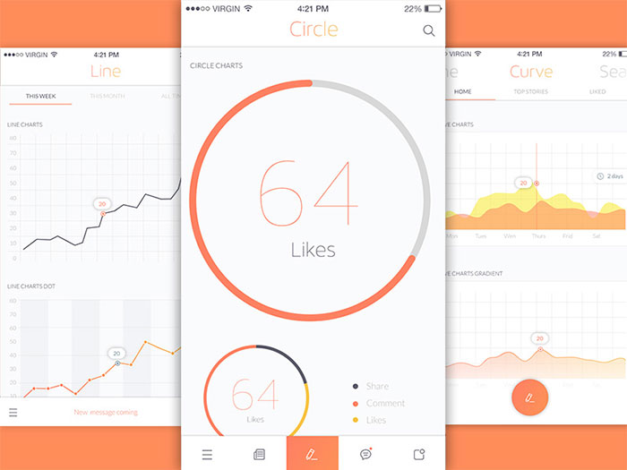
Financial and news app screens
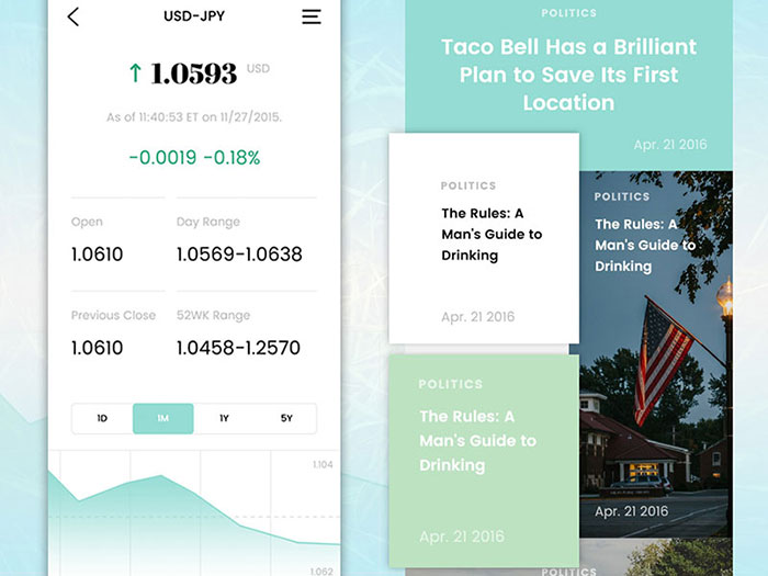
Pay Bills
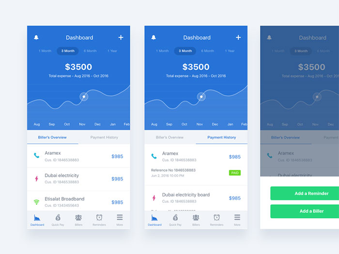
Line Graph Screen
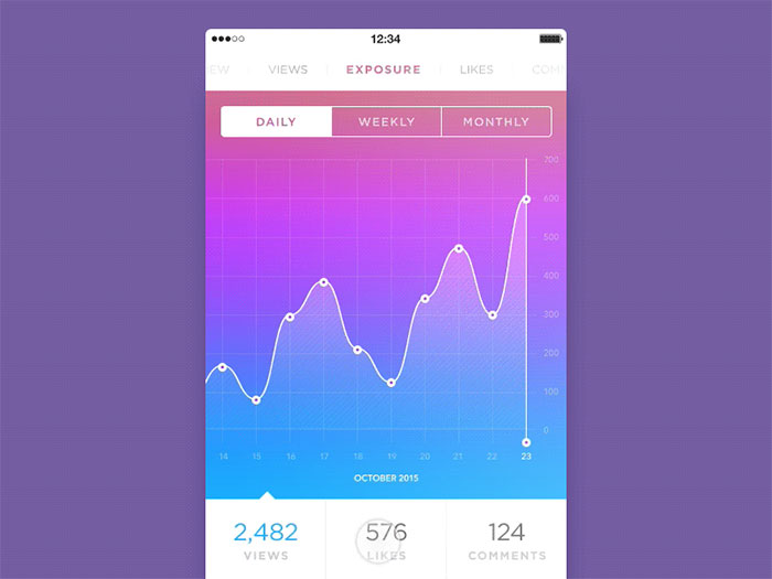
Analytics app screens
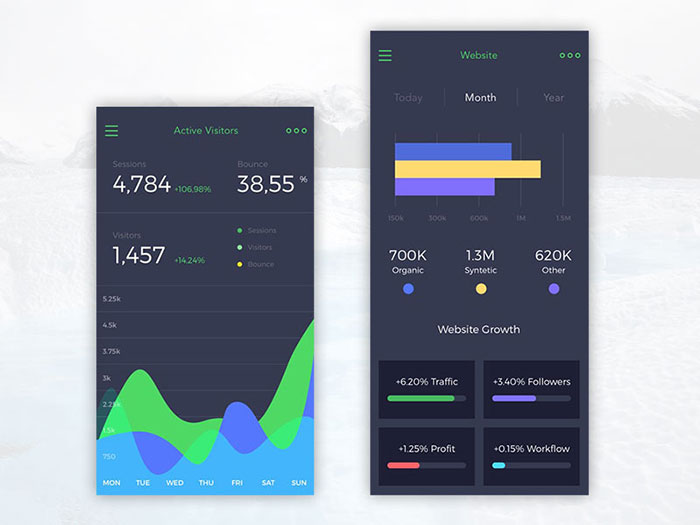
Analytics App
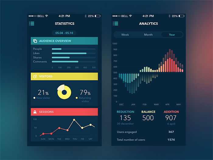
Cycling Match
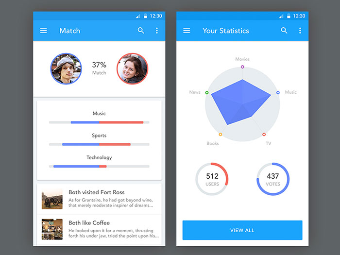
Threat Dashboard Direction iOS
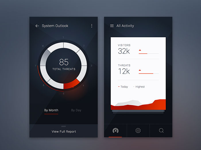
Mobile dashboard
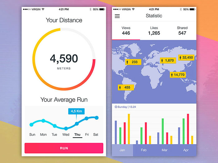
Charts
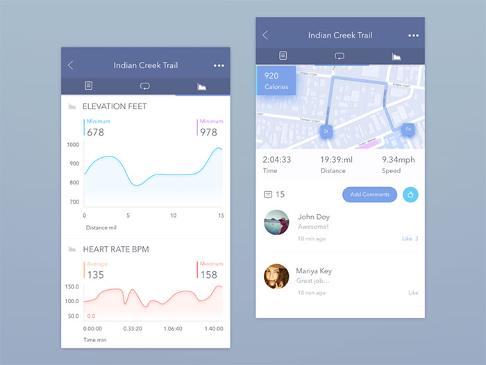
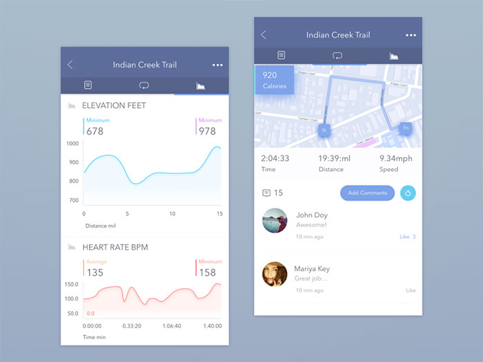
Indian Creek Trail App Concept
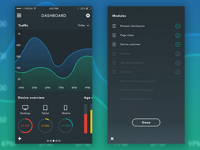
Manage modules
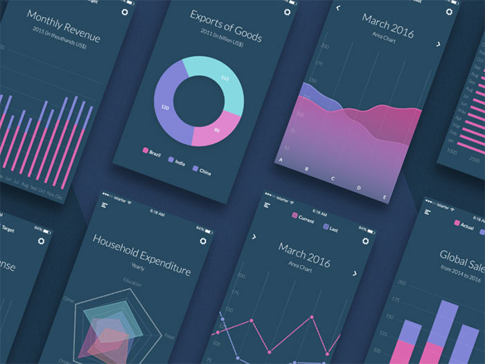
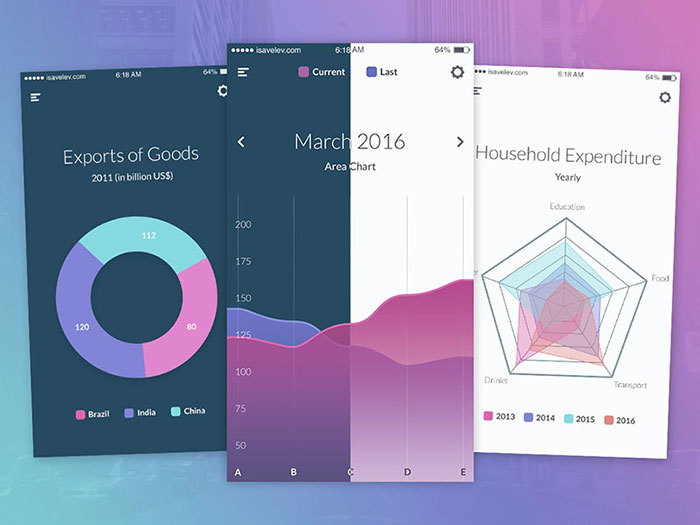
Purple charts and graphs
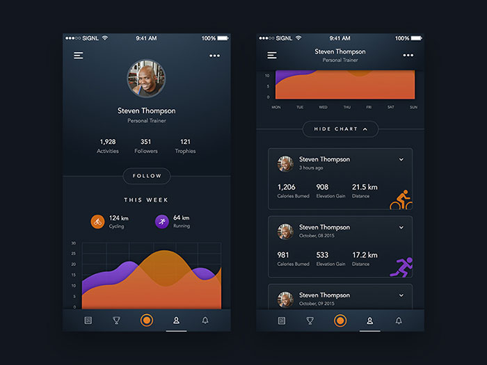
Sport Tracking App – Profile
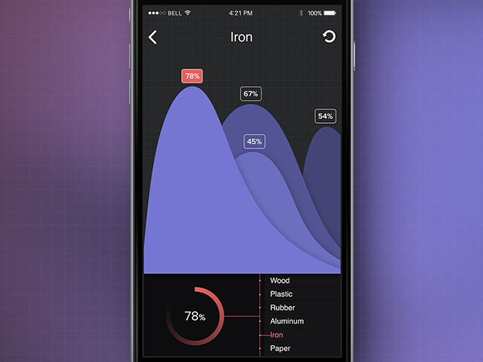
Iron Chart
Noblyn App Redesign
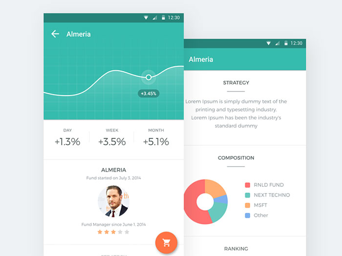
Mobile Investment Platform
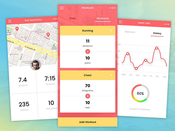
Tracking app
FAQ on Charts On Mobile
Do Mobile Charts Need to Be Accessible to Screen Readers?
Yes, and this one isn’t optional. WCAG’s Non-Text Content criterion requires an accessible alternative for every chart, usually a hidden data table plus an aria-label summarizing the chart type and finding. WAI-ARIA guidance also recommends hiding decorative axis marks with aria-hidden while keeping the actual data reachable.
What Is the Best Chart Library for Native Mobile Apps?
On iOS, Apple’s own Swift Charts framework, introduced in iOS 16, handles most standard chart types natively. On Android, MPAndroidChart remains the most widely used open-source option, with DGCharts serving as its Apple-side port for teams that need both platforms covered.
How Does Dark Mode Affect Mobile Chart Design?
Dark mode doesn’t lower the bar on contrast. WCAG’s 4.5:1 minimum for normal text still applies against a dark background, and colors chosen for a light theme often fail that ratio once inverted, so palettes need their own contrast checks for each mode.
Can Mobile Charts Work Without an Internet Connection?
Yes, if the data ships with the app or gets cached beforehand. Progressive web apps commonly use the Cache API or IndexedDB to store chart data locally, letting the chart render from cache when the device has no signal.
What Is the Ideal Number of Colors for a Mobile Chart Palette?
Most designers cap a mobile chart at 4 to 6 distinct colors, since a narrow screen leaves little room to compare hues side by side. Beyond that, pattern fills or direct labels communicate difference better than color alone.
Can Users Export or Share a Mobile Chart as an Image?
Most chart libraries expose a method to serialize the canvas or SVG into a PNG or base64 image string, which apps hand off to the native share sheet. Chart.js ships a built-in toBase64Image method for exactly this.
What Is a Swipeable Chart Carousel, and When Should You Use One?
A swipeable carousel shows one chart at a time, with a horizontal swipe moving between related metrics instead of stacking them vertically. It suits dashboards with 3 to 5 related KPIs, keeping each chart at full width and legible.
How Often Should a Mobile Chart’s Design Be Reviewed or Refreshed?
Review mobile chart layouts whenever a platform ships a major OS update, since Apple and Google periodically revise touch target and typography guidelines. Outside that trigger, a yearly audit against current viewport and accessibility standards catches most drift.
What Is the Difference Between a Mobile App Chart and a Mobile Web Chart?
A mobile web chart runs inside a browser and depends on CSS media queries and a JavaScript library like Chart.js. A native app chart, built with Swift Charts or MPAndroidChart, renders through the platform’s renderer and hooks into system gestures directly.
What Size Should a Chart Canvas Be on a Phone Screen?
Most mobile charts work best between 200 and 300 pixels of height, with the width set to fill the container rather than a fixed value. A roughly 16:9 or 4:3 aspect ratio keeps the shape readable without forcing vertical scroll.
Conclusion
Charts on mobile succeed or fail before a single pixel gets styled. The dataset decides the outcome long before chart type or color palette gets a say, and well before anyone picks a library either.
Cut the point count first. Aggregation and sampling fix more legibility problems than font tweaks or spacing adjustments ever will.
Accessibility standards aren’t optional polish anymore. WCAG conformance carries real legal weight in several jurisdictions now, and a chart that fails contrast or reflow checks creates real exposure, not just a bad review.
Build for the narrowest phone width first, then scale outward. A chart that works at 320px earns everything larger almost for free, and reworking that logic later costs a lot more than getting it right from the start would have.

Renowned for his expertise in logo design and visual branding, Bogdan has developed a multitude of logos for various clients.
His skills extend to creating posters, vector illustrations, business cards, and brochures. Additionally, Bogdan's UI kits were featured on marketplaces like Visual Hierarchy and UI8.
He also wrote in the past years on sites like Design Your Way, WebDesignerDepot, WPDean, Designmodo, Speckyboy, Slider Revolution, and more.
- Pantone Color Codes - 19 August 2026
- When an App Redesign Needs More Than a Visual Refresh - 19 August 2026
- The Best AI Avatar Generators for Business Teams in 2026 - 18 August 2026

Bogdan Sandu is a seasoned designer who has been designing websites since 2008. Renowned for his expertise in logo design and visual branding, Bogdan has developed a multitude of logos for various clients. His skills extend to creating posters, vector illustrations, business cards, and brochures. Additionally, Bogdan's UI kits were featured on marketplaces like Visual Hierarchy and UI8. He also wrote in the past years on sites like Design Your Way, WebDesignerDepot, WPDean, Designmodo, Speckyboy, Slider Revolution, and more.
You Might Also Like