Some paintings make you stop and stare for all the wrong reasons. Dogs playing poker, vegetables arranged as human faces, screaming popes trapped in cages.
Art history contains weird art examples that challenged viewers, broke rules, and sometimes launched entire movements. From Hieronymus Bosch’s nightmarish visions to Andy Warhol’s soup cans, these works refused to play it safe.
This collection explores twenty bizarre artworks that puzzled (and sometimes horrified) audiences. You’ll discover what makes each piece strange, who created it, and why it matters.
Some sparked surrealism. Others became internet legends. A few still hang in museums despite initial outrage.
Weird doesn’t mean bad. Sometimes the strangest art becomes the most influential.
Weird Art Examples
| Artwork & Artist | Period & Style | Unique Characteristics | Cultural Context |
|---|---|---|---|
| The Garden of Earthly Delights Hieronymus Bosch |
1490-1510 Northern Renaissance |
Triptych depicting paradise, earthly pleasures, and hell with fantastical hybrid creatures and surreal imagery | Moral allegory exploring human sin, temptation, and divine judgment through complex symbolism |
| The Vegetable Gardener Giuseppe Arcimboldo |
1587-1590 Mannerism |
Reversible portrait constructed from vegetables; appears as bowl when inverted | Clever visual puzzle celebrating nature’s abundance while demonstrating artistic virtuosity at Habsburg court |
| Vertumnus Giuseppe Arcimboldo |
1590 Mannerism |
Portrait of Emperor Rudolf II composed entirely of fruits, vegetables, and flowers | Allegorical tribute depicting emperor as Roman god of seasons, symbolizing his rule over natural cycles |
| The Overturned Bouquet Abraham Mignon |
1660-1679 Dutch Golden Age |
Hyperrealistic still life featuring spilled flowers, insects, reptiles in dramatic composition | Vanitas symbolism representing life’s fragility and beauty’s transience through meticulous detail |
| The White Cat Pierre Bonnard |
1894 Post-Impressionism |
Elongated, stylized white cat with exaggerated proportions and intense gaze | Early work showing Japanese influence and departure from naturalistic representation toward decorative art |
| The Sphinx Georg von Rosen |
1888 Symbolism |
Mythological creature depicted with unsettling human-beast hybrid features | Symbolist exploration of mystery, enigma, and the boundary between human and animal nature |
| An Ugly Duchess Quentin Massys |
1513 Northern Renaissance |
Grotesque female portrait with exaggerated aged features and elaborate headdress | Satirical commentary on vanity, aging, and beauty standards; possibly depicting Paget’s disease |
| Les Demoiselles d’Avignon Pablo Picasso |
1907 Proto-Cubism |
Five angular female figures with African mask-like faces and fragmented geometric forms | Revolutionary break from perspective tradition, launching Cubist movement and modernist aesthetics |
| The Weeping Woman Pablo Picasso |
1937 Cubism |
Distorted female face showing anguish through fractured planes and sharp angles | Extension of Guernica themes, depicting universal suffering through Dora Maar’s portrait |
| Campbell’s Soup Cans Andy Warhol |
1962 Pop Art |
32 canvases depicting each variety of Campbell’s soup in uniform grid arrangement | Critique of consumerism and mass production, elevating commercial imagery to fine art status |
| Dogs Playing Poker Cassius Coolidge |
1894-1910 Genre Painting |
Anthropomorphized dogs engaged in poker games in domestic settings | Humorous advertising art becoming iconic kitsch, satirizing Victorian social conventions |
| The Lovers René Magritte |
1928 Surrealism |
Two figures kissing with heads completely wrapped in white cloth, obscuring features | Exploration of isolation within intimacy, hidden identity, and barriers to true connection |
| Hands Resist Him Bill Stoneham |
1972 Contemporary |
Boy and doll before glass door with hands pressed against it; eerie, unsettling atmosphere | Gained notoriety as “haunted painting” through viral internet legend and auction controversy |
| Melun Diptych Jean Fouquet |
1450s Early Renaissance |
Virgin Mary with exposed pale breast, wearing crown, surrounded by red and blue angels | Controversial portrait possibly based on king’s mistress, blending sacred and secular imagery |
| Angry Dog Edvard Munch |
1890s Expressionism |
Snarling dog rendered with distorted features and agitated brushwork | Expression of inner turmoil and aggression through animal subject, typical of Munch’s psychological focus |
| Screaming Pope Francis Bacon |
1953 Expressionism |
Distorted papal figure in anguished scream, trapped within geometric cage-like structure | Reinterpretation of Velázquez’s Pope Innocent X, expressing existential horror and institutional power |
| The Ambassadors Hans Holbein the Younger |
1533 Northern Renaissance |
Double portrait with anamorphic skull visible only from specific angle, surrounded by scientific instruments | Memento mori incorporating optical illusion, showcasing wealth, learning, and mortality’s inevitability |
| Mr. Monkey Vinicius Quesada |
Contemporary Neo-Surrealism |
Anthropomorphic monkey in formal attire with unsettling human-like qualities | Brazilian artist’s commentary on social hierarchies and human-animal boundaries through disturbing imagery |
| Aquarius Jacek Yerka |
Contemporary Surrealism |
Fantastical landscape where buildings merge with natural elements in impossible architecture | Polish surrealist’s dreamlike fusion of childhood memories with metaphysical impossibilities |
| Blood Piss Blues series Vinicius Quesada |
Contemporary Neo-Surrealism |
Visceral, grotesque imagery mixing bodily fluids with surreal elements in provocative compositions | Raw exploration of physical decay, psychological disturbance, and taboo subjects through shock aesthetics |
The Garden of Earthly Delights

Hieronymus Bosch’s triptych assaults viewers with an overwhelming parade of bizarre imagery. Five hundred years later, people still can’t agree on what the hell it means.
What Makes It Weird
The painting sprawls across three massive oak panels packed with thousands of naked figures, hybrid creatures, and objects that shouldn’t exist.
Giant strawberries dwarf the humans. Musical instruments torture the damned. A tree-man with a cracked egg body stares out from hell.
In the central panel, people cavort inside transparent bubbles and climb into enormous fruit. Birds the size of buildings carry humans in their beaks.
Artist & Creation Context
Hieronymus Bosch painted this masterwork between 1490 and 1510 in the Netherlands.
He was around 40 to 60 years old when he created it. The original commission remains unknown, though it was likely created for a private collector rather than a church.
Born Jeroen van Aken in ‘s-Hertogenbosch, Bosch married into wealth and became one of the city’s most respected residents.
Medium & Technique
Oil on oak panels creates this triptych measuring 185.8 cm tall.
The central panel alone spans 172.5 cm wide. Each wing measures 76.5 cm.
Bosch built up layers of paint to create the intricate details. Some scholars suggest he used a magnifying glass for the smallest figures.
The exterior panels, when closed, show a grisaille creation scene depicting the third day.
Cultural Impact
Contemporary viewers found the work fascinating despite (or because of) its shocking content.
The painting influenced later surrealists including Salvador Dali, who called Bosch a pioneer. Widespread reproductions appeared almost immediately after the original went on display.
Art historians remain split on interpretation. Some read it as a moral warning about sin. Others see it as a celebration of paradise lost.
Its influence on 20th-century surrealism is undeniable.
Where to See It
The triptych hangs in Madrid’s Museo del Prado, where it’s been since 1939.
Crowds pack around it daily. You’ll need to book ahead during peak season to get anywhere near it.
The Vegetable Gardener

Giuseppe Arcimboldo stacked vegetables in a bowl to create a face. Flip it upside down and the illusion shatters into produce.
What Makes It Weird
This painting works as a reversible optical trick.
Right side up, you see a bowl of root vegetables, turnips, onions, and leafy greens. Flip it 180 degrees and a grinning human face materializes from the arrangement.
The onion becomes a bulbous cheek. A massive parsnip transforms into a nose.
Artist & Creation Context
Arcimboldo painted this between 1587 and 1590 during his time working for European royalty.
He spent decades as court painter to Holy Roman Emperors in Vienna and Prague. This piece came from his later period when he’d perfected his composite portrait technique.
The Mannerism movement encouraged his playful approach to traditional portraiture.
Medium & Technique
Oil on wood panel measuring just 35 x 24 cm makes this an intimate work.
Arcimboldo painted each vegetable with botanical precision. Every carrot, turnip, and leafy sprig looks like it could be plucked from a garden.
The dark background throws the produce into sharp relief. He arranged the vegetables to suggest anatomical features when inverted.
Cultural Impact
The painting demonstrates Arcimboldo’s unique contribution to Renaissance art through visual puns.
20th-century surrealists rediscovered his work with enthusiasm. His influence on artists like Man Ray and Dali became obvious once scholars reconnected the dots.
The reversible format anticipated later developments in conceptual art.
Where to See It
Museo Civico Ala Ponzone in Cremona, Italy houses the original.
The small size means you need to get close to appreciate the detail. Museum lighting reveals how meticulously Arcimboldo rendered each vegetable.
Vertumnus

Arcimboldo composed Holy Roman Emperor Rudolf II’s portrait entirely from seasonal fruits, vegetables, and flowers. The emperor loved it.
What Makes It Weird
Rudolf II’s face materializes from a cornucopia of produce representing all four seasons simultaneously.
Grapes form his hair. Cherry tomatoes create rosy lips. Peapods serve as eyebrows while corn becomes an ear.
Pears, pumpkins, artichokes, and gourds construct his torso. The painting flatters the emperor by depicting him as master of nature itself.
Artist & Creation Context
Arcimboldo completed this portrait around 1590-1591 as a gift to Emperor Rudolf II.
Rudolf ruled from Prague, where he assembled Europe’s most eccentric court. Scientists, alchemists, and artists mingled in his service.
The emperor commissioned this work to reinforce his image as a ruler whose domain controlled the natural world. Arcimboldo painted it after leaving Rudolf’s service but maintained their relationship.
Medium & Technique
Oil on panel measuring 27.5 x 22.8 inches creates this remarkable composite portrait.
Each fruit and vegetable is rendered with scientific accuracy. Arcimboldo studied botanical specimens to get the details right.
The inclusion of corn (a New World crop) served as political messaging. It demonstrated Rudolf’s reach extended to exotic imports from the Americas.
Cultural Impact
This portrait represents the peak of Arcimboldo’s composite style.
Contemporary viewers understood the political allegory immediately. The variety of seasonal produce symbolized Rudolf’s golden reign bringing abundance.
Swedish troops looted it during the Thirty Years’ War. The painting disappeared from view until 1845 when it resurfaced in Sweden.
The 1987 exhibition “The Archimboldo Effect” revived widespread interest in the artist’s revolutionary approach.
Where to See It
Skokloster Castle in Sweden displays the painting today.
It became one of the castle’s most famous artworks. You can visit it about an hour from Stockholm.
The Overturned Bouquet
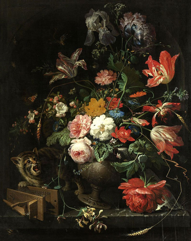
Abraham Mignon painted a cat knocking over a vase of flowers, creating an excuse to render insects, decay, and vanitas symbolism in obsessive detail.
What Makes It Weird
A tabby cat plays with a mousetrap while toppling an elaborate flower arrangement.
The real subject isn’t the cat or flowers. It’s the menagerie of insects crawling through the blooms – ants, spiders, caterpillars, snails, butterflies, dragonflies.
Death and decay lurk in this still life celebration. Flowers wilt. Insects devour. Time passes.
Artist & Creation Context
Mignon painted this between 1660 and 1679 during his Utrecht period.
Born in Frankfurt in 1640, he trained under Jacob Marrel before moving to the Dutch Republic. He worked as an assistant in Jan Davidszoon de Heem’s workshop.
The painting demonstrates his mastery of the Dutch Golden Age still life tradition.
Medium & Technique
Oil on canvas captures every texture with startling realism.
Mignon rendered different materials so convincingly that contemporaries coined the phrase “semblance without being” to describe such technical skill. You can almost feel the flower petals’ silky surface and the cat’s fur.
His color palette favored reds, yellows, and blues set against dark backgrounds. The lighting creates dramatic contrast between illuminated subjects and shadows.
Cultural Impact
The painting exemplifies Dutch vanitas themes about life’s transience.
Collectors throughout Europe sought Mignon’s work during the 17th and 18th centuries. His technical precision influenced later still life painters.
The overturned arrangement became a popular motif. Other artists copied the composition.
Where to See It
Amsterdam’s Rijksmuseum owns this masterpiece in their permanent collection.
It hangs alongside other Dutch Golden Age treasures. The museum’s lighting lets you examine Mignon’s incredible detail work.
The White Cat
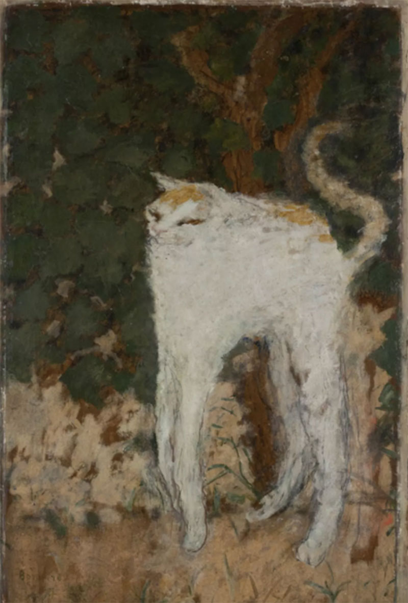
Pierre Bonnard stretched a white cat vertically against a dark background, creating something between comedy and Japanese woodblock aesthetics.
What Makes It Weird
This cat defies normal feline proportions through extreme vertical exaggeration.
The legs stretch unnaturally long. The tiny head perches atop a fluffy white body that seems to float against the dark brown-black background.
Its arched back and raised hackles suggest alarm at something unseen. The posture captures a frozen moment of feline anxiety.
Artist & Creation Context
Bonnard painted this in 1894 when he was deeply influenced by Japanese art.
He belonged to Les Nabis, a group nicknamed “The Japanese Nabis” for their obsession with Eastern aesthetics. The movement rejected traditional Western perspective in favor of flat spatial planes.
Born in Fontenay-aux-Roses in 1867, Bonnard died in Le Cannet in 1947 after a long career.
Medium & Technique
Oil on cardboard measuring 51.9 x 33.5 cm creates this intimate portrait.
Bonnard applied paint loosely, creating the cat’s fur through casual brushwork. The flat composition and vertical format directly reference Japanese prints.
He painted numerous cat studies throughout his career. This one became his most famous feline work.
Dark tones dominate. The white cat glows against browns and blacks, creating strong visual hierarchy through saturation and value differences.
Cultural Impact
The painting marks Bonnard’s transition away from strict Nabis doctrine toward his own style.
Critics noted the sardonic humor in the exaggerated proportions. The work influenced later artists interested in combining decorative graphic design elements with fine art.
X-ray scans reveal countless changes underneath. Bonnard reworked the composition extensively.
Where to See It
Paris’s Musee d’Orsay displays the painting in their permanent collection.
It’s been part of French national collections since 1982. The museum acquired it specifically to represent Bonnard’s early Japonisme period.
The Sphinx

Georg von Rosen painted a nude woman with a lion’s body sprawling across a rocky landscape, then spent decades refining it.
What Makes It Weird
A sphinx with disturbingly human female features stares directly at viewers from barren rocks.
The creature combines realistic human anatomy with a tawny lion’s body. Her gaze feels both seductive and threatening.
Von Rosen worked on this painting from 1887 to 1907, unable to leave it alone.
Artist & Creation Context
Swedish count and artist Georg von Rosen created this between 1887 and 1907.
Born in 1843, he traveled extensively through Egypt and the Mediterranean. These journeys influenced his mythological subject matter.
The sphinx represents more than Greek mythology. Von Rosen wrote that viewers misunderstood his intentions, seeing it as a symbol of dangerous feminine seduction when he meant something more complex about gender power dynamics.
Medium & Technique
Oil on canvas measuring a massive 280 x 365 cm dominates gallery walls.
The enormous scale makes the sphinx feel physically imposing. Von Rosen rendered the creature with meticulous attention to anatomical accuracy.
Rocky desert landscape surrounds the figure. The painting’s palette emphasizes earth tones and the creature’s tawny fur.
Cultural Impact
The work sparked controversy about gender politics during the Art Nouveau period.
Von Rosen explicitly rejected interpretations that cast the sphinx as a femme fatale destroying men. His letters clarify he sympathized with women’s historical oppression.
The painting influenced later Scandinavian symbolist artists.
Where to See It
Stockholm’s Nationalmuseum acquired the painting in 1908 through the Academy of Fine Arts.
It remains a centerpiece of their collection. The painting’s size requires substantial wall space.
An Ugly Duchess

Quentin Massys painted an elderly woman with severe facial deformities wearing elaborate dress and clutching a rosebud. People called it satire. Medical experts call it Paget’s disease.
What Makes It Weird
This portrait assaults Renaissance beauty standards with aggressive ugliness.
Deep-set eyes, a bulbous forehead, wide nostrils, pimply skin, and a toothless mouth create an almost grotesque visage. A hairy mole punctuates the prominent square chin.
Yet she’s dressed in expensive, outdated fashion with an ornate horned headdress. She offers a rosebud with obvious romantic intentions despite her advanced age and appearance.
Artist & Creation Context
Flemish artist Quentin Massys painted this around 1513 in Antwerp.
Born between 1465-1466 in Louvain, Massys became a leading figure in Northern Renaissance art. He pioneered secular, satirical imagery that departed from religious subjects.
The work formed half of a diptych paired with “Portrait of an Old Man.” Recent scholarship suggests the figure might actually be a cross-dressed man participating in carnival traditions.
Medium & Technique
Oil on oak panel measuring 62.4 x 45.5 cm shows Massys’s technical mastery.
He used sgraffito techniques, scratching through wet paint layers to create texture. The embroidery and hair details demonstrate this method.
Underdrawings reveal extensive planning. Massys prepared carefully before applying paint.
Medical analysis suggests the subject suffered from Paget’s disease, which causes bone deformation. The enlarged forehead and facial proportions match the condition’s symptoms.
Cultural Impact
The painting pioneered grotesque subject matter as acceptable art.
It possibly influenced or was influenced by Leonardo da Vinci’s grotesque head studies. The two artists may have exchanged drawings.
In the 17th century, viewers misidentified the subject as Margaret Maultasch, Duchess of Carinthia (supposedly the “ugliest woman in history”). This gave the painting its nickname.
John Tenniel used this image as inspiration for the Duchess in “Alice’s Adventures in Wonderland” (1865), embedding it in British culture.
Where to See It
London’s National Gallery houses the painting, acquired through Jenny Louisa Roberta Blaker’s bequest in 1947.
A 2023 exhibition reunited it with its companion piece “An Old Man” for the first time in decades. The museum drew massive crowds.
Les Demoiselles d’Avignon
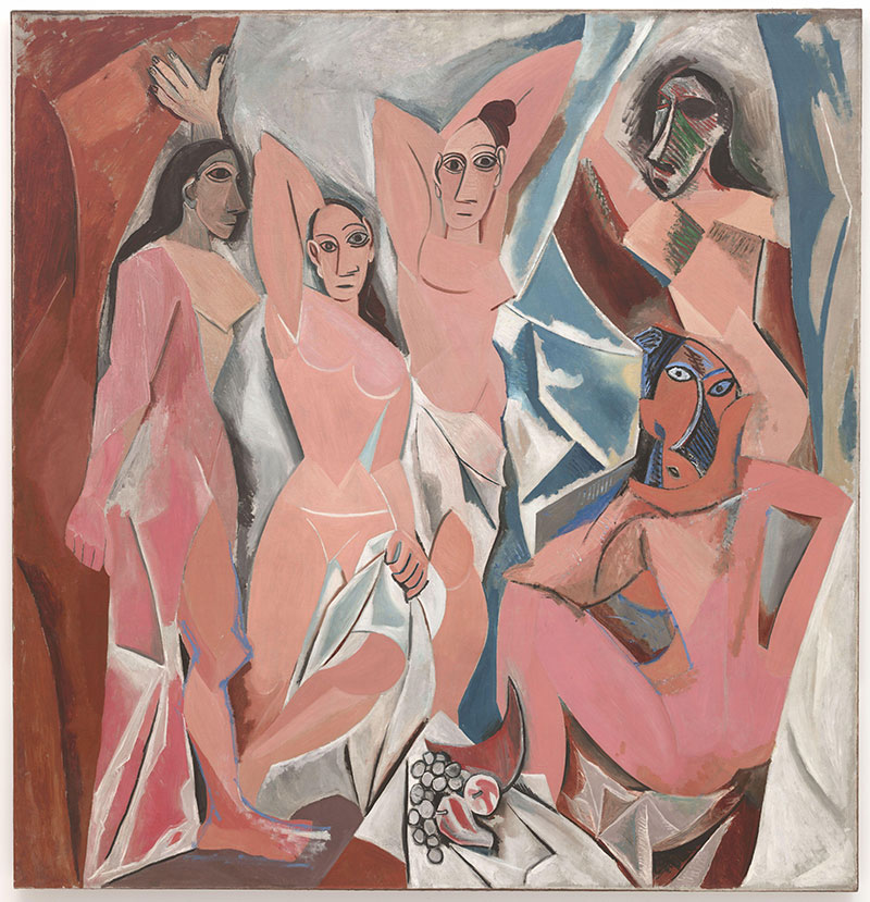
Picasso painted five prostitutes from a Barcelona brothel with geometric, mask-like faces and dismembered bodies that violated every rule of Western art. His friends hated it.
What Makes It Weird
This painting demolishes 500 years of Renaissance perspective and anatomical accuracy in one brutal stroke.
Five nude women confront viewers with angular, fragmented bodies. Their faces range from Iberian masks to African tribal influences.
The left figure shows Egyptian styling. The two rightmost figures wear African masks. None look remotely human in traditional terms.
Perspective collapses. Bodies twist impossibly. Space flattens into geometric planes.
Artist & Creation Context
Pablo Picasso created this in Paris between June and July 1907 at age 25.
He worked in his Bateau-Lavoir studio in Montmartre. The painting references a brothel on Carrer d’Avinyo in Barcelona.
Picasso originally titled it “Le Bordel d’Avignon” (The Brothel of Avignon). Art critic Andre Salmon changed it to the current, less scandalous title when organizing its first exhibition in 1916.
The artist made hundreds of preparatory sketches over nine months. This represents possibly the most intensive preparation for any single artwork in history.
Medium & Technique
Oil on canvas measuring 243.9 x 233.7 cm (8 feet by 7 feet 8 inches) creates an imposing presence.
Picasso reduced human figures to geometric shapes – spheres, cones, cylinders. This technique abandoned anatomical accuracy entirely.
The palette uses ochres, whites, and grays with stark warm-cool contrasts. African and Iberian art heavily influenced the faces, though Picasso later denied the African connection.
He eliminated perspective’s vanishing point. Eyes can’t escape the confrontational gazes.
Cultural Impact
Friends including Henri Matisse initially despised it. Matisse called the figures “hideous whores” and viewed it as an attack on modern art.
Georges Braque studied it obsessively despite his initial dislike. This led to his collaboration with Picasso and the birth of Cubism.
The painting remained rolled up in Picasso’s studio until 1924. Jacques Doucet purchased it for 25,000 francs with help from Andre Breton and Louis Aragon.
Newsweek called it “the most influential work of art of the last 100 years” in 2007. Art historian Holland Cotter argued Picasso “changed history with this work.”
Where to See It
New York’s Museum of Modern Art acquired it in 1939 through the Lillie P. Bliss Bequest.
It’s been a centerpiece of MoMA’s collection for over 80 years. The painting hangs on the fifth floor where crowds constantly surround it.
The Weeping Woman
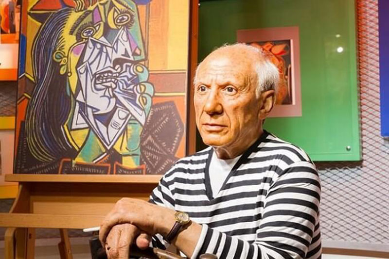
Picasso painted his lover Dora Maar crying obsessively throughout 1937. He turned grief into geometric shards of pain.
What Makes It Weird
The woman’s face fragments into angular geometric planes.
Tears slice down her cheeks like knives. A handkerchief crumples into shapeless white mass against her chest.
Her eyes don’t align. The face twists simultaneously toward and away from viewers.
Artist & Creation Context
Picasso created at least 36 variations between May and October 1937.
The series emerged directly from work on Guernica, his response to the Spanish Civil War bombing. He couldn’t stop painting the grief-stricken face even after finishing the massive mural.
Dora Maar, his lover and a Surrealist photographer, served as the model. She documented Guernica’s creation while simultaneously becoming its emotional aftermath.
Medium & Technique
Oil on canvas measuring 55.2 x 46.2 cm (dimensions vary slightly between versions).
Picasso used his Cubist fragmentation techniques to shatter the face into planes. Sharp angles create cutting edges where tears flow.
The color theory shifts between versions, some using harsh greens and purples, others more muted tones. The most famous version at Tate uses vibrant, almost sickening colors.
Cultural Impact
The series represents Picasso’s most sustained exploration of a single emotional state.
Art historians debate whether it depicts genuine empathy or exploitative cruelty toward Maar. She later confirmed Picasso drew inspiration from her actual sadness.
The weeping woman became an iconic antiwar image. It condensed the horror of Guernica into a single intimate portrait.
Where to See It
The most famous version hangs at London’s Tate Gallery.
The National Gallery of Victoria in Melbourne owns another major version from October 18, 1937. Los Angeles County Museum of Art and Musee Picasso in Paris hold additional variations.
Campbell’s Soup Cans
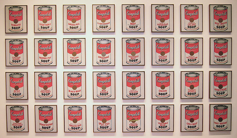
Andy Warhol painted 32 identical soup cans, one for each flavor Campbell’s sold in 1962. The art world lost its mind.
What Makes It Weird
Thirty-two canvases of soup cans hung in a line like grocery store shelves.
Each painting looks mechanically produced, though Warhol hand-painted every one. The labels differ only in the soup variety printed in red.
The work eliminated traditional artistic skill, emotion, and meaning. It was just soup.
Artist & Creation Context
Warhol created the series between November 1961 and June 1962 in New York.
He’d worked as a commercial illustrator throughout the 1950s. These paintings marked his transition to fine art and launched Pop Art on the West Coast.
The Ferus Gallery in Los Angeles exhibited them in July 1962. Gallery director Irving Blum eventually bought all 32 for $1,000 total.
Medium & Technique
Synthetic polymer paint on 32 canvases, each measuring 20 x 16 inches.
Warhol projected the soup can image onto canvas, traced the outline, then carefully painted the interiors. He used a stamp for the fleur-de-lis pattern on the bottom.
The paintings show pencil marks and paint irregularities, proving they’re hand-painted despite looking mechanically produced. This contradiction became central to their meaning.
Cultural Impact
The work revolutionized what could be considered art.
A neighboring gallery mounted a pyramid of actual soup cans with a sign offering “the original” at “two for 33 cents.” The stunt perfectly captured the provocation Warhol intended.
MoMA acquired the complete set in 1996 for a reported $15 million. The purchase validated Pop Art as museum-worthy.
Critics still debate whether Warhol celebrated or critiqued American consumerism.
Where to See It
New York’s Museum of Modern Art owns the complete 32-painting set.
They display them in a line (not a grid), echoing the original 1962 exhibition. The arrangement references supermarket shelves.
Dogs Playing Poker
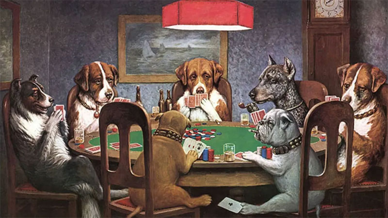
Cassius Marcellus Coolidge painted anthropomorphized dogs gambling, smoking cigars, and drinking whiskey. Nobody took it seriously as art until it sold for hundreds of thousands.
What Makes It Weird
Dogs sit around poker tables on leather chairs in dimly lit rooms.
They wear glasses, smoke pipes, and sip whiskey. Some cheat by passing cards under the table.
The paintings treat canine poker games with complete seriousness, rendering every detail meticulously.
Artist & Creation Context
Coolidge created 18 paintings in the series between 1894 and 1910.
Born in 1844 with zero formal art training, he worked as a cartoonist and illustrator before Brown & Bigelow commissioned 16 paintings in 1903 to advertise cigars.
The series was pure commercial art. Calendars and promotional materials featuring these dogs entered millions of American homes.
Medium & Technique
Oil on canvas with dimensions varying across the series.
Coolidge modeled some compositions on paintings by Caravaggio and Cézanne. The poker scenes incorporate genuine dramatic tension – which cards does each dog hold?
“A Bold Bluff” and “Waterloo” form a narrative diptych. The St. Bernard bluffs with a pair of deuces in the first painting, then rakes in his winnings in the second.
Cultural Impact
The series became embedded in American popular culture despite critical dismissal.
Coolidge was dubbed “The most famous American artist you’ve never heard of.” His work appeared in countless TV shows from Cheers to The Simpsons.
“A Friend in Need” (1903) became the most recognized painting, showing a bulldog secretly slipping an ace to his partner.
In 2015, “Poker Game” sold for $658,000. “A Bold Bluff” and “Waterloo” together fetched $590,400 in 2005.
Where to See It
Most paintings remain in private collections.
The originals surface occasionally at auction. Reproductions hang in bars, game rooms, and college dorms across America.
The Lovers
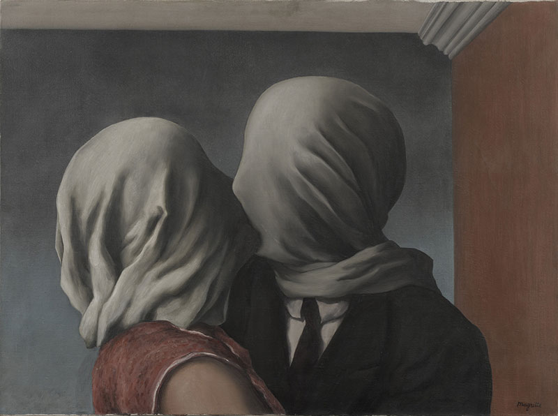
Rene Magritte painted two people kissing with white cloth completely covering their heads. It’s either deeply romantic or profoundly alienating.
What Makes It Weird
Two figures lean together for a kiss, but white fabric wraps their entire heads.
They cannot see each other. Cannot touch skin. The cloth transforms intimacy into suffocation.
The barrier makes the kiss simultaneously tender and horrifying.
Artist & Creation Context
Magritte painted four variations in 1928 while living in Paris.
Belgian Surrealist born in 1898, he witnessed his mother’s suicide by drowning at age 14. Her body was reportedly found with her nightgown wrapped around her head.
He created the series during his most productive Surrealist period after joining Andre Breton’s circle.
Medium & Technique
Oil on canvas measuring 54 x 73.4 cm for the MoMA version.
The man wears a black suit, the woman a red dress. Gender identification depends entirely on clothing since faces disappear.
Magritte used a pastoral background in The Lovers I but an abstract setting in The Lovers II. The cloth creates folds and curves suggesting both rope and shroud.
Cultural Impact
The paintings influenced fashion designers, filmmakers, and countless artists.
Pedro Almodovar referenced the image in “Broken Embraces.” David Delfin created controversial fashion featuring hooded models.
Art historians connect the work to Magritte’s mother’s death, though he rejected biographical interpretations. He preferred viewers experience mystery without explanation.
The series captures impossible love. Physical closeness combined with absolute separation.
Where to See It
The Lovers (I) hangs at MoMA in New York as part of the Richard S. Zeisler collection.
The Lovers II resides at the National Gallery of Australia in Canberra. The Lovers III and IV remain in private collections.
Hands Resist Him
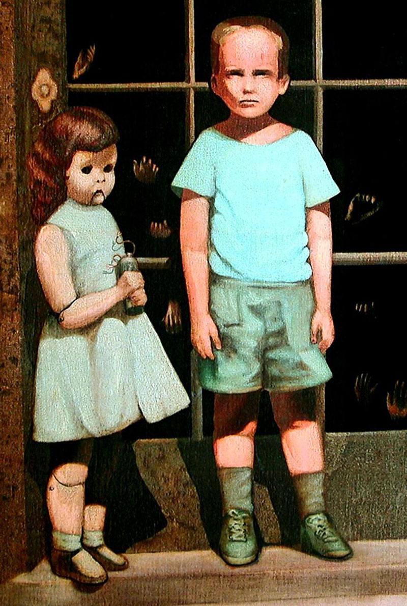
Bill Stoneham painted a boy, a doll, and disembodied hands pressing against glass. When it sold on eBay in 2000 with claims of being haunted, the internet exploded.
What Makes It Weird
A five-year-old boy stands with a life-size hollow-eyed doll before a glass door.
Dozens of ghostly hands press against the glass from behind. The doll holds what sellers claimed was a gun (actually a battery and wires).
The painting’s reputation for being cursed overshadows its actual imagery.
Artist & Creation Context
Bill Stoneham created it in 1972, basing the boy on a childhood photograph of himself at age five.
The doorway represents the line between waking and dreaming. The doll serves as a guide through that threshold. The hands symbolize alternate lives or possibilities.
Actor John Marley (from The Godfather) bought it at the Feingarten Gallery. After his 1984 death, it disappeared until 2000.
Medium & Technique
Oil on canvas measuring 36 x 24 inches.
Stoneham used realistic techniques to render the unsettling imagery. The doll’s eyes create the most disturbing element.
The glass door and hands create depth while maintaining claustrophobic compression.
Cultural Impact
The February 2000 eBay listing claimed the painting was haunted.
Sellers reported the children moved at night and exited the painting. The listing included legal disclaimers about supernatural powers.
After 30,000 views and 30 bids, it sold for $1,025 to Perception Gallery in Grand Rapids, Michigan.
Both the gallery owner who first displayed it and the art critic who reviewed it died within a year. Stoneham calls this coincidence.
The painting spawned three sequels: “Resistance at the Threshold” (2004), “Threshold of Revelation” (2012), and “The Hands Invent Him.”
Where to See It
Perception Gallery in Grand Rapids, Michigan owns the original.
The prequel hangs at Zak Bagans’ Haunted Museum in Las Vegas. The gallery keeps it in a back room per the owners’ sons’ request.
Melun Diptych
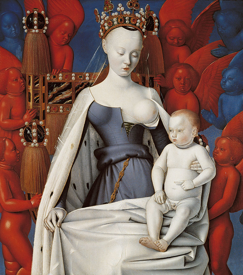
Jean Fouquet painted the Virgin Mary with one exposed breast, porcelain-white skin, and a bizarrely spherical head. She looks more alien than holy.
What Makes It Weird
The Virgin Mary’s skin appears impossibly white, almost translucent.
Her head forms a perfect sphere. One breast sits exposed, round and high. She seems carved from marble rather than flesh.
Baby Jesus looks equally strange, reaching stiffly toward her.
Artist & Creation Context
Jean Fouquet painted this around 1450-1455 for Etienne Chevalier, treasurer to King Charles VII of France.
The diptych originally hung in Notre-Dame de Melun. The left panel shows Chevalier kneeling with Saint Stephen. The right panel depicts the Virgin and Child.
Art historians suggest the Virgin’s face was modeled on Agnes Sorel, Charles VII’s mistress.
Medium & Technique
Oil on wood panels, each measuring approximately 93 x 85 cm.
Fouquet used Renaissance techniques but pushed proportions into surreal territory. The Virgin’s spherical head defies anatomical reality.
Blue and red angels surround her, rendered in graduating shades that create an otherworldly gradient effect.
Cultural Impact
The painting represents one of the most unusual Virgin Mary depictions in art history.
The exposed breast sparked centuries of debate. Was it erotic? Theological? Both?
French kings separated the panels in the 16th century. They remained apart for centuries.
Where to See It
The right panel (Virgin and Child) hangs in Antwerp’s Royal Museum of Fine Arts.
The left panel (Etienne Chevalier with Saint Stephen) resides at Berlin’s Gemaldegalerie. The separation continues.
Angry Dog
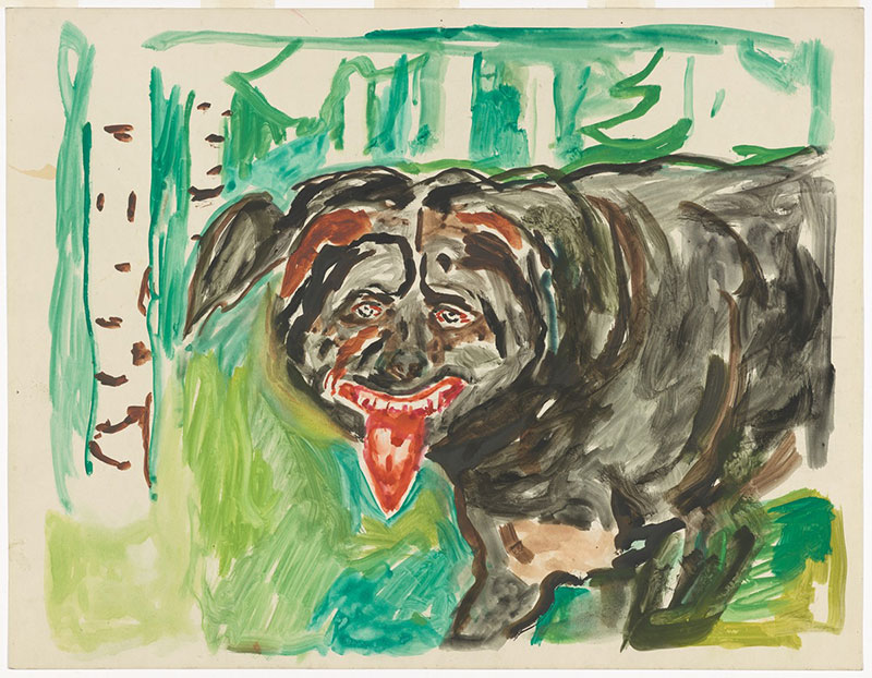
Edvard Munch painted a yellow dog barking furiously at nothing. The painting channels pure rage through a canine proxy.
What Makes It Weird
A yellow-brown dog stands in profile, mouth open in aggressive bark.
The background dissolves into loose brushstrokes. No clear threat appears. The dog’s anger exists in a vacuum.
Munch painted the same dog multiple times, always furious.
Artist & Creation Context
Munch created this around 1930 near the end of his career.
Born in Norway in 1863, he pioneered Expressionism through works like “The Scream.” This dog painting continues his exploration of raw emotion.
He owned the dog depicted and painted it repeatedly in various poses.
Medium & Technique
Oil on canvas using Munch’s characteristic loose, expressive brushwork.
The movement in the painting comes from gestural marks rather than realistic detail. Bold strokes convey the dog’s agitation.
Colors shift between versions, but yellow-brown tones dominate most.
Cultural Impact
The painting demonstrates how Munch applied his emotional intensity to unexpected subjects.
Critics note the dog’s rage mirrors Munch’s own psychological struggles. He channeled human anxiety through animal subjects.
The work influenced later artists interested in animal psychology and emotion.
Where to See It
The Munch Museum in Oslo holds several versions.
Private collections own others. The paintings rarely leave Norway.
Screaming Pope
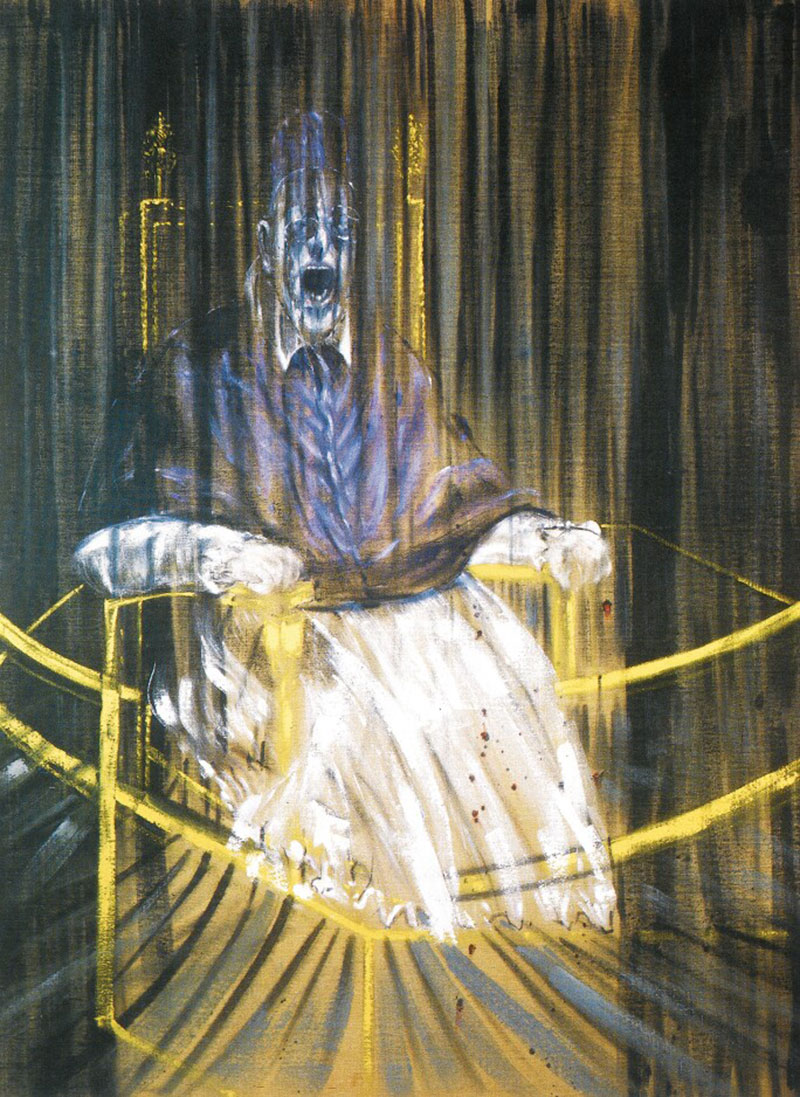
Francis Bacon took Velazquez’s dignified papal portrait and transformed it into a howling nightmare trapped in a cage.
What Makes It Weird
The pope sits on his throne inside a transparent cage, mouth frozen in a silent scream.
Purple vestments replace Velazquez’s dignified reds. The background disappears into darkness.
Vertical lines suggest bars or curtains falling through the figure.
Artist & Creation Context
Bacon painted around 50 variations between 1946 and the 1960s, with the 1953 version becoming most famous.
He worked obsessively from reproductions of Velazquez’s 1650 “Portrait of Pope Innocent X,” deliberately avoiding the original in Rome.
British artist born in 1909, Bacon identified as Nietzschean and atheist. The screaming popes enact Nietzsche’s “God is dead” declaration.
Medium & Technique
Oil on canvas, with the 1953 version measuring 152.1 x 117.8 cm.
Bacon’s palette shifted darker in 1953. Earlier blues became velvet purples. The nocturnal tone intensified.
He used translucent curtains and “space frames” to cage the figure. These geometric structures create psychological entrapment.
The scream references the Screaming Nurse from Eisenstein’s “Battleship Potemkin.”
Cultural Impact
The series became Bacon’s most recognizable work.
He claimed he sought to “triumph over” Velazquez rather than comment on religion. Critics ignored this, reading the paintings as attacks on religious authority.
The gallery owner who first displayed the 1953 version and the art critic who reviewed it both died within a year.
The Des Moines Art Center paid an undisclosed sum for the 1953 version, now considered one of Bacon’s finest works.
Where to See It
Des Moines Art Center in Iowa owns the famous 1953 Study after Velazquez’s Portrait of Pope Innocent X.
Aberdeen Art Gallery holds Pope I (1951). The Vatican Museums controversially display Study for Velazquez Pope II (1961).
The Ambassadors
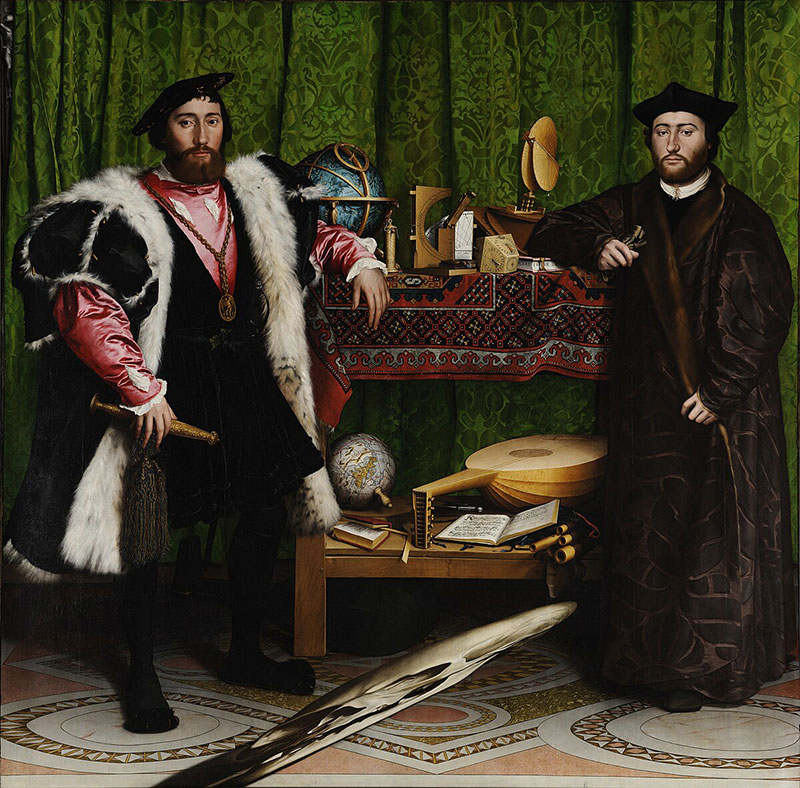
Hans Holbein painted French ambassadors in expensive clothes surrounded by scientific instruments. A grotesque smear floats at their feet until you view it from the side.
What Makes It Weird
An elongated skull stretches diagonally across the bottom of the painting.
From straight on, it looks like a smudge or stain. Walk to the painting’s right side and the anamorphic perspective resolves into a perfect skull.
Death lurks in plain sight, hidden by mathematical distortion.
Artist & Creation Context
Hans Holbein the Younger painted this in 1533 in London.
It depicts Jean de Dinteville and Georges de Selve, French ambassadors visiting England. The painting celebrates their wealth, learning, and diplomatic status.
The skull serves as memento mori, reminding viewers that death awaits everyone regardless of status.
Medium & Technique
Oil on oak panels measuring 207 x 209.5 cm.
Holbein used anamorphic projection to create the skull. The mathematical precision required demonstrates his technical mastery.
Every object carries symbolic meaning. Broken lute string suggests discord. Celestial globe shows astronomical knowledge. The green floor cloth displays intricate geometric patterns emphasizing symmetry.
Cultural Impact
The painting pioneered anamorphic techniques in Western art.
It demonstrates Renaissance fascination with perspective, optics, and mathematical precision. The hidden skull adds a dark joke to diplomatic grandeur.
Scholars continue debating every symbolic element’s meaning.
Where to See It
London’s National Gallery owns the painting.
Stand at the painting’s right edge to see the skull properly. Most visitors walk past without noticing the trick.
Mr. Monkey

Contemporary Brazilian artist Vinicius Quesada paints hyper-realistic monkeys in unsettling scenarios that blend cute with disturbing.
What Makes It Weird
Monkeys appear in impossibly detailed realism but placed in bizarre contexts.
The technical precision makes the strange scenarios more unsettling. These aren’t cartoons – they’re photorealistic creatures in wrong situations.
Quesada’s style sits between pop art and surrealism.
Artist & Creation Context
Vinicius Quesada is a contemporary Brazilian artist born in 1984.
He works primarily in oil on canvas, developing a distinctive style that merges street art influences with classical techniques.
His work explores themes of identity, pop culture, and the intersection of high and low art.
Medium & Technique
Oil on canvas with meticulous attention to fur texture, lighting, and anatomical detail.
Quesada builds up layers to achieve photographic quality. The monkeys look tangible enough to touch.
He contrasts this realism with surreal compositions or anachronistic settings.
Cultural Impact
Quesada represents a new generation of Brazilian artists gaining international recognition.
His work appeals to both street art collectors and traditional galleries. The accessibility of monkey imagery combined with technical excellence bridges multiple audiences.
Social media amplified his reach beyond traditional art world channels.
Where to See It
Quesada’s work appears in galleries primarily in Brazil and Europe.
Private collections hold most pieces. His Instagram showcases recent work.
Aquarius

Polish artist Jacek Yerka constructs impossible architecture from organic forms, creating dreamscapes where buildings grow like plants.
What Makes It Weird
A massive fish-shaped building floats above the landscape.
Windows and doors puncture its scales. Chimneys sprout from fins. The structure defies physics while maintaining architectural logic.
Every Yerka painting operates by its own internal rules that contradict reality.
Artist & Creation Context
Yerka was born in Torun, Poland in 1952.
He studied fine art and graphic design before developing his signature surrealist style. His parents, both artists, encouraged his imagination from childhood.
The paintings blend childhood memories of rural Poland with impossible fantasy.
Medium & Technique
Acrylics on canvas with obsessive detail.
Yerka renders every brick, leaf, and texture with painstaking realism. The technical precision makes the impossible scenarios more believable.
He works slowly, spending months on single paintings. The meticulous technique creates seamless integration of contradictory elements.
Cultural Impact
Yerka’s work represents contemporary surrealism continuing Salvador Dali’s legacy.
His paintings attract collectors seeking technically accomplished fantasy art. The combination of Polish folk influences with surrealist techniques creates a distinctive voice.
Digital reproductions spread widely online, though originals command high prices.
Where to See It
Galleries in Poland and Germany represent Yerka’s work.
Most paintings sell to private collectors immediately. Museum exhibitions occur periodically in Europe.
Blood Piss Blues series
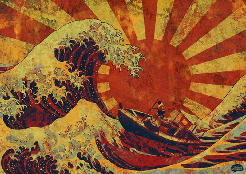
Vinicius Quesada’s provocatively titled series combines bodily fluid references with melancholic imagery in unsettling hyperrealistic paintings.
What Makes It Weird
The title alone shocks viewers before they see the work.
Quesada pairs crude biological references with technically sophisticated painting. The contrast creates intentional discomfort.
The series continues his exploration of beauty mixed with transgression.
Artist & Creation Context
Quesada created this series as part of his ongoing investigation into high/low art boundaries.
The title references both bodily reality and blues music’s raw emotionality. He forces viewers to reconcile beautiful execution with repulsive concepts.
Brazilian contemporary art often embraces provocation. Quesada positions himself within this tradition.
Medium & Technique
Oil on canvas maintaining Quesada’s signature hyperrealistic style.
The paintings’ beauty contradicts their titles. This tension drives the work’s impact.
Figures appear isolated against minimal backgrounds, emphasizing emotional states.
Cultural Impact
The series demonstrates contemporary art’s continued ability to provoke through juxtaposition.
Quesada challenges viewers to separate aesthetic appreciation from conceptual content. Can something titled “Blood Piss Blues” still be beautiful?
The work addresses bodily reality art often sanitizes.
Where to See It
The series appears in contemporary galleries specializing in provocative work.
Private collectors interested in boundary-pushing art acquire pieces. Online documentation reaches wider audiences than physical exhibitions.
FAQ on Weird Art Examples
What qualifies as weird art?
Weird art defies conventional aesthetics through disturbing imagery, impossible compositions, or unconventional materials. It challenges what viewers expect from visual art.
Artists like Hieronymus Bosch painted hellish creatures. Others used food (Arcimboldo) or everyday objects (Warhol) as subjects. Weirdness emerges when execution meets unexpected concepts.
Which art movement is the weirdest?
Surrealism tops most lists with dream logic and impossible scenarios. Dada embraced absurdity and anti-art principles deliberately.
Outsider art by self-taught creators often feels stranger than trained artists’ work. Contemporary movements blur boundaries further. Each era produces its own version of strange.
Why did Renaissance artists paint weird subjects?
Renaissance painters explored religious symbolism through bizarre imagery. Bosch depicted sin and temptation using hybrid creatures and nightmarish landscapes.
Symbolism required visual codes that modern viewers find confusing. Arcimboldo’s vegetable portraits entertained royal courts. Religious art allowed freedom to visualize heaven, hell, and moral lessons through shocking imagery.
What is the creepiest painting in existence?
Bill Stoneham’s Hands Resist Him became internet famous as the “haunted eBay painting.” The doll’s eyes and pressing hands disturb viewers.
Francis Bacon’s screaming popes trapped in cages create visceral unease. Bosch’s hell panels show torture in graphic detail. Edvard Munch’s works beyond The Scream often feel deeply unsettling.
How does weird art influence modern design?
Surrealism shaped advertising and graphic design through unexpected juxtapositions. Pop Art techniques appear in branding and packaging constantly.
Contemporary designers borrow from Cubism’s fragmentation. Color theory from weird art movements informs digital palettes. The boundary between fine art and commercial design keeps shrinking.
Can anyone create weird art?
Technical skill helps but isn’t required. Outsider artists prove that unique vision matters more than training.
Weirdness comes from genuine personal expression rather than following rules. Many famous bizarre artworks came from self-taught creators. The internet democratized weird art distribution, letting anyone share strange creations globally.
What makes Bosch’s paintings so disturbing?
Bosch combined religious themes with grotesque hybrid creatures and graphic violence. His triptychs show paradise, earth, and hell with unprecedented detail.
The Garden of Earthly Delights depicts thousands of naked figures engaged in bizarre acts. Fish swallow humans. Musical instruments torture sinners. Nobody painted sin quite like Bosch.
Why are Picasso’s portraits so distorted?
Picasso pioneered Cubism, showing subjects from multiple angles simultaneously. Les Demoiselles d’Avignon fractured faces into geometric planes.
His later portraits like The Weeping Woman expressed emotional states through distortion. African masks influenced his angular approach. Picasso believed accurate representation meant capturing essence, not appearance.
Where does weird art sell best?
Major auction houses handle famous contemporary art pieces. Christie’s and Sotheby’s sold Bacon and Warhol for millions.
Online platforms democratized weird art sales. Saatchi Art and similar sites connect collectors with emerging creators. Gallery districts in New York, London, and Berlin specialize in unconventional work.
How do museums decide what weird art to display?
Curators balance historical significance with public interest. MoMA acquired controversial pieces that later became masterpieces.
Museums consider artistic movement importance and cultural impact. Technical innovation matters. Provenance and condition affect decisions. Institutions increasingly embrace avant-garde work that initially shocked audiences.
Conclusion
These weird art examples prove that breaking rules often matters more than following them. From Bosch to Bacon, artists who embraced the strange shaped entire movements.
Dadaism, Cubism, and outsider art all started as rebellions. Now they hang in the Museum of Modern Art and Tate Gallery.
Weird doesn’t age out. Contemporary creators still push boundaries through unconventional materials and disturbing subjects.
The strangest pieces often become the most memorable. They stick in your mind precisely because they refuse to comfort you.
Art history remembers the bold over the beautiful. Next time something looks completely wrong, look closer. That’s usually where innovation lives.

Renowned for his expertise in logo design and visual branding, Bogdan has developed a multitude of logos for various clients.
His skills extend to creating posters, vector illustrations, business cards, and brochures. Additionally, Bogdan's UI kits were featured on marketplaces like Visual Hierarchy and UI8.
He also wrote in the past years on sites like Design Your Way, WebDesignerDepot, WPDean, Designmodo, Speckyboy, Slider Revolution, and more.
- Baseball Team Color Codes - 28 July 2026
- Canva vs Adobe Express: Which Is Better? - 27 July 2026
- Why Website Projects Need Two Workflows Instead of One - 27 July 2026

Bogdan Sandu is a seasoned designer who has been designing websites since 2008. Renowned for his expertise in logo design and visual branding, Bogdan has developed a multitude of logos for various clients. His skills extend to creating posters, vector illustrations, business cards, and brochures. Additionally, Bogdan's UI kits were featured on marketplaces like Visual Hierarchy and UI8. He also wrote in the past years on sites like Design Your Way, WebDesignerDepot, WPDean, Designmodo, Speckyboy, Slider Revolution, and more.
You Might Also Like