Logotype vs Logomark: Unraveling the Core Differences
What’s in a logo?
Quite a lot actually.
From tiny startups to colossal corporations, every entity needs a symbol, something that will make it stand out in a crowd, something that will embed itself in the minds of customers.
The key lies in understanding logotype vs logomark, and knowing which one will serve your cause the best.
But before we delve into that, let’s get the terminology straight.
Key takeaways
- Logo Fundamentals: A logo is a symbol or stylized name that serves as a company’s visual identity, playing a critical role in branding by grabbing attention, making a strong first impression, and helping customers to recognize the brand.
- Logo Design Considerations: When designing a logo, relevance, simplicity, uniqueness, memorability, scalability, and versatility are crucial factors to consider, ensuring the logo remains effective across various mediums and applications.
- Logotype Characteristics: A logotype, which is the stylized rendering of the brand’s name, is direct and simple, helping with brand recall, but may lack a visual element and be challenging for longer business names.
- Logomark Qualities: Logomarks offer visual impact and cross-language appeal, making them universally recognizable, but they require an established brand recognition to be effective, and designing a unique and meaningful symbol can be challenging.
Definition of Key Terms: Logo, Logotype, Logomark
Here’s the thing, these three terms: logo, logotype, logomark, they may seem like they’re different versions of the same thing. But, they’re not. They’re three different entities with their own identities and purposes.
Logo – It’s the face of your brand. It’s what people will see, remember, and associate with your business. It can be a symbol, a graphic, or even just text.
Logotype – Ever noticed how some brands use only text as their logos? That’s a logotype. It’s essentially your company name presented in a stylized way. Think Google or Coca-Cola.
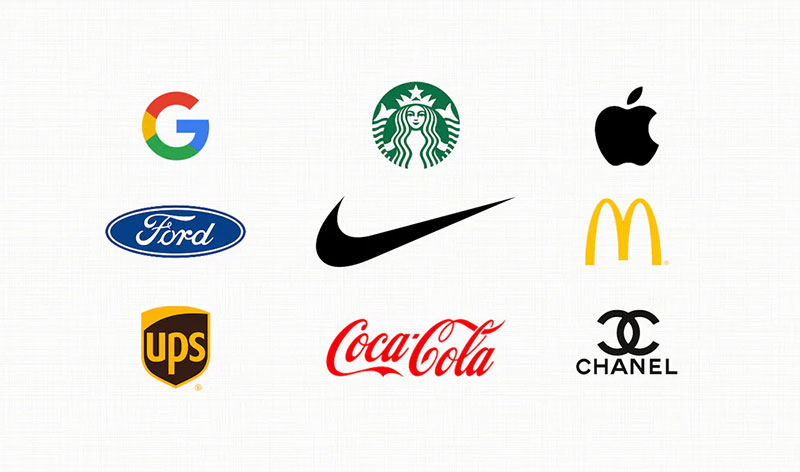
Logomark – That’s the symbolic bit. It’s a logo that’s a picture or a symbol. Apple’s apple or Nike’s swoosh? That’s a logomark.
Importance of Understanding These Terms for Businesses and Designers
So, why should you, as a business owner or a designer, care about logotype vs logomark? I mean, as long as it looks good, it’s all fine, right? Well, not really.
See, logos are more than just pretty pictures or fancy fonts. They’re a representation of your brand, your business, and what you stand for. They’re your first impression, and we all know how much that matters.
Knowing the difference between a logotype and a logomark helps you understand what kind of logo will suit your brand identity the best. It will guide your creative process and help you create a logo that truly resonates with your audience.
Understanding Logos
Before we get into the whole logotype vs logomark debate, let’s step back for a moment. Let’s take a broader look at logos. After all, that’s where it all begins.
Definition and Purpose of a Logo
In the simplest of terms, a logo is a symbol, a design, or a stylized name that identifies your company. It’s like your company’s ID card, but way cooler.
But why do we need them, anyway? We need logos because they serve three crucial roles: they grab attention, make a strong first impression, and form the foundation of brand identity. They are a point of identification; they’re the symbol that customers use to recognize your brand.
Importance of a Logo in Branding
Consider your logo as the cornerstone of your brand. It’s like the most visible manifestation of the company. People see it on your website, your packaging, your business cards – basically everywhere.
Your logo tells your audience that you’re here, you’re reliable, and you’re worth their time. It also differentiates you from your competitors and leaves a mark on the customer’s mind, making it easier for them to remember and recognize you.
Factors to Consider When Designing a Logo
Designing a logo sounds like fun, right? But it’s not as simple as doodling on a napkin. There’s a method to the madness.
Here’s what you need to consider:
- Relevance – Your logo should be relevant to your business, industry, and target audience.
- Simplicity – Keep it simple and clean. Remember, less is more!
- Uniqueness – It should be distinctive, different from your competitors.
- Memorable – Make it easy to remember. The more memorable it is, the easier it is for customers to recognize you.
- Scalable – Your logo should look good whether it’s on a giant billboard or a small business card.
- Versatile – It should look good in black and white as well as in color.
And there you have it. That’s the lowdown on logos, logotypes, and logomarks. The next time someone talks about logotype vs logomark, you’ll know what they’re on about.
Deep Dive into Logotypes
All right, now that we’ve warmed up with a broad overview of logos, let’s delve into the details of a particular type of logo – the logotype.
Definition and Examples of Logotypes
Remember, we’re talking logotype vs logomark here. The first contender in the ring is the logotype. In simple words, a logotype is a logo made entirely of text. It’s the name of the business displayed in a visually intriguing manner.
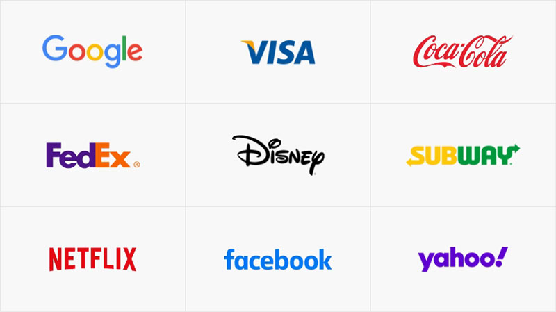
No frills, no fuss, just text. But don’t mistake the simplicity for lack of creativity or impact. Some of the most recognizable logos out there are logotypes. Google, anyone? Or Coca-Cola, Visa, eBay? Ringing any bells? These are all iconic logotypes.
Pros and Cons of Using Logotypes
Just like everything else in the world, logotypes come with their own set of perks and drawbacks. Let’s take a look at both sides of the coin.
Pros
- Directness – It’s your name right there, loud and proud. It leaves no room for misinterpretation or confusion.
- Simplicity – It’s straightforward. There are no hidden meanings or abstract concepts to decode.
- Memorability – Since it’s your name, it becomes easier for people to remember and recall your brand.
Cons
- Lack of Visual Element – Sometimes, a picture really is worth a thousand words. With logotypes, there’s no visual element, which may limit the visual impact.
- Name Length – If your business has a long name, it might not fit neatly into a logotype.
Ideal Scenarios for Using Logotypes
So when should you consider using a logotype for your business? Here’s what you need to consider:
- Brand Name Recognition – If your brand name is already well recognized, a logotype can help solidify that recognition.
- Unique Business Name – If your business name is unique and distinct, a logotype can help showcase that uniqueness.
- Short and Sweet – If your business name is short, it can work exceptionally well as a logotype.
Tips for Designing Effective Logotypes
Ready to get your hands dirty and start designing a logotype? Great! Here are a few pointers:
- Font Matters – The typeface you choose for your logotype is crucial. It needs to reflect the personality of your brand. Elegant or edgy, serious or playful, the right font can make all the difference.
- Color and Contrast – Make sure your logotype is clearly visible and readable. Play around with colors and contrast to achieve that.
- Space It Right – Pay attention to the spacing between the letters. Too close, and they’ll merge. Too far, and they’ll feel disjointed.
Now you’re armed with a whole lot of knowledge about logotypes. But remember, our discussion about logotype vs logomark isn’t over yet. Logomarks are next on the agenda.
Exploring Logomarks

Okay, moving on. We’ve taken a good hard look at logotypes. But remember, our theme here is logotype vs logomark.
We can’t leave out logomarks now, can we? So let’s dive in and uncover what logomarks are all about.
Definition and Examples of Logomarks
Stepping out of the text world of logotypes, let’s enter the realm of graphics and symbols – the land of logomarks.
So what’s a logomark? Well, if you see a logo that’s a symbol or an image, without any text, that’s a logomark.
Think Apple’s iconic apple, or Twitter’s little bird, or Nike’s swoosh. All these are examples of logomarks.
They’re visual, they’re impactful, and they’re instantly recognizable, even without any accompanying text.
Pros and Cons of Using Logomarks
Like everything else in design (and life), logomarks come with their own set of strengths and weaknesses. Let’s check them out.
Pros
- Visual Impact – A picture is worth a thousand words. The visual element of a logomark can be highly impactful and memorable.
- Cross-Language Appeal – Logomarks aren’t limited by language barriers. They can be recognized and understood regardless of the language the viewer speaks.
Cons
- Need for Recognition – A logomark works best when your brand is already well known. Without the name, a new brand might struggle to establish recognition with just a symbol.
- Difficulty in Design – Creating a simple yet meaningful and unique symbol can be challenging.
Ideal Scenarios for Using Logomarks
So, when should you be using a logomark? Here are some scenarios:
- International Appeal – If you’re a global brand, a logomark can seamlessly cross language barriers.
- Distinctive Symbol – If you can distill your brand into a distinctive symbol, a logomark is the way to go.
Tips for Designing Effective Logomarks
Looking to design a killer logomark? Here are some tips:
- Keep it Simple – Simple designs are more likely to be recognized and remembered.
- Make it Meaningful – Your logomark should somehow reflect your brand’s personality or what you do.
- Make it Unique – Make sure your logomark is distinctive and doesn’t resemble any existing logos.
And with that, we’ve covered the basics of logomarks.
Hybrid Logos: Combining Logotypes and Logomarks
So, we’ve gone over logotypes and logomarks.
Now, what if I told you that sometimes you don’t have to choose between the two? You can have your cake and eat it too!
Welcome to the world of hybrid logos, a perfect blend of logotype and logomark.
Definition and Examples of Hybrid Logos
Remember, our key discussion point is logotype vs logomark. Now, imagine smashing these two together. That’s exactly what a hybrid logo is!
It’s a combination of your brand’s name (the logotype part) and a visual symbol or icon (the logomark part).
Examples?
Think McDonald’s golden arches with the word “McDonald’s” underneath.
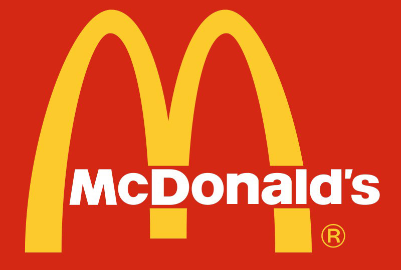
Or Starbucks’ siren encircled by the Starbucks Coffee logotype. These are hybrid logos.
You get the recognizability of the brand name and the visual appeal of the symbol. Best of both worlds, right?
Pros and Cons of Using Hybrid Logos
Like logotypes and logomarks, hybrid logos too have their highs and lows. Let’s weigh them.
Pros
- Name Recognition + Visual Appeal – You get to showcase your brand name and also create a visual impact with a symbol.
- Versatility – Hybrid logos offer more versatility. You can use the logotype and logomark together or separate them based on the use case.
Cons
- Complexity – With two elements to design and harmonize, creating a hybrid logo can be complex.
- Space Requirement – Since it includes both text and symbol, a hybrid logo often requires more space than a logotype or logomark alone.
Ideal Scenarios for Using Hybrid Logos
When does a hybrid logo make sense? Here’s when:
- New Businesses – If you’re a new business trying to establish brand recognition, a hybrid logo can be effective. It provides visual interest and also puts your name out there.
- Versatile Usage – If you want a logo that works equally well on your storefront as it does on your social media, a hybrid logo is a good pick. You can use the full logo or just the logotype or logomark part as needed.
Tips for Designing Effective Hybrid Logos
Ready to take a shot at designing a hybrid logo? Here’s some advice:
- Harmonize – Ensure the logotype and logomark parts of your hybrid logo work well together. They should look like they belong together, not like two separate elements mashed up.
- Flexibility – Design with flexibility in mind. The logotype and logomark parts should be able to work independently if needed.
- Balance – Strive for balance in size, color, and visual weight between the logotype and logomark parts.
Variable Logo Design: Adapting to Different Scenarios
Alright, let’s shift gears a little. We’ve discussed logotype, logomark, and their hybrid form in our logotype vs logomark quest.
Now, let’s delve into something more dynamic and modern – variable logo design. It’s all about adaptability and flexibility, so buckle up!
Explanation of Variable or Responsive Logo Design
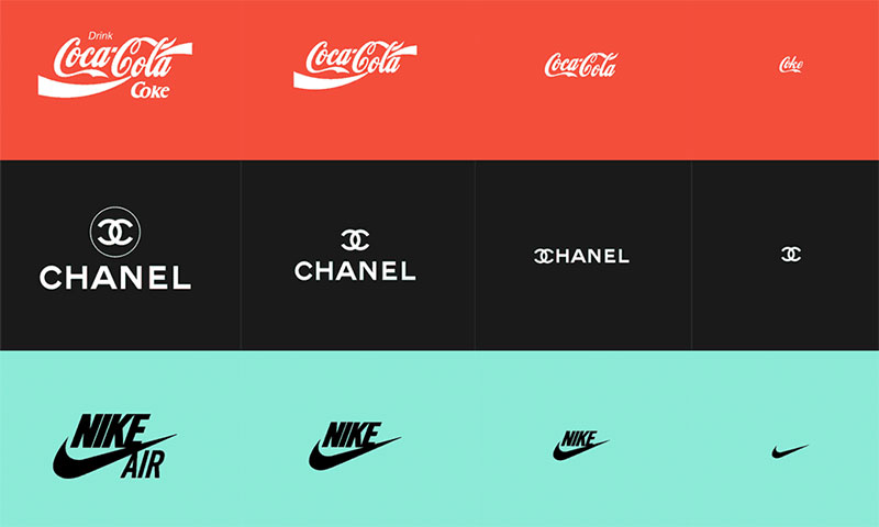
Let’s start with the basics – what is a variable or responsive logo? It’s quite simple, really. A variable logo isn’t just a single, static logo. It’s a suite of logos, each tailored to look its best in different contexts and mediums.
Think about how your logo appears on your website, on a billboard, on a business card, or as a social media icon. A one-size-fits-all approach might not work, and that’s where variable logos come in.
Importance of Having Different Logo Variations
Why bother with different logo variations, you ask? Well, let’s break it down.
The need for Adaptability
We live in a world where your brand presence spans different platforms and mediums, each with its own limitations and possibilities.
Your logo needs to shine in all those places, and that might need some tweaking and adaptation.
Consistency is key
Having a suite of logo variations doesn’t mean compromising your brand consistency. In fact, it’s the opposite.
A variable logo design ensures your logo looks its best and stays recognizable, no matter where it appears.
Examples of Brands Using Variable Logo Design
Not sure what variable logos look like in action? Here are a few examples:
- Google – Google’s full logo with its colorful lettering is widely recognizable. But when you’re using Google’s mobile search or Google apps, you often just see the simplified ‘G’ logo. That’s variable logo design.
- Spotify – Spotify’s icon changes based on whether you’re on mobile or desktop, without losing its overall brand identity.
We’ve come a long way in our logotype vs logomark journey, and now we’ve added variable logo design to our toolkit. So what’s next? Let’s figure out how to choose the right logo type for your business.
Choosing the Right Logo Type for Your Business
Alright, we’ve been on quite a journey together, exploring logotype vs logomark, their hybrid form, and even ventured into variable logo design.
But how do you decide what’s right for you? How do you choose the logo type that fits your business like a glove? That’s what we’re going to crack in this section!
Factors to Consider When Choosing a Logo Type
So you’re ready to make the big decision. Here’s what you should consider:
Your Brand Personality
Your logo is a visual representation of your brand. Think about your brand personality. Is it formal and sophisticated?
Maybe a classic logotype fits the bill. Is it modern and minimalist? A simple logomark could be your pick. Or do you want the best of both worlds? A hybrid logo might be the answer.
Your Target Audience
Always consider who you’re designing for. Your target audience’s preferences can guide your logo design choices.
Keep in mind their age group, their interests, and what kind of designs resonate with them.
The Nature of Your Business
Think about what your business does. If your business name is descriptive of the services you offer, a logotype could work well.
If you’re in a creative field, a logomark might give you more room for expression.
Importance of Aligning Logo Type with Brand Identity and Target Audience
Your logo is not just a pretty picture – it’s a critical part of your brand identity. It’s one of the first things your target audience will notice about your brand, so it needs to communicate the right message.
Choosing a logo type that aligns with your brand identity and resonates with your target audience is crucial.
Whether you choose a logotype, a logomark, a hybrid, or a variable logo, it should be a reflection of your brand personality and values.
Role of a Logo in Brand Recognition and Recall
Remember, the goal of your logo is not just to look good. It’s also about brand recognition and recall. Your logo is like a shortcut to your brand.
When people see your logo, you want them to instantly connect it with your brand and what you stand for.
So whether you’re going for a logotype or a logomark, make sure it’s something memorable. It should be distinctive, easy to recognize, and capable of telling your brand story at a glance.
FAQ on Logotype vs Logomark
What’s the difference between a logotype and a logomark?
Well, let’s break it down. A logotype is all about text. It’s your brand’s name in a specific, unique typeface. You know, like Google or Coca-Cola.
On the other hand, a logomark is a symbol or image that represents your brand. No words necessary. Think about the iconic Apple logo. That, my friend, is a logomark.
Do I need both a logotype and logomark for my brand?
Not necessarily. It’s all about your brand, its style, and how you want to present it to the world. Some brands rock just a logotype, others go for a logomark, and many use a combo of the two.
It’s all about making a choice that resonates with your brand identity and what you want people to remember.
How do I choose between a logotype and a logomark?
There’s no magic formula here, but think about what would make your brand memorable. If you have a cool, catchy name, a logotype might be your best bet.
If there’s a symbol or image that perfectly captures your brand’s essence, go for a logomark. It’s all about what makes the most sense for your brand.
What if my brand’s name is long, should I still go for a logotype?
Long brand names can be tricky to fit into a neat, tidy logotype. In such cases, a logomark could be a smart option. Alternatively, you might consider an acronym or initials for your logotype.
But remember, simplicity is key. You don’t want to confuse your audience with a complex design.
Are there any limitations with logotypes?
Yep, there are a couple. First, a logotype is language specific. If you’re planning to go global, your logotype might not resonate the same way in different languages.
Also, smaller sizes could make your logotype hard to read. Keep these things in mind!
Are there any limitations with logomarks?
Just like logotypes, logomarks aren’t perfect. They can be challenging to design and it’s tough to find a symbol that conveys your brand’s message without any words.
Also, for new businesses, a logomark alone might not be as recognizable as a logotype. It takes time and consistent marketing to build that recognition.
Can I change my logo from a logotype to a logomark, or vice versa?
Sure, you can. But be aware that any logo change can be risky. Your logo is part of your brand’s identity.
If you decide to switch it up, make sure you’re doing it for the right reasons and not just for a change’s sake. Keep in mind, consistency is super important in branding.
How important is color in a logotype or logomark?
Color is hugely important. It sets the mood, grabs attention, and makes your logo stand out. Whether it’s a logotype or logomark, picking the right colors can make all the difference.
But don’t forget to also consider how your logo looks in black and white. You want it to be versatile.
Can a logotype and logomark work together?
Absolutely, yes! Many brands use both together. They create a unique logotype and pair it with a meaningful logomark.
This combo can give you the best of both worlds: a visually striking image and the recognition that comes with a name.
What’s more important, the design of the logotype/logomark or the meaning behind it?
Honestly, both are important. You need a design that’s visually appealing, but the meaning behind it is what gives your logo substance.
It’s that deeper significance that can really connect with people and make them remember your brand. So, focus on both the look and the story behind your logo. It’s a balance.
Conclusion
Alright, let’s wrap this up. We’ve dived deep into the world of logos, deciphering logotype vs logomark, their hybrid forms, and even the adaptable world of variable logos.
It’s been a journey, one that I hope has armed you with the knowledge to approach logo design with a keen eye and a clear mind.
Recap of Key Points
Before we bid adieu, let’s take a quick trip down memory lane, recapping our key learnings:
- Logos, whether they’re logotypes, logomarks, hybrids, or variable designs, are the visual cornerstone of your brand. They represent your brand personality and communicate your brand values to your audience.
- Logotypes are text-based logos, the simplicity and clarity of which make them a strong choice for brands with catchy, unique names.
- Logomarks, on the other hand, are purely visual symbols, great for those with a flair for creativity and a knack for communicating messages visually.
- Hybrid logos marry the benefits of logotypes and logomarks, offering both a memorable symbol and clear brand name visibility.
- Variable logo design caters to the modern need for adaptability and flexibility, ensuring your logo looks its best in all situations and mediums.
Importance of Thoughtful Logo Design in Branding
As we’ve seen throughout our logotype vs logomark exploration, the importance of thoughtful logo design in branding can’t be overstated.
A well-designed logo isn’t just visually pleasing. It’s a hard-working component of your brand that builds recognition, communicates your brand story, and fosters trust with your audience.
Encouragement for Businesses to Invest Time and Resources in Creating the Right Logo
To all the businesses out there, here’s my final piece of advice – invest in your logo. It’s tempting to rush through logo design, eager to get your brand out there.
But remember, your logo is the face of your brand, and first impressions matter.
Whether you’re creating a logotype, logomark, hybrid, or variable logo, spend time crafting something that truly encapsulates your brand.
It’s a one-time investment that will continue to pay dividends as your brand grows and evolves.
And there you have it! From our initial discussions on logotype vs logomark to choosing the right logo for your brand, we’ve covered quite a bit of ground. I hope this has been as exciting for you as it has been for me.
If you enjoyed reading this article about the logotype vs logomark discussion, you should read these as well:
- Ice Cream Logo Design Examples for Inspiration
- Music logo design: Tips and examples to inspire you
- Geometric logo design: examples you should check out
- Nature Color Palettes Inspired by the Outdoors - 25 April 2024
- The Epic Games Logo History, Colors, Font, And Meaning - 24 April 2024
- Spread Joy: Happy Color Palettes for Uplifting Designs - 24 April 2024


