
The Dualshockers logo is the visual identity of one of gaming’s most recognized news outlets, a red-and-white wordmark built entirely around bold typography.
Founded in 2009 by Yaris Gutierrez, Joel Taveras, and Al Zamora, the site has carried a consistent brand identity that reflects its PlayStation-adjacent roots and no-frills editorial voice.
The logo has remained a fixture across gaming journalism as DualShockers grew from a passion project into a Valnet Inc. publication reaching millions of readers monthly.
It’s gone through a handful of refinements but the core design DNA has stayed intact.
What is the DualShockers Logo?

The DualShockers logo is a bold, all-caps wordmark in red and white, introduced alongside the site’s launch in 2009. It functions as a straightforward typographic identity with no symbol or icon, relying on strong letterforms and a high-contrast color palette to signal authority in video game media.
- Design Type: Wordmark (logotype only, no accompanying icon or symbol)
- Primary Elements: All-caps sans-serif typography, bold weight, set against a red background or displayed in red on white
- Official Introduction Date: 2009 (site launch)
- Designer/Agency: Not publicly credited; developed internally at launch
- Trademark Status: Used under Valnet Inc. since the June 2022 acquisition
- Color Palette: Primary red (#E4002B approximate), white (#FFFFFF)
- Usage Context: Site header, social media profiles, editorial thumbnails, press materials, favicon
How Has the DualShockers Logo Evolved Over Time?
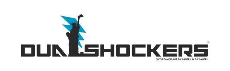
The logo has stayed close to its original concept across the site’s history. Early iterations were rougher around the edges, typical of independently-run gaming blogs from that era. The cleaner, more production-ready version emerged as the site grew its readership and editorial staff through the 2010s.
No full rebrand has taken place. What happened instead was gradual refinement: tighter kerning, cleaner rendering, and better consistency across platforms.
The Valnet acquisition in 2022 didn’t trigger a visual overhaul. The existing identity was kept intact, which says something about how recognizable it had already become in the gaming press space.
Original DualShockers Logo (2009-mid 2010s)
- Years Active: 2009 to approximately 2015
- Design Description: Bold all-caps wordmark, heavy weight sans-serif style, slightly rough execution consistent with early-era indie gaming blogs
- Color Scheme: Red and white
- Designer: Not publicly credited
- Context: Launched as a passion project out of Staten Island, New York, targeting PlayStation-focused gaming coverage
- Key Changes from Previous: N/A (original version)
- Cultural Significance: Reflected the DIY energy of gaming blogging in the late 2000s, when personal gaming sites competed directly with established outlets
Refined DualShockers Logo (mid-2010s-present)
- Years Active: Approximately 2015 to present
- Design Description: Cleaner, more consistent wordmark execution with tighter spacing and better cross-platform rendering
- Color Scheme: Red (#E4002B approximate) and white (#FFFFFF)
- Designer: Not publicly credited
- Context: Site was growing into a major gaming publication, eventually acquired by GRV Media and later Valnet Inc. in 2022
- Key Changes from Previous: Tighter letterform spacing, improved digital rendering, better pixel-level clarity at small sizes
- Cultural Significance: Signaled the site’s transition from indie blog to professional media property
What Do the Design Elements of the DualShockers Logo Mean?

The logo communicates speed and authority. Bold all-caps typography signals confidence. Red communicates urgency, which makes sense for a breaking news outlet. The absence of any icon keeps it direct.
There’s no hidden complexity here. The design says: this is a gaming news site, and it wants you to know that immediately.
That directness is actually harder to pull off than it looks. A lot of gaming media logos from the same era tried to be clever with controllers, joysticks, or pixel art. DualShockers skipped all of that.
Why Did DualShockers Choose These Specific Colors?
Red (#E4002B approximate)
- Color name: Gaming red
- Symbolic meaning: Urgency, breaking news, energy
- Psychological impact: Grabs attention fast, signals importance, creates immediate focal point
- Brand connection: Red is common in gaming media (IGN used it, GameSpot used it) and connects loosely to PlayStation’s own brand history
White (#FFFFFF)
- Color name: White
- Symbolic meaning: Clarity, cleanliness, contrast
- Psychological impact: Makes the red pop harder, improves readability at small sizes
- Brand connection: Standard high-contrast pairing for news and media brands
Red and white is one of the most used combinations in gaming company logos and media branding. It reads well on dark backgrounds, works on mobile, and scales cleanly to favicon size. Honestly, it’s a practical choice as much as an expressive one.
What Typography Style Is Used in the DualShockers Logo?
The wordmark uses a bold, condensed sans-serif font. The letterforms are tight and upright with no decorative elements.
The specific typeface has not been officially disclosed. It shares characteristics with heavy condensed grotesque fonts common in news and sports media branding.
All-caps setting increases the visual hierarchy and makes the wordmark feel more assertive than mixed-case would. Tracking is tight, which keeps the name reading as a single solid unit rather than individual letters.
The font choice aligns well with the brand’s editorial personality: blunt, fast, and confident.
What Are the Hidden Meanings in the DualShockers Logo?
The name itself is the main layer of meaning. “DualShockers” references the DualShock controller, Sony’s iconic PlayStation gamepad, making the PlayStation focus of the site clear from the name alone.
There are no known subliminal design elements or geometric tricks in the wordmark.
What’s intentional is the sheer weight of the typography. Heavy bold letterforms signal that the site takes its coverage seriously, that it’s not a side project.
The all-caps treatment is worth noting too. It puts DualShockers on equal visual footing with long-established outlets like IGN or GameSpot without needing a complex symbol to do the work.
How Does the DualShockers Logo Compare to Competitor Logos?

Among gaming news outlets, DualShockers sits in a group that favors bold wordmarks with strong color contrast. IGN uses black and red. GameSpot has used red and white historically. Kotaku has leaned into more playful, italic-heavy treatments.
DualShockers is more restrained than most.
Sites like game-focused outlets often try to signal their niche through iconography, controller silhouettes, or pixel-art elements. DualShockers relies purely on the typographic weight of its wordmark, which gives it a slightly more editorial, newspaper-like quality.
Compared to broader tech company logos, it’s more aggressive in color. Tech brands trend toward blues, whites, and neutrals. Gaming media runs hotter, and red is almost a category default.
Within Valnet’s portfolio (GameRant, TheGamer, Polygon), DualShockers holds one of the more direct visual identities. No mascots, no abstract marks, just the name in bold red.
What Are the Technical Specifications of the DualShockers Logo?
Official Color Codes
Primary Color: Red
- Hex: #E4002B (approximate, not officially published)
- RGB: (228, 0, 43)
- CMYK: (0, 100, 81, 11) approximate
- Pantone: Approximate match to Pantone 185 C
Secondary Color: White
- Hex: #FFFFFF
- RGB: (255, 255, 255)
- CMYK: (0, 0, 0, 0)
Dimensions and Proportions
- Aspect ratio: Approximately 6:1 (width to height) for the standard horizontal wordmark
- Minimum size requirements: Not officially published; general news media standards suggest no smaller than 120px wide for legible digital use
- Clear space specifications: Not officially documented; standard practice would call for clear space equal to the cap height of the wordmark on all sides
- Official usage guidelines: Managed under Valnet Inc. brand standards since 2022; logo assets are available through the site’s press kit
- File formats available: SVG (documented on Wikimedia Commons at 614 x 100 px native dimensions), PNG with transparent background
- DPI for print: 300 DPI minimum recommended for print applications
What Cultural Impact Has the DualShockers Logo Had?
Within gaming journalism, the DualShockers brand has become a reliable shorthand for PlayStation-leaning coverage and direct editorial takes. The logo appears on content that millions of readers engage with monthly.
It’s not a logo that shows up on merchandise or gets referenced in broader pop culture the way something like the PlayStation symbol does.
But in gaming media circles, it carries real weight.
Seeing the DualShockers header on a review or news piece signals a specific kind of coverage, editorial-first, community-aware, and not watered down. That association didn’t come from the logo design itself. It came from 15+ years of consistent publishing. The logo just holds that identity together visually.
For anyone tracking how gaming media brands have built visual identity from scratch, DualShockers is a decent case study. No redesigns, no mascot experiments, no trend-chasing. Just the same bold red wordmark, staying consistent while the site grew around it.
How Does the DualShockers Logo Fit Into the Overall Brand Identity?

The logo is the anchor point for everything DualShockers puts out. It appears in the site header, social thumbnails, YouTube channel art, and press kit materials.
The color palette established by the logo (red, white, with dark neutrals for supporting UI) runs through the full site design.
There’s no separate icon version for most uses. The wordmark does all the work. That’s a deliberate choice that keeps the brand tight and legible across contexts.
Since the Valnet acquisition, DualShockers sits alongside GameRant, TheGamer, and Polygon in a portfolio where each brand maintains its own distinct visual identity. The red wordmark keeps DualShockers visually separate from the others, which matters when all these properties share traffic pipelines and editorial networks.
The brand guidelines that govern exact usage are managed internally by Valnet’s team, though they have not been published publicly.
How Should the DualShockers Logo Be Used?
- Authorized use: Press coverage, editorial references, gaming journalism roundups, and historical documentation of gaming media
- Not authorized: Commercial merchandise, derivative branding, modified versions of the wordmark, or use implying official affiliation
- Where to access official assets: The SVG version is documented on Wikimedia Commons; press inquiries should go through Valnet Inc. directly
- Trademark protection: The DualShockers name and visual identity are held under Valnet Inc. following the June 2022 acquisition
- Color integrity: Do not alter the red-and-white color scheme; do not place the wordmark on low-contrast backgrounds that reduce legibility
- Scaling: As a vector graphic, the logo scales without quality loss; always use the SVG or high-resolution PNG for any publication use
- Do not: Add effects, shadows, gradients, or outlines to the wordmark; do not crop, skew, or recolor individual letters
FAQ on The Dualshockers Logo
What does the DualShockers logo look like?
It’s a bold, all-caps wordmark in red and white.
No icon, no symbol. Just the name set in a heavy condensed sans-serif font with tight letter spacing. Clean, direct, and instantly readable at any size.
What color is the DualShockers logo?
The primary color is red, approximately #E4002B, paired with white.
Red signals urgency and energy, which fits a breaking news outlet. The high contrast between red and white keeps the wordmark legible across digital platforms and small screen sizes.
What font does the DualShockers logo use?
The specific typeface has never been officially disclosed.
It shares characteristics with heavy condensed grotesque fonts common in sports and news media branding. Bold weight, all-caps, tight font spacing. No decorative elements anywhere in the wordmark.
When was the DualShockers logo created?
The logo dates back to the site’s founding in 2009.
DualShockers was launched as a passion project by Yaris Gutierrez, Joel Taveras, and Al Zamora. The visual identity has stayed close to that original concept across the site’s entire history.
Has the DualShockers logo ever been redesigned?
Not in any significant way. There’s been no full rebrand.
What happened over time was gradual refinement: tighter spacing, cleaner rendering, better consistency across platforms. The core gaming media brand identity has remained intact through multiple ownership changes.
What type of logo is the DualShockers logo?
It’s a wordmark logo, also called a logotype.
That means the entire identity relies on typography alone, with no supporting icon or symbol. This design type works well for media brands where the publication name itself carries recognition value.
What does the name DualShockers reference in the logo design?
The name references the DualShock controller, Sony’s iconic PlayStation gamepad.
That connection signals the site’s PlayStation-focused editorial roots. The logo doesn’t visualize this reference directly. It lets the name do the work, which is a deliberate choice consistent with the wordmark-only approach.
How does the DualShockers logo compare to other gaming news logos?
It’s more restrained than most gaming publication logos from the same era.
Sites like IGN and GameSpot leaned into icon-heavy branding. DualShockers skipped controller graphics and pixel art entirely. The result is a gaming news brand identity that reads more like an editorial outlet than a product.
Who owns the DualShockers logo now?
Valnet Inc. has owned the DualShockers brand since the June 2022 acquisition.
Before that, GRV Media held the property. The logo and visual identity were kept intact after both ownership transitions, which speaks to how well-established the brand mark had already become.
Where can I download the official DualShockers logo?
An SVG version is documented on Wikimedia Commons at 614 x 100 px native dimensions.
For press use, official assets should be requested through Valnet Inc. directly. The logo is protected under trademark and should not be modified, recolored, or used in ways that imply official affiliation.
Conclusion
The Dualshockers logo is a rare case of a gaming news wordmark that held its ground without chasing trends.
No rebrand, no icon experiments. Just a consistent gaming publication identity built on bold typography, a red-and-white color palette, and a name that speaks directly to its PlayStation-focused roots.
For a site that grew from a Staten Island passion project into a major Valnet Inc. property, the logo design history tells a straightforward story: get it right early, then refine rather than reinvent.
That’s a solid approach for any brand style in competitive media.

Renowned for his expertise in logo design and visual branding, Bogdan has developed a multitude of logos for various clients.
His skills extend to creating posters, vector illustrations, business cards, and brochures. Additionally, Bogdan's UI kits were featured on marketplaces like Visual Hierarchy and UI8.
He also wrote in the past years on sites like Design Your Way, WebDesignerDepot, WPDean, Designmodo, Speckyboy, Slider Revolution, and more.
- How to Install Fonts on Mac (Step-by-Step Guide) - 20 September 2026
- From Mockup to Code: How AI-Augmented Development Speeds Up the Design Handoff - 19 September 2026
- The Beehiiv Logo History, Colors, Font, And Meaning - 18 September 2026

Bogdan Sandu is a seasoned designer who has been designing websites since 2008. Renowned for his expertise in logo design and visual branding, Bogdan has developed a multitude of logos for various clients. His skills extend to creating posters, vector illustrations, business cards, and brochures. Additionally, Bogdan's UI kits were featured on marketplaces like Visual Hierarchy and UI8. He also wrote in the past years on sites like Design Your Way, WebDesignerDepot, WPDean, Designmodo, Speckyboy, Slider Revolution, and more.
You Might Also Like