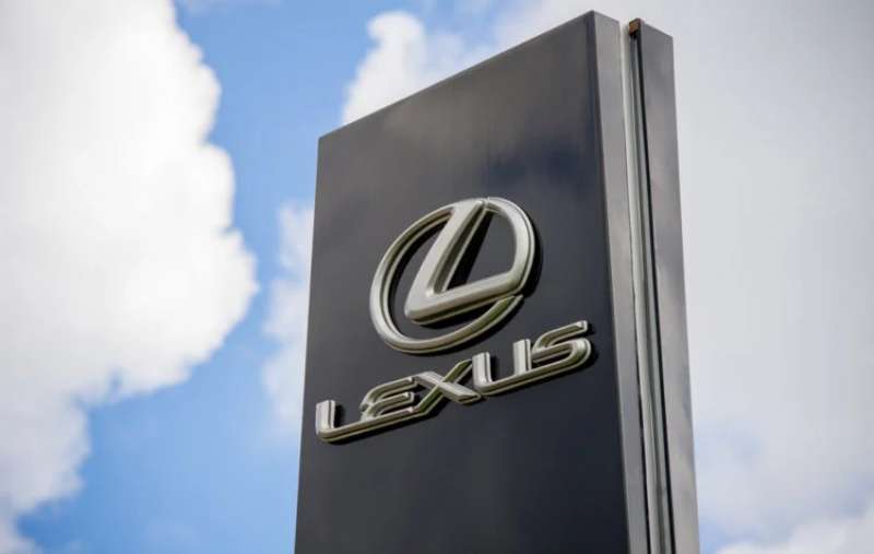
The Lexus logo stands as one of the most recognizable symbols in the luxury automotive segment. It represents Toyota’s premium division, launched in 1989 to compete with established European brands.
This emblem combines a stylized “L” within an oval frame. Simple, clean, unmistakably premium.
Within the broader context of car logos, the Lexus mark arrived during a period when Japanese manufacturers were pushing into luxury markets. The current version has remained largely unchanged since its debut, with only minor refinements over three decades.
Toyota founded Lexus specifically to challenge Mercedes-Benz and BMW. The logo has seen two primary iterations since 1989.
What is the Lexus Logo?
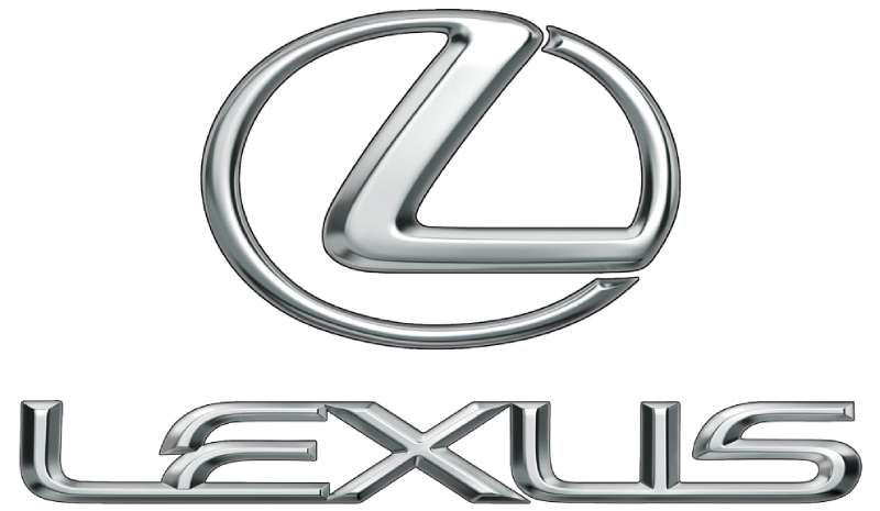
The Lexus logo features a stylized letter “L” enclosed within an elliptical oval shape. Introduced in 1989 alongside the brand’s launch, it was created by Molly Designs and Team One Advertising. The symbol represents the brand’s commitment to precision and luxury.
Design Specifications
- Design Type: Combination mark (symbol with wordmark)
- Primary Elements: Stylized “L” character inside an oval frame
- Official Introduction Date: 1989
- Designer/Agency: Molly Designs (symbol), Team One Advertising (brand identity)
- Trademark Status: Registered trademark of Toyota Motor Corporation
- Color Palette: Chrome silver (#C0C0C0), Black (#000000)
- Usage Context: Vehicle badges, dealership signage, marketing materials, digital platforms, merchandise
How Has the Lexus Logo Evolved Over Time?
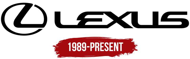
The Lexus logo has maintained remarkable consistency since 1989. Unlike many automotive brands that undergo frequent redesigns, Lexus kept its core symbol intact.
The primary changes involved refinements to proportions and rendering techniques. Chrome treatments evolved. Digital applications required adaptations.
But the fundamental “L” within an oval? That stayed put.
Original Lexus Logo (1989-2013)
- Years Active: 1989-2013
- Design Description: Angular stylized “L” inside a flattened ellipse, typically rendered in chrome
- Color Scheme: Chrome silver with dimensional shading
- Designer: Molly Designs
- Context: Launched with the LS 400 sedan to establish Lexus as a legitimate luxury competitor
- Cultural Significance: Signaled Japan’s serious entry into the premium automotive market
Refined Lexus Logo (2013-Present)
- Years Active: 2013-present
- Design Description: Slightly adjusted proportions, updated chrome rendering, cleaner lines
- Color Scheme: Chrome silver, flat black for certain applications
- Key Changes from Previous: Subtle refinements to letter weight and oval dimensions
- Context: Aligned with Lexus’s spindle grille introduction and bolder design direction
- Cultural Significance: Represents the brand’s shift toward more emotional, design-forward vehicles
What Do the Design Elements of the Lexus Logo Mean?
The stylized “L” obviously represents the brand name. But there’s more going on here.
The oval frame suggests completeness and global reach. The angular treatment of the letter conveys precision engineering.
These weren’t accidental choices.
Why Did Lexus Choose These Specific Colors?
Chrome silver dominates the Lexus logo for good reason. It communicates premium quality instantly.
The metallic finish suggests craftsmanship. High-end materials. Attention to detail.
- Chrome Silver: Hex #C0C0C0. Symbolizes luxury, technology, and sophistication. Creates a premium psychological response.
- Black: Hex #000000. Used in flat applications. Represents elegance and timelessness.
Understanding color psychology explains why these choices work so well for a luxury automotive brand.
What Typography Style Is Used in the Lexus Logo?
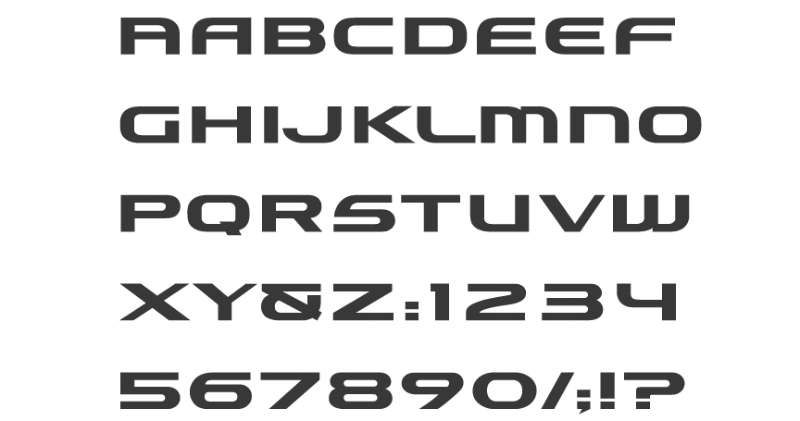
The Lexus wordmark uses a custom sans-serif font with distinctive characteristics. Clean lines. Generous spacing between letters.
The tracking is notably wide, giving the name room to breathe.
This approach to typography creates an upscale, unhurried feel. No cramped letters here.
What Are the Hidden Meanings in the Lexus Logo?
Some see the oval as representing a steering wheel. Others interpret it as a global symbol.
The “L” itself features precise 90-degree angles in certain sections. This geometric exactness reflects Toyota’s engineering philosophy.
Designers have noted the deliberate balance between curved and angular elements. The oval is soft. The letter is sharp. Together they work.
How Does the Lexus Logo Compare to Competitor Logos?
Lexus took a different path than its German rivals. BMW uses a roundel. Mercedes has its three-pointed star. Audi went with interlocking rings.
The Lexus approach feels more contemporary somehow. Less rooted in century-old traditions.
Compare it to Rivian’s logo or the SpaceX logo, both modern brands, and you see similar philosophies. Clean geometry. Minimal ornamentation.
Among Japanese luxury competitors, Infiniti uses an abstract road-to-horizon symbol. Acura features a caliper-inspired “A” shape. The Lexus “L” remains the most straightforward of the group.
What Are the Technical Specifications of the Lexus Logo?
Official Color Codes
- Primary (Chrome Silver): Hex #C0C0C0, RGB (192, 192, 192), CMYK (0, 0, 0, 25)
- Secondary (Black): Hex #000000, RGB (0, 0, 0), CMYK (0, 0, 0, 100)
- Accent (Deep Red): Hex #8B0000, used in F Sport variants
Dimensions and Proportions
- Aspect Ratio: Approximately 1.5:1 (width to height)
- Minimum Size: 0.5 inches for print applications
- Clear Space: Minimum padding equal to half the logo height on all sides
- File Formats: Available in vector graphics (AI, EPS, SVG) and raster formats
When working with the logo digitally, proper DPI settings matter for print quality.
What Cultural Impact Has the Lexus Logo Had?
The Lexus logo changed perceptions about Japanese luxury goods. Before 1989, “Japanese luxury car” sounded like an oxymoron to many buyers.
That chrome “L” helped shift attitudes. It showed up on vehicles that matched or exceeded German quality standards.
The logo became shorthand for “reliable luxury.” A different value proposition than the established players offered.
How Does the Lexus Logo Fit Into the Overall Brand Identity?

Lexus built an entire visual system around that “L” emblem. The spindle grille echoes the oval’s proportions. Interior design cues reference similar shapes.
Marketing materials follow strict brand guidelines. The logo placement, the typography choices, the photography style. Everything connects.
This creates what designers call unity across touchpoints. You recognize a Lexus ad before reading a single word.
How Should the Lexus Logo Be Used?
Official Usage Guidelines
- Do: Maintain clear space around the logo
- Do: Use official color values
- Do: Scale proportionally
- Don’t: Stretch or distort the logo
- Don’t: Change colors without authorization
- Don’t: Place on busy backgrounds that reduce legibility
Access and Licensing
Official Lexus logos are available through Toyota’s brand portal for authorized dealers and partners. The trademark is protected under international intellectual property law.
Unauthorized commercial use can result in legal action. Personal, editorial, or educational use generally falls under fair use provisions.
FAQ on The Lexus Logo
What Does the Lexus Logo Mean?
The Lexus emblem features a stylized “L” representing the brand name. The oval frame symbolizes the global reach of this Japanese luxury car manufacturer.
Some interpret the ellipse as a steering wheel. Others see it as representing unity and completeness in Toyota Motor Corporation’s premium division.
Who Designed the Lexus Logo?
Molly Designs created the iconic L symbol. Team One Advertising developed the broader brand identity system.
The project happened in the late 1980s. These agencies worked closely with Toyota’s leadership, including guidance from Eiji Toyoda’s vision for the luxury brand.
When Was the Lexus Logo Created?
The logo debuted in 1989 alongside the Lexus LS 400 at the Detroit Auto Show. This marked Toyota’s official entry into the premium automotive segment.
The timing was strategic. Japanese manufacturers were ready to challenge BMW, Mercedes-Benz, and Audi in North American markets.
What Font Does Lexus Use in Its Wordmark?
Lexus uses a custom typeface with clean, modern lines. The letters feature generous spacing and refined proportions.
This approach to typography elements creates an upscale feel. Nothing cramped. Nothing rushed. The font spacing communicates luxury through restraint.
What Are the Official Lexus Logo Colors?
Chrome silver serves as the primary color for vehicle badges. Black appears in flat digital applications and print materials.
The metallic finish connects to broader color theory principles. Silver suggests technology and sophistication. F Sport variants add deep red accents.
Has the Lexus Logo Changed Since 1989?
The core design stayed remarkably consistent. Only subtle refinements occurred over three decades of logo history.
Proportions received minor adjustments in 2013. Chrome rendering techniques evolved. But the fundamental Lexus symbol? Unchanged since launch.
What Does the L Symbol Inside the Oval Represent?
The stylized L stands for Lexus. Pretty straightforward.
But the execution matters. The angular letter creates contrast against the curved oval. Sharp meets soft. Precision meets elegance. This tension defines the visual identity.
Why Did Lexus Choose an Oval Shape for Its Badge?
Ovals suggest completeness and global ambition. The shape also differentiates Lexus from competitors using circles, shields, or stars.
Understanding the psychology of shapes explains this choice. Ellipses feel dynamic yet stable. Perfect for a brand balancing performance with comfort.
How Much Did the Lexus Logo Design Cost?
Exact figures remain undisclosed. Industry estimates suggest the complete brand identity development ran into millions of dollars.
This included the Lexus grille emblem, dealership signage, marketing materials, and trademark registration. The investment paid off through decades of brand recognition.
Can I Use the Lexus Logo for My Project?
The Lexus trademark is protected intellectual property. Commercial use requires explicit authorization from Toyota Motor Corporation.
Editorial and educational contexts typically fall under fair use. But printing the hood ornament design on merchandise? That will get you a legal letter fast.
Conclusion
The Lexus logo proved that newcomers could compete with established luxury brands. That chrome L inside an oval changed perceptions about Japanese car manufacturers overnight.
Three decades later, the emblem remains largely unchanged. A testament to getting it right the first time.
From the original Lexus LS 400 to current models featuring the spindle grille, this badge has maintained its premium positioning. The design respects core logo design principles while standing apart from German rivals.
Simple geometry. Precise execution. Lasting brand recognition.
That is what effective automotive branding looks like.

Renowned for his expertise in logo design and visual branding, Bogdan has developed a multitude of logos for various clients.
His skills extend to creating posters, vector illustrations, business cards, and brochures. Additionally, Bogdan's UI kits were featured on marketplaces like Visual Hierarchy and UI8.
He also wrote in the past years on sites like Design Your Way, WebDesignerDepot, WPDean, Designmodo, Speckyboy, Slider Revolution, and more.
- How Designers can Build a Stronger Online Creative Identity - 9 October 2026
- Minecraft Font Generator - 8 October 2026
- How Top Meta Ad Creative Is Designed for E-commerce Brands - 8 October 2026

Bogdan Sandu is a seasoned designer who has been designing websites since 2008. Renowned for his expertise in logo design and visual branding, Bogdan has developed a multitude of logos for various clients. His skills extend to creating posters, vector illustrations, business cards, and brochures. Additionally, Bogdan's UI kits were featured on marketplaces like Visual Hierarchy and UI8. He also wrote in the past years on sites like Design Your Way, WebDesignerDepot, WPDean, Designmodo, Speckyboy, Slider Revolution, and more.
You Might Also Like