From the rich crimson of a vintage wine to the vibrant scarlet of a sunset, the shades of red captivate and inspire. As a color that evokes both warmth and intensity, red dominates art, design, and fashion. The spectrum of red is vast, each shade telling its own story, influencing our emotions and surroundings.
Understanding these shades is crucial for anyone looking to harness the power of red in their work. Whether you’re selecting the perfect paint color from Sherwin-Williams or choosing a lipstick for an upcoming photoshoot, the right hue can make all the difference.
In this article, we’ll delve into the world of red, exploring its various tones-from burgundy and maroon to the fiery hues of vermilion and coral. By the end, you’ll not only recognize these shades but also know how to use them effectively in your projects. Let’s dive into the palette and discover the true essence of red.
Popular Shades of Red
| Shade Name | HEX Code | RGB Values | Description |
|---|---|---|---|
| Scarlet | #FF2400 | (255, 36, 0) | A bright and vivid red with a hint of orange. |
| Crimson | #DC143C | (220, 20, 60) | A deep and rich red with a slight blue undertone. |
| Maroon | #800000 | (128, 0, 0) | A dark brownish-red, often associated with elegance. |
| Ruby Red | #9B111E | (155, 17, 30) | A deep and rich red, similar to the gemstone ruby. |
| Firebrick | #B22222 | (178, 34, 34) | A dark red, similar to the color of bricks. |
| Candy Apple Red | #FF0800 | (255, 8, 0) | A bright and glossy red, often used in automotive finishes. |
| Cherry Red | #DE3163 | (222, 49, 99) | A bright and vibrant red, like the color of cherries. |
| Rose Red | #C21E56 | (194, 30, 86) | A medium red with a hint of pink, like the color of roses. |
| Salmon | #FA8072 | (250, 128, 114) | A light and soft red with a hint of orange, like the color of salmon flesh. |
| Tomato | #FF6347 | (255, 99, 71) | A bright red with a slight orange tint, like the color of ripe tomatoes. |
| Indian Red | #CD5C5C | (205, 92, 92) | A medium red with a brownish tint, named after the reddish-brown soil. |
| Light Coral | #F08080 | (240, 128, 128) | A soft and pale red, like the color of coral. |
| Dark Red | #8B0000 | (139, 0, 0) | A very dark and intense red. |
| Medium Violet Red | #C71585 | (199, 21, 133) | A bright red with a strong violet undertone. |
| Red | #FF0000 | (255, 0, 0) | The purest form of red, very bright and vivid. |
| Light Salmon | #FFA07A | (255, 160, 122) | A pale and soft red with a hint of orange. |
| Dark Salmon | #E9967A | (233, 150, 122) | A medium red with a slight orange tint. |
| Light Pink | #FFB6C1 | (255, 182, 193) | Light pink is a very pale and soft pink, often associated with delicacy. |
| Hot Pink | #FF69B4 | (255, 105, 180) | A bright and intense pink, often associated with fun and playfulness. |
| Deep Pink | #FF1493 | (255, 20, 147) | A very bright and strong pink. |
| Pale Violet Red | #DB7093 | (219, 112, 147) | A soft red with a strong violet tint. |
| Dark Pink | #FF1493 | (255, 20, 147) | A very deep and rich pink. |
| Brick Red | #CB4154 | (203, 65, 84) | A medium to dark red, similar to the color of bricks. |
| Vermilion | #E34234 | (227, 66, 52) | A bright and vivid red with an orange undertone. |
| Burgundy | #800020 | (128, 0, 32) | A dark red with a slight purple tint, often associated with wine. |
| Rosy Brown | #BC8F8F | (188, 143, 143) | A soft and muted red with a brownish tint. |
| Light Red | #FFCCCB | (255, 204, 203) | A very pale and soft red, almost pink. |
| Bittersweet | #FE6F5E | (254, 111, 94) | A medium red with a slight orange tint. |
| Coral | #FF7F50 | (255, 127, 80) | A bright red with a strong orange tint, like the color of coral reefs. |
| Burnt Sienna | #E97451 | (233, 116, 81) | A medium red with a strong brownish-orange tint. |
Using a red color palette: the global meanings of red
- Many people choose the red color as amongst their two favorite colors.
- Red is a great symbol of nationalism, with 77% of flags made up of some red.
- Internationally, stop signs and traffic lights use red.
- Red is associated with sexuality and in every European city there is a red light district.
- Historically, red was the first color to be introduced into the language after black and white.
Why use the color red in your designs
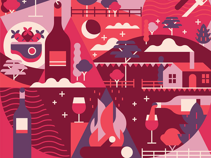
Red is an attention-grabbing color. It is striking in appearance and is one of the most highly visible colors. This is why stop signs, as well as fire engines, use red. Yellow and orange are equally visible, but red is also associated with danger and stresses the importance of staying alert.
When we see red, our lenses literally pull forward. We see red as having a great deal of movement which draws us in. Perhaps this is why red grabs our attention so easily.
Meanings of the color red
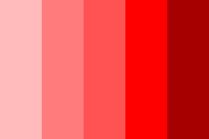
When you draw on the color red, you’ll be using a striking and very emotional color. Red is passionate and alive and symbolizes extreme emotions such as love and hate, Cupid and the devil. The red color palette is warm and passionate, exciting, and full of movement. When we see red, our blood pressure rises, our libido increases, and our metabolism increases. The color red causes us to breathe faster. Our confidence and our energy levels begin to increase.
Too much of the color red and we might become agitated. When we see red, we lose our tempers, behave in an overbearing manner and partake in angry or demanding behaviors. When there is too little red in our lives, we may be too cool and lethargic, sad, cautious, or manipulative. Green balances out red, creating a vibrant and relaxed atmosphere. If your designs are overly passionate, add green. To get rid of lethargic or exhausted energy, add red.
When used to express passion, red becomes the color of love. However, red is often far more representative of sexuality and lust. Pink is used to represent love.
At its most positive, red symbolizes sexuality and a love of life. When used negatively, red is an angry and even violent color that carries dangerous meaning.
The red color palette is often used in restaurants as it increases the metabolism.
Alternate meanings associated with red shades
- Vibrant red colors are often combined with vivid greens to symbolize Christmas and the wonders and joys of the festive season.
- Ruby red shades are symbolic of the fortieth wedding anniversary and the gifts associated with this.
- At present times, red is an inexpensive color. Country barns are often painted red as this paint was easy to acquire.
Shades of red
There are many different types of red. Some are a deep red color such as brick, Venetian red, crimson, maroon, and burgundy, while other colors of red are lighter, such as rose madder.
Reds may be combined with a touch of orange, as in cinnabar, russet, or rust. Other reds are pure in colors, such as tomato, Indian red, blood red, scarlet, and flame.
Scarlet Color
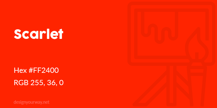
Hex #FF2400
RGB 255, 36, 0
Scarlet is a pure red color with a touch of orange. Scarlet is often considered to be a pure red shade. Perfectly balanced and deep in color, the scarlet color of red also contains a small tint of green.
Indian Red Color
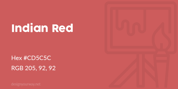
Hex #CD5C5C
RGB 205, 92, 92
Chilli Red Color
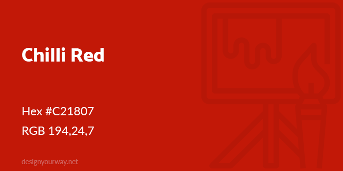
Hex #C21807
RGB 194,24,7
Fire Brick Color
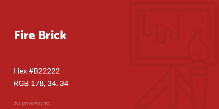
Hex #B22222
RGB 178, 34, 34
Carmine Red Color
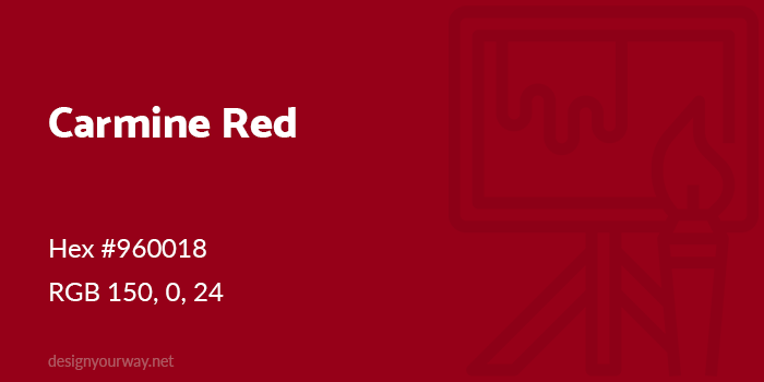
Hex #960018
RGB 150, 0, 24
Carmine-Red is a bright color red which is vivid, with a dominant red light. It is close to a scarlet color.
Maroon Color
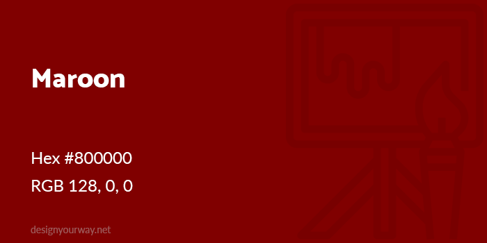
Hex #800000
RGB 128, 0, 0
Maroon is a red color which combines with a touch of black to create a deep red shade. Although it looks like a deep red color, maroon is really a pure shade of red. This is because it doesn’t have any blue or green light incorporated into the color red.
Redwood Color
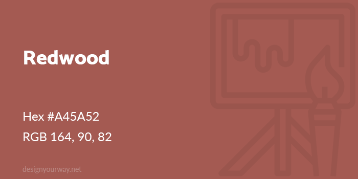
Hex #A45A52
RGB 164, 90, 82
Desire Color
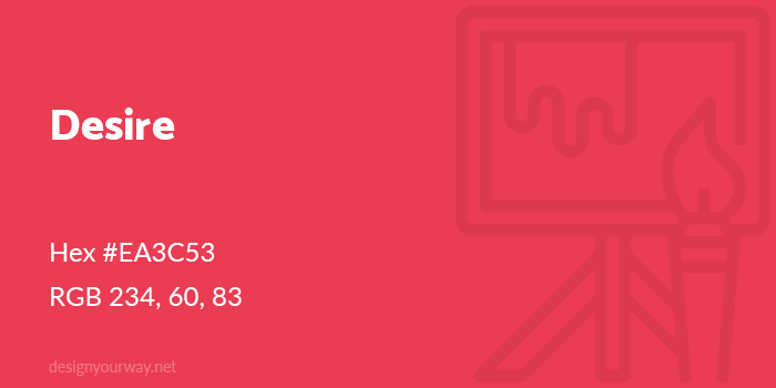
Hex #EA3C53
RGB 234, 60, 83
Hibiscus Color
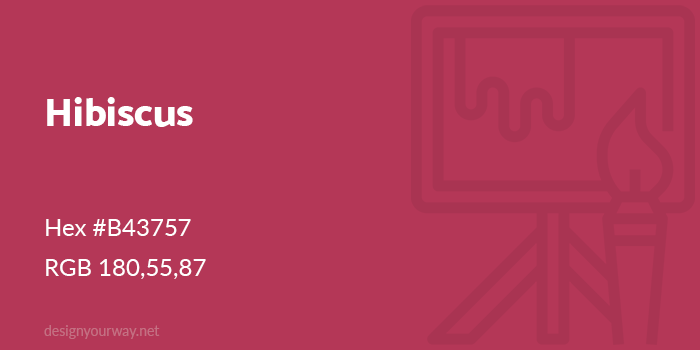
Hex #B43757
RGB 180,55,87
Cerise Color
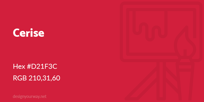
Hex #D21F3C
RGB 210,31,60
Cerise is a bright red color given the French word for ‘cherry’. We can, therefore, say that cerise is a cherry red color. Cerise has also been used to describe other red shades such as blood, raspberries, rubies, and tomatoes.
Persian Red Color
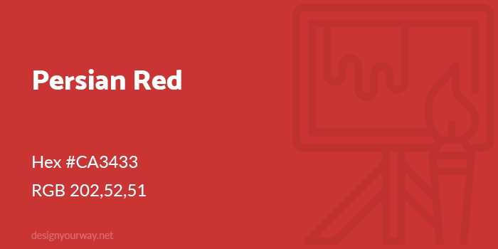
Hex #CA3433
RGB 202,52,51
USA Flag Color
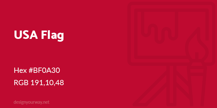
Hex #BF0A30
RGB 191,10,48
Mahogany Color
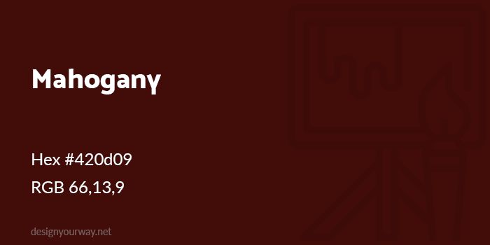
Hex #420d09
RGB 66,13,9
Barn Red Color
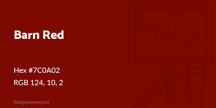
Hex #7C0A02
RGB 124, 10, 2
Ruby Red Color
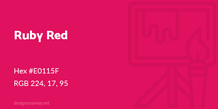
Hex #E0115F
RGB 224, 17, 95
Vermilion Red Color
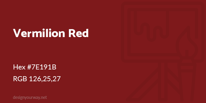
Hex #7E191B
RGB 126,25,27
Candy Apple Color
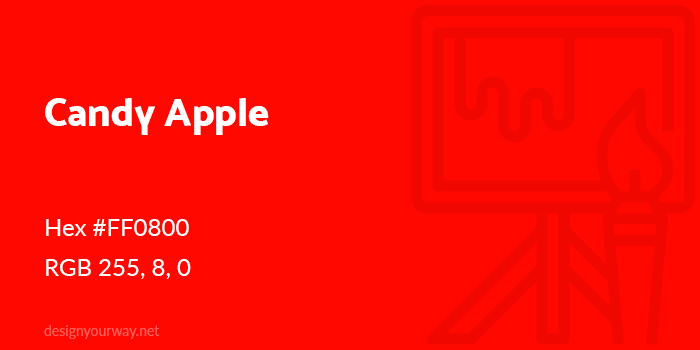
Hex #FF0800
RGB 255, 8, 0
Ferrari Red Color
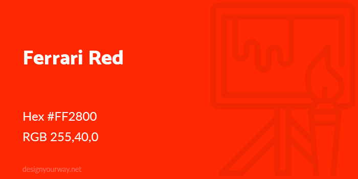
Hex #FF2800
RGB 255,40,0
Crimson Color
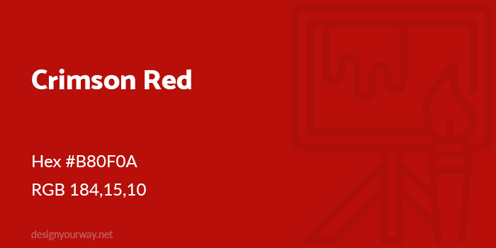
Hex #B80F0A
RGB 184,15,10
Crimson’ is a deep, blood red color which is associated with wine, sunsets and even blushing.
Sangria Color
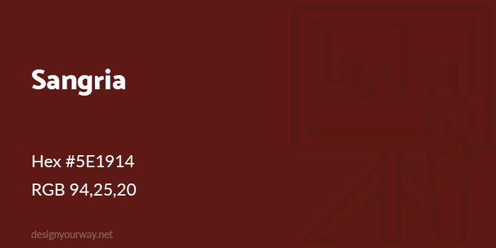
Hex #5E1914
RGB 94,25,20
Burgundy Color
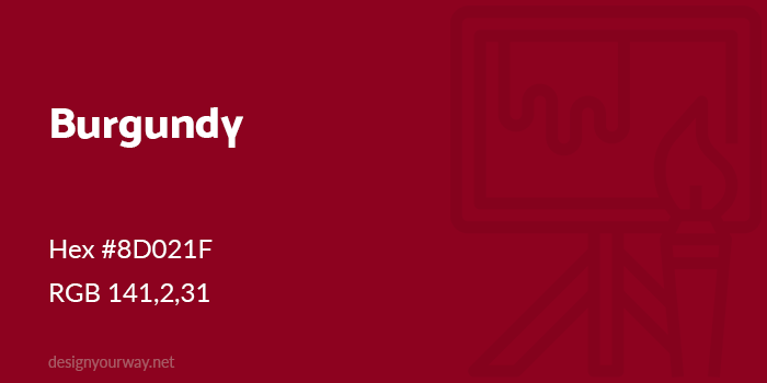
Hex #8D021F
RGB 141,2,31
Have you ever wondered about the difference between burgundy vs maroon? Both are deep, wine red colors. However, while maroon red shades are pure shades mixed with black, burgundy has a tinge of purple, making it one of the warmer shades of red.
Rust Color
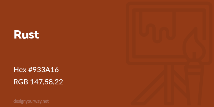
Hex #933A16
RGB 147,58,22
Using a red color palette in graphic design
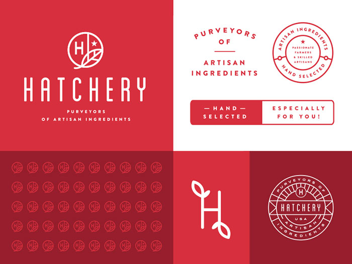
Hatchery Branding System
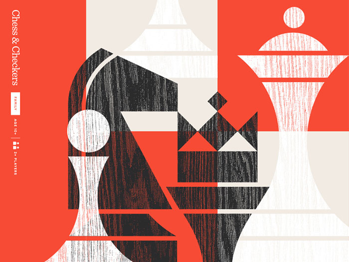
Fun & Games pt. II
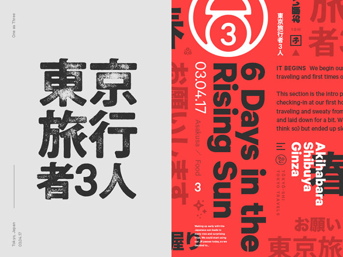
Tokyo Travelers Identity
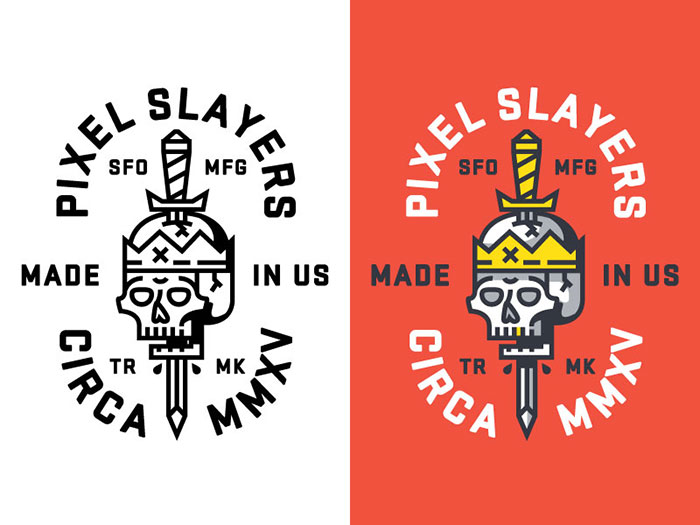
Pixel Slayer
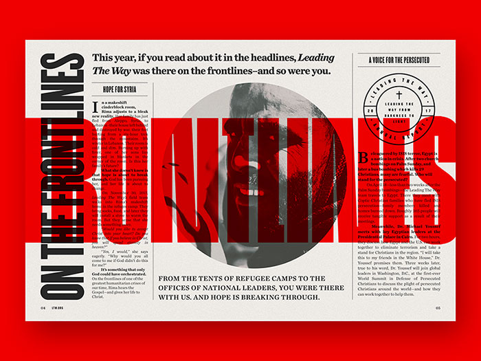
Leading The Way Annual Report
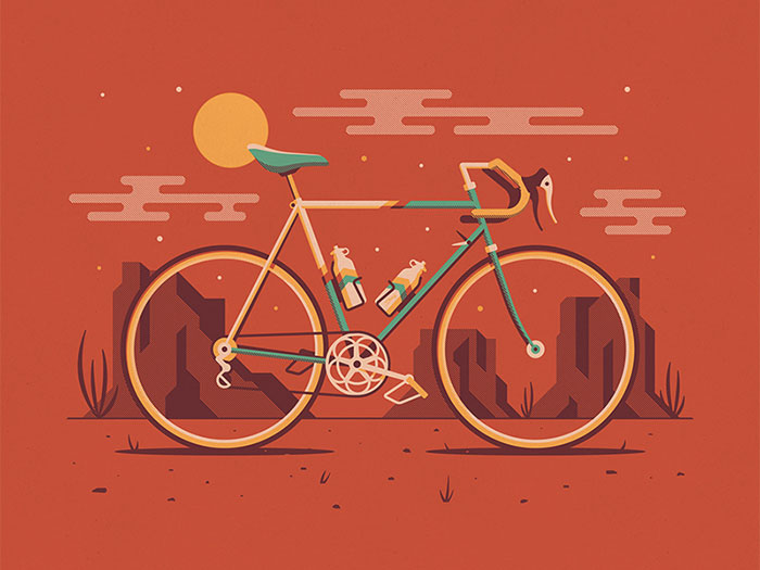
Explorers Club: Mesa
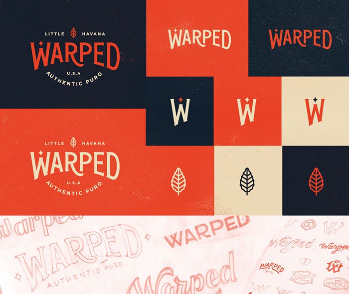
Warped – Identity Preview 01
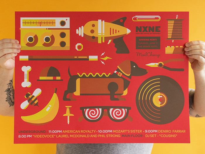
SXSW’s Flatstock 59 in Austin, TX

NXNE Opening Party Poster
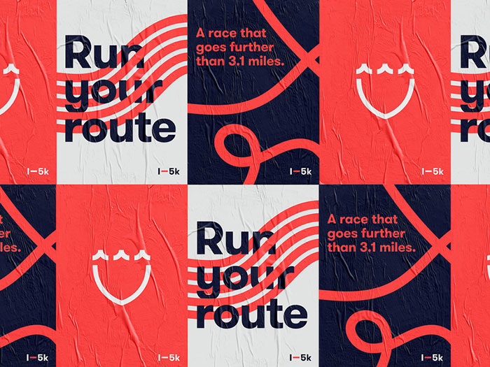
I-5K Poster Series
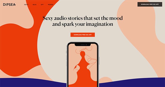
Examples of a red color palette in web design
Dipsea
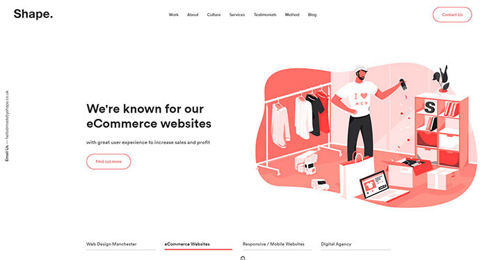
Shape
Gilk

Rawww
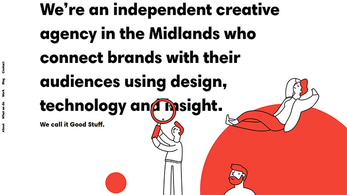
Pigeon

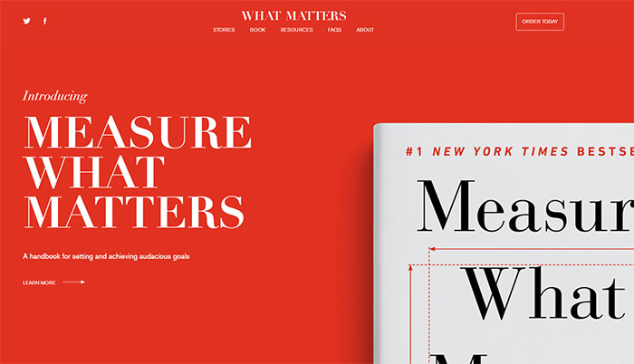
Measure that matters
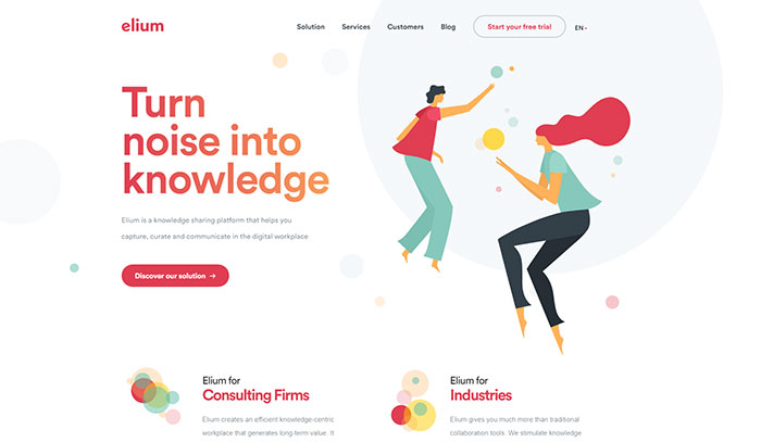
Elium
Mindset

Bodymovin Solutions

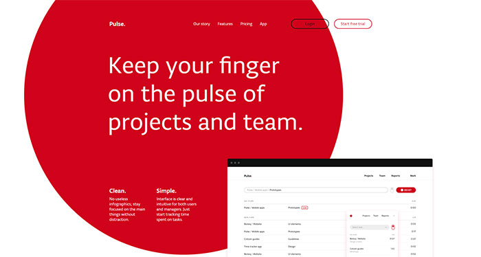
Pulse
Taab

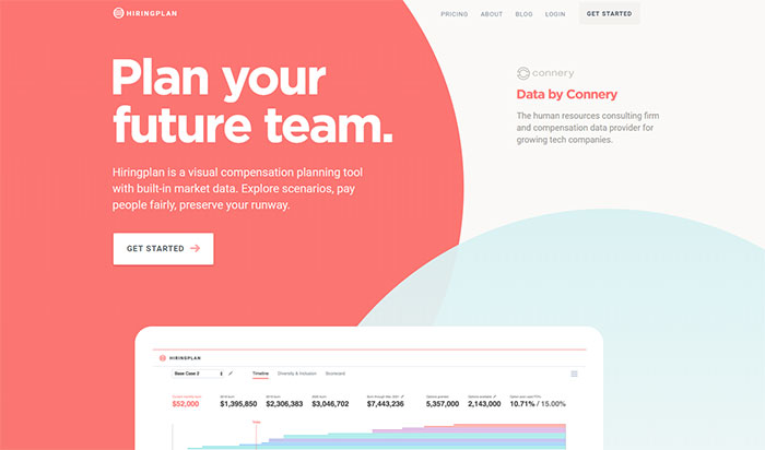
HiringPlan
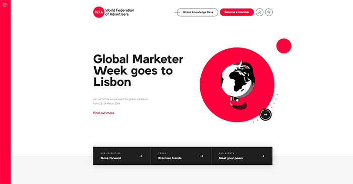
WFA
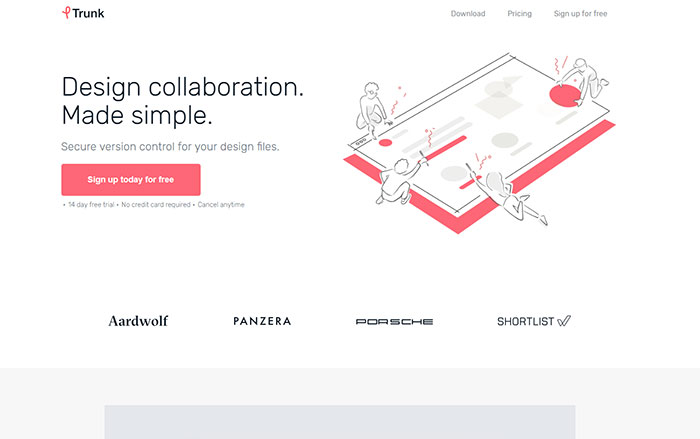
Trunk
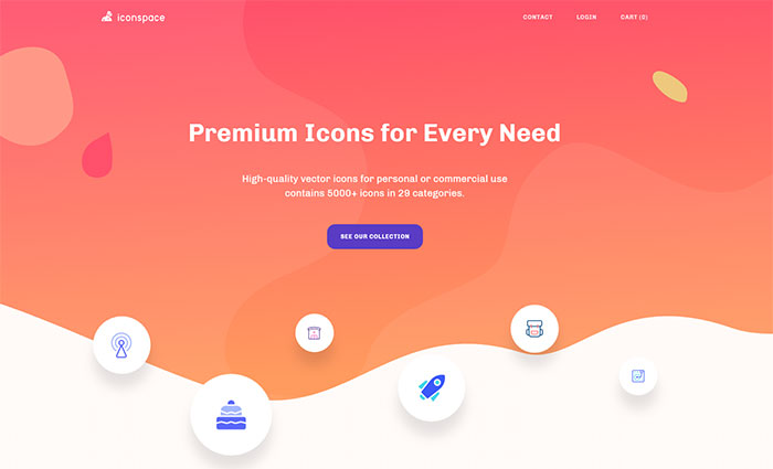
Iconspace
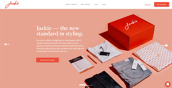
Jackie
There are lots more newer red websites out there. I just listed a few of them.
Showcase of a red color palette in UI design
Hotjar Mobile App Concept

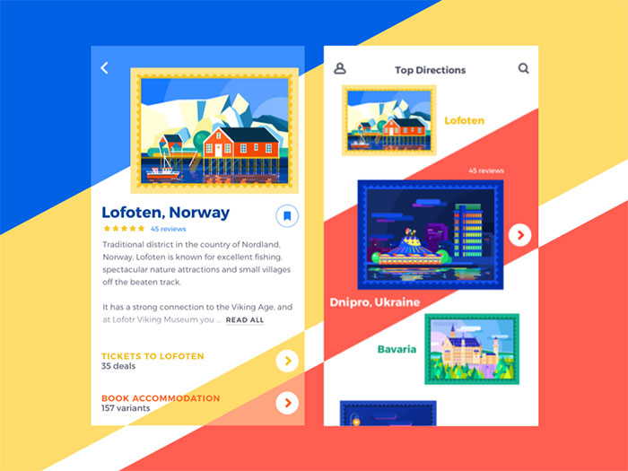
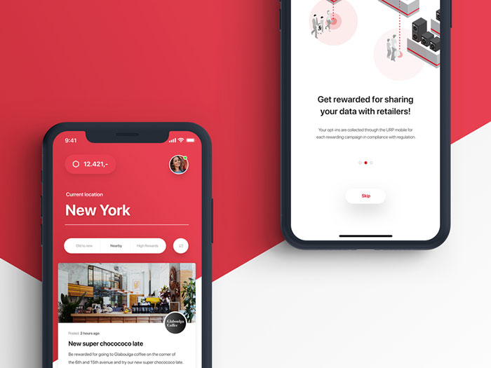
Travel App UI Design
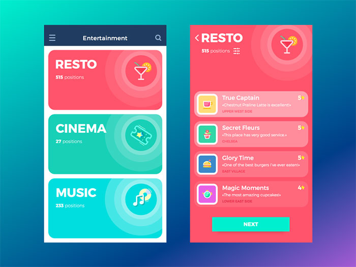
Entertainment App
Uniqlo E-Commerce App Exploration
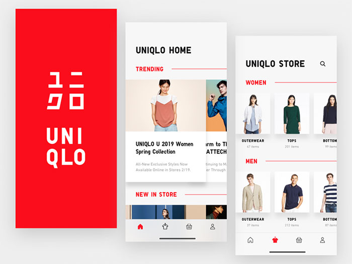
UX/UI iOS application
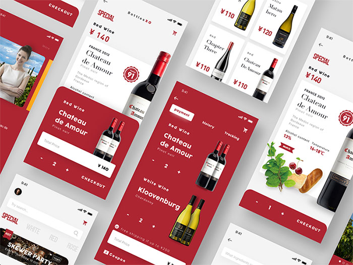
The wine shop app
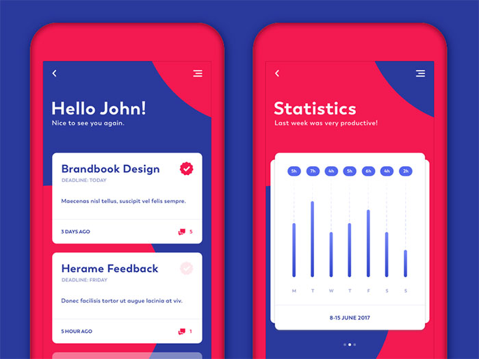
Tasks Statistics Screens
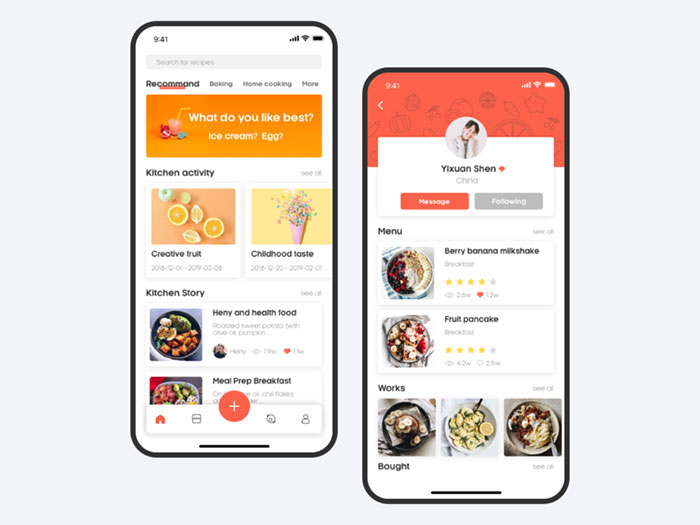
Cooking APP
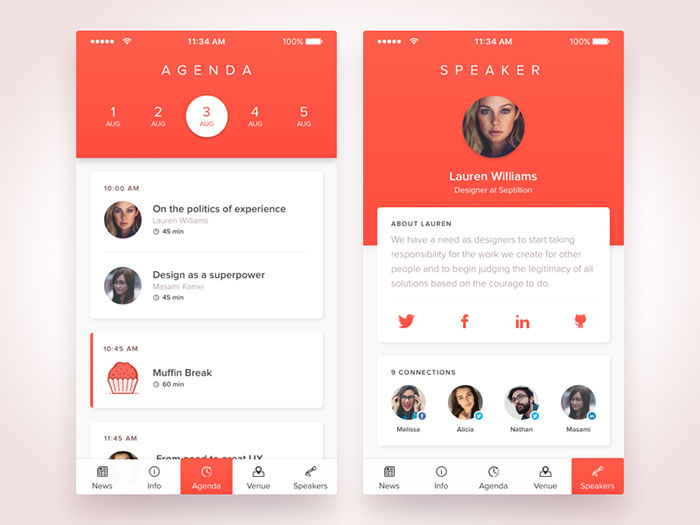
Agenda Mobile Application
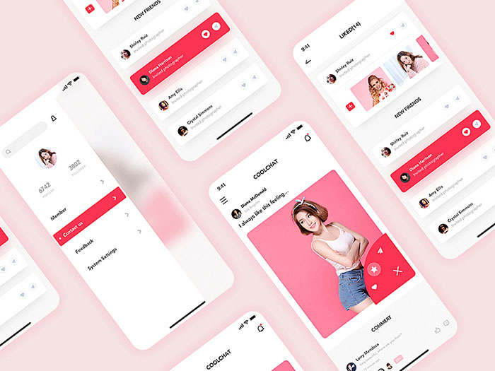
Cool Chat APP
Bike Community App

Fitamin Modals
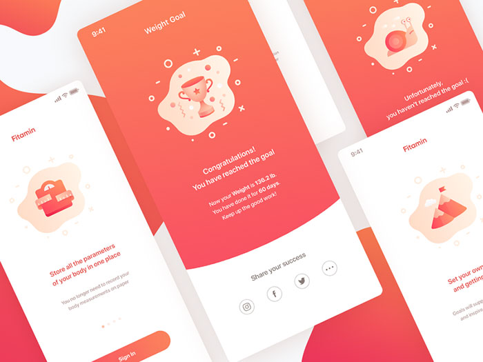
Health App
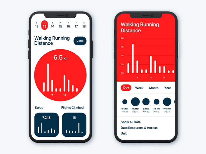
Music App
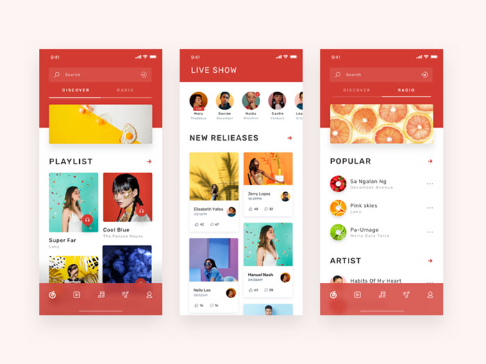
Dignity of Children

Men’s Fashion iOS App Concept

Today’s Schedule
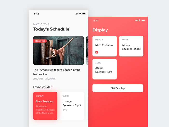
Make Steak Application

Express Tracking App Design
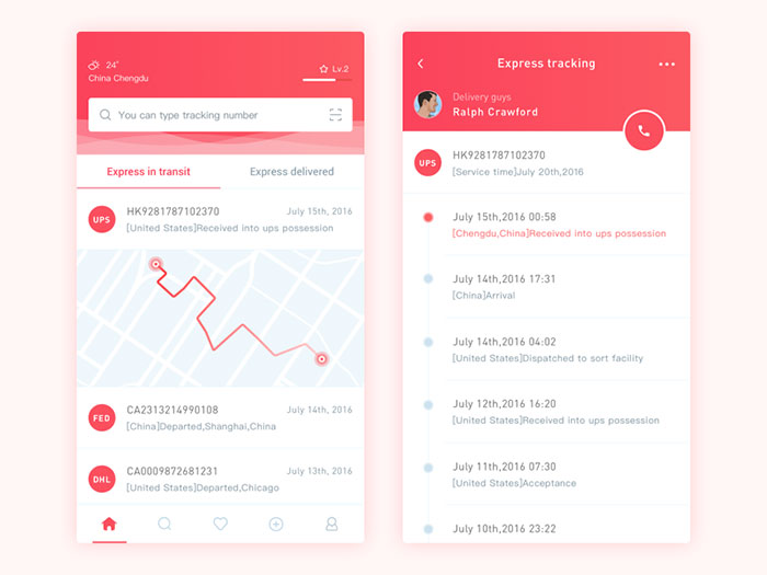
Card App | iOS

FAQ about shades of red
What are the different shades of red?
Red comes in many shades, each with its own character. Think crimson, scarlet, burgundy, and maroon. Each has a unique blend and vibe. From the deep hues of ruby and garnet to the lighter rose and blush, these variations are used across art, fashion, and interior design.
How do I choose the right shade of red for my project?
Choosing the right red depends on the mood and purpose. For a bold statement, go for scarlet or fire engine red. For elegance, consider burgundy or crimson. Use tools like the Pantone color system or samples from Sherwin-Williams to find the perfect match.
What are the most popular shades of red in interior design?
Maroon, rust, and brick red are popular in interiors for their warm, cozy feel. Coral adds a fresh touch, while ruby and garnet bring in rich, dramatic elements. Designers often use these shades to create inviting and stylish spaces, balancing intensity and warmth.
How does red influence mood and perception?
Red is powerful. It evokes passion, energy, and excitement. In color psychology, it can increase heart rates and create a sense of urgency. That’s why it’s popular in both marketing and interior design. Shades of red like crimson and scarlet can make spaces feel vibrant and alive.
What is the significance of red in fashion?
Red is a standout in fashion. It symbolizes confidence and boldness. Designers use shades like scarlet and cardinal red to make striking garments. Maroon and burgundy add sophistication. Red is versatile, fitting everything from evening wear to casual outfits, always making a statement.
What shades of red are best for painting a room?
For a cozy room, use maroon or rust. These create a warm, inviting atmosphere. Brick red is great for an accent wall, adding depth and interest. For a brighter space, consider coral or rose. These shades make a room feel lively and cheerful without being overwhelming.
How do shades of red affect branding and marketing?
Red grabs attention. It’s used to convey excitement and urgency. Brands like Ferrari and Coca-Cola leverage bright red for visibility and impact. Pantone shades like fire engine red and crimson are popular in marketing to evoke strong emotional responses and drive engagement.
What are the most common uses of red in art?
In art, red is used to draw attention and convey emotions. Crimson, vermilion, and ruby are favorites for their intensity. Artists like to use these shades to depict passion, drama, and action. Red pigments are essential in creating dynamic compositions and highlighting key elements.
How can I use red in graphic design effectively?
In graphic design, use red for call-to-action buttons and highlights. Cardinal red and tomato are effective for grabbing attention. Use blush and rose for softer, romantic designs. Balance is key-pair red with neutral colors to avoid overwhelming the viewer and maintain visual harmony.
What are some unique and lesser-known shades of red?
Explore shades like russet, a mix of red and brown, or mahogany, with its deep, rich tone. Vermilion, a vibrant red-orange, adds a striking touch. Red wine offers a sophisticated, deep hue. These unique shades provide depth and variety, enriching any palette with their distinct characteristics.
Conclusion
The shades of red are more than just colors-they’re storytellers. Each shade, from crimson to vermilion, carries a unique narrative, influencing art, design, and fashion with its vibrant energy and depth.
Choosing the Right Shade:
- For interior design, maroon and rust create warmth.
- In fashion, scarlet and cardinal red demand attention.
- For branding, shades like fire engine red make an impactful statement.
Understanding Red’s Influence:
Color psychology tells us red evokes passion and urgency, making it powerful in marketing and design. Whether you’re selecting paint from Sherwin-Williams or exploring the Pantone palette, red’s versatility is unmatched.
Embrace the richness of red in your projects. From the subtle elegance of burgundy to the boldness of ruby, these shades offer endless possibilities. Dive into the world of red, and let its dynamic spectrum enhance your creativity and expression. Discover the true essence and potential of this captivating color.
If you enjoyed reading this article about using a red color palette, you should check out these about HTML color names, shades of blue, shades of yellow, green color palettes, orange color palettes, and shades of pink.

Renowned for his expertise in logo design and visual branding, Bogdan has developed a multitude of logos for various clients.
His skills extend to creating posters, vector illustrations, business cards, and brochures. Additionally, Bogdan's UI kits were featured on marketplaces like Visual Hierarchy and UI8.
He also wrote in the past years on sites like Design Your Way, WebDesignerDepot, WPDean, Designmodo, Speckyboy, Slider Revolution, and more.
- Canva vs Photoshop: When Does Each Make Sense? - 12 September 2026
- Briefing 3D Game Animation: Rigs, Clip Lists and Engine Handoffs - 11 September 2026
- The Webflow Logo History, Colors, Font, And Meaning - 10 September 2026

Bogdan Sandu is a seasoned designer who has been designing websites since 2008. Renowned for his expertise in logo design and visual branding, Bogdan has developed a multitude of logos for various clients. His skills extend to creating posters, vector illustrations, business cards, and brochures. Additionally, Bogdan's UI kits were featured on marketplaces like Visual Hierarchy and UI8. He also wrote in the past years on sites like Design Your Way, WebDesignerDepot, WPDean, Designmodo, Speckyboy, Slider Revolution, and more.
You Might Also Like