
Logo Color Schemes: The Best Guide for Branding Success
Life is a symphony of colors. As a designer, I’m always playing with color palettes, finding ways to communicate feelings and ideas through hues and shades.
Color is essential, especially when we talk about logo design.
It’s not just about making things look nice, it’s about striking a chord with the audience.
Let’s dive into this world of logo color schemes together.
Importance of color in logo design
When you think about your favorite brands, what comes to your mind first? Maybe it’s the swoosh of a certain sportswear brand or the bitten apple of a tech giant.
But what about the color?
That golden arches on a red background? The green of a particular coffee chain?
Those are not random choices, my friend. They’ve been selected with careful thought and purpose. Color carries messages and meanings and can generate certain emotions in people.
This is why it’s such a crucial part of a logo.
Role of color psychology in branding
Every color has its own vibe, its own story. Red can symbolize passion and energy. Blue might be about trust and stability.
Even the absence of color, like in black and white logos, tells its own tale. This is the power of color psychology in branding.
When we choose logo color schemes, we are not just picking colors we personally like. We are trying to capture the soul of the brand and express it visually.
Understanding Color Psychology
Okay, let’s delve a little deeper into this fascinating science.
Explanation of color psychology
Color psychology is the study of how colors can influence our emotions, our behaviors.
It’s like each color speaks its own language, stirring up specific feelings in us. Imagine walking into a red room. Now imagine walking into a blue room. Different feelings, right? That’s color psychology in action.
How colors evoke emotions and influence decisions
Now, how does this work with logos? Well, it’s all about perception. Our brains associate colors with certain feelings and ideas.
When we see green, we might think of nature, freshness, tranquility.
When we see orange, we might feel warmth, excitement, creativity. Brands use these associations to guide our perceptions of them and even influence our decisions.
For instance, a company wanting to appear sustainable and eco-friendly might use a lot of green in their logo color schemes.
Impact of color psychology on branding

And this brings us back to branding. The goal of a brand is to connect with its audience.
It wants to communicate its values, its personality, and evoke specific emotions. So, the choice of color in a logo can help to create a strong, meaningful connection between the brand and its audience.
Now that we have the foundation, let’s take a look at how we can play around with colors in our logos.
Types of Color Combinations
When designing a logo, one color might not be enough to convey the full story of a brand. So, we combine colors. But it’s not a random game.
There are different types of color combinations that we can use in our logo color schemes.
Monologous color combinations
Monologous? Sounds fancy, right? It’s actually pretty simple. It means using different shades, tints, or tones of a single color.
It’s like taking a color on a joy ride, exploring all its different moods and expressions.
Complementary color combinations
Now, this one is about harmony and balance. Complementary colors are those sitting opposite each other on the color wheel.
Blue and orange, red and green, purple and yellow. They can create a vibrant, energetic look.
Analogous color combinations
![]()
Here’s another way to create harmony in our logos. Analogous color combinations involve colors that sit next to each other on the color wheel.
It’s like they are neighbors, living in harmony. Think blues and greens or yellows and oranges.
Triadic color combinations
Three’s a party in the world of color. Triadic combinations are all about balance and contrast, using colors that are evenly spaced around the color wheel.This gives us a vibrant, dynamic look.
Tetradic color combinations
And finally, we have the tetradic or double complementary scheme. It’s like a double date on the color wheel, using two pairs of complementary colors.
This allows for a great variety and contrast, making our logos pop.
Alright, this is getting interesting, isn’t it?
But there’s also a darker side to it. Let’s take a look at some common pitfalls when it comes to logo color combinations.
The Pitfalls of Bad Logo Color Combinations
Welcome to the bumpy road of logo design. Yep, it’s not all rainbows and butterflies.
Sometimes, things can go a bit haywire with logo color schemes. But hey, we learn from our mistakes, right?
Common mistakes in logo color combinations
So, what kind of pitfalls are we talking about? Well, first off, it’s the classic issue of overcomplication. It’s like trying to stuff too many flavors into a single dish. You want the taste of each color to stand out, not turn into a mish-mash of confusion.
Second, there’s the issue of balance. You might think, the more vibrant, the better. But too much of a good thing can turn into a bad thing. It’s about harmony, remember?
Lastly, it’s about context. We don’t live in a vacuum. Our logos have to work in different situations, whether it’s a giant billboard or a tiny favicon. So, your color choices need to work in a variety of sizes and backgrounds.
The science behind combining colors
Here’s the thing. There’s a method to the madness. Color combinations follow some basic principles, like contrast, harmony, and balance. You also need to think about things like how the colors look in different light conditions or against different backgrounds.
The color wheel is your friend here. It’s a handy tool to visualize these principles and make the right decisions. So, use it, explore it, have fun with it!
The importance of aligning color combinations with brand personality
And we’re back to branding. Your logo is the face of your brand. So, it should express the brand’s personality. A playful brand might go for bright and vibrant colors. A luxury brand might opt for sleek and sophisticated shades.
So, when you’re playing with colors, always ask yourself, does this fit the brand? If your colors and brand personality are having a feud, you might need to step in and resolve it.
Now, are you ready for some real-life inspiration? Let’s take a look at some brilliant logo color schemes.
Inspiring Logo Color Combinations
Let’s get some inspiration now, shall we? Here’s a showcase of how colors can breathe life into logos. Soak it up, you might find some ideas for your next logo color schemes.
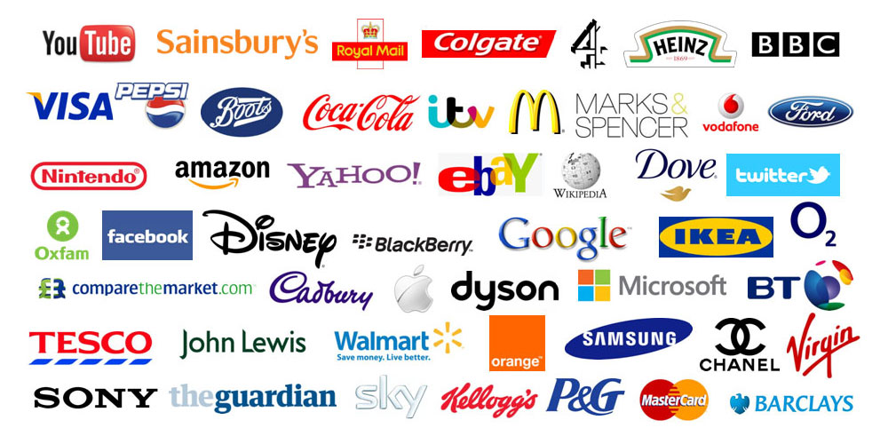
Yellow Logo Color Combinations
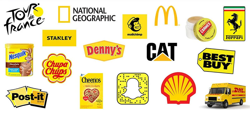
Yellow, the color of sunshine, happiness, and energy. Paired with black or dark blue, it can be quite a head-turner, like the gleaming arches of a famous fast-food chain.
Or how about yellow and green? Brings back memories of a farm, doesn’t it? Fresh, organic, natural. It’s like a burst of sunlight in your logo.
Orange Logo Color Combinations
Next up, orange. A little bit of red’s passion, a touch of yellow’s joy. Think of a sunset, warm and welcoming. Combined with blue, it’s a vibrant contrast.
Or go for orange and white, clean yet energetic. It’s a color that can inject a dose of fun and creativity into your logo.
Red Logo Color Combinations
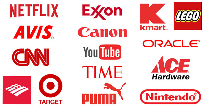
On to red, the color of love, excitement, and power. Red and white, classic yet powerful, like the logo of a certain cola brand we all know.
Or red and yellow, fiery and dynamic, like a spark in the dark. Red can be quite the showstopper in your logo.
Pink Logo Color Combinations
And now, pink, a softer, gentler side of red. It’s all about sweetness, femininity, and compassion.
Pink and black, sophisticated yet feminine, like a chic fashion brand. Or pink and white, soft and pure, like cotton candy clouds. It’s like a soft whisper in the world of logo color schemes.
Isn’t this fascinating? How colors can transform logos, tell stories, and evoke emotions. Let’s keep exploring. We’re just getting started.
Purple Logo Color Combinations
Let’s talk purple, the color of royalty, luxury, and mystery. Combine it with gold, and you’ve got a logo fit for a king (or queen).
Or go for a softer approach with purple and white, like a field of lavender against a clear sky. It’s a color that can add a touch of elegance to your logo color schemes.
Blue Logo Color Combinations

Blue, the color of trust, stability, and depth. It’s the sky above and the sea below.
Pair it with yellow, and you’ve got a bright, cheery contrast. Or combine blue and white, clean and serene, like a crisp winter morning. It’s a color that can convey reliability in your logo.
Green Logo Color Combinations
Green, a symbol of nature, growth, and health. Pair it with brown, and it’s like a walk in a forest. Or go for green and yellow, fresh and vibrant, like a sunlit meadow. It’s a color that can express sustainability and growth in your logo.
Black Logo Color Combinations
And finally, black, the color of sophistication, power, and elegance. Combine it with white, and you’ve got a timeless, classic look.
Or go for a more edgy vibe with black and red, fierce and powerful. Black can provide a sleek and strong base for your logo color schemes.
Grey Logo Color Combinations
Time to talk about grey, the color of balance, neutrality, and sophistication. Paired with yellow, it’s a blend of modern and vibrant.
Or perhaps grey and white? A minimalistic yet elegant duo. If your brand aims to project a balanced, neutral, and modern image, grey is your ally in your logo color schemes.
Brown Logo Color Combinations
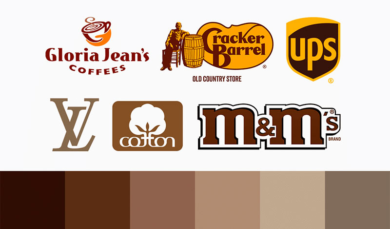
Next up is brown, symbolizing earthiness, stability, and reliability. Combine it with green, and it’s like a walk in the woods.
Or maybe brown and cream, reminiscent of a soothing cup of coffee. It’s a comforting, trustworthy color that can set a strong foundation for your logo.
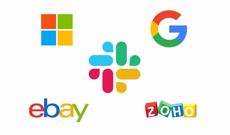
Colorful Logo Color Combinations
And finally, for those who don’t want to limit themselves, let’s talk about colorful logo combinations.
The sky’s the limit here!
Think of the vivid logos of tech companies or the vibrant palette of a social media platform logo.
The trick with colorful combinations is balance. You don’t want your logo to look like a rainbow exploded. You want to create harmony among the colors, each one standing out but also working together to create a cohesive whole.
Case Studies of Famous Brands
Alright, we’ve learned a lot about colors, how they play together, and how to use them to convey a message.
But how about we dive into some real-world examples, eh? Some famous brands have nailed their logo color schemes, let’s see what we can learn from them.
How famous brands use color combinations effectively
First off, think about the golden arches on a red background. That’s right, McDonald’s.
![]()
The vibrant red and yellow create an energetic and appetizing feel. Just seeing those colors can make some people crave a burger and fries.
Then there’s Starbucks, with its green and white logo. It’s not just a coffee chain, it’s a place that promotes sustainability and community. The earthy green and clean white echo these values perfectly.
Analysis of color meanings in famous logos
Now let’s break down the colors a bit more. Ever wondered why Facebook is blue? Well, it’s a color that signifies trust, loyalty, and wisdom. Qualities you’d want in a social media platform, right?
And what about Coca-Cola?
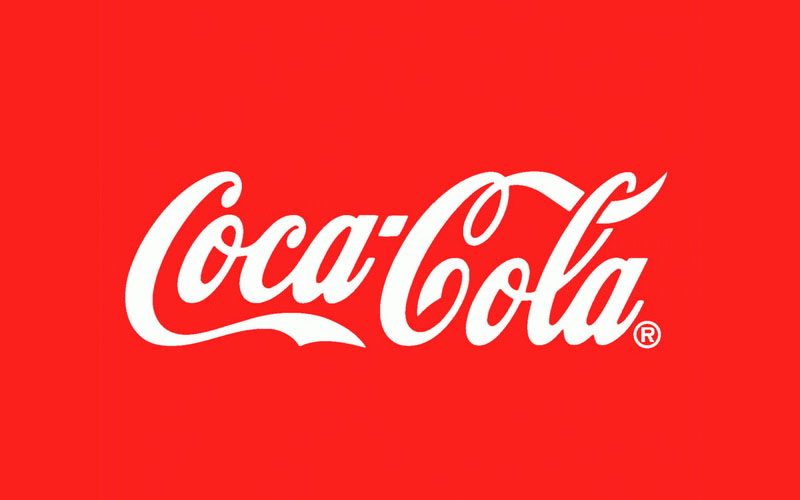
The bold red of their logo exudes excitement, energy, and passion. Paired with the white type, it’s a balance of power and simplicity, creating a logo that’s both striking and memorable.
These big brands didn’t just pick their colors out of a hat. They thought about what they wanted to convey, who their audience was, and how they wanted to position themselves in the market. And their logo color schemes played a crucial role in that.
Tips for Choosing the Best Logo Color Palette
Alright, so you’ve seen how famous brands have nailed their logo color schemes. Now, it’s time to craft your own.
But where do you start?
How do you make sure your logo colors resonate with your brand? Let’s break it down, step by step.
Factors to consider when choosing colors
Here’s the deal, your logo color should reflect your brand’s personality, appeal to your target audience, and set you apart from the competition.
Think about what your brand stands for. Is it a high-energy, youthful brand? Then vibrant colors might be the way to go. Or is it a luxury brand? Then maybe some cool, muted colors or metallics would work better.
Then consider your audience. What colors would resonate with them? If your target market is children, then bold, primary colors would likely catch their attention. If you’re marketing to a more mature audience, perhaps some more sophisticated hues would be better.
And don’t forget to look at what your competitors are doing. You don’t want to blend in with them, you want to stand out. So if everyone in your industry is using blue, maybe you should consider a different color.
How to match colors with brand personality and values
This is where color psychology comes in. Different colors evoke different emotions. We’ve talked about this before, remember? Use that knowledge to your advantage.
If you want your brand to convey trust and stability, go for blues. If creativity and boldness are your things, opt for purples or oranges. If you want to reflect growth and health, then green is your friend.
But remember, it’s not just about choosing one color. It’s about creating a color palette that works together. You need a primary color, secondary colors, and potentially some accent colors. It’s like a puzzle, finding the pieces that fit together to form a cohesive whole.
In the end, choosing your logo color schemes is not a one-size-fits-all process. It requires thought, research, and a bit of creativity.
FAQ on Logo Color Schemes
How crucial is color choice in a logo design?
Color is more than just aesthetics—it’s psychology. Colors evoke emotions and perceptions. They can imply trust, excitement, boldness, simplicity, and more. So, color choice in your logo isn’t just about “looking good,” it’s about communicating your brand’s personality and values. In essence, it’s hugely important.
What does a color scheme mean in logo design?
In logo design, a color scheme is the selection of colors you choose to represent your brand. It’s not just a random assortment of hues, but a thoughtfully curated palette that communicates your brand’s personality and values. Each color in your scheme plays a part in shaping how your audience perceives your brand.
How do I pick a color scheme for my logo?
Think about your brand’s personality. Is it energetic and youthful, or sophisticated and elegant? Different colors represent different feelings and ideas. For example, blue often signifies trust and reliability, while red can denote excitement and passion. Choose a color scheme that aligns with what your brand stands for.
How many colors should be in my logo?
Less is more when it comes to logo design. Typically, two to three colors should do the trick. Having too many colors can distract and confuse your audience. Keep it simple and make sure the colors you pick complement each other.
Can I use black and white in my color scheme?
Absolutely! Black and white are timeless and versatile. They can be used in almost any design and pair well with other colors. Plus, having a logo that also looks good in black and white ensures it will work well in different mediums, both in print and digital.
Do the colors in my logo need to match my website or product colors?
Your logo colors should be a part of your overall brand color palette, which includes your website, products, marketing materials, and so on. Consistency is key in branding, and a unified color palette can make your brand look cohesive and professional.
What if I want to change the color scheme of my logo?
Just like changing your logo’s design, changing its color scheme is a big deal. Make sure it’s a well-thought-out decision. Color changes can alter how your brand is perceived, so do your research and consider getting feedback before making the switch.
Can I use trendy colors in my logo?
You can, but be careful. Trends come and go, but your logo should be designed to last. Using trendy colors might make your logo look dated once the trend fades away. Instead, focus on choosing colors that best represent your brand’s personality and values.
Should my logo color scheme stand out or blend in with the competition?
Well, it’s a bit of both. You want your logo to stand out and be memorable, but you also want it to feel appropriate for your industry. Study your competition, see what color schemes they’re using, and find a balance between differentiating your brand and ensuring it doesn’t feel out of place.
Can colors really influence my audience’s perception of my brand?
Colors do a lot more than meet the eye. They can trigger emotions, evoke memories, and even influence decisions. So yes, the colors in your logo can and will influence your audience’s perception of your brand. It’s not magic, it’s psychology.
Conclusion on Logo Color Combinations
Let’s take a second to revisit what we’ve learned. We’ve delved deep into color psychology, how colors can evoke feelings and influence decisions. It’s pretty powerful stuff, isn’t it? We’ve seen how the right color combinations can make your logo pop and leave an unforgettable impression.
From monochromatic to triadic, we’ve looked at all sorts of color combinations, each with its own charm. Remember, there’s no right or wrong here. It’s about choosing what best tells your brand story.
Then we waded through the do’s and don’ts, the common pitfalls you’ve gotta steer clear of. From colors that clash to overdoing it with too many colors, we’ve learned that balance is key.
We’ve admired and learned from famous brands, picked apart their logo color schemes to see what makes them tick. It’s like being on a guided tour of a logo museum, right?
And finally, we’ve looked at how you can choose your own color palette. You now know how to pick colors that vibe with your brand personality, resonate with your target audience, and set you apart from the crowd.
If you enjoyed reading this article about logo color combinations, you should read these as well:
- Best free fonts for logos: 72 modern and creative logo fonts
- Logo maker app examples to try as an alternative to hiring a designer
- Bird Logo Design: Examples and Bird Symbolism
Bogdan Sandu, a seasoned designer with 15 years of diverse experience, has been designing websites since 2008.
Renowned for his expertise in logo design and visual branding, Bogdan has developed a multitude of logos for various clients.
His skills extend to creating posters, vector illustrations, business cards, and brochures. Additionally, Bogdan's UI kits were featured on marketplaces like Visual Hierarchy and UI8.
Latest posts by Bogdan Sandu (see all)
- Green Color Palettes for Designers To Use - 11 May 2024
- Digital Style: What Font Does Cash App Use? - 11 May 2024
- The Coors Light Logo History, Colors, Font, And Meaning - 10 May 2024