Imagine a symbol that not only captures an essence but does it with a finesse that’s both striking and smart. Geometric logos are that sweet spot in design where art meets math, and simplicity meets sophistication.
Think about it.
When you see a logo that melds together shapes and symmetry, there’s a certain ‘aha’ moment; you’re hooked, and you’re not quite sure why.
In this deep dive, we’re going to untangle that mystery.
You’re about to embark on a journey through the sleek world of polygonal design, where every angle counts, and every line has a purpose. By the time we reach our destination, you’ll have the lowdown on turning simple geometric patterns into icons of brand identity.
You might be asking, “Why should I stick around?” Well, whether it’s deciphering the nuances of color theory in logos or mastering the precision of a scalable vector graphic, this isn’t just about slapping shapes together. It’s about crafting a visual language that speaks volumes without shouting.
From illuminating the golden secrets of the Golden Ratio in design to exploring the might of minimalist branding, we’re covering it all. Ready? Let’s shape up that logo know-how.
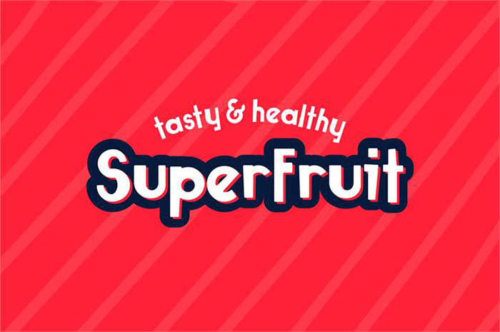
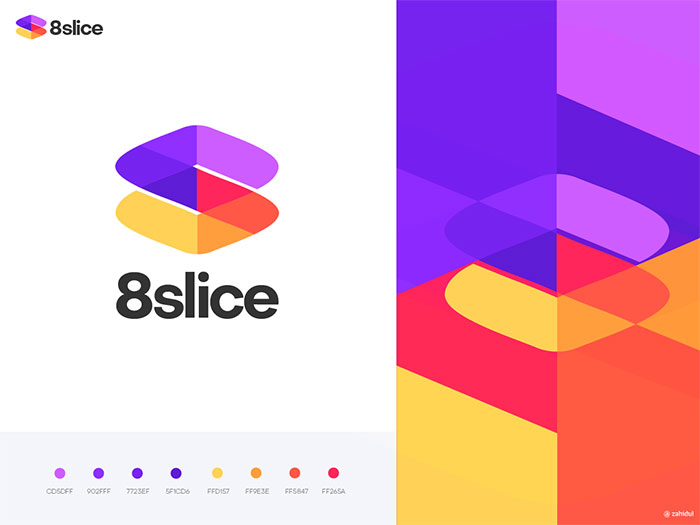
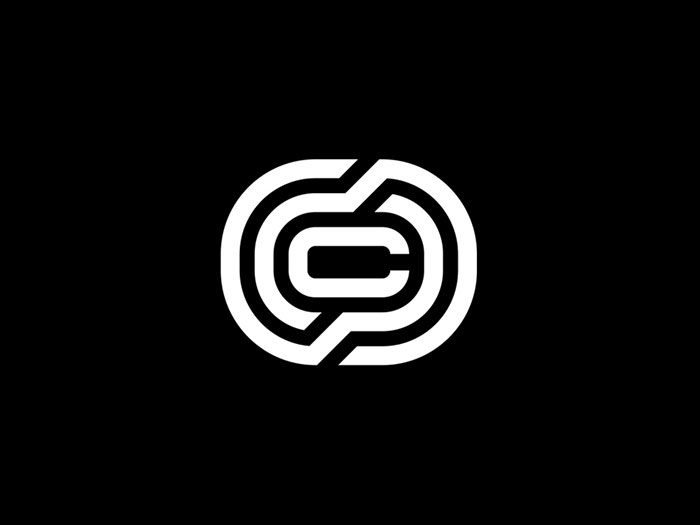
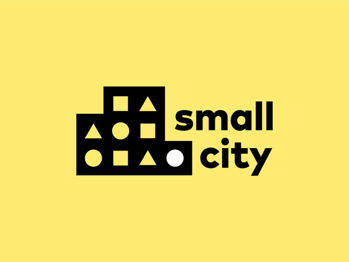
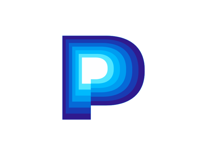
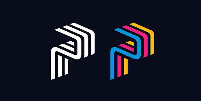
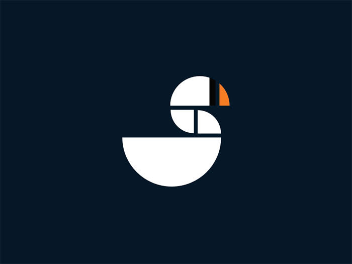
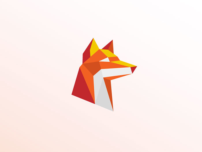
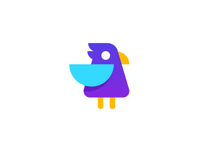
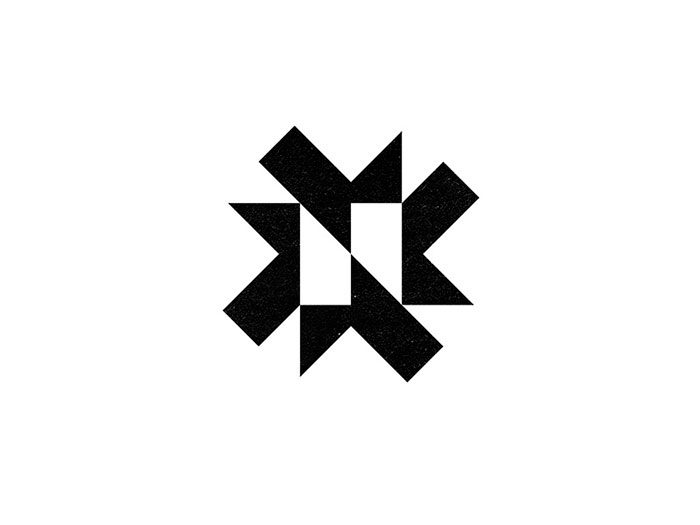
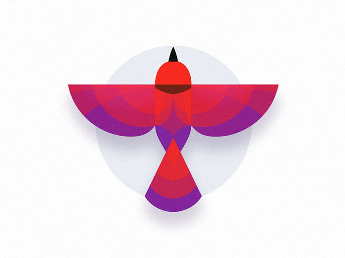
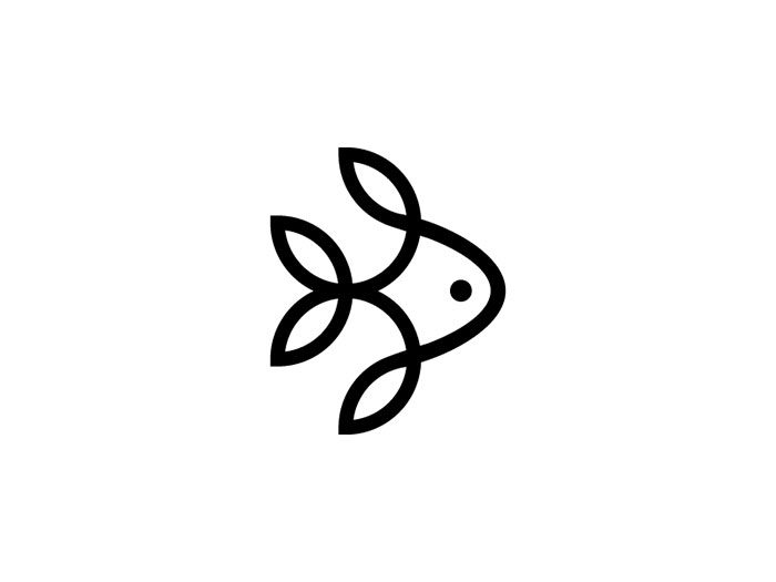
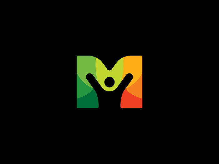
Geometric logos to check out
![]()
![]()
![]()
![]()
![]()
![]()
![]()
![]()
FAQ on geometric logos
What’s the big deal with geometric logos?
Oh, they’re not just ‘in’ right now; geometric logos are timeless. They bridge the gap between bespoke sophistication and the kind of crisp, clear imagery that nails brand identity. Shapes are a universal language, and these logos are fluent speakers, each angle and line delivering brand messages in a snap.
How does geometry influence logo design?
Think geometry as the secret sauce. It serves up balance, harmony, and grabs the eye. Everything from the soothing circles to the dynamic triangles tells a unique story. Using geometry, a logo can be a stable square or a high-energy zigzag, depending on the brand vibe you’re aiming for.
Can geometric logos work for any business?
Absolutely, but here’s the kicker: they need to align with your brand’s personality. A tech startup? Sharp angles convey innovation. A spa? Soft curves whisper relaxation. It’s about choosing shapes that reflect your business’s core values. Simple or complex, geometric logos flex to fit just about any industry.
What makes a geometric logo memorable?
It’s all about striking the right chord with simplicity and recognition. A memorable geometric logo isn’t about being over-the-top; it’s about finding that sweet spot where a simple shape somehow says it all. Think Apple’s apple or Adidas’s stripes-iconic because they’re unmistakable.
How do you choose the right shapes for a geometric logo?
Start by brainstorming what your brand stands for, and then match that vibe with the personality traits of shapes. Squares spell stability, circles symbolize unity, triangles scream dynamism. The key is in matching your brand’s heartbeat with the right geometric rhythm.
Are there trends in geometric logo design I should follow?
Trends are cool, sure, but don’t rely on them. Dive into design trends only if they make sense for your brand identity. Trends come and go, but if a particular trend-a burst of fractal designs or minimalist branding, for example-echoes your brand voice, then go for it.
What role does color play in geometric logos?
Massive, honestly. Color breathes life into shapes. It sets moods and stirs emotions. The sharpness of a triangle paired with a fiery red takes on a whole different personality when it’s in a calming blue. Color theory in logos matters just as much as the shapes themselves.
How complex should a geometric logo be?
Less is more. Really. Start with simplicity; aim for a clean, uncluttered design that can scale anywhere, from a billboard to a watch face. Overcomplicate it, and you risk losing that instant recognition factor. Aim for a design that’s both straightforward and versatile – like vector logos.
What’s the best way to test the effectiveness of a geometric logo?
Get it out there; watch and learn. Put it in different contexts: Does it stand out on social media? Can it hold its own on signage? Ask for feedback. A solid geometric logo should sail through these tests with flying colors (and shapes).
How often should I update my geometric logo?
Think of it as evolution, not revolution. If your brand’s essence hasn’t shifted, small tweaks can keep it fresh. Major overhauls? Those are for rebrands or significant shifts in your business strategy. Your geometric logo is a long-term player, not a fashion statement.
Conclusion
Wrapping it all up, geometric logos aren’t just about shapes; they’re a whole vibe. They’re your brand’s handshake, first impression, and enduring symbol, all rolled into one. We’ve skated through the why’s and how’s, from the elegance of minimalist branding to the precision of a vector logo.
Remember:
- Shapes are storytellers.
- Colors are the mood-setters.
- Simplicity is your best friend.
They come together, creating a visual hook no one can ignore. Getting it right means tapping into that sweet spot where familiarity meets innovation. Whether it’s the steady trust of a square or the balance of a perfect circle, the logo speaks before you even say a word.
So, keep it tight, make it right, and let those geometric patterns echo what your brand’s all about. Here’s to crafting that spot-on logo that’ll be a slam dunk in the memory banks of all who see it.
If you enjoyed reading this article about these geometric logos, you should read these as well:
Renowned for his expertise in logo design and visual branding, Bogdan has developed a multitude of logos for various clients.
His skills extend to creating posters, vector illustrations, business cards, and brochures. Additionally, Bogdan's UI kits were featured on marketplaces like Visual Hierarchy and UI8.
He also wrote in the past years on sites like Design Your Way, WebDesignerDepot, WPDean, Designmodo, Speckyboy, Slider Revolution, and more.
- David Bowie Album Covers That Defined an Era - 17 July 2026
- The Replit Logo History, Colors, Font, And Meaning - 16 July 2026
- The Best Fonts for Real Estate Branding and Marketing - 15 July 2026
Bogdan Sandu is a seasoned designer who has been designing websites since 2008. Renowned for his expertise in logo design and visual branding, Bogdan has developed a multitude of logos for various clients. His skills extend to creating posters, vector illustrations, business cards, and brochures. Additionally, Bogdan's UI kits were featured on marketplaces like Visual Hierarchy and UI8. He also wrote in the past years on sites like Design Your Way, WebDesignerDepot, WPDean, Designmodo, Speckyboy, Slider Revolution, and more.
You Might Also Like