

Pastel colors basics, usage, and website color schemes
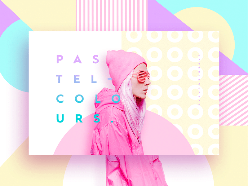
Pastel colors have been trending for a number of years.
They aren’t just for cakes and greeting cards anymore but are used all over the internet, even on sites where you might not be expecting a pastel color scheme.
Why are pastel colors so appealing? What emotions do they help to convey? What is the history of pastel website color schemes?
Knowing the answers to these kinds of questions may help you decide on using pastel colors for your next project. Let’s go through the definition of pastel colors and their history so we can start answering them!
The Basics of Pastel Colors
A pastel color is any hue with a high value (also called lightness) and low to medium saturation (which is the intensity or purity of the color). This classification actually includes a very large number of colors.
There are more colors classified as pastels than you might originally assume. For practical purposes, however, whenever someone says “pastels”, they’re typically referring to a more limited color scheme that includes mint green, mauve, coral and robin’s egg blue.
What are Pastel Colors Used For?

The use of any color scheme is driven by several factors: supporting brand identity colors, creating a certain tone for a web presence, calling the desired emotions of the viewers.
In the case of pastel colors, they communicate a softer and friendlier atmosphere, making them perfect for calling to mind calmer feelings.
A pastel website color scheme does not have a wide range of hues, which is why designs that use it have a tendency to look oversaturated.
Muted colors are all about softness. They have a more sophisticated look that makes a website look lighter and more refined at the same time.
Does This Mean that the Designation of colors as “Pastels” is Completely Arbitrary?
It is a bit arbitrary, but there are some standards that can be universally applied. Before we used pastels to describe colors, it was actually the term for an art medium, the pastel sketch.
The word “pastel” shares the same root as the word “paste” and came into use because pastels were made of raw pigment of any color, including darker ones, that were suspended in a mix of water and a binder (typically gum arabic) that was dried and formed into the shape of a stick.
Pastels the art medium was invented in the 15th century, then because popular for creating portraits in the 18h century, and reached its zenith at the end of the 19th thanks to Impressionist masters like Edgar Degas.
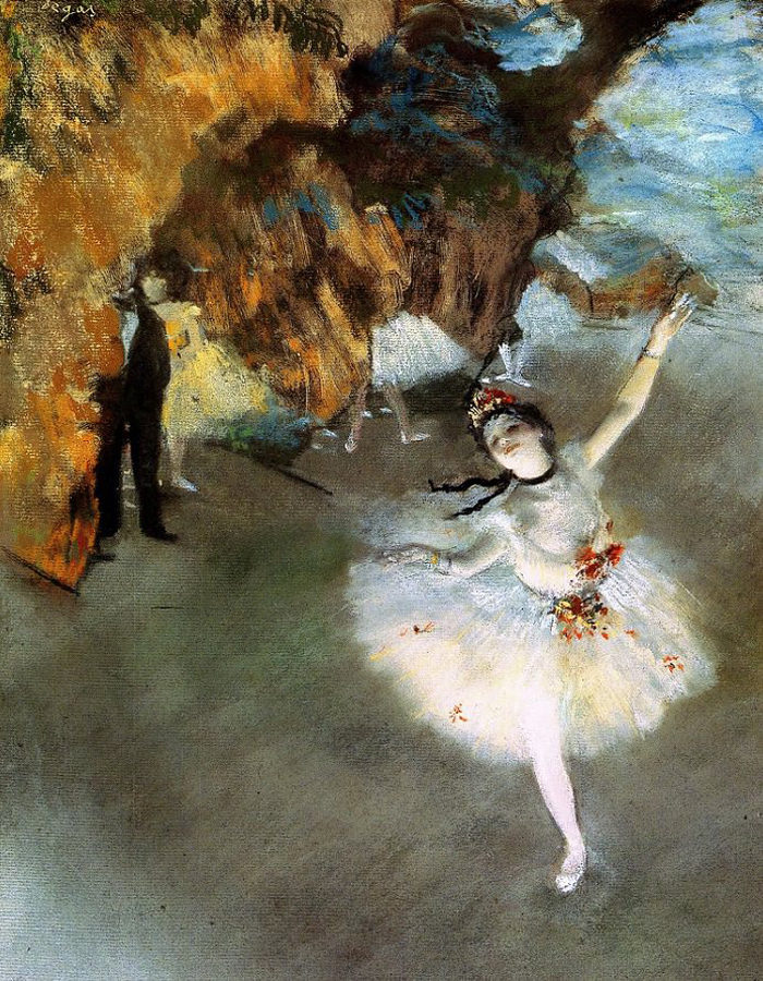
Pastels could be very concentrated and rich, but they often had a lower saturation of pigment than oil paints and other common artistic media. This is probably why the word pastels came to describe a number of light and faded-looking colors as it does today.
Why Pastel Colors Have Come Back
Colors come into fashion and go out of it….and go back into fashion again. Like everything in fashion, this tendency follows a sine wave in which styles and colors come back every thirty years, pretty much on the dot.
This seems to have been traced with skirt lengths back to the early 19th century. It is certainly a pattern that holds true for pastels.
Pastels were very popular in the United States in the 1950s. People wore pastel clothing and decorated their entire homes with pastels from bathroom tiles to kitchen appliances. It is a good symbol of the innocence and optimism of that time period.
In the 1980s, there was another resurgence of pastels thanks to the period’s exuberance and its economic boom. It was motivated at least partly by the rise of the preppy style which and use of powdery polos and sweaters.
The Official Preppy Handbook, dating back to 1980, spelled out the codes of this now dated and WASP-y look.
Another reason for the rebirth of pastels was the hit TV show Miami Vice (1984-1990) where the lead character, undercover detective James Crockett, wore pastel colored clothing in every scene, often framed against pastel-colored Art Deco architecture that was often found in the show’s Miami setting.
In the 2010s, pastels have seen another upswing. It is most obvious in the world of digital design. Pastels work very well for websites and apps that have large empty spaces to fill.
They are easy to look at and come in a number of positive associations. Digital displays also give designers a chance to more finely tune their color options than analog tech did, allowing pastel colors to be expanded beyond their traditional boundaries as Easter-y, retro, or preppy colors.
How To Use Pastel Colors in Web Design
It can be quite difficult to implement pastel colors well in your website design. You want to prevent the site from having a washed out look or be too overtly feminine.
You need to hit the right balance between the colors and tone. You can still make use of bold colors amid your pastels, especially to highlight or draw attention to an area on the page, like a call to action button.
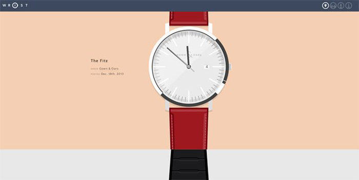
Wrist
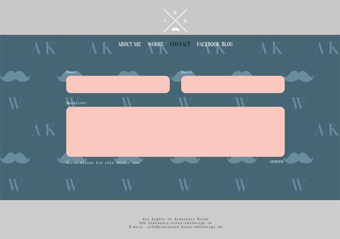
Alexandra Kuban Web Design
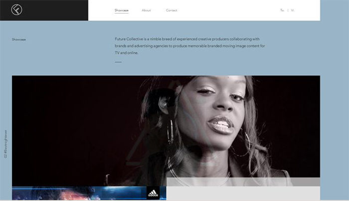
Future Collective
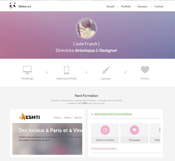
Xbition Art
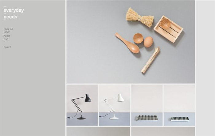
Everyday Needs
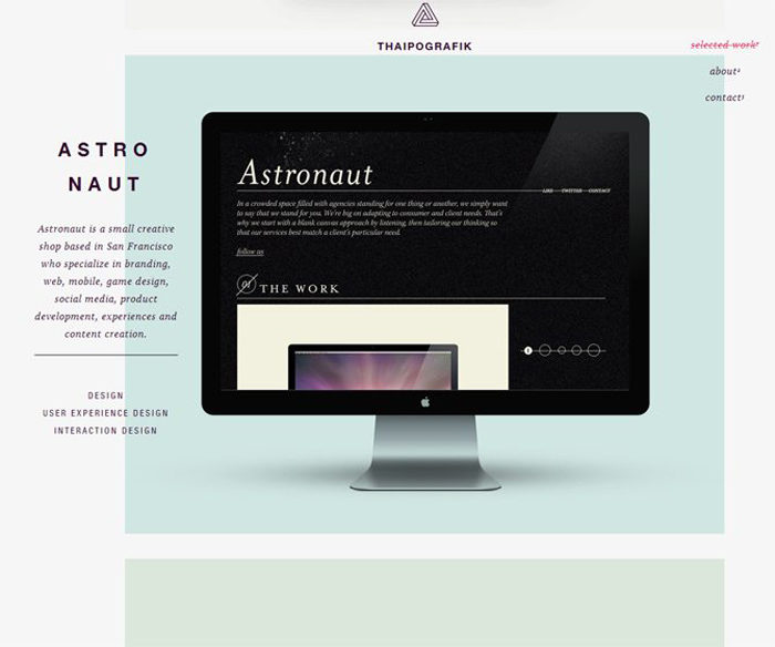
Thaipografik
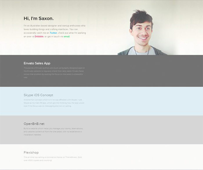
By Saxon
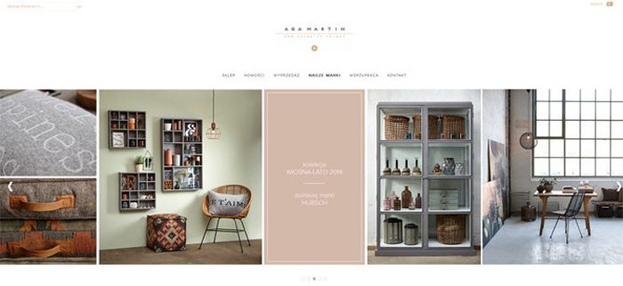
Aga Martin
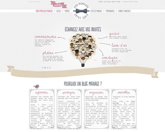
Petit Mariage Entre Amis
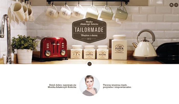
Tailor Made
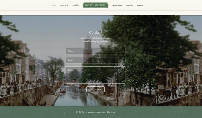
Jonathan Ploeg
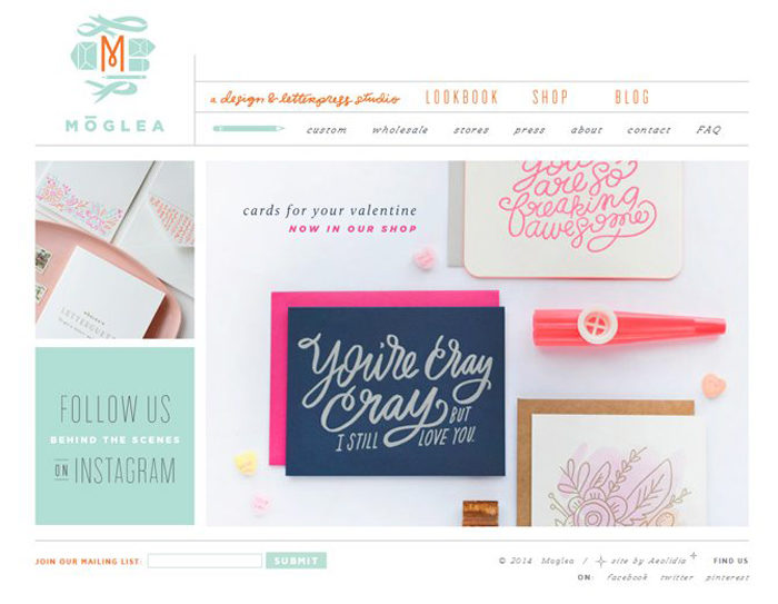
Moglea
Isadora Design
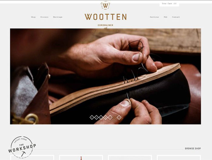
Wootten
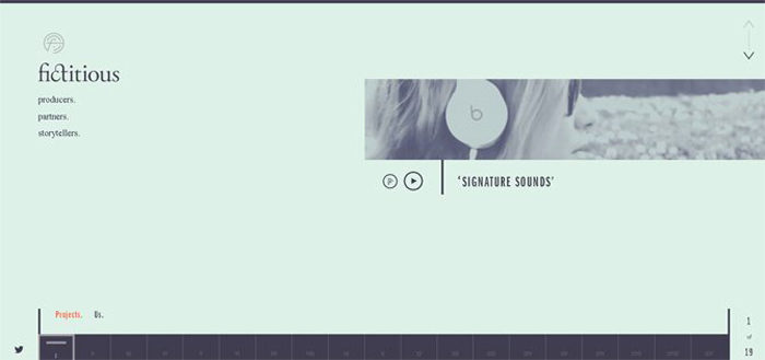
We Are Fictitious
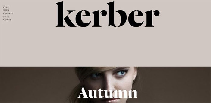
Kerber
Fremtidens Hoder
Heydays
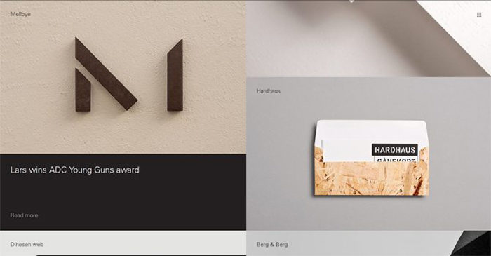
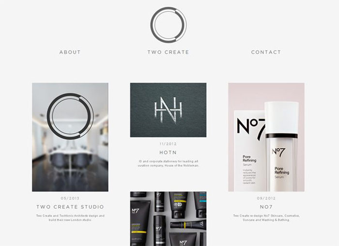
Two Create
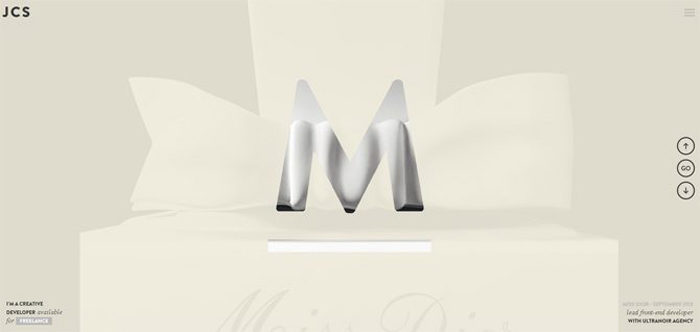
Jean Christophe Suzanne
Rueda Film
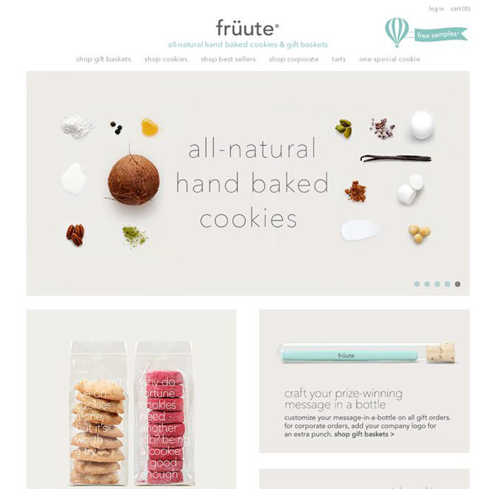
Fruute
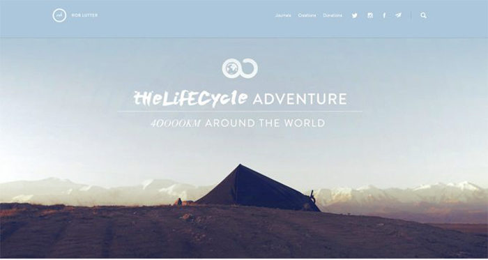
The Lifecycle Adventure
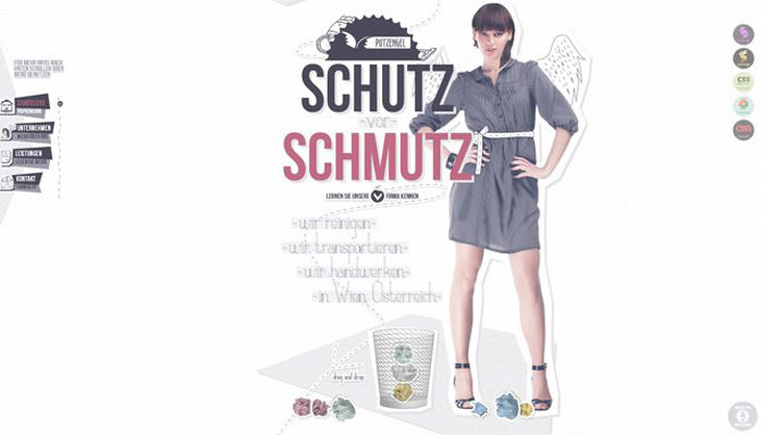
Schutz Schmutz
Because pastels have seen a resurgence in the world of web designers, it’s important to figure out just how to work with them.
Web designers have been refining their use for pastel colors for years and come up with some smart ways to make these colors help your design rather than hurt.
Where to Apply Pastels?
Pastels are most commonly implemented in following elements of web design: background (both textures and images), logos, icons, fonts, and frames. It doesn’t much matter where you apply several muted pastel colors.
The main point to get a polished and elegant look for the website. Most flat designs and vintage designs like pastel color schemes because they are very good at creating the desired retro look or precise, clean atmosphere.
Are Pastels Too Feminine?
Pastels add a light tone to any design and are sometimes considered too feminine for certain uses. This is partially true.
Creamy, airy colors on a website give clues that it is a non-masculine place. Lightness and softness are feminine characteristics that work best for websites that have a target audience of women.
This does not mean that serious web presences like businesses, design agencies, and personal pages can’t make us of well-balanced pastels. These sites need to have a colder take on pastels than usual, but this will give them a sophisticated masculinity.
Contrasting Pastels
Pastel color schemes can work well when you use a mix of one or two pastel colors with a bolder one, like dark gray. They’ll still have that pastel feel and look but also have a nice contrasting effect.
Pastel Photography
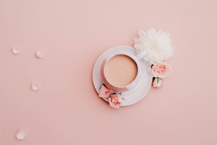
For nice subtle website canvas, try using pastel overlays on photos or photos taken under the right lighting conditions.
By having more muted tones in a photo, its a lot more available area to place other elements. Using pastel photography can also create contrast with other elements like logos or buttons.
Pastel Backgrounds
Because pastels more subdued than many other kinds of colors, they are a good way to cover a lot of space in color without being too overwhelming.
A soft pastel red (almost but not quite pink) can be much more tolerable as a background than bold red. It’s common to use variations of a single pastel hue to create a monochromatic colors scheme as a background.
Bold Pastels

While “bold pastels” seems like an oxymoron, the truth is that a pastel color palette can be used to create some very bold designs. Pastels tend to fall back, making them a great choice if you would like to do something with the elements around them.
Flat design all too often makes use of the brightest colors possible, which can make it seem harsh or tacky. Having large fields in primary colors often looks too simple and unsophisticated. Using pastel colors instead can make the elements of a flat design more polished and deliberate.
Use Pastels for Mood
Pastels will help visitors to your website feel more relaxed. They naturally cause people to feel calmer and more at ease. If this is something you want tour site or business to elicit then a pastel color scheme is likely the best one for you.
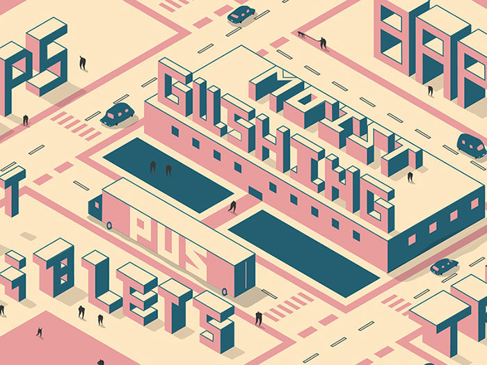
Pastels in Illustrations
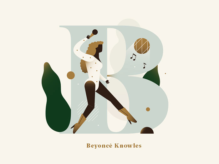
Pastels look very good in illustrations. They pull together the idea of the drawing and a sense of calm. This allows you to use illustrations in ways and places where they would not normally fit.
Pastels for Navigation
Pastels can and do work well for a site’s navigation tools. Designers will often frame websites with black or white borders or bars, but you can use pastel colors here instead to great effect. They are still colored, but they don’t distract or get in the way of other parts of the web design.
Pastel Typography
Pastels aren’t just for backgrounds and images. They can also be used for typography, though this can be a bit tricky to pull off.
Pastel typography is at its best when you use large, bold type against a starker background, creating a lot of contrast and making sure the more muted pastel colors show on screen. Save this idea for small groupings of letters and words, into body copy.
Pastel Logos
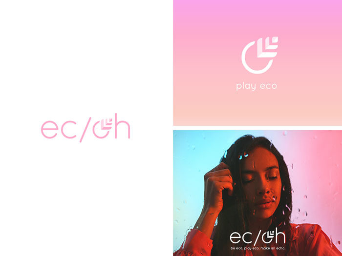
A pastel logo seems to go against a lot of ideas behind logo design, but that’s not necessarily that case. Pastel colors can say a lot about a brand/ They help to communicate a more subtle experience than bolder colors and often give the logo a sense of modernity.
Pastel colors will help make a logo seem more current and light. This works well for businesses from design studios to candy stores to spas.
Use Pastels As You Would Primary Colors
Pastels follow basic color theory the same as bolder colors. Use the same relationships to help guide your pastel color palette. You will get a similar effect as you would with brighter colors, but it will make for a more light, whimsical, and unusual feel.
Ending thoughts on pastel colors
Pastels are a set of colors with a lot of potential for good web design. While using them can be tricky, the results can be very effective.
If you enjoyed reading this article about Pastel colors, you should read these as well:
- Website Header Design: 44 Cool Examples and What Makes Them Good
- CSS Text Effects: 116 Cool Examples That You Can Download
- About us page design: Tips and best practices to create one
Bogdan Sandu, a seasoned designer with 15 years of diverse experience, has been designing websites since 2008.
Renowned for his expertise in logo design and visual branding, Bogdan has developed a multitude of logos for various clients.
His skills extend to creating posters, vector illustrations, business cards, and brochures. Additionally, Bogdan's UI kits were featured on marketplaces like Visual Hierarchy and UI8.
Latest posts by Bogdan Sandu (see all)
- Light Up Your Designs with These Light Color Palettes - 19 April 2024
- How to Measure Brand Loyalty Effectively - 19 April 2024
- The Square Enix Logo History, Colors, Font, And Meaning - 18 April 2024