Imagine your inbox flooded with emails. Yet, amidst the clutter, a single email catches your eye. That’s the power of exceptional email newsletter design best practices.
Standing out is not just a desire but a necessity. An email marketing strategy meticulously crafted with stunning visuals and compelling content can transform your engagement metrics.
Picture your emails boasting high click-through rates and conversion rates, thanks to the integration of responsive email design and mobile-friendly emails.
By exploring these best practices, you’ll uncover secrets from industry leaders like MailChimp and HubSpot. You’ll learn about essential techniques such as A/B testing for emails, creating email design templates, and ensuring email accessibility.
This article will guide you through:
- Crafting eye-catching email templates
- Enhancing readability and visual appeal
- Utilizing tools like Canva and Litmus for seamless designs
Why is email template design so important?
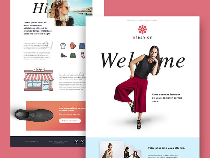
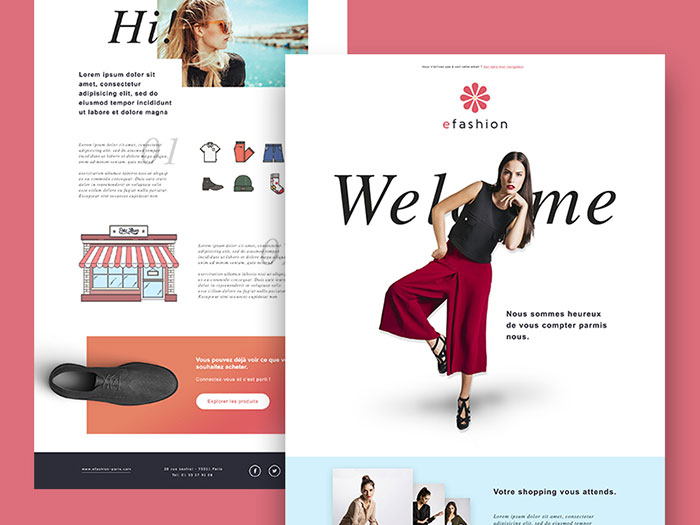
Image source: Florian Casanova
It is because recipients are by far more likely to open a beautiful message than the rest of them in their cluttered inbox.
When reaching out to new audiences, great newsletter ideas help you leave a positive first impression, and motivate viewers to become buyers and subscribers.
How does the perfect email design look?
Just as it is usually in the design world, there is no magical formula to apply and let the miracle happen. Nevertheless, there are few critical factors you should consider to distinguish solid newsletter examples from average ones:
- Less is more, so keep things simple
- Make sure you’ve included a direct call to action
- Nothing but absolute responsiveness is accepted
- Tons of baclinks to your website won’t help, and neither will decorative bells and whistles
- Images play a huge role, and you must choose such that would render automatically when displayed on mobile devices
- Make the correlation between the email’s design and your brand’s style visible
- Keep important information over the scroll
- The content should be up to point, ideally short and exciting
- Format text in a single column, such as the one of websites
- Test what you’ve produced on several devices to ensure it works well
Responsive email newsletter design is becoming more and more popular, and the reasons are pretty obvious: Almost 50% of all emails are opened using mobile devices, while for certain prominent brands the percentage goes up to 70%.
This makes it essential for an online business to have a responsive email so that can make their subscribers’ experience easy and enjoyable, and secure in such way the engagement they need.
Tip: Always use an SPF Record. It is an Anti-Spam Tool for Email Security.
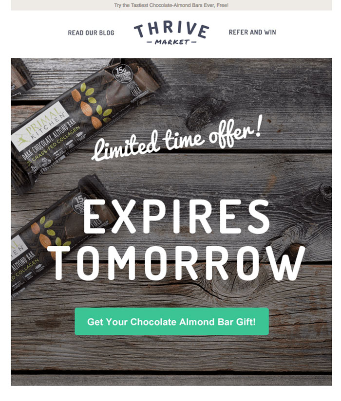
Image source: Thrive Market
The first question you must answer is: What kind of emails are you about to design?
- Are those personal messages?
- Are those branded marketing emails?
- Or are you going to focus solely on newsletters?
Defining the layout in advance will help you implement the best newsletters design:
For personal messages: Use plain layouts and simple colors, and keep branding minimal in order not to distract users from the content.
Branded marketing emails: Attach extra pieced of branded contents (images, videos, etc.). Make sure that the color scheme matches the branding style. Logos and other essential branding principles must be included, so that the content is credible and professional.
Newsletters: Generally, newsletters tolerate more content pieces than regular branded email, so feel free to add images, videos, or articles neatly placed in a sidebar from where users can access them. Keep in mind that it is exactly newsletters that convince users you care about them, so put them in the focus of your campaign.
Tips for becoming a great email designer

Image source: Lonely Planet
As long as you have the idea of how your email is going to look, you can make it happen easily by rearranging snippets.
Give our tips some time, as they will for sure add value to your marketing campaigns.
How does a successful email template look like? Most of the time, it is uncluttered and easy to read, and shares just the right message your customers need to see. What emails like these do for you is to give our brand confidence and credibility, and save you the time invested in several campaigns at once.
- Put the message in the focus: For best results, share a single message, and save the rest for other emails.
- Keep attachments easy and tractable – the more snippets you add, the easier it will be for your customers to navigate and maneuver content.
- Stay concise – Simplify as much as you can, especially in terms of length.
- Remember to include interesting images in each paragraph or article snippet. Several smaller images per paragraph are also a good idea.
- Make hierarchy visible – The most important information comes first, so that even people on the rush can read what you wanted to tell them.
- Once again: simplicity means everything to email design!
As tempted as you feel to write long and novelist messages in your emails, remember that this is not what users expect you to do.
The strategy did well a decade ago, but people of today have no time to navigate through lengthy emails. Instead, make your point crispy clear, and include a link to a relevant post for those who wish to read more.
The best email design templates
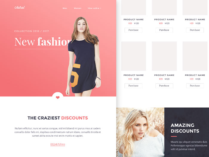
Image source: Walid Benoihi
Start with the basics.
Choose a simple template that resembles the layout you imagined, and work with the drag-and-drop editor to add your content, or change styles and colors.
Once done, save the template and apply it each time you send a similar email, and keep the editing option activated just in case.
The need to test your designs
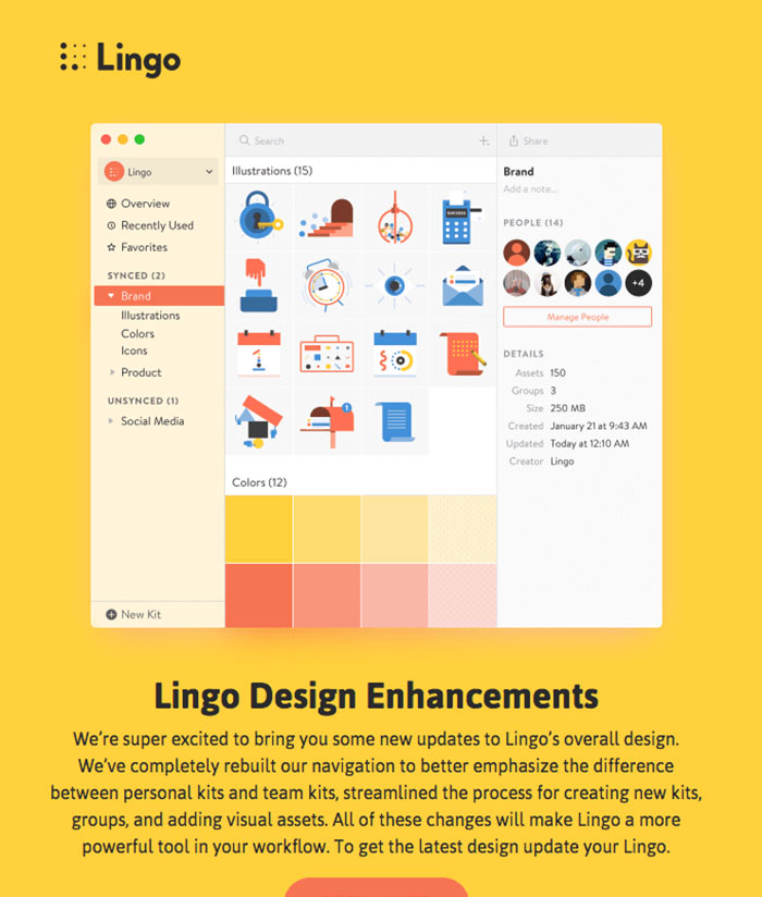
Image source: Lingo
The reason why you’re reading this post now is that you weren’t really blown off your shoes with previous campaigns, and we bet this wouldn’t have happened if there was someone to warn you of your mistakes.
The way things are today, you can test all of the segments displayed on the email templates to ensure you get the best response marketing.
Again, there is no unified approach to determine what works and what doesn’t, so just check the template through a customer’s prism.
Labeling & Branding
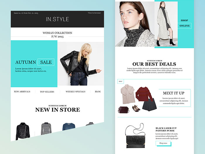
Image source: Andreea
Label your emails.
Ensure that customers know it was you who sent it, by adding the logo and the name of your company on top of it.
Attach links
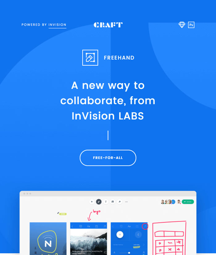
Image source: Craft by Invision
Links may seem obtrusive while you’re adding them, but the truth is they are very practical.
Refer the email’s content to your website more than once, so that people can easily take action.
Do the same with images, as they are large and appealing, and customers will very likely click on them.
Use the right colors
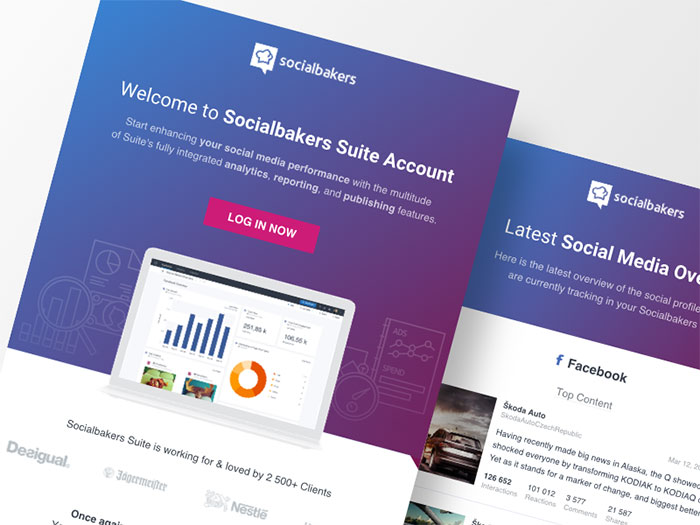
Image source: Martin Kalabek
Pick the palette in advance.
Ideally, use two colors, because the fewer shades there are the cleaner the email will look, and recipients won’t get distracted from reading your main message.
Obviously, those should be the colors recognizable for your brand. Next, clearly divide the header and the footer, and use color to separate them visually from the part of the email.
The 80/20 rule, and why you should follow it
The 80/20 rule is probably the most famous rule of thumb which also applies to email design.
In the case, it tells you should limit text to 80%, and imagery to 20%, or at least roughly estimate how to divide content in a smart way.
Use the right fonts
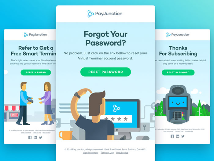
Image source: Claudiu Cioba
Legibility is imperative, and the ideal measures are 14px body text size for longer emails, and 16px for shorter ones (a couple of sentences).
Then, use some basic marketing psychology to choose a font that corresponds to your message.
Serifs, for instance, unites small lines font with extended letter strokes, and looks more professional and sophisticated, unlike sans serif that may appear too casual for your needs. Mixing is allowed if you know how to do it, but use no more than three fonts per email.
Add short blocks of copy
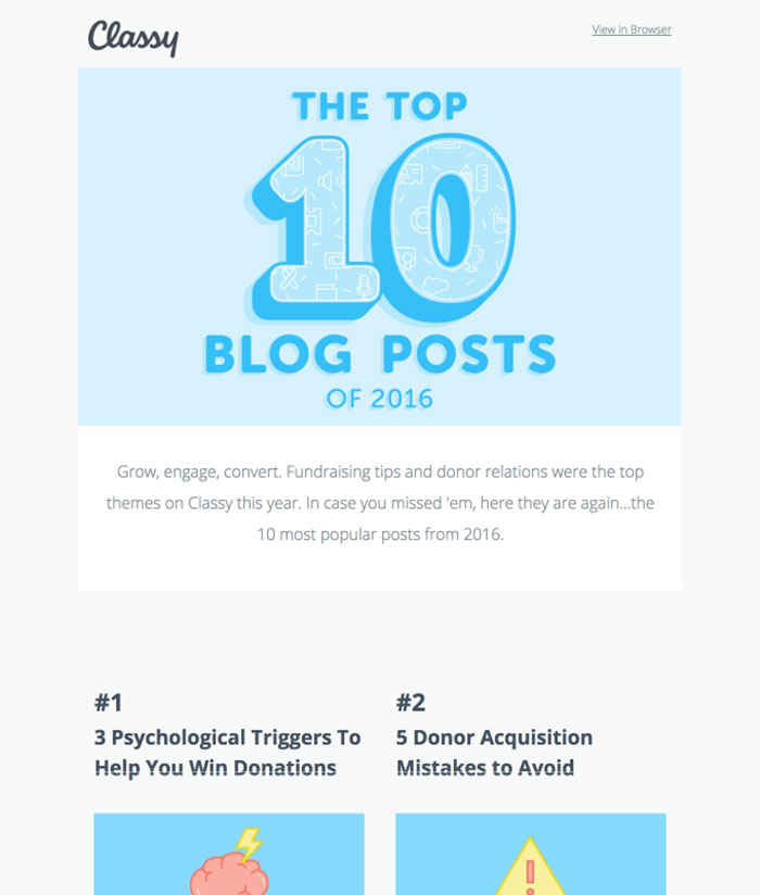
Image source: Classy
Instead of dividing content in large and unreadable paragraphs, structure it in short ones with plenty of bullet points.
In case you have to use long content sections, highlight the words that are essential, so that the reader can scan quickly and decide whether he wants to take action or not.
Email design inspiration
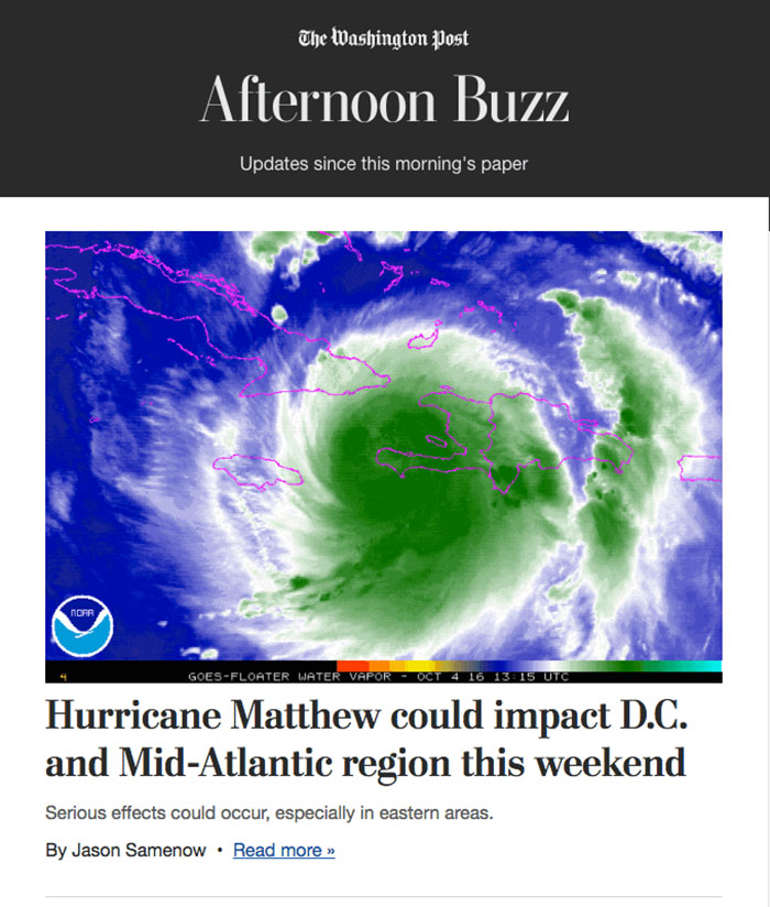
Image source: The Washington Post
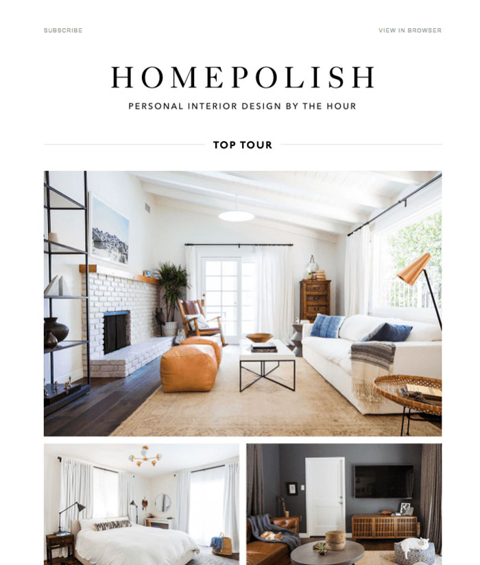
Image source: Homepolish
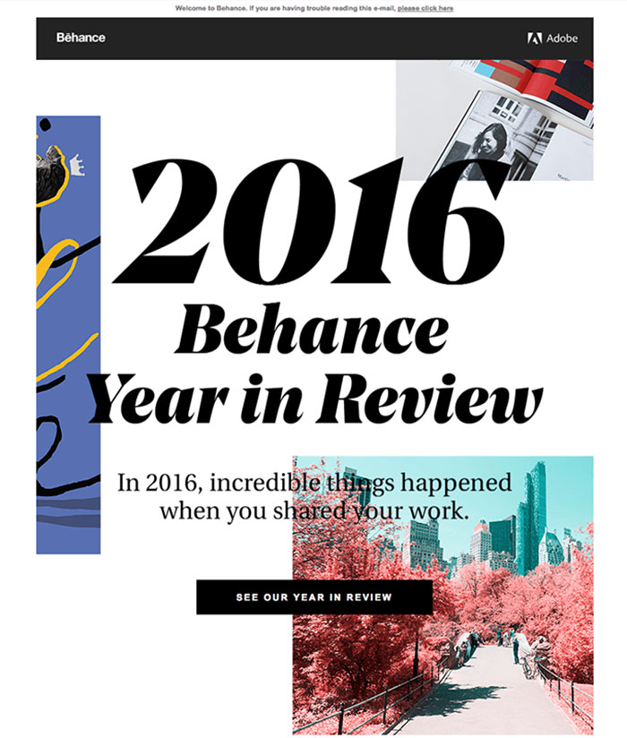
Image source: Behance
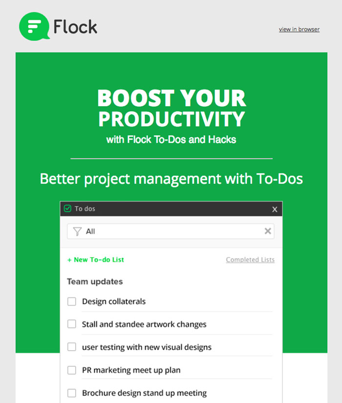
Image source: Flock – Sourced from Really Good Emails
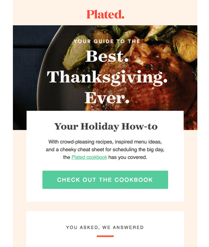
Image source: Plated – Sourced from Really Good Emails
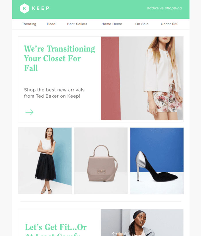
Image source: Keep – Sourced from Really Good Emails
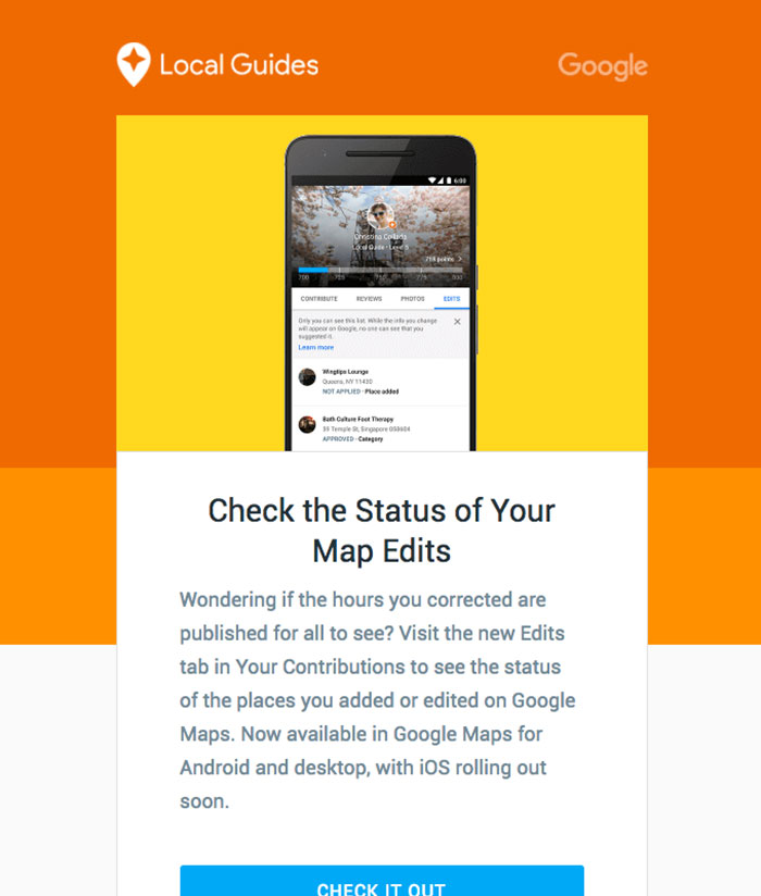
Image source: Local Guides – Sourced from Really Good Emails
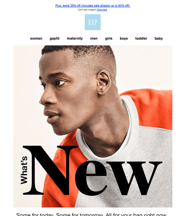
Image source: Gap – Sourced from Really Good Emails
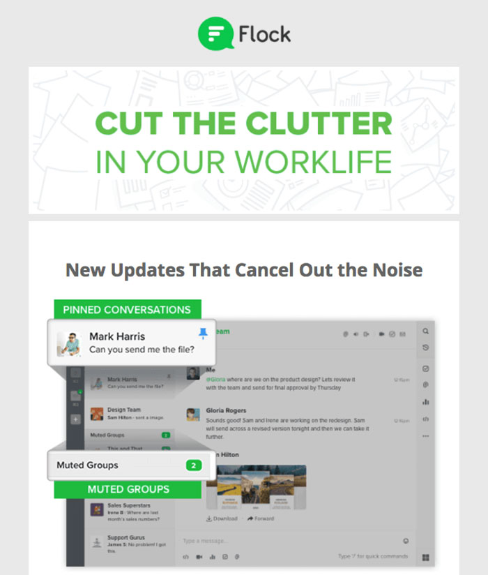
Image source: Flock – Sourced from Really Good Emails
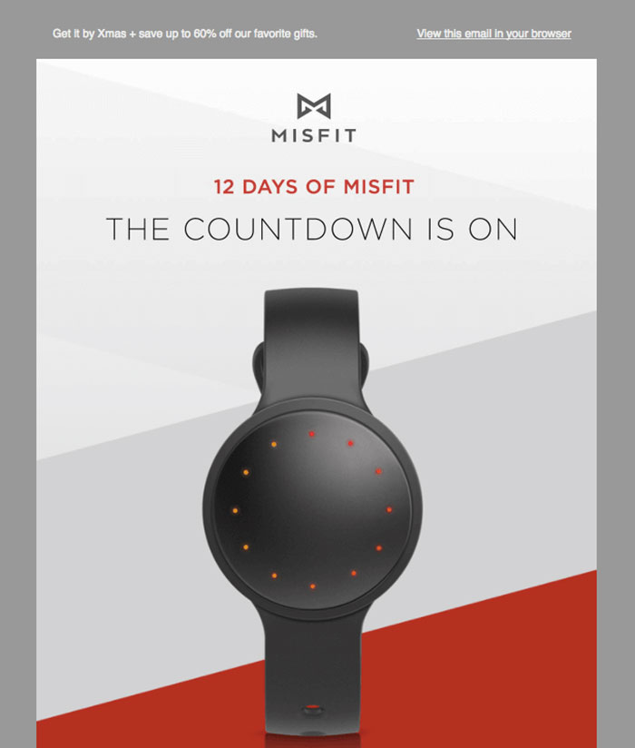
Image source: Misfit – Sourced from Really Good Emails
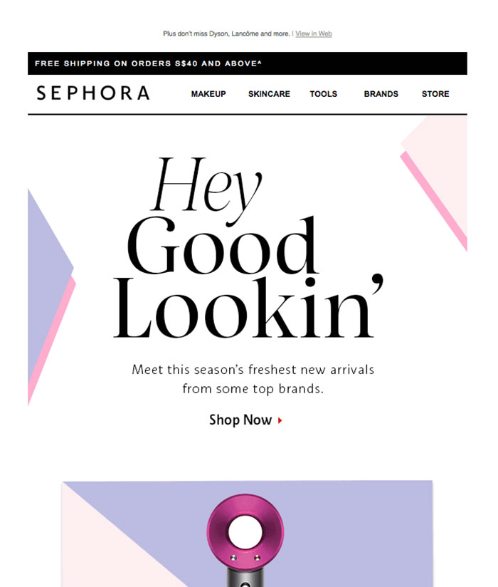
Image source: Sephora – Sourced from Really Good Emails
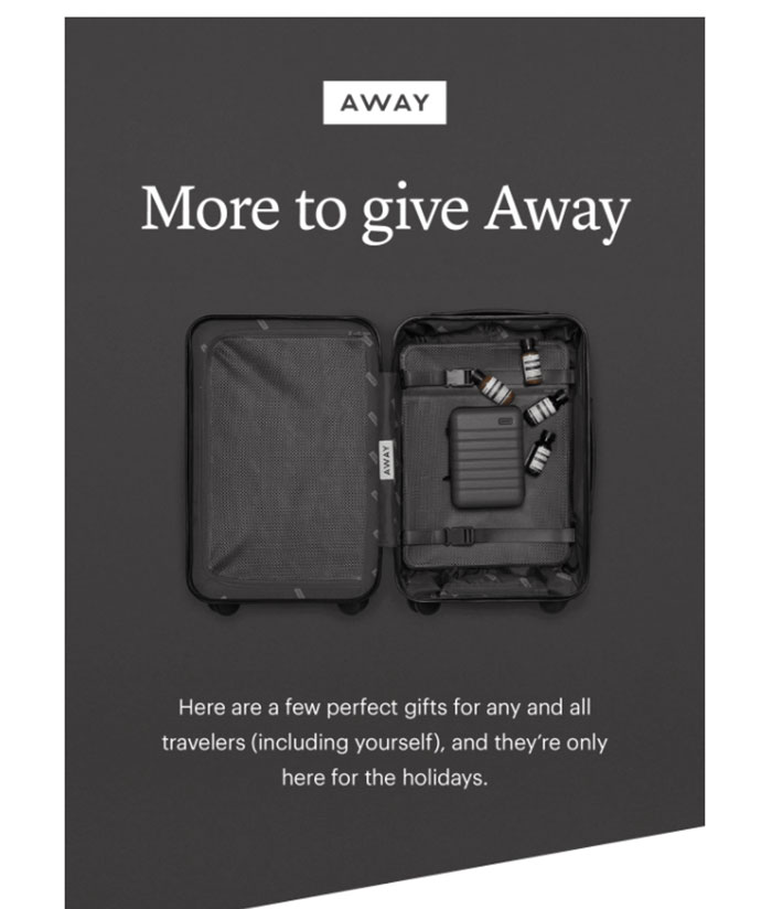
Image source: Away – Sourced from Really Good Emails
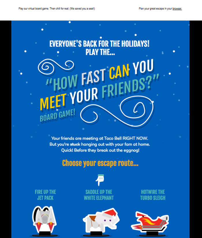
Image source: Taco Bell – Sourced from Really Good Emails
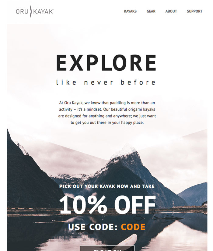
Image source: Oru Kayak – Sourced from Really Good Emails
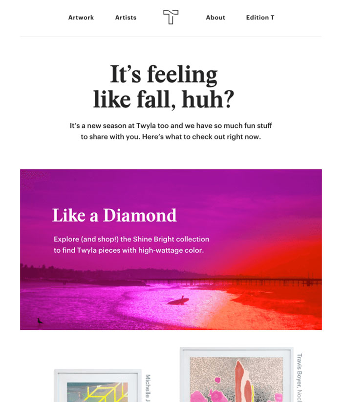
Image source: TWYLA – Sourced from Really Good Emails
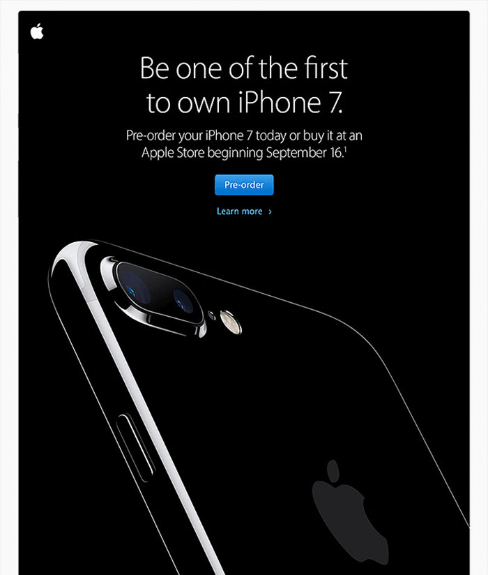
Image source: Apple – Sourced from Really Good Emails
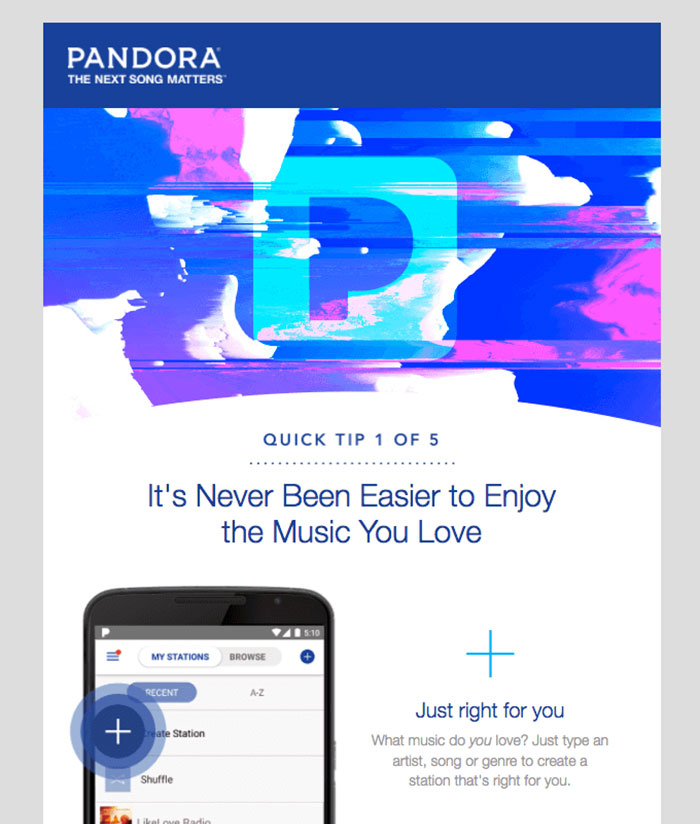
Image source: Pandora – Sourced from Really Good Emails
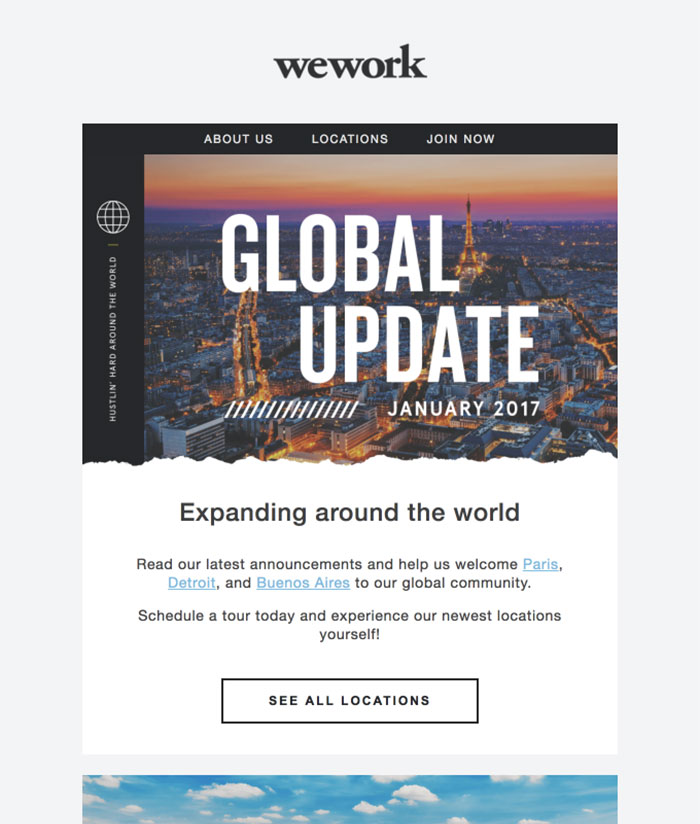
Image source: Wework – Sourced from Really Good Emails
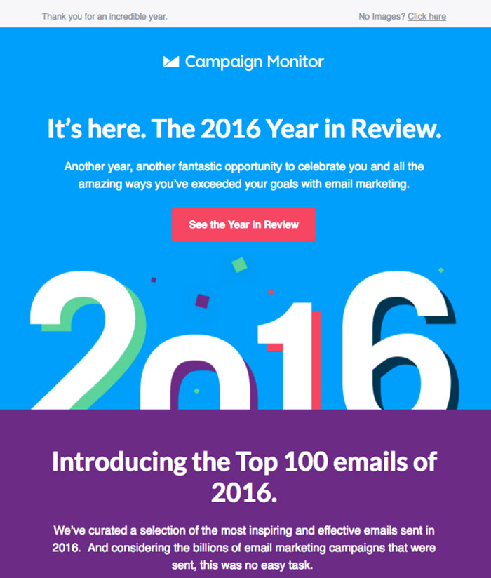
Image source: Campaign Monitor – Sourced from Really Good Emails
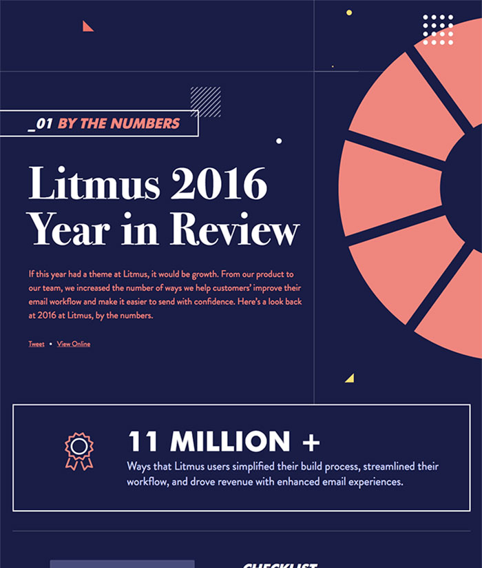
Image source: Litmus – Sourced from Really Good Emails
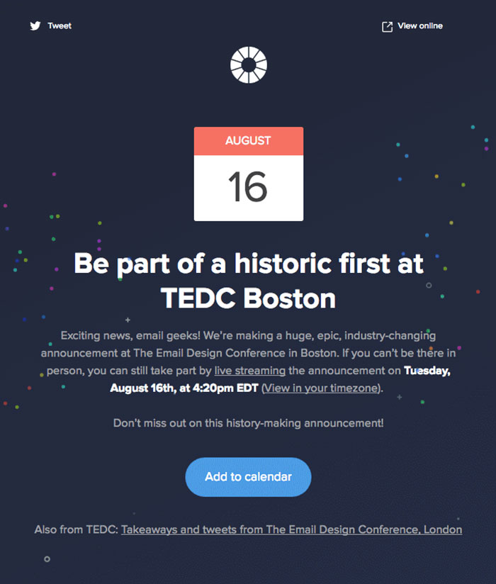
Image source: Litmus – Sourced from Really Good Emails
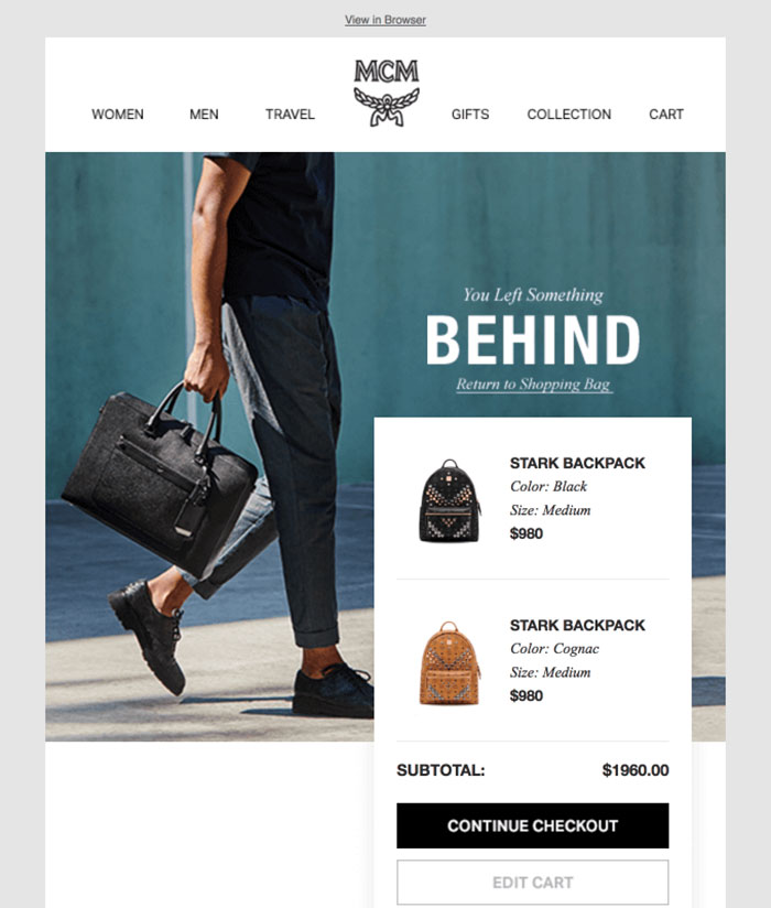
Image source: MCM – Sourced from Really Good Emails
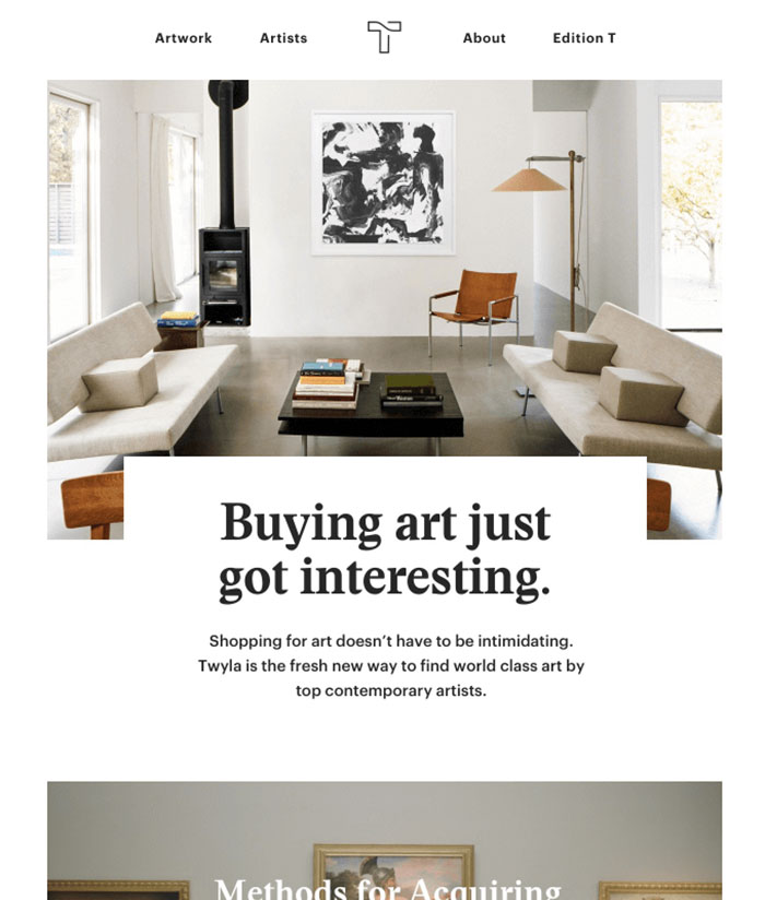
Image source: TWYLA – Sourced from Really Good Emails
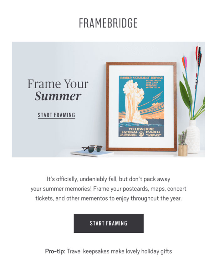
Image source: Framebridge – Sourced from Really Good Emails
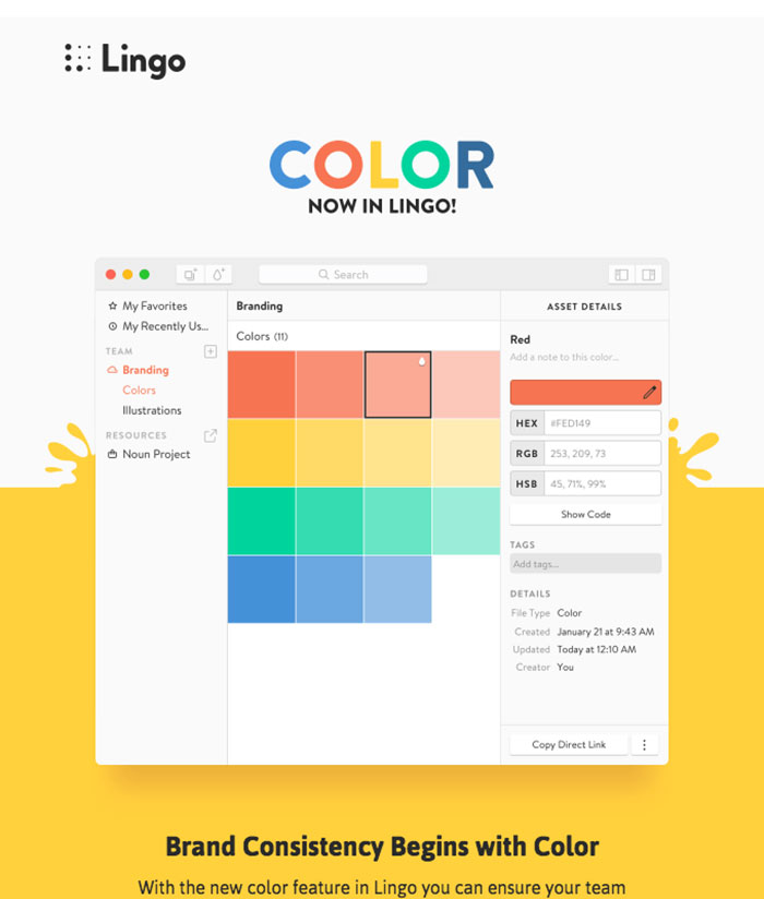
Image source: Lingo – Sourced from Really Good Emails
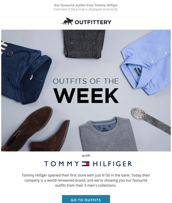
Image source: Outfittery – Sourced from Really Good Emails
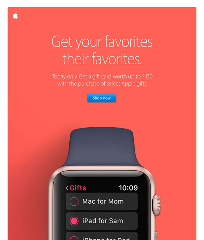
Image source: Apple – Sourced from Really Good Emails
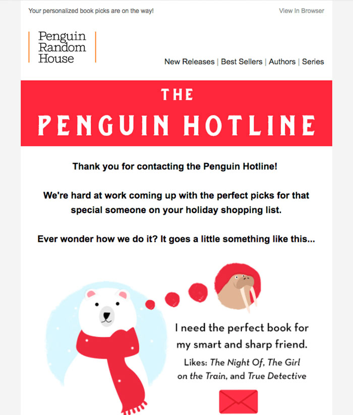
Image source: Penguin Random House – Sourced from Really Good Emails
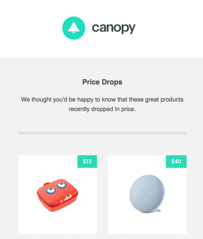
Image source: Canopy – Sourced from Really Good Emails
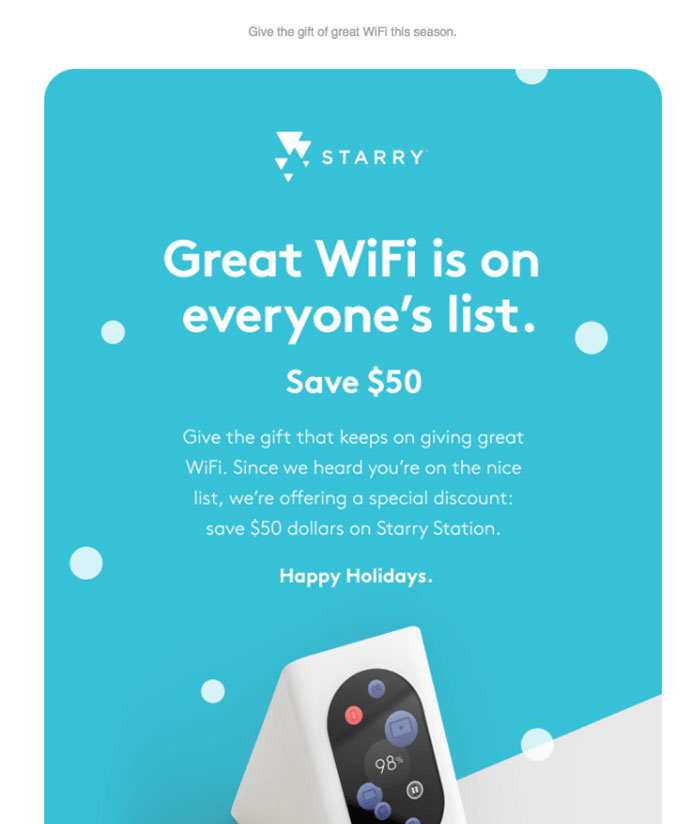
Image source: Starry – Sourced from Really Good Emails
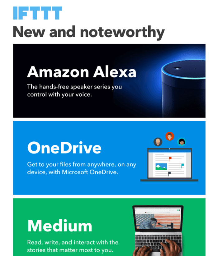
Image source: IFTTT – Sourced from Really Good Emails
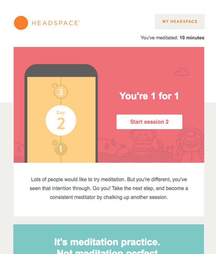
Image source: Headspace – Sourced from Really Good Emails
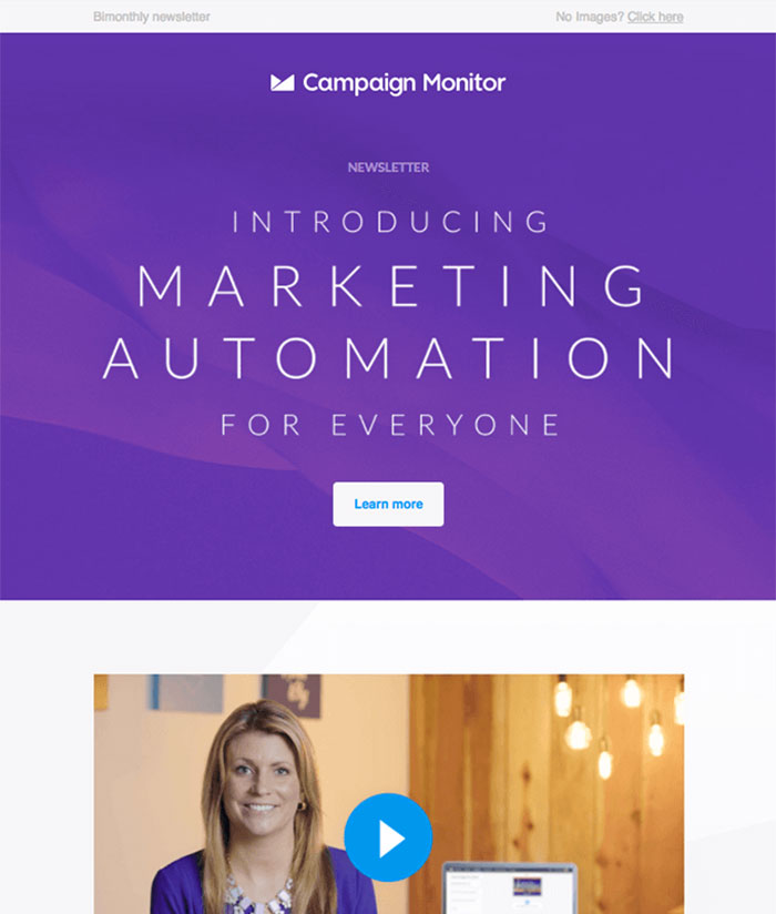
Image source: Campaign Monitor – Sourced from Really Good Emails
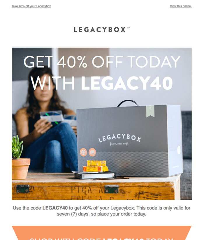
Image source: Legacybox – Sourced from Really Good Emails
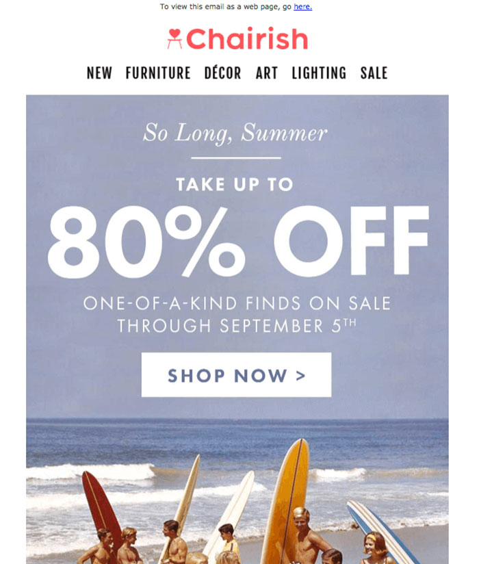
Image source: Chairish – Sourced from Really Good Emails
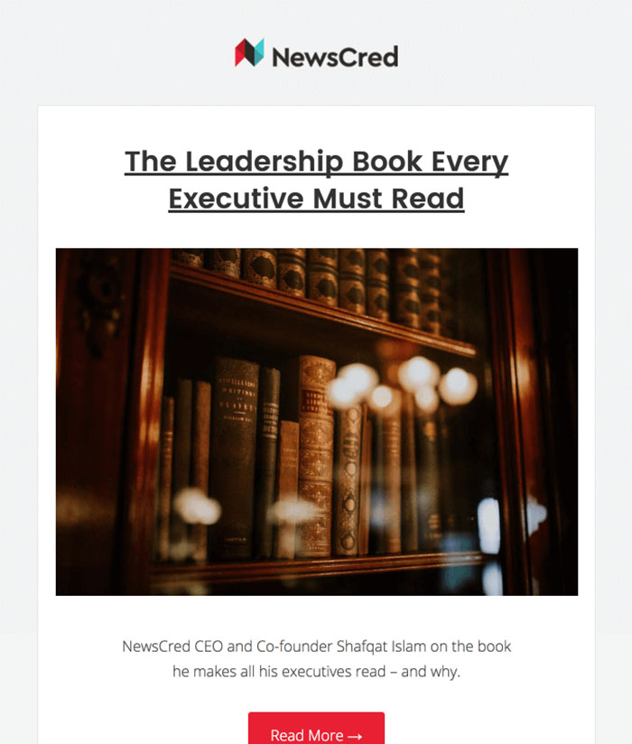
Image source: NewsCred – Sourced from Really Good Emails
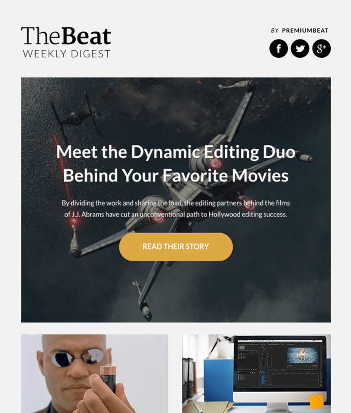
Image source: Premiumbeat – Sourced from Really Good Emails
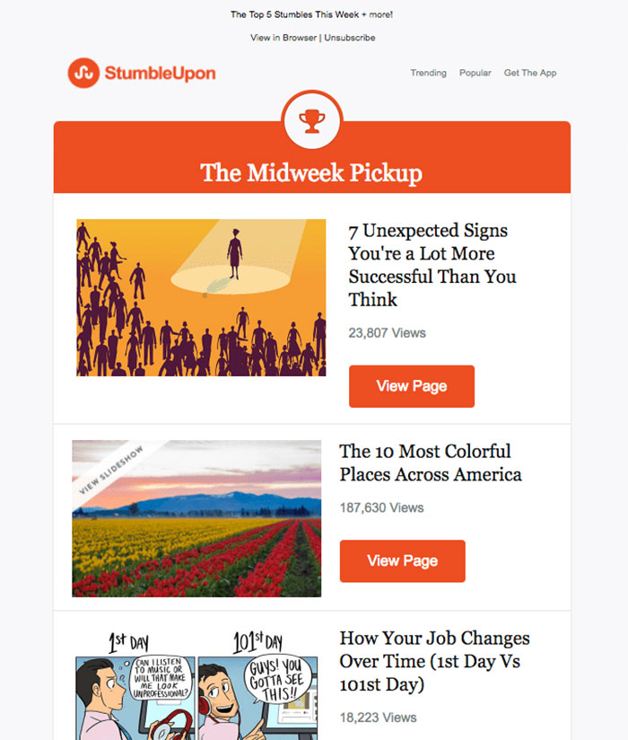
Image source: Stumbleupon – Sourced from Really Good Emails
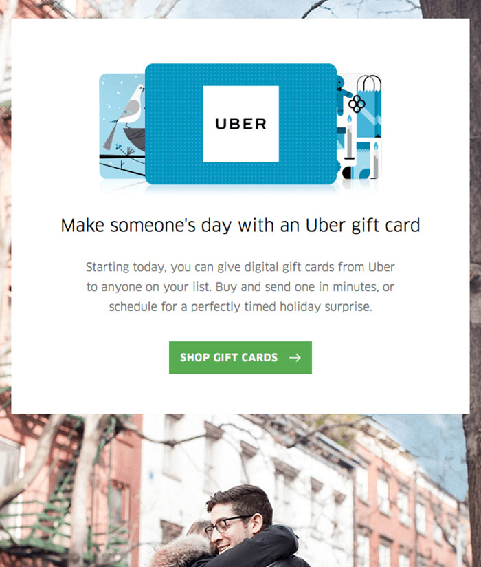
Image source: Uber – Sourced from Really Good Emails
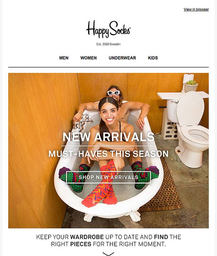
Image source: Happysocks – Sourced from Really Good Emails
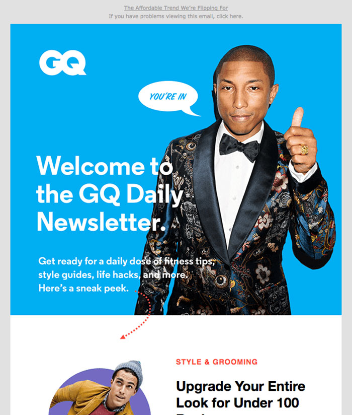
Image source: GQ – Sourced from Really Good Emails
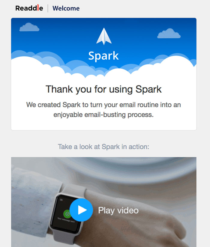
Image source: Readdle – Sourced from Really Good Emails
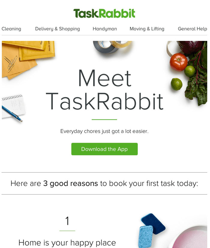
Image source: TaskRabbit – Sourced from Really Good Emails
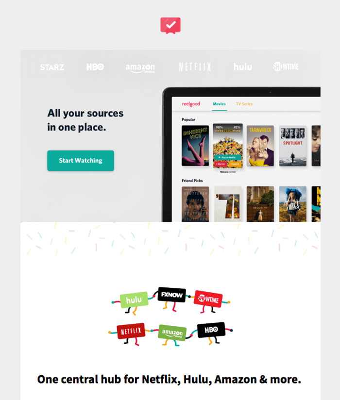
Image source: Reelgood – Sourced from Really Good Emails
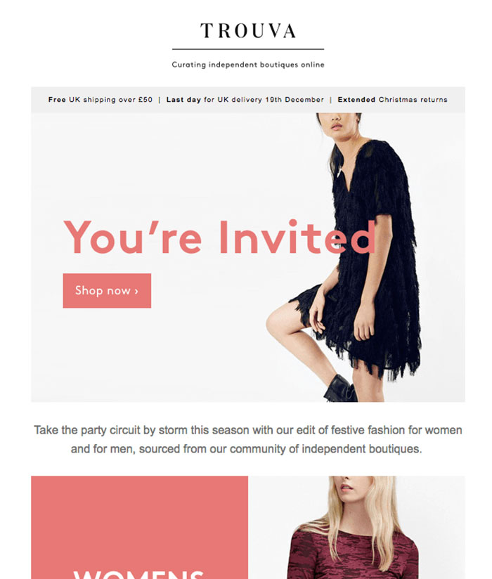
Image source: Trouva – Sourced from Really Good Emails
FAQ On Email Newsletter Design Best Practices
How do I create an effective email newsletter design?
Effective email newsletter design begins with a clear structure. Use responsive email design to ensure it looks great on all devices.
Visual hierarchy guides readers’ eyes to the most important parts. Tools like Canva and Litmus help craft visually appealing templates.
What are the best practices for email content strategy?
Your content should be relevant and engaging. Start with a catchy subject line. Personalize your emails using email personalization techniques and segment your audience.
Mix text, images, and interactive elements to maintain interest. Ensure your email content strategy aligns with your goals.
How can I increase my email open rates?
Focus on subject lines and preview text. Make them compelling and concise. Personalize where possible. Testing different approaches with A/B testing can reveal what works best. Keep your email frequency consistent but not overwhelming, and always provide value.
What should I include in my email design guidelines?
Your guidelines should cover layout, font choices, color schemes, and image usage. Define your brand’s tone.
Include standards for responsive design, email headers, and footers. Email accessibility standards ensure everyone can read your emails. Tools like Litmus can assist in testing.
How do I ensure my emails are mobile-friendly?
Use a responsive design that adjusts to different screen sizes. Keep your layout simple with single-column designs.
Use large, readable fonts, and buttons big enough to tap. Images should scale correctly. Test on various devices using platforms like MailChimp and HubSpot.
What are the key elements of an email CTA design?
A clear, compelling Call to Action (CTA) is crucial. Use contrasting colors to make it stand out. The text should be action-oriented. Place CTAs where they’re easily seen without scrolling.
Tools like Canva can help design attractive buttons. Test different placements and wording with A/B testing.
How can I personalize my email newsletters?
Personalization goes beyond just using names. Segment your audience based on behavior and preferences. Use dynamic content to tailor messages.
Tools like ActiveCampaign and HubSpot can automate this process. Personalized email newsletters improve engagement and conversion rates.
What are the common mistakes to avoid in email design?
Avoid cluttered designs and too much text. Don’t neglect mobile-friendliness. Poor visual hierarchy can confuse readers.
Failing to test emails can lead to display issues. Avoid generic content. Tools like Litmus and Email on Acid help catch errors before sending.
How do I measure the success of my email newsletters?
Track metrics like open rates, click-through rates, and conversion rates. Use tools like MailChimp and HubSpot for detailed analytics.
Monitor engagement metrics like bounce rates and unsubscribes. Regularly review these metrics to understand what’s working and refine your strategy.
How often should I send email newsletters?
Balance is key. Too frequent can annoy subscribers; too rare can lead to disengagement. Test different frequencies to see what your audience prefers. Tools like Benchmark Email and GetResponse can help manage your sending schedule and analyze engagement patterns.
Conclusion
Crafting compelling email newsletters is both an art and a science. Implementing email newsletter design best practices is essential to stand out in the crowded inbox. Remember, it’s not just about aesthetics; it’s about engaging your audience and driving action.
Start with a strong foundation: Utilize responsive email design to ensure your emails look great on any device. Leverage tools like Canva and Litmus for design and testing.
Content is king: Keep it relevant and personalized. Segment your audience and use email personalization techniques to make each subscriber feel special.
Visuals matter: Use high-quality images and a clear visual hierarchy to guide your readers. Pay attention to your email headers, footers, and CTAs-they should be visually appealing and drive action.
Test, test, test: Regularly conduct A/B testing to see what works best for your audience. Measure success with tools like MailChimp and HubSpot.
By mastering these practices, you’ll create newsletters that not only capture attention but also convert and retain your audience.

Renowned for his expertise in logo design and visual branding, Bogdan has developed a multitude of logos for various clients.
His skills extend to creating posters, vector illustrations, business cards, and brochures. Additionally, Bogdan's UI kits were featured on marketplaces like Visual Hierarchy and UI8.
He also wrote in the past years on sites like Design Your Way, WebDesignerDepot, WPDean, Designmodo, Speckyboy, Slider Revolution, and more.
- The Windsurf Logo History, Colors, Font, And Meaning - 10 October 2026
- How to Remove Background From Product Photos (No Photoshop) - 10 October 2026
- How Designers can Build a Stronger Online Creative Identity - 9 October 2026

Bogdan Sandu is a seasoned designer who has been designing websites since 2008. Renowned for his expertise in logo design and visual branding, Bogdan has developed a multitude of logos for various clients. His skills extend to creating posters, vector illustrations, business cards, and brochures. Additionally, Bogdan's UI kits were featured on marketplaces like Visual Hierarchy and UI8. He also wrote in the past years on sites like Design Your Way, WebDesignerDepot, WPDean, Designmodo, Speckyboy, Slider Revolution, and more.
You Might Also Like