


The Hallescher FC logo is the official club emblem of Hallescher Fußball Club, a German football club based in Halle (Saale), Sachsen-Anhalt. The badge represents one of East Germany’s oldest football traditions, with roots going back to 1900 when the club was first founded as Wacker Halle.
The current version of the crest was introduced in 2012 and uses a stylized pentagon shield in red and white. It replaced a circular design that had been in use since 2000.
Across its history, the club has gone through at least four distinct logo versions. Each one tied to a different chapter, from the DDR-Oberliga era under the name Hallescher FC Chemie, through German reunification, and into the modern German football league system. The emblem has always carried the red and white club colors, no matter which version was active.
What Is the Hallescher FC Logo?
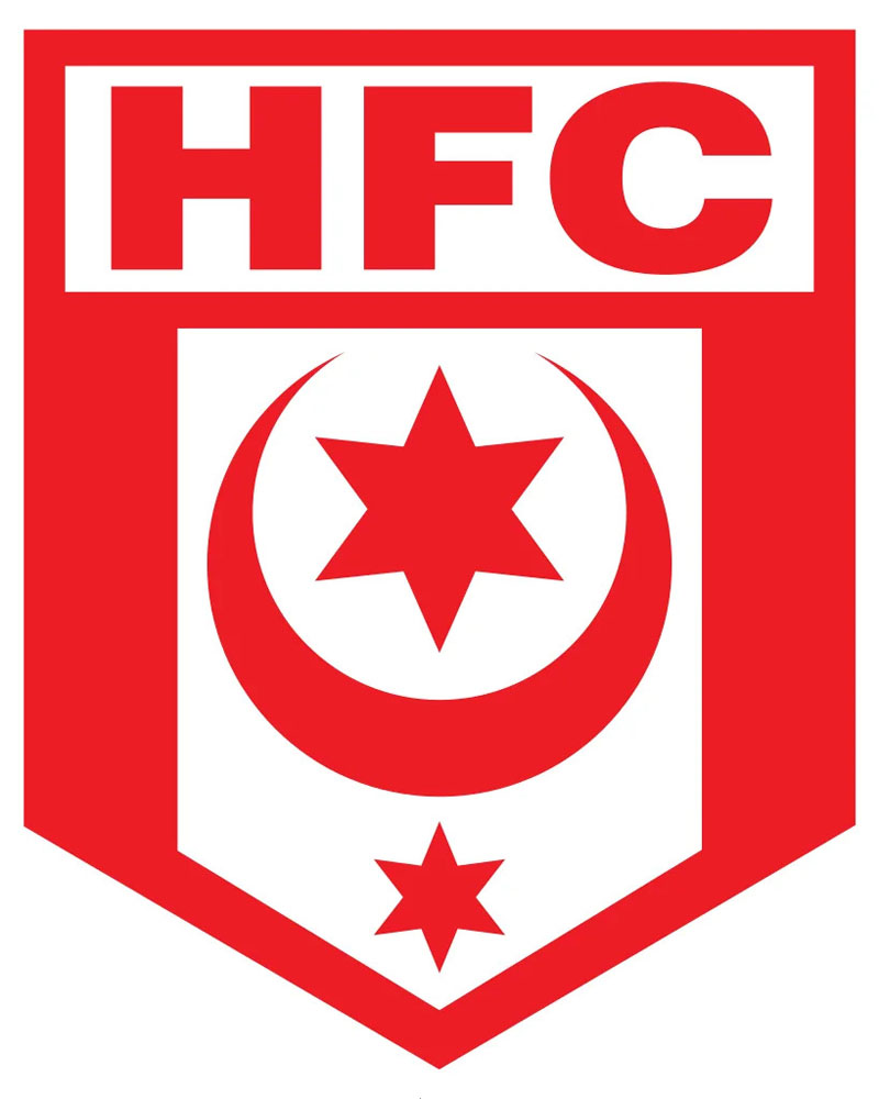
The Hallescher FC logo is a red and white pentagon-shaped shield emblem used by the German football club from Halle (Saale). It was introduced in 2012 when the club returned to the 3. Liga. The design draws from the coat of arms of the city of Halle.
- Design type: Emblem (shield-based)
- Primary elements: Pentagon shield, club name lettering, “HFC” abbreviation, red and white color scheme
- Official introduction date: 2012
- Designer/Agency: Not publicly credited
- Color palette: Red (#E2001A), White (#FFFFFF), with black accents
- Usage context: Match kits, merchandise, official website, stadium branding, digital platforms, fan products
- Trademark status: Protected under German trademark law as a registered club emblem through the DFB
The pentagon shape is what makes this badge stand out among other German club crests. Most clubs in the Regionalliga and 3. Liga tend to go with round or traditional shield formats. HFC does something different here.
How Has the Hallescher FC Logo Evolved Over Time?

The Hallescher FC badge has gone through four documented versions since 1967.
Each redesign matched a shift in the club’s identity or competitive status.
The progression moved from a DDR-era circular badge, through a transitional post-reunification design, to the current pentagon shield introduced alongside the club’s return to professional football.
Hallescher FC Chemie Logo (1967–1990)
- Years active: 1967–1990
- Design description: Circular badge featuring the “HFC” initials within a round frame, using DDR-era design conventions
- Color scheme: Red and white
- Context: Introduced after the football department separated from SC Chemie Halle on January 26, 1966, forming Hallescher FC Chemie. This badge was worn during the club’s DDR-Oberliga years.
- Cultural significance: Represented the club during one of its strongest competitive periods, including a third-place Oberliga finish in 1970–71 and a UEFA Cup appearance
This was the era when East German football clubs were reshaped by state sports bureaucracy. The logo reflected that institutional feel. Clean, functional, and not overly decorative.
The club used this badge during what were arguably its best years. Took me a while to dig that up, but the 1970–71 season stands out because it earned HFC a spot in the UEFA Cup. That campaign ended tragically when a hotel fire during the away leg against PSV Eindhoven killed midfielder Wolfgang Hoffmann.
Plenty of other East German clubs, like Dynamo Dresden and Hansa Rostock, went through similar identity shifts during this period.
Post-Reunification Logo (1990–2000)
- Years active: 1990–2000
- Design description: Updated circular design dropping the “Chemie” from the club name, reflecting the new identity as simply Hallescher FC
- Color scheme: Red and white, consistent with club tradition
- Context: Adopted following German reunification in 1990, when the club entered the 2. Bundesliga
- Key changes from previous: Removed DDR-era elements and the “Chemie” association, modernized the overall look
- Cultural significance: Marked the club’s transition into the unified German football system
The 1990s were rough for Hallescher FC. The club dropped from the 2. Bundesliga all the way down to the fifth-tier Verbandsliga Sachsen-Anhalt by 1995–96.
The logo from this period carried the weight of that decline. It was still recognizably HFC, but it felt like a club searching for its footing in a completely different football structure.
Many former East German clubs experienced similar struggles. Hertha BSC and FC Magdeburg both had to rebuild their identities after reunification, though each took a different path.
Circle-Pentagon Logo (2000–2012)
- Years active: 2000–2012
- Design description: A combined design featuring a circular outer ring with a pentagon shape at its center
- Color scheme: Red and white
- Context: Introduced as the club stabilized in the NOFV-Oberliga and began climbing back up the German football pyramid
- Key changes from previous: Added the pentagon element inside a circular frame, a design halfway between tradition and modernization
This version appeared during the club’s rebuilding years. HFC returned to the NOFV-Oberliga in 1999–2000 and eventually earned promotion to the Regionalliga Nord in 2008.
The circle-pentagon combo was a bridge. Not fully modern, not fully traditional. It worked for a club that was still figuring out where it belonged.
Current Hallescher FC Logo (2012–Present)
- Years active: 2012–present
- Design description: Standalone pentagon shield without the circular outer frame, featuring bold “HFC” lettering and the full club name
- Color scheme: Red (#E2001A) and White (#FFFFFF)
- Context: Adopted when HFC won promotion to the 3. Liga in the 2011–12 season, marking a return to professional football after 20 years
- Key changes from previous: Dropped the circular frame, keeping only the pentagon shield. The club’s press spokesperson at the time said it was a return to the badge used during the 1991–92 2. Bundesliga season.
- Cultural significance: Tied directly to the club’s professional football comeback
This is where things get interesting. The club didn’t just update the logo for the sake of it. They went back to an older version on purpose.
The reasoning was simple. When HFC last played in a professional league (1991–92), they used the pentagon-only design. Bringing it back in 2012 was a “back to the roots” move that connected the new era to the old one.
And it worked. The badge now sits on kits supplied by Patrick for the 2025–26 season and is featured across all digital and physical club materials.
What Do the Design Elements of the Hallescher FC Logo Mean?
The pentagon shield shape comes from Halle’s city coat of arms. Red and white are the traditional colors of the city. The “HFC” abbreviation and full club name provide immediate identification.
Every element connects back to the city of Halle and its football heritage.
Why Did Hallescher FC Choose These Specific Colors?

- Red (#E2001A, RGB: 226, 0, 26): Represents energy, passion, and the competitive spirit of the club. Red has been a constant in Halle’s football identity since the earliest days.
- White (#FFFFFF, RGB: 255, 255, 255): Stands for sportsmanship and integrity. It provides contrast and balance in the badge design.
- Black (accent color): Used sparingly for outlines and text legibility.
These are the same colors found on the coat of arms of Halle (Saale). The club didn’t invent this palette. They inherited it from the city.
Home kits have always used red and white in some combination, whether halved, striped, or solid. The 2023–24 kit even brought back a half-and-half red-white pattern from 1976–77.
What Typography Style Is Used in the Hallescher FC Logo?

The font is a bold, custom sans-serif typeface. It’s designed for clarity at small sizes.
The lettering is clean and authoritative. You can read “HFC” from a distance in the stadium or on a tiny digital thumbnail. That’s the whole point.
It blends traditional and modern characteristics. Not overly stylized, not generic either.
What Are the Hidden Meanings in the Hallescher FC Logo?
The pentagon is the biggest one. It’s not a random shape. Five-sided forms are unusual in German football badges, where circles and traditional heraldic shields dominate.
Some supporters see the pentagon as a nod to the five-pointed stars common in DDR-era symbolism, though the club has never confirmed this officially.
The overall simplicity of the current logo is intentional. After decades of name changes and identity shifts (SG Glaucha, SG Freiimfelde, ZSG Union, BSG Turbine, SC Chemie, HFC Chemie), a clean and direct badge made sense.
How Does the Hallescher FC Logo Compare to Competitor Logos?
Hallescher FC’s pentagon crest is fairly unique among German lower-league clubs. Most competitors use round or shield-based designs.
Clubs in similar competitive positions take different visual approaches.
FC Magdeburg, a fellow Sachsen-Anhalt club, uses a more traditional circular design with more detail and a completely different color palette.
FSV Zwickau goes with a completely different style. More angular, more aggressive in its color contrasts.
If you look beyond German football, clubs like Eintracht Frankfurt demonstrate how eagle motifs create a totally different kind of brand identity. And RB Leipzig, who competed alongside HFC for promotion in 2011–12, opted for a corporate-feeling bull emblem.
Further south in European football, clubs like Fiorentina or Torino show how Italian clubs handle the balance between city identity and football tradition in their crests.
The HFC badge doesn’t try to compete with flashy designs. It’s quiet, confident, and rooted in its city.
What Are the Technical Specifications of the Hallescher FC Logo?
Official Color Codes
- Primary Red: Hex #E2001A, RGB (226, 0, 26), CMYK (0, 100, 88, 11)
- White: Hex #FFFFFF, RGB (255, 255, 255), CMYK (0, 0, 0, 0)
- Black (accent): Hex #000000, RGB (0, 0, 0), CMYK (0, 0, 0, 100)
Dimensions and Proportions
- Aspect ratio: Approximately 4:5 (width to height), following the pentagon shape
- Minimum size: Should remain legible at sizes down to around 20mm width for print applications
- Clear space: A buffer zone equal to roughly 10% of the logo’s width should surround the badge on all sides
- Available formats: SVG, PNG, EPS, AI, JPEG for different use cases
The SVG format is ideal for scaling without any quality loss. PNG works best for web and social media. EPS and AI are for print production.
What Cultural Impact Has the Hallescher FC Logo Had?

The badge is a symbol of Sachsen-Anhalt football identity. In a region where clubs have faced decades of economic challenges after reunification, maintaining a consistent visual identity matters.
HFC’s logo carries the history of East German football. From the DDR-Oberliga to the Regionalliga, it’s been on jerseys, stadium banners, and fan scarves for over five decades in various forms.
For supporters in Halle, the pentagon is more than a badge. It’s what they see at the Leuna-Chemie-Stadion every matchday.
How Does the Hallescher FC Logo Fit Into the Overall Brand Identity?

The logo anchors everything the club does visually. Kits, social media profiles, merchandise, stadium signage, and official communications all build on the red-and-white pentagon.
The brand extends to the Leuna-Chemie-Stadion naming and the club’s partnership structure. Current kit supplier Patrick integrates the badge prominently on all jerseys.
HFC’s visual identity connects to a broader network of German football club branding. Clubs like VfB Stuttgart, SC Freiburg, and Holstein Kiel each handle their own regional identity through distinct badge choices.
How Should the Hallescher FC Logo Be Used?

- Do use the official versions available through the club’s website or authorized brand asset platforms
- Do maintain the correct color codes and proportions
- Do keep adequate clear space around the badge
- Don’t alter the colors, stretch the proportions, or add effects to the logo
- Don’t place the badge on busy backgrounds that reduce readability
- Don’t use outdated versions of the logo for current communications
The logo is a registered trademark. Unauthorized commercial use requires permission from Hallescher FC. Fan use for non-commercial purposes (scarves, banners, personal items) generally follows typical German football culture norms.
Official logo files can be accessed through the club’s official website and authorized brand platforms like Brandfetch.
FAQ About the Hallescher FC Logo
When was the Hallescher FC logo created?
The earliest known version dates to 1967, following the formation of Hallescher FC Chemie in 1966. The current pentagon-only version was introduced in 2012 when the club returned to the 3. Liga.
Who designed the Hallescher FC logo?
The designer of the Hallescher FC logo has not been publicly credited. The club handled branding decisions internally. The 2012 update was based on the badge used during the 1991–92 season.
What do the colors in the Hallescher FC logo mean?
Red stands for energy, passion, and competitive spirit. White represents sportsmanship and integrity. Both colors come from the traditional palette of the city of Halle (Saale).
How many times has the Hallescher FC logo been redesigned?
At least four documented versions exist: 1967–1990 (HFC Chemie era), 1990–2000 (post-reunification), 2000–2012 (circle-pentagon), and 2012–present (standalone pentagon).
Where can I download the official Hallescher FC logo?
Official logo files are available through the club’s website and through brand asset platforms. Vector formats (SVG, EPS, AI) and raster formats (PNG, JPEG) are typically provided.
Is the Hallescher FC logo trademarked?
Yes. The logo is a protected trademark registered under German intellectual property law. Commercial use without authorization from the club is not permitted.
What font is used in the Hallescher FC logo?
The logo uses a custom bold sans-serif typeface. It’s not based on a commercially available font. The lettering was designed specifically for legibility across print and digital formats.
Why did Hallescher FC choose a pentagon for their logo?
The pentagon shape draws from the coat of arms of Halle (Saale). When the club returned to professional football in 2012, they revived the pentagon-only design from the 1991–92 era as a deliberate “back to the roots” decision.
Conclusion
The Hallescher FC logo is a pentagon-shaped red and white emblem that connects the club to the city of Halle and its football history. Introduced in its current form in 2012, it has become the most recognizable version of the HFC badge.
The design stands out among German lower-league clubs through its unusual shape and clean execution. It carries the weight of a club that has been through DDR-era football, reunification, relegation to the fifth tier, and a return to professional football.
As HFC continues to compete, the pentagon badge remains a steady identifier for supporters and the broader German football community.

Renowned for his expertise in logo design and visual branding, Bogdan has developed a multitude of logos for various clients.
His skills extend to creating posters, vector illustrations, business cards, and brochures. Additionally, Bogdan's UI kits were featured on marketplaces like Visual Hierarchy and UI8.
He also wrote in the past years on sites like Design Your Way, WebDesignerDepot, WPDean, Designmodo, Speckyboy, Slider Revolution, and more.
- Canva vs PowerPoint: Which Is Better for Presentations? - 22 September 2026
- How to Install Fonts on Mac (Step-by-Step Guide) - 20 September 2026
- From Mockup to Code: How AI-Augmented Development Speeds Up the Design Handoff - 19 September 2026

Bogdan Sandu is a seasoned designer who has been designing websites since 2008. Renowned for his expertise in logo design and visual branding, Bogdan has developed a multitude of logos for various clients. His skills extend to creating posters, vector illustrations, business cards, and brochures. Additionally, Bogdan's UI kits were featured on marketplaces like Visual Hierarchy and UI8. He also wrote in the past years on sites like Design Your Way, WebDesignerDepot, WPDean, Designmodo, Speckyboy, Slider Revolution, and more.
You Might Also Like


