


Mobile Menu Design User Interface Examples (33 App Menus)
App menus are key to making an app work well. An app menu should appear upon interaction with a button or some other action.
A well-designed menu UI will display a list of choices. Context is very important when designing a good app menu. These contextual app menus change available menu items dynamically depending on the current state of the app.
As simple as all this seems, mobile app menus design is fairly difficult to get right. You have to determine the purpose of the app menu and every menu item on it.
Then all of this needs to be designed so that users can easily understand what the items are, find them, and click on them. This guide will help you understand how to design a good app menu.
Why a menu?
A menu is really just a way for users to get from one point in an app to another. It’s a temporary thing. A menu should contain at least two items, otherwise, it’s not of much use and is an extra loading screen.
Every menu item should offer a discrete option or action that affects the app or selected elements, including the view within the app. Typically, these are accessed via menu buttons.
As useful as a menu is, it shouldn’t be the primary method of navigating through the app. They are there to help people maneuver through the app. Even the greatest features aren’t of much use if no one can find where they are.
Even if you have a search function in your app, that shouldn’t be the only way someone has to find your app’s features. If you look at many commonly used apps, you’ll see their designers recognized this and included some form of navigation app menu.
Don’t get stuck in thinking of a navigation app menu as something that has to look a certain way. They can take many forms, including a navigation bar or a hamburger menu.
Menu Labels
One of the vital features of a good app menu is the labels of every app menu button. Every one of these labels needs to accurately and concisely reflect what the button does. You need to make sure the menu buttons avoid confusing users by being too vague or improperly labeled.
They should also be short and to the point. A lot of menu bars use a single simple word for their labels, including “format”, “file, or “edit”. While one-word labels have their advantages, you can also use longer labels as necessary. Don’t feel you need to keep it overly simple in order to provide the information users need.
Disabled Menu Options
A well-designed app menu should display a consistent set of items. This doesn’t mean that the options are always static. Allow menu items to be enabled or disabled depending on what eh current state of the application is.
For instance, having in-app purchases disabled will disable attempts to purchase items from the menu. The button may be grayed out or obviously not working in some way.
Contextual Menus
Contextual menus have become increasingly useful and common. They dynamically change the items available on the app menu based on what else is going on in the app. In a contextual menu, items that are irrelevant to the present context might be removed.
Menu items that are relevant, but need certain conditions to be met before they can be used, can also be disabled. It’s all a matter of understanding how to communicate to users what they can do when they can do it.
Single Menu Item States
On occasion, a contextual app menu can end up showing only one single menu item. This is not a bad thing if that is the real limitations of the app. It reduces the amount of clutter on the screen and helps prevent any kind of confusion.
If disabled items are visible but grayed out, a user may click on them and wonder why they aren’t working without realizing why they don’t work. This can be a much better option than graying out text or menu buttons in some apps. A lot of this depends on the app menu style you’re going for.
Options Menu
An options app menu contains commands that apply across the current activity. They can also be used to start a new activity. They should not apply to a selected item in the content. That’s the domain of a context menu.
For most devices, users press the menu button to access the app’s options menu. To close it, they typically press the menu again or press the back button. They might also press the menu button again or touch a point outside the menu. This can and does differ on different devices depending on what works better.
Every activity should have its own set of operations, which means that it should have its own options menu. If your app offers multiple activities, every one of them should have its own options menu.
For instance, in an email app, the options menu could let you compose a new message, search messages, refresh the list, or alter the email settings. In the compose view, there would be a different options menu that might include adding a CC field, attaching files, or discarding the message.
In order to decide on what menu items you should have and how they should be organized, most options app menu progressively disclose them in two steps:
- Options menu icons- with the first press of the menu button, a non-scrollable grid of icons is displayed. The number of buttons in this grid varies and some apps even offer them to be adjusted.
- Option expanded menu- If there are more menu items for an activity than will fit on the icon menu, the last icon is usually labeled as “more” or a similar label. Selecting it will display a list that can contain any amount of menu items and can usually scroll as needed.
Scrollable Menus
A menu can be too tall to display all its items on the screen. In that case, it should be able to scroll internally. This might be a technique you use all the time, or when an app is being (or must be viewed) in a landscape orientation.
The scrolling should be easy to access and not require users to use bars that are small. A lot of apps use touch scrolling. Some use arrows to accomplish the same thing.
Ideas for Menu Items
Single Line Display
Every menu item should be limited to single line of text, whether this is a single word or a short phrase. This line of text should describe the action the menu buttons will perform when it’s selected.
Menu items can also contain icons and helper text, like keyboard shortcuts or social media sharing buttons. They can also have controls like checkmarks that can be used to indicate a number of selected states or items. See ‘List Controls’ for more details on how these menus often work.
Menu Ordering
If you have an app menu with static content, it should have the most frequently used menu items near the top of the menu. This enhances usability and prevents users from getting lost. It simply makes the most relevant menu buttons easier to find.
If the app menu has dynamic content, they may not stick to this formula. For instance, previously used fonts can be placed at the top of a menu that lists fonts. This order can change based on user actions. This will allow the app menu to adjust dynamically to the user’s preferences, allowing them to more easily find the options they want on the menu.
Menu Nesting
You can design a menu so that clicking on it, or on a particular point on it, reveals nested submenus. Try to limit nesting to one level deep as much as you can. Multiple nested submenus can be very hard to navigate.
Sometimes they also tend not to work right, becoming hard to select before the app starts to think the menu has been closed. Nesting is a nice trick to use, but be discrete with it. Also, do a lot of testing to make sure your nesting works intuitively and well before publishing your app.
Disabling Actions
While you can remove actions that are unusable at the moment due to the conditions, this isn’t always the best choice. For instance, on a document or photo processing app, the redo button may be disabled but not gone when there is nothing to redo. Often this is indicated by it graying out. When it becomes usable again, it simply fills in with color.
Deciding between visible disabling or complete removal will depend on your app and the action itself. There is not one right fit. Context is very important for making this decision. A minimalistic menu style may be better served by getting rid of the option altogether, but others would work better by keeping it visible but disabling it.
Common Mistakes to Avoid when Designing App Menus
Make It Visible
- Don’t use small app menus or app menu icons, especially on larger screens. Menus should not be hidden when you have enough space to display them.
- Place menus in familiar locations. Most users expect to find user interface elements where they find them on other apps or sites. Typically, this is in a location on the left rail, near the top of the screen. Allow these expectations to work in your favor by taking advantage of them and placing menus where users expect to find them.
- Make sure menu links look interactive. It’s all too easy for users not to even realize that the interface is a menu if none of the options look tappable or clickable. Without an obvious indicator, a menu may seem like a decorative set of images or a fancy heading, especially if you use too many graphics in the design or stick too closely to the principles of flat design.
- Give your app menu enough visual weight. Menus that are placed in familiar locations don’t; really need much surrounding white space or color saturation most of the time. However, if your overall design is cluttered, your menus may lack the visual emphasis they need and become all too easily lost in other graphics, headlines, and promotions. All of these elements compete for a users’ attention. You want your app menu design to stand out.
- To help your menu links stand out better, use link text colors that contrast with the background color. A lot of designers ignore this a lot, to the detriment of their app menu designs. Navigating through digital spaces is inherently disorienting. Having to squint a screen to read the menu is not helpful at all.
Even those who know these guidelines by heart can end up making app menus that users overlooked. It’s hard to objectively evaluate your own work and things slip through the cracks when deadlines are tight or you’re stressed.
If you know where a menu item is, part of the reason is that you’re the one who put it there. You need to be sure to test your app menu design with users to be sure that they can see everything they need to without any trouble.
Communicate the User’s Current Location Effectively
Make sure users can tell where their current screen is located within your app menu options. In order to navigate, users first need to know where they are. Users rely on assorted visual cues to figure this out.
If you don’t, clearly let them know where they are in the app relative to your menu options, they will probably get frustrated. This is one of the single largest issues on both websites and apps. It’s especially important for a menu to indicate the user’s current location when it’s not likely a user has entered from the homepage.
Coordinate Menu Items with User Tasks
- Make sure your links labels are understandable. Figure out what users are looking for, then use labels that are relevant and familiar. An app menu is not a place to be cute or try to be unique. Don’t use made-up words or your team’s internal jargon. Use language that clearly described the features and content of your app. Again, user testing is key to make sure that you haven’t done any of these things by accident.
- Allow link labels to be easy to scan. Try left-justifying your vertical app menus and front-load key terms when you can. This will reduce the amount of time users take reading menus. Know how people typically read things. As cool as your app menu design may and as much time as you may have put into it, users don’t enjoy spending a lot of time navigating an app menu. Get them to the content they are using the app for.
- For larger sites and apps, allow users to preview lower-level content via the menu. If your menu guides users down several levels, these mega-menus or event traditional drop-down app menus will help users save time by allowing them to skip a level or two. Be careful when doing this. You don’t want to overcomplicate your app menu or cause it to be technically difficult to implement. This technique really only works with complex menus that need to communicate a lot of info.
- Make good use of visual communication. Colors, graphics, and other images will help users know what the menu options are and what they mean. These visual elements help aid comprehension. However, be sure to use images that support user tasks. At the very least, they shouldn’t make tasks harder for users to accomplish.
Make it Easy to Use and Manipulate
- Have your menu links be large enough to be easily clicked or tapped. Links that are too small, or placed too close together, cause a lot of frustration for mobile users especially. They also make it unnecessarily difficult to use the app menu on large-screen designs.
- Make sure that drop down menus are not too small and not too big. They need to be just right. Drop-downs that hover-activated that are too short are very frustrating. They have a tendency to disappear when users are trying to mouse over them to click on links. However, vertical drop-down menus that are too long make it hard to access links that are located near the bottom of the list. These links may get cut off below the edge of the screen and require the users to scroll down to them. If a hover-activated menu is too wide, they can be mistaken for new pages unto themselves. This causes a lot of confusion for users. They may think that the page is switched, but they don’t know what they clicked or tapped to cause it to happen. An app that does things without user input is not going to go over well.
- Think about adding ‘sticky’ menus for longer pages. When a user who reaches the bottom of a long page, they can face a long, boring scroll back to the top before they get back to the menu they’re looking for. A ‘sticky’ menu is one that remains visible as a user scrolls down the page. This prevents users from having to scroll back up to navigate to a new place in the app or webpage. This is especially welcome on smaller screens and very long, informative pages. Just make sure the menu doesn’t get in the way further down the page.
- Optimize the app menu for easy physical access through commonly used commands With drop-down app menus, this means that you should place the most common menu items close to the link-target that launches the drop-down functions. This means that the user doesn’t have to travel as far with their mouse or finger. Some mobile apps have even begun using pie menus recently. Pie menus keep all the options close by because they arrange them in a circle or semicircle. Don’t stick to thinking solely inside the box. There are a lot of different menus that are easy for users to get what they need.
Separate Selection-Specific Commands from the App Menu’s Global Commands
- Make sure that your global commands for the current activity are placed in the options menu. You can also put them on an activity screen. Just place these command in the context menu. No matter which decision you make, the command can run as part of this activity or trigger the start of another activity.
- In order to know which menu to place a command in, here’s a simple trick. If a command acts on a selected set of content or a specific location on the screen, place the command in the context movie for this content. If this command acts on no particular set of content or no set location, place it in the options menu instead. This separation of command is enforced in the system, as well. Whenever you press the menu button to display the options menu, the selected content will become unselected and you can’t do anything to it.
For a good example of this, consider when a user does a ‘touch and hold’ on a person’s name in their smart phone’s contact list in the contacts app. The context menu then usually displays a couple commands, like “call contact”, “message contact”, or “edit contact”.
Place the Most Commonly Used Operations First
Screens are only so tall, so some menus may be scrollable. Make sure you place the most important commands so they can be viewed without scrolling. This will save users time and energy.
No one likes scrolling through the menu to find some option they use all the time. It can get very frustrating, causing users to look for an app that wastes less of their time.
Also, place similar commands in the same location. This will make it easier for users to make adjustments if they need something similar but different.
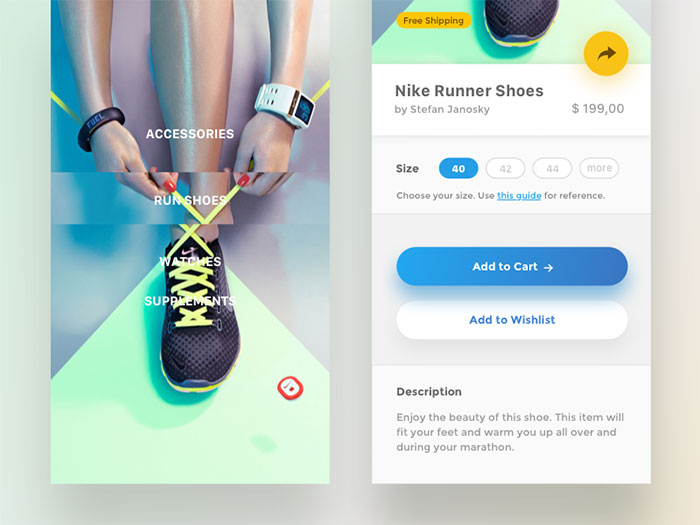
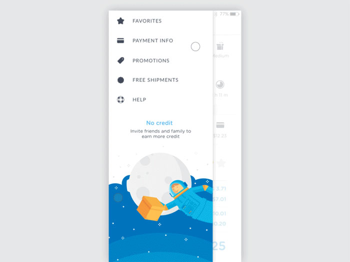
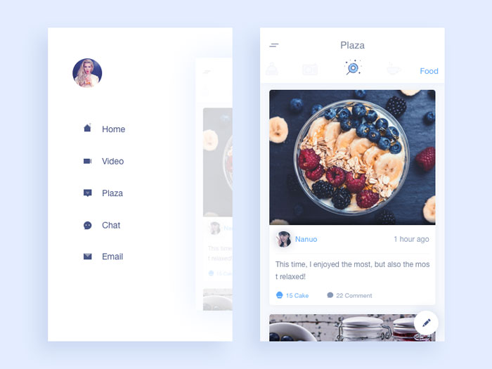
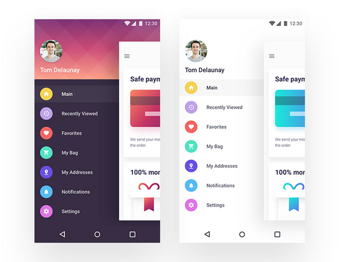
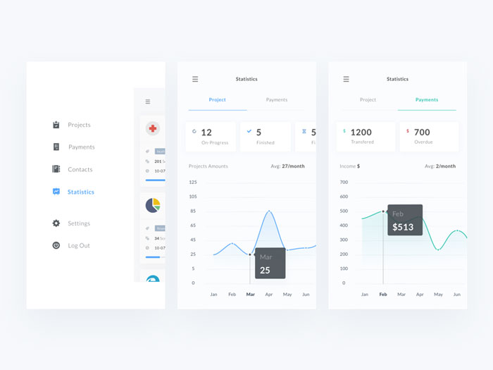
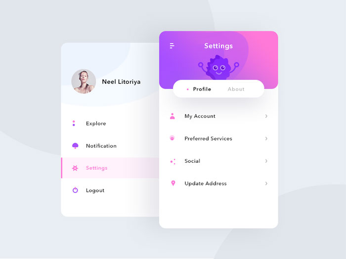
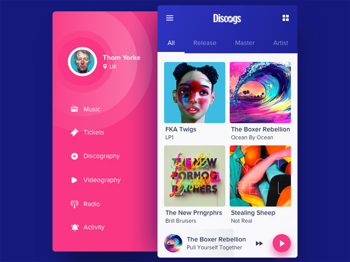
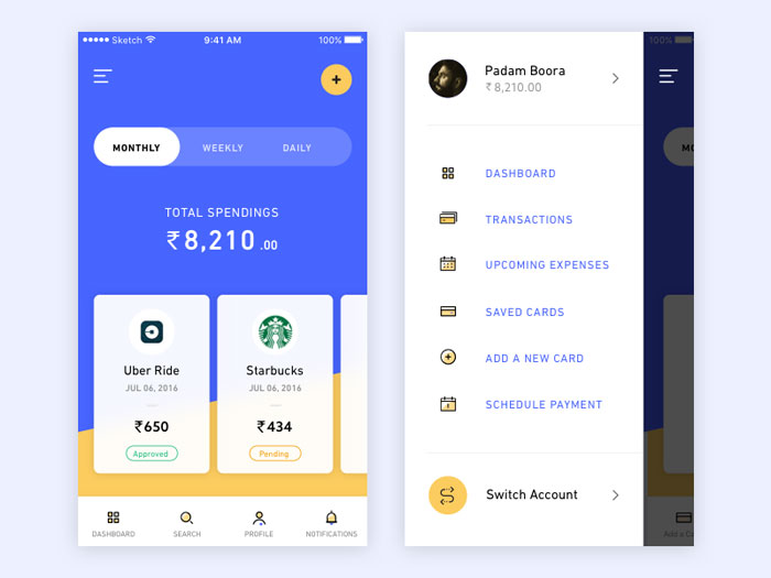
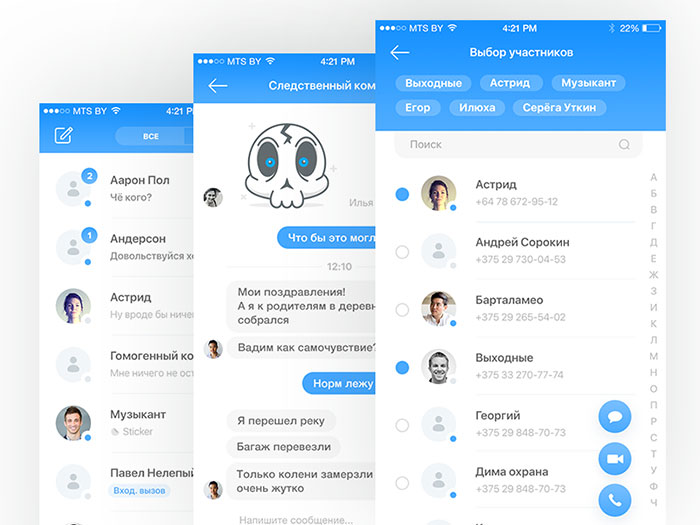
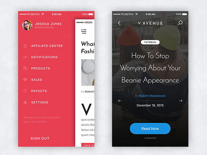
Mobile Menu Design Examples
A very difficult part about mobile menu design is organizing it intelligently and designing in a way that will make the mobile navigation easy and intuitive.
Coding can be relatively easy when you have what to work on, but the creative process is something that must not be made in a hurry.
The navigation menu can be a very challenging aspect of mobile design, especially if a site or app has many sections or pages which you have to squeeze in a mobile resolution. On desktop websites things are easy, you can make a large menu, maybe even two of them and you still have a lot of space to do more.
However, on mobile things are different and this is why I made this second article about navigation in mobile user interfaces to showcase a few mobile designs that I hope will be good UI inspiration for you.
If you haven’t seen the first article in this mini-series, check it out. It has a lot of interesting examples.
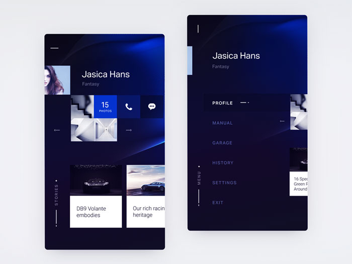
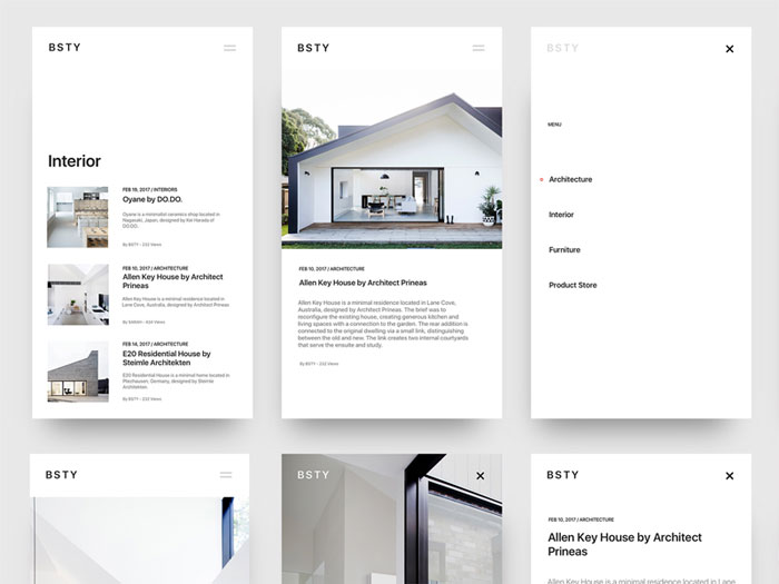
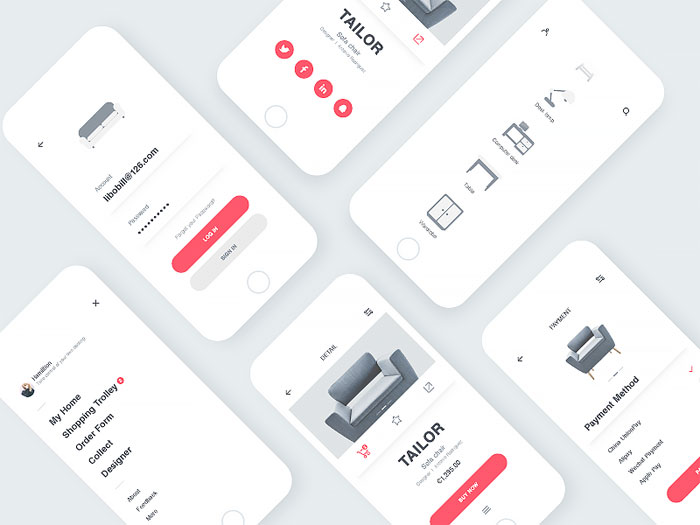
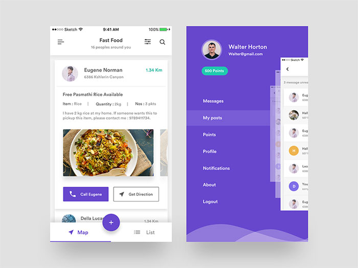
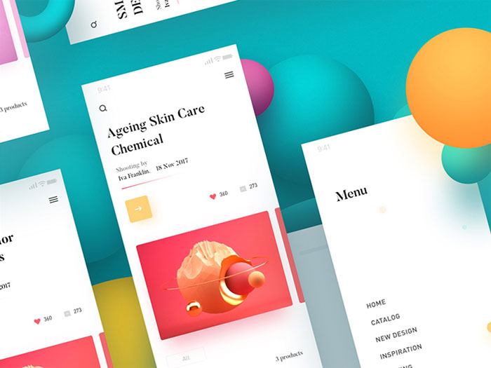
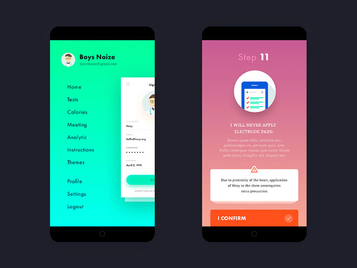
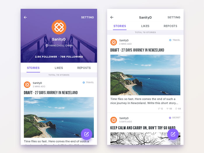
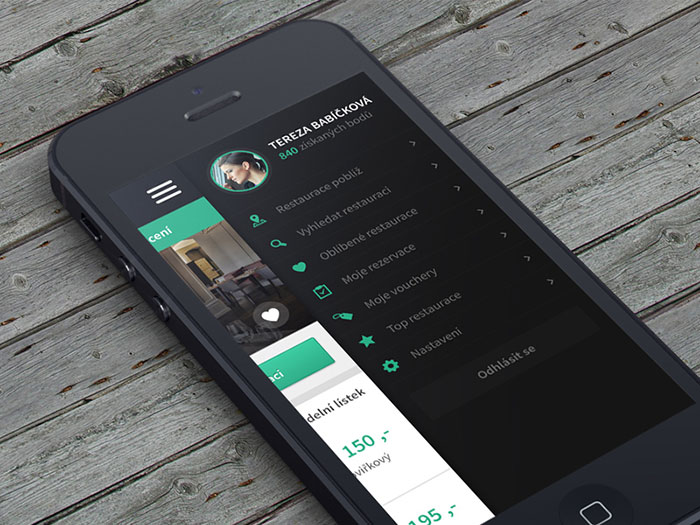
ICQ mobile app redesign
Mobile menu Animation

V Avenue
Test and Navigation on Mobile
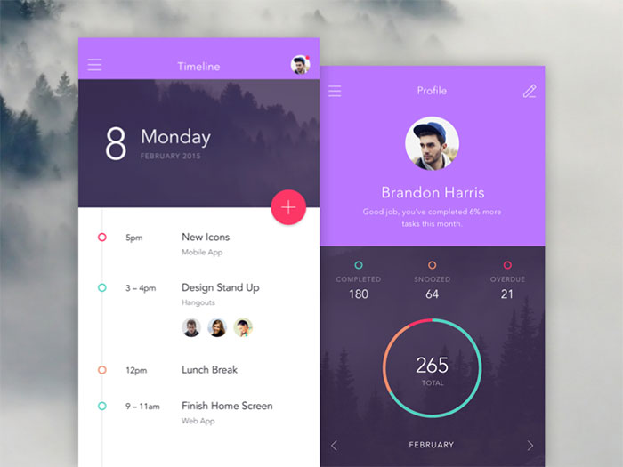
Timeline & Profile menu design
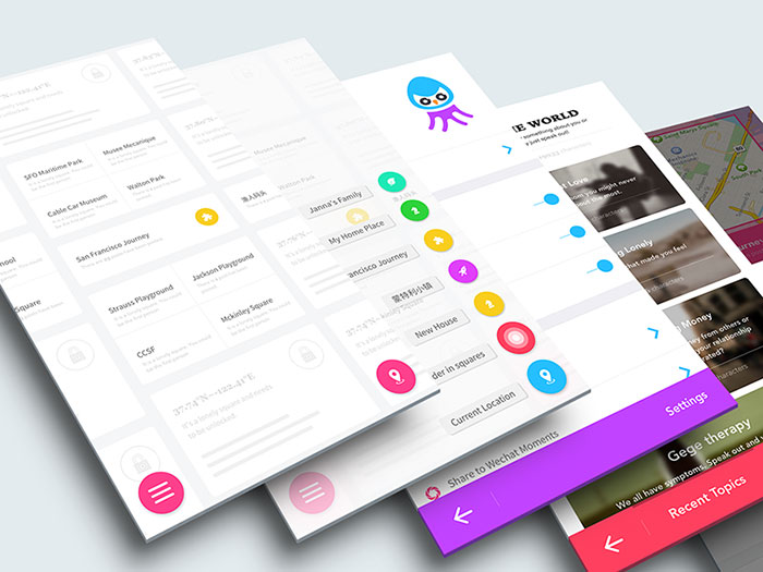
GeGe App: user interface menu design
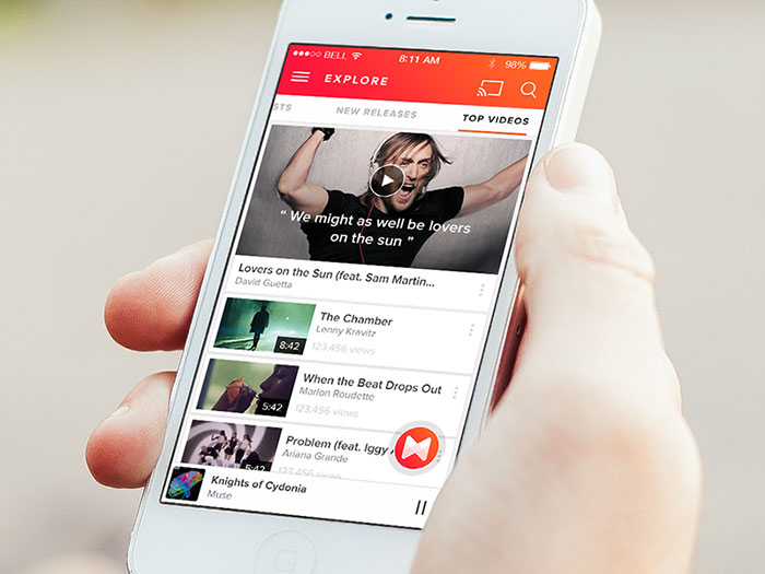
Musixmatch Prototype
Profile UI
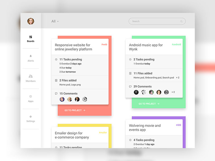
Project collaboration: Mobile navigation
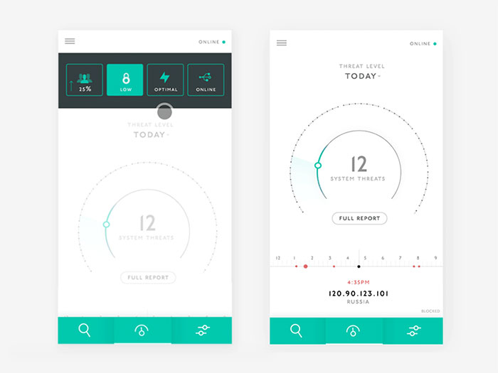
Cloud Analytics Mobile App
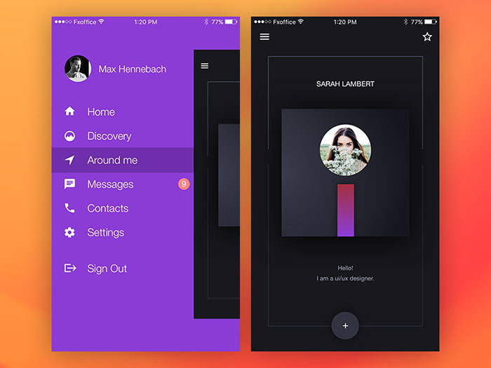
Mobile Side Menu UI/UX
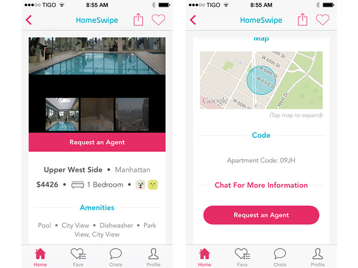
HomeSwipe
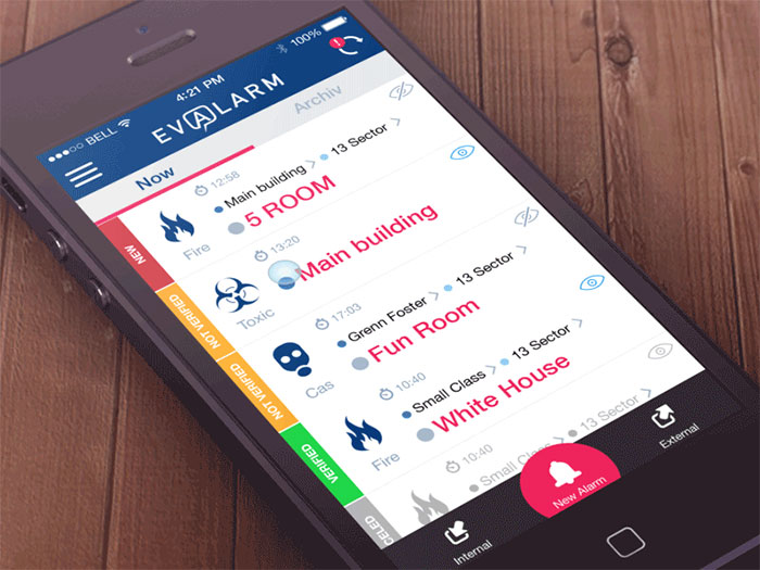
Evalarm project
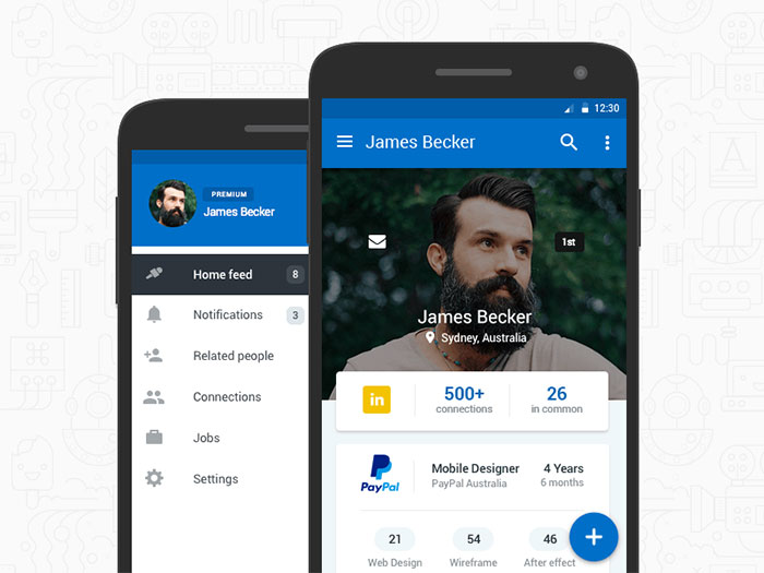
Linkedin – Android material design
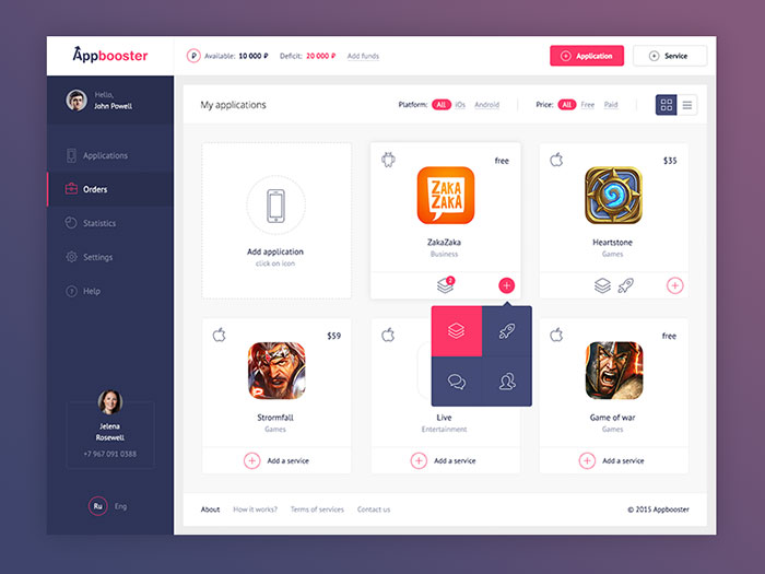
Appbooster dashboard
Bolder Multipurpose Mobile UI Kit for Sketch

Profile

Mobile navigation
FAQ on mobile menu design
What is mobile menu design?
Mobile menu design is all about creating an easy-to-use and visually appealing navigation system for mobile websites or apps. Since mobile screens are smaller than desktop screens, designing a mobile menu requires a focus on simplicity, usability, and responsiveness.
A well-designed mobile menu helps users find their way around your website or app with ease, enhancing their overall experience.
Why is mobile menu design important?
Mobile menu design is crucial because it directly impacts user experience. With the increasing use of smartphones and tablets, more and more people are accessing websites and apps on their mobile devices.
A well-designed mobile menu ensures that users can easily navigate your site or app, find the information they’re looking for, and have a positive experience overall. This can lead to increased user satisfaction, higher engagement, and better conversion rates.
What are some popular mobile menu design patterns?
There are several popular mobile menu design patterns, each with its own benefits and drawbacks. Some common patterns include:
- Hamburger menu: a widely used pattern featuring three horizontal lines, which expand into a full menu when tapped
- Tab bar: a row of icons or labels at the bottom or top of the screen, allowing users to switch between different sections of the app
- Priority+ pattern: a design that shows the most important menu items first, with less important items hidden behind a “More” button or similar element
How do I choose the right mobile menu design for my website or app?
Choosing the right mobile menu design depends on your specific needs, target audience, and overall design aesthetic. Consider factors like the number of menu items, the importance of each item, and how users will interact with your site or app.
Usability testing and user feedback can be invaluable in helping you make the right choice. Don’t be afraid to experiment with different designs and see which one works best for your particular situation.
What are some best practices for mobile menu design?
Here are some best practices to keep in mind when designing a mobile menu:
- Keep it simple: prioritize the most important menu items and avoid cluttering the menu with too many options
- Make it easy to use: ensure that menu items are large enough to tap easily and have clear labels or icons
- Ensure accessibility: design your menu with accessibility in mind, considering color contrast, font size, and screen reader compatibility
- Test on different devices: make sure your menu works well on various screen sizes and resolutions
What is a responsive menu?
A responsive menu is a type of mobile menu design that automatically adapts to different screen sizes and devices. This means that the menu will look and function well on smartphones, tablets, and desktop computers. Responsive menus often use CSS media queries and JavaScript to detect the user’s screen size and adjust the menu accordingly, ensuring a consistent and user-friendly experience across all devices.
How can I make my mobile menu more user-friendly?
To make your mobile menu more user-friendly, focus on the following aspects:
- Clarity: use clear labels and icons to help users easily identify menu items
- Size and spacing: ensure that menu items are large enough to tap and have adequate spacing to prevent accidental taps
- Visual hierarchy: prioritize the most important menu items and use visual cues to help users understand the structure of your menu
- Feedback: provide feedback, like highlighting the selected menu item or using subtle animations, to indicate user interaction
Should I use a hamburger menu or a tab bar for my mobile menu?
The choice between a hamburger menu and a tab bar depends on your specific needs and goals. Hamburger menus are popular and save space, but they can hide important menu items and may not be as intuitive for some users.
Tab bars, on the other hand, are more visible and provide immediate access to the main sections of your app or website. They can be more intuitive for users and generally result in higher engagement. However, they may not work well if you have many menu items or if you need to prioritize some items over others.
Consider your specific requirements, the number of menu items, and your target audience when deciding between a hamburger menu and a tab bar. It’s also a good idea to test both options with real users to determine which one works best for your website or app.
Ending thoughts on designing app menus
Here we are, folks, reaching the end of our delightful tour of mobile menu design. It’s been an absolute blast, hasn’t it?
- We’ve uncovered the importance of mobile menus,
- We’ve discovered some stellar design examples,
- And we’ve shared tips and tricks for creating a user-friendly experience!
Now, it’s time for you to put your newfound knowledge to the test. Go ahead, let your creative juices flow, and work on designing a mobile menu that’ll blow users’ minds.
And don’t forget – it’s all about balancing form and function. You want your mobile menu to look fabulous, but it also needs to be easy to navigate, right? So, keep those pointers in mind, and you’ll be well on your way to creating a menu that users will love.
Thank you for joining me on this exciting adventure through mobile menu design. I can’t wait to see what you come up with! So, buckle up, get your creative hats on, and let’s revolutionize the world of mobile menus, one design at a time.
If you enjoyed reading this article about app menus, you should read these as well:
Bogdan Sandu, a seasoned designer with 15 years of diverse experience, has been designing websites since 2008.
Renowned for his expertise in logo design and visual branding, Bogdan has developed a multitude of logos for various clients.
His skills extend to creating posters, vector illustrations, business cards, and brochures. Additionally, Bogdan's UI kits were featured on marketplaces like Visual Hierarchy and UI8.
Latest posts by Bogdan Sandu (see all)
- Summer Color Palettes for Hot Designs: 40 Examples - 23 April 2024
- Corporate Identity Examples Any Designer Should See - 23 April 2024
- The Nintendo Logo History, Colors, Font, And Meaning - 22 April 2024